
pro
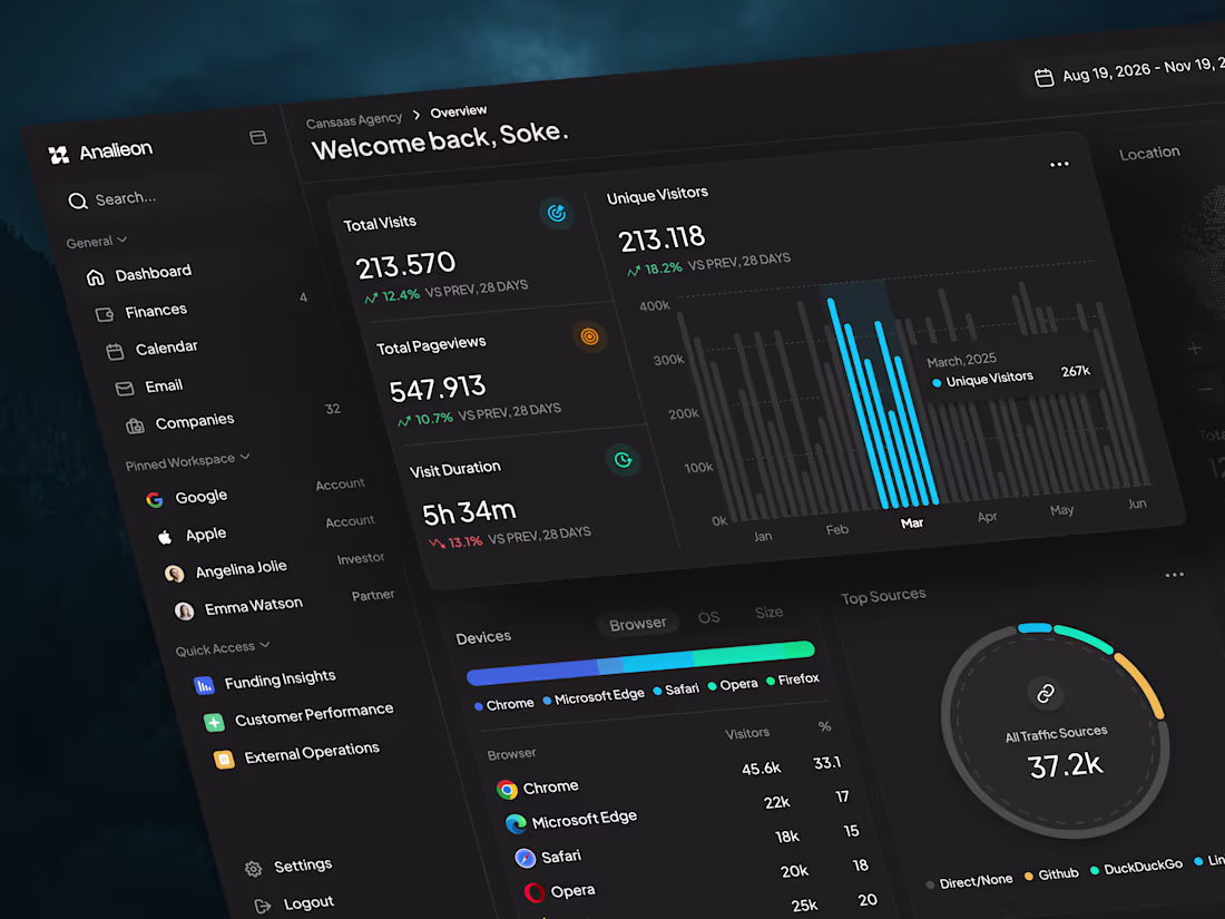
Cansaas Agency
UI/UX Design Expert Specializing in SaaS Products
- $50k+
- Earned
- 35x
- Hired
- 4.96
- Rating
- 266
- Followers
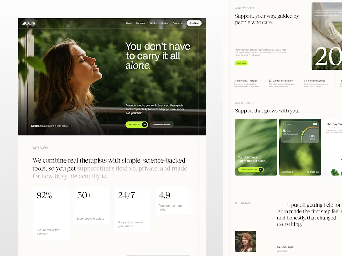
Aura Health and Wellness Landing Page Design
0
1
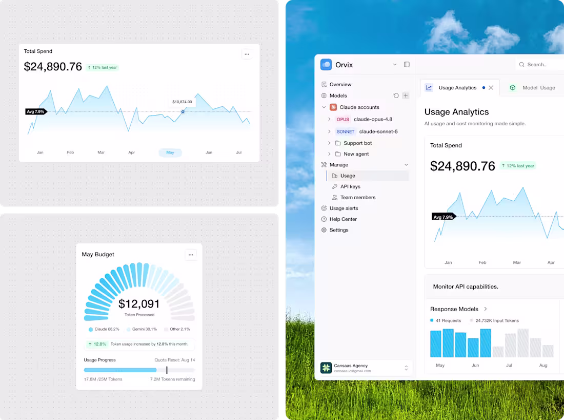
Orvix AI Usage Analytics Dashboard Design
1
3
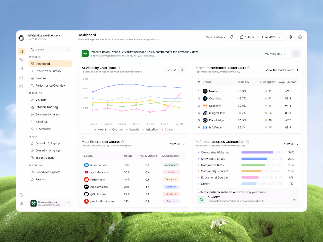
AI Search Analytics Dashboard Design
1
2
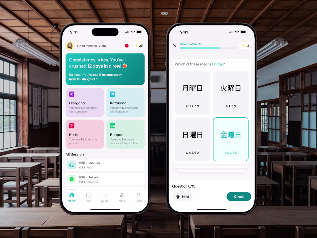
Japanese Language Learning Mobile App UI Design
1
4
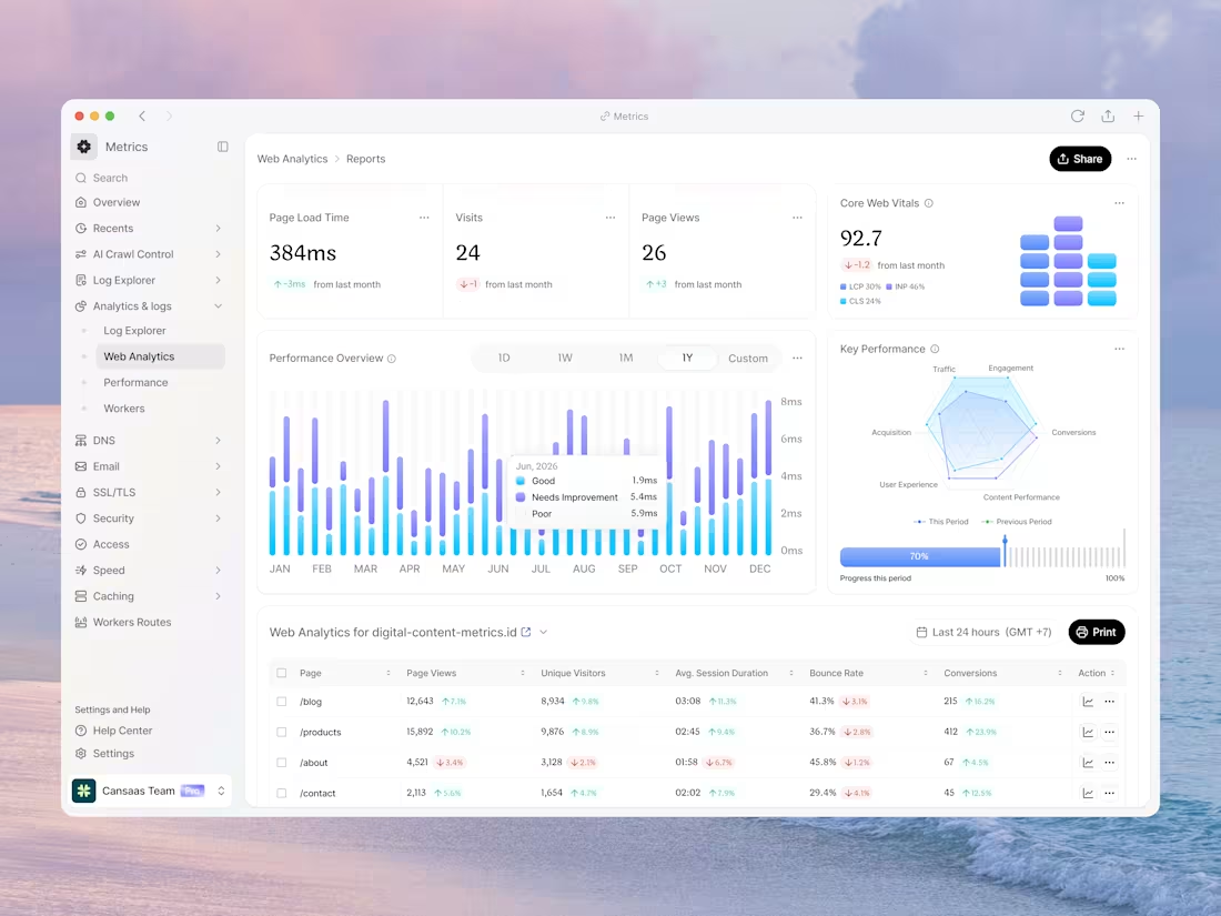
Analytics Dashboard Design for Web Performance Monitoring
1
4
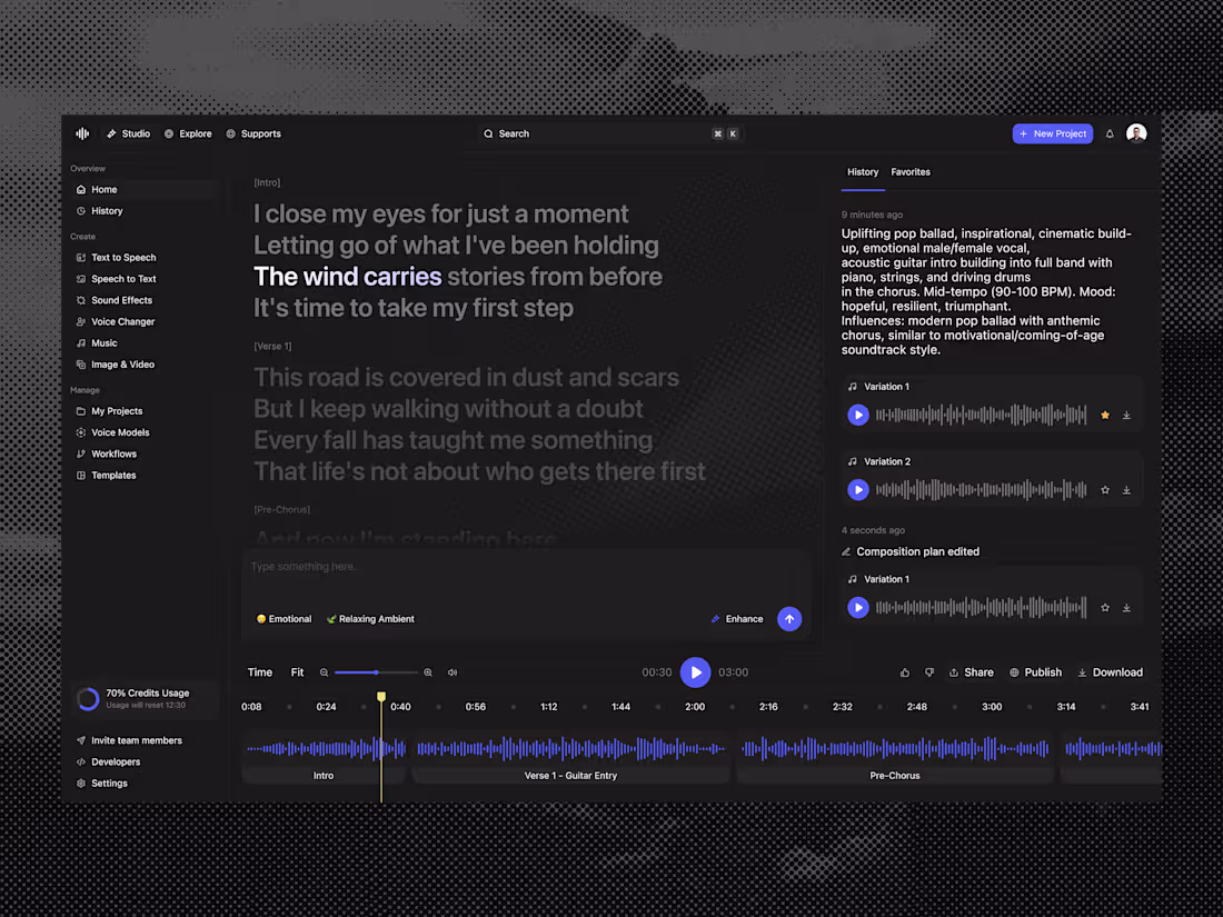
AI Audio Dashboard Design for Mucer
1
4
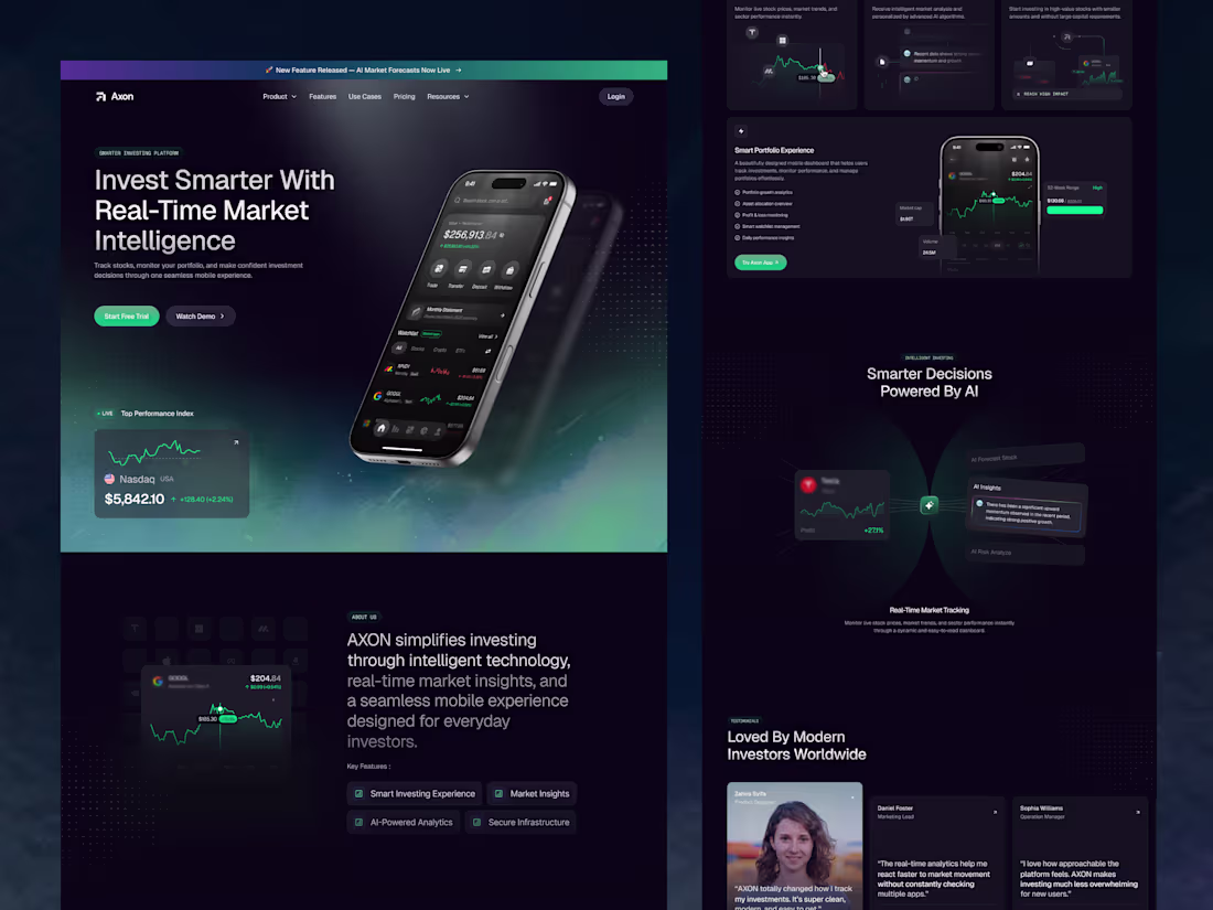
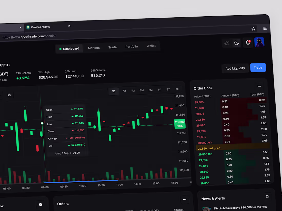
Axon Stock App Landing Page Design
1
5
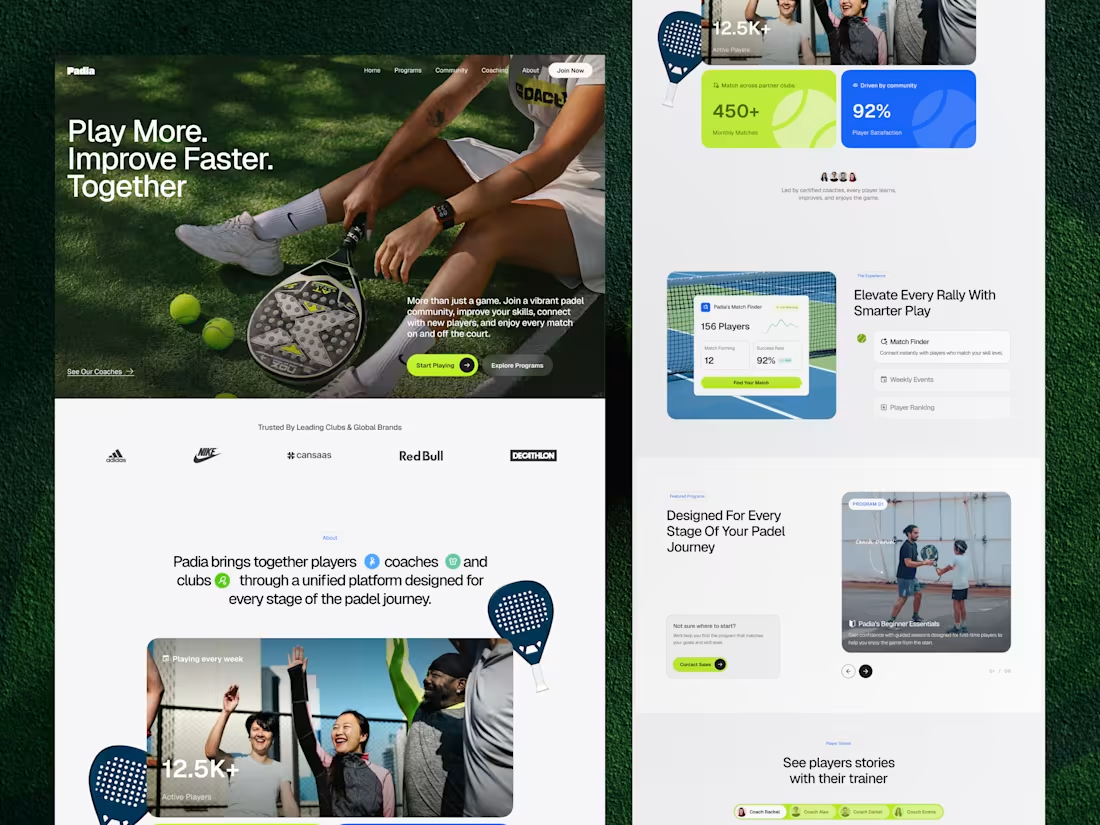
Padia Sports Community Landing Page Design
2
16
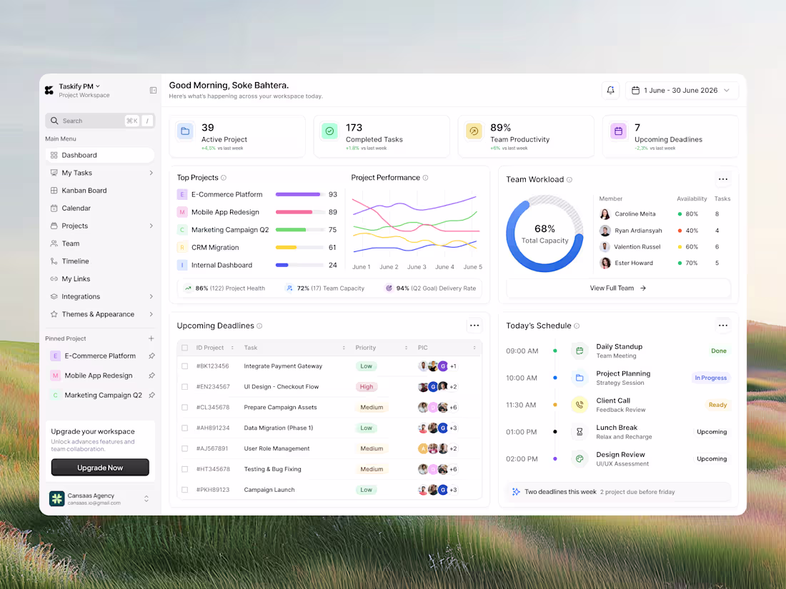
Project Management Dashboard Design
1
9
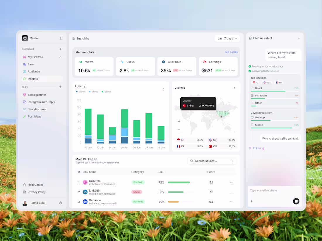
User-Friendly Link Analytics Dashboard Design
1
8
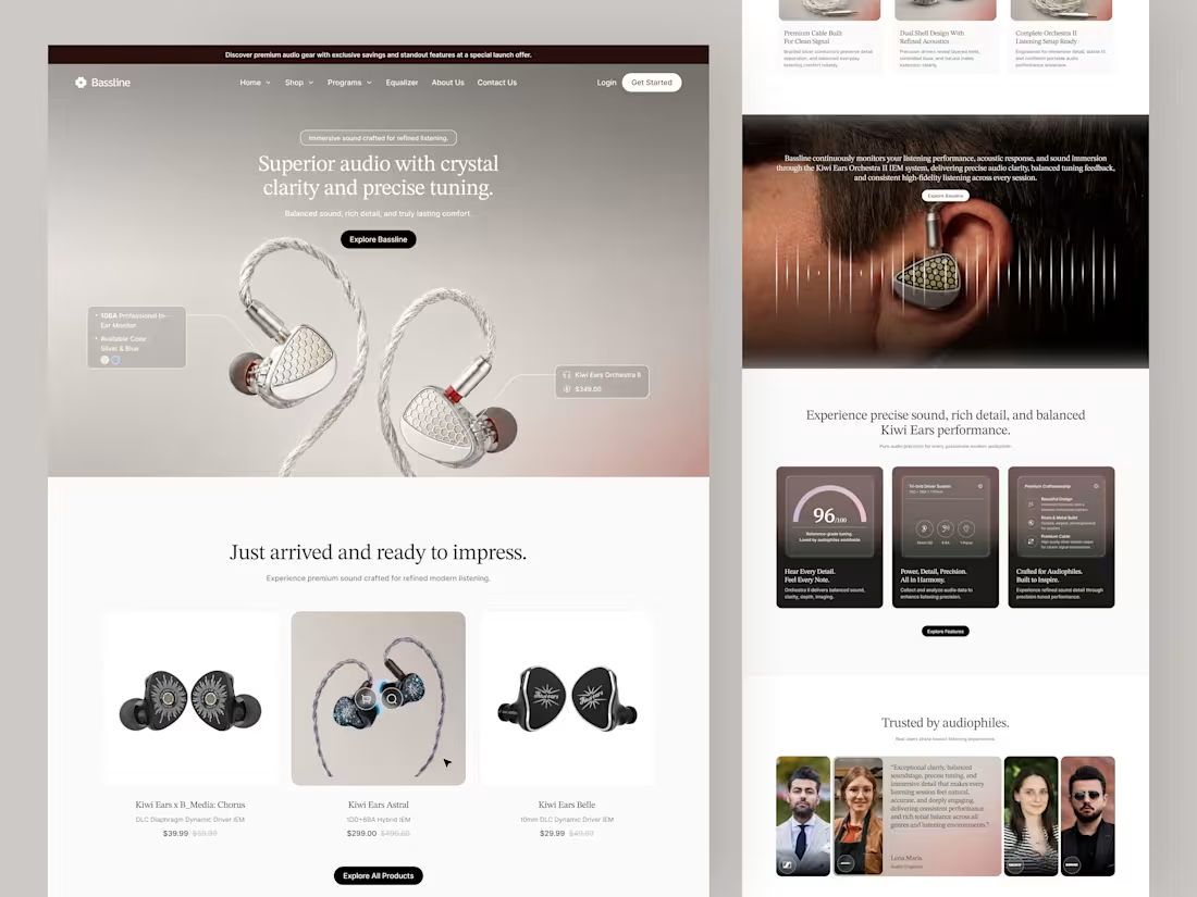
Bassline Premium Product Landing Page Design
1
4
Email Analytics Dashboard Design
1
4
Finance SaaS Landing Page Design
1
4
Database Monitoring Dashboard Redesign
1
6
Football Dashboard Design and Implementation
1
6
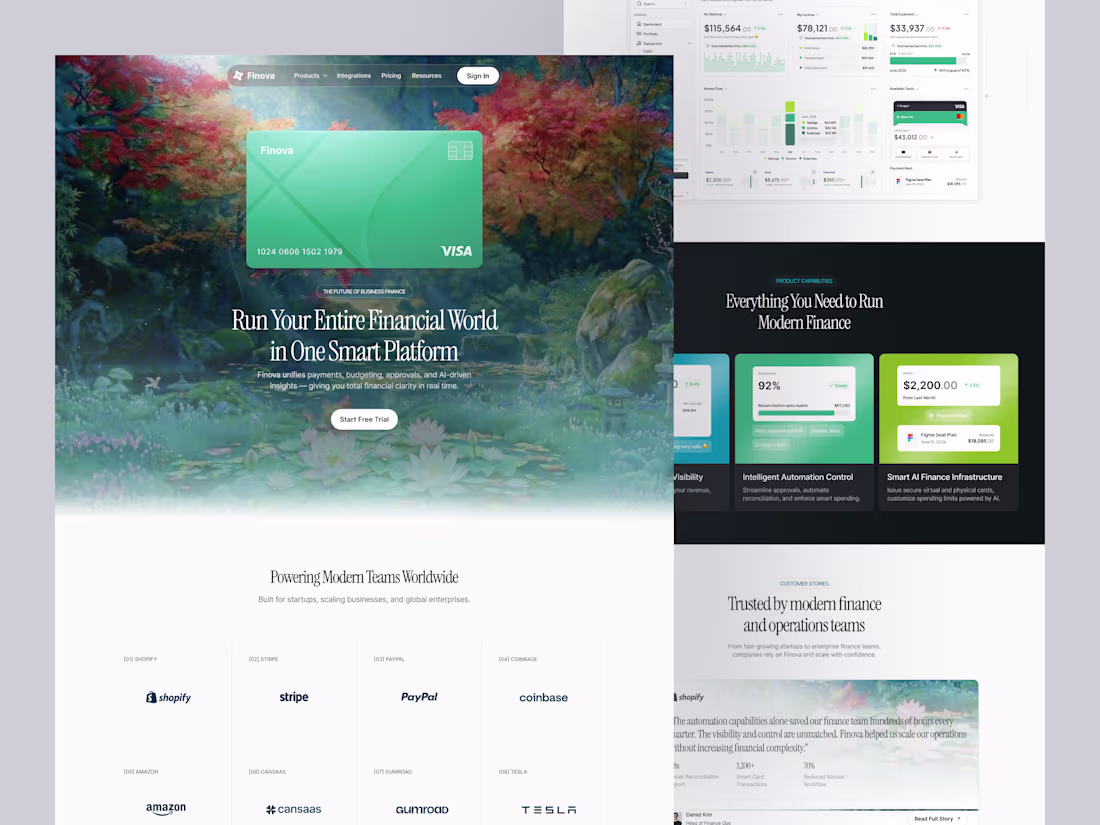
Finova Finance Landing Page Design
1
6
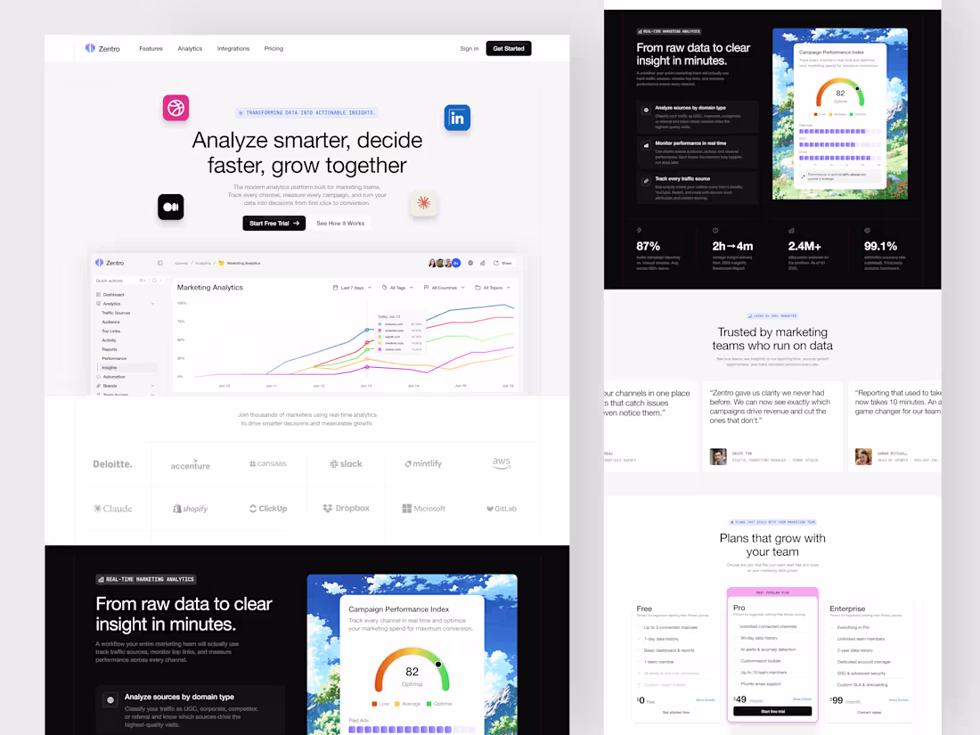
Zentro SaaS Landing Page Design
1
7
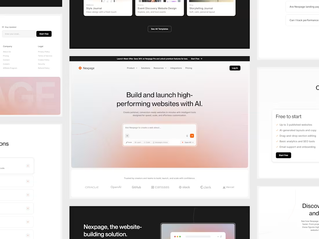
AI Website Builder Landing Page Concept
1
7
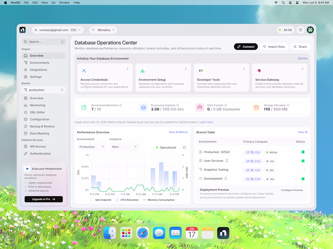
Database Operations Center Development
1
3
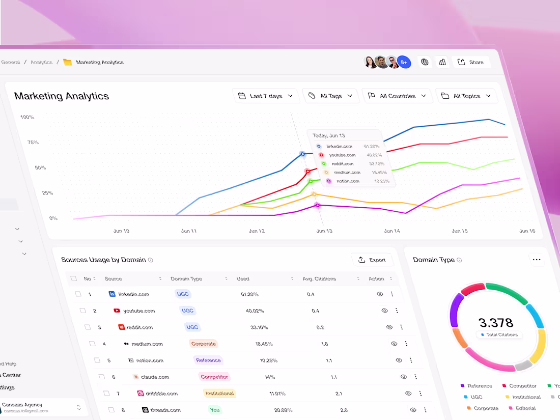
Intuitive Marketing Analytics Dashboard Design
1
4
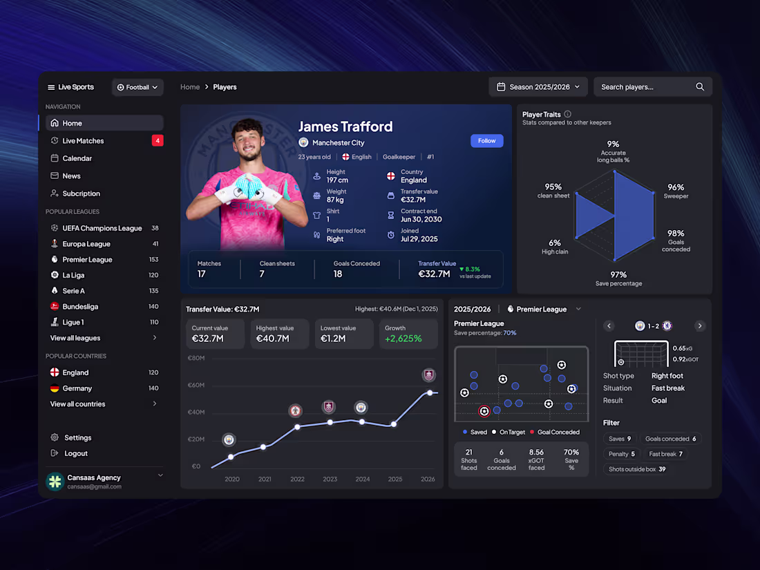
Player Statistics Dashboard Design
1
13
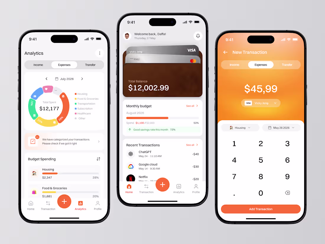
Budget Tracker App UI/UX Design
0
13
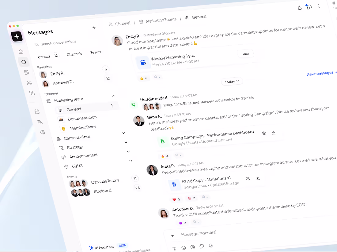
Communication Dashboard Design for Team Unification
1
6
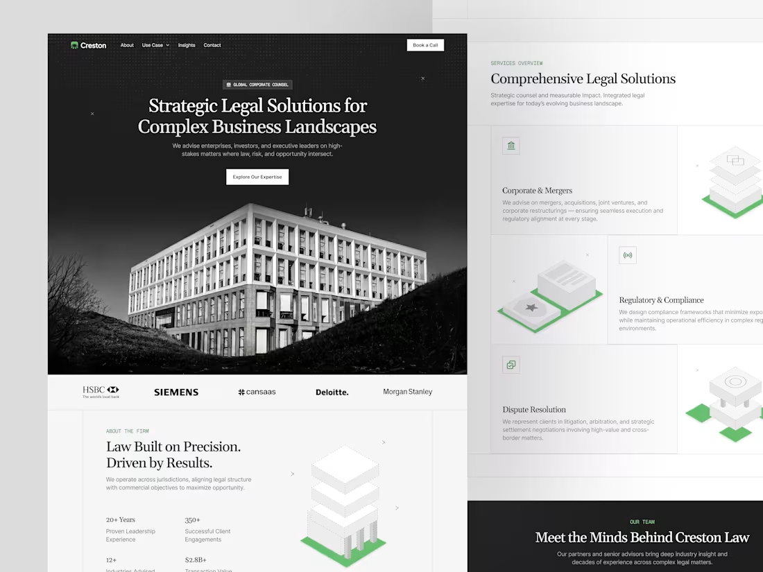
Creston Law Firm Landing Page Design
1
10
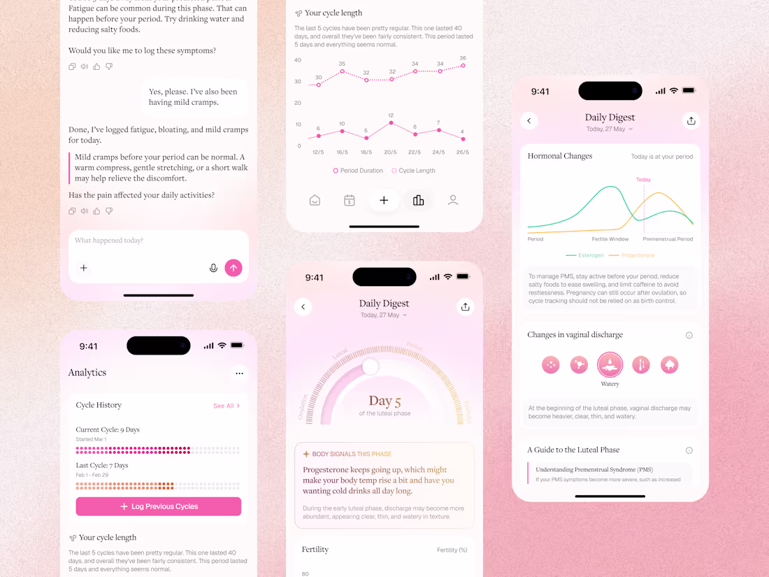
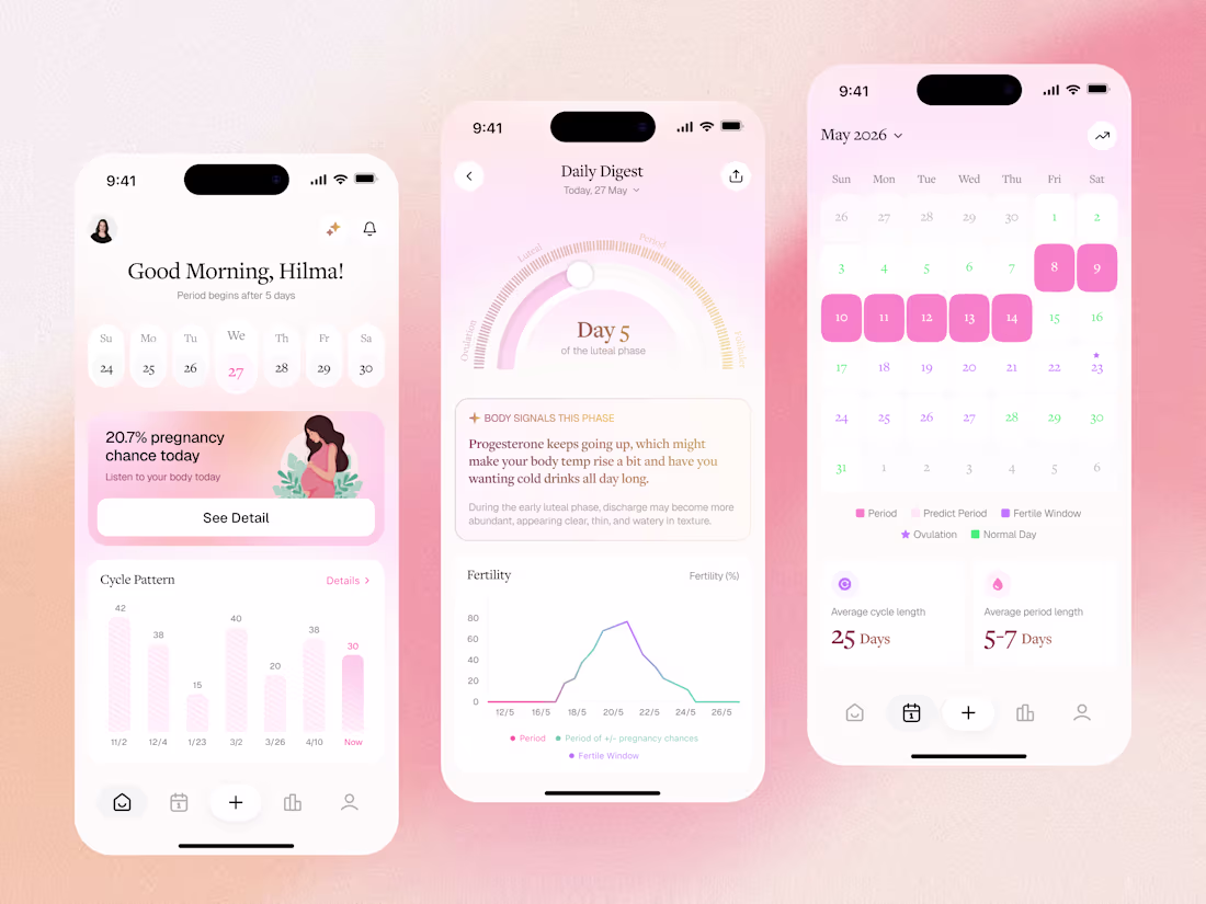
Women Wellness Mobile App Design
1
10
Development of Football Live Score App Interface
1
10
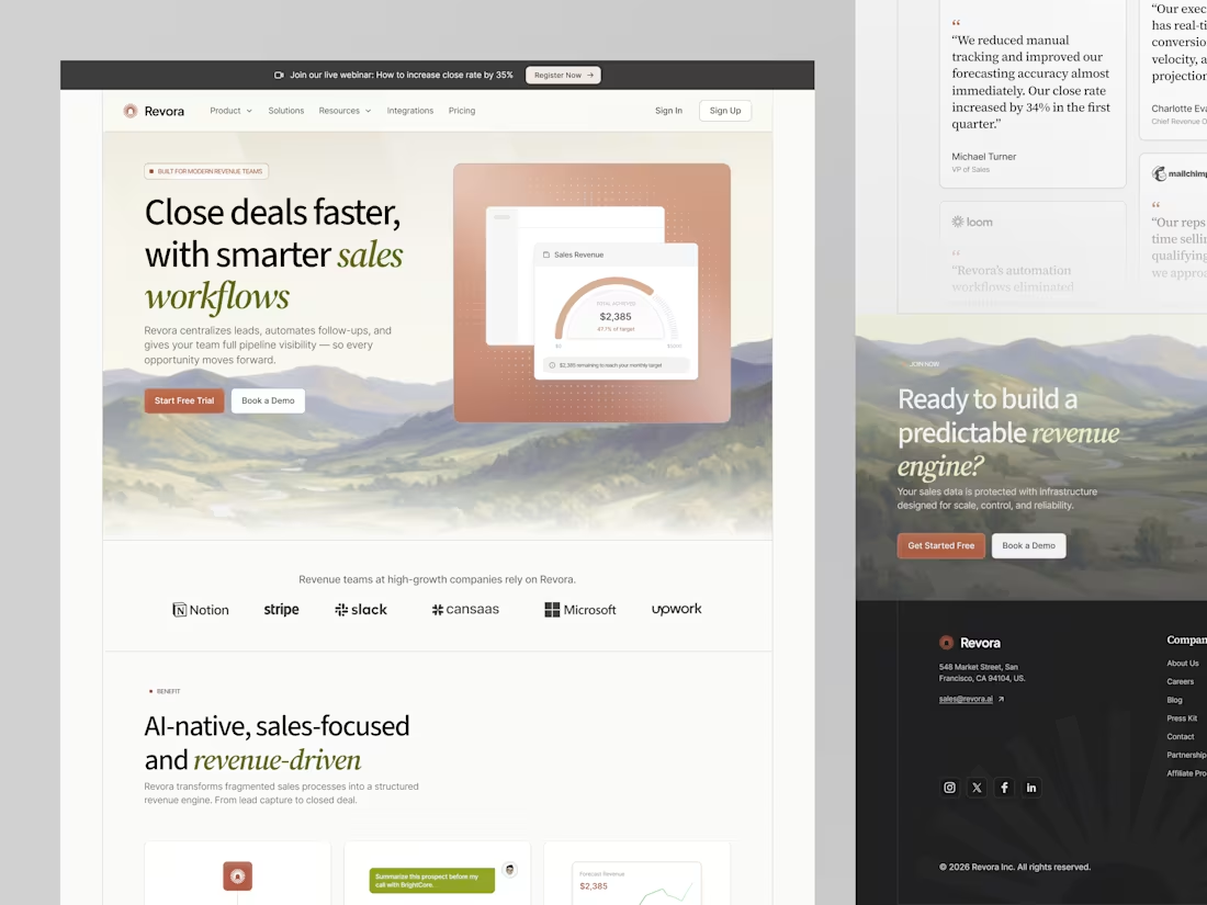
Revora Sales Landing Page Design
1
4
Women's Wellness Mobile App Design
0
8
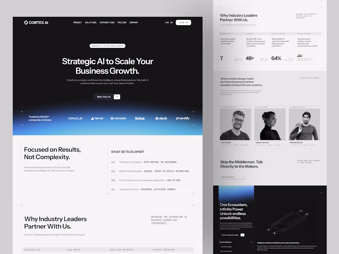
Cortex AI B2B Platform Interface Design
1
6
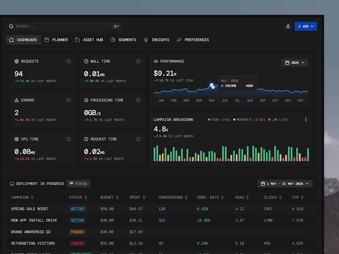
Adforma Ad Management Dashboard Design
1
5
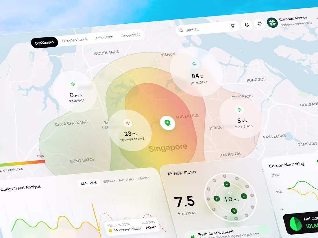
Air Monitoring Dashboard UX/UI Design
2
13
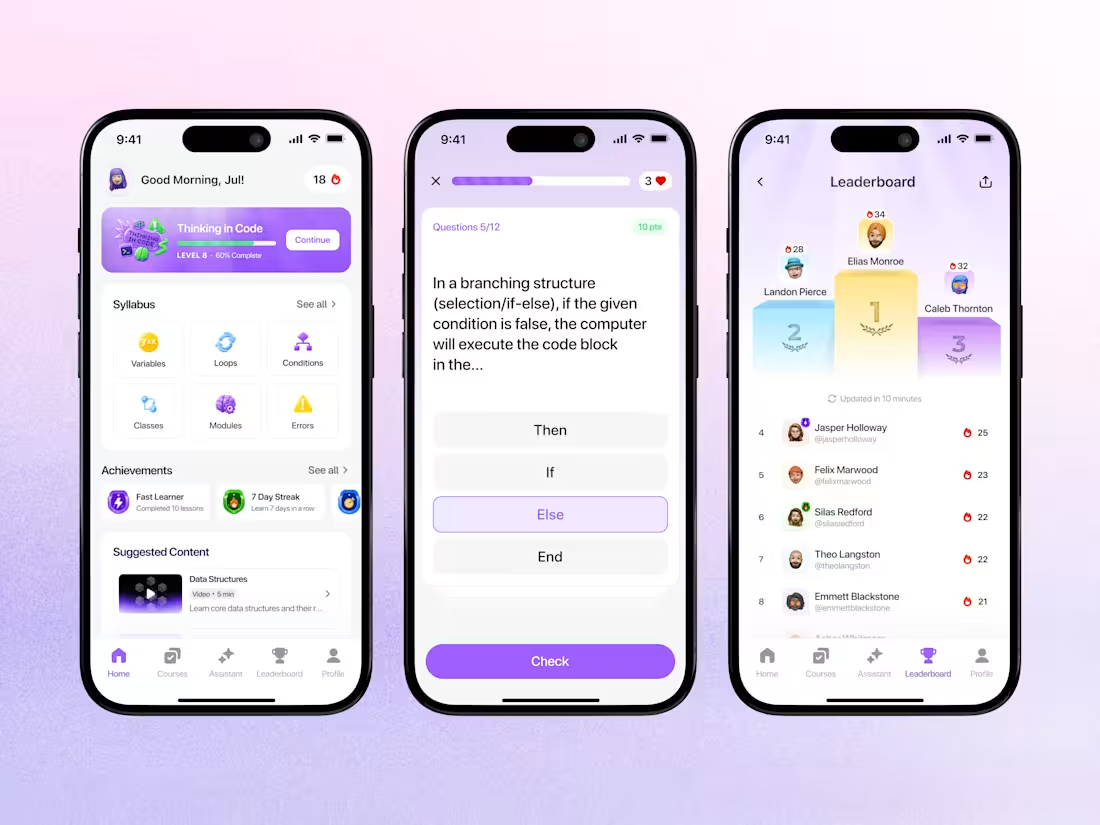
Gamified Learning Platform Mobile App Design
0
10
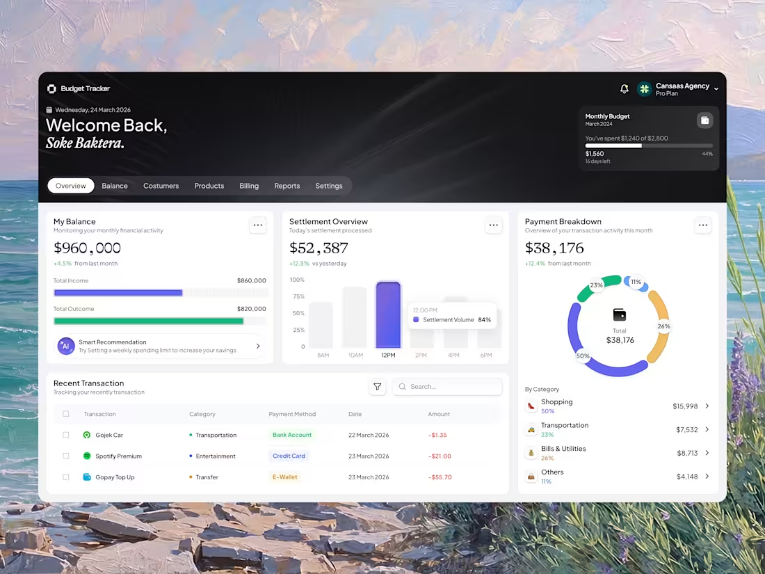
Budget Finance Tracker Dashboard Design
1
16
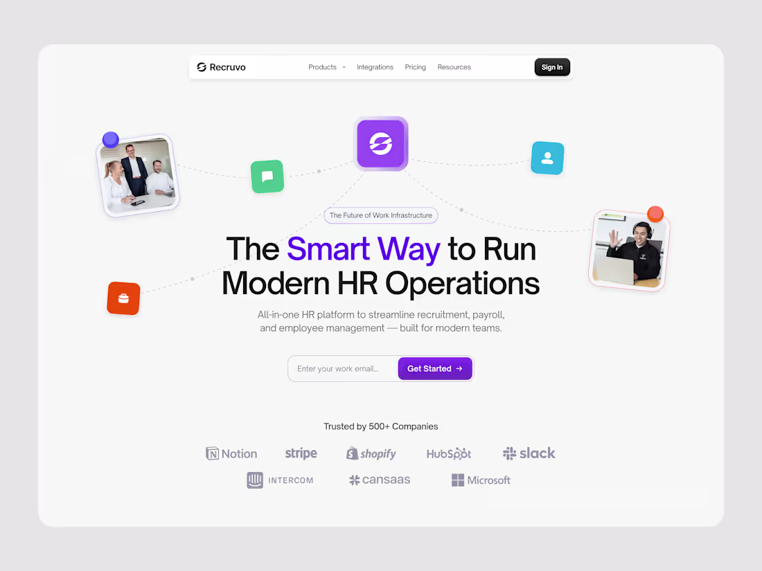
Recruvo HR SaaS Landing Page Design
1
9
AI Workflow Automation Dashboard Design
2
12
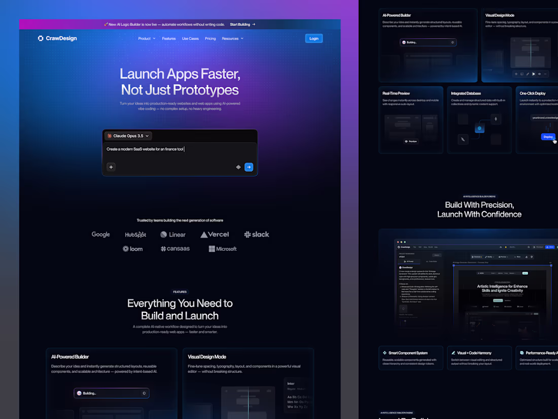
CrawDesign AI-Powered No-Code Platform Landing Page
1
9
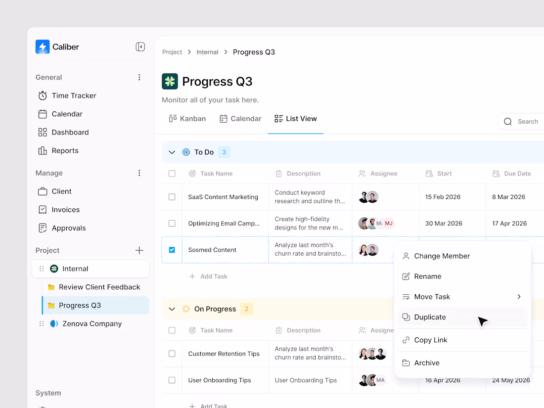
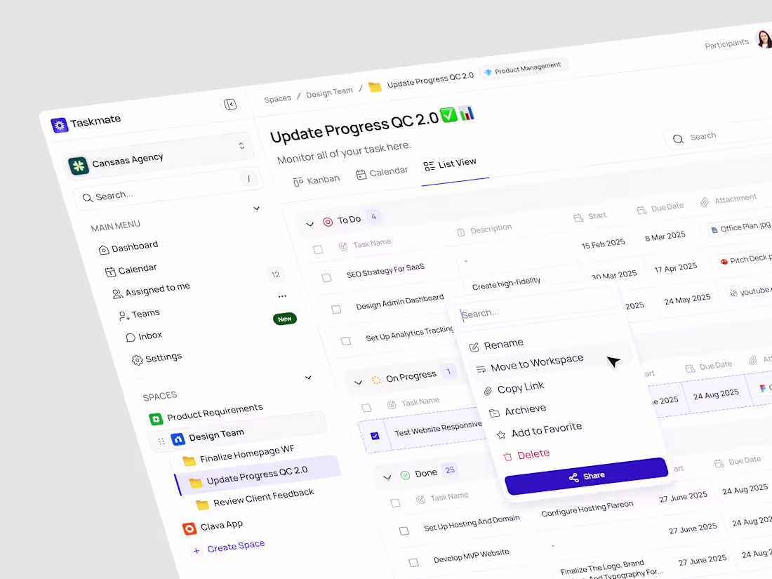
Caliber - SaaS Task Management Dashboard
1
14
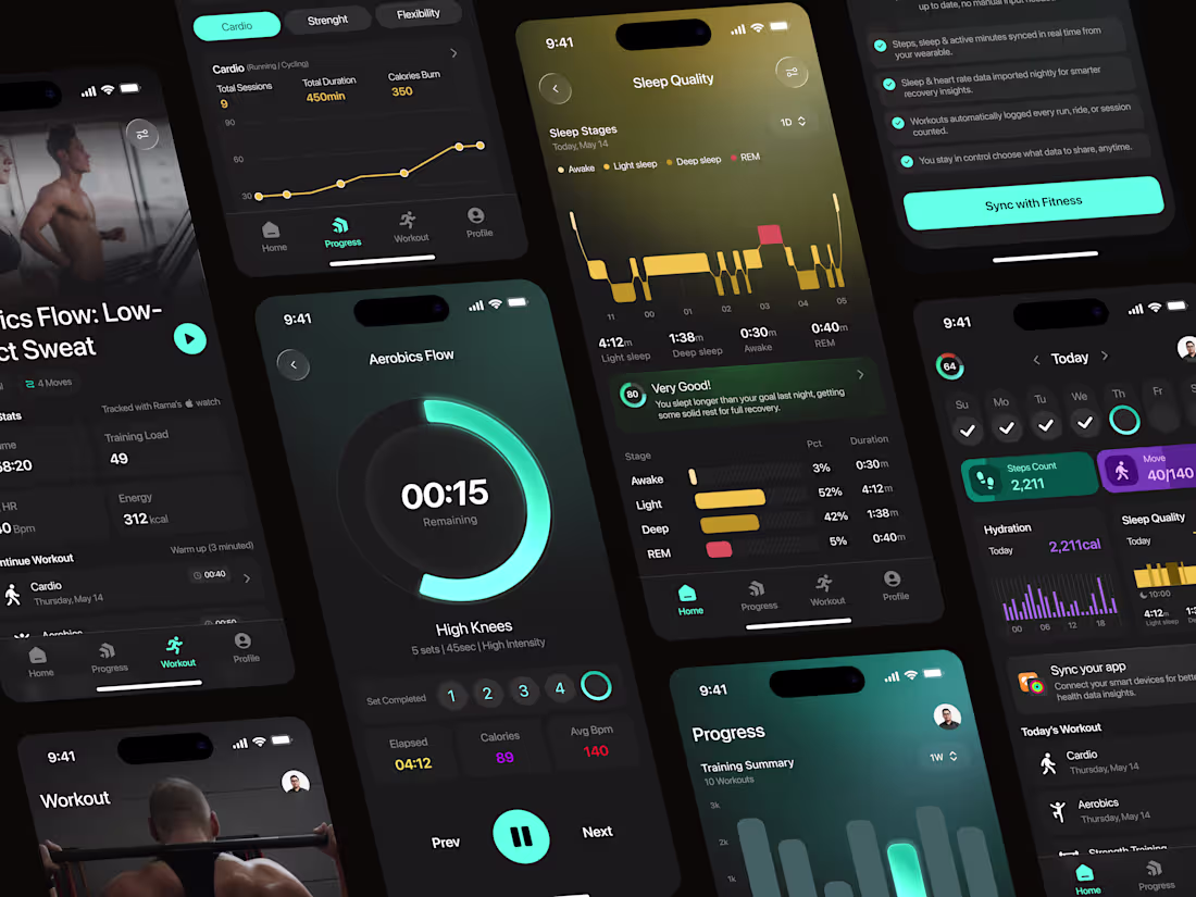
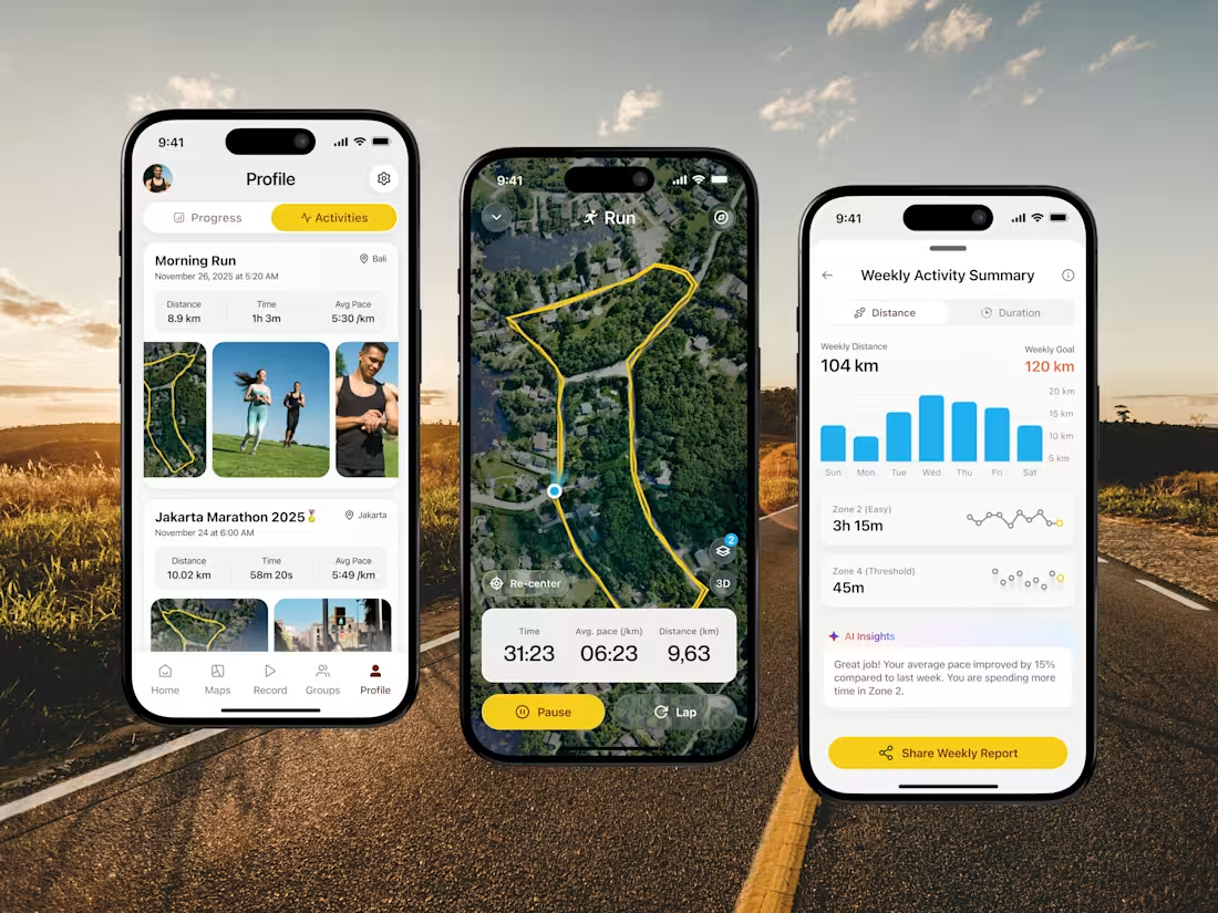
PulseFit: Modern UI Design for Fitness Tracking
1
9
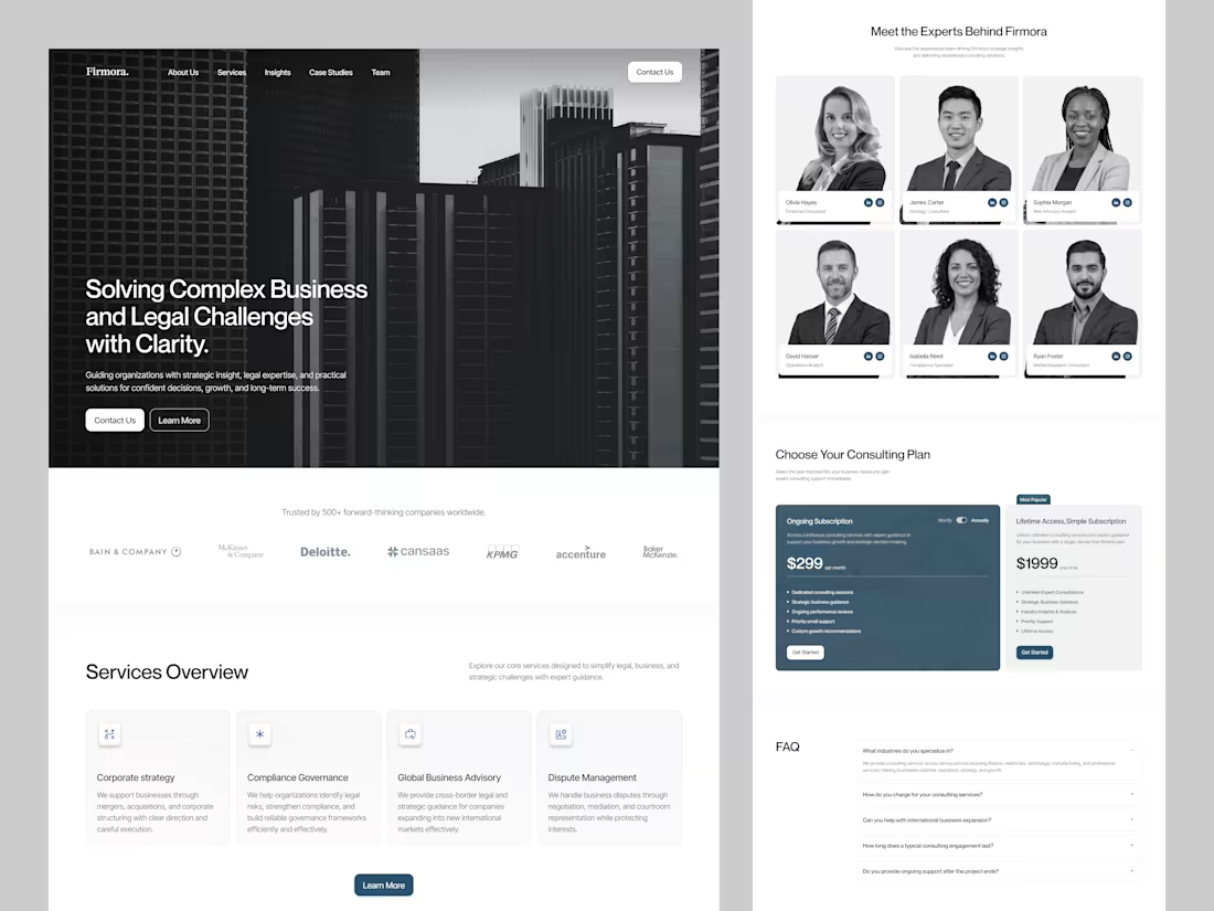
Firmora Consulting Firm Landing Page Design
1
8
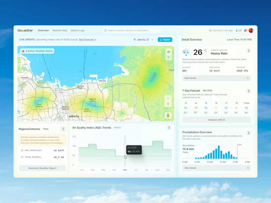
Geoaether: Modern Weather Monitoring Dashboard Design
1
1
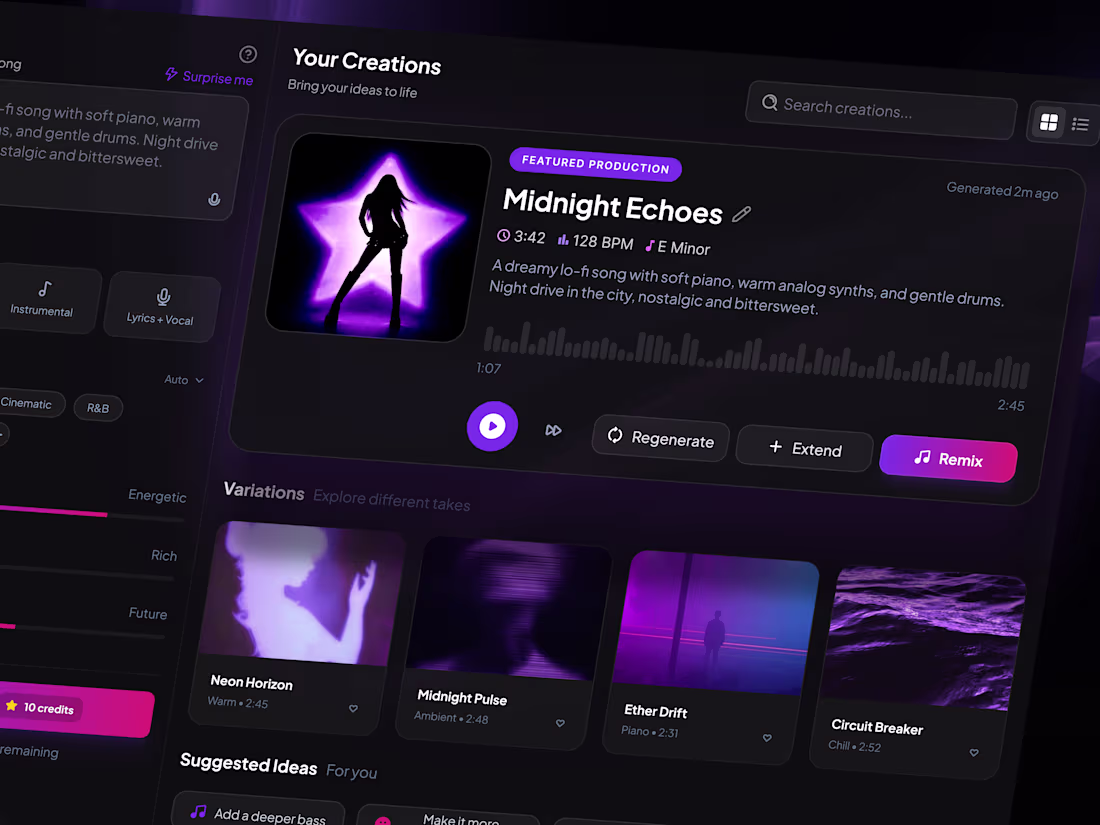
SonicAI AI Music Generator Dashboard Design
1
8
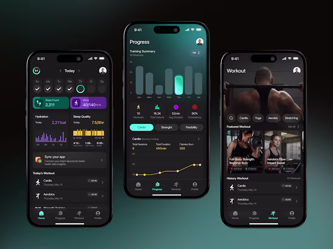
Fitness Tracker App UI/UX Design
1
7
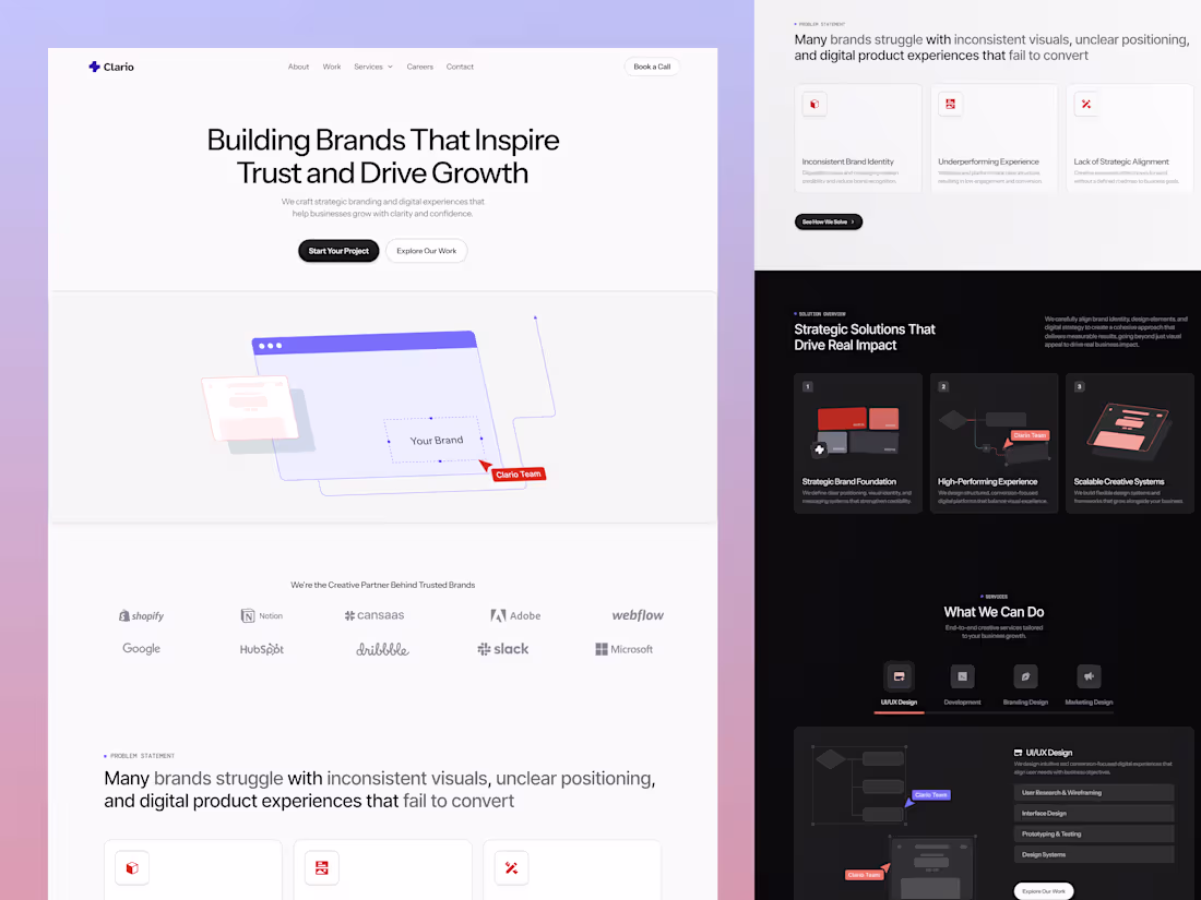
Clario Creative Agency Landing Page Design
1
6
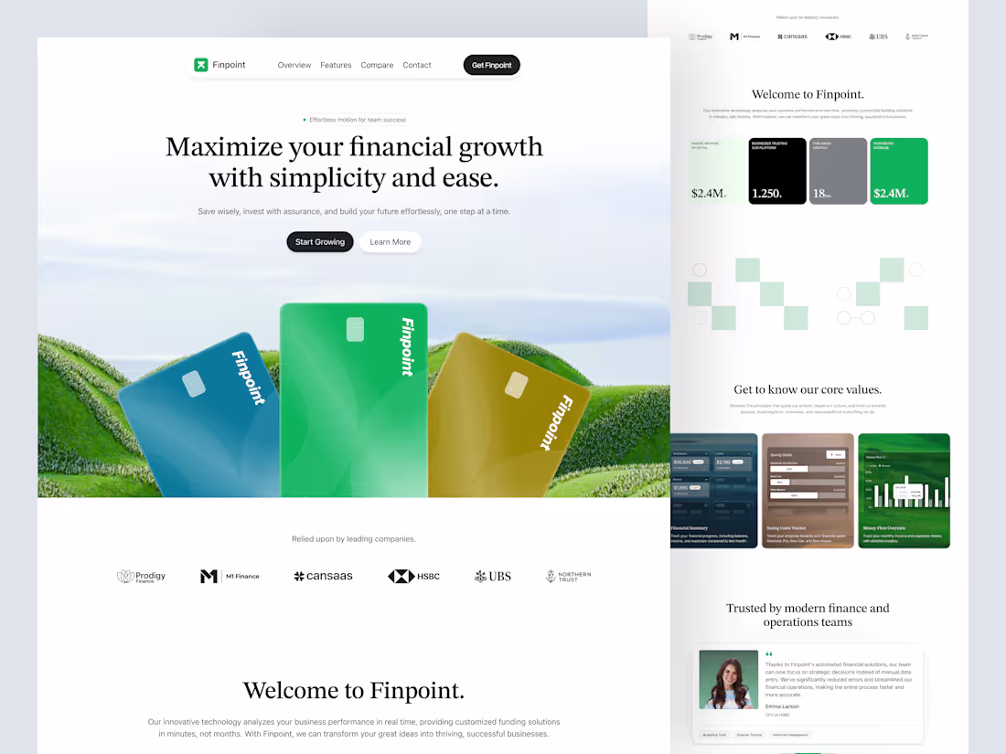
Finpoint Payment Management Dashboard Design
1
7
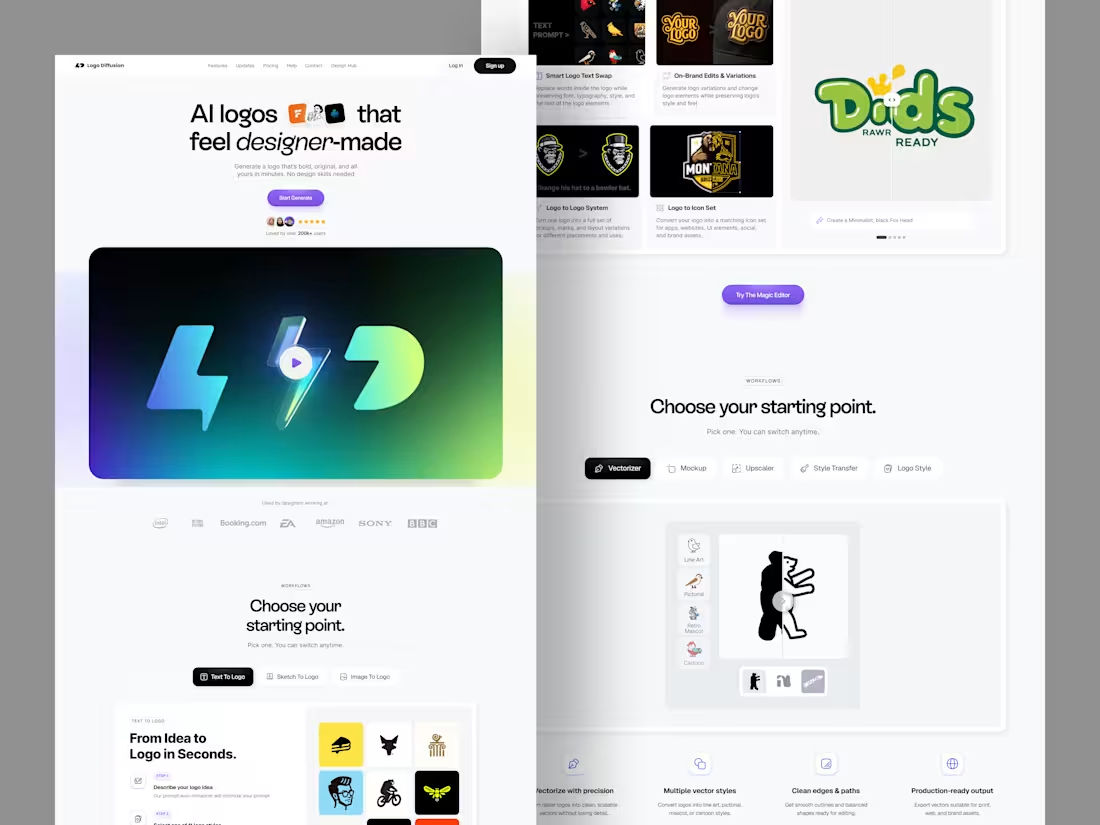
Premium AI Logo Generator Landing Page Design
1
16
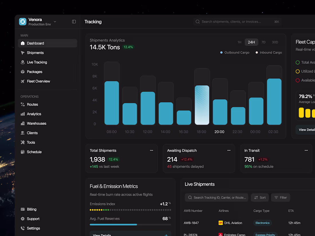
Venora Shipping Dashboard Design
0
9
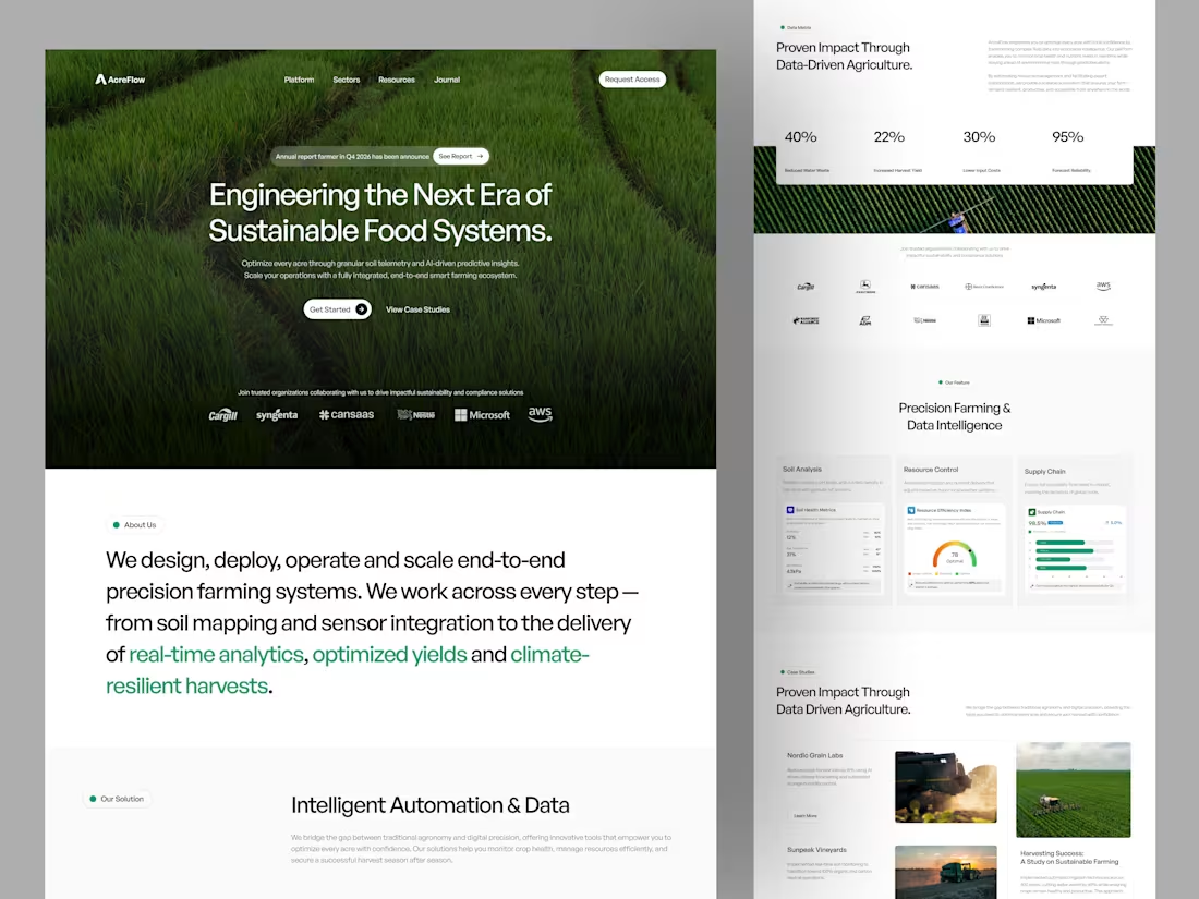
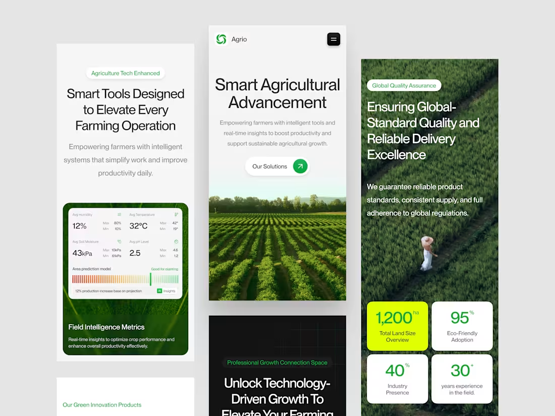
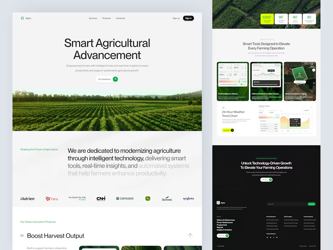
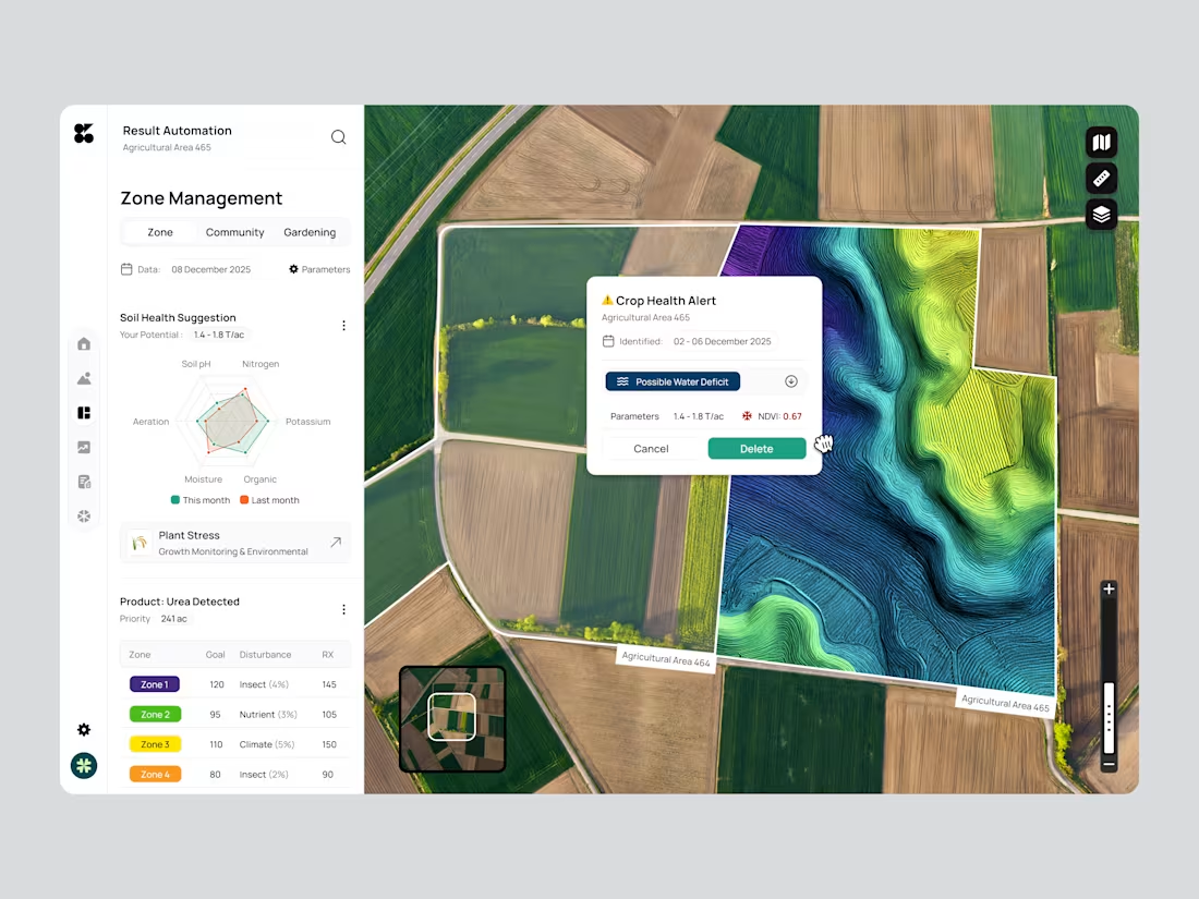
AcreFlow Agriculture Website Design
1
21
Finpoint Finance Landing Page Design
1
11
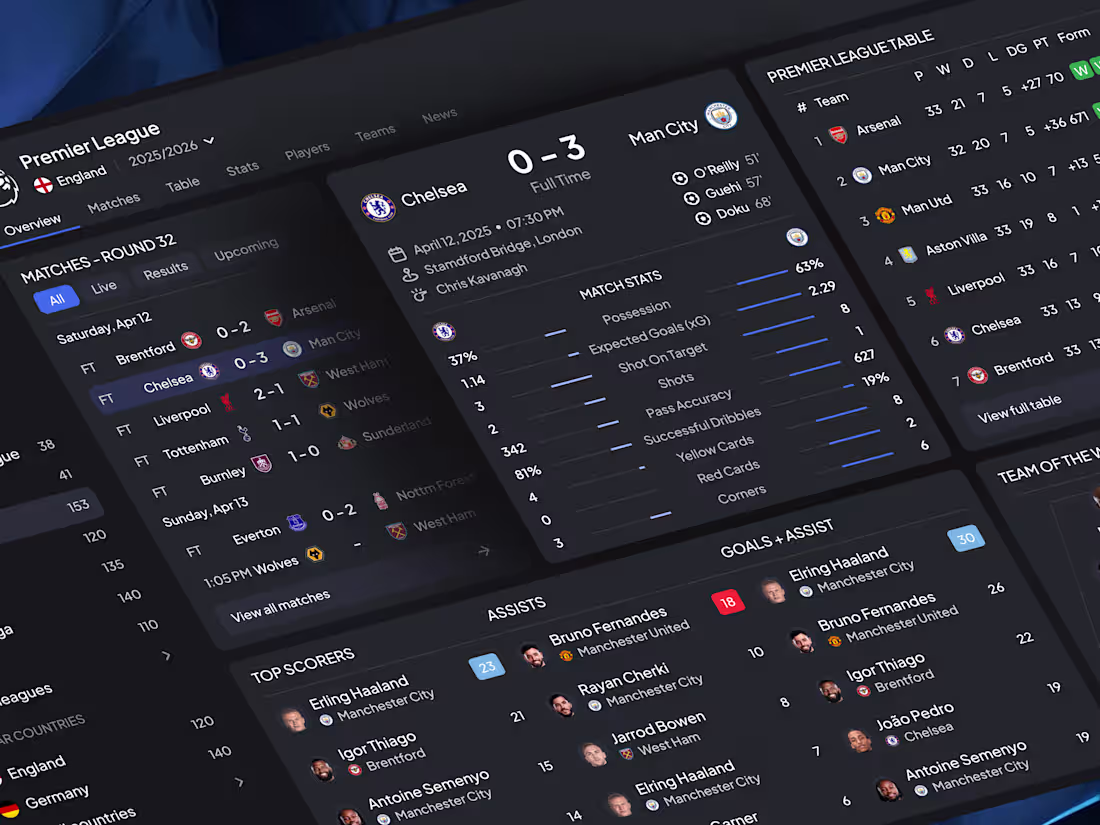
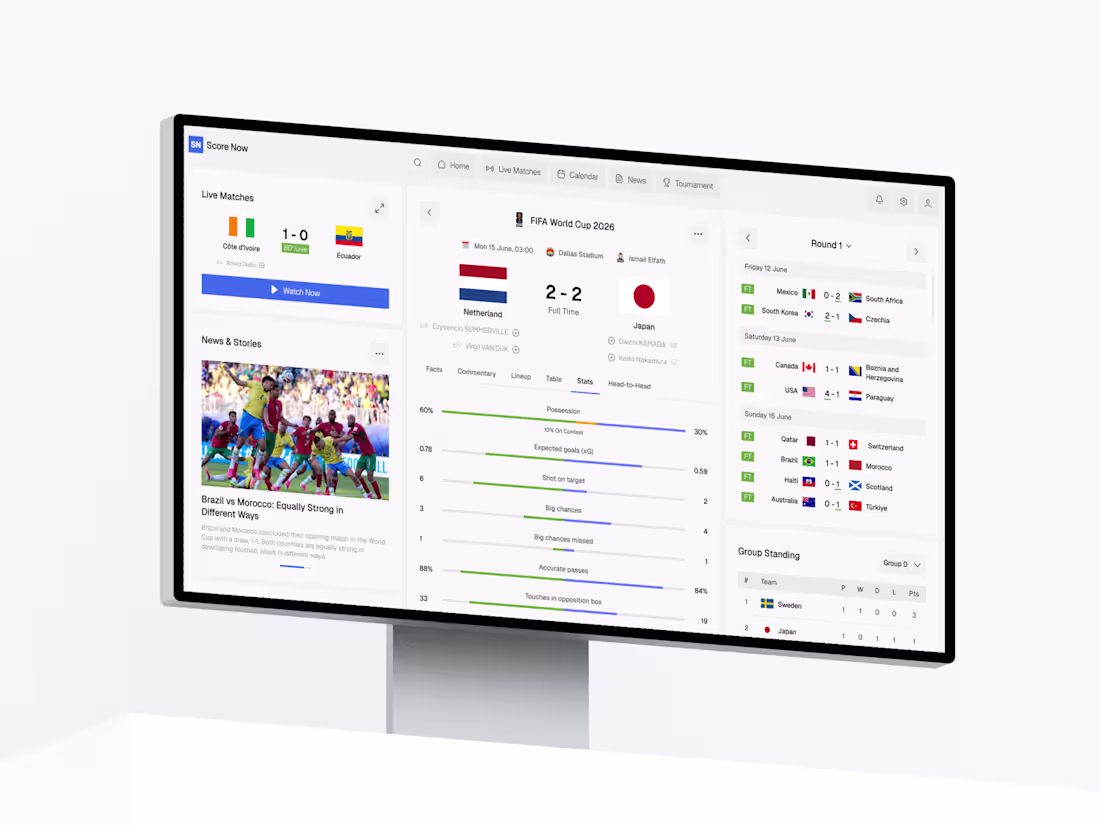
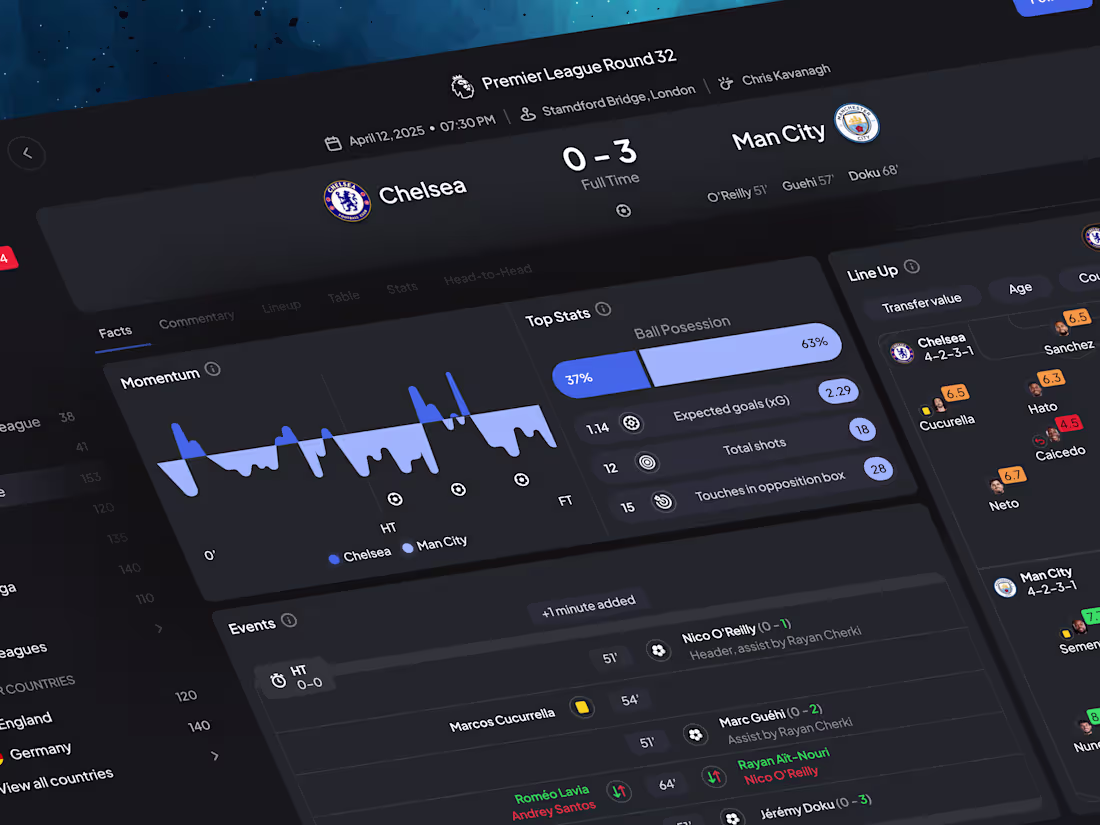
Football Live Score Dashboard Design
1
20
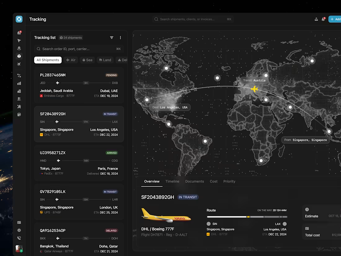
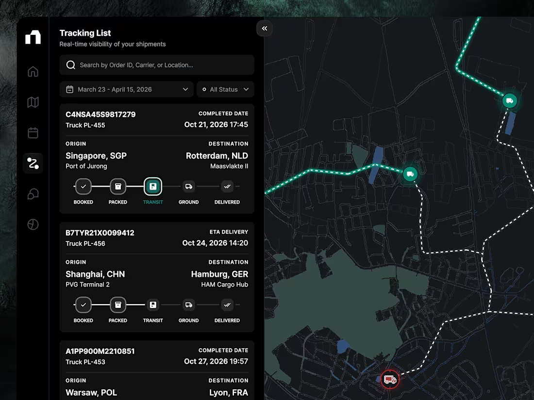
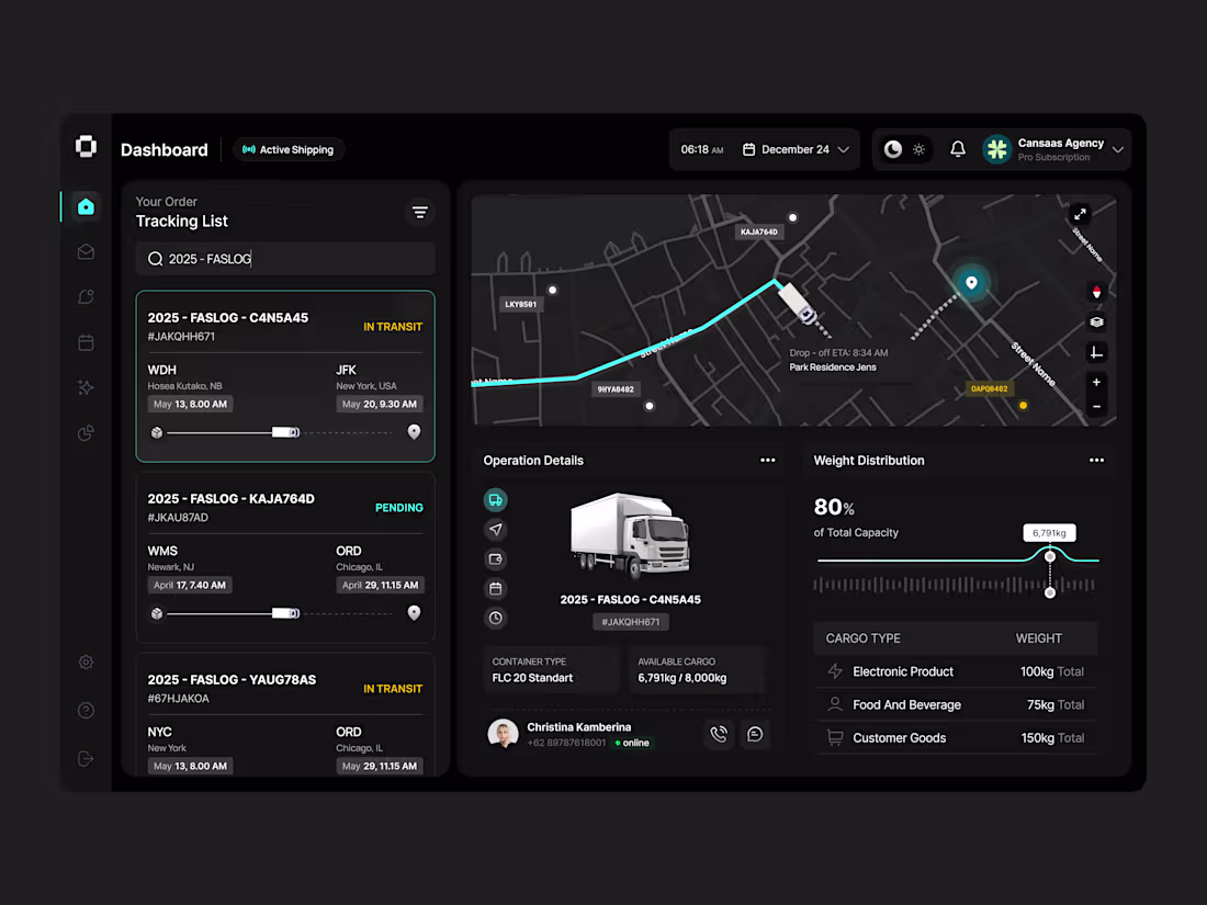
Shipping Logistics Dashboard Design
1
21
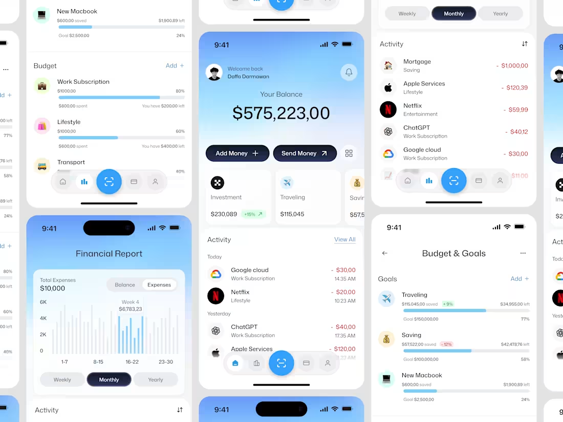
Budget Tracker Mobile App Design
1
7
Shipping Dashboard UI Design
1
17
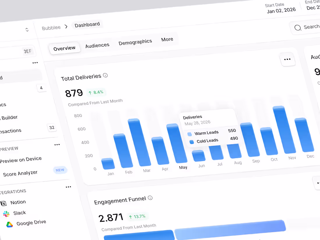
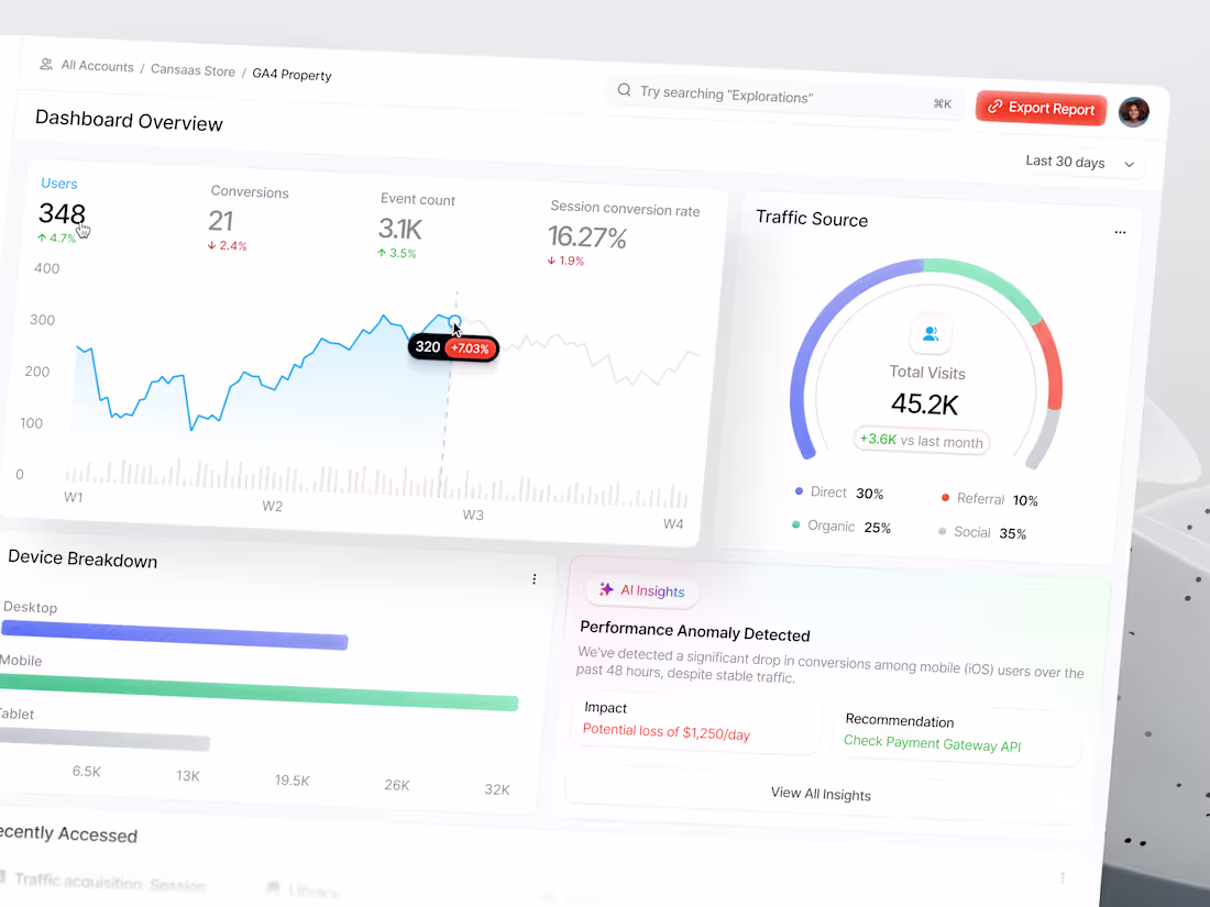
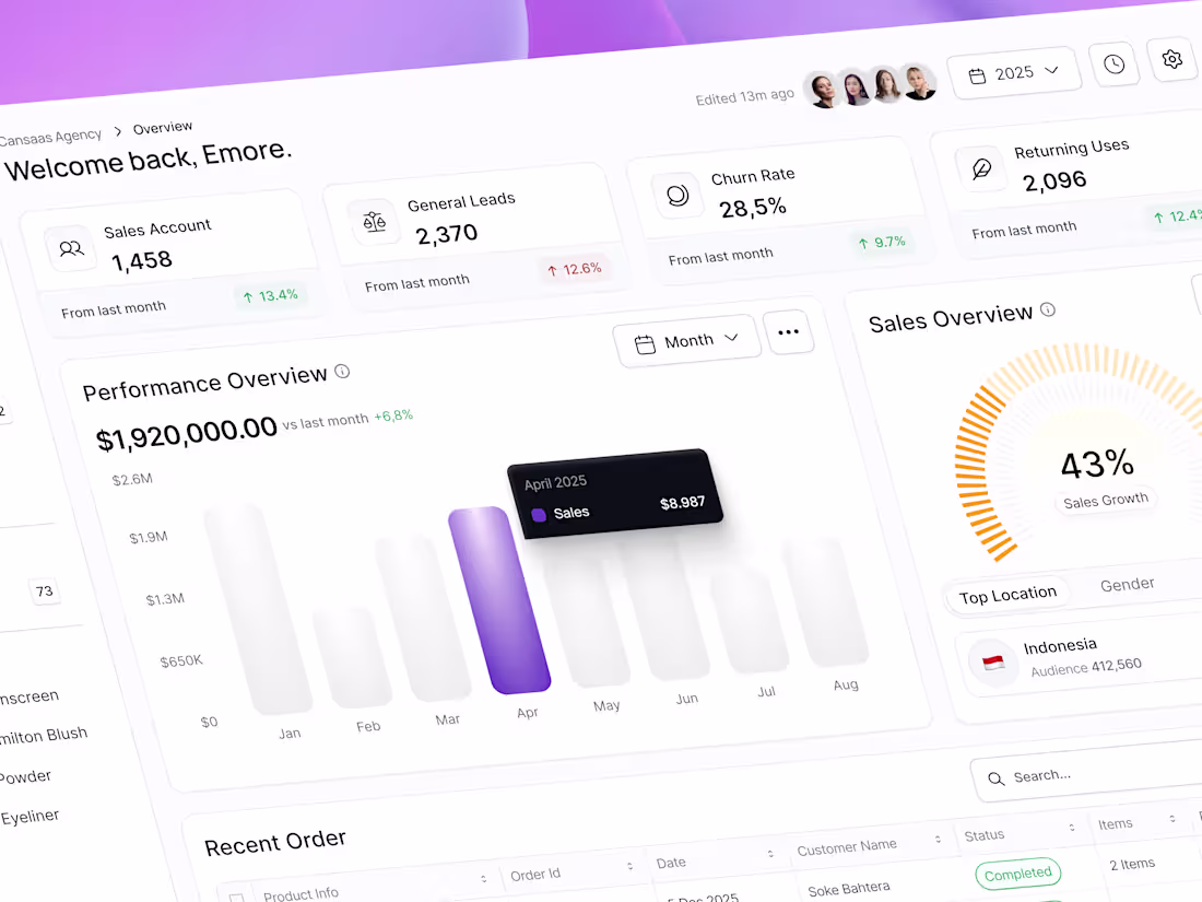
Design of a Modern Analytics Dashboard
0
8
Finpoint Financial Dashboard Design
1
9
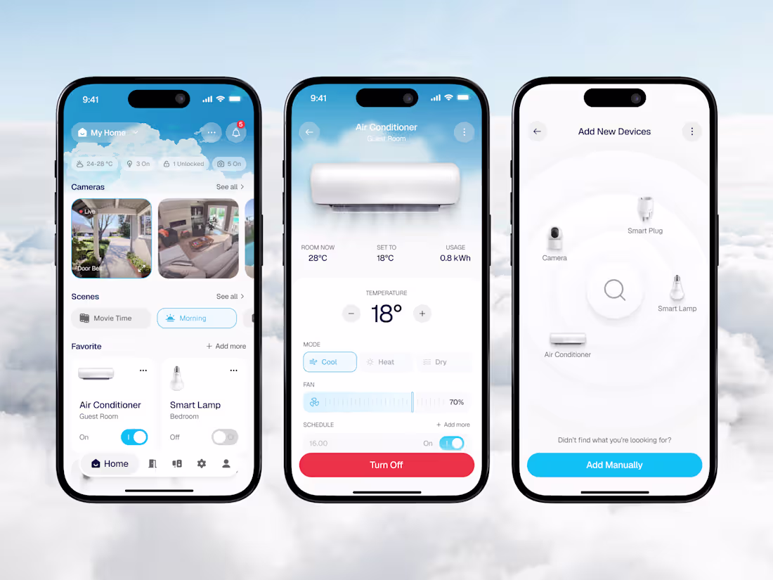
In this design, we streamlined how users interact with their smart home by combining device control, real-time status, and automation into one clean interface. From adjusting temperature to managing scenes and monitoring devices, every interaction is designed to feel effortless. With soft visuals, clear hierarchy, and intuitive flows, controlling your home becomes faster, smarter, and more enjoyable.
📩 Collaborate with Us? Contra Cansaas Agency (https://contra.com/cansaasagency/work?r=cansaasagency)
5
5
268
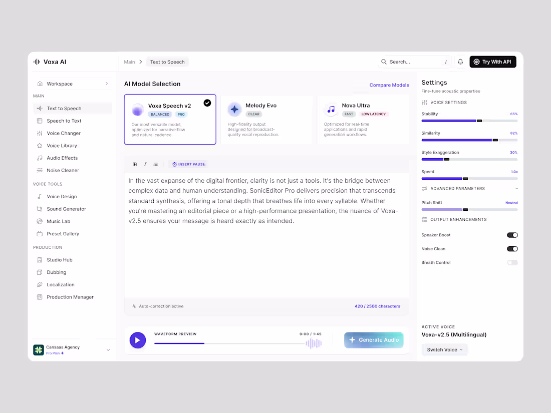
We rethought how users interact with AI voice generation by combining model selection, real-time editing, and advanced audio controls into a single structured interface. we streamlined how users interact with AI voice generation by combining model selection, real-time text editing, and advanced audio controls into a single, structured interface. From adjusting voice parameters like stability, tone, and speed to previewing output instantly, every interaction is designed for efficiency and precision.
📩 Collaborate with Us? Contra Cansaas Agency (https://contra.com/cansaasagency/work?r=cansaasagency)
4
228
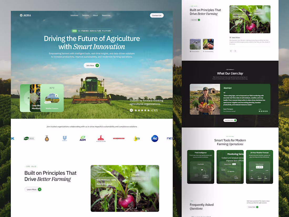
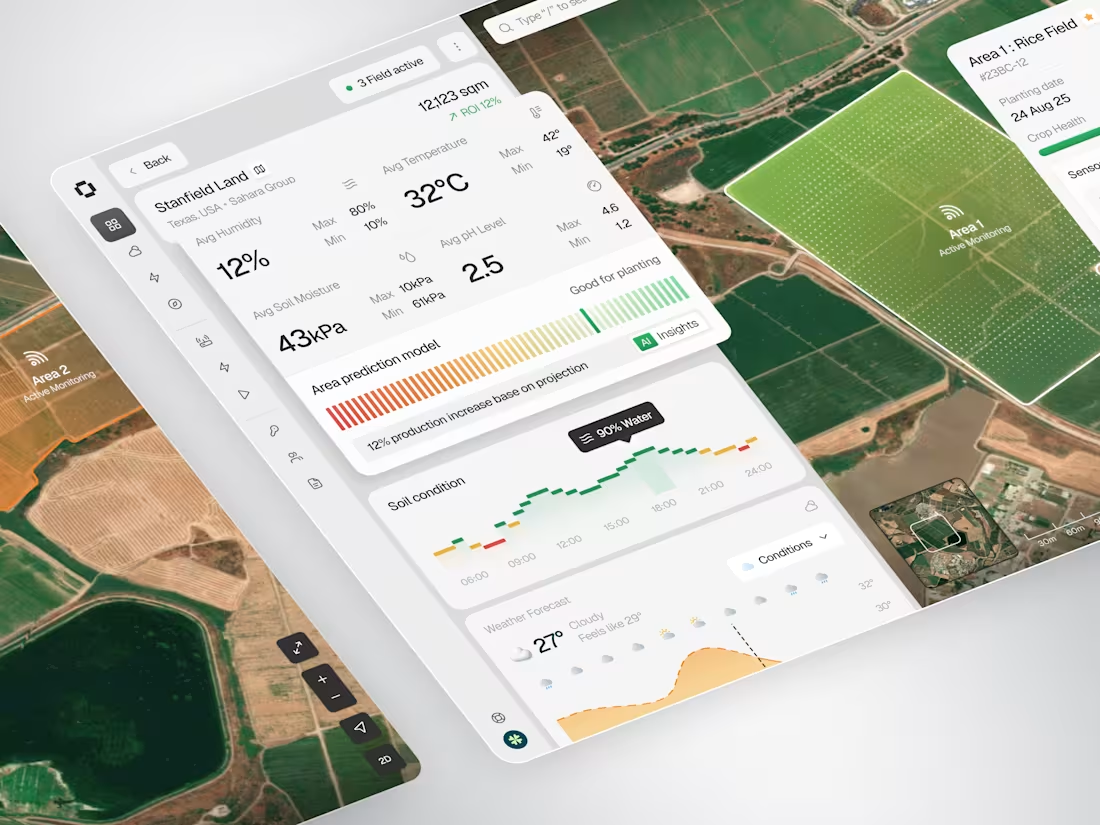
This Agra agriculture landing page is designed to simplify how modern farming operations are managed through data-driven technology. We combined real-time crop monitoring, environmental insights, and smart automation tools into a clean, structured interface. With nature-inspired visuals, strong typography, and modular layouts, complex agricultural data becomes easy to understand, actionable, and visually engaging.
📩 Collaborate with Us? Contra Cansaas Agency (https://contra.com/cansaasagency/work?r=cansaasagency)
2
5
251
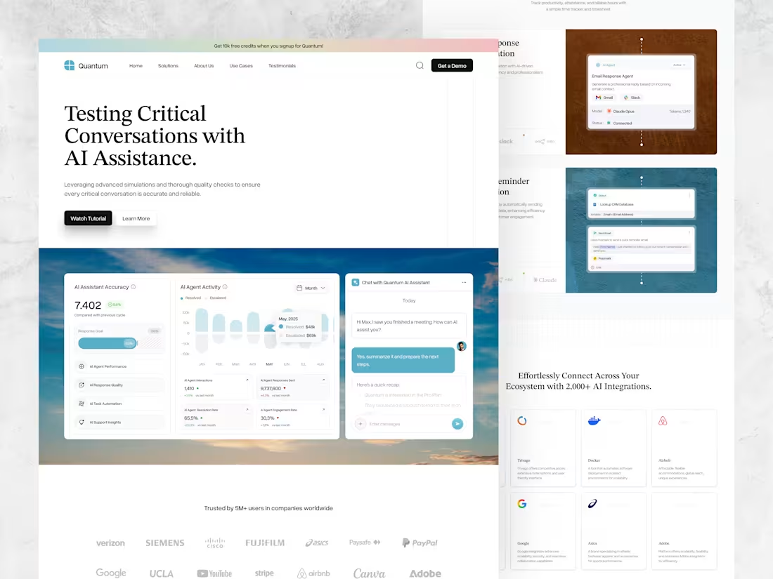
This AI SaaS landing page is designed to simplify how critical conversations and workflows are managed through intelligent automation. By combining AI-driven assistance, performance analytics, and seamless integrations into a clean, structured interface, the experience becomes both powerful and intuitive.
📩 Collaborate with Us? Contra Cansaas Agency (https://contra.com/cansaasagency/work?r=cansaasagency)
4
5
288
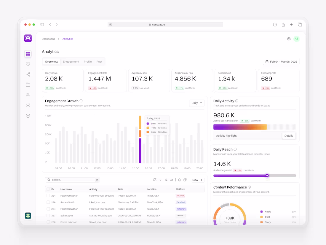
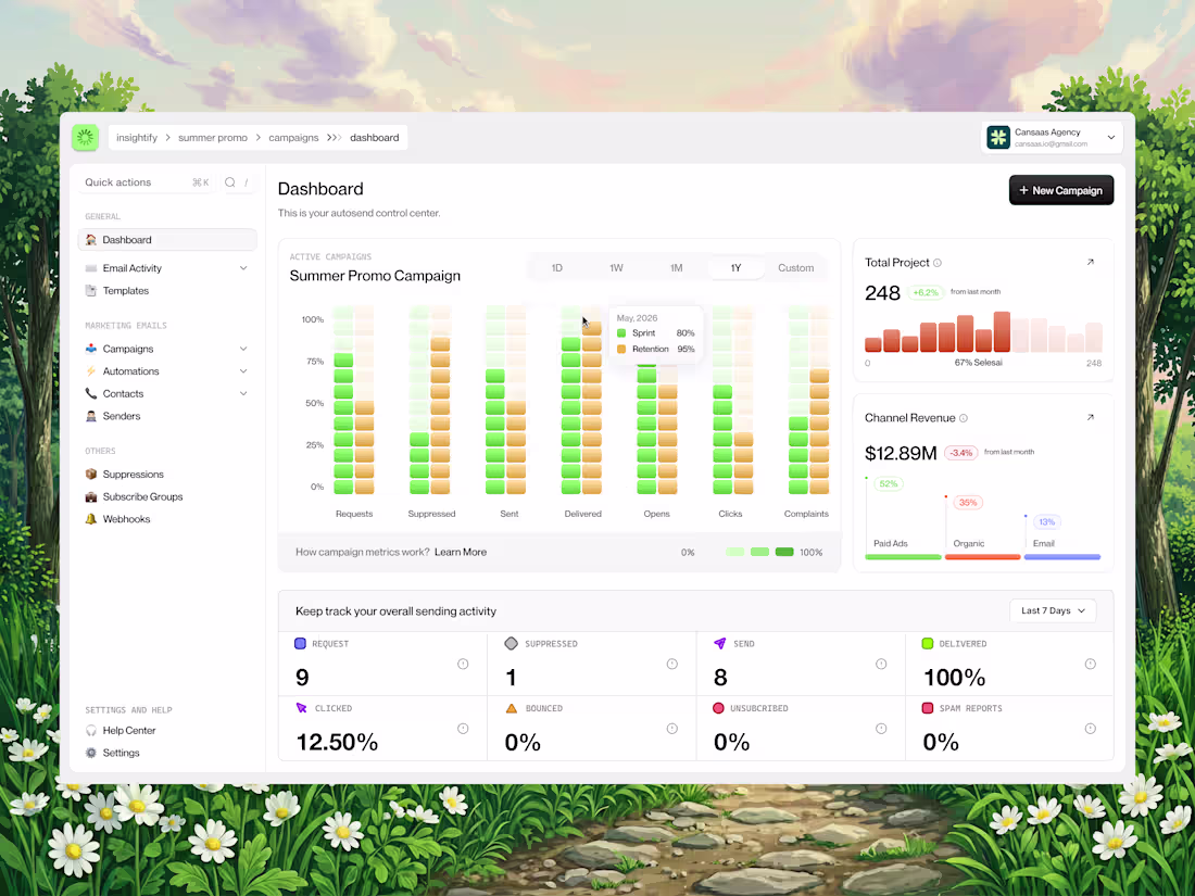
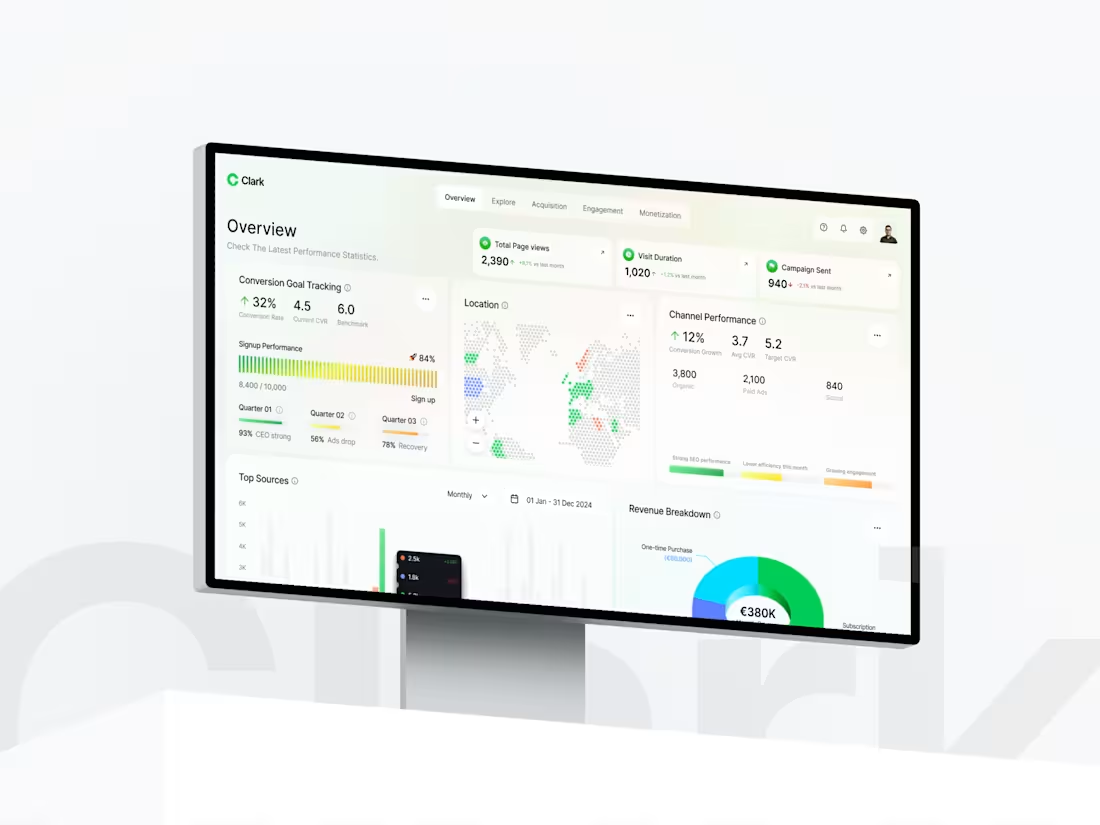
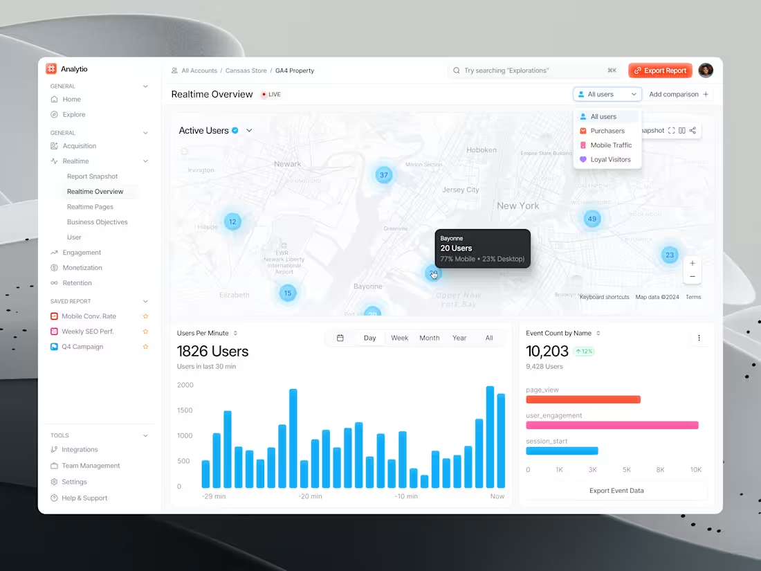
This social media analytics dashboard simplifies complex performance data into a clean, structured UI. From engagement tracking and daily activity insights to real-time growth visualization, every element is designed for clarity, speed, and better decision-making. With intuitive navigation, color-coded metrics, and modular cards, exploring data feels effortless and actionable.
📩 Collaborate with Us? Contra Cansaas Agency (https://contra.com/cansaasagency/work?r=cansaasagency)
2
234
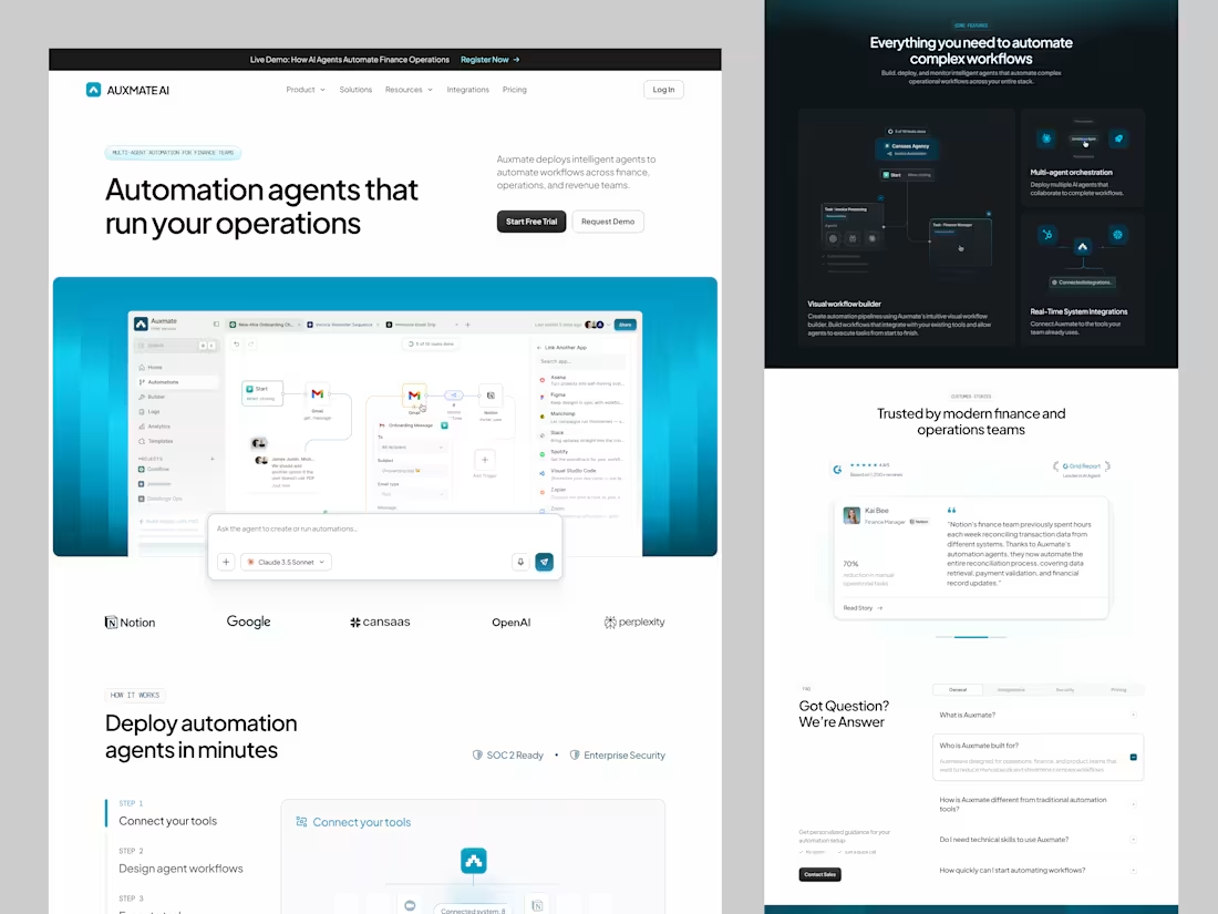
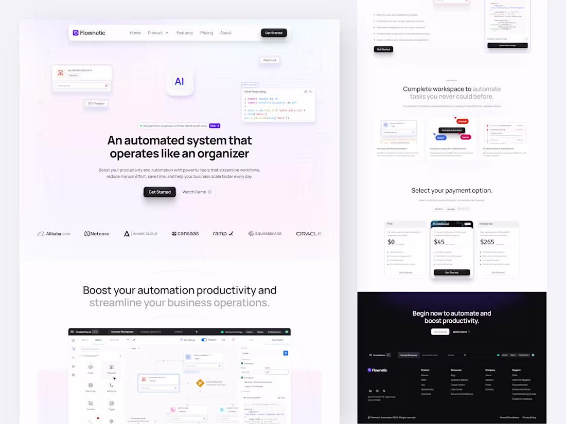
This AI automation landing page is designed to simplify how complex workflows are built, deployed, and managed. By combining a visual workflow builder, multi-agent orchestration, and real-time system integrations into a structured and minimal interface, the experience becomes both powerful and intuitive.
📩 Collaborate with Us? Contra Cansaas Agency (https://contra.com/cansaasagency/work?r=cansaasagency)
12
12
517
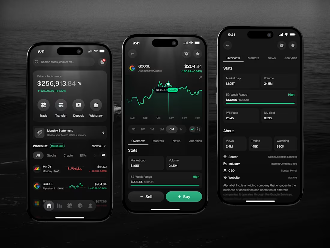
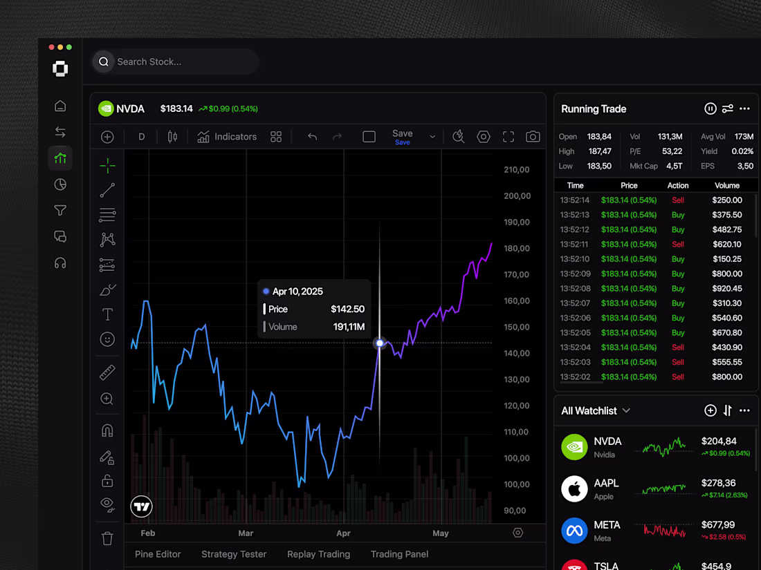
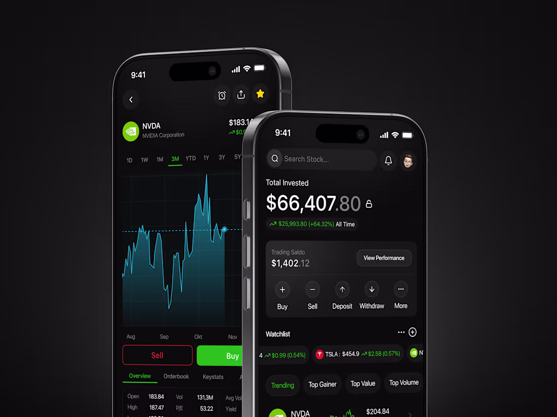
Designed to simplify complex financial workflows, this stock mobile app delivers a sleek, high-performance interface focused on clarity and speed. Real-time price tracking, portfolio insights, and market data are organized through clean UI patterns and intuitive navigation. The dark theme enhances focus, while modular components like charts, stats cards, and watchlists create a seamless flow for monitoring and executing trades with confidence.
📩 Collaborate with Us? Contra Cansaas Agency (https://contra.com/cansaasagency/work?r=cansaasagency)
8
6
309
A modern UI/UX showreel by Cansaas showcasing high-quality SaaS dashboards, landing pages, and product interfaces designed for clarity, scalability, and performance. This collection highlights clean layouts, structured design systems, and intuitive user flows that simplify complex data into meaningful experiences.
📩 Collaborate with Us? Contra Cansaas Agency (https://contra.com/cansaasagency/work?r=cansaasagency)
4
9
339
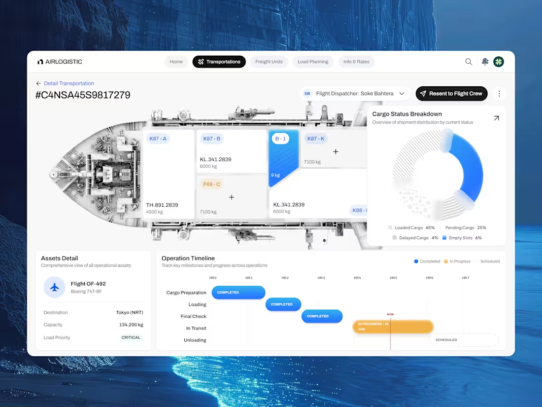
This logistics dashboard design transforms complex shipment and cargo management into a clear, intuitive interface. By combining real-time cargo visualization, asset tracking, and operational timelines into a structured layout, users can monitor logistics performance effortlessly. The clean UI, modular cards, and data-driven visuals create a seamless experience where heavy operational data feels organized, actionable, and easy to navigate.
📩 Collaborate with Us? Contra Cansaas Agency (https://contra.com/cansaasagency/work?r=cansaasagency)
1
5
231
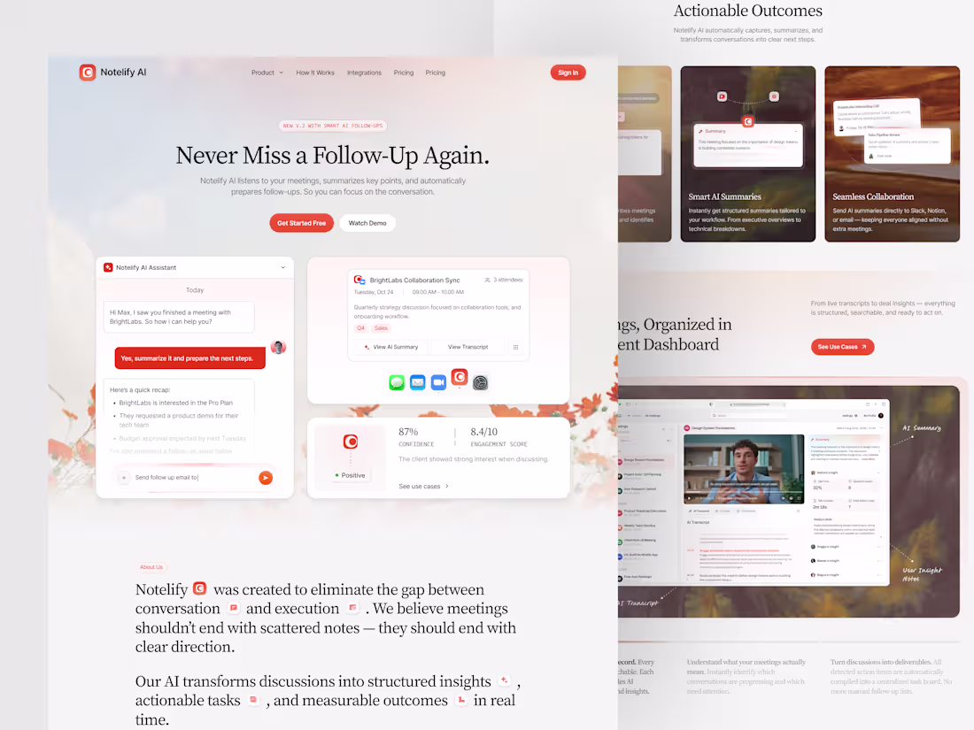
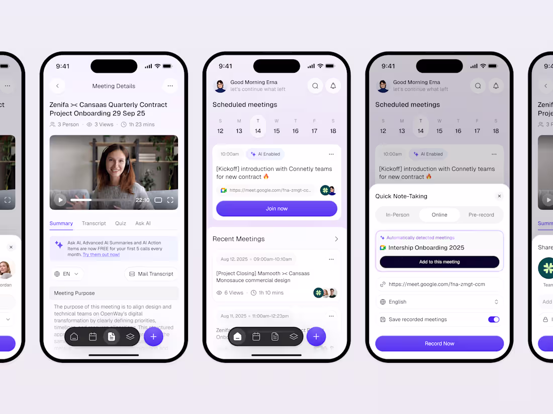
A modern AI SaaS landing page designed to transform meeting workflows into actionable outcomes through a clean, structured, and user-centric interface. This design highlights how Notelify AI simplifies complex conversations into organized insights, combining intuitive UI components, soft visual storytelling, and clear content hierarchy to enhance usability and engagement.
📩 Collaborate with Us? Contra Cansaas Agency (https://contra.com/cansaasagency/work?r=cansaasagency)
3
8
284
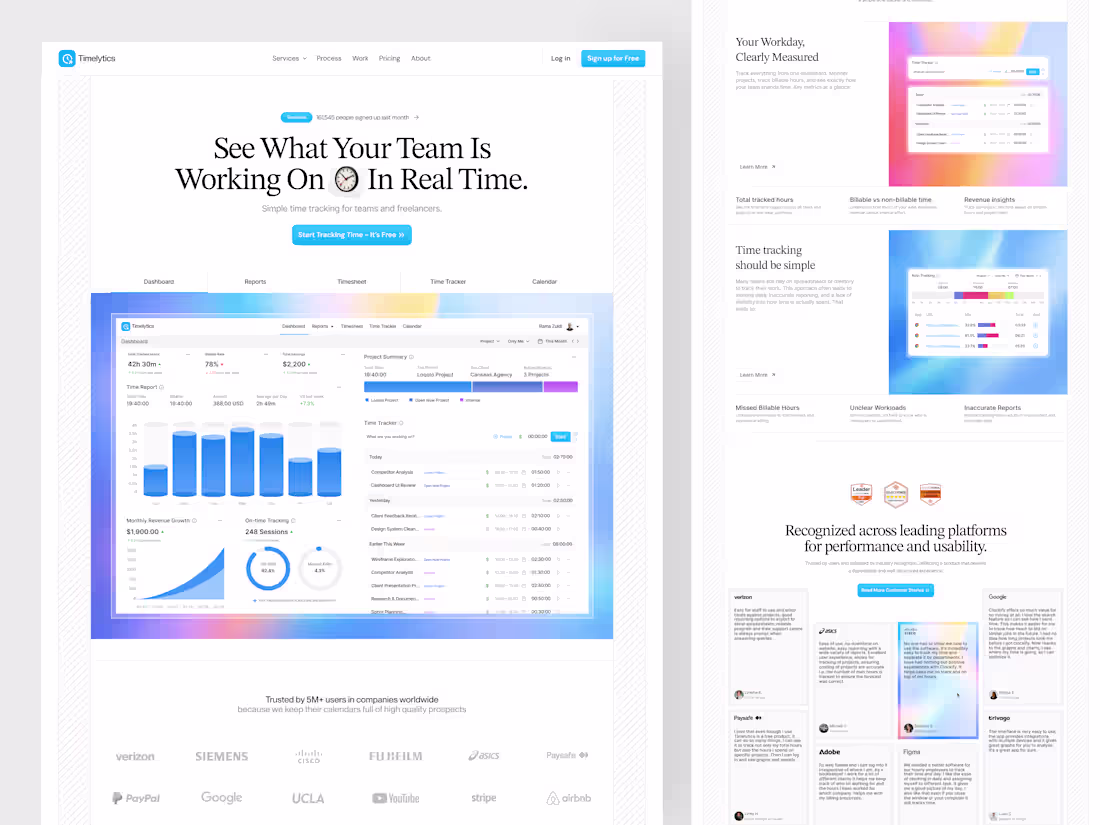
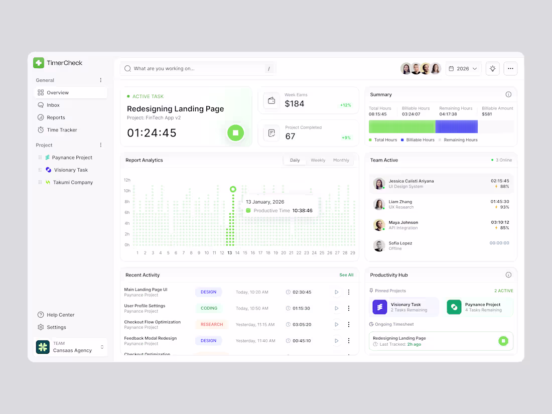
Just explored a Time Tracker Landing Page focused on clarity and real-time visibility.Designed to communicate productivity, reporting, and team performance in a simple flow.
📩 Collaborate with Us? Contra Cansaas Agency (https://contra.com/cansaasagency/work?r=cansaasagency)
1
3
238
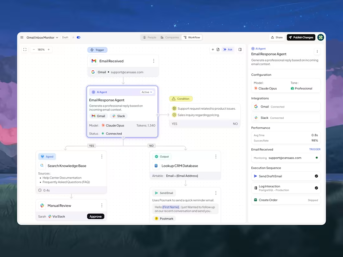
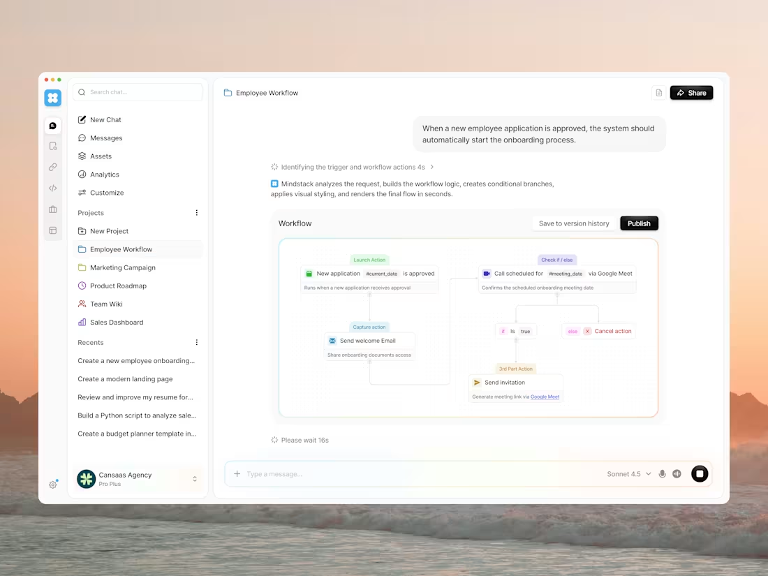
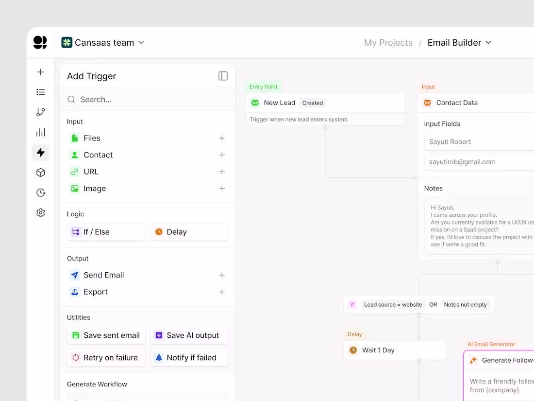
Explore this modern workflow automation dashboard UI designed to simplify complex processes into a clean, intuitive visual system. This no-code automation interface combines triggers, conditions, and outputs into structured, easy-to-understand flows, helping users build and manage automation effortlessly.
📩 Collaborate with Us? Contra Cansaas Agency (https://contra.com/cansaasagency/work?r=cansaasagency)
2
3
252
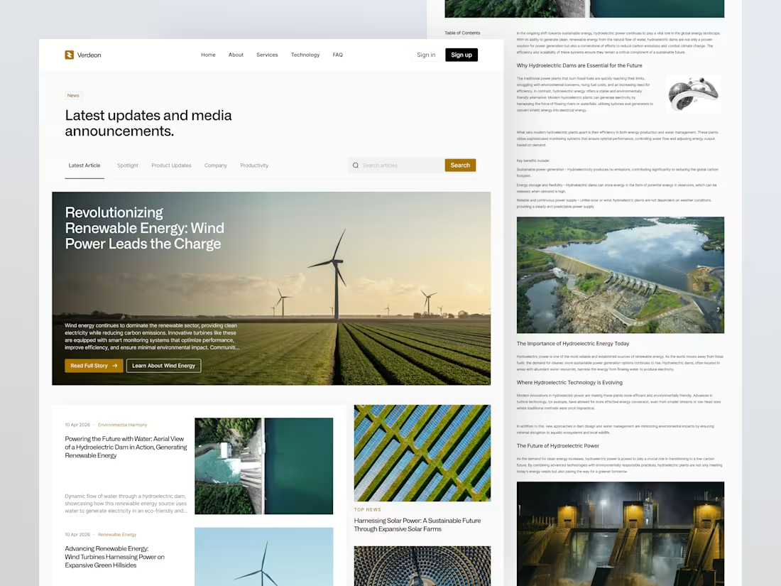
Clean Energy News Platform Design
0
7
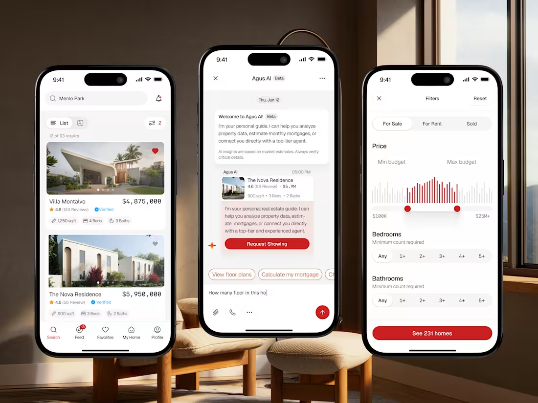
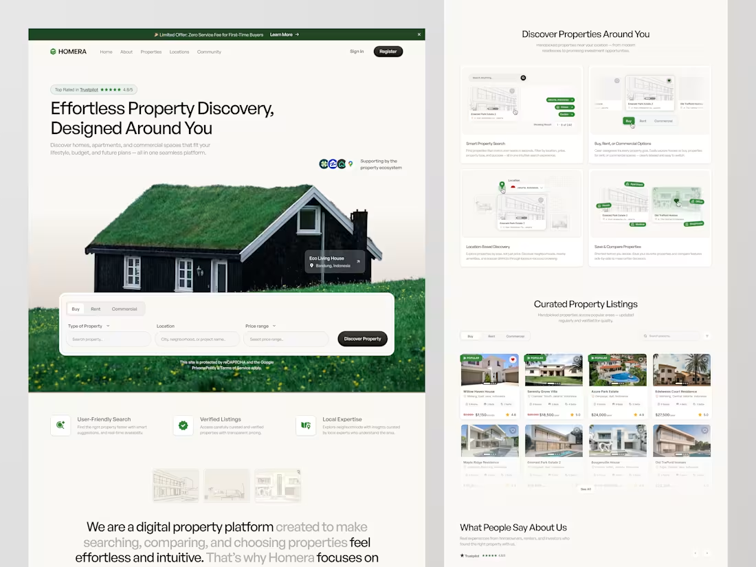
Real Estate Mobile App Redesign
1
4
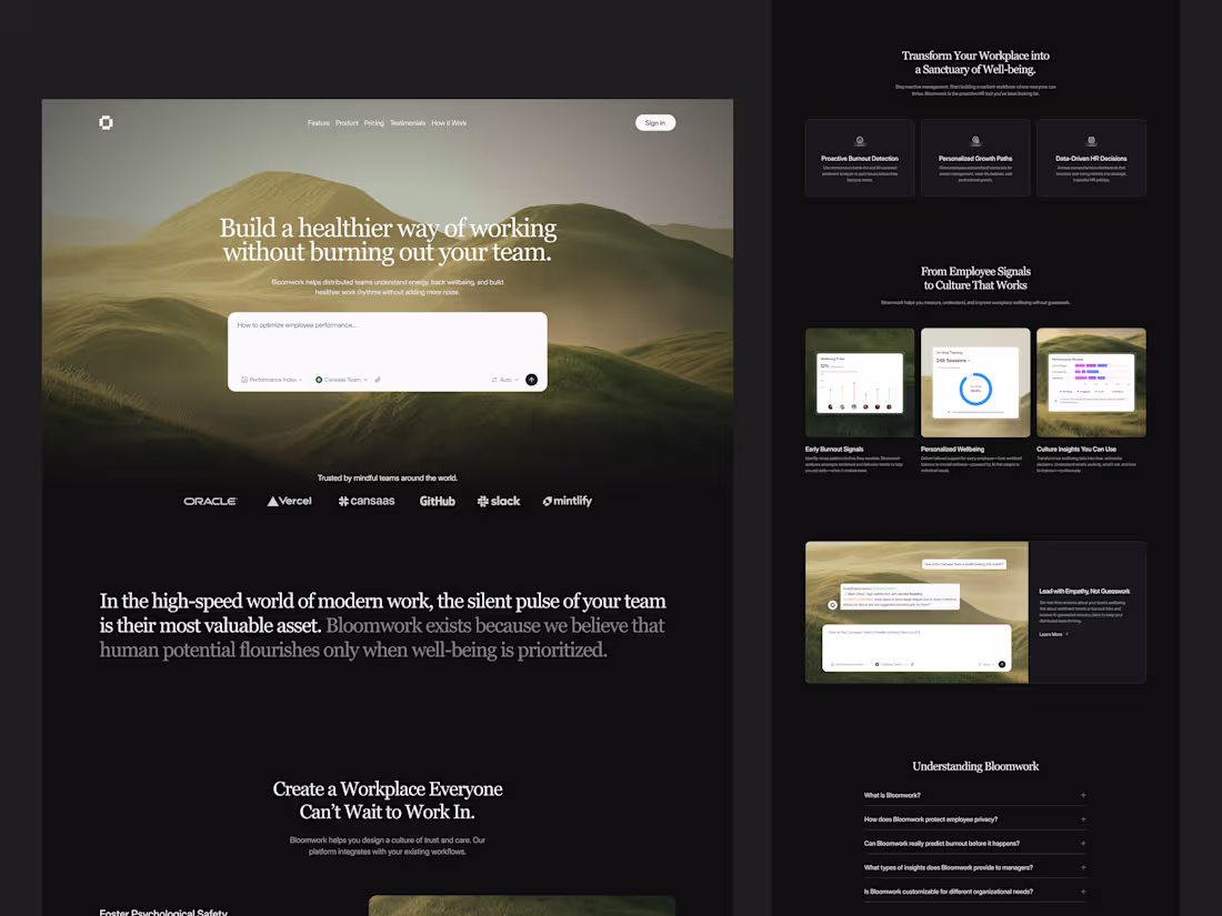
AI SaaS Landing Page Design for Workplace Wellbeing
0
11
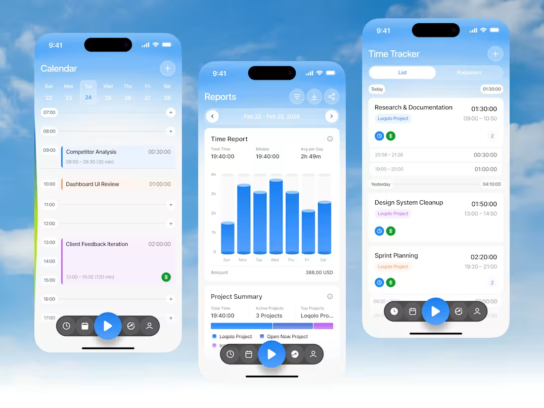
Time Tracker Mobile App Design
1
11
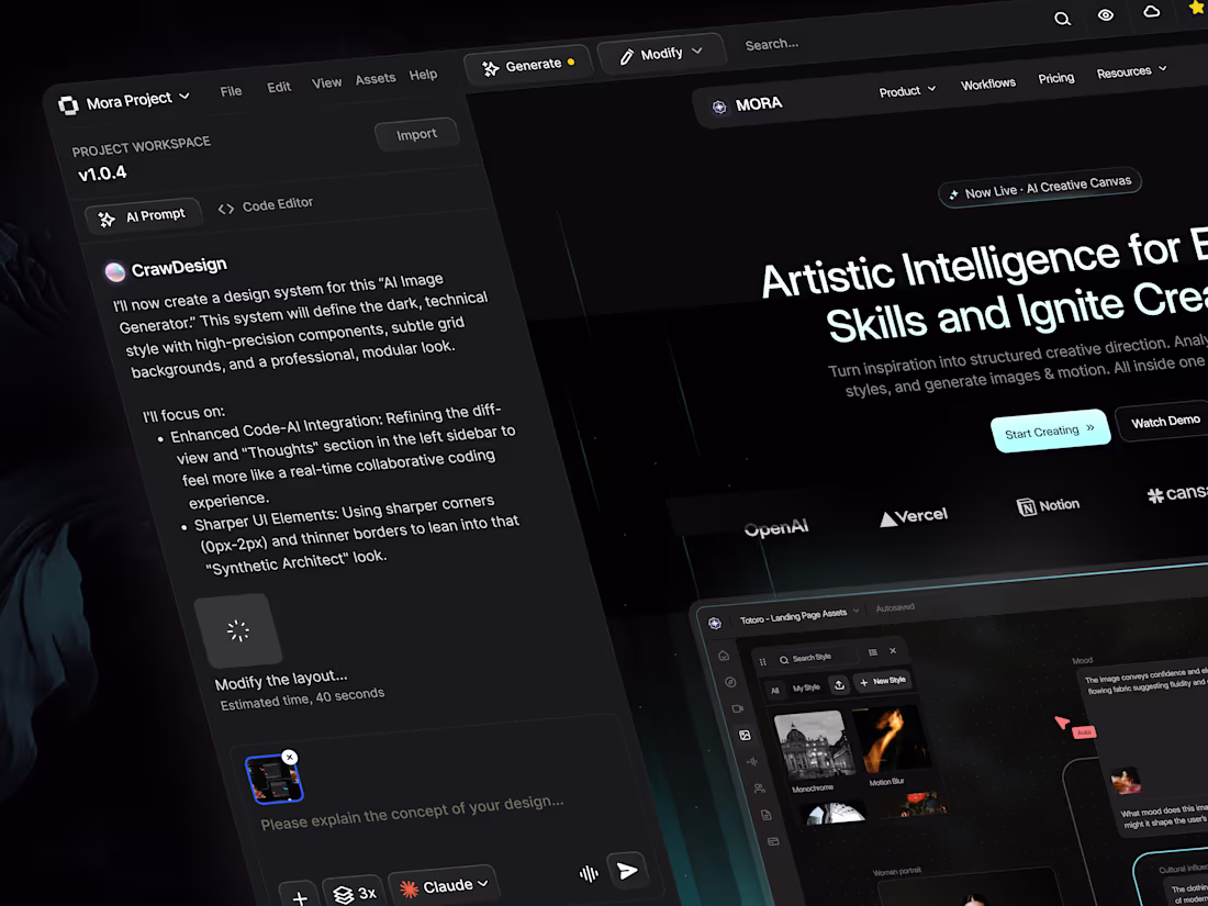
AI-Powered Creative Platform Design
0
6
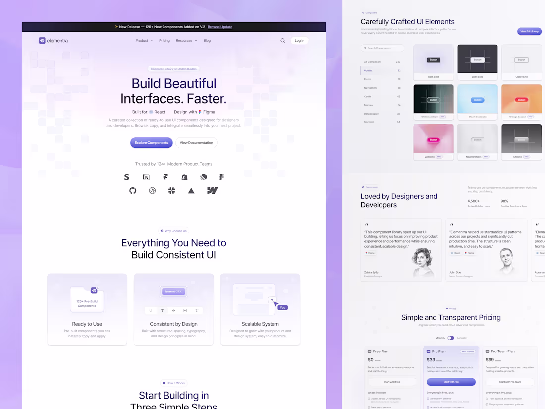
Elementra Component Library Landing Page Design
1
8
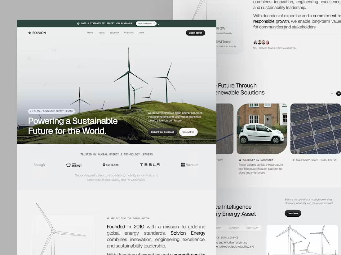
Solvion Clean Energy Landing Page Design
0
5
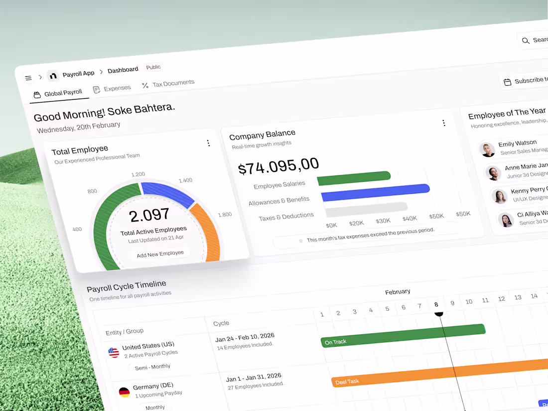
Global Payroll Dashboard UI Design
0
21
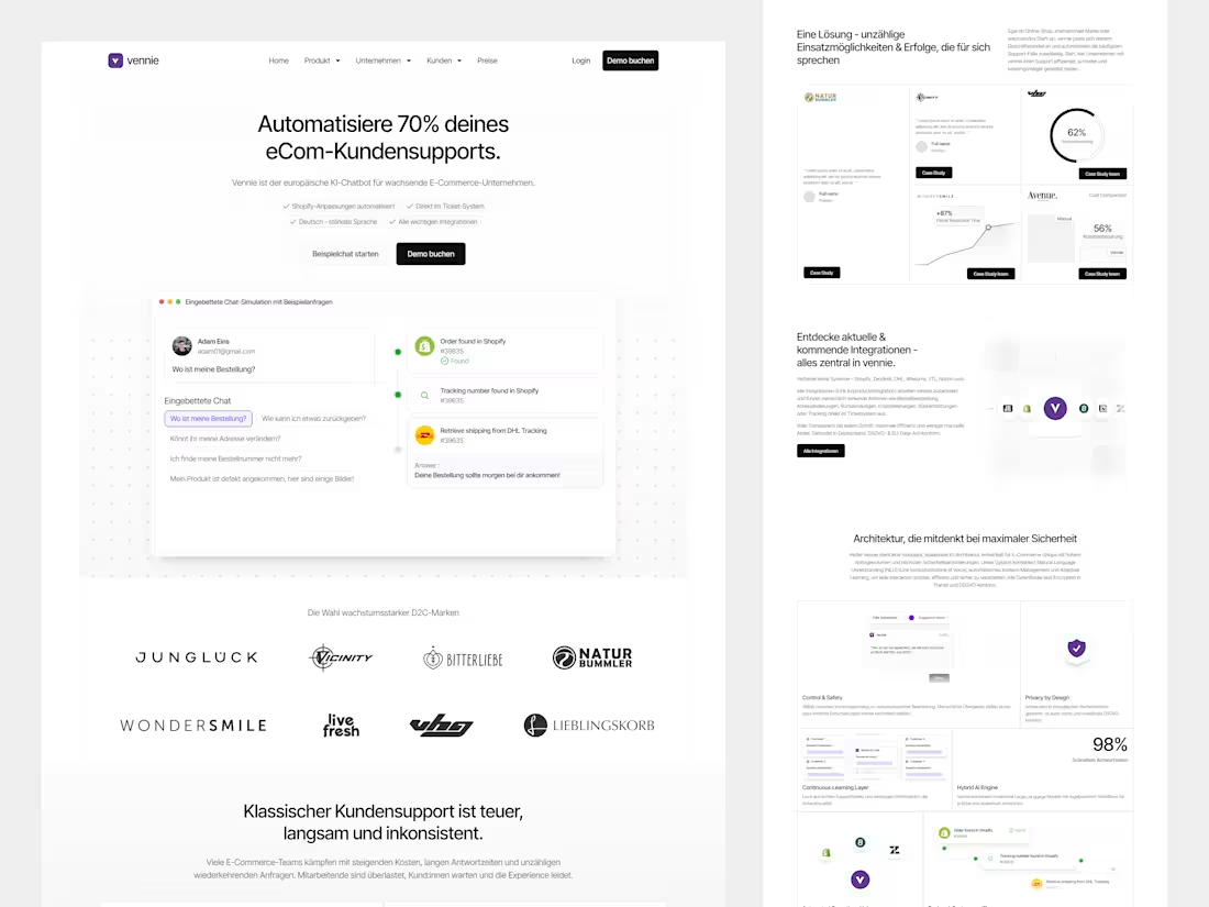
Vennie AI-Powered eCommerce Support Platform Design
3
15
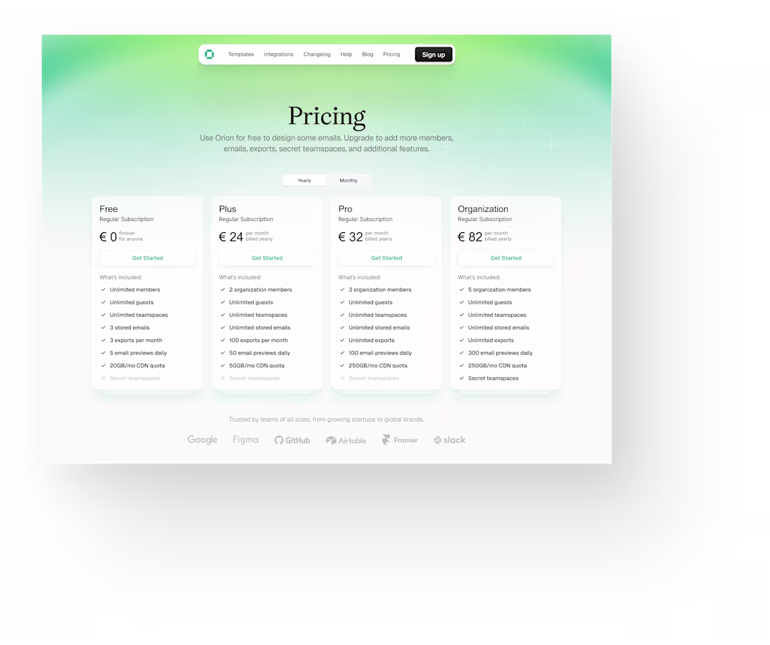
Pricing Page Redesign for Email Builder Platform
0
4
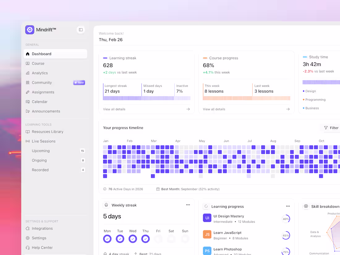
eLearning Platform Dashboard Design
0
7
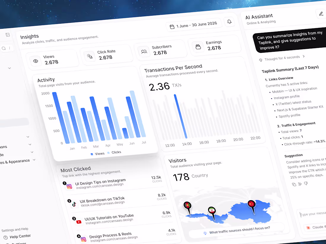
Taplink Dashboard Design
0
13
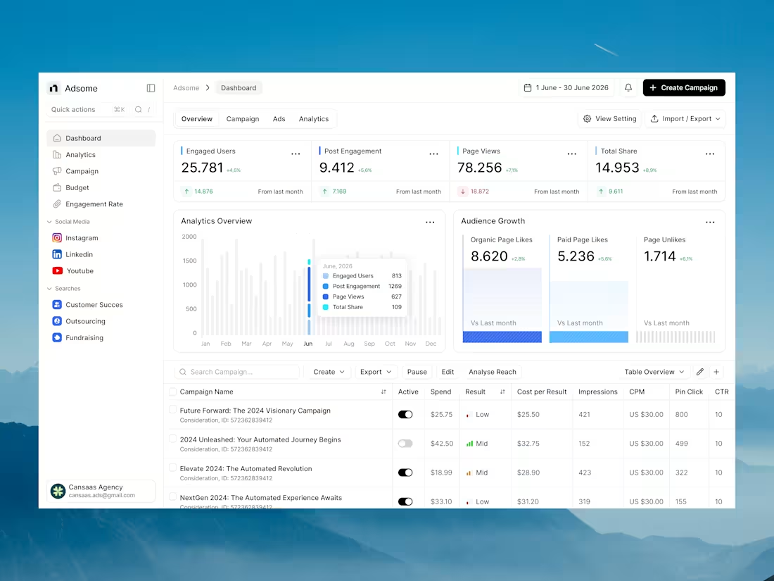
Ads Dashboard Design for Marketers
0
4
Integration Page
0
8
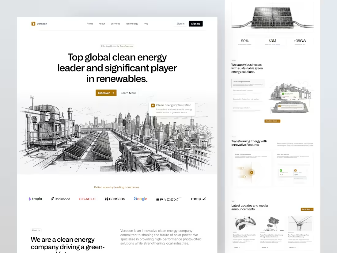
Verdeon Clean Energy Landing Page Design
0
8
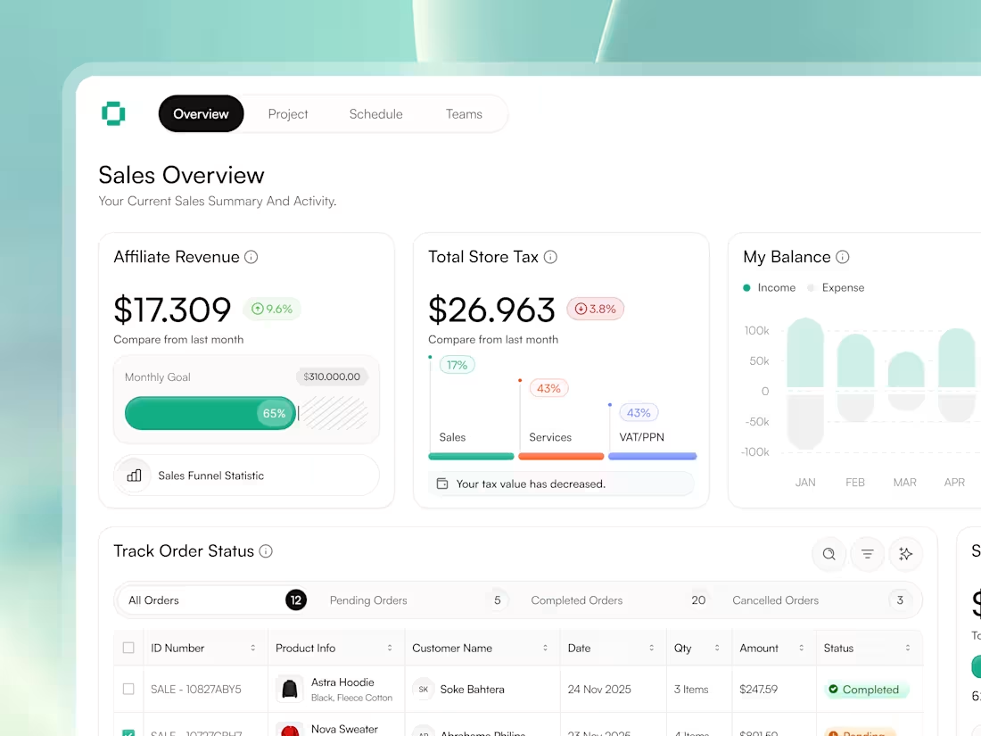
Sales Performance Dashboard Design for QuotaSight
0
11
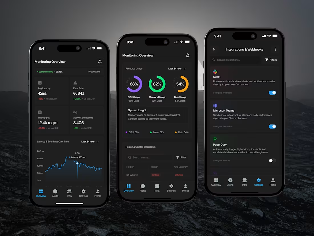
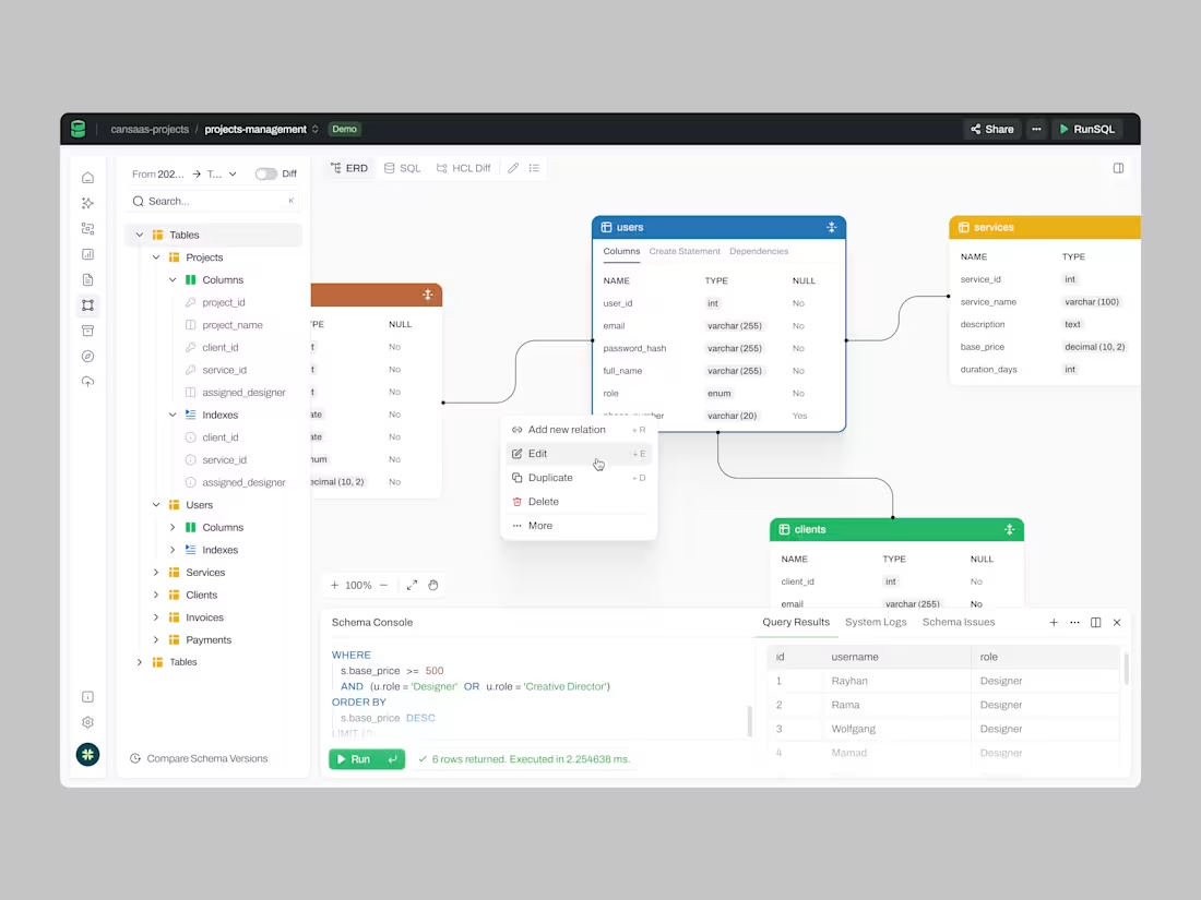
Design of Serverless Database Monitoring Mobile App
1
5
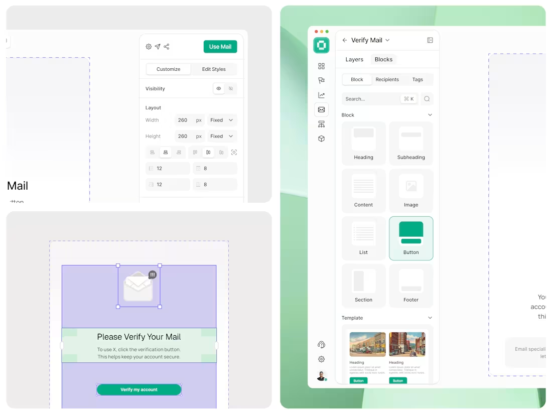
Email Builder Dashboard UI Design
0
49
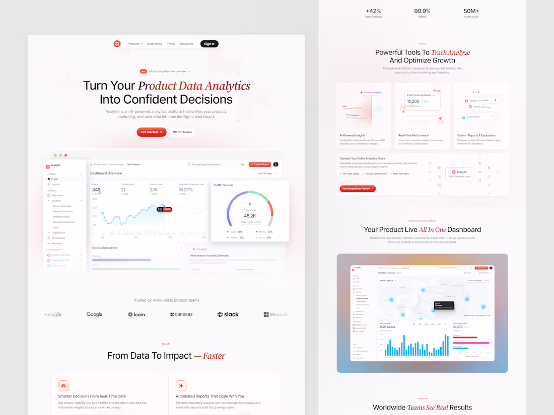
Modern SaaS Analytics Dashboard Design
0
22
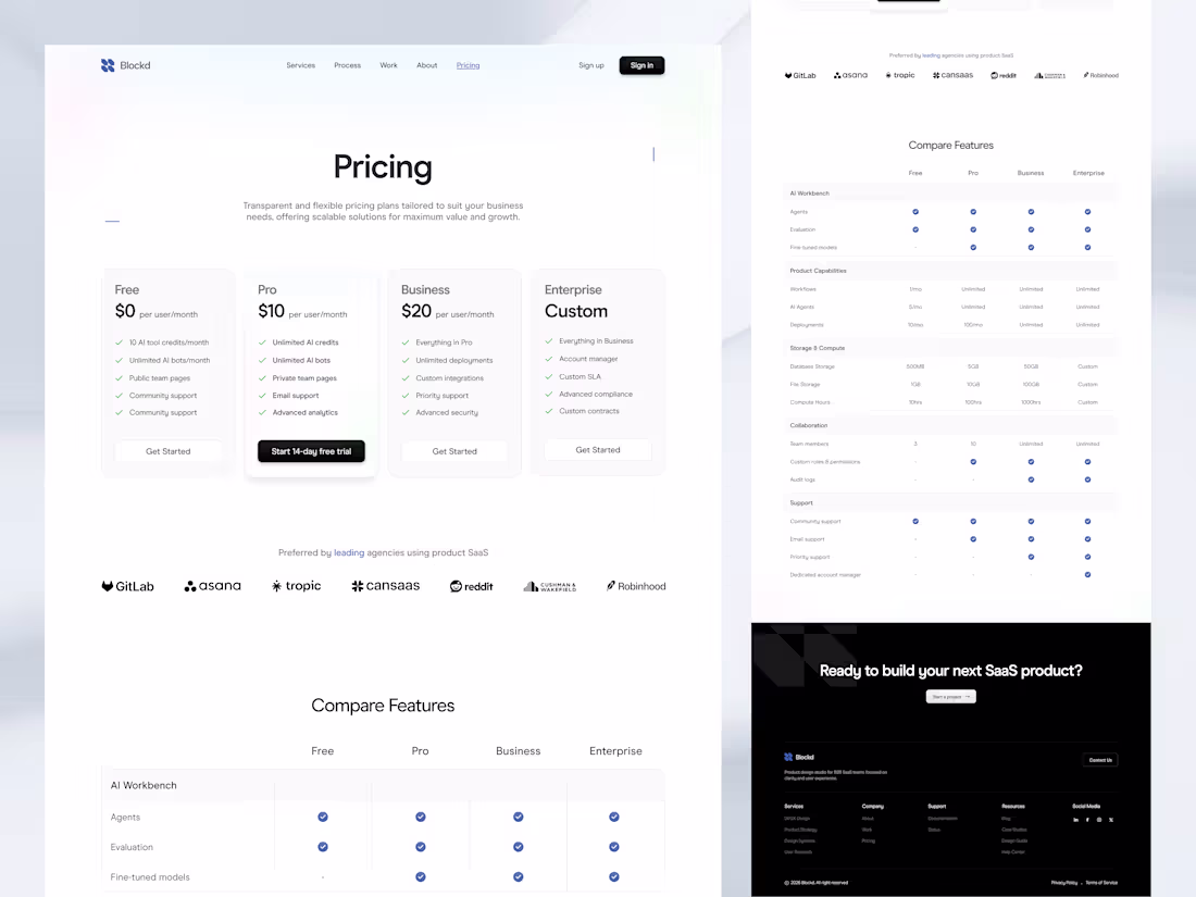
Blockd SaaS Pricing Page Design
0
6
SaaS Sales Performance Dashboard Design
0
4
Food Delivery Mobile App UX Design
0
16
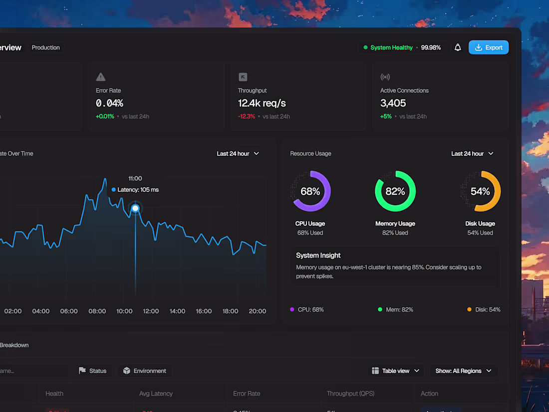
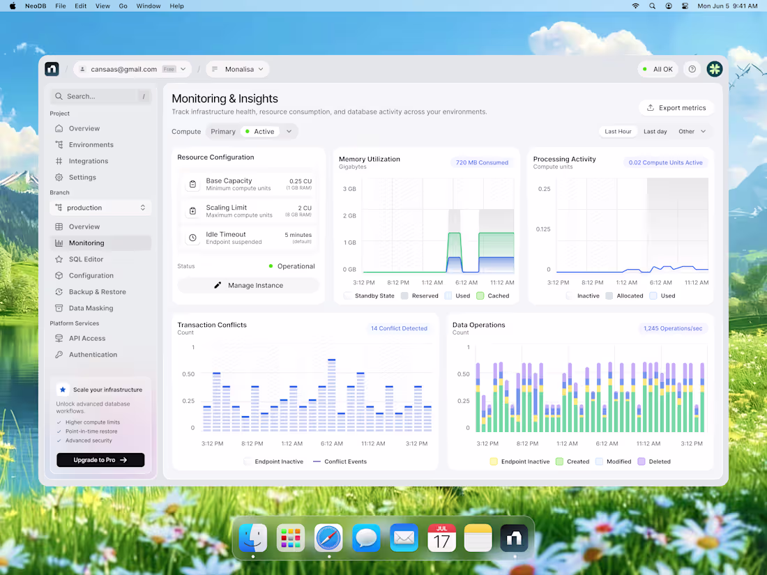
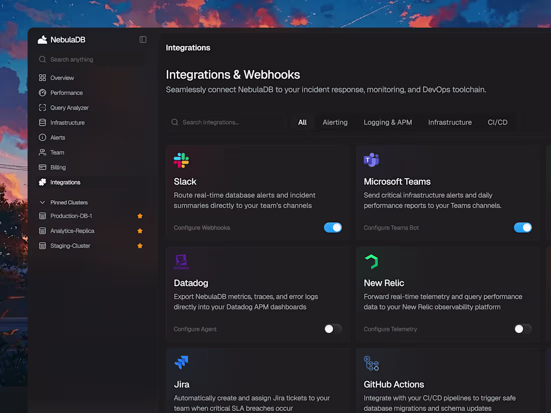
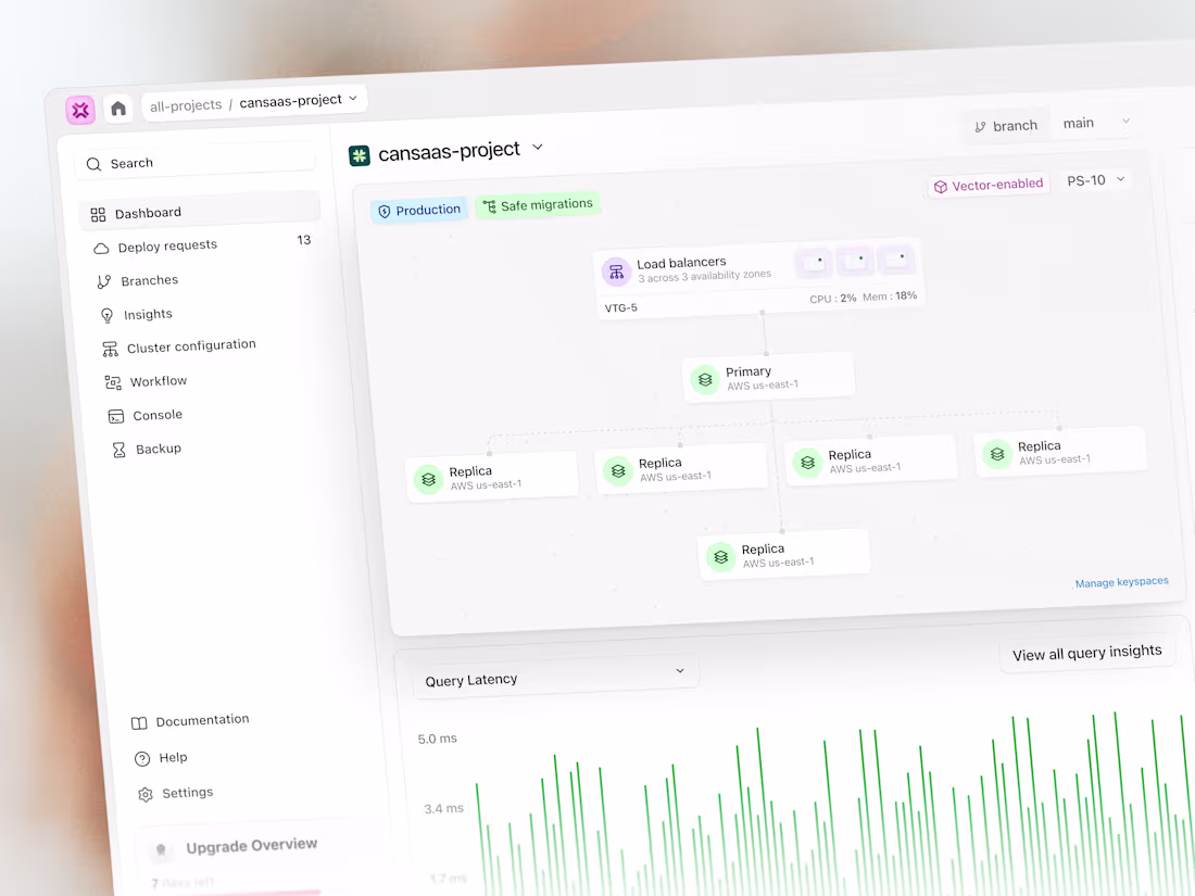
Serverless Database Dashboard Design for NebulaDB
1
4
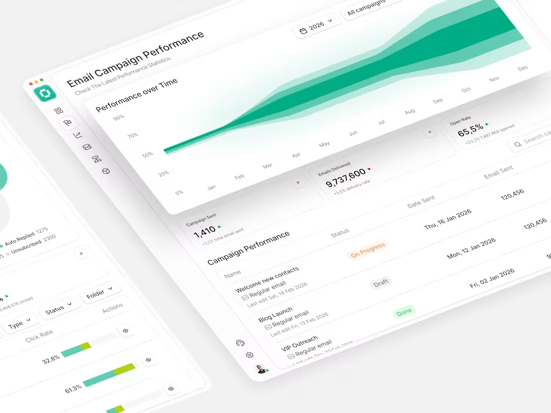
Email Campaign Performance Dashboard Design
0
5
CRM Landing Page and Dashboard Design
0
2
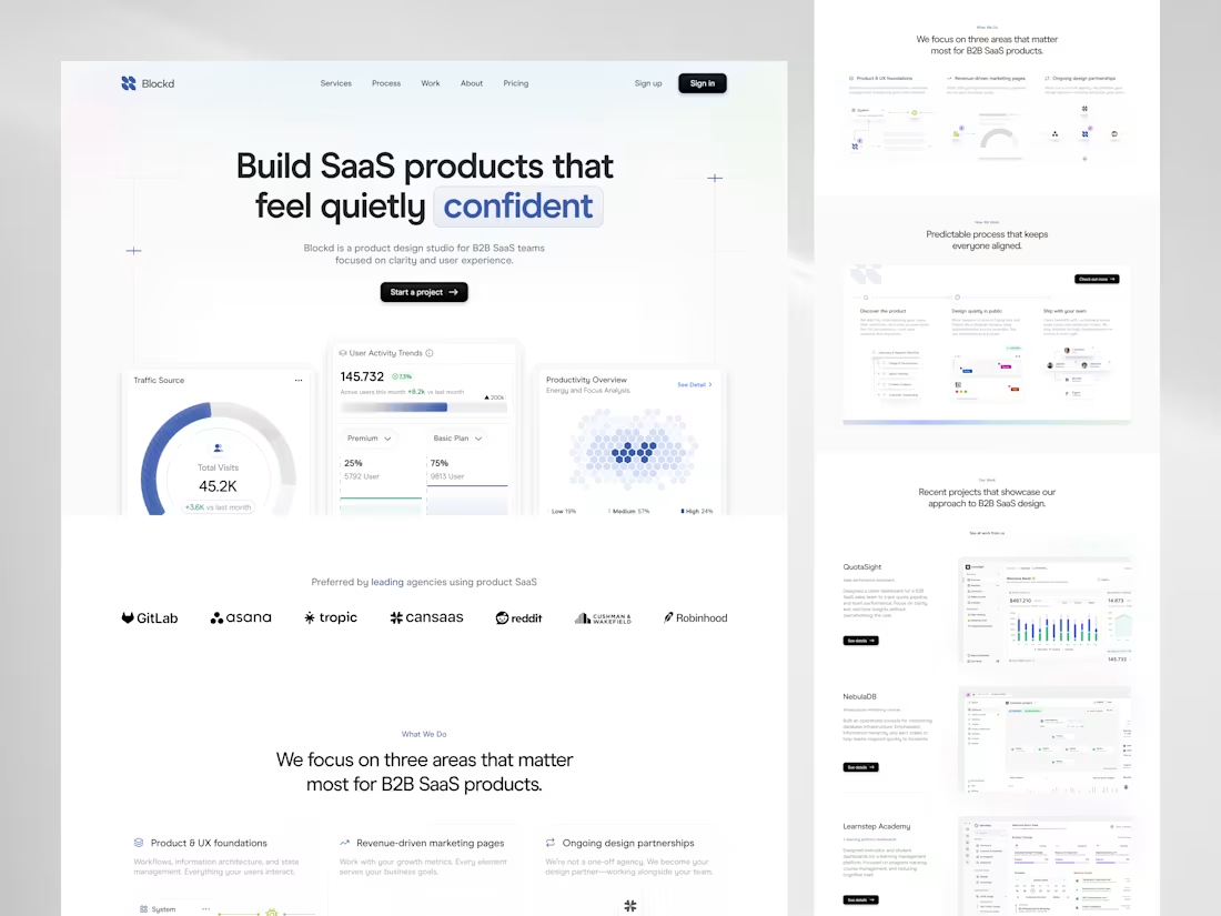
Minimal SaaS Landing Page Design for Blockd
0
7
Modern Analytics SaaS Landing Page Design
1
5
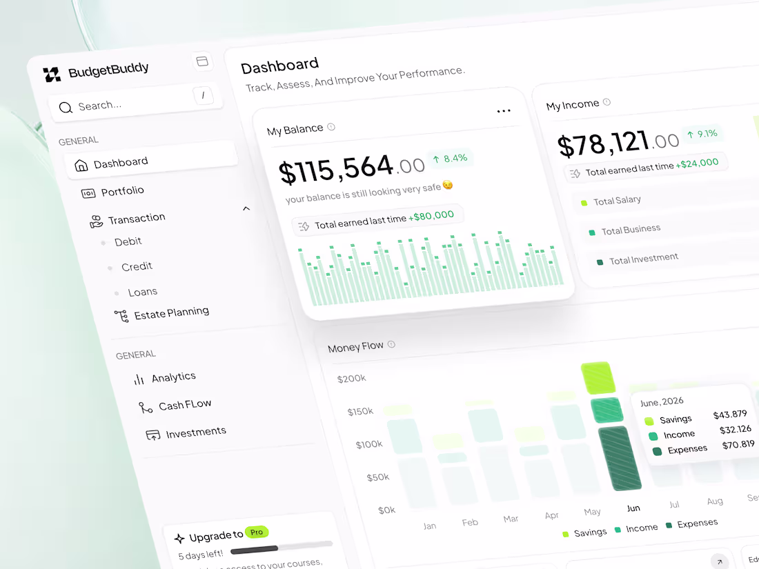
BudgetBuddy Financial Dashboard Design
0
7
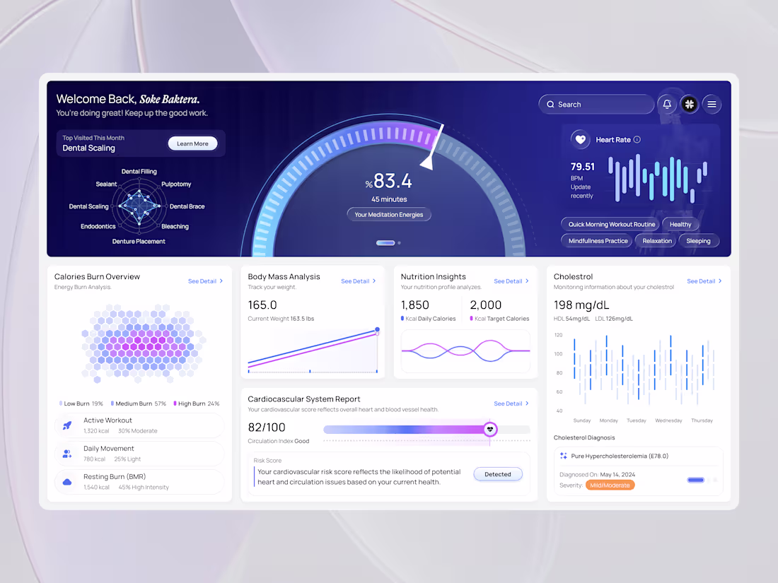
Health Monitoring Dashboard
0
21
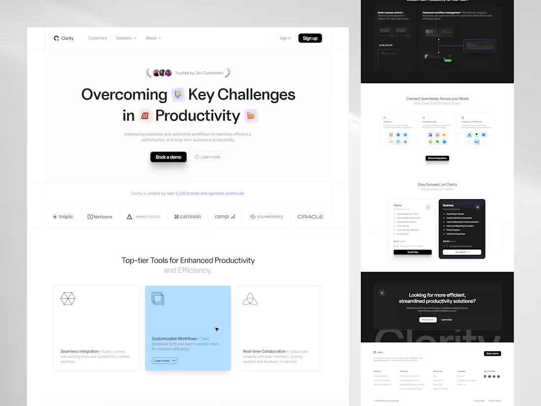
Productivity SaaS Landing Page
1
11
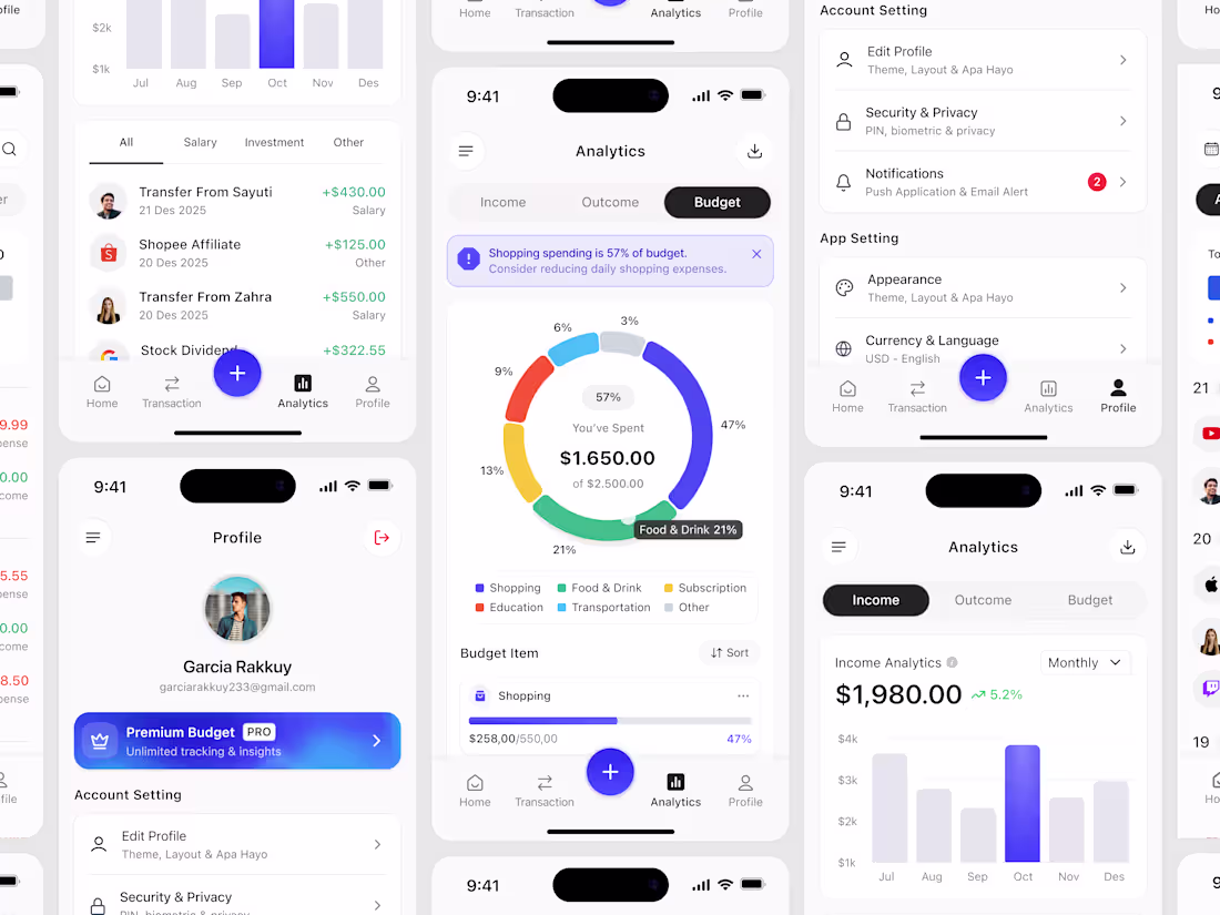
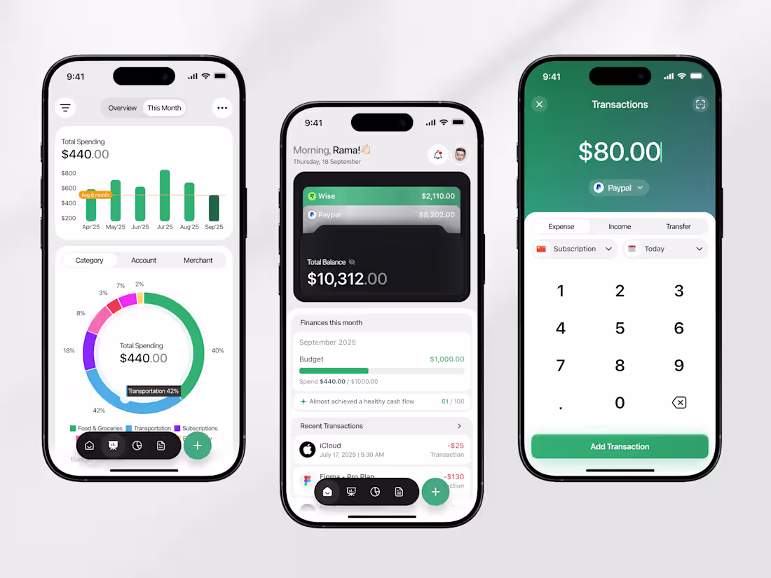
Budget Tracking Mobile App
1
6
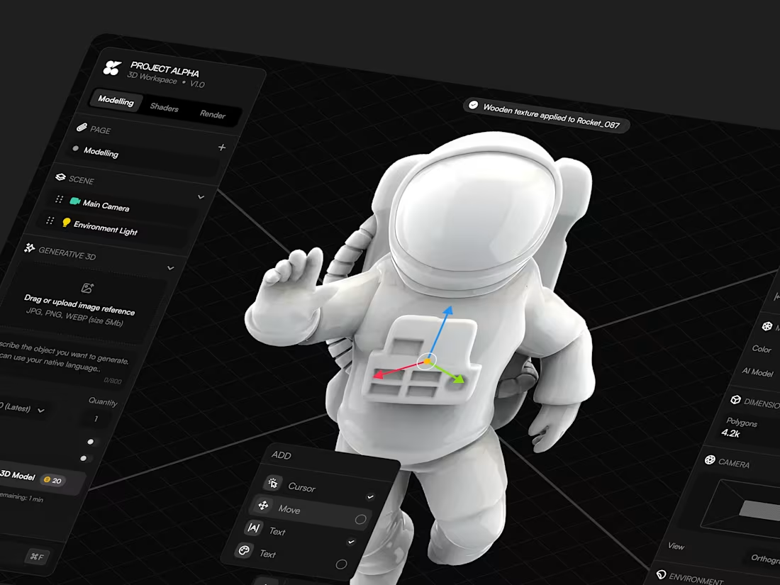
3D Builder Dashboard Design
1
18
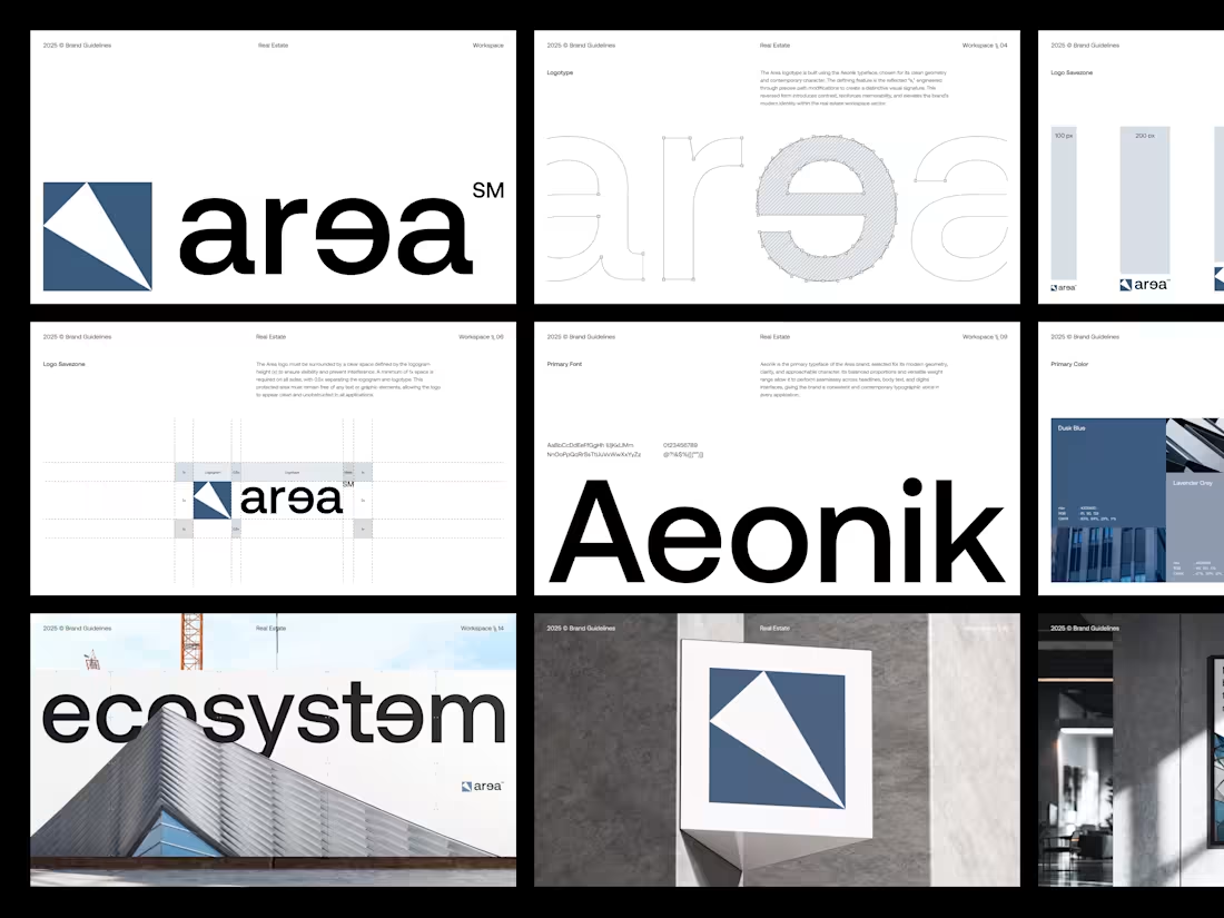
Area - Real Estate Brand Guidelines
3
18
Email Builder Landing Page
1
4
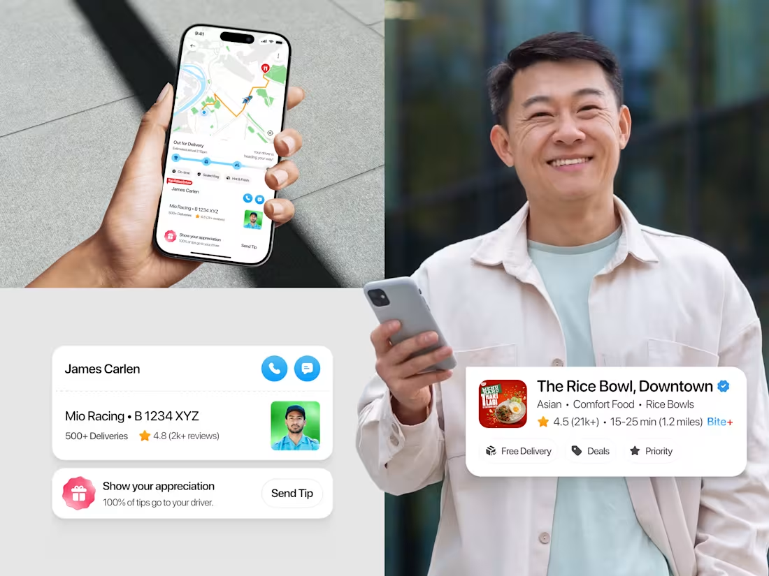
Food Delivery Mobile App
1
10
Customer Service Dashboard
1
11
Real Estate Landing Page
2
7
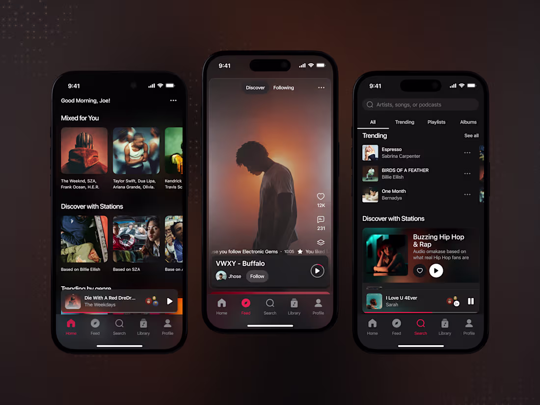
Intuitive Music Streaming App Design
2
11
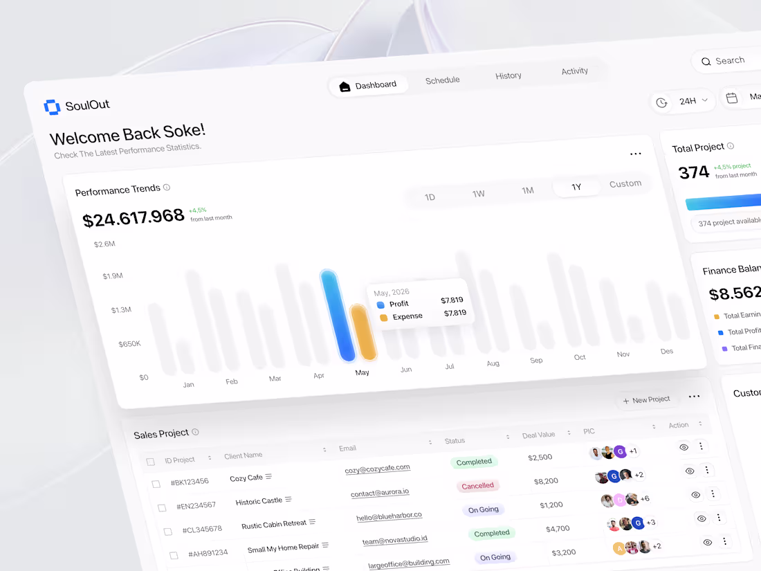
Sales Performance Dashboard
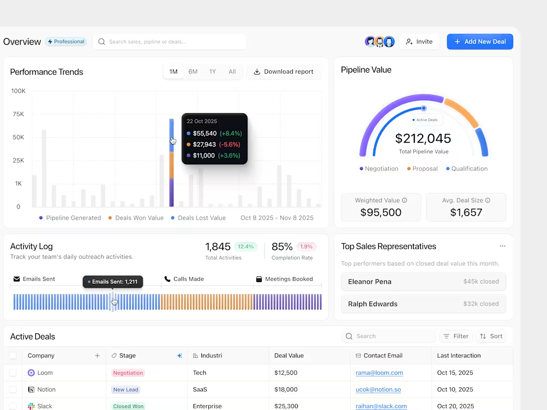
1
8
Scalable CRM Dashboard UI Design Project
2
21
Email Builder Dashboard
2
6
Email Dashboard
2
2
Task Management Landing Page
2
7
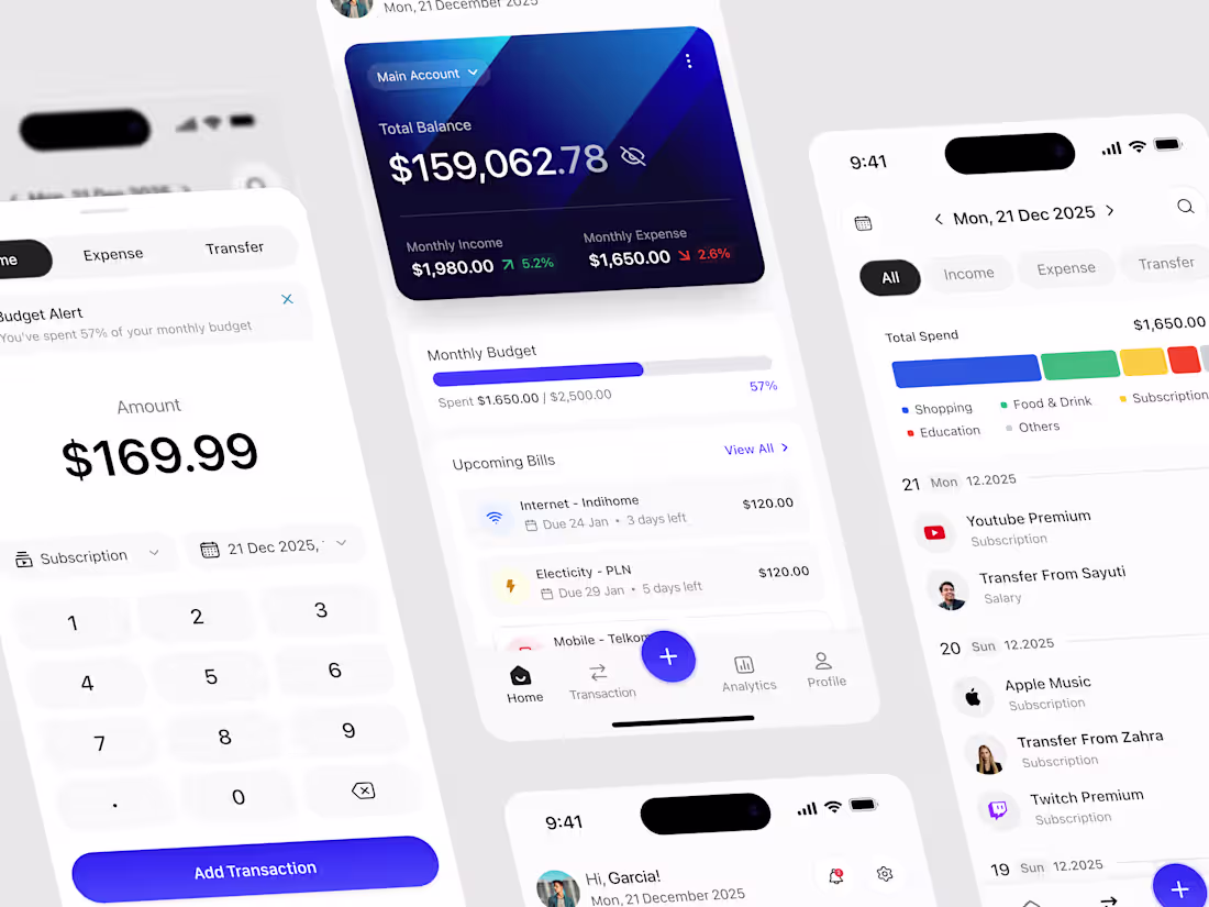
Budget Tracker Mobile App
2
25
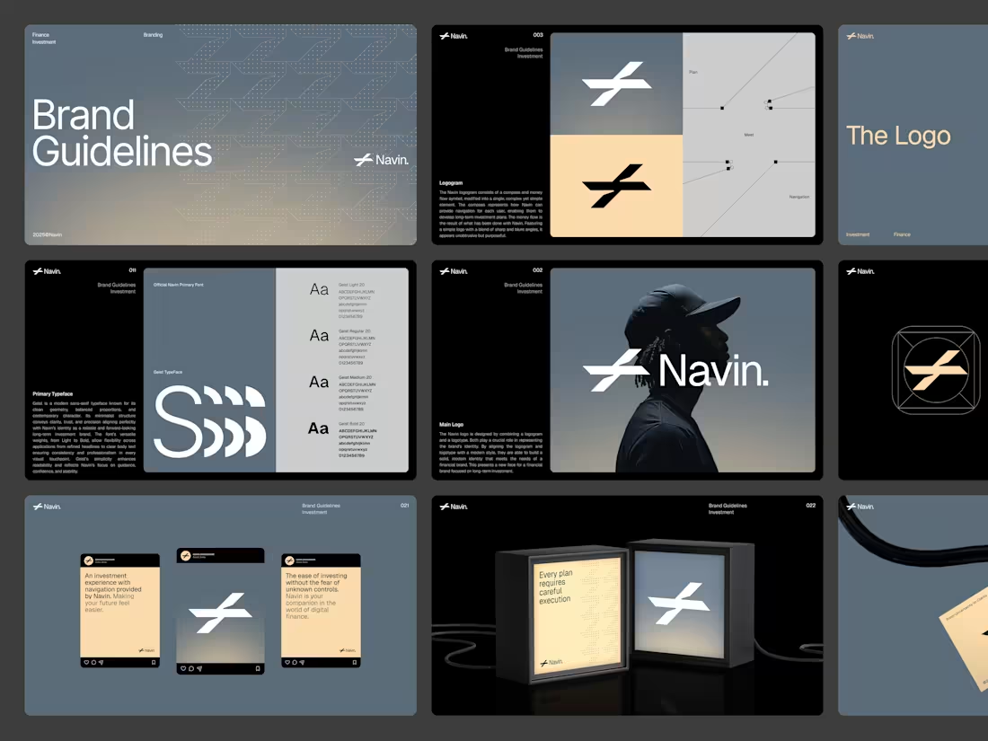
Navin - Finance Brand Guidelines
4
21
3D Builder Dashboard
2
4
Statistics Dashboard Design
2
7
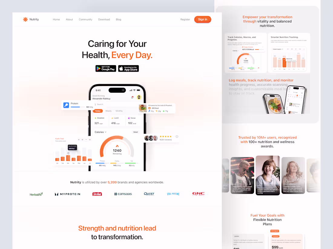
Nutrity Nutrition Tracker Landing Page Design
2
12
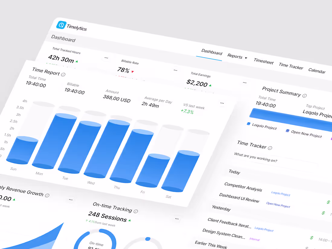
Timerlytics Dashboard Design
2
4
Finance Dashboard
2
8
Time Tracker Dashboard
2
6
Serverless Database Dashboard
2
6
Invoice Maker Dashboard
2
16
Sales Dashboard
2
7
E-Learning Dashboard
2
7
AI SaaS Landing Page
2
8
Anlytics Dashboard
2
10
To-Do List Dashboard
2
15
Workflow Builder Dashboard
2
16
Running Mobile App
2
13
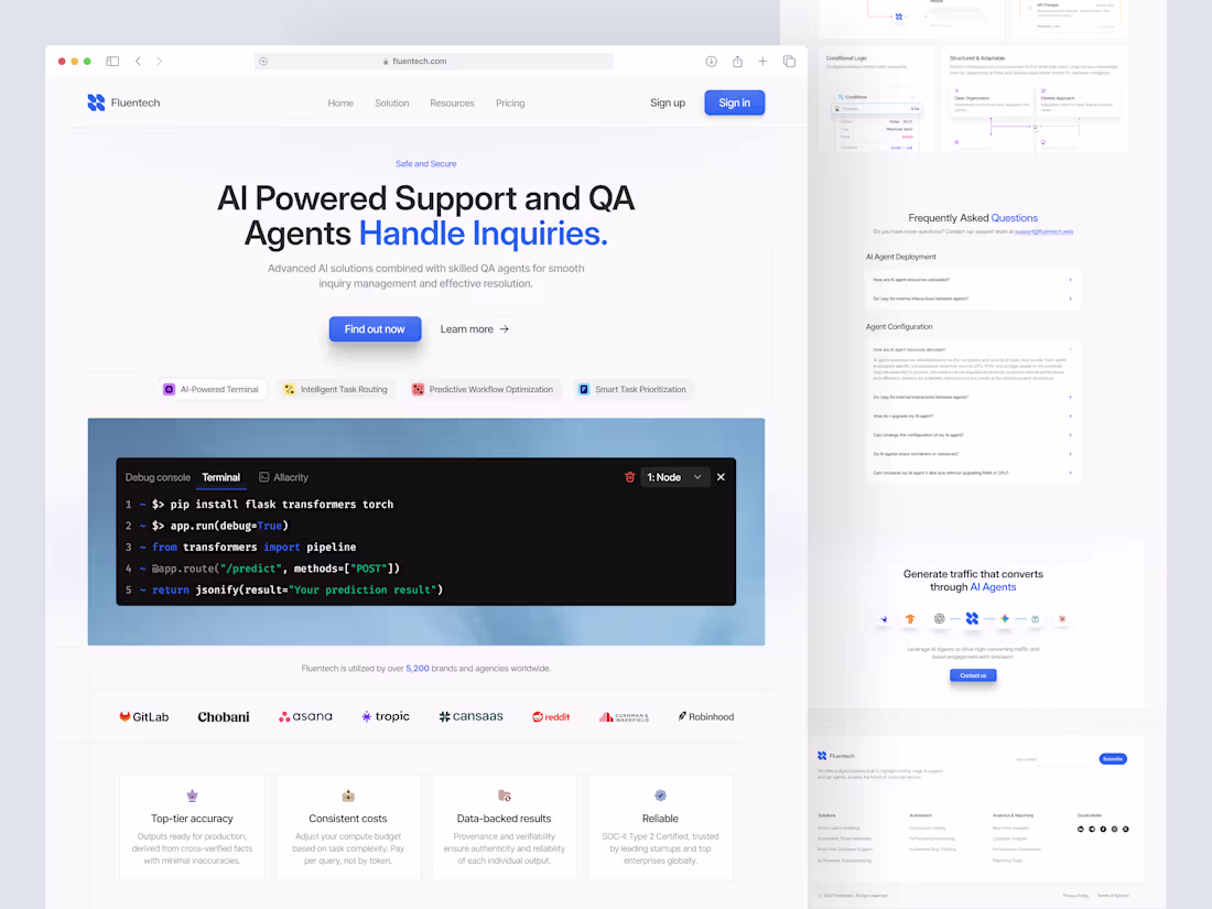
Fluentech - AI Landing Page
2
7
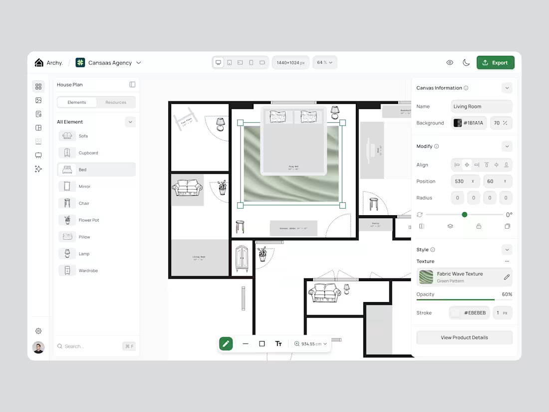
Archy - Interior Design App
2
7
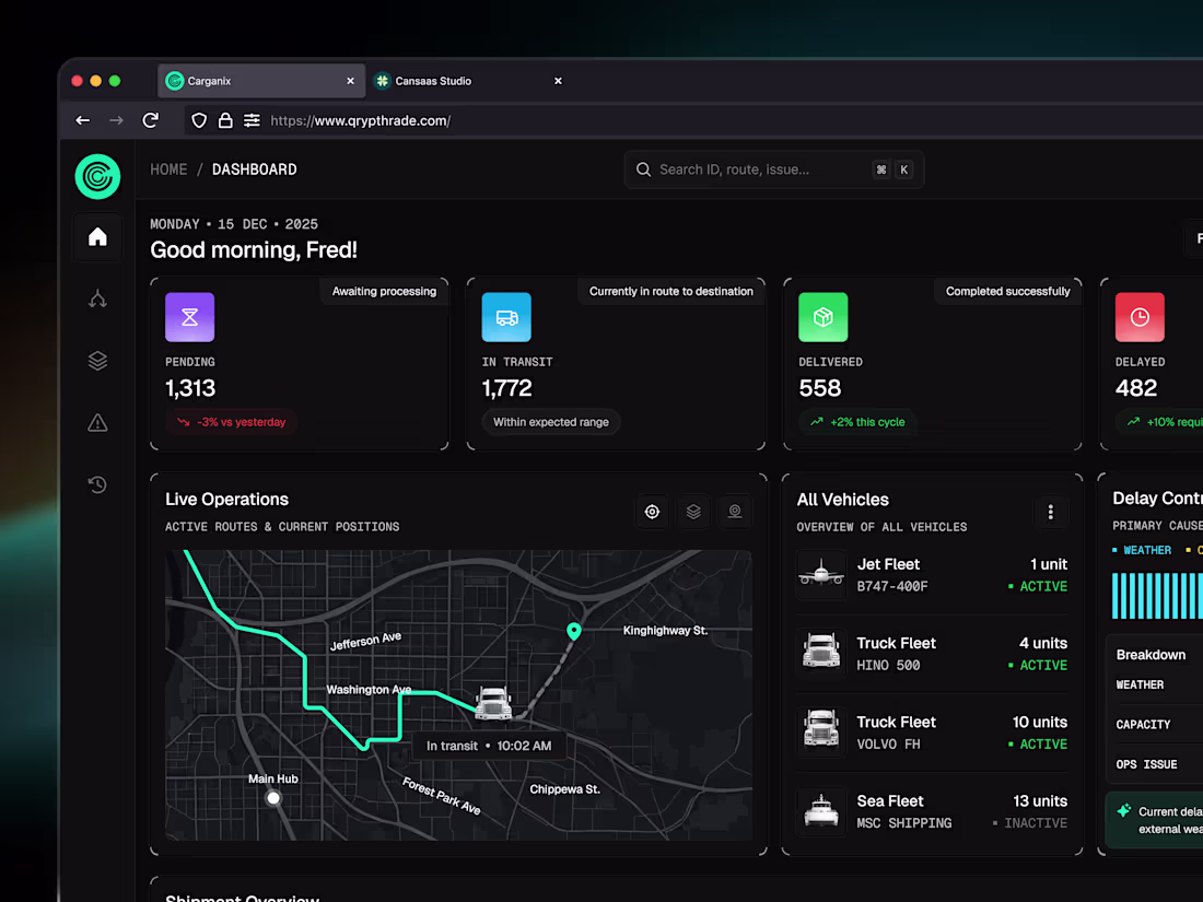
Carganix - Logistics Dashboard
2
10
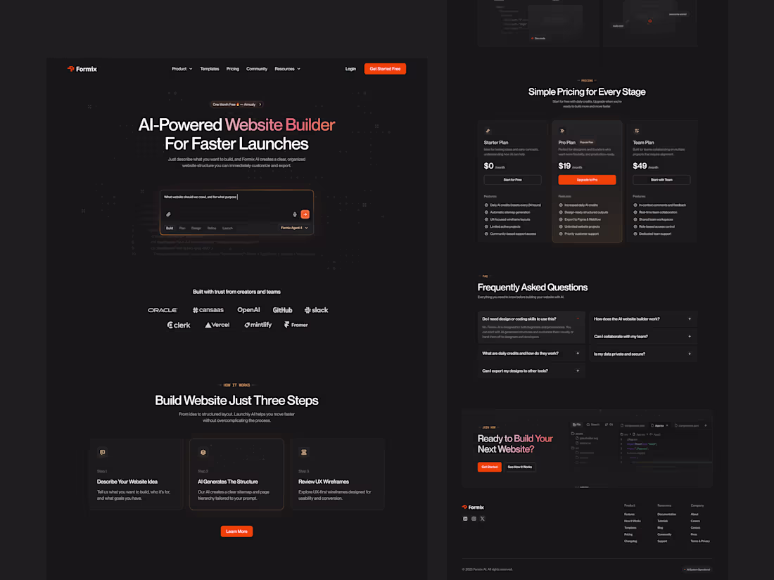
Formix - AI Landing Page
2
7
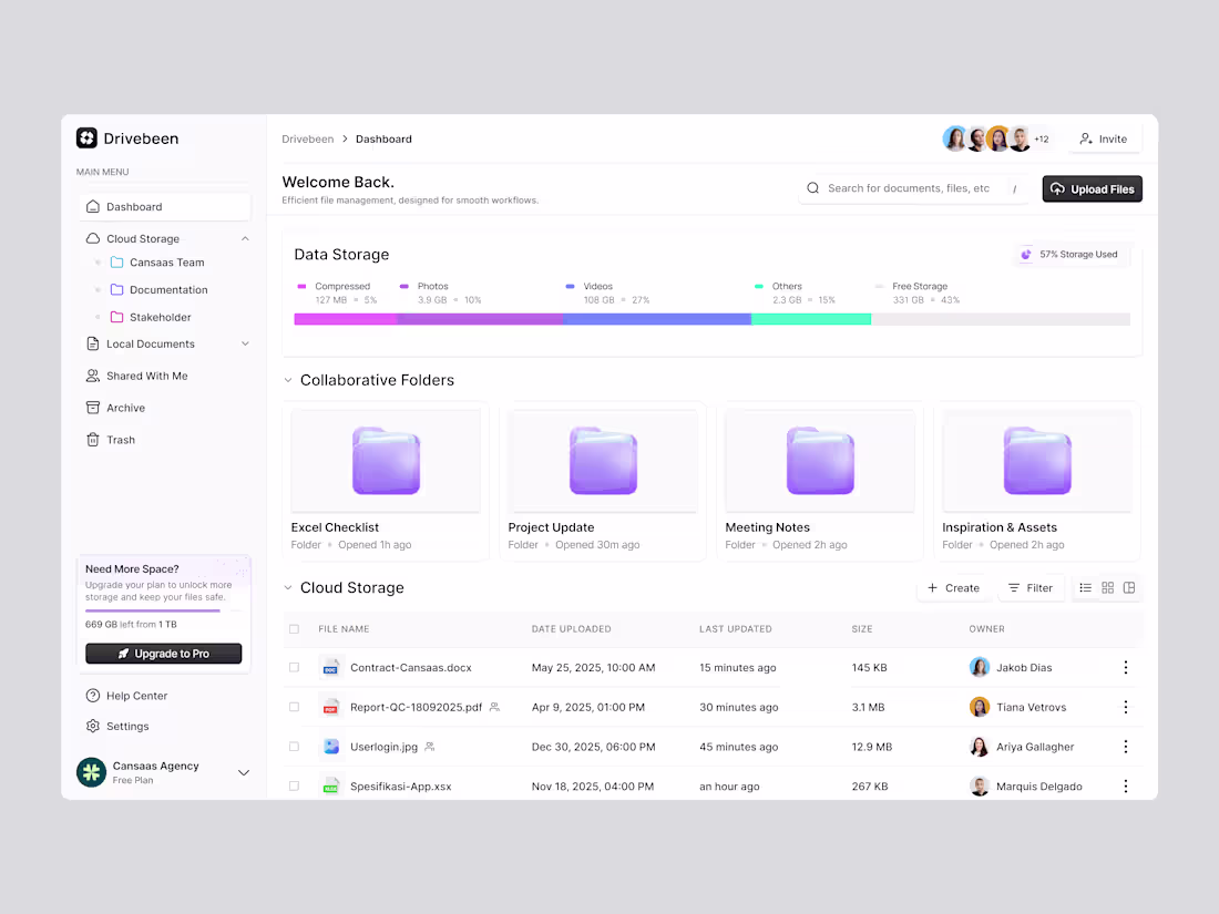
Drivebeen - Cloud Storage Dashboard
2
9
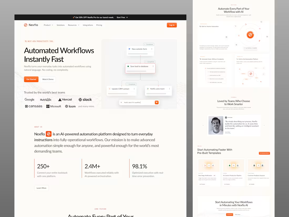
Nexflo - Automation Landing Page
3
14
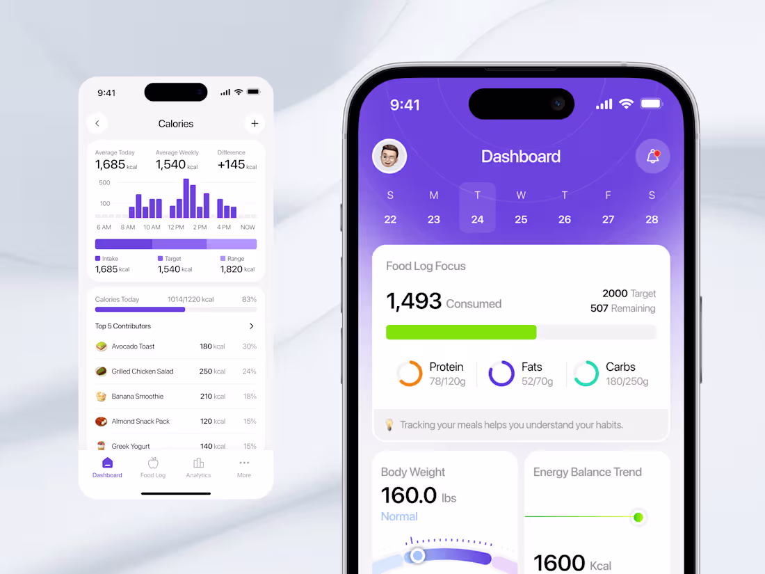
Nutrition Tracker Mobile App
2
14
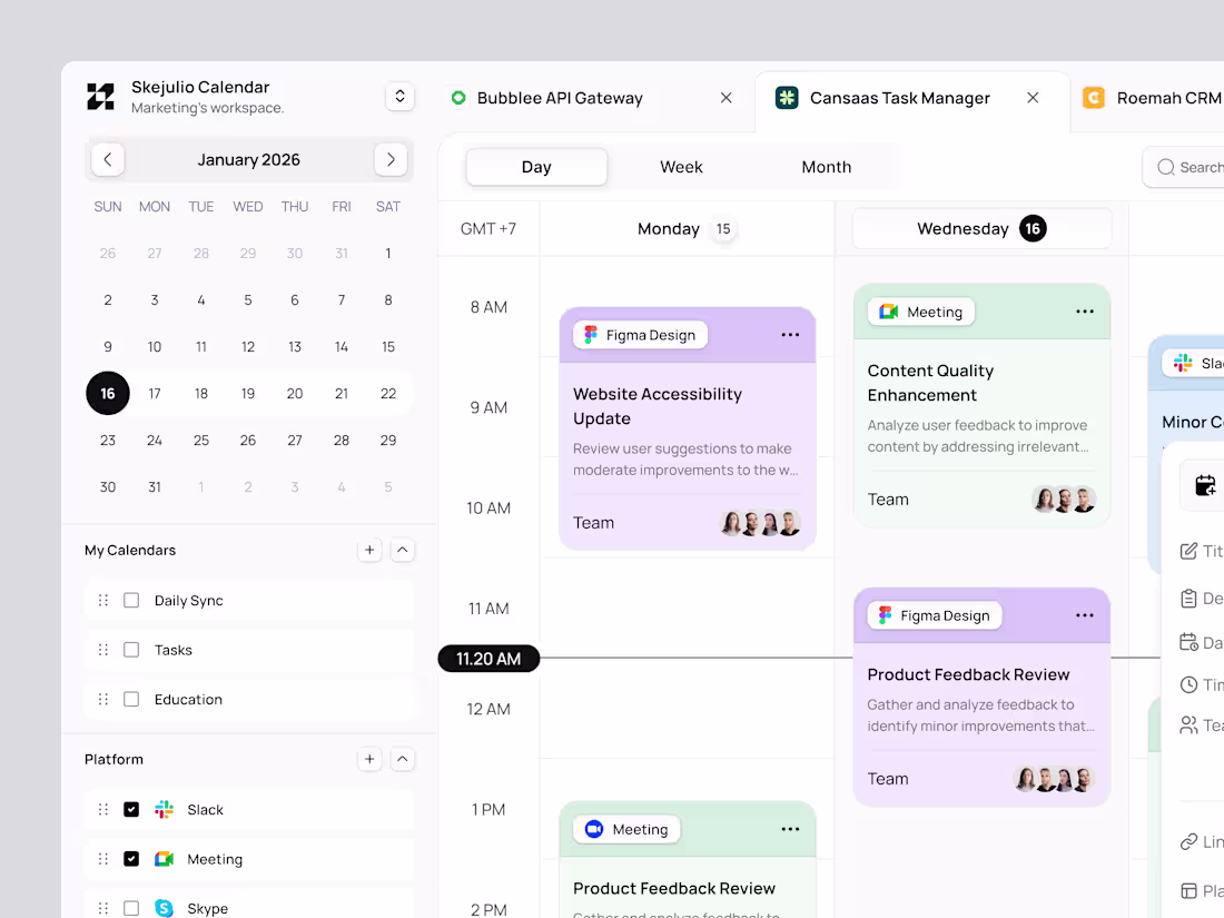
Calendar Dashboard
2
5
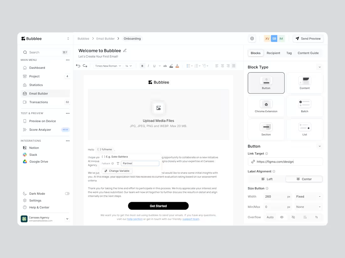
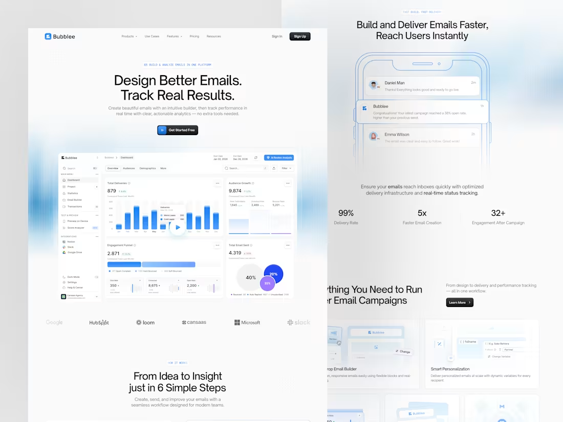
Bubblee - Email Builder Dashboard
2
12
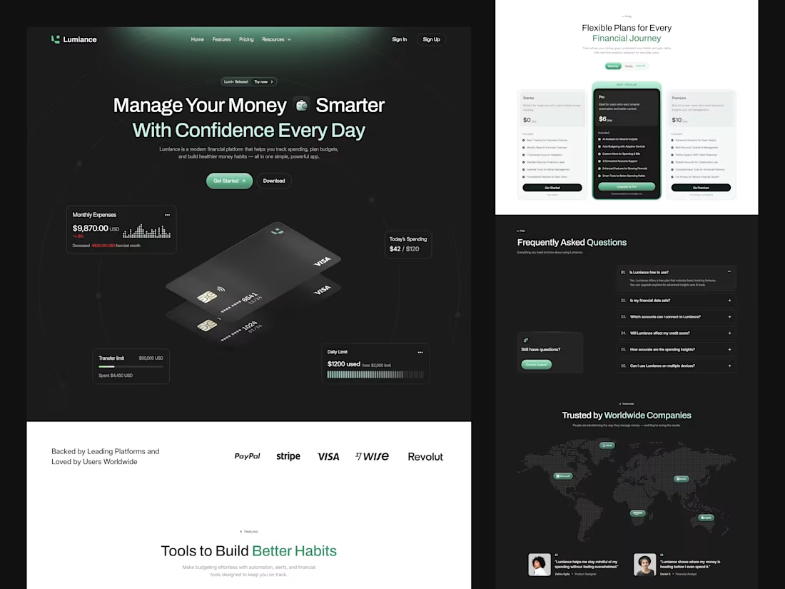
Lumiance - Finance Landing Page
2
10
Nutrition Tracker Mobile App
2
6
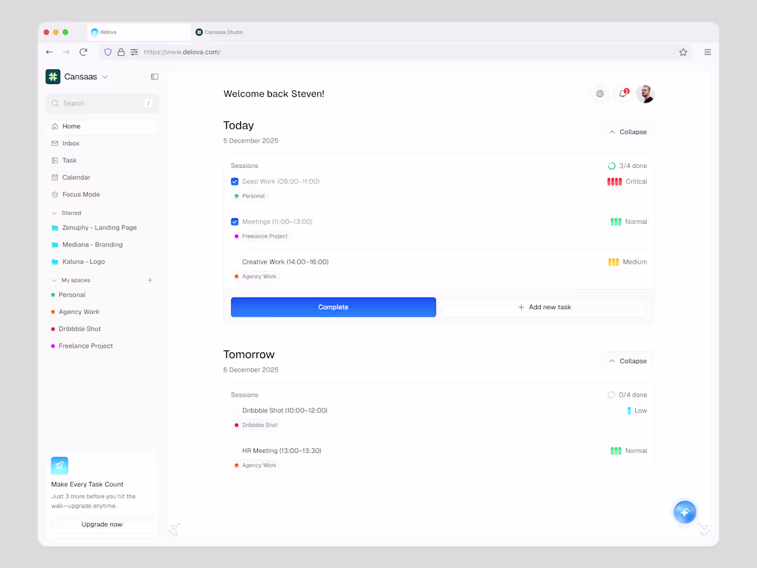
Delova - To Do List Dashboard
2
7
Shipment Logistic Dashboard App
2
5
Agrio - Agriculture Responsive Landing Page
2
4
Mobile Chat App
2
14
AI Image Generator Dashboard
2
12
CRM Dashboard
3
5
Analytics Dashboard
1
5
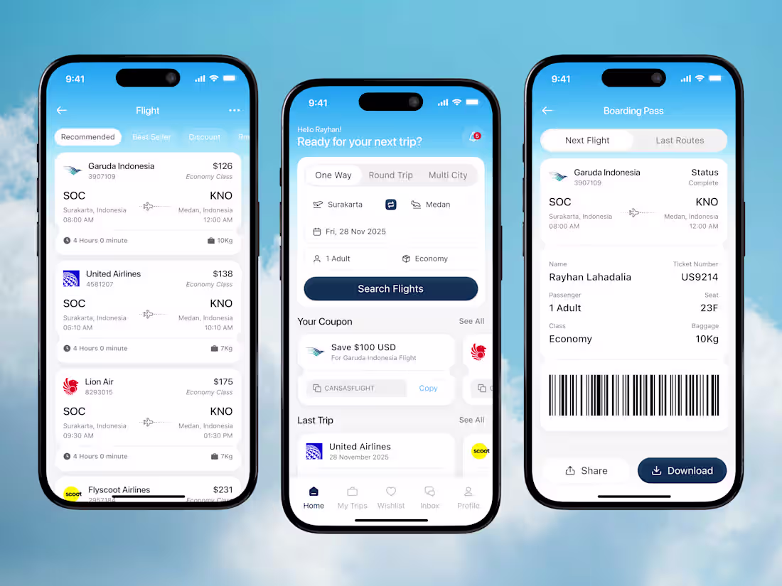
Craftyo - Flight booking mobile app
2
14
Agrio - Agriculture Landing Page
2
16
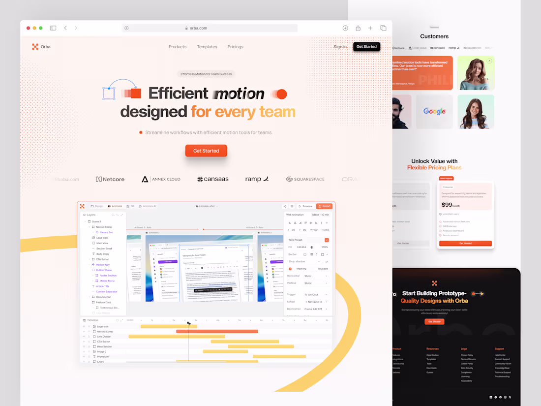
Orba - Prototype App Landing Page
3
8
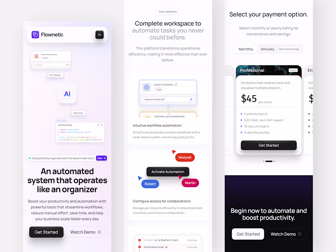
Responsive Automation SaaS Landing Page
1
6
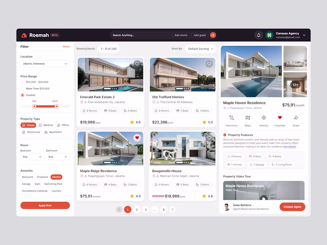
Roemah - Real Estate Dashboard
1
11
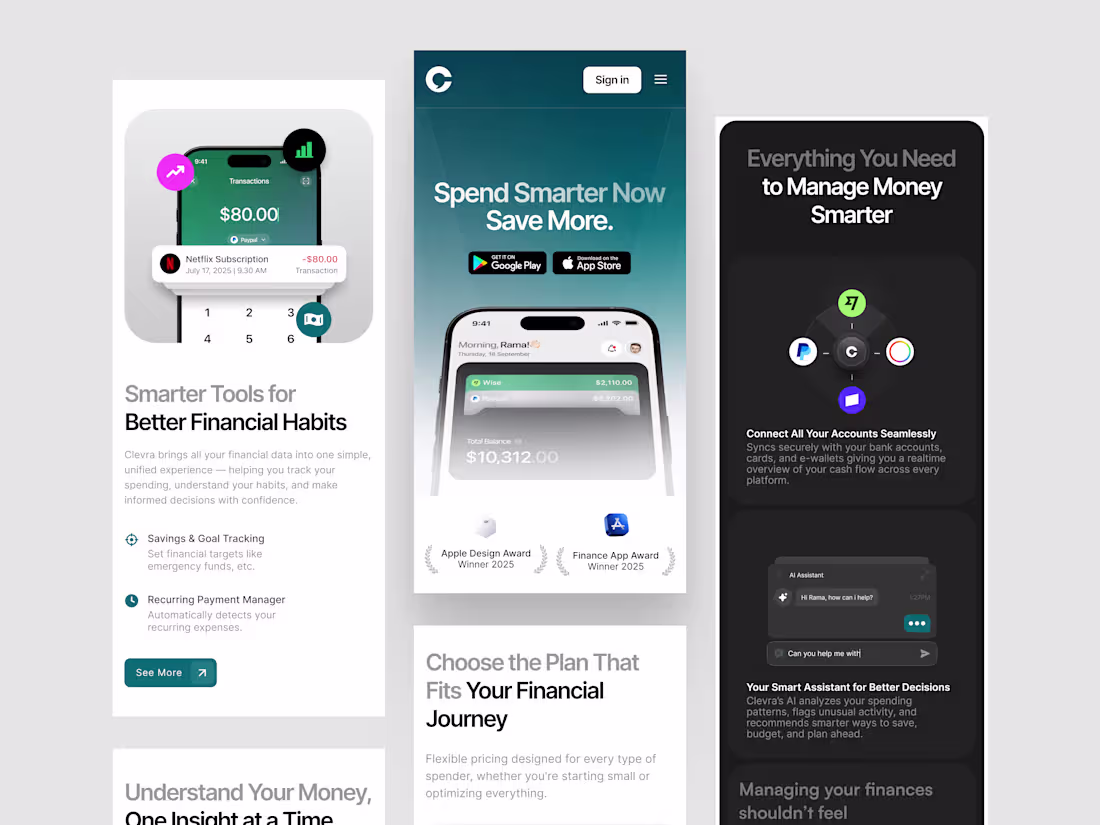
Clevra - Responsive Finance SaaS Landing Page
1
11
AI Image Generator Dashboard
1
3
Prototype App Dashboard
1
10
Clevra - Finance SaaS Landing Page
1
8
Database Visualitation Dashboard
1
12
Automation SaaS Landing Page
1
6
Agrotech Dashboard
2
58
Stock Investment Dashboard
2
12
Database Management Dashboard
1
12
Agrotech Dashboard
1
14
Orbitale - CRM Dashboard
1
6
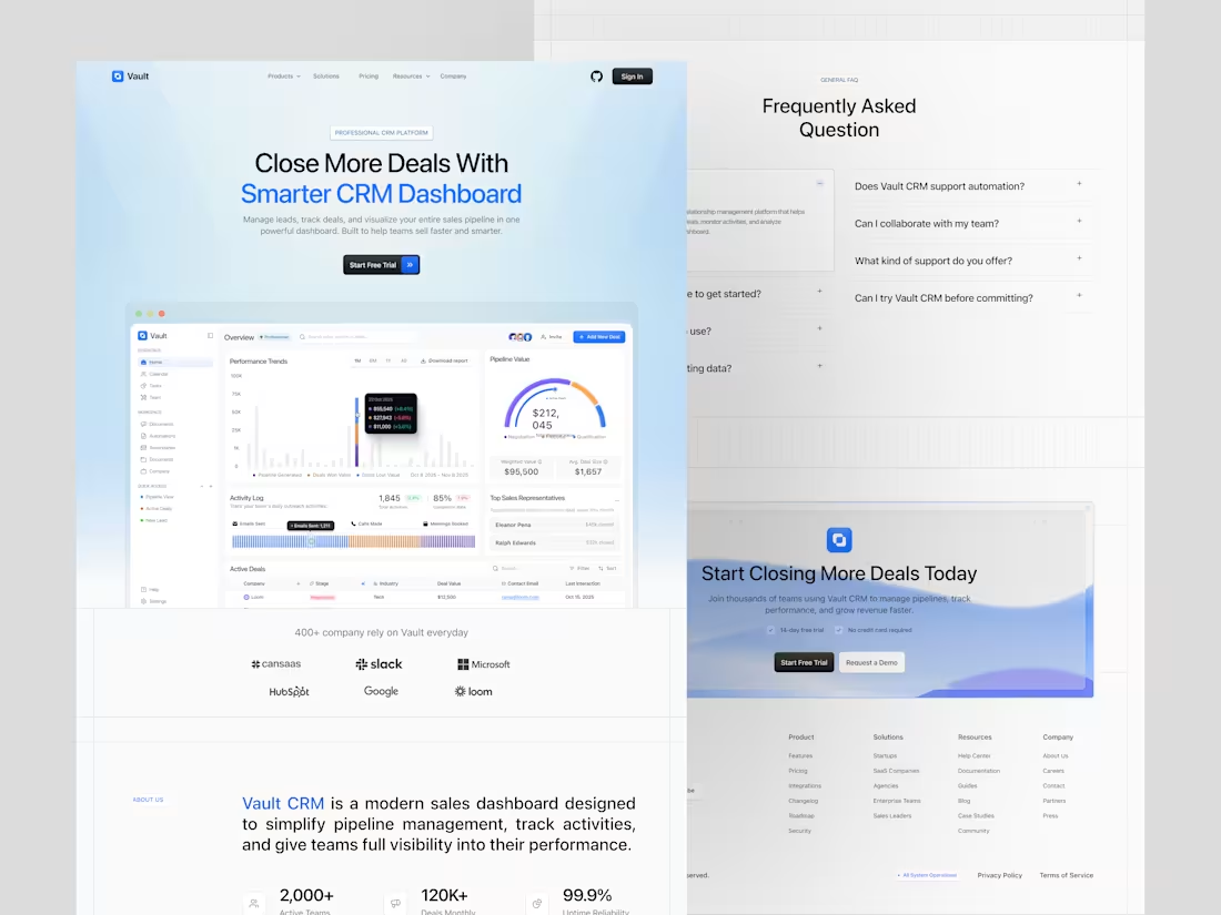
Vault - CRM Dashboard
2
12
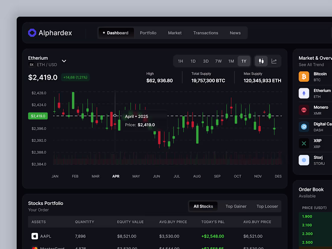
Alphardex - Stock Dashboard
0
11
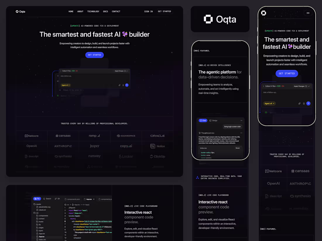
Oqta - AI Builder Responsive Landing Page
2
17
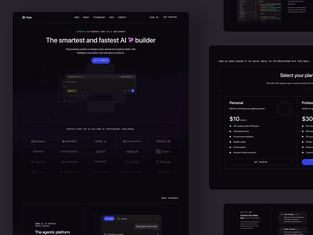
Oqta - AI Builder Landing Page
1
4
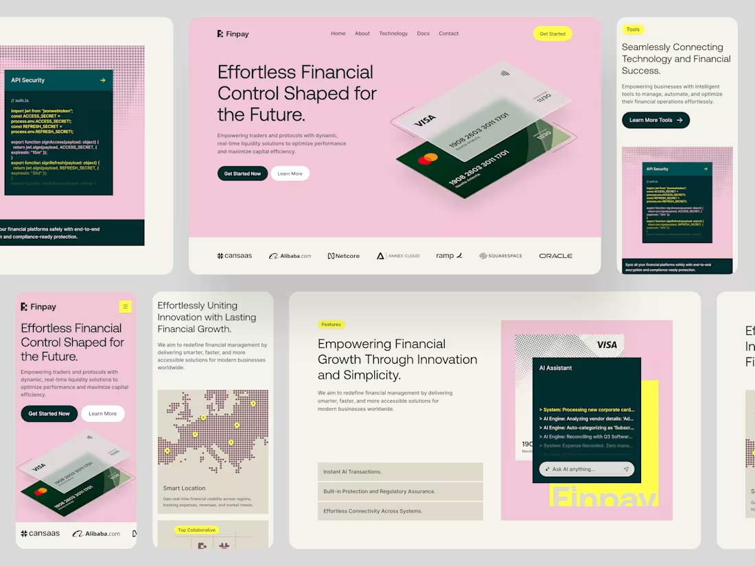
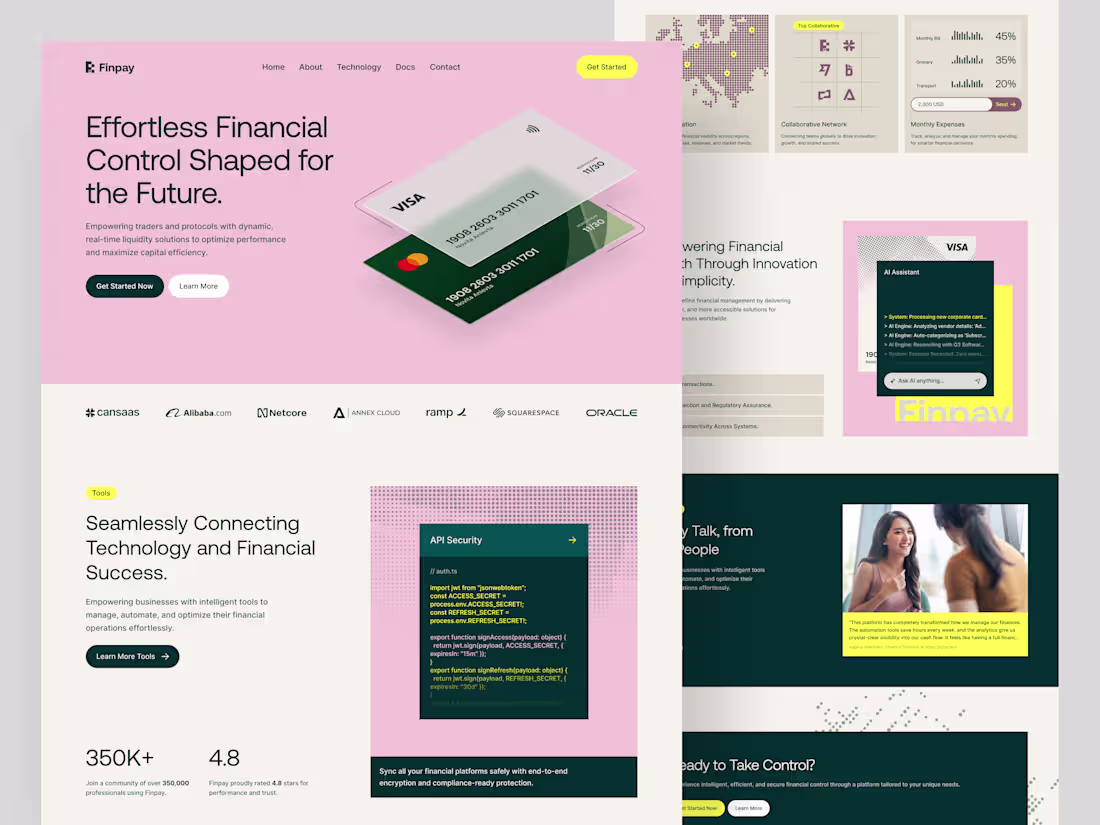
Finpay - Finance SaaS Responsive Landing Page
1
8
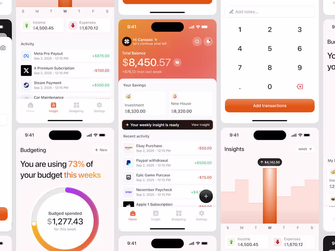
Money Tracker Mobile App
1
9
Stock Mobile App
1
7
Hireman - HR Dashboard
2
7
Finance Dashboard
2
14
Notes App Dashboard
1
12
Finpay - Finance SaaS Landing Page
2
6
Team Communication Dashboard
1
5
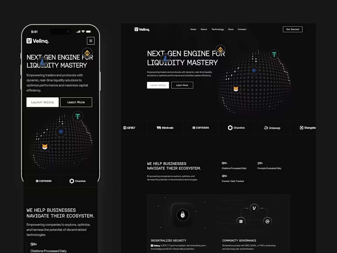
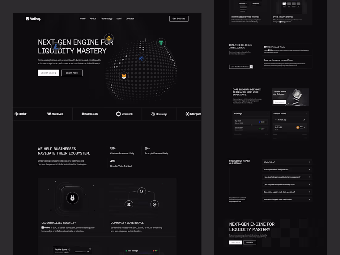
Velinq Web3 Responsive Landing Page Design
1
8
Oqta - AI Builder Dashboard
2
19
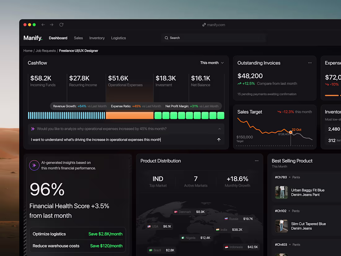
Manify - CRM Dashboard
2
10
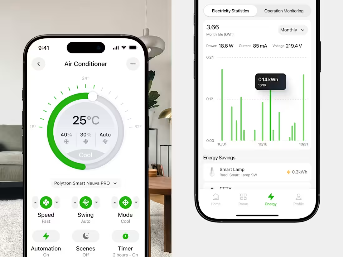
Smart Home App
1
1
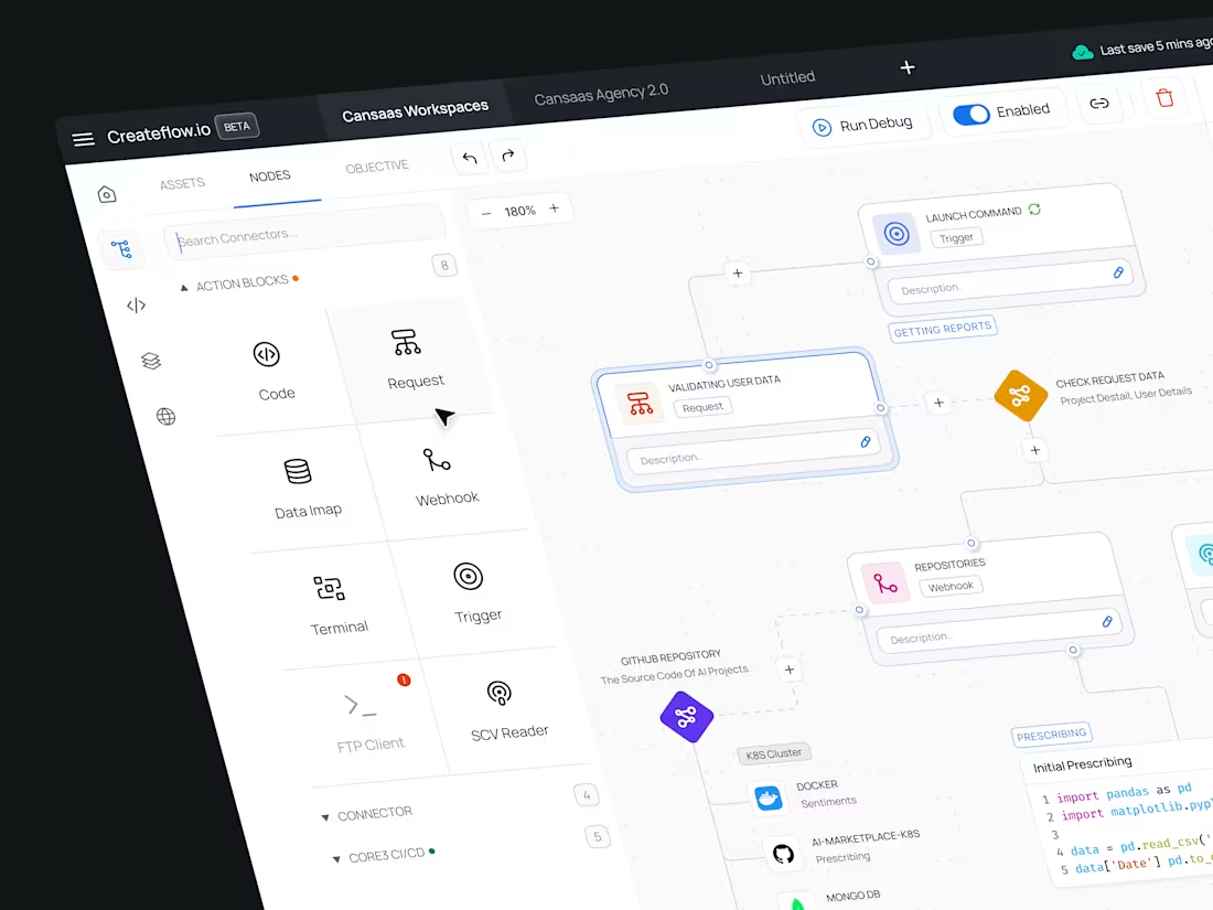
Createflow.io Automation Dashboard Design
1
21
Web3 Landing Page
1
7
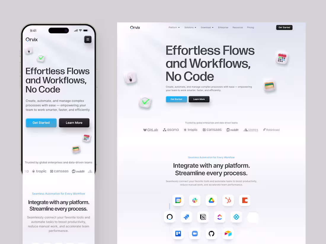
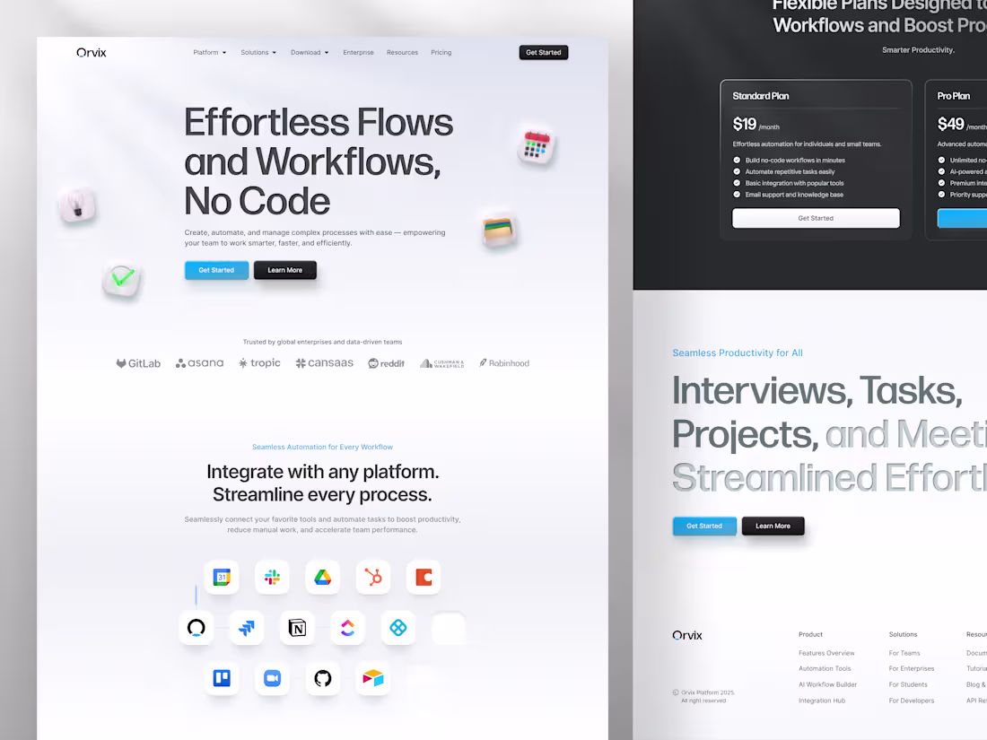
Orvix - Productivity Responsive Landing Page
1
13
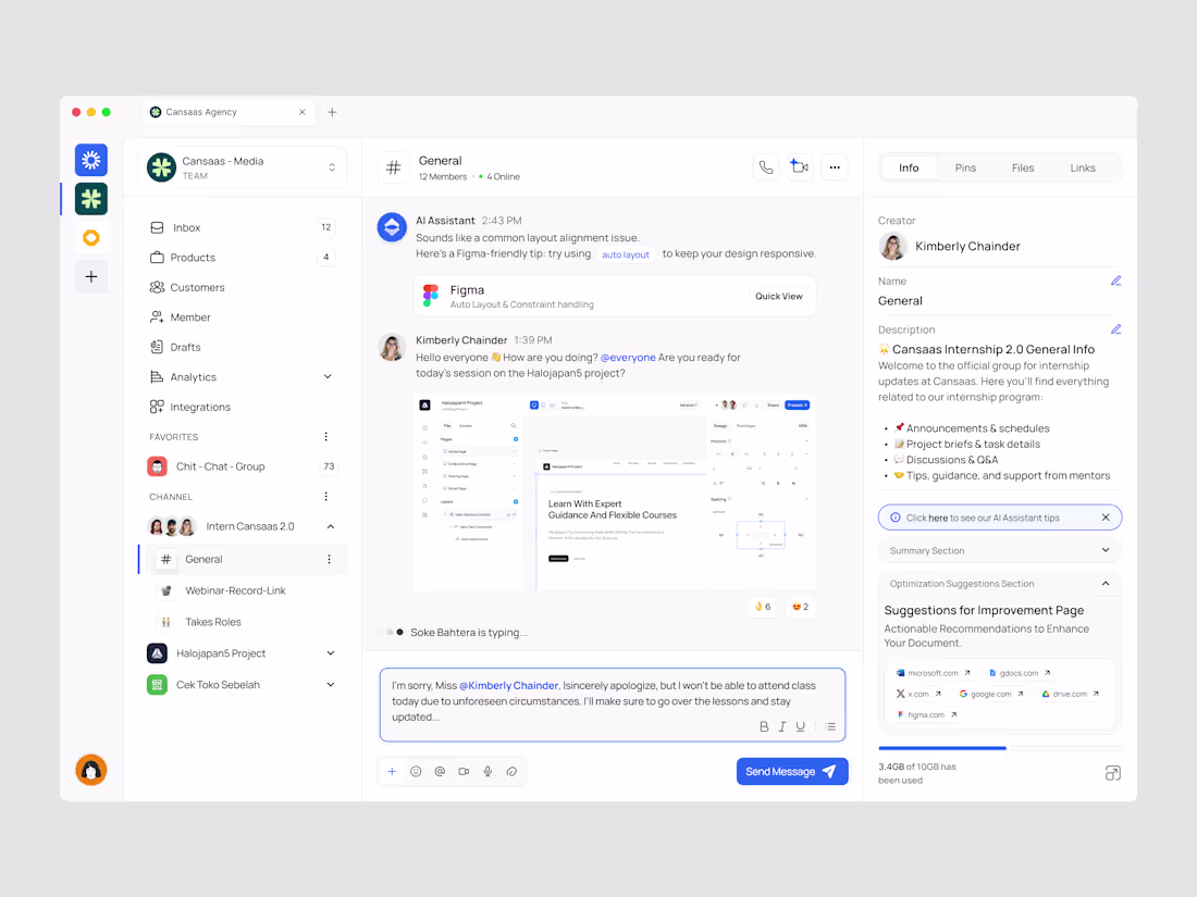
Team Communication Dashboards
2
14
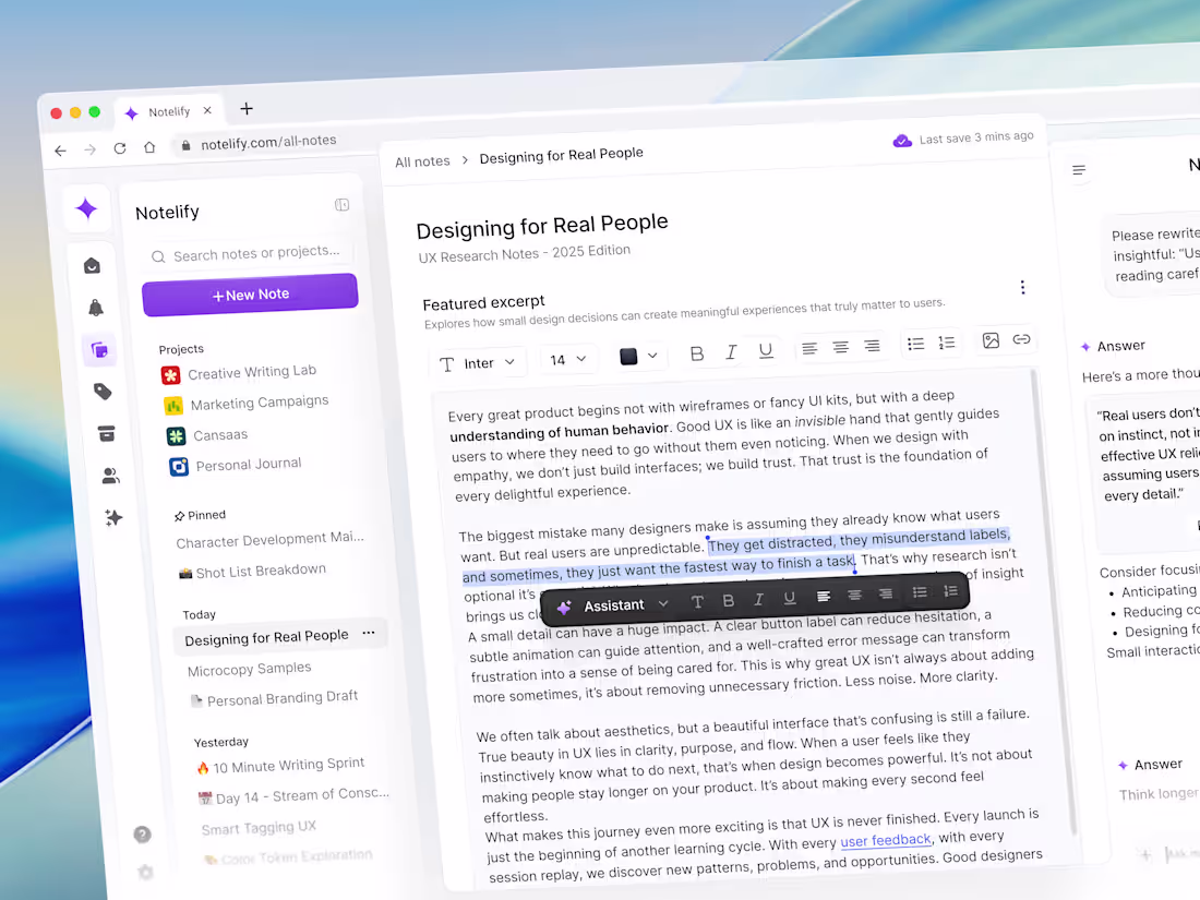
Notelify - Text Editor Dashboard
1
10
AI Note-Taking Mobile App Design
1
6
SaaS Task Management
1
11
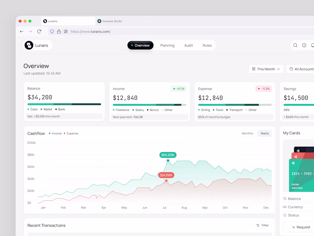
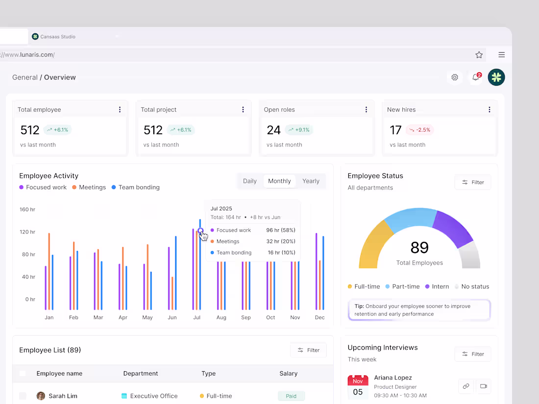
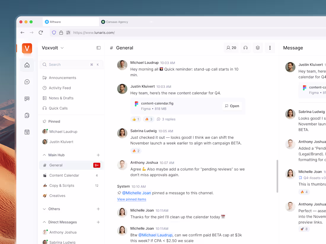
Lunaris - Finance Dashboard
1
10
Orvix - Productivity Landing Page
1
11
Shots Cansaas Clevra - Finance Mobile App
1
18
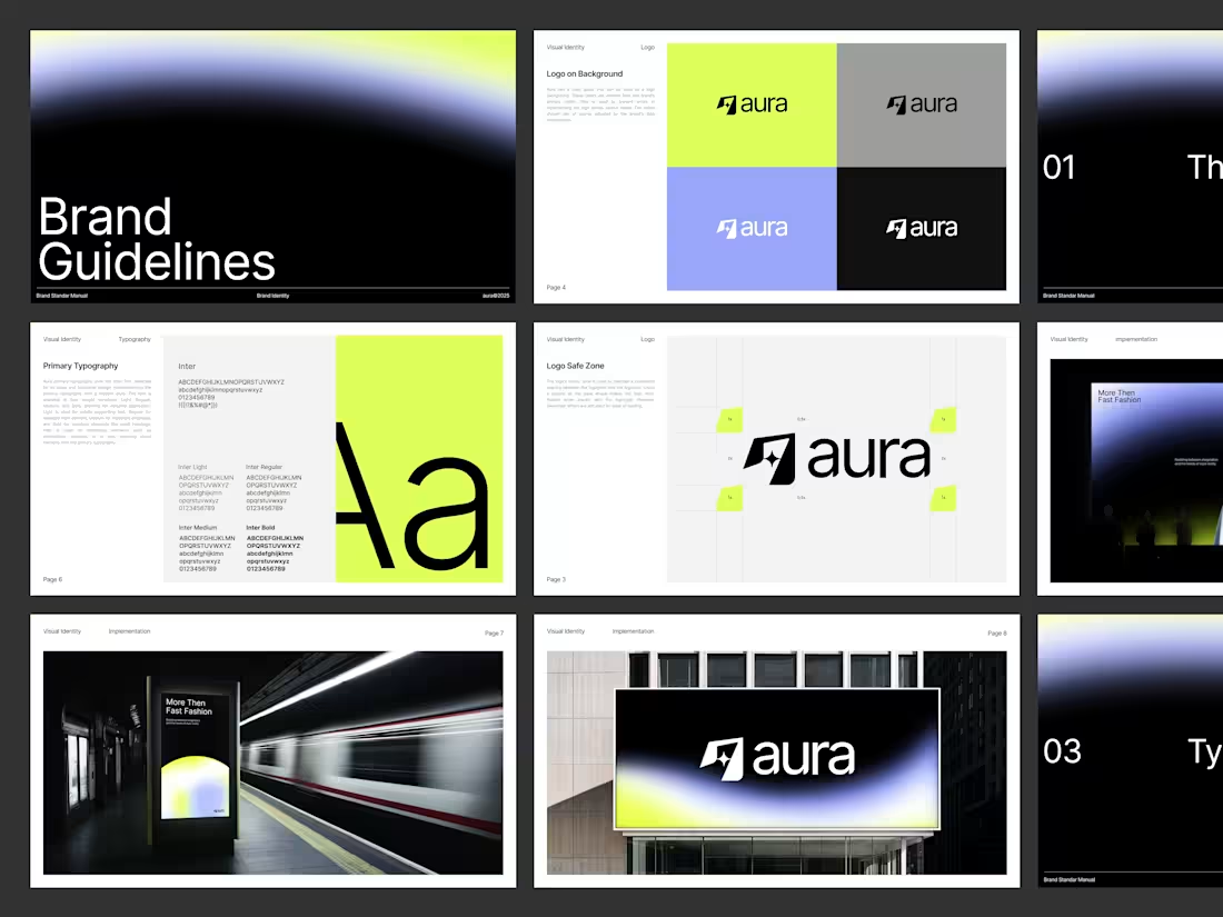
Aura AI - Brand Guidelines
1
19
Cloud Storage Dashboard
2
22
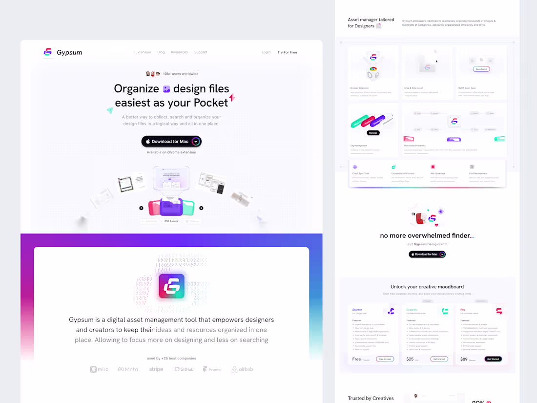
Gypsum - SaaS Landing Page
1
12
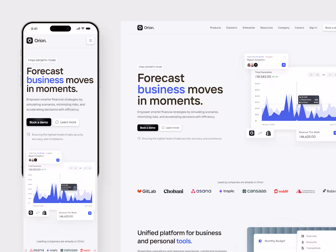
Orion Finance Responsive Landing Page
1
8
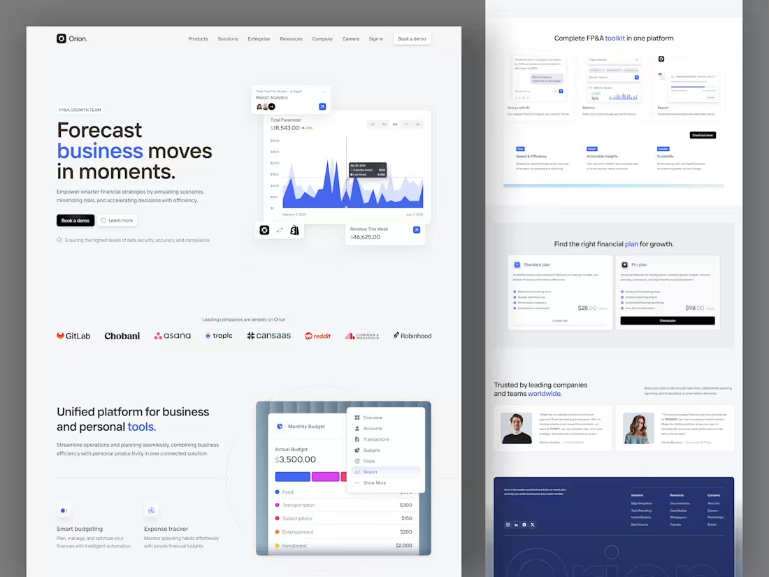
Orion - Finance Landing Page
1
7
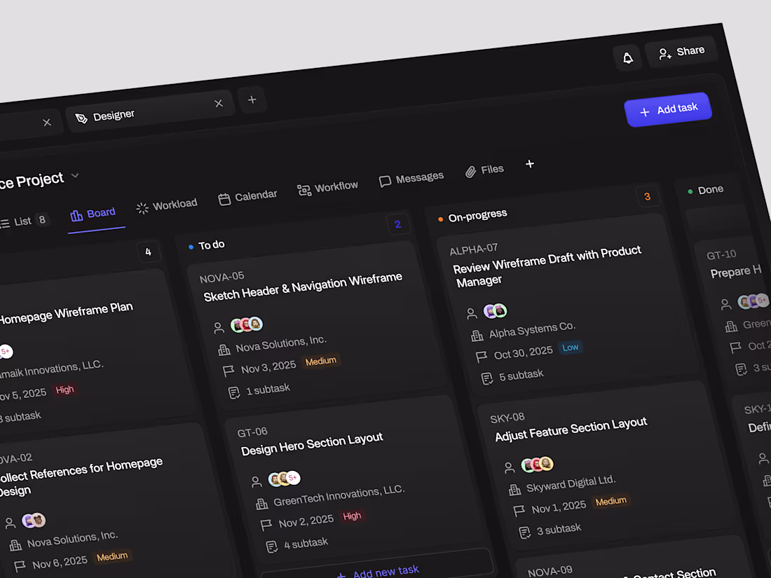
Task Management Dashboard
1
12
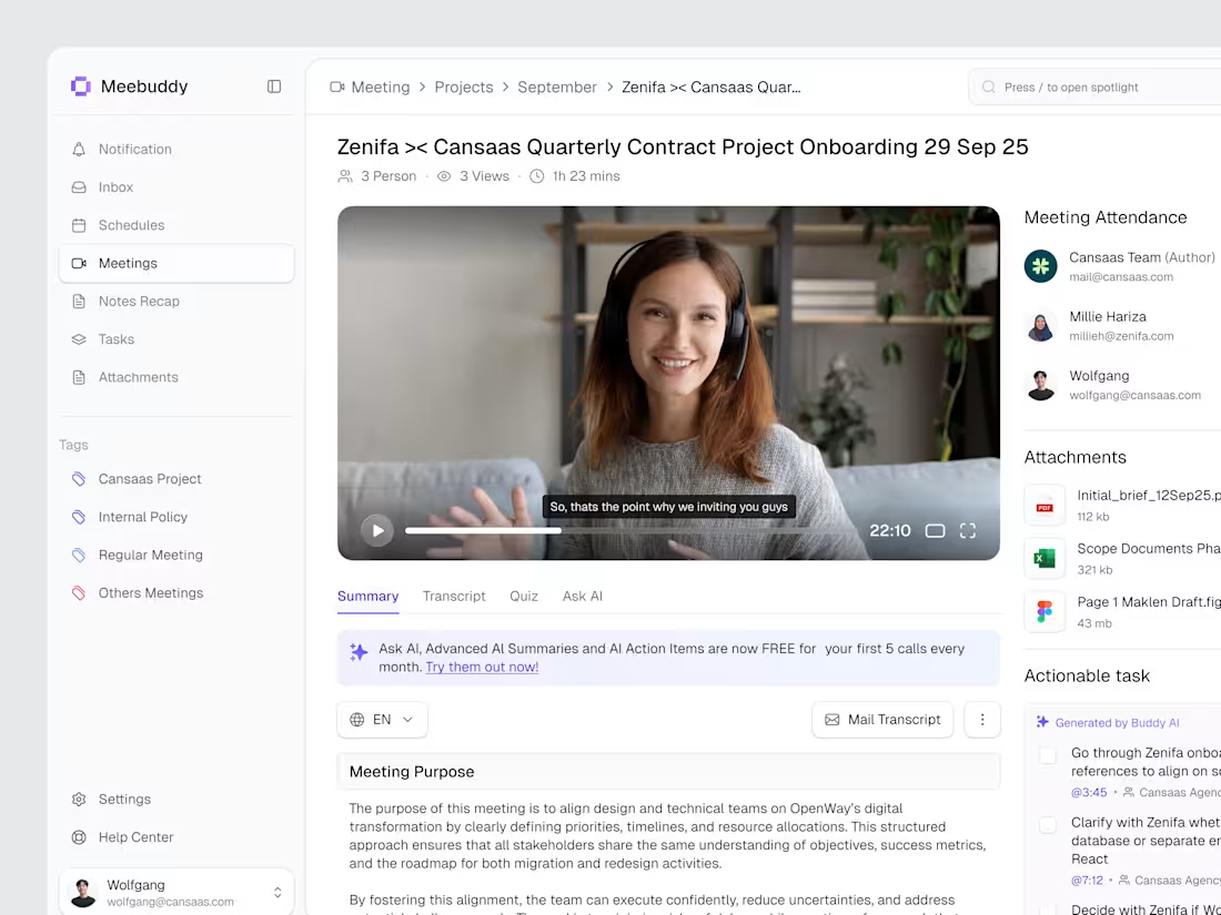
Meebuddy - AI Note Taking Dashboard
1
5
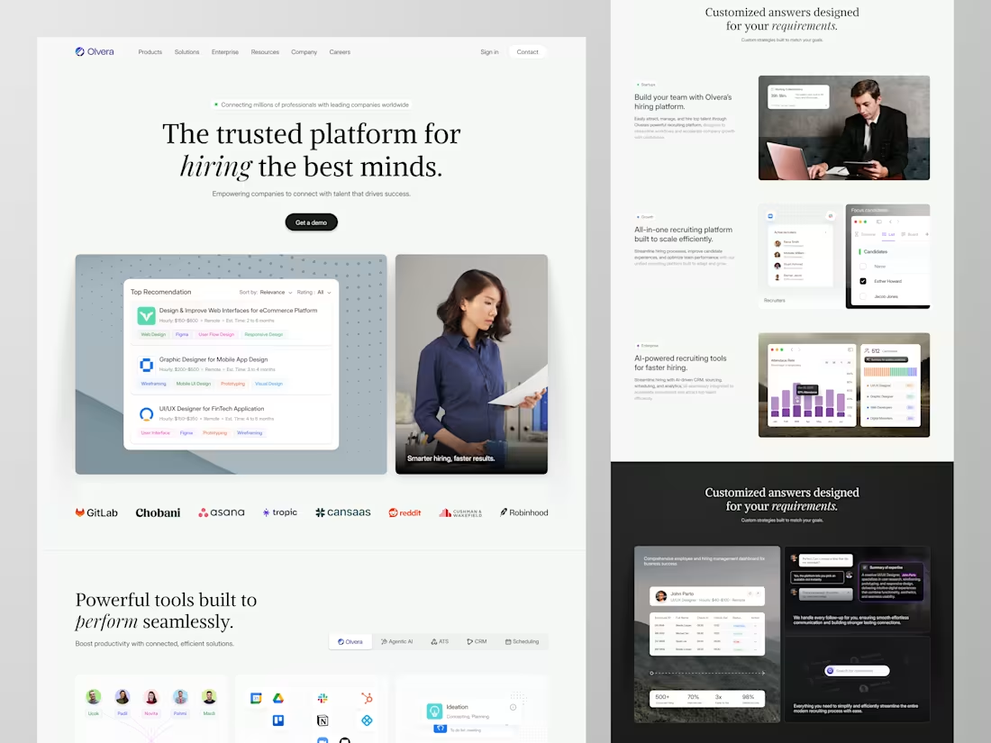
Olvera - HR Platform Landing Page
1
19
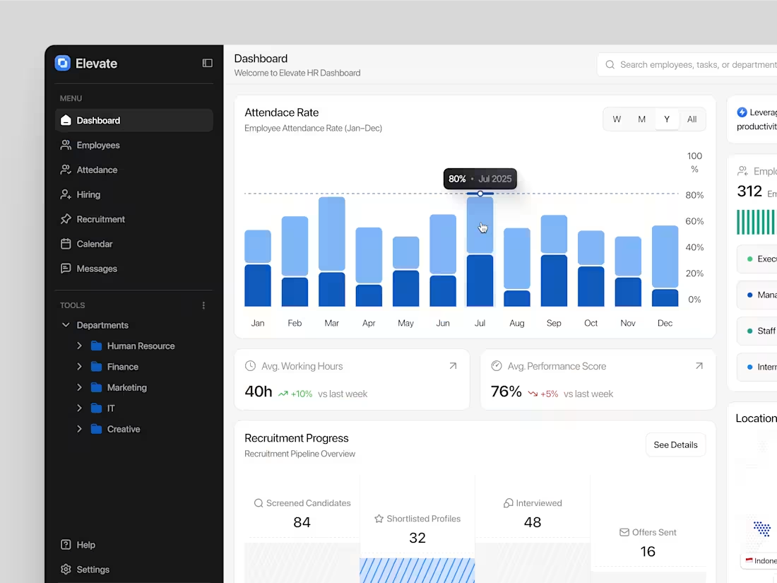
HR Dashboard
1
12
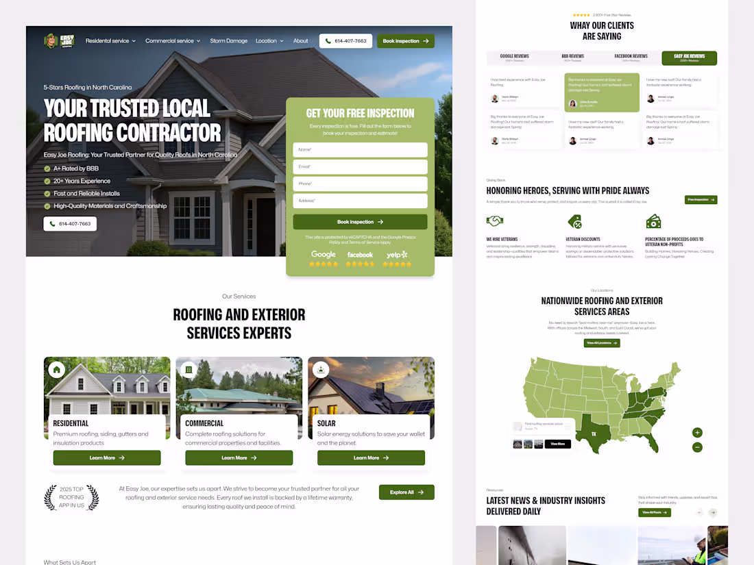
Landing Page Design for Easy Joe
3
18
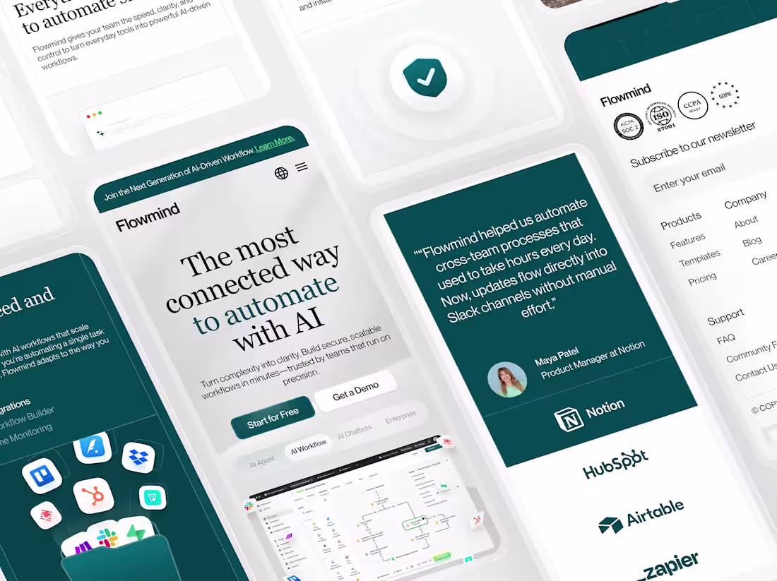
Flowmind - Responsive SaaS Landing Page
1
7
Nuvexa - Cloud Responsive Landing Page
1
6
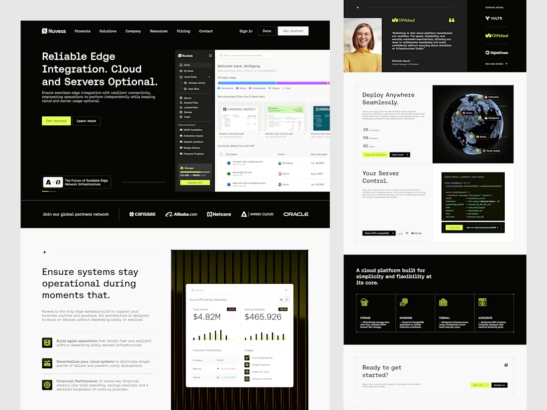
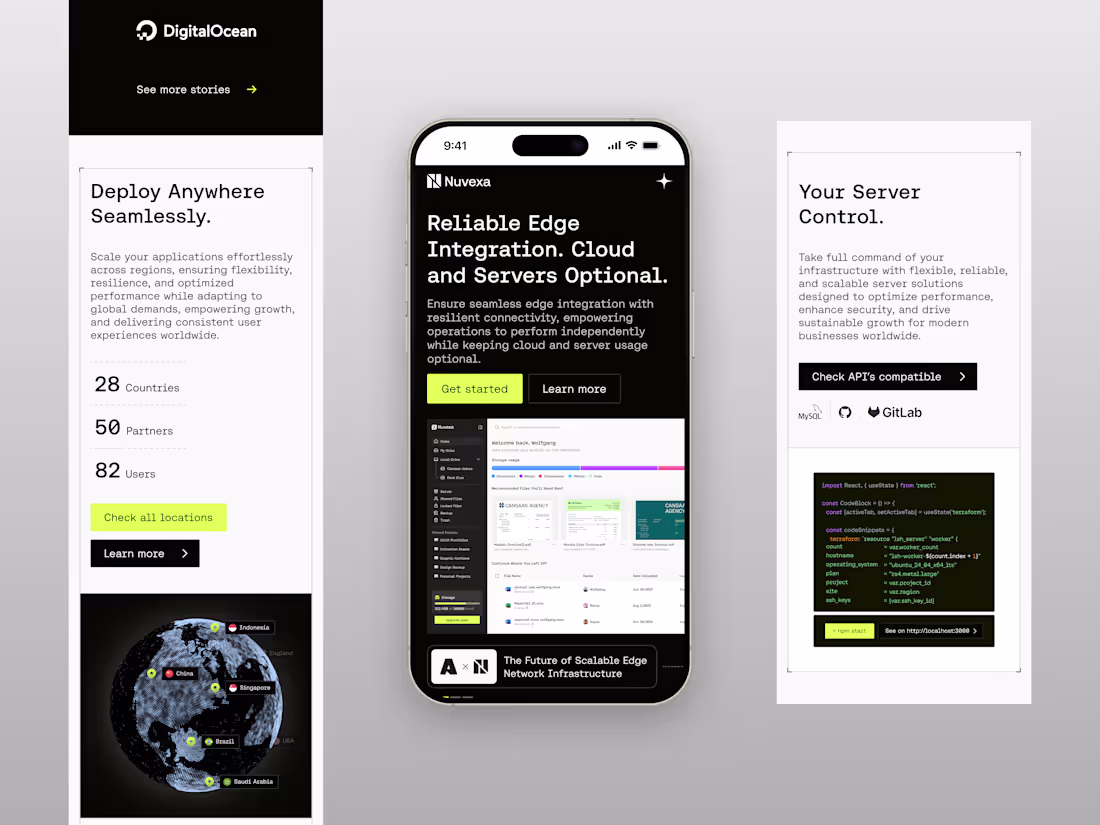
Nuvexa - Cloud Landing Page
1
10
Cryptocurrency Dashboard
1
16