Nutrity Nutrition Tracker Landing Page Design
Cansaas Agency
Overview
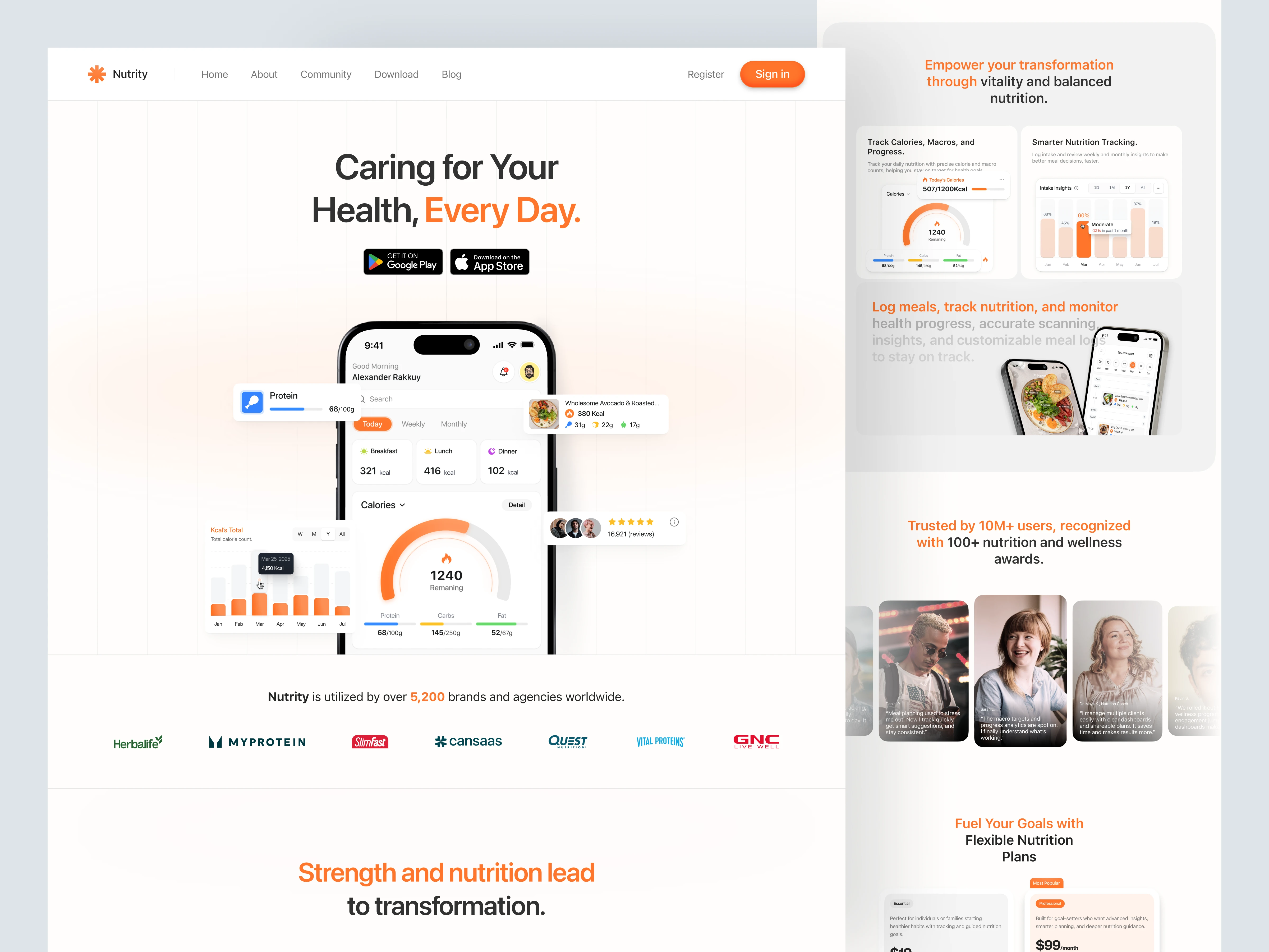
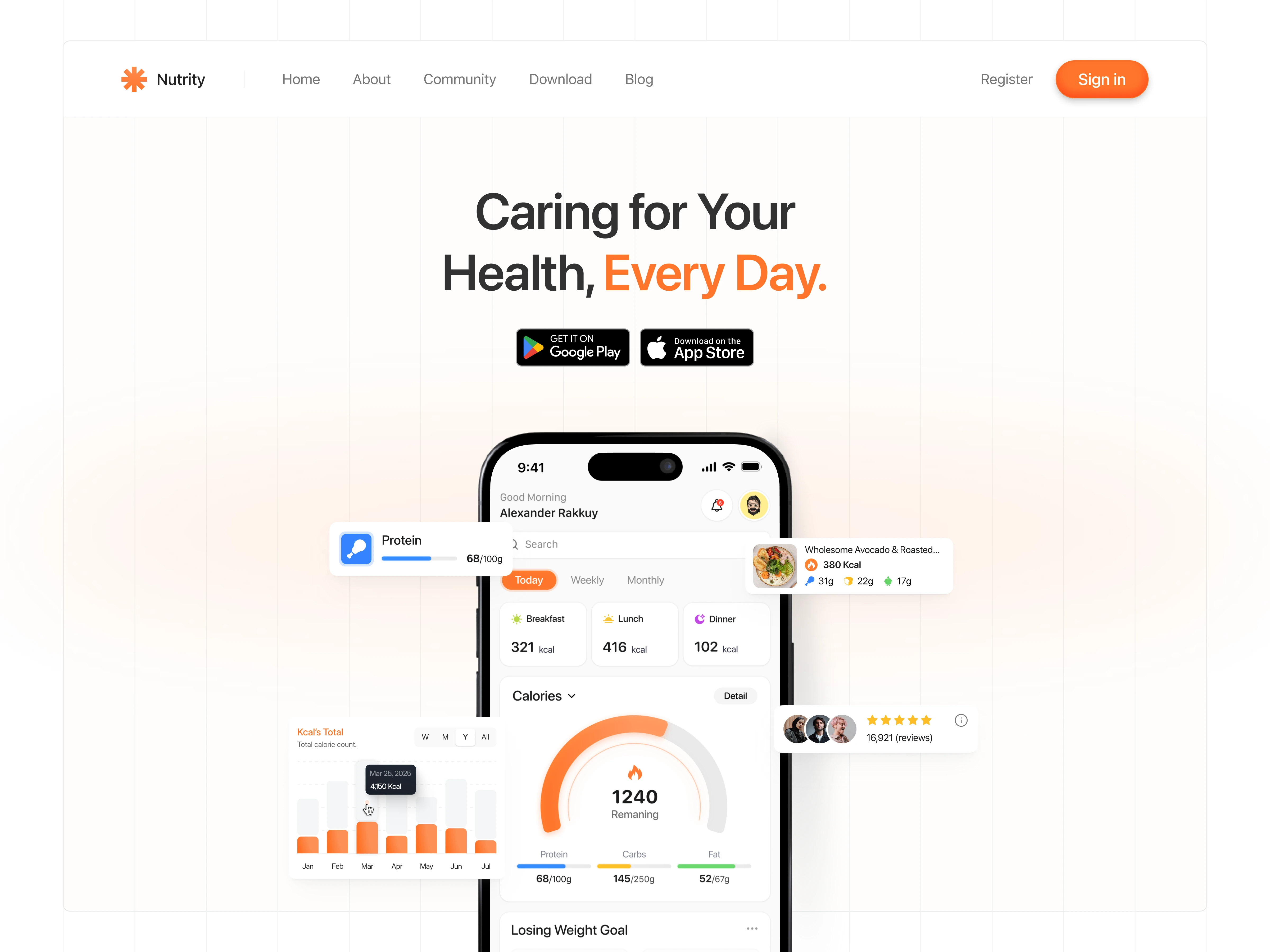
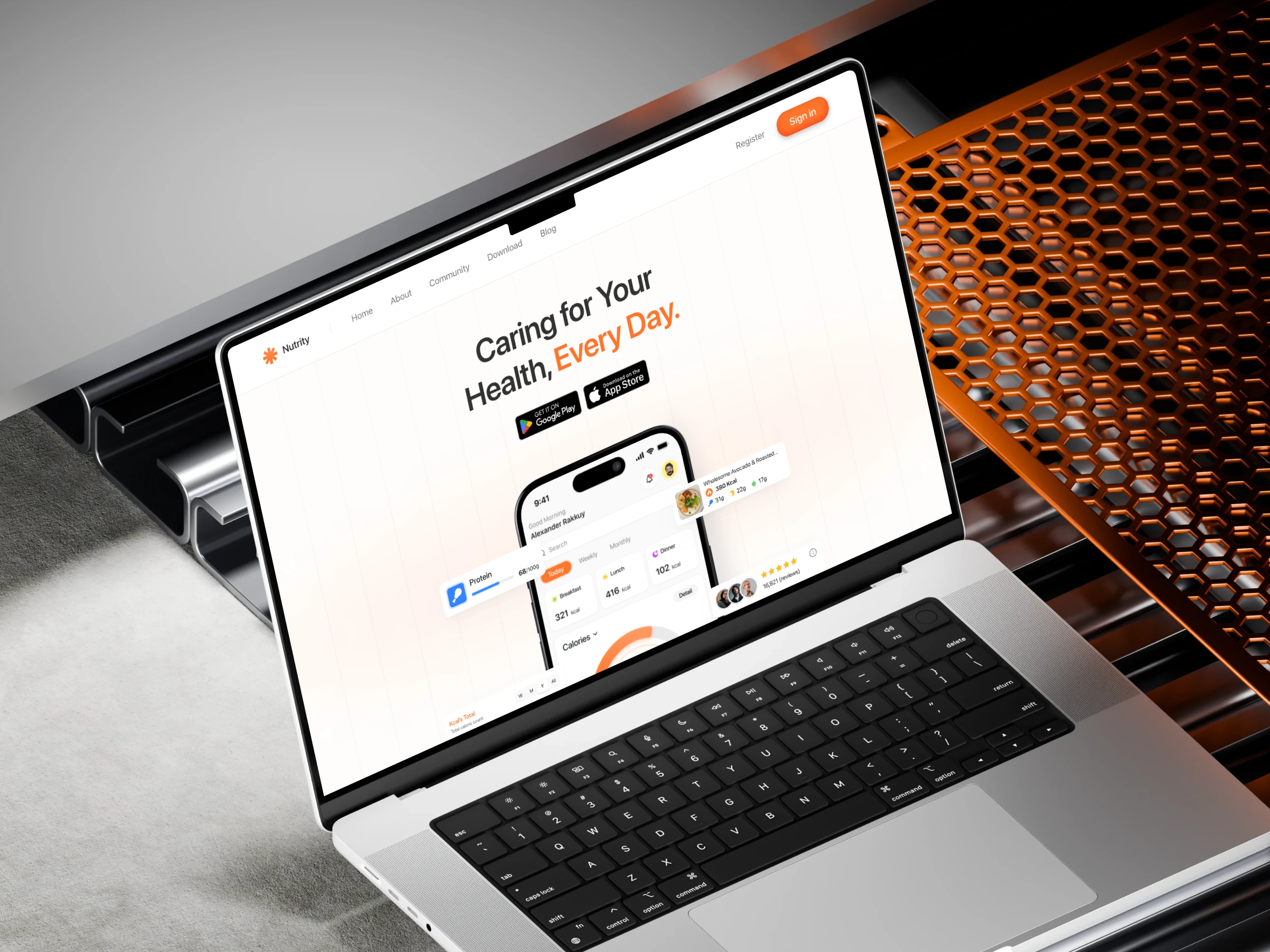
This exploration presents Nutrity, a nutrition tracker landing page designed to help users understand their daily health, calorie intake, and nutrition progress through a friendly, mobile-first experience. The landing page focuses on communicating value clearly while building trust and motivation from the first interaction.
The Challenge
Nutrition and health products often struggle to balance data accuracy with emotional motivation. Too much technical detail can overwhelm users, while overly generic messaging fails to build credibility. The challenge was to present Nutrity as both reliable and approachable, encouraging users to start tracking without feeling intimidated.
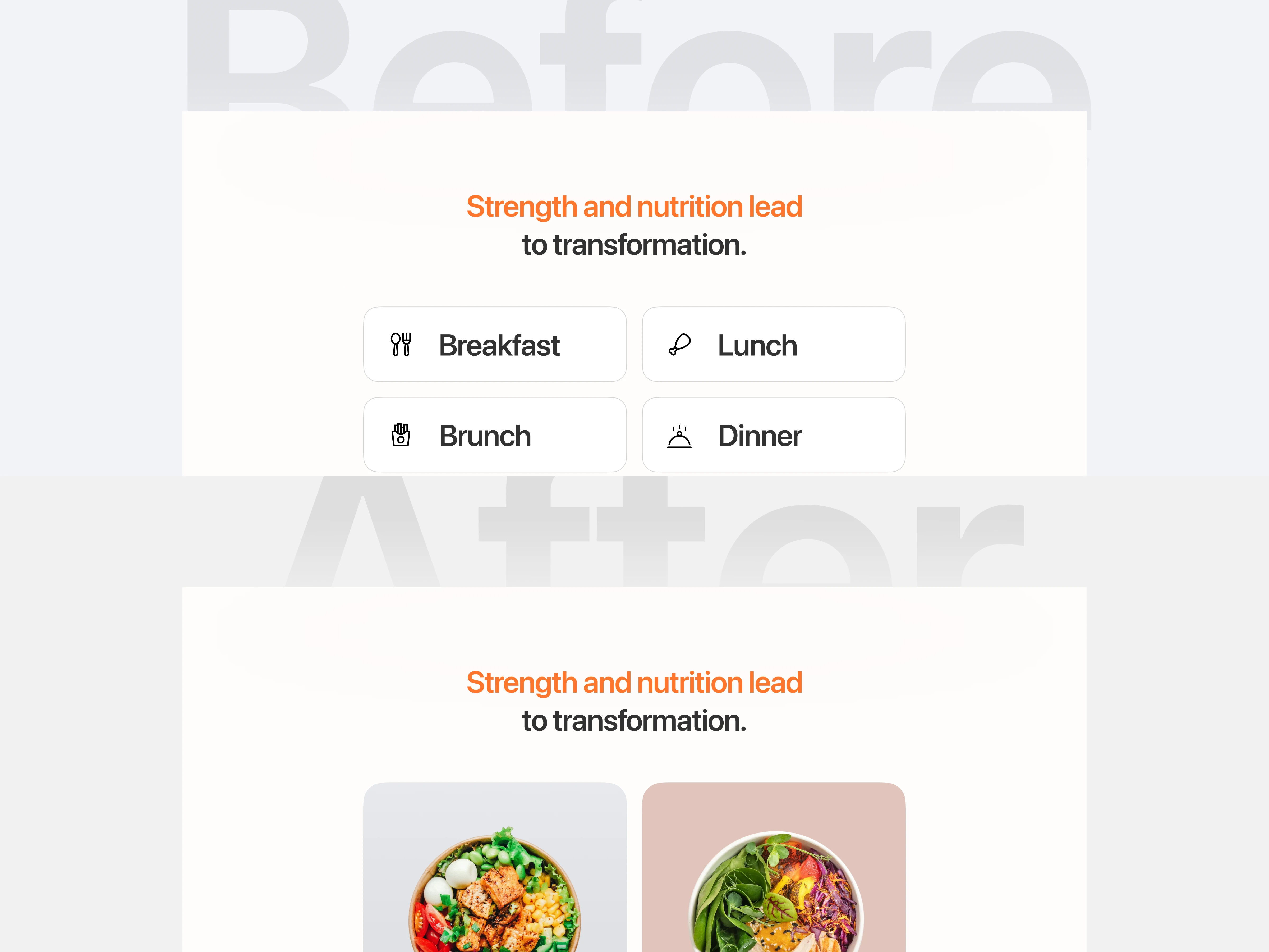
The lower screen excels by offering meaningful context, improving visual hierarchy, minimizing cognitive effort, and enabling users to quickly grasp the benefits of each feature. It leverages principles such as Recognition Over Recall, Progressive Disclosure, and the Von Restorff Effect to craft a seamless, intuitive, and engaging user experience. (src: nngroup.com, goodui.org, lawsofux.com)
Design Approach
The landing page is designed with a clean, warm visual tone and a strong hero section that immediately communicates daily health support. Content is structured into clear sections that explain features, benefits, and outcomes step by step. Visual hierarchy, generous spacing, and product previews are used to guide users naturally through the story.
The Solution and Impact
By combining clear messaging, friendly visuals, and real product context, Nutrity delivers a landing experience that builds confidence and motivation. Users can quickly understand how the app supports healthier habits, making the decision to try the product feel easy and reassuring.
Like this project
Posted Jan 27, 2026
Nutrition tracker landing page exploration for Nutrity, focused on healthy habits, progress tracking, and daily insights through a clean, friendly layout.
Likes
2
Views
12