Timerlytics Dashboard Design
Cansaas Agency
Overview
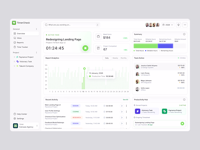
This exploration presents Timerlytics, a time tracker dashboard designed to help professionals and teams monitor working hours, track billable time, and understand productivity trends through a clear, data-driven interface. The focus is on turning raw time data into actionable insights without disrupting daily workflows.
The Challenge
Many time tracking tools feel either too basic or overly complex. Users often struggle to understand where their time goes, how productive they actually are, and how tracked hours translate into earnings. The challenge was to present time, revenue, and performance metrics in a way that feels transparent, motivating, and easy to scan at a glance.
Design Approach
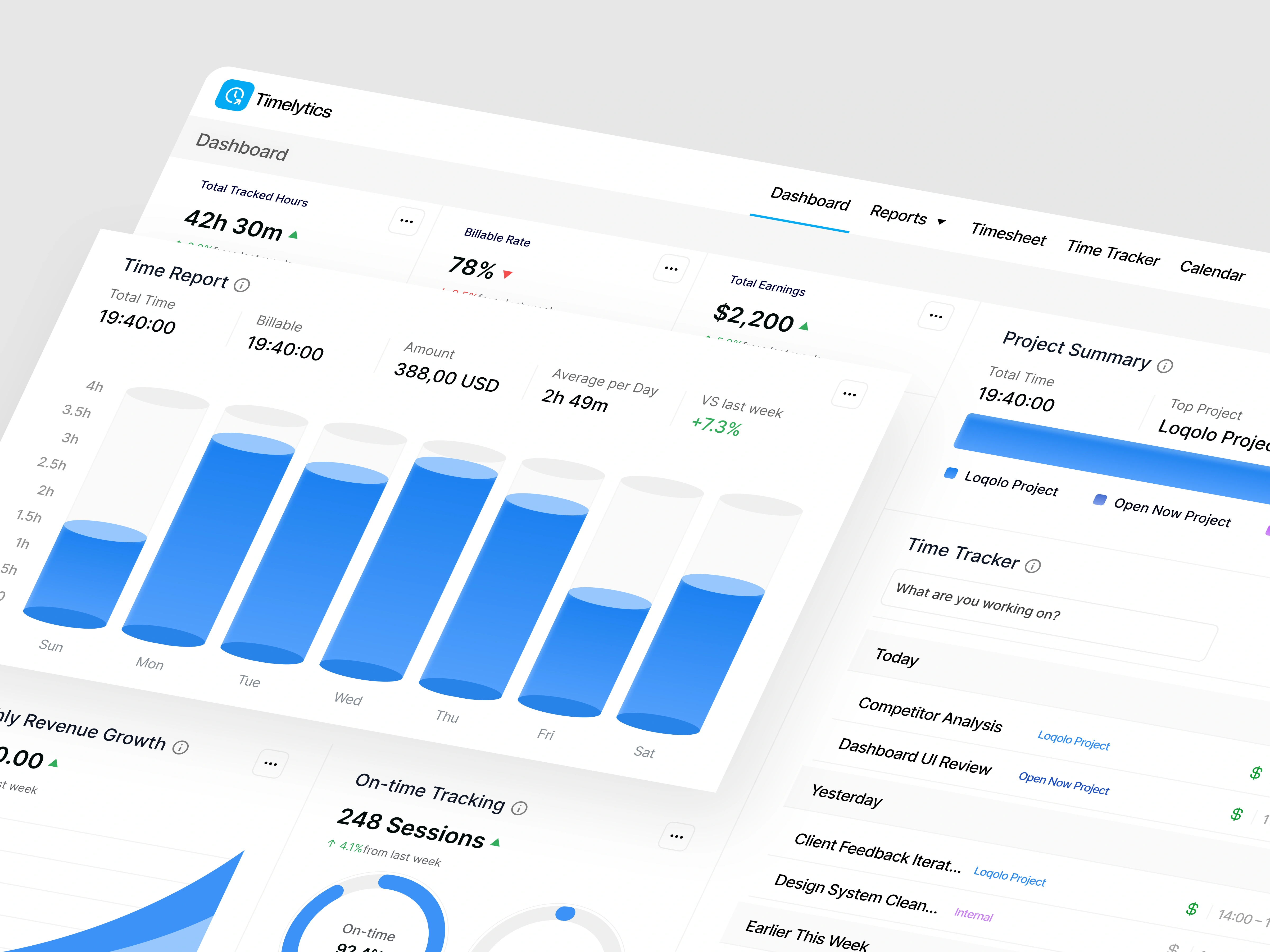
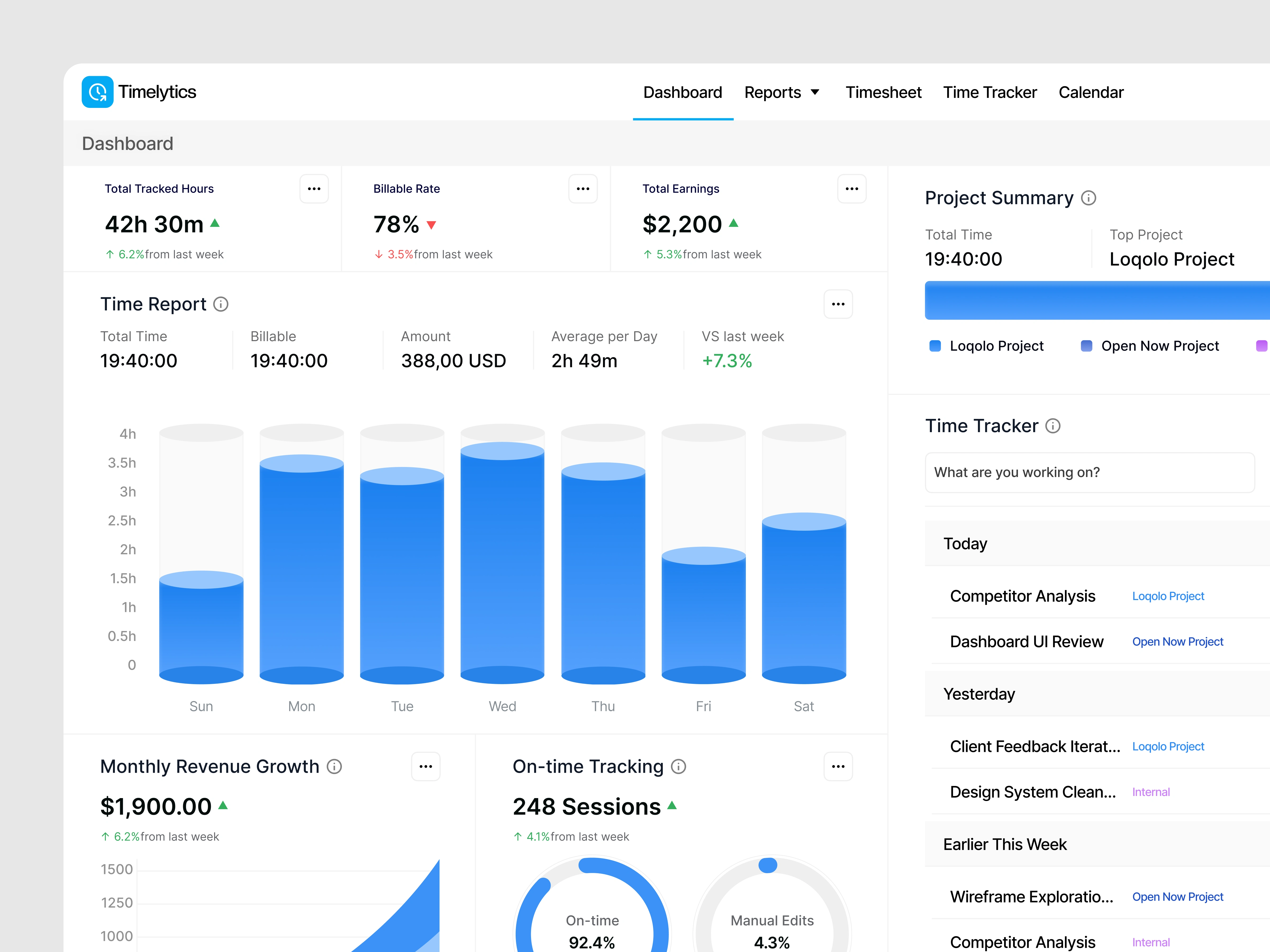
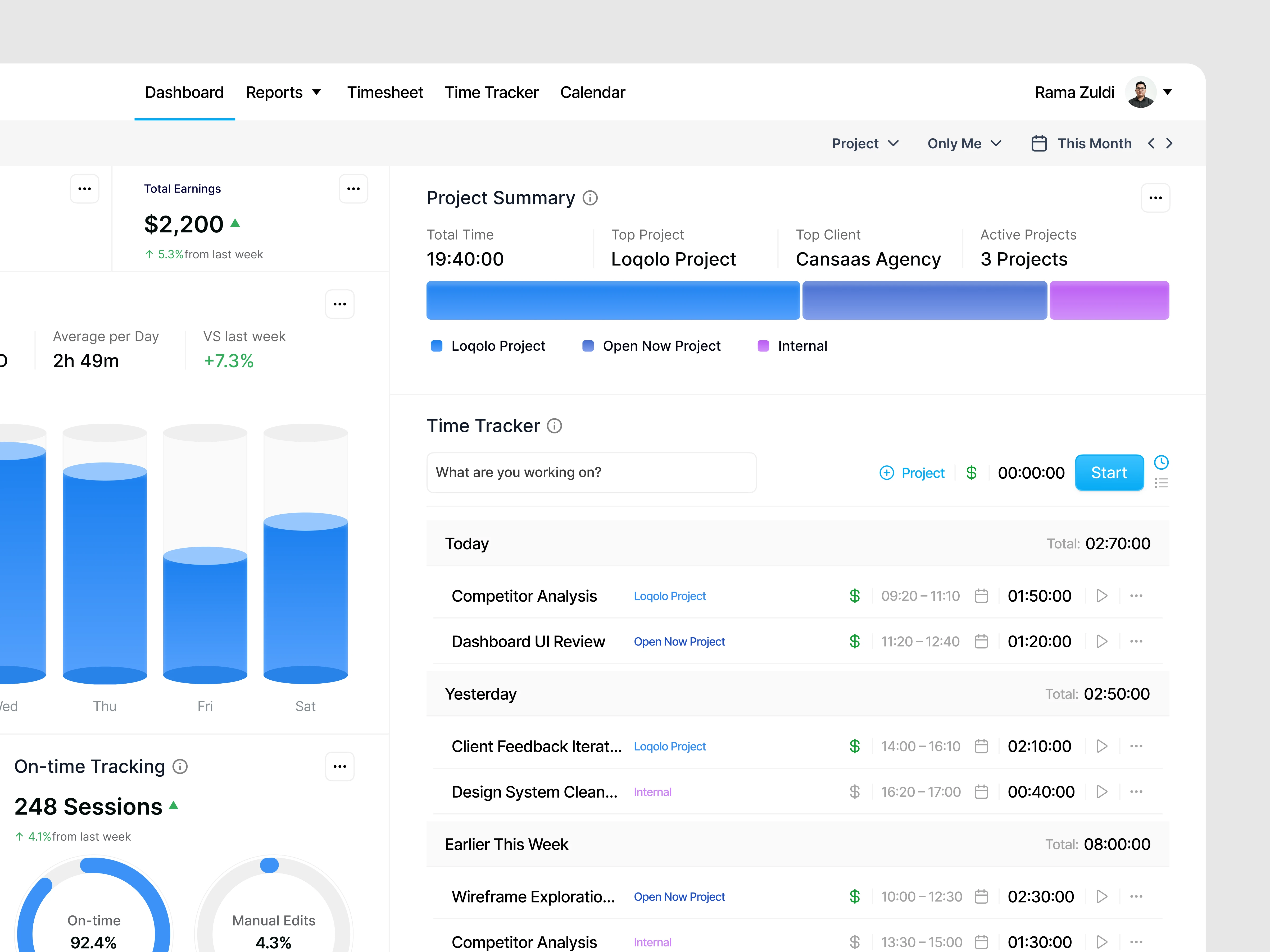
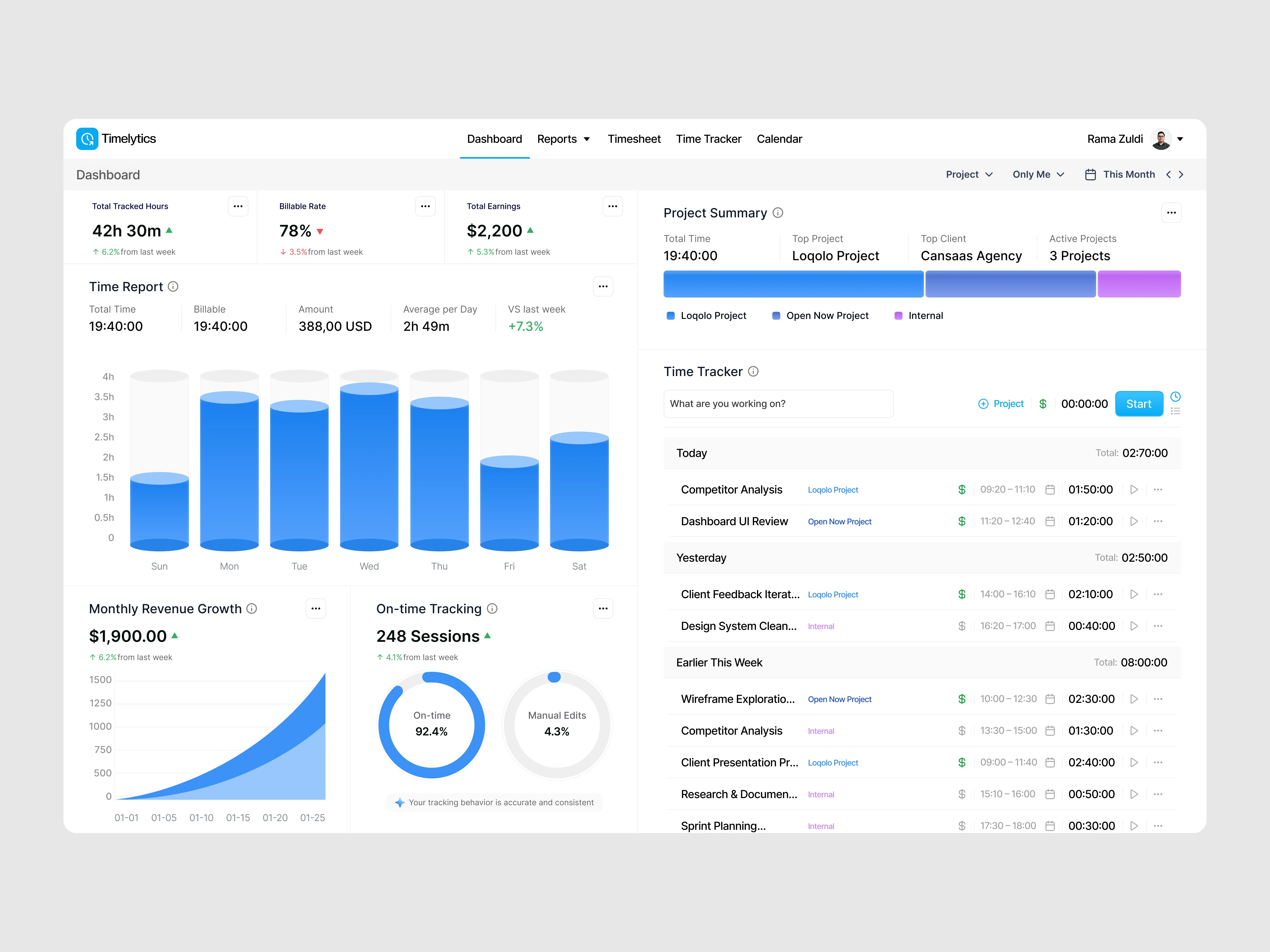
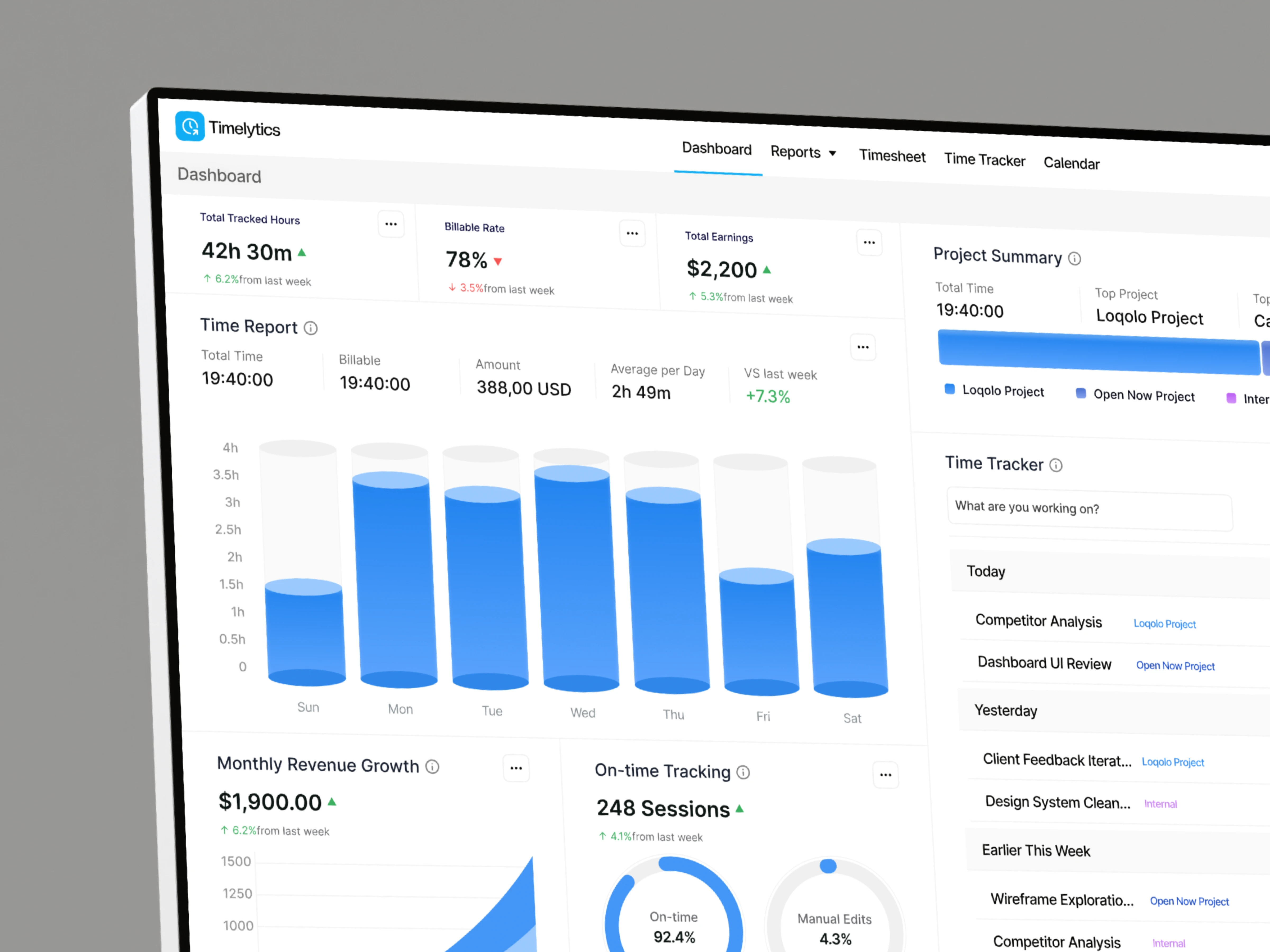
The dashboard is structured around clarity and hierarchy. Key metrics such as total tracked hours, billable rate, and earnings are surfaced at the top, supported by visual reports and daily breakdowns. The layout balances analytical depth with simplicity, allowing users to move seamlessly between overview and detailed activity logs.
Key Features Highlighted
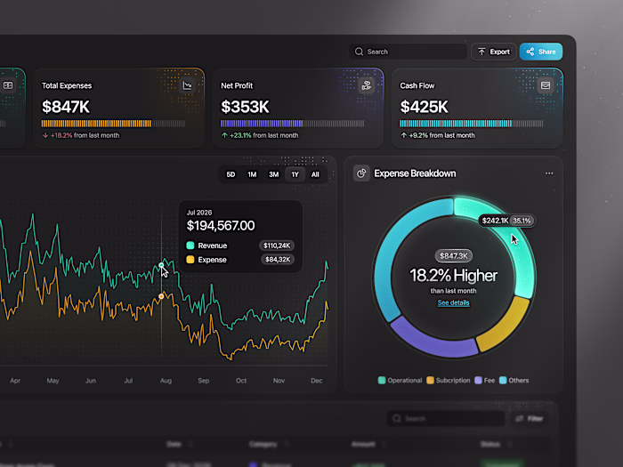
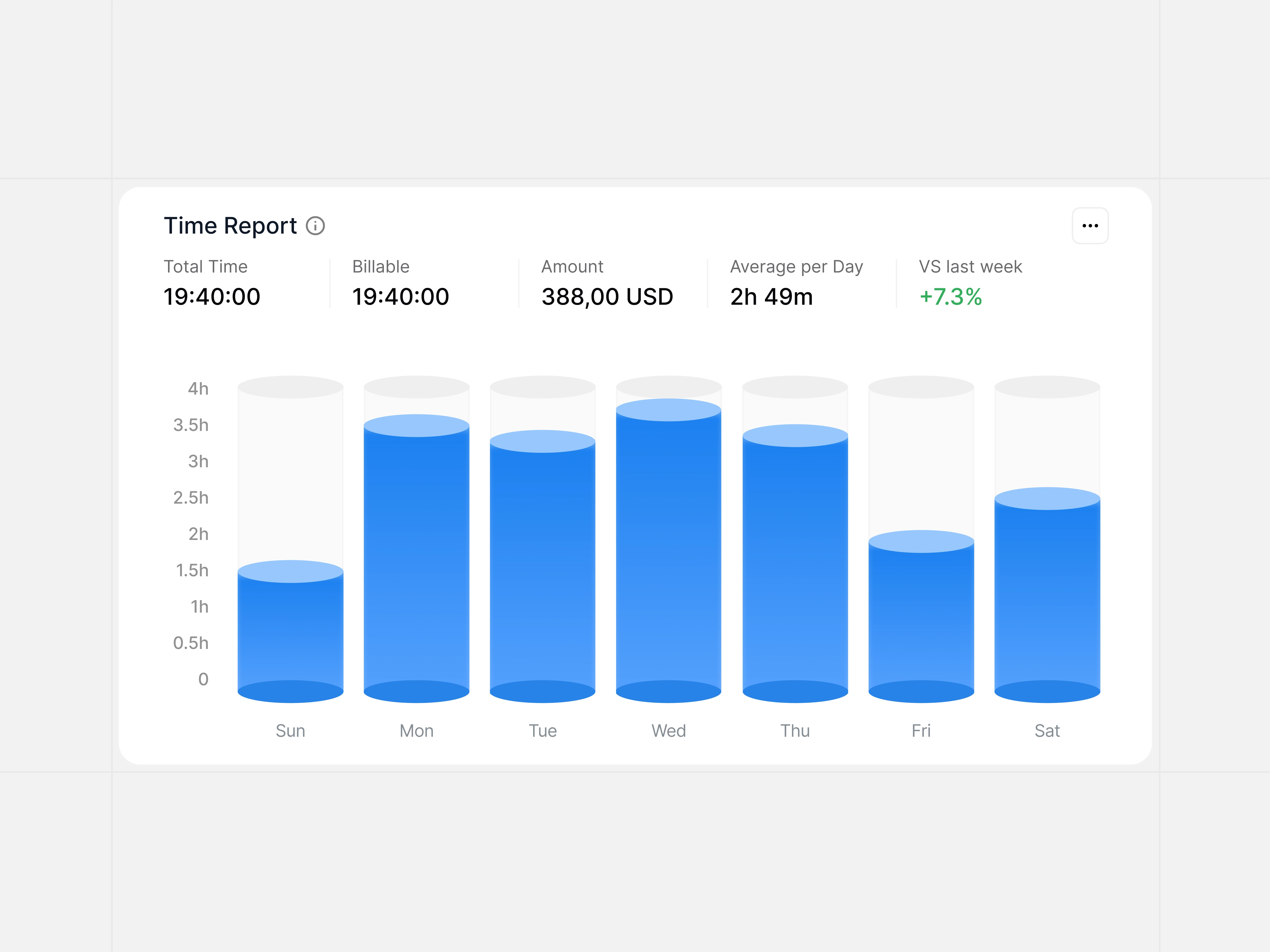
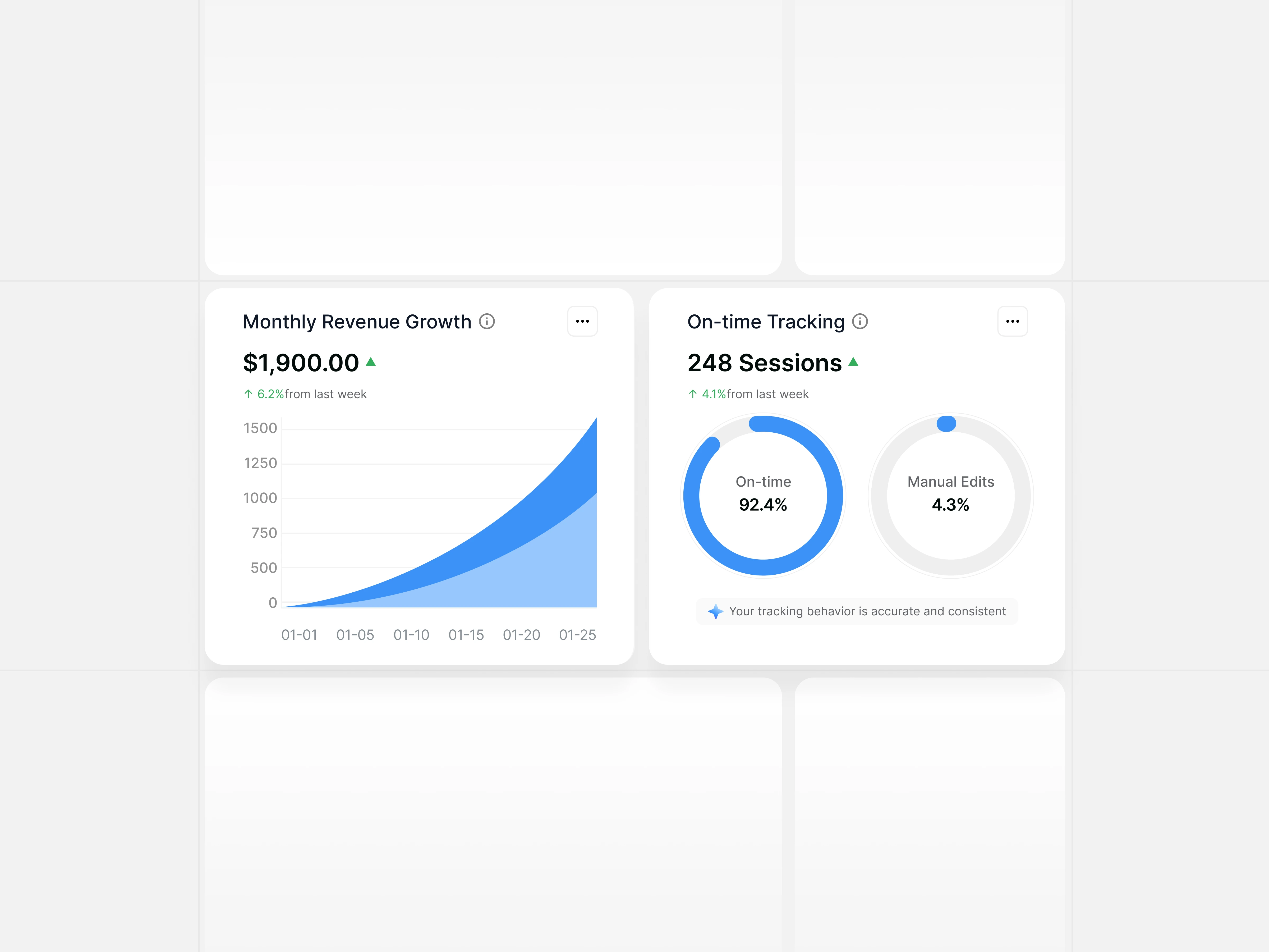
Timerlytics highlights real-time time tracking, billable vs non-billable hours, project-based summaries, revenue growth charts, and on-time tracking accuracy. Supporting charts and progress indicators help users quickly understand performance patterns and workload distribution.
Data Visualization Strategy
Visual components play a central role in translating time data into insight. Bar charts show daily effort distribution, donut charts communicate tracking accuracy, and growth charts illustrate revenue trends over time. This approach ensures that complex metrics remain readable and meaningful for both individuals and teams.
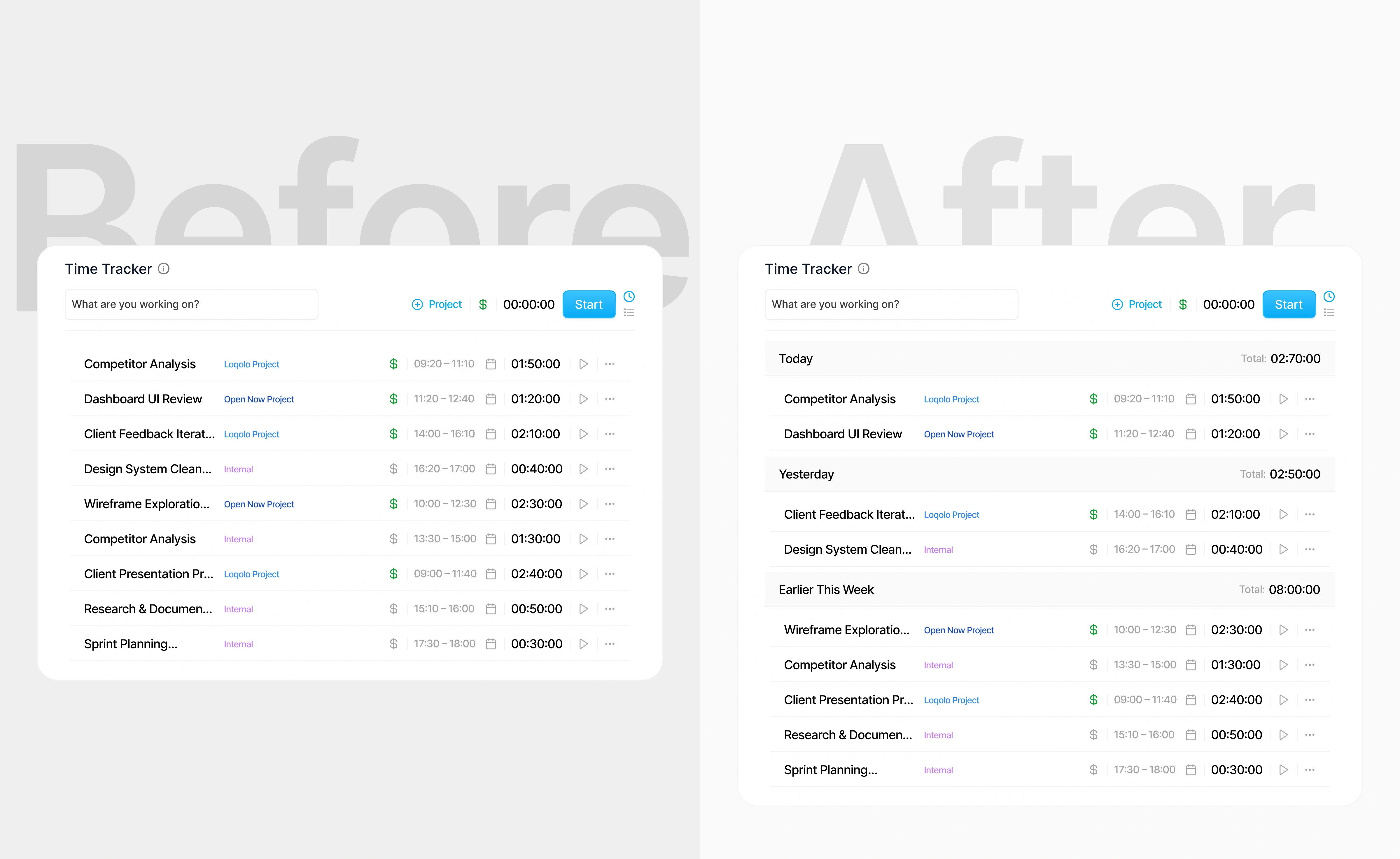
The right screen improves clarity by grouping time entries into meaningful time periods with daily summaries. This reduces cognitive load, improves scannability, and aligns with users’ natural mental models for understanding work time.(src: nngroup.com, goodui.org, lawsofux.com)
Interaction & UX Flow
The interaction flow is designed to support fast, low-effort usage. Starting and stopping timers, switching projects, and reviewing reports require minimal steps. Contextual actions and inline feedback help users stay focused on work while maintaining accurate time tracking.
The Solution and Impact
By combining clear structure, meaningful visuals, and intuitive interactions, the dashboard enables users to manage time more effectively and understand how their work translates into value. The result is a transparent, insight-driven experience that supports better productivity and decision-making.
Like this project
Posted Jan 30, 2026
Timerlytics time tracker dashboard exploration, built to surface productivity, billable hours, and performance insights with clarity.
Likes
2
Views
4