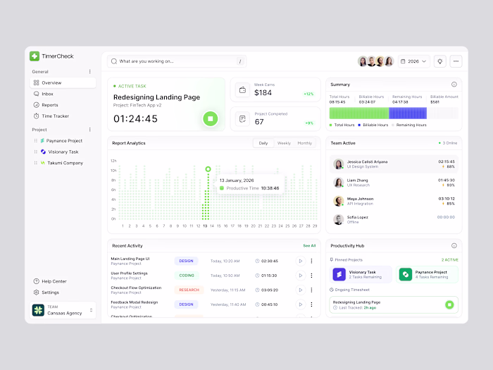
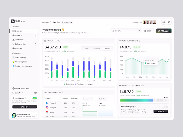
Finance Dashboard
Cansaas Agency
Overview
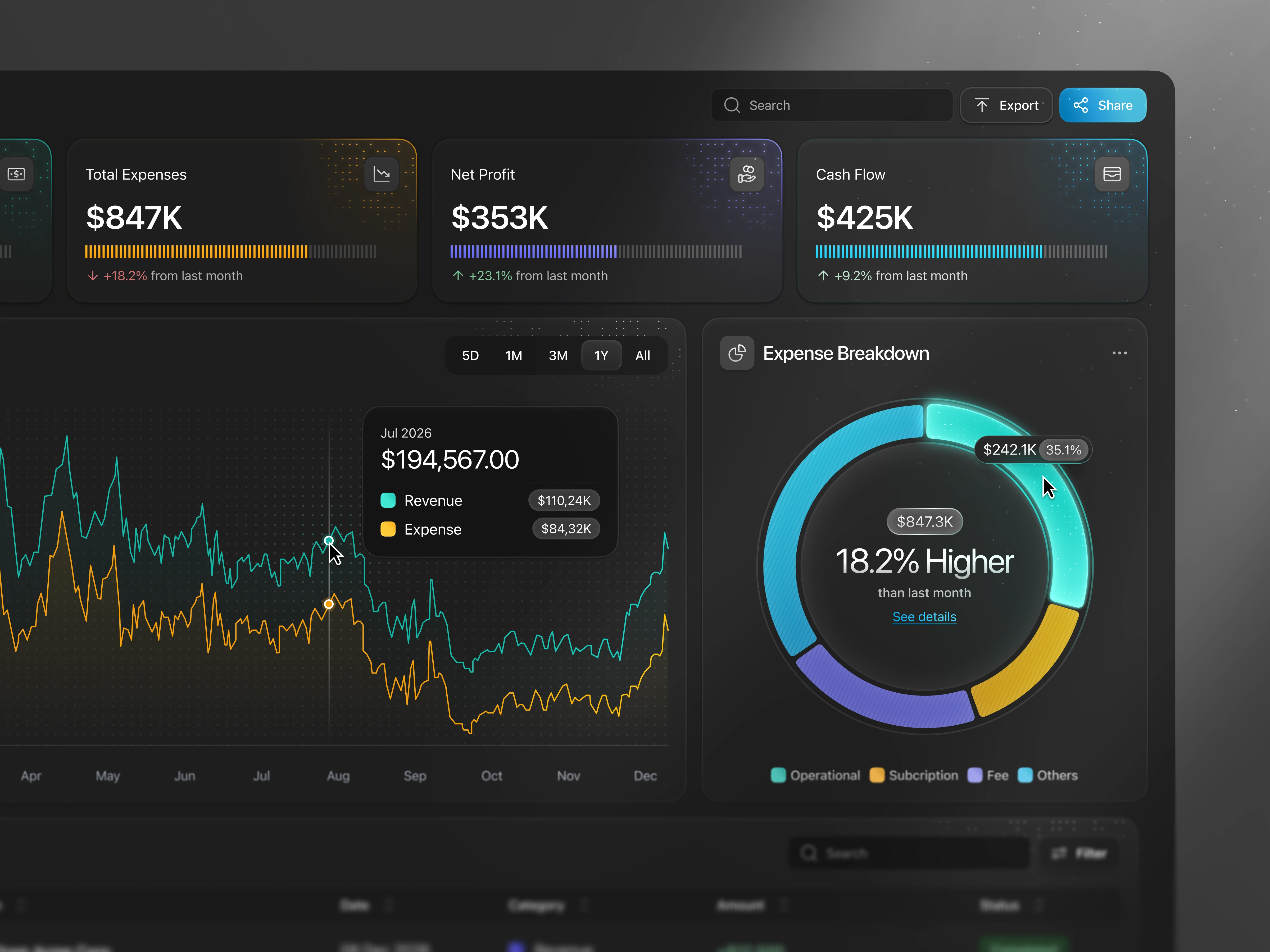
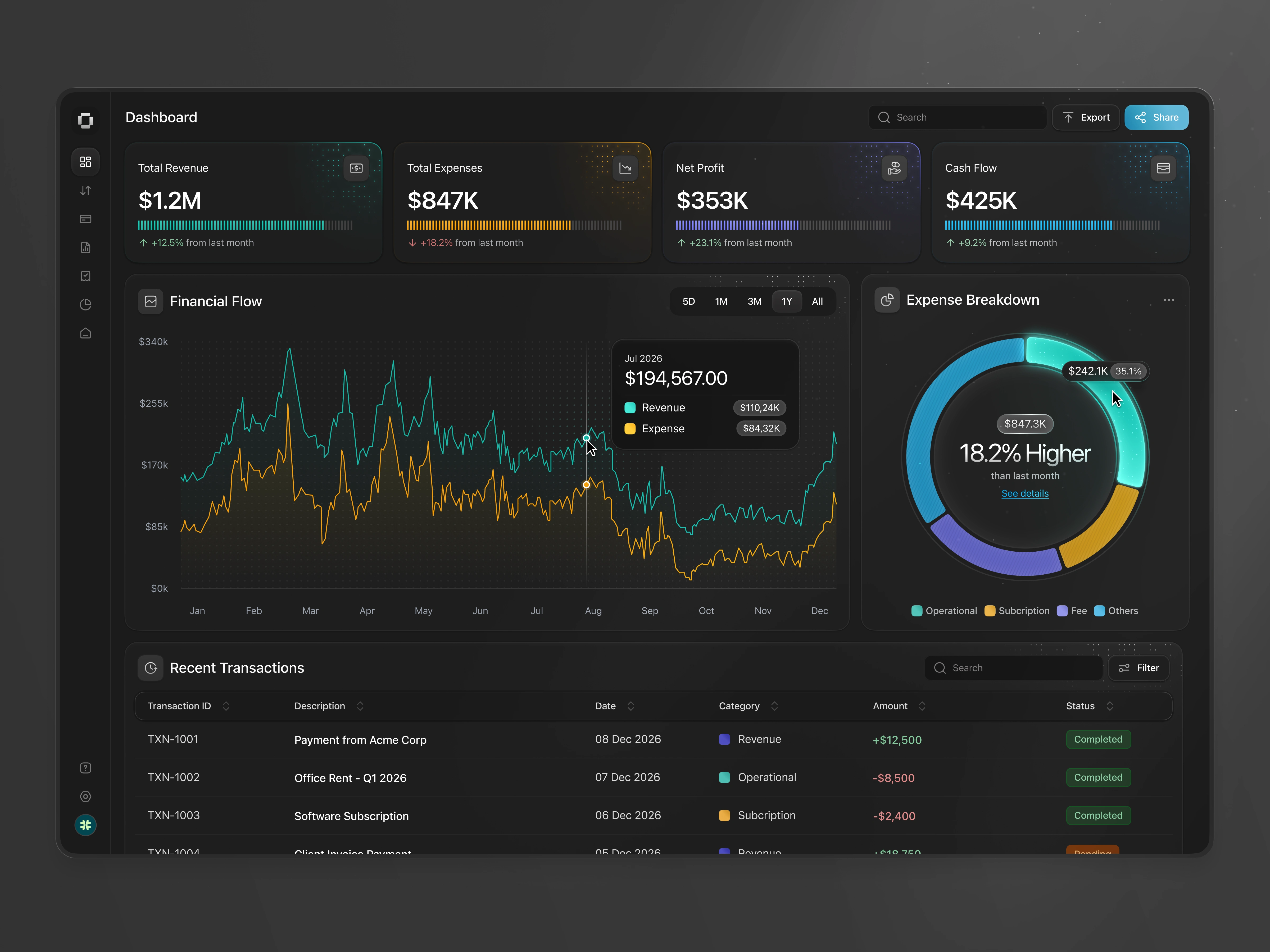
This exploration presents a finance dashboard designed to help businesses monitor revenue, expenses, cash flow, and profitability through a centralized, real-time financial overview. The dashboard focuses on making complex financial data easier to understand and act on.
The Challenge
Financial dashboards often present dense numbers and charts that require extra effort to interpret. Users can struggle to quickly assess business health, identify trends, or understand where money is coming from and going. The challenge was to surface key financial insights clearly without overwhelming users.
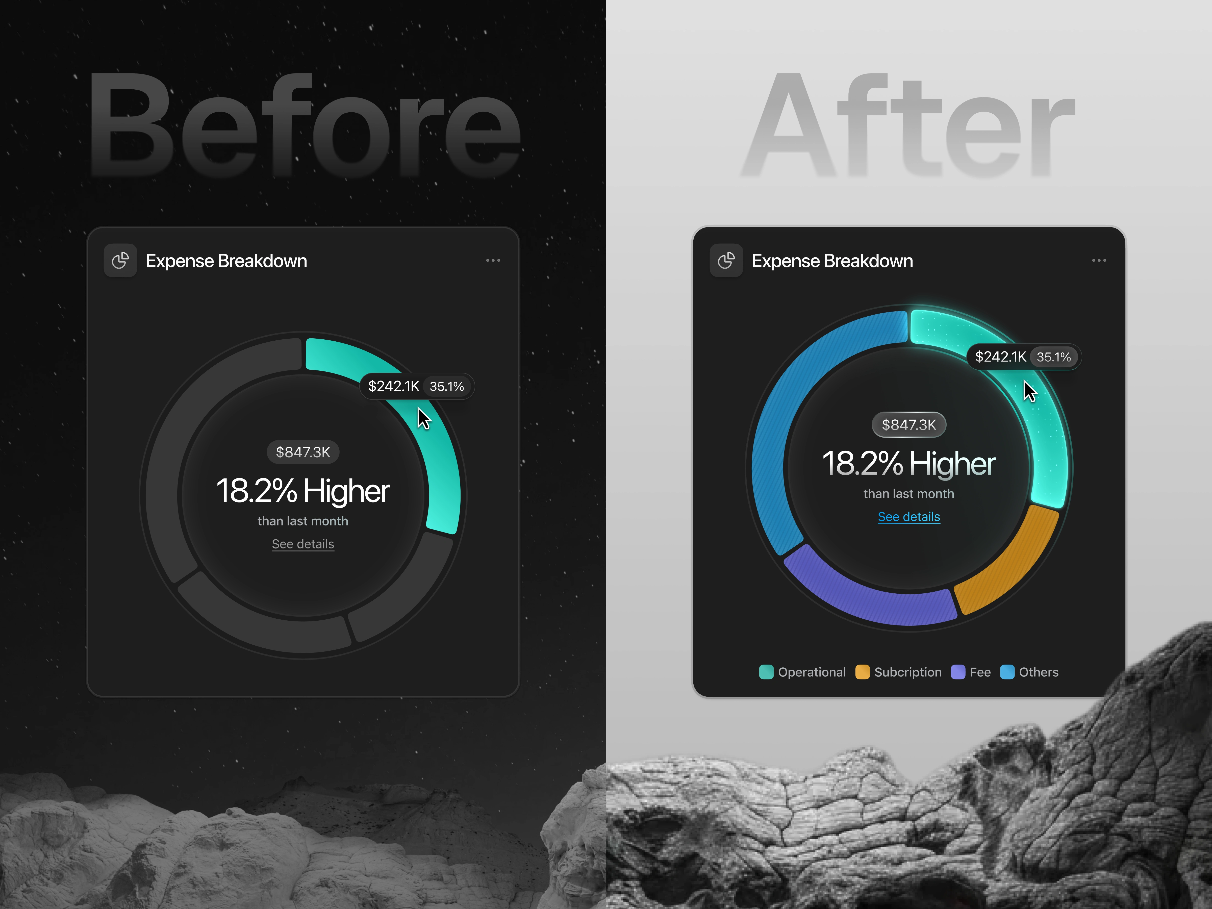
In the Before design (left), the chart relies heavily on muted tones with minimal color variation. While visually calm, this approach weakens category differentiation. Users must rely on tooltips or cognitive effort to understand which expense segments are significant, slowing insight discovery.
Design Approach
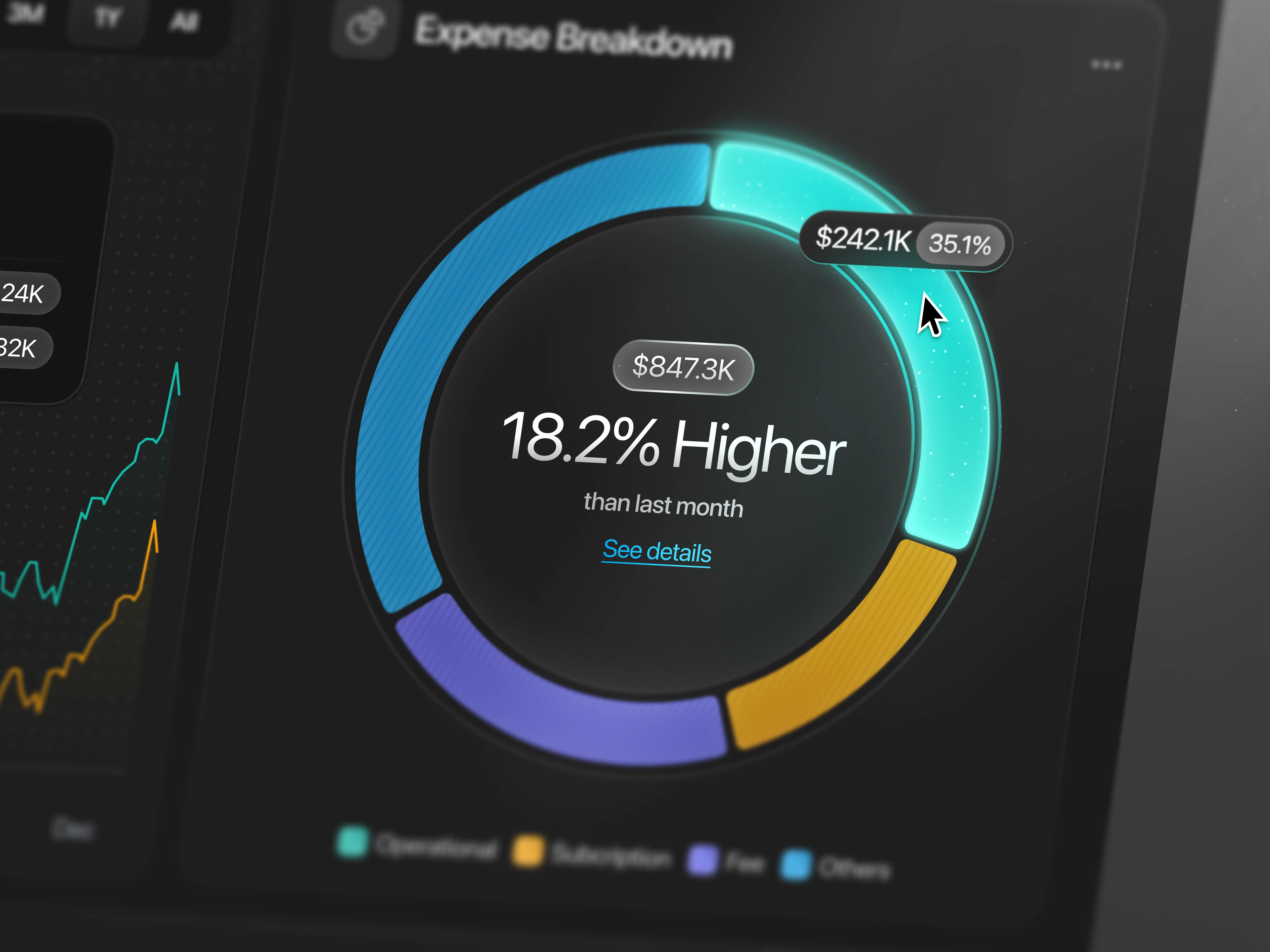
We designed the dashboard with a strong emphasis on hierarchy and visual clarity. Key financial metrics such as total revenue, expenses, net profit, and cash flow are highlighted upfront, supported by trend charts and breakdown visualizations. Dark UI styling and subtle color accents help differentiate data categories while maintaining focus.
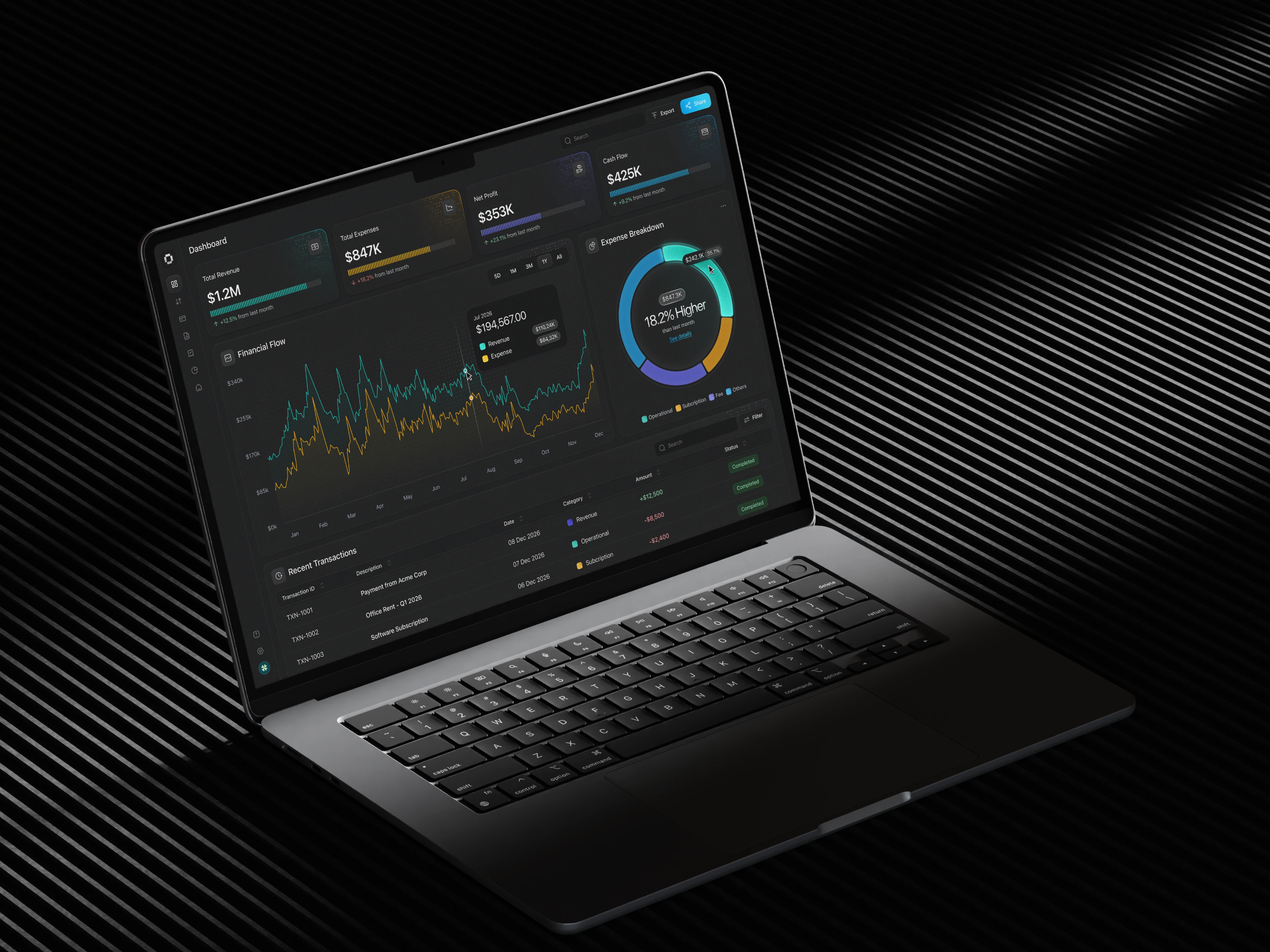
The Solution and Impact
By translating raw financial data into structured, easy-to-scan visuals, this finance dashboard enables users to monitor performance, identify issues early, and make more confident financial decisions. The result is a clearer, more actionable financial management experience.
Like this project
Posted Jan 28, 2026
Finance dashboard exploration designed to visualize revenue, expenses, cash flow, and profitability through a clean, structured, insight-driven layout.
Likes
2
Views
8