Navin - Finance Brand Guidelines
Cansaas Agency
Overview: Crafting a Disruptive Identity for Navin Finance
This Brand Identity Case Study showcases the Visual Identity System developed for Navin, a forward-thinking finance brand aiming to redefine its presence in the competitive FinTech sector. Our mandate was to create a robust and memorable Corporate Identity Design that balances the necessary gravitas of finance with a modern, tool-oriented approach. The resulting Brand Guidelines document details a sophisticated, high-contrast aesthetic designed for clarity and authority, ensuring brand recognition and seamless digital application across all user interfaces and marketing materials.
The Challenge:
The prevailing challenge for Navin was achieving differentiation within the crowded financial market, where many brands rely on conservative blue and green palettes. We needed a Brand Strategy that would position Navin not merely as a service provider, but as an essential tool a partner in precision financial management. The core problem was designing a Minimalist Logo Design and a Modern Color Palette that could convey both innovation and unwavering trust, without resorting to industry clichés that often dilute brand personality.
The Design Strategy & Iconography:
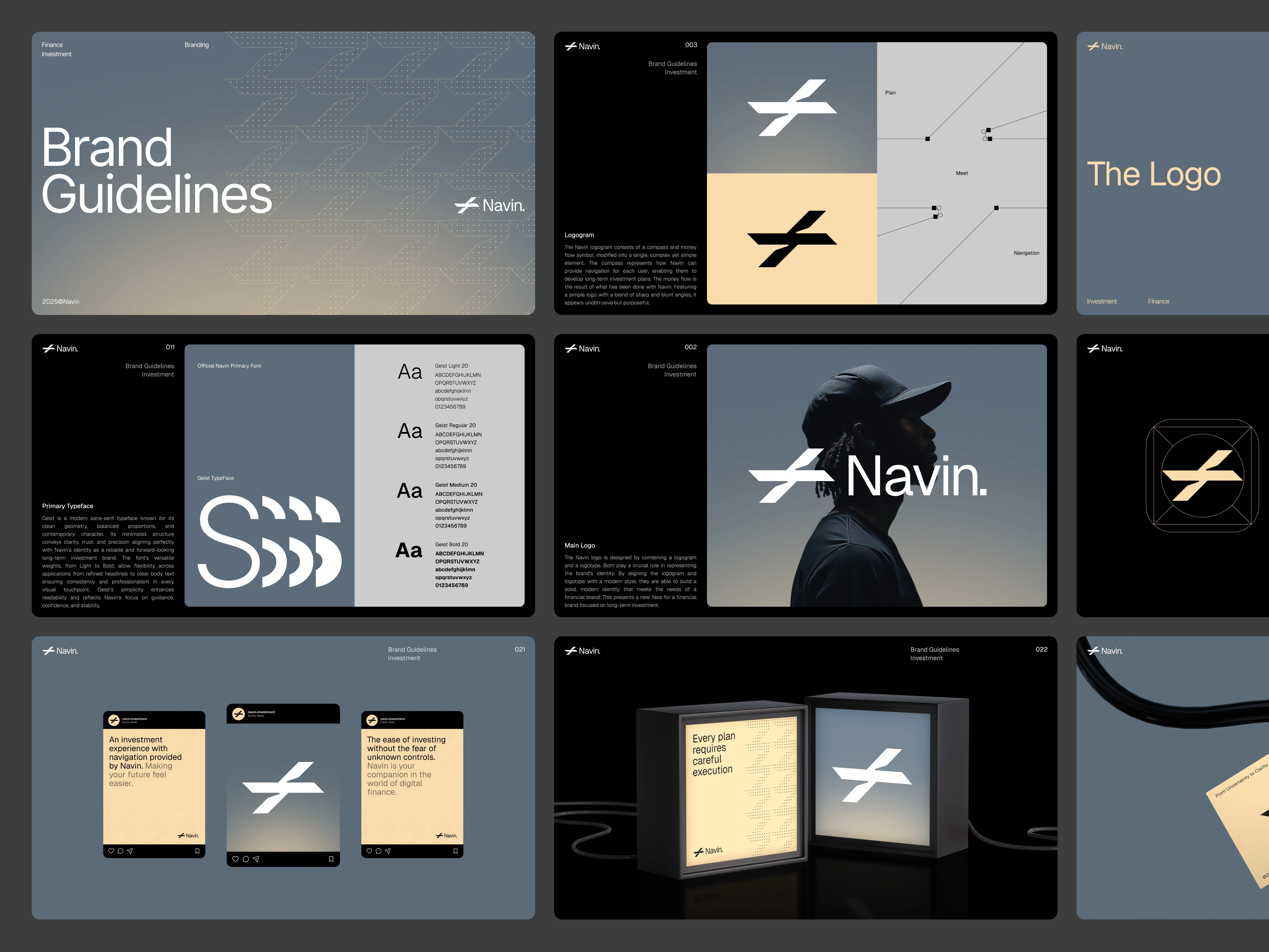
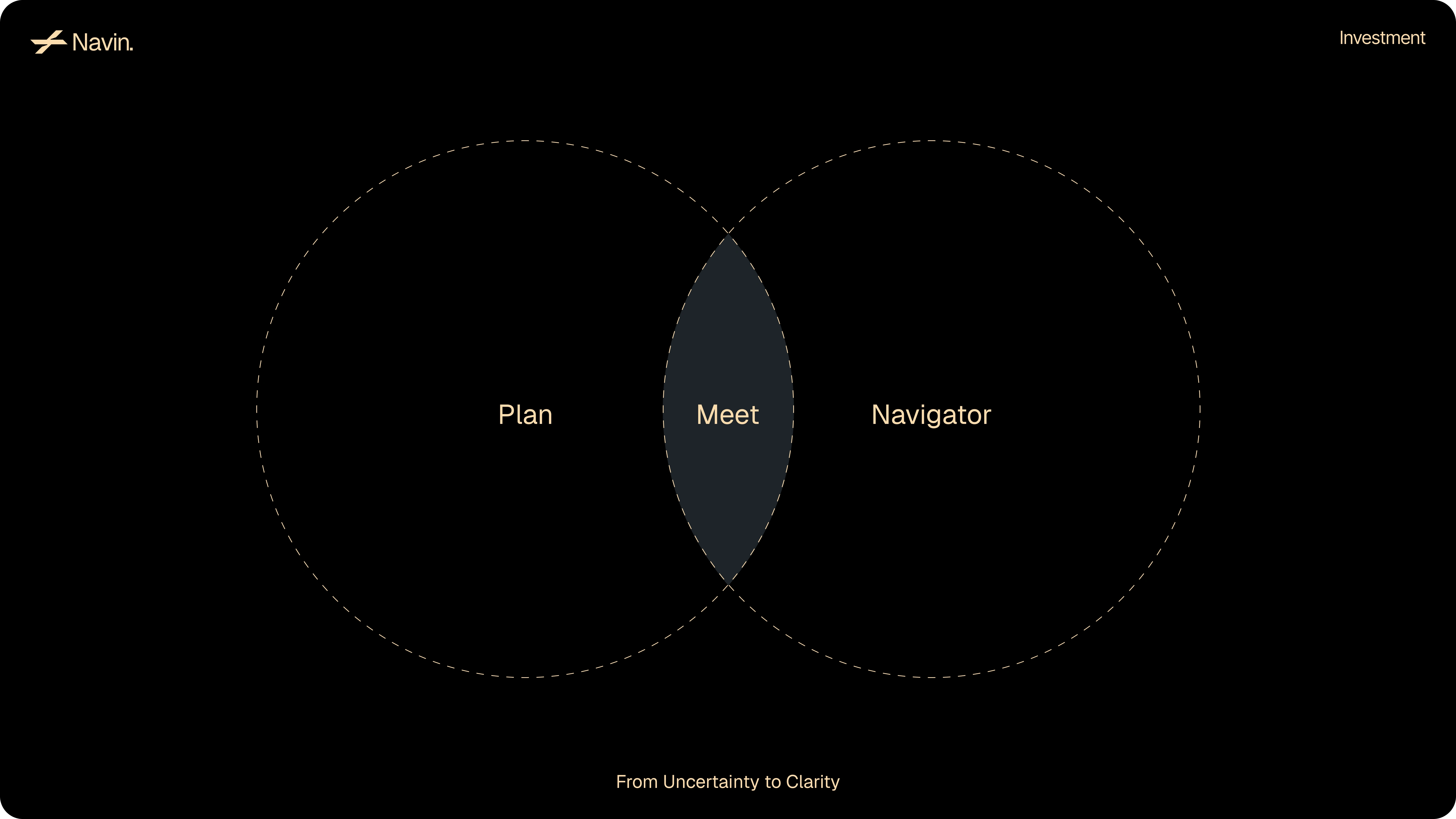
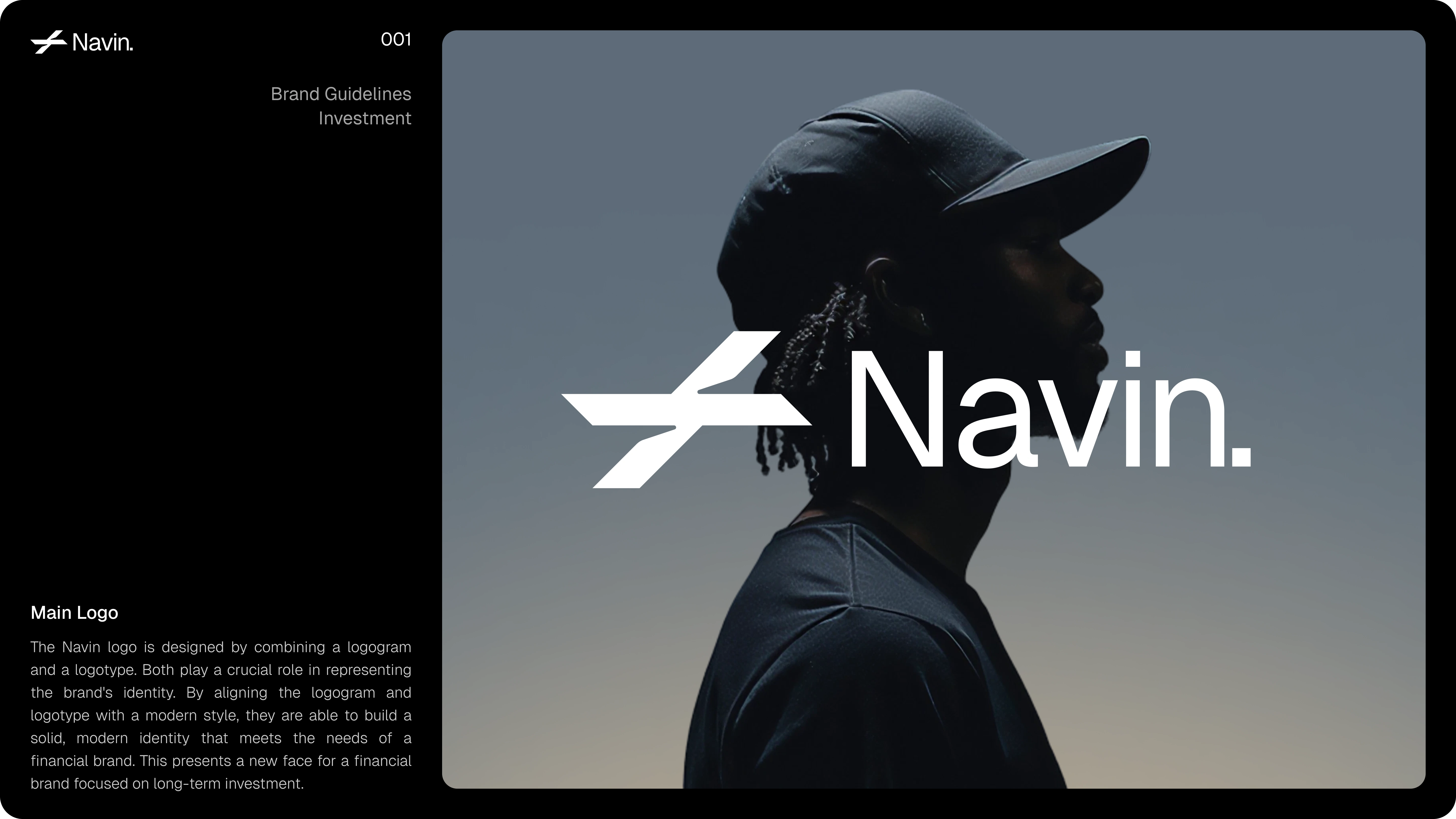
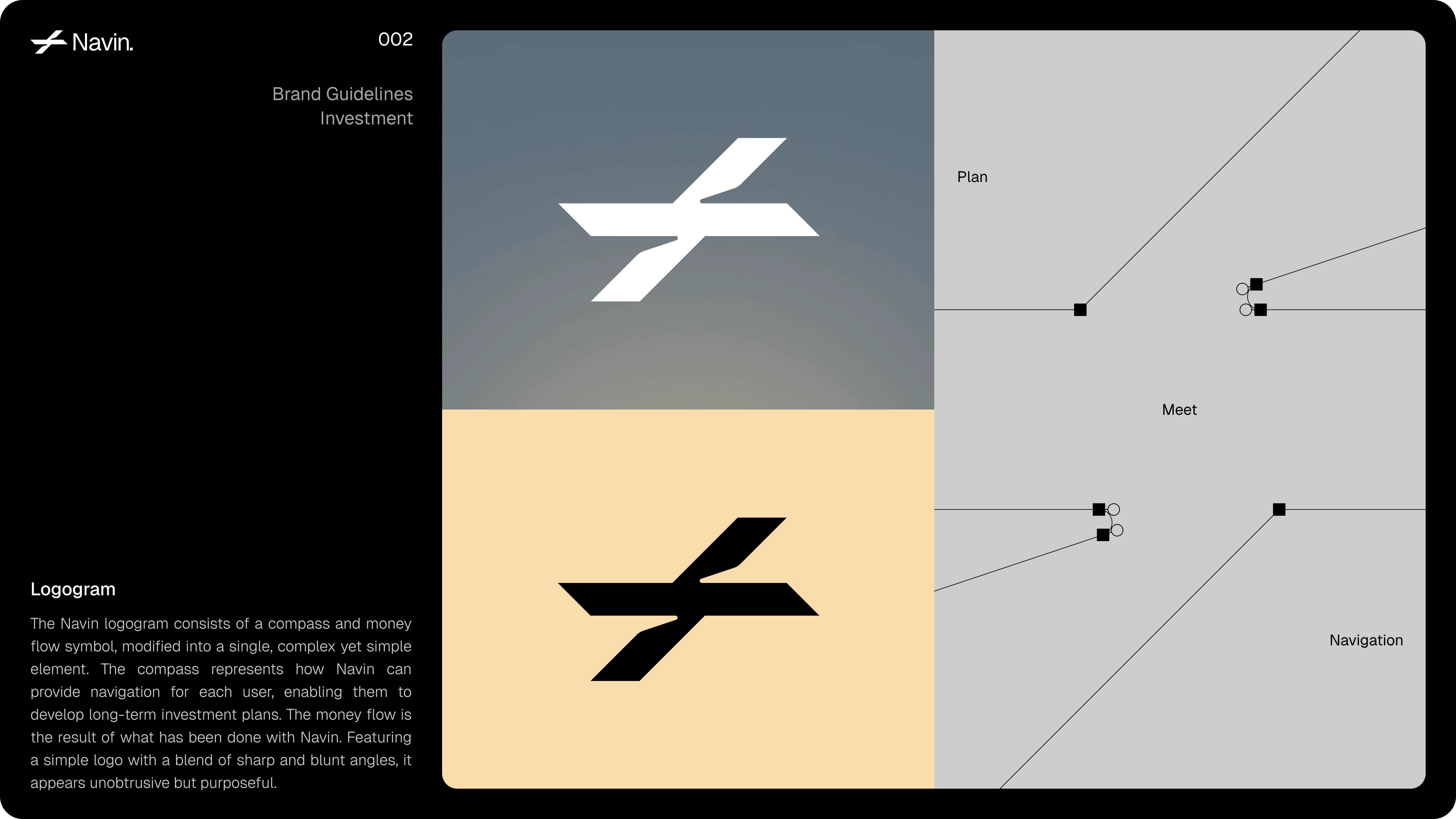
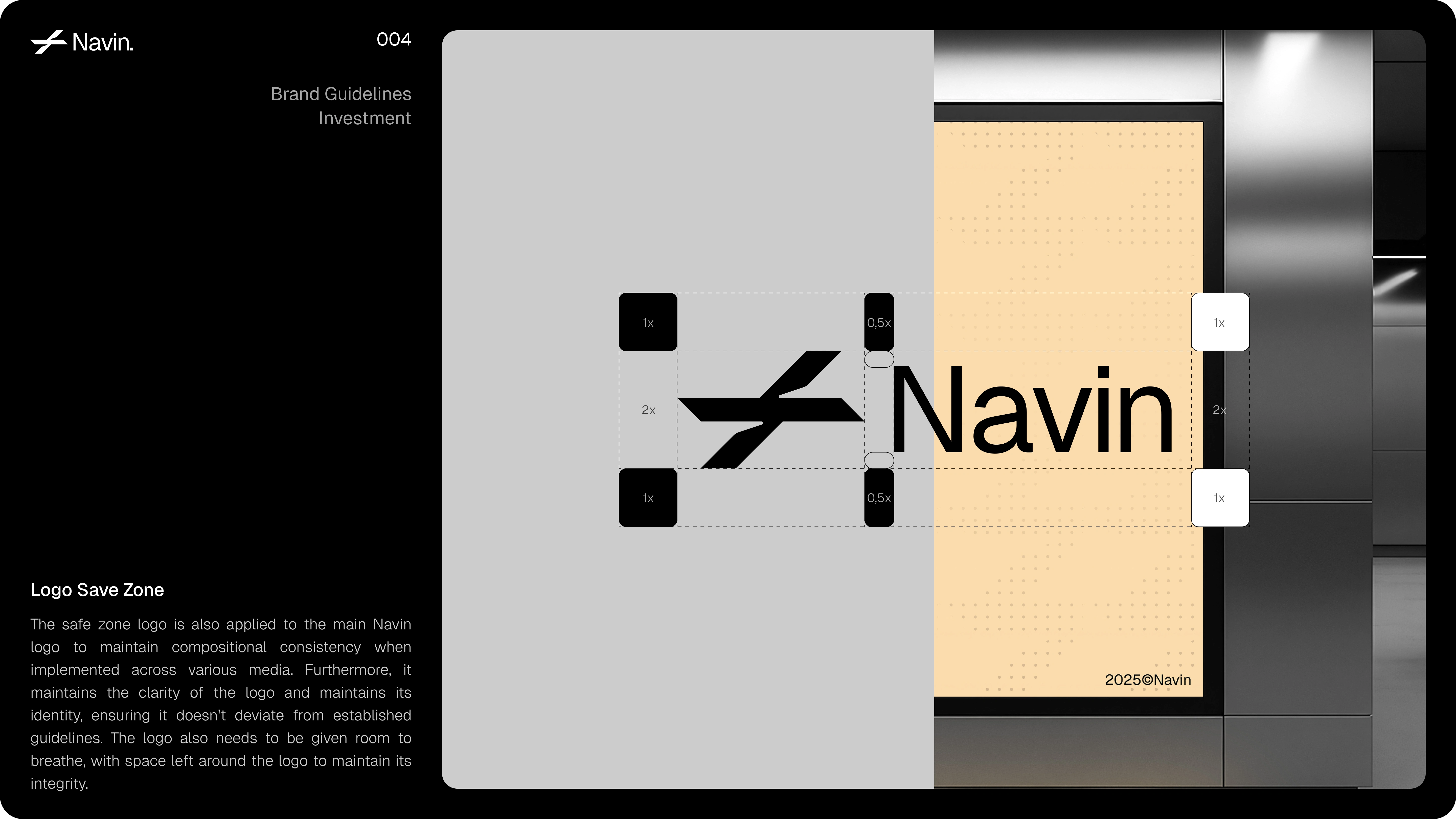
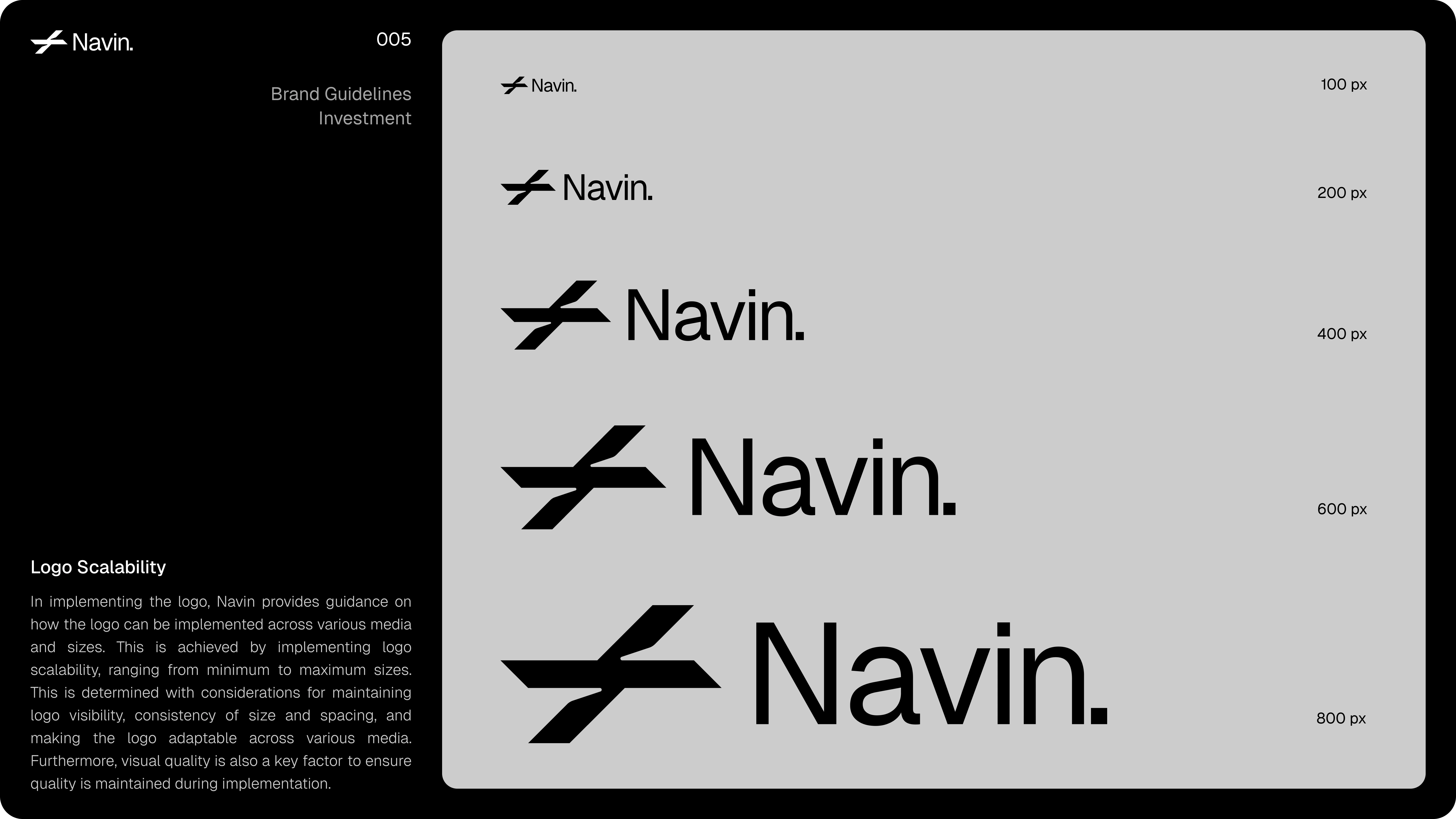
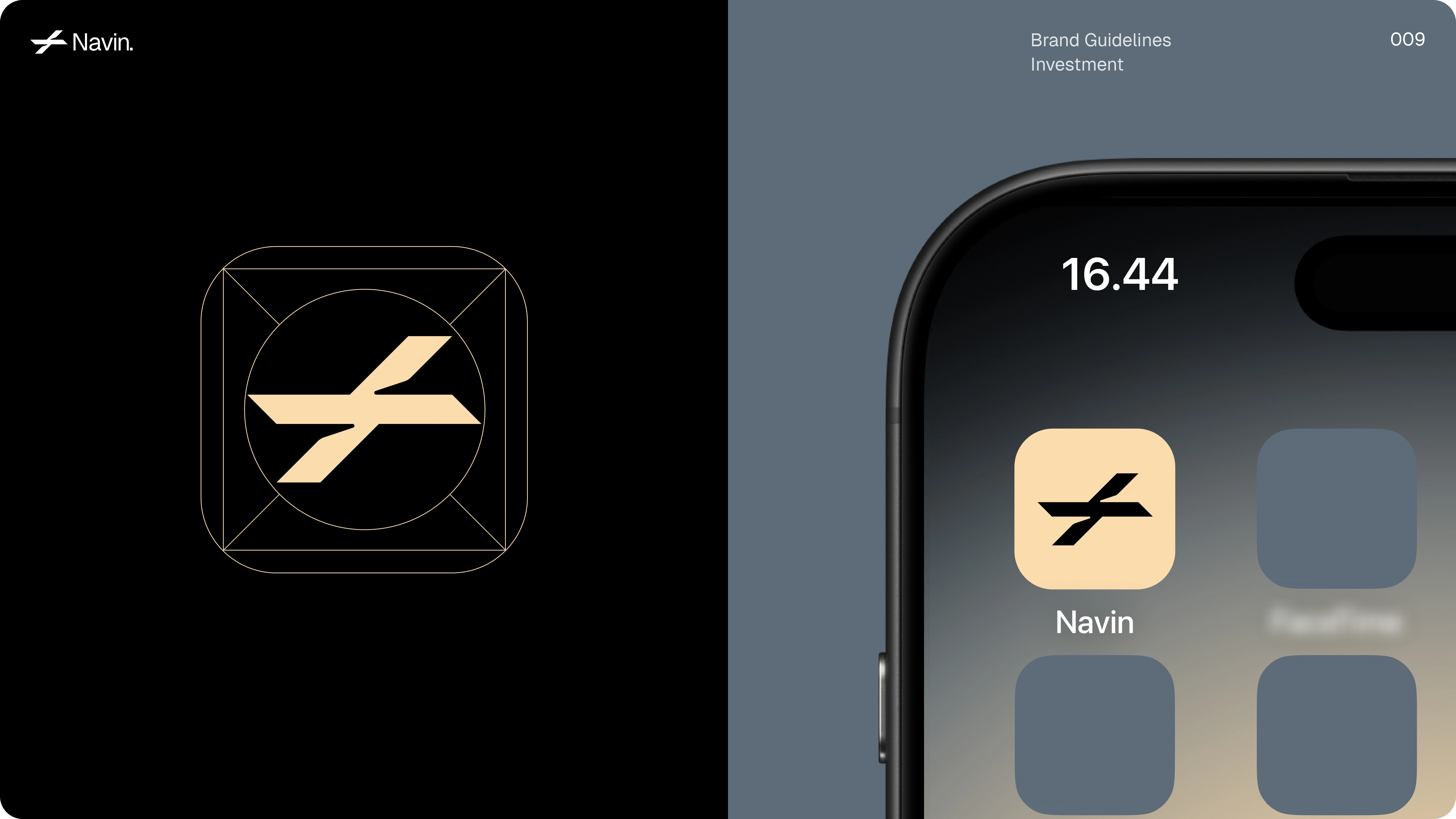
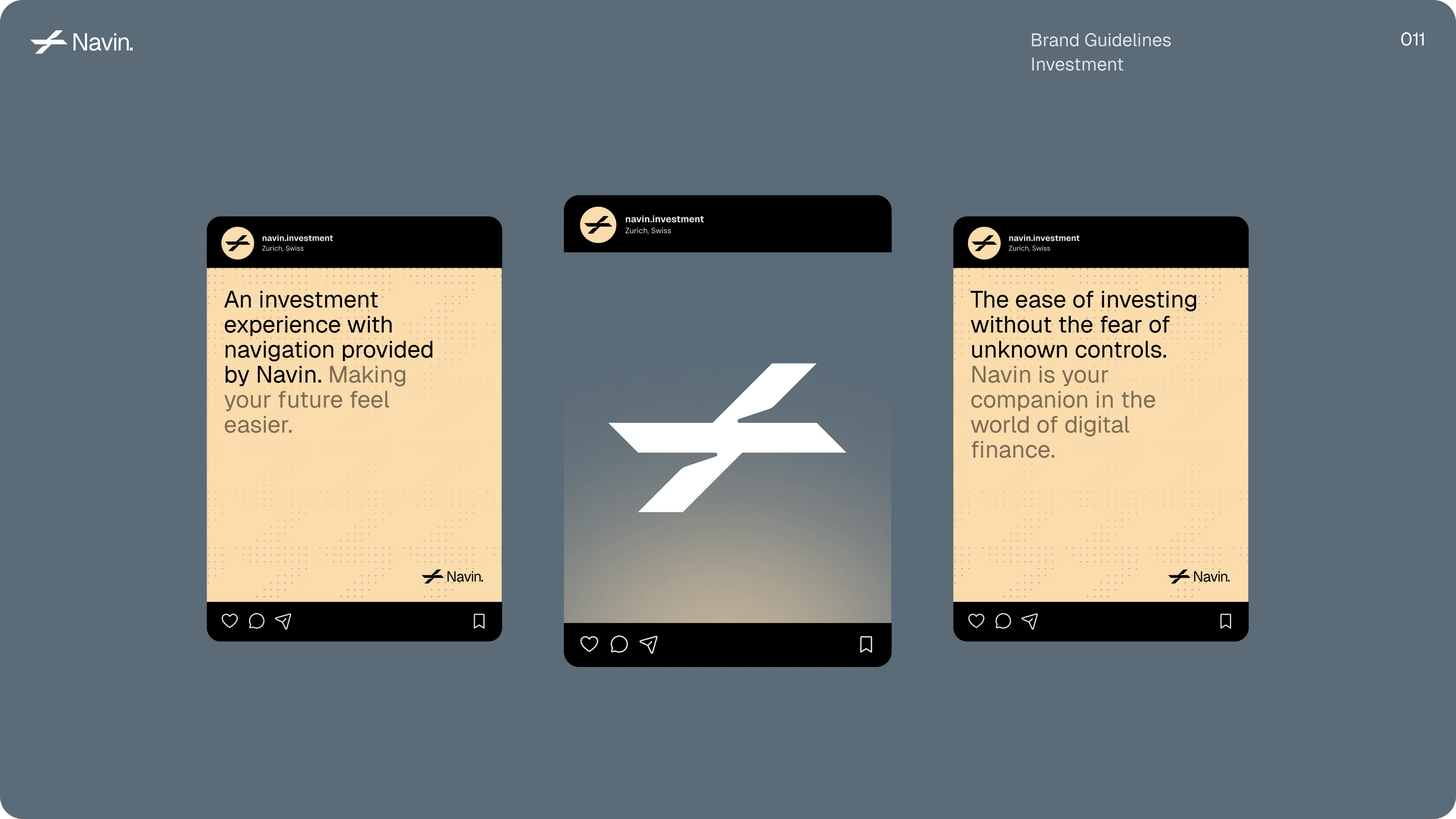
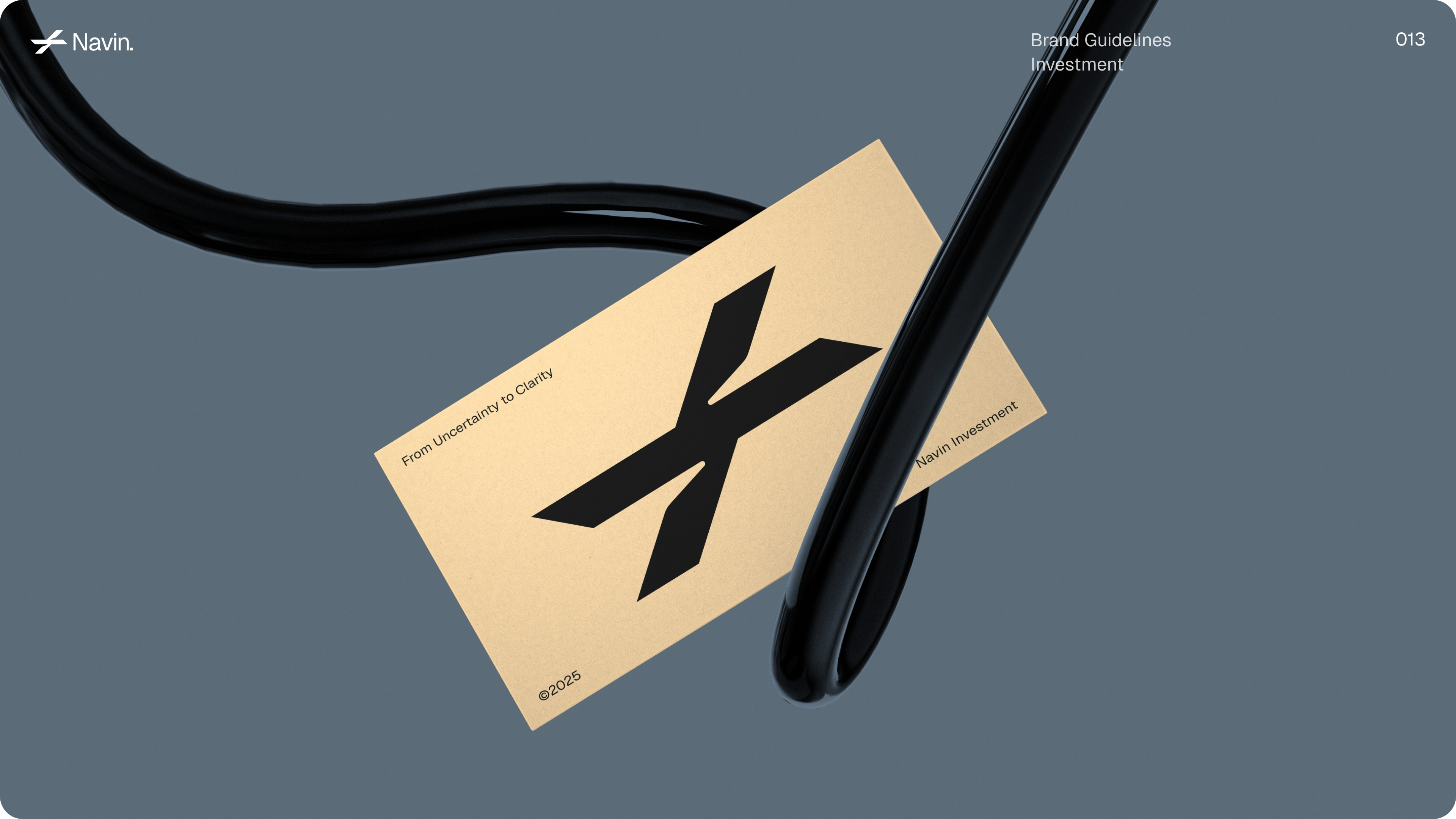
Our strategy centered on a highly unique Logo Design, adopting a stylized wrench icon. This bold choice immediately communicates Navin’s role as an empowering financial tool, signaling precision, repair, and the act of actively building wealth. This potent symbol is paired with a clean, confident sans-serif typeface, adhering to minimalist principles. The high-contrast visual system utilizes stark black and white for maximum clarity, providing a strong foundation for the detailed Brand Asset Management documented within the guidelines.
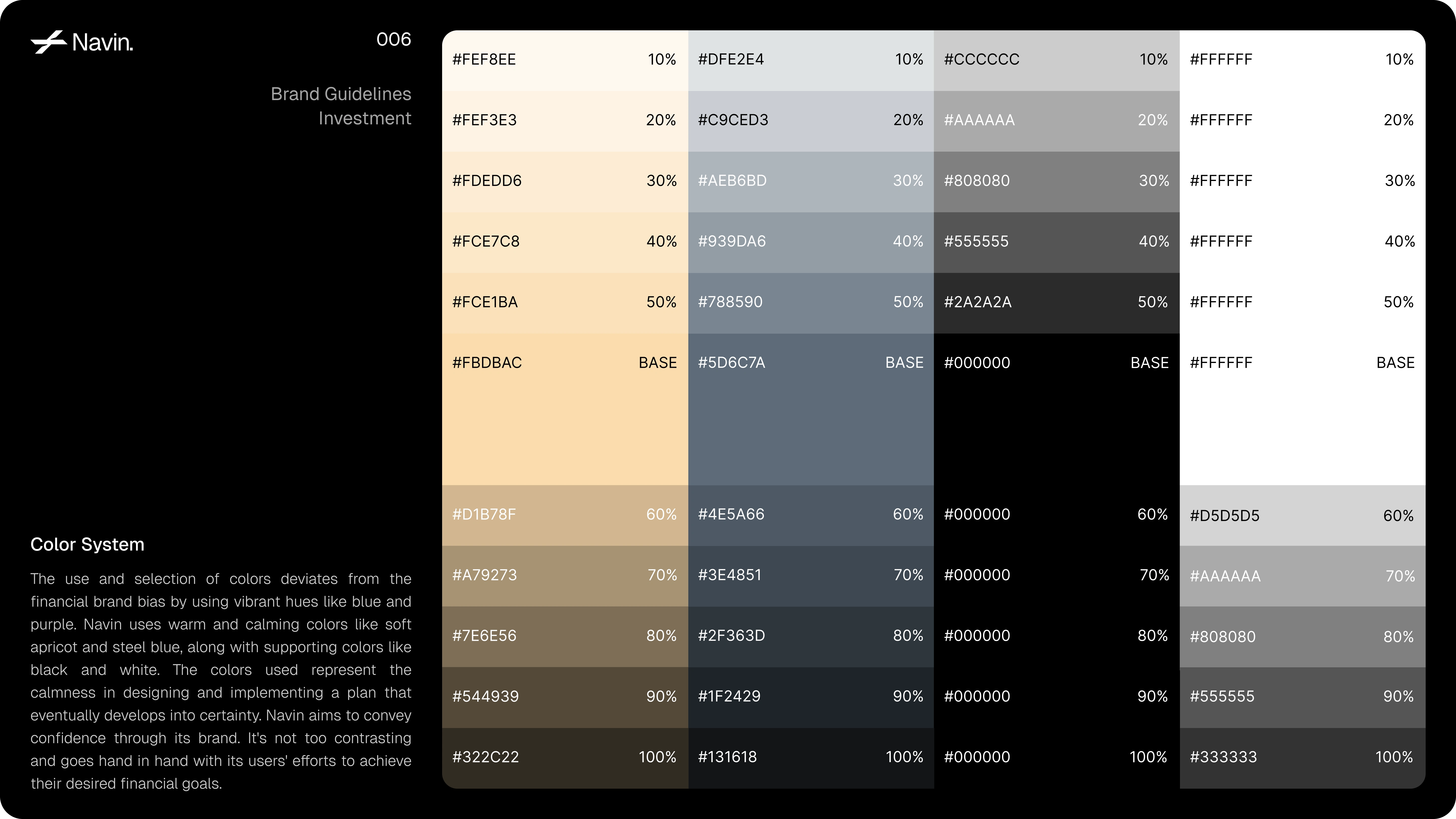
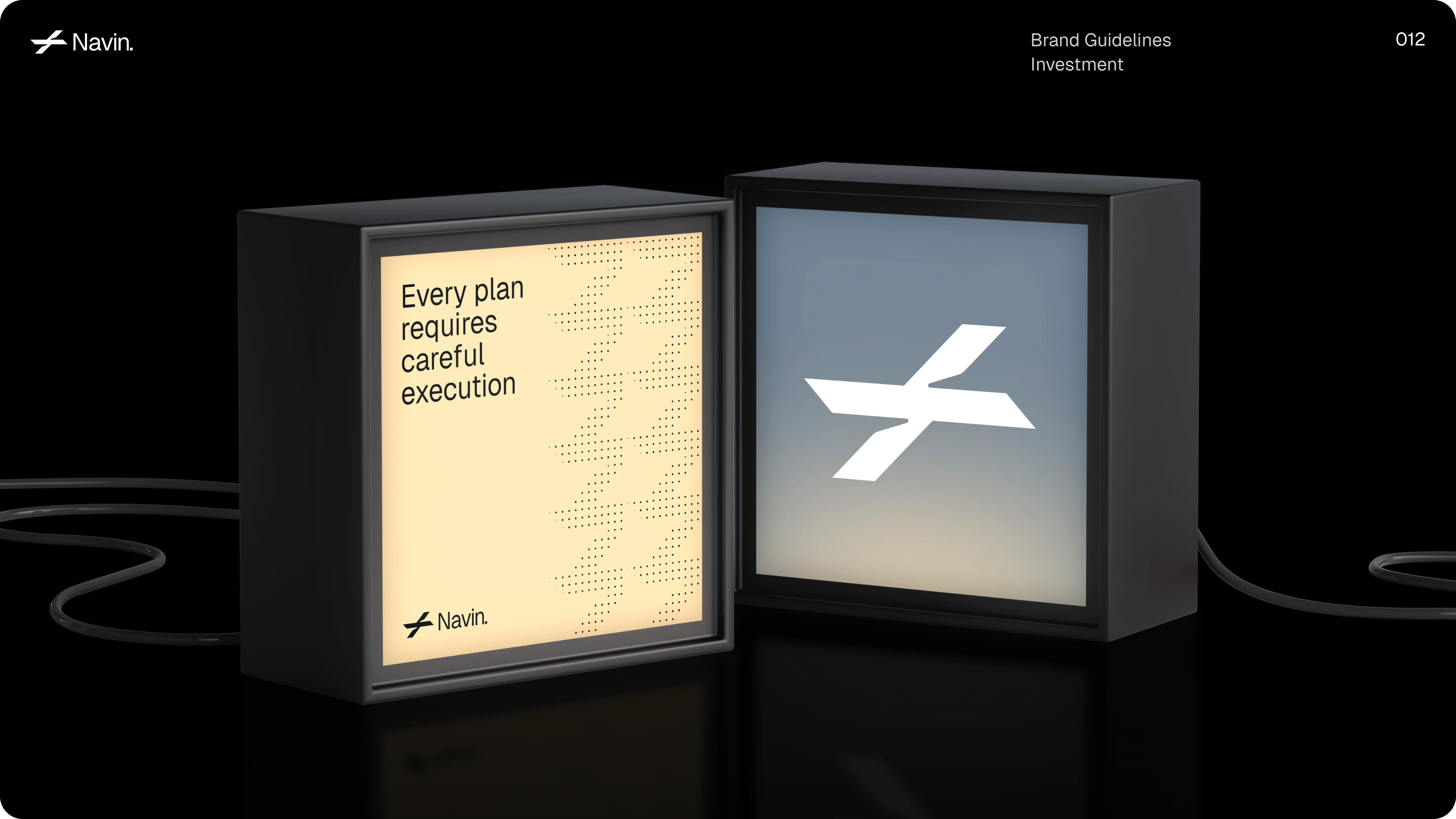
A refined color system built to challenge the conventional tones of finance. Navin blends soft apricot and steel blue with neutral blacks and whites, creating a balance between warmth, confidence, and clarity.
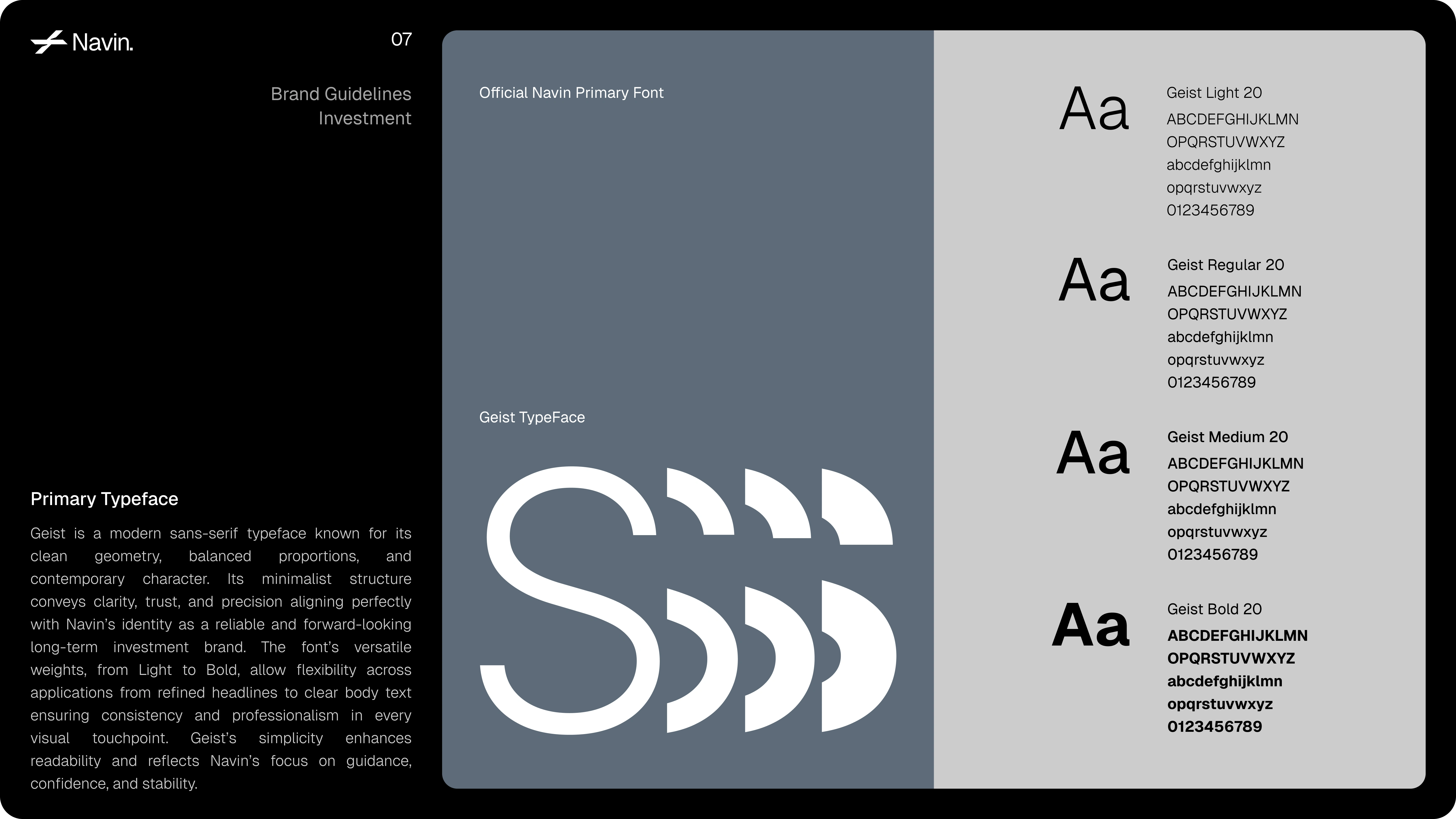
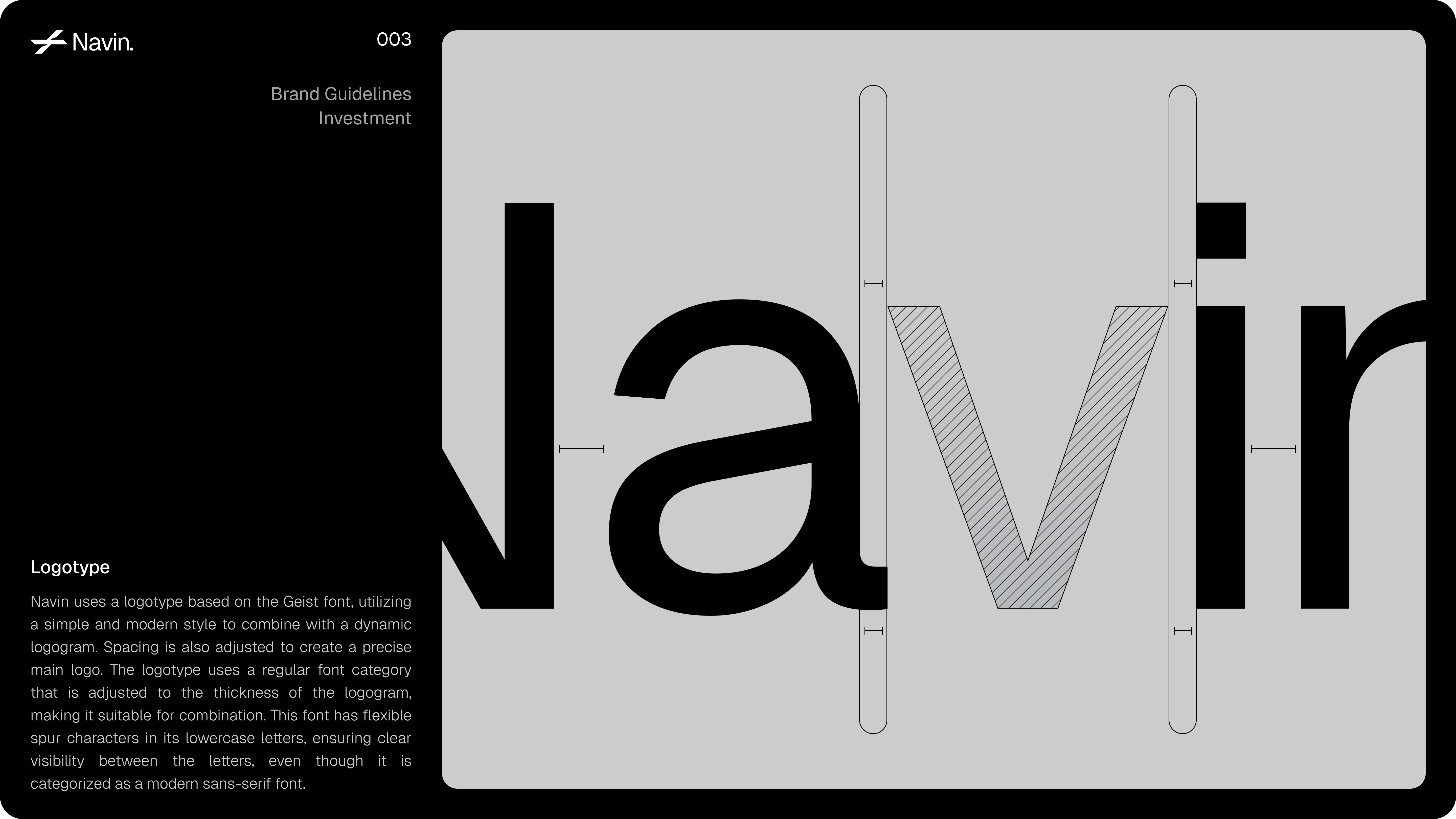
Navin embraces Geist, a modern sans-serif typeface that radiates clarity, balance, and confidence. Its clean geometry and adaptable weights deliver a refined aesthetic that supports Navin’s identity as a trustworthy, future-driven finance brand.
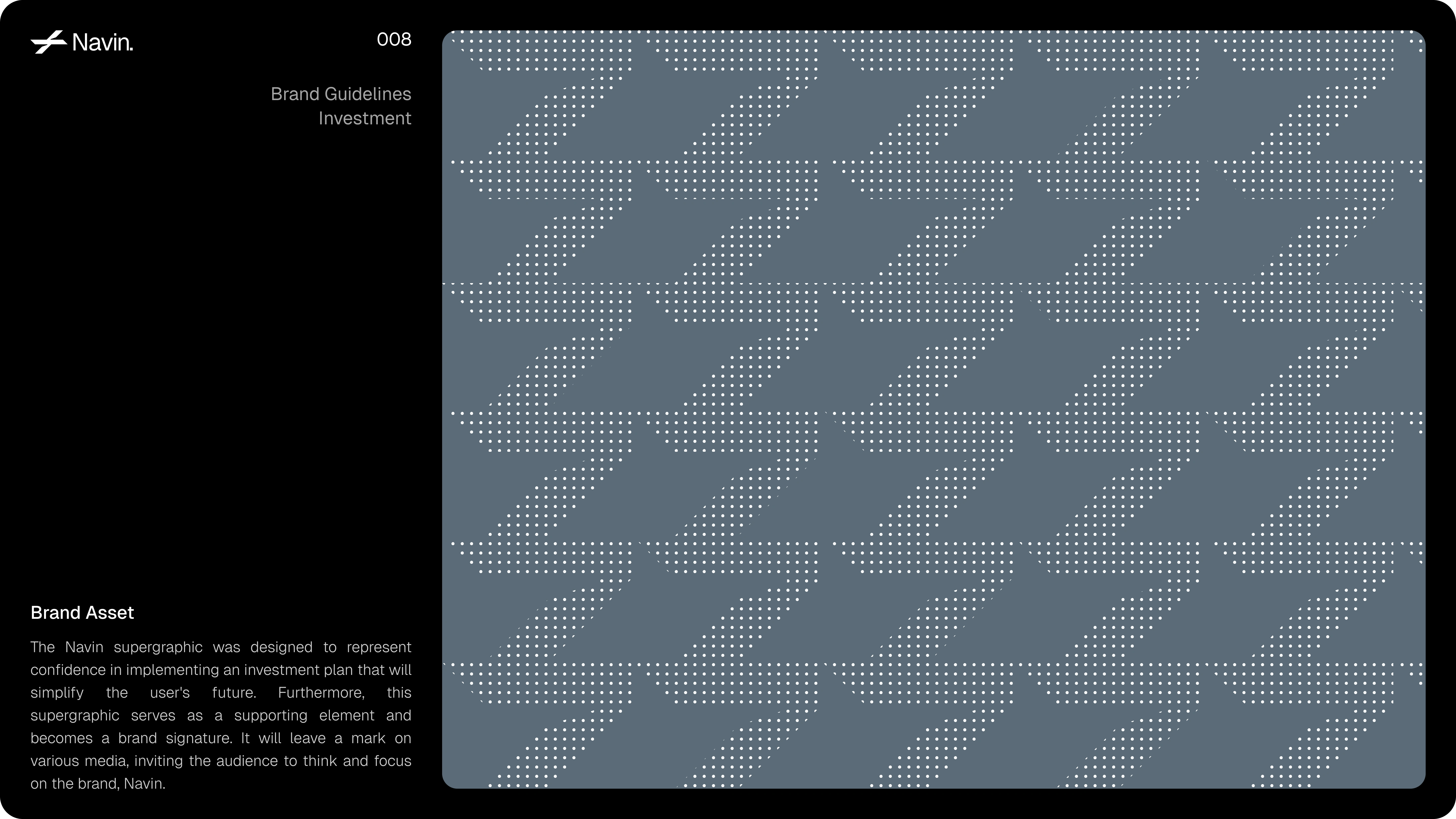
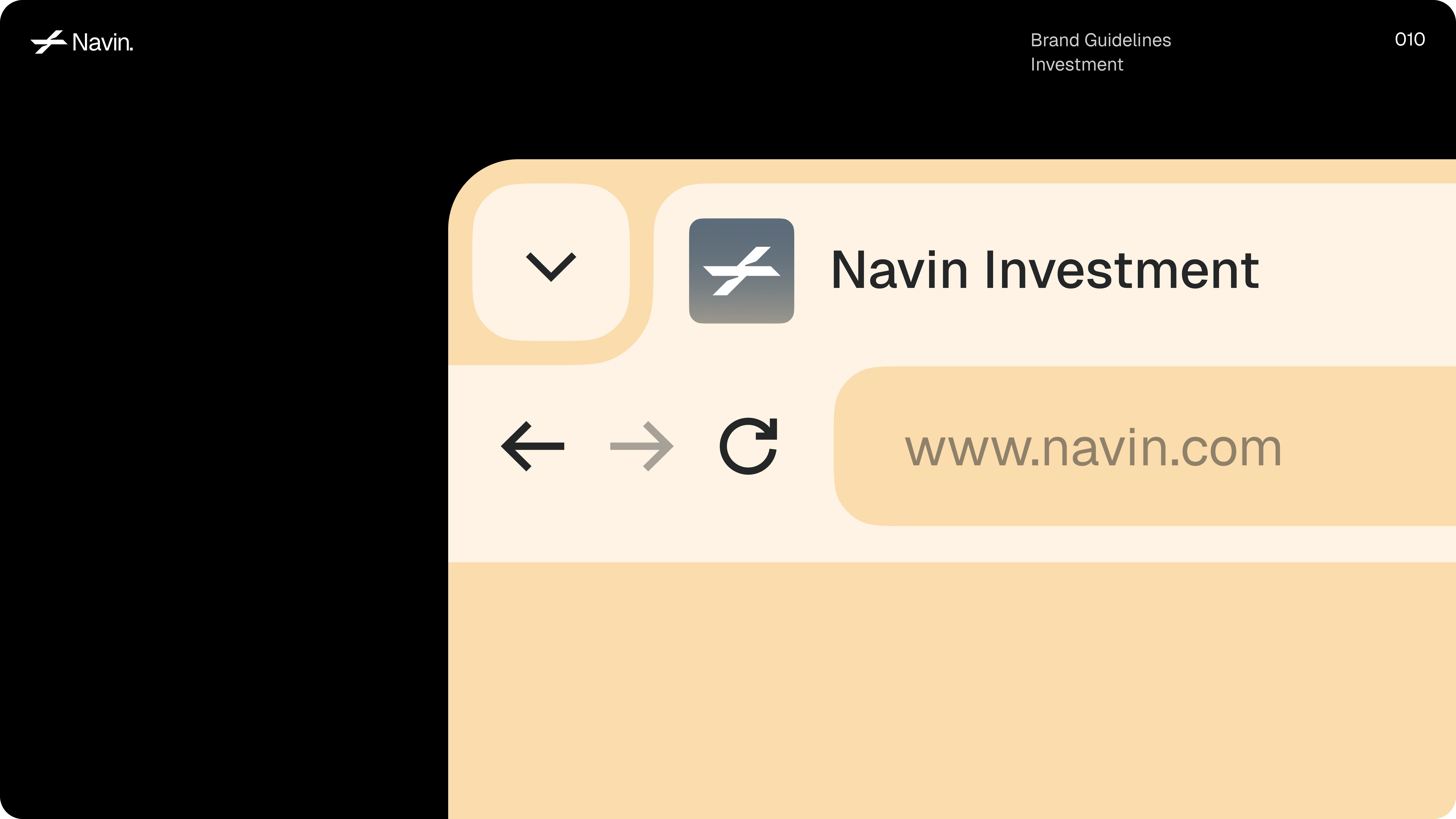
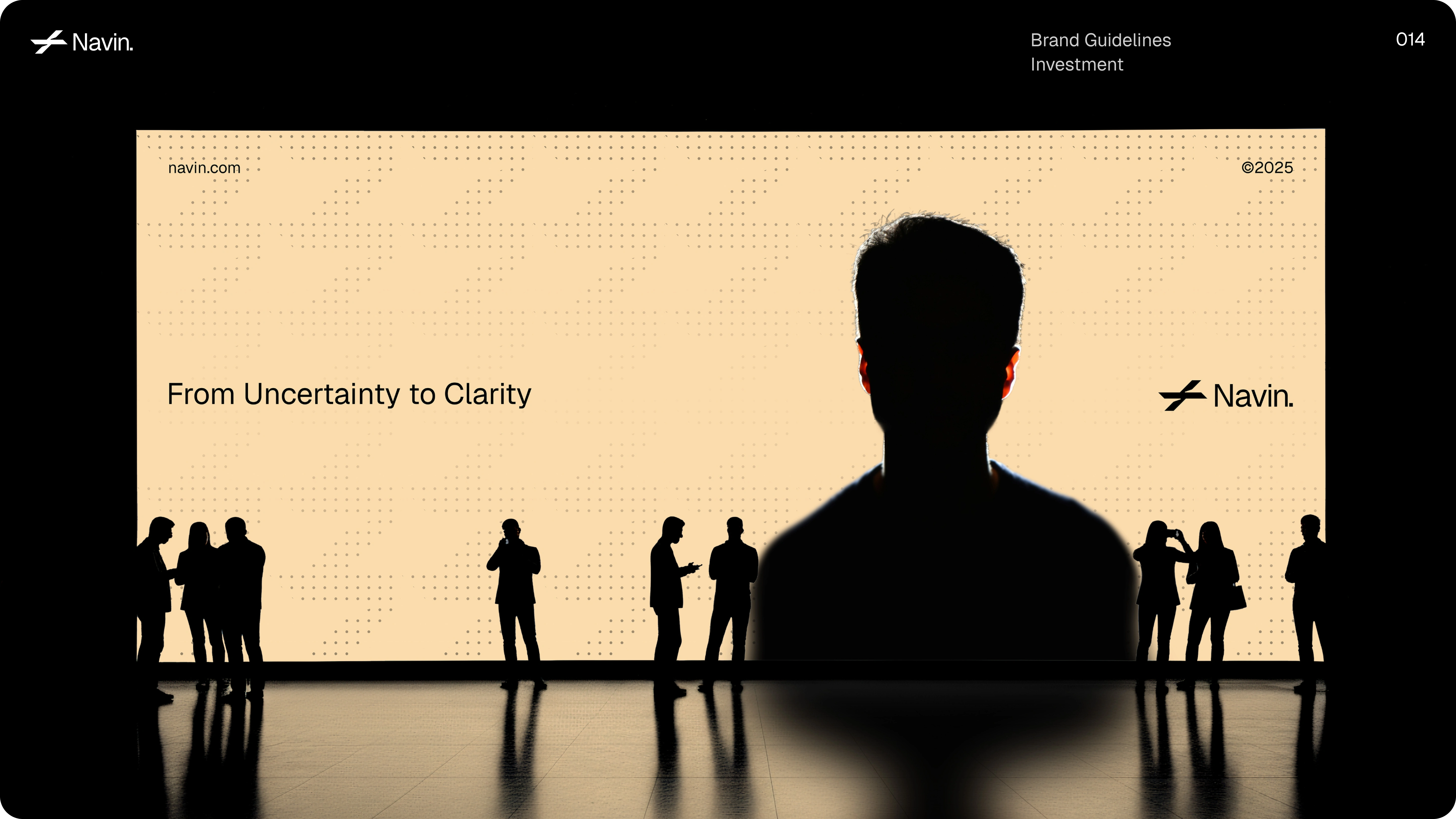
The supergraphic represents confidence and progress mirroring how Navin simplifies investment for its users. With a clean grid, dotted motion, and calm color palette, the design embodies reliability and innovation, turning a financial platform into a visual experience of clarity and assurance.
Like this project
Posted Nov 4, 2025
This branding system for Navin Investment redefines how finance brands express trust and intelligence.
Likes
4
Views
21