Statistics Dashboard Design
Cansaas Agency
Overview
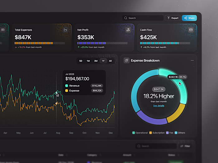
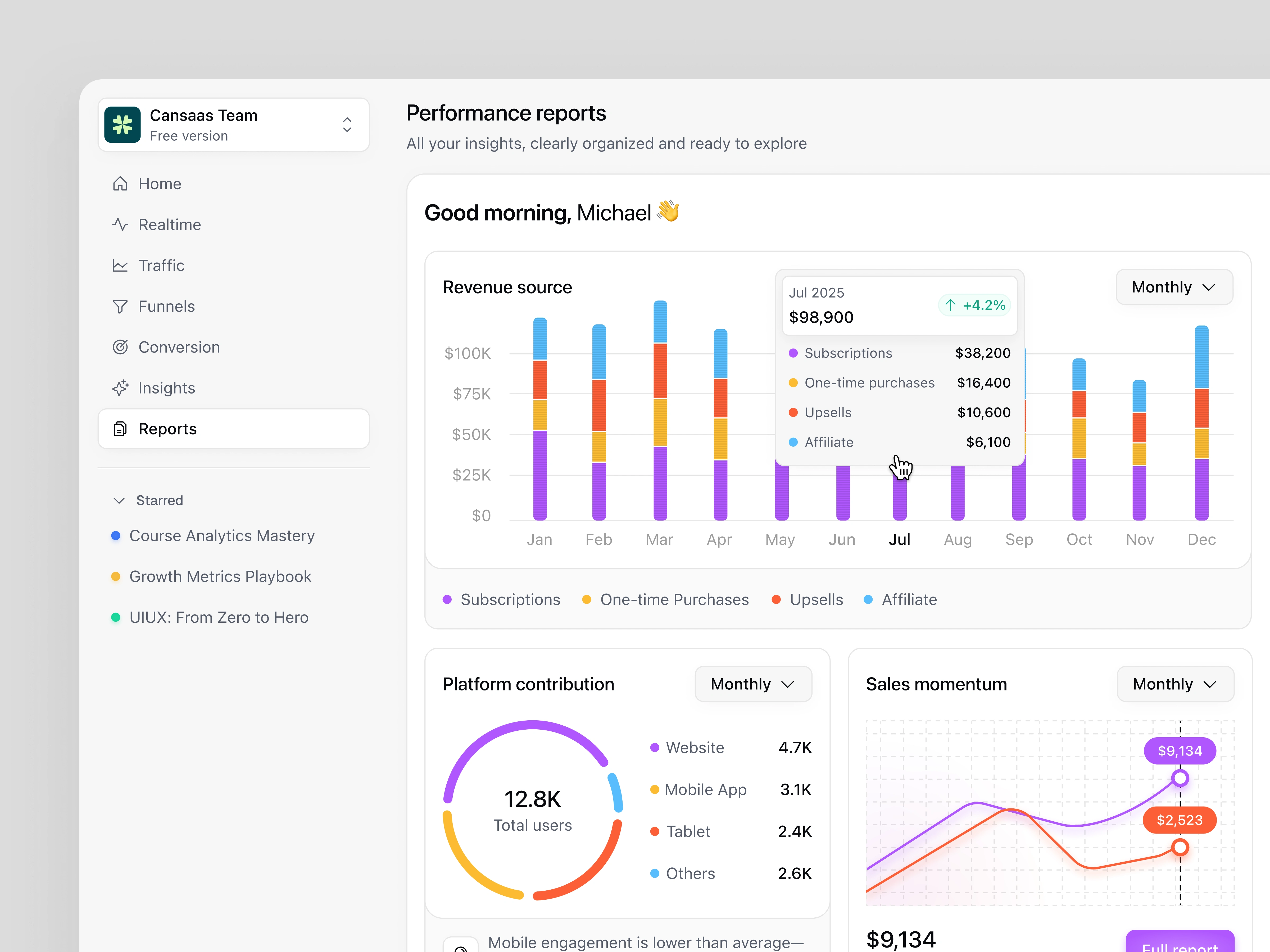
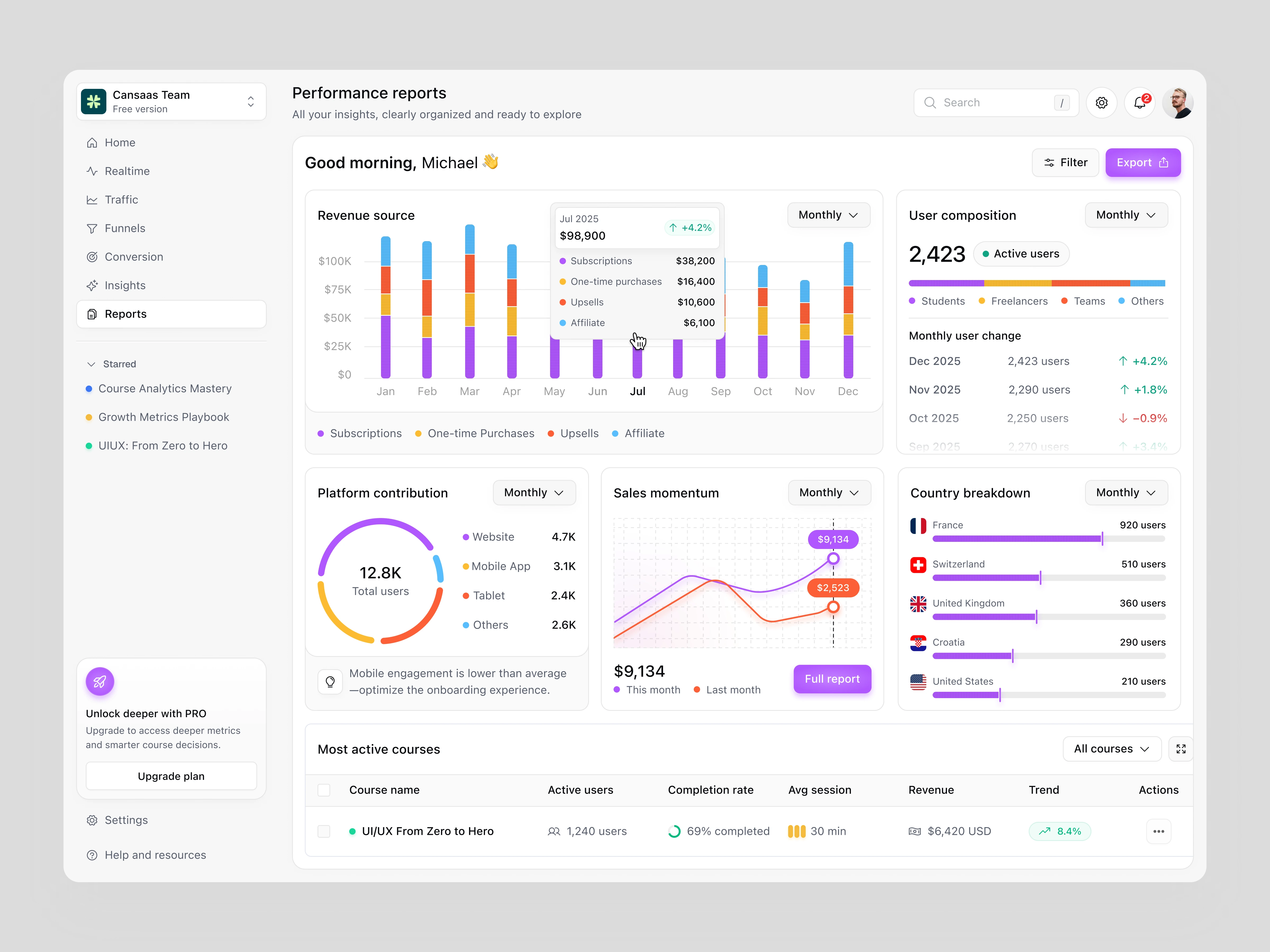
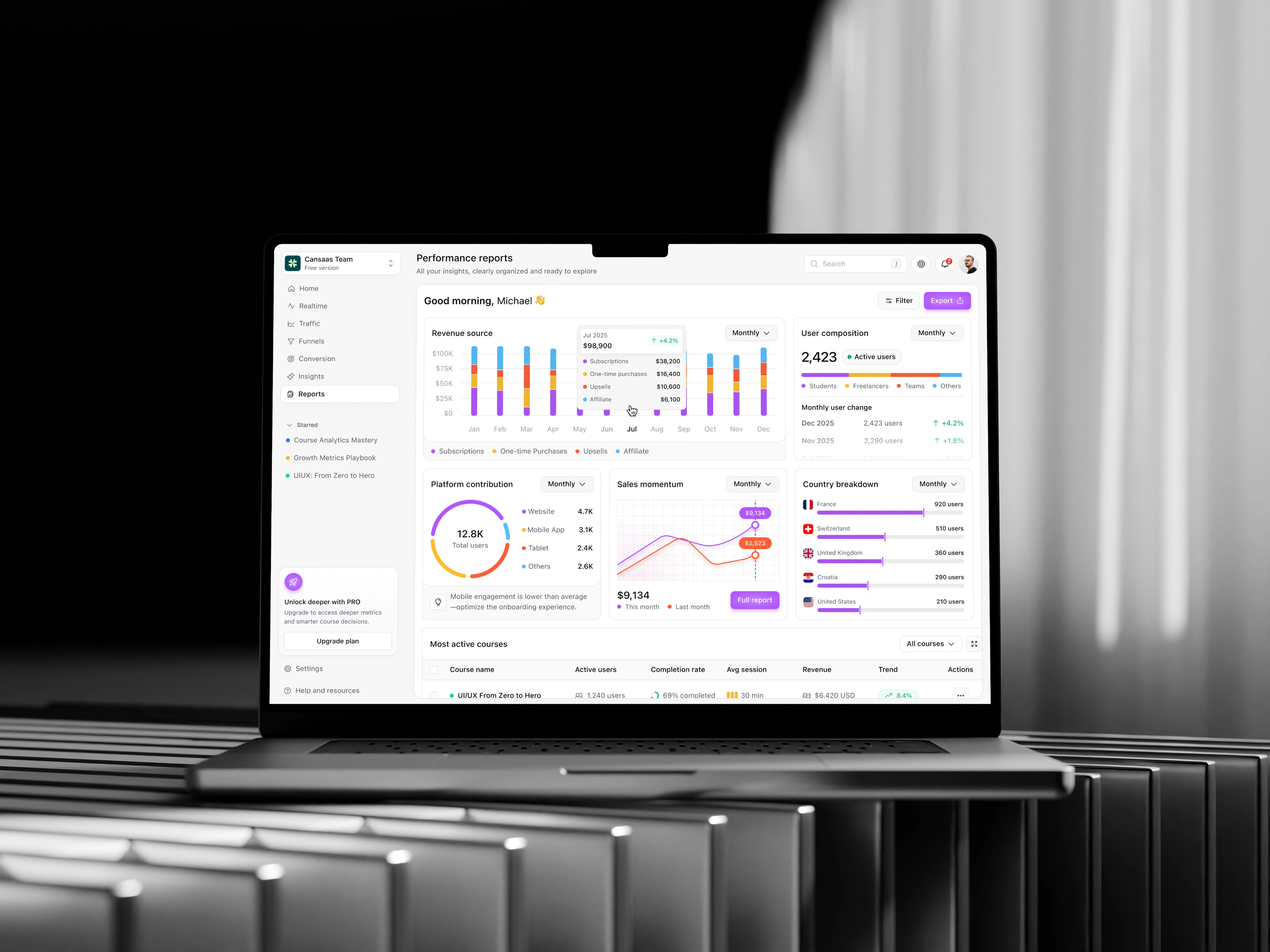
This exploration presents a statistics dashboard designed to help teams monitor performance, revenue streams, and user composition through a clear, insight-driven layout. The dashboard focuses on turning complex metrics into easily readable patterns for faster understanding and decision-making.
The Challenge
Analytics dashboards often overload users with charts and numbers, making it difficult to identify what actually matters. The challenge was to present multiple metrics revenue, growth, user distribution, and engagement without overwhelming the interface or the user.
The Solution and Impact
By combining structured layouts with purposeful data visualization, the dashboard enables users to quickly understand performance trends and take informed actions. The result is a statistics dashboard that feels calm, readable, and decision-ready rather than dense and analytical.
Like this project
Posted Feb 2, 2026
Statistics dashboard exploration designed to visualize revenue, user growth, and performance insights through a clear, structured analytics layout.
Likes
2
Views
7