Database Monitoring Dashboard Redesign
Cansaas Agency
Overview
Modern database platforms generate an enormous amount of infrastructure data every second, yet many monitoring tools still overwhelm users with complex layouts and fragmented information. This concept reimagines a Database Monitoring Dashboard that prioritizes clarity, operational visibility, and fast decision-making through a clean, minimal interface. The goal was to create a workspace where developers, DevOps engineers, and database administrators can monitor system health without unnecessary cognitive load.
The Challenge
Database monitoring requires teams to continuously track resource allocation, processing activity, memory consumption, transaction conflicts, and operational events. While these metrics are essential, presenting them all at once often results in visual clutter that slows down analysis rather than accelerating it.
The challenge was to design a dashboard capable of displaying multiple technical metrics simultaneously while keeping the experience approachable, organized, and effortless to navigate.
The Solution
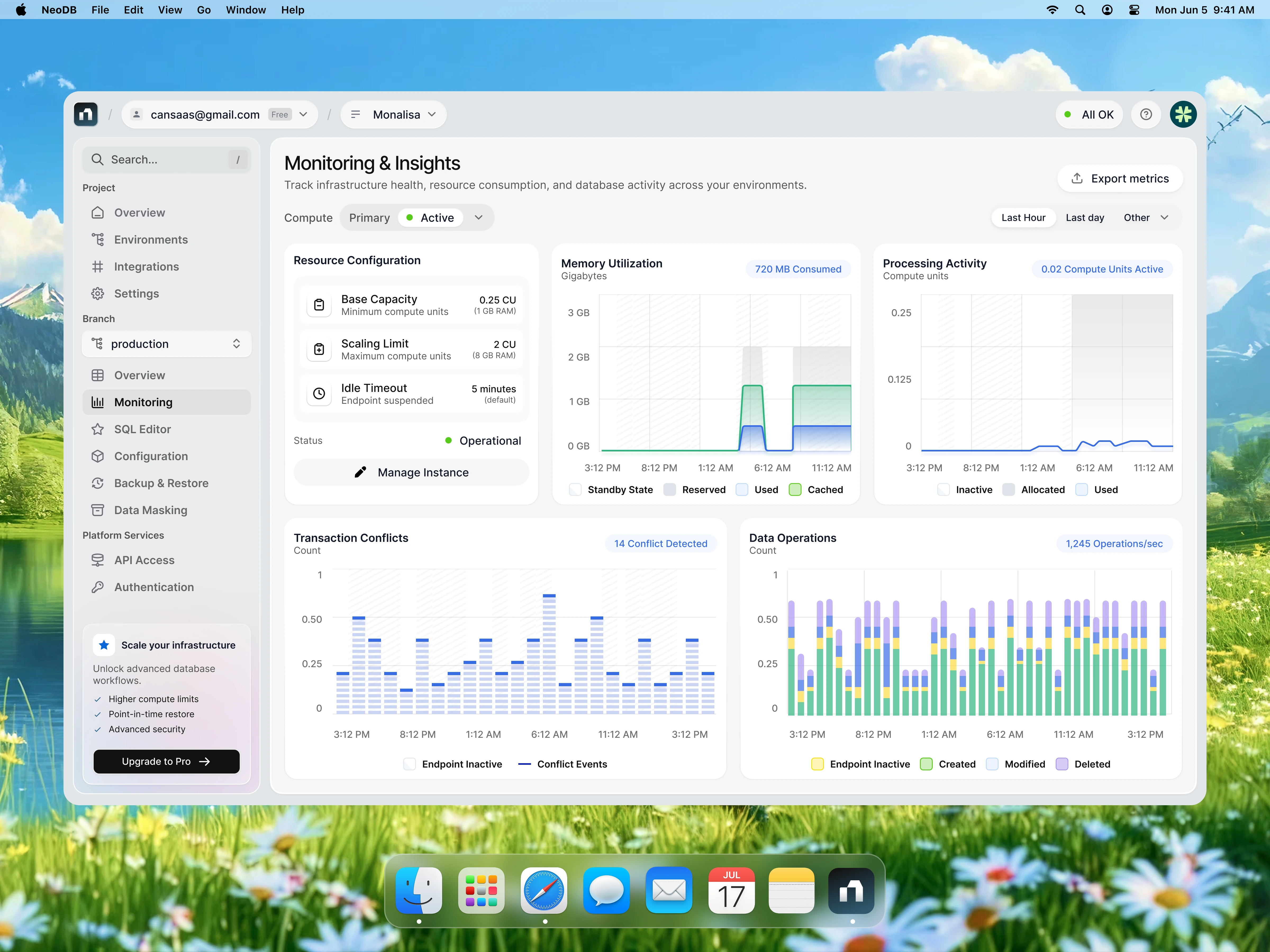
The interface was built around a modular card-based layout that groups related metrics into clearly defined sections. Each panel focuses on a specific operational area, allowing users to scan infrastructure health without jumping between multiple screens.
A simplified sidebar architecture, lightweight navigation, contextual status indicators, and carefully spaced components create a predictable workflow that reduces visual noise while maintaining high information density.

Design Approach
The overall design embraces a modern SaaS aesthetic with soft surfaces, generous whitespace, subtle shadows, and restrained color usage. Instead of relying on heavy visual effects, hierarchy is established through spacing, typography, and component sizing.
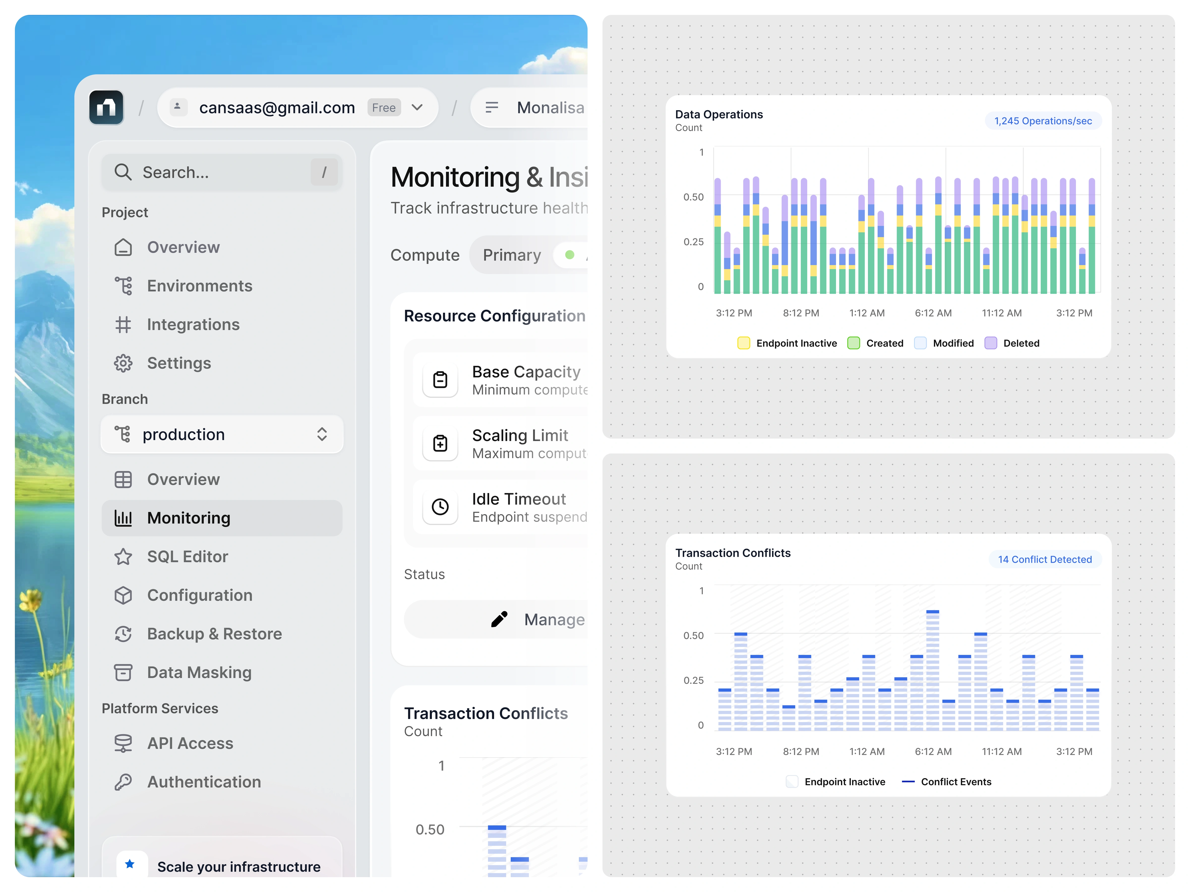
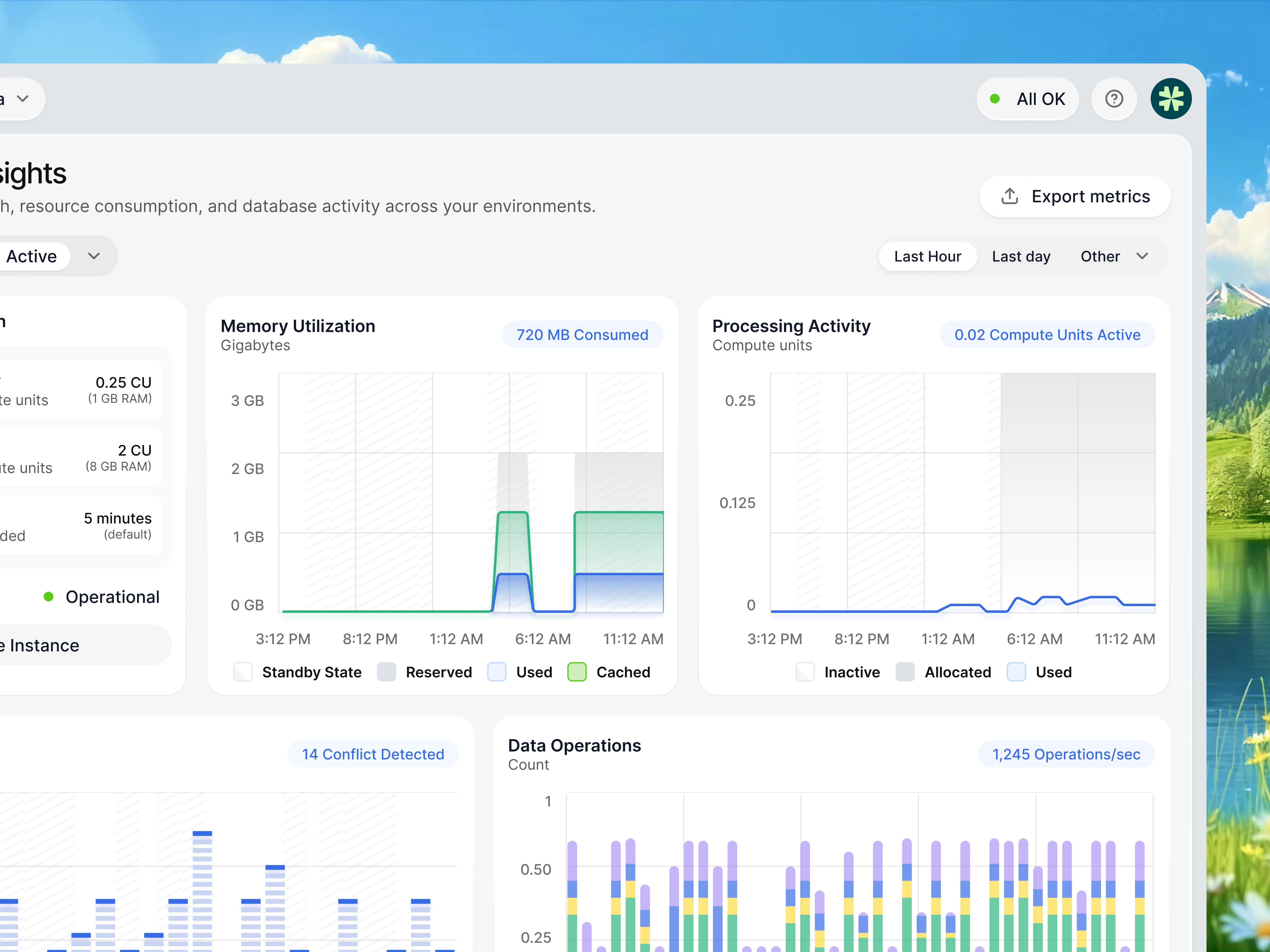
Operational metrics such as Memory Utilization, Processing Activity, Transaction Conflicts, and Data Operations are visualized using lightweight charts that emphasize trends rather than decoration. Consistent chart styling, clear legends, and intuitive color coding make technical insights easier to interpret at a glance.
The interface also introduces contextual controls for compute environments, branch management, monitoring states, and infrastructure configuration, helping users move from observation to action without interrupting their workflow.
Final Thoughts
This project explores how thoughtful UI and UX can transform highly technical infrastructure monitoring into a calmer, more actionable experience. Rather than simply displaying data, the interface helps engineering teams understand system behavior, detect anomalies faster, and make operational decisions with greater confidence.
If you're building products for developers or enterprise platforms, simplicity isn't about showing less—it's about making complex information instantly understandable.
Like this project
Posted Jul 1, 2026
Designed a modular interface for a database monitoring dashboard.
Likes
1
Views
6