Geoaether: Modern Weather Monitoring Dashboard Design
Cansaas Agency
Overview
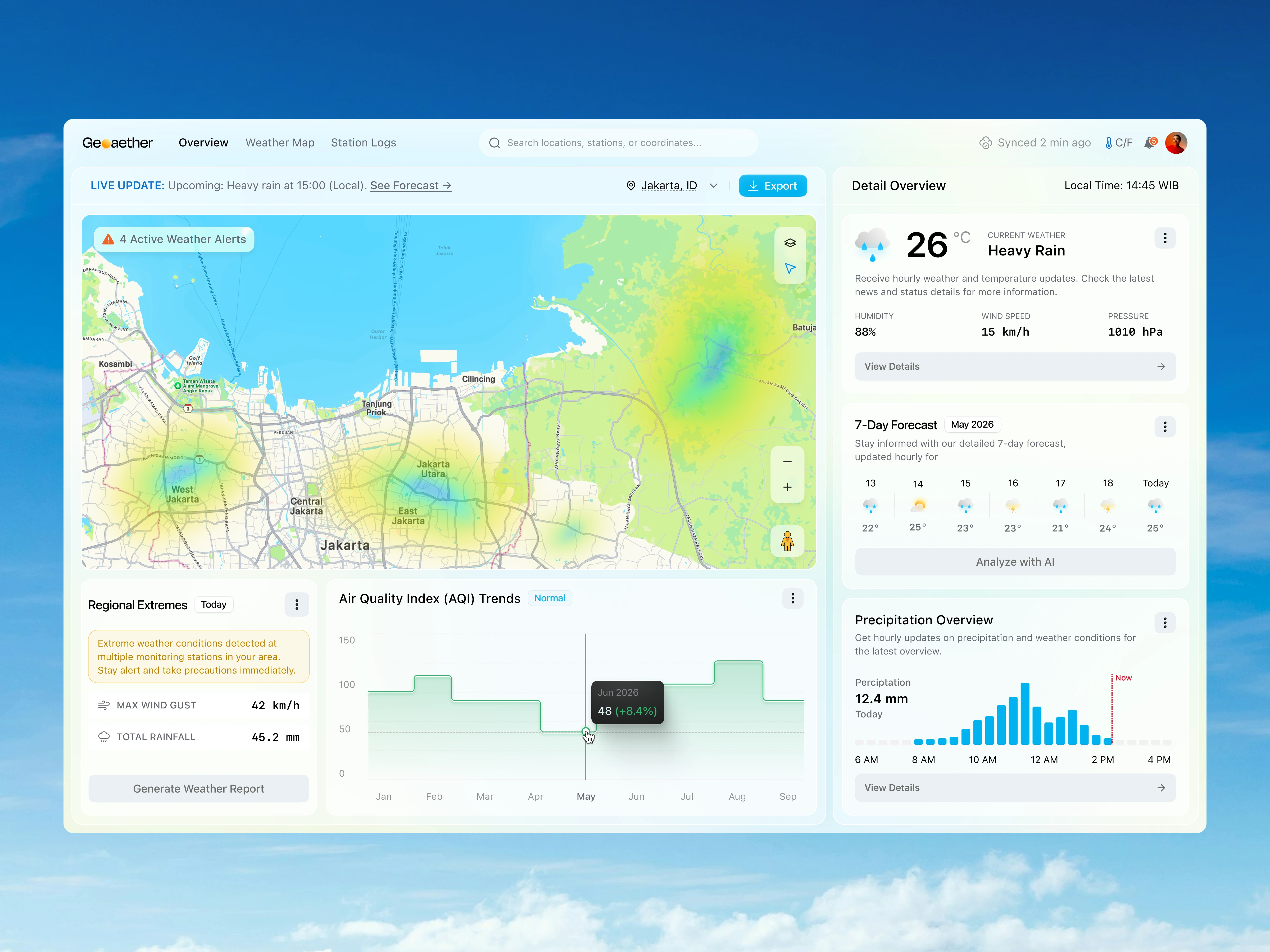
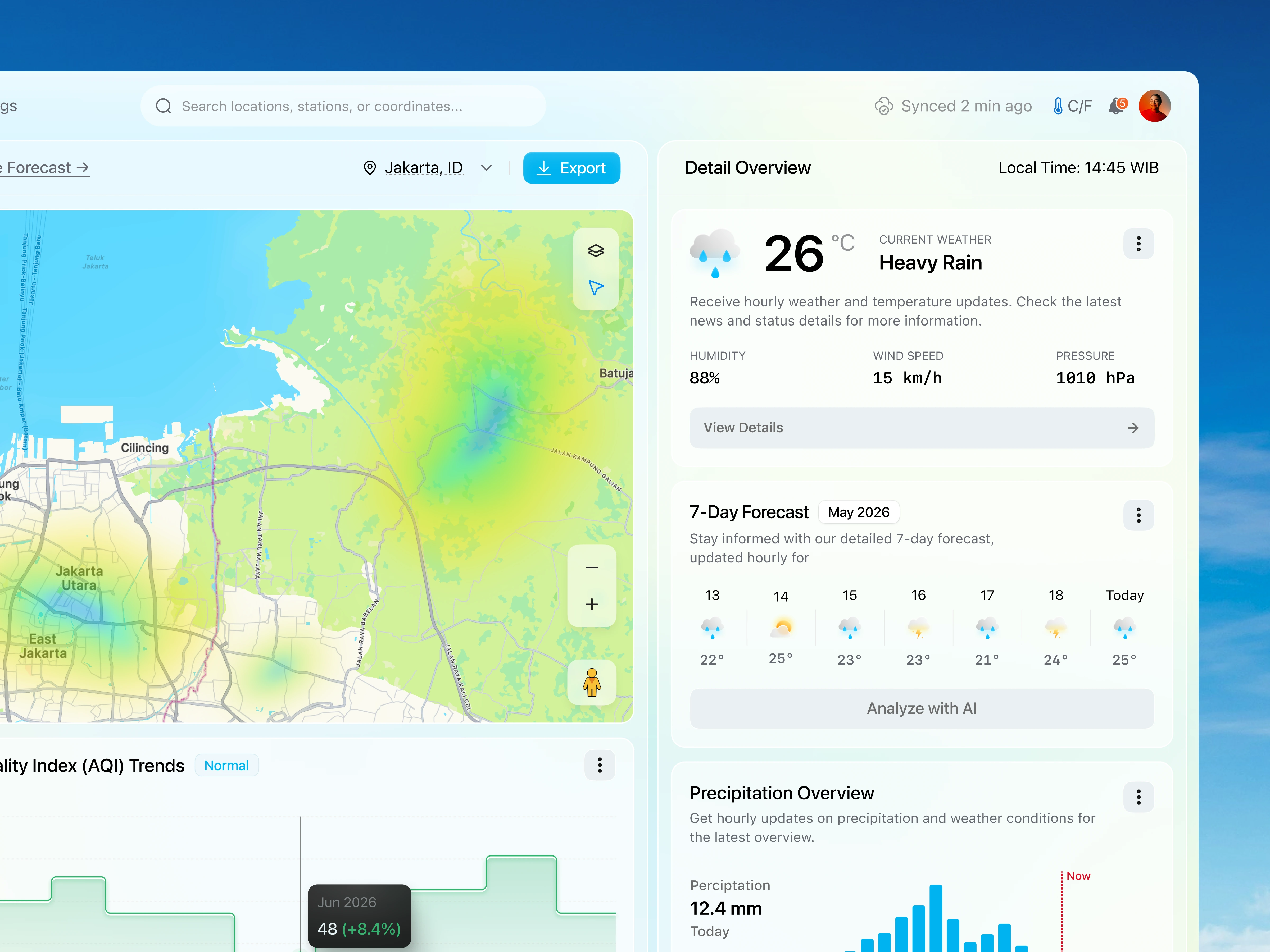
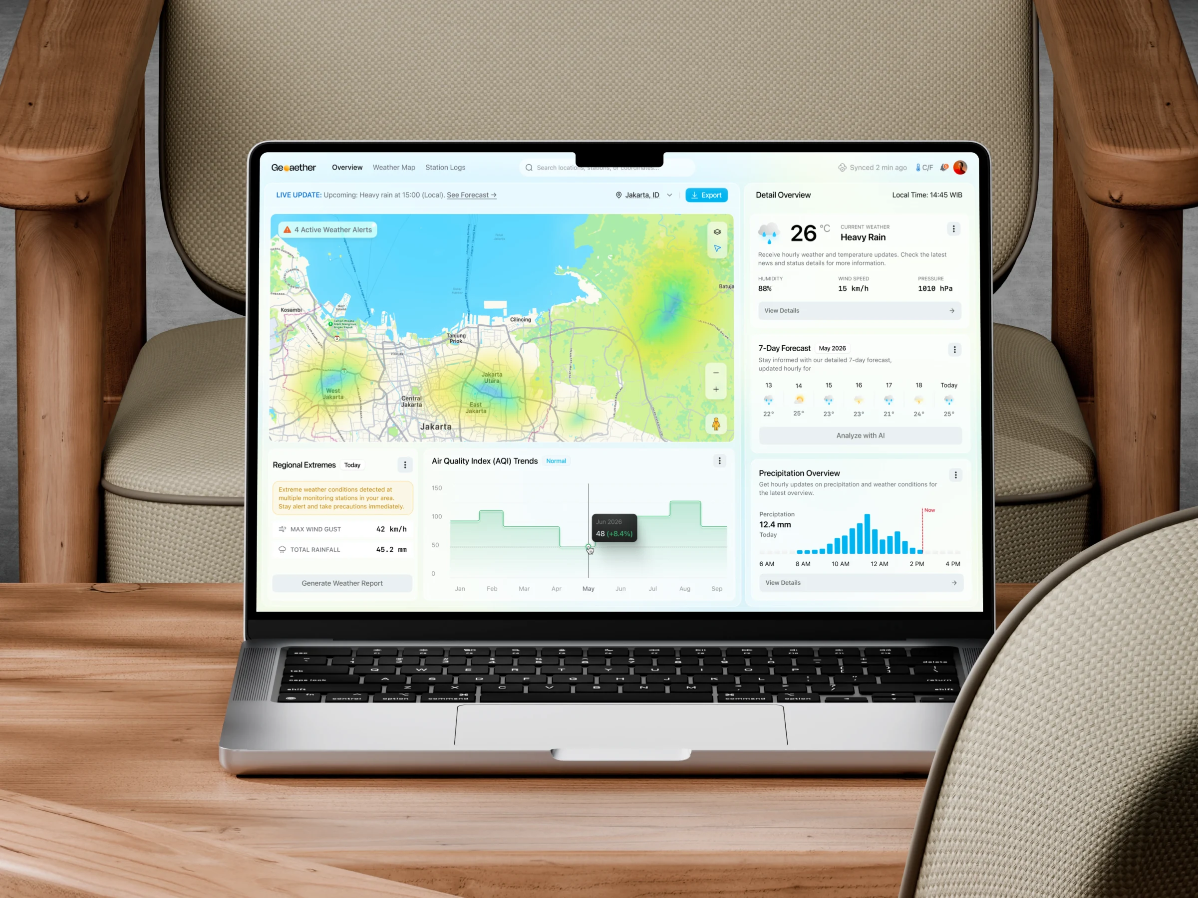
Geoaether is a modern Weather Monitoring Dashboard concept designed to simplify the way users monitor environmental conditions, weather alerts, and climate analytics in real time. The interface combines interactive weather maps, AQI tracking, precipitation insights, and forecast monitoring into a clean and structured dashboard experience. Built with a soft visual palette and spacious layout, the design focuses on improving readability while making complex environmental data feel more intuitive and actionable.
The Challenge
Weather monitoring platforms often overload users with dense information, technical metrics, and fragmented data visualization. Many dashboards prioritize raw data over usability, making it difficult for users to quickly identify critical weather conditions, regional risks, and forecasting patterns. The challenge was to create a dashboard UI that could present multiple environmental datasets in a way that feels organized, lightweight, and easy to understand at a glance.
Design Approach
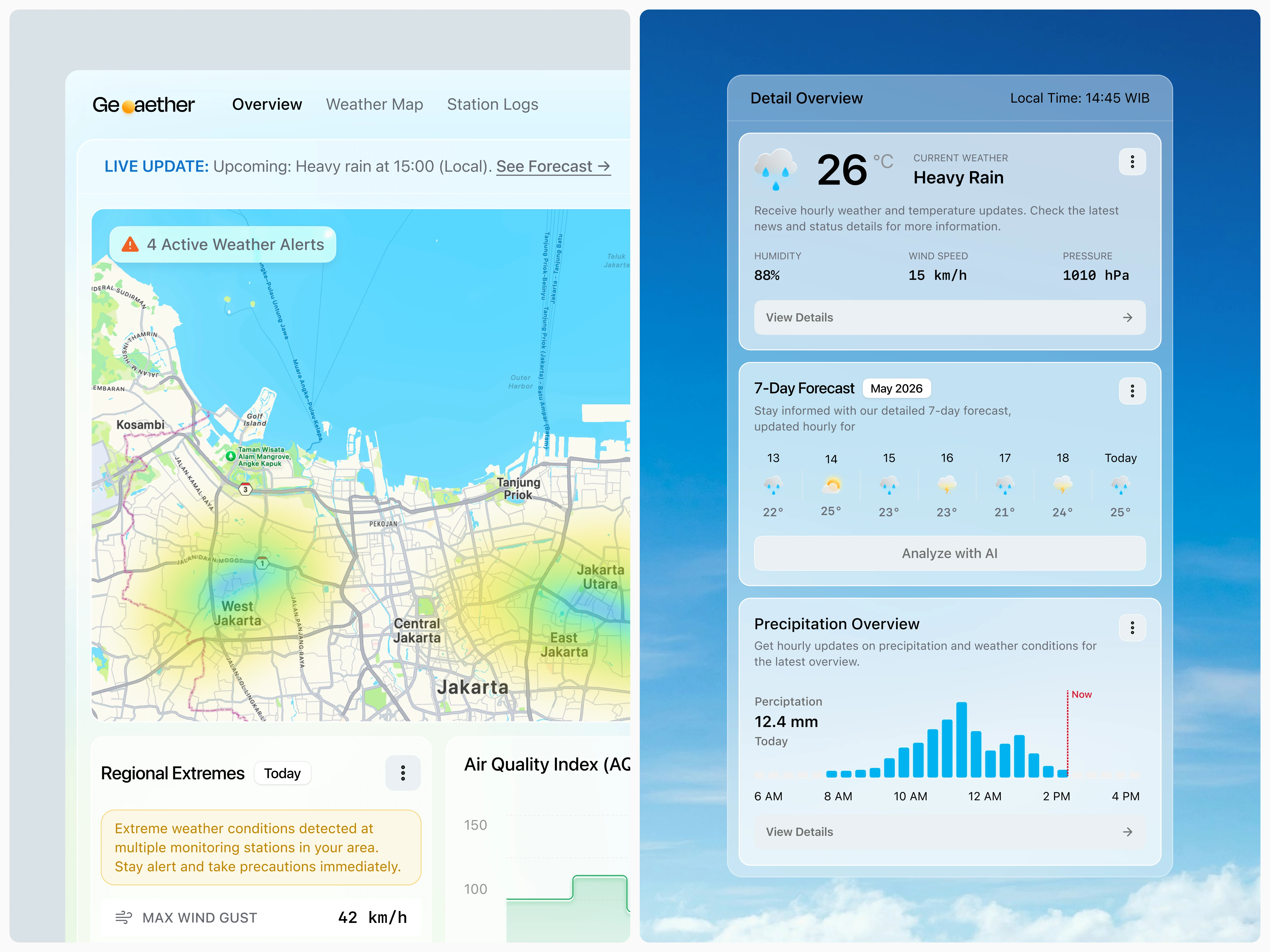
This dashboard was designed using a map-first layout strategy to prioritize geographic awareness and live environmental monitoring. The interface uses modular weather cards, soft blue color gradients, minimal visual noise, and intuitive spacing to create a calmer and more accessible user experience. Interactive charts, live weather alerts, and forecasting components were structured with clear visual hierarchy to help users scan information faster while maintaining focus on critical climate insights.
Result
Geoaether demonstrates how weather and environmental data platforms can feel more modern, user-friendly, and visually refined without sacrificing functionality. By combining interactive weather visualization with a clean SaaS dashboard approach, the design creates a more accessible experience for users monitoring climate conditions, forecasting trends, and environmental risks in real time.
Like this project
Posted May 22, 2026
Developed an intuitive weather monitoring dashboard for real-time environmental tracking.
Likes
1
Views
1