Area - Real Estate Brand Guidelines
Cansaas Agency
A clean and geometric brand system built around architectural forms, refined typography, and a calm blue-toned palette. The identity blends structure and personality to create a visual language that feels contemporary, confident, and distinctly spatial.
The Problem
Real estate brands often suffer from generic visuals that lack distinction and fail to represent the sophistication of the industry. Many identities lean heavily on dated symbols, unclear typography, or inconsistent visual systems, resulting in brands that struggle to communicate expertise, trust, and contemporary relevance. Area needed a cohesive identity that could reflect its architectural mindset, operational clarity, and the elevated experience it offers to clients.
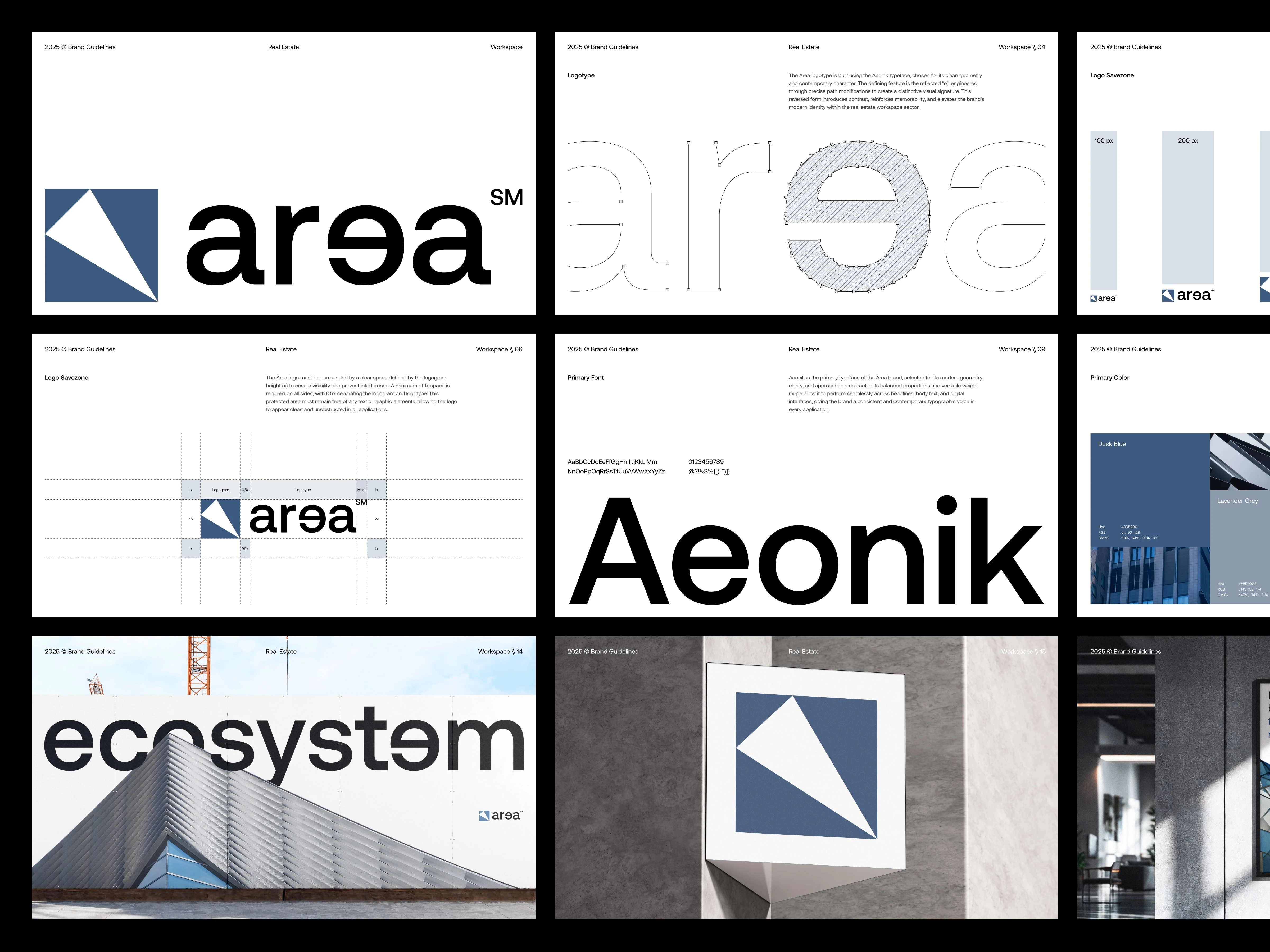
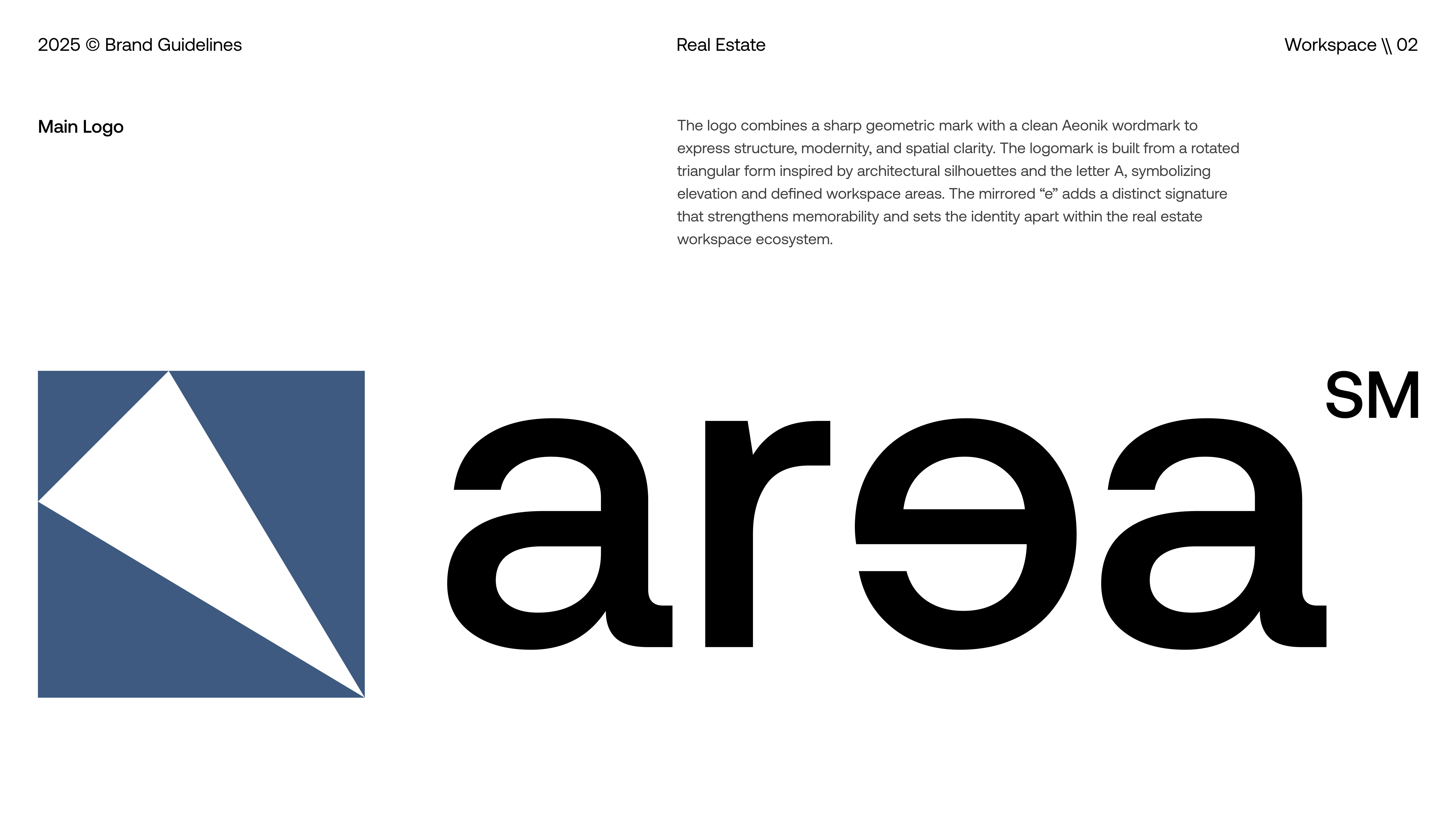
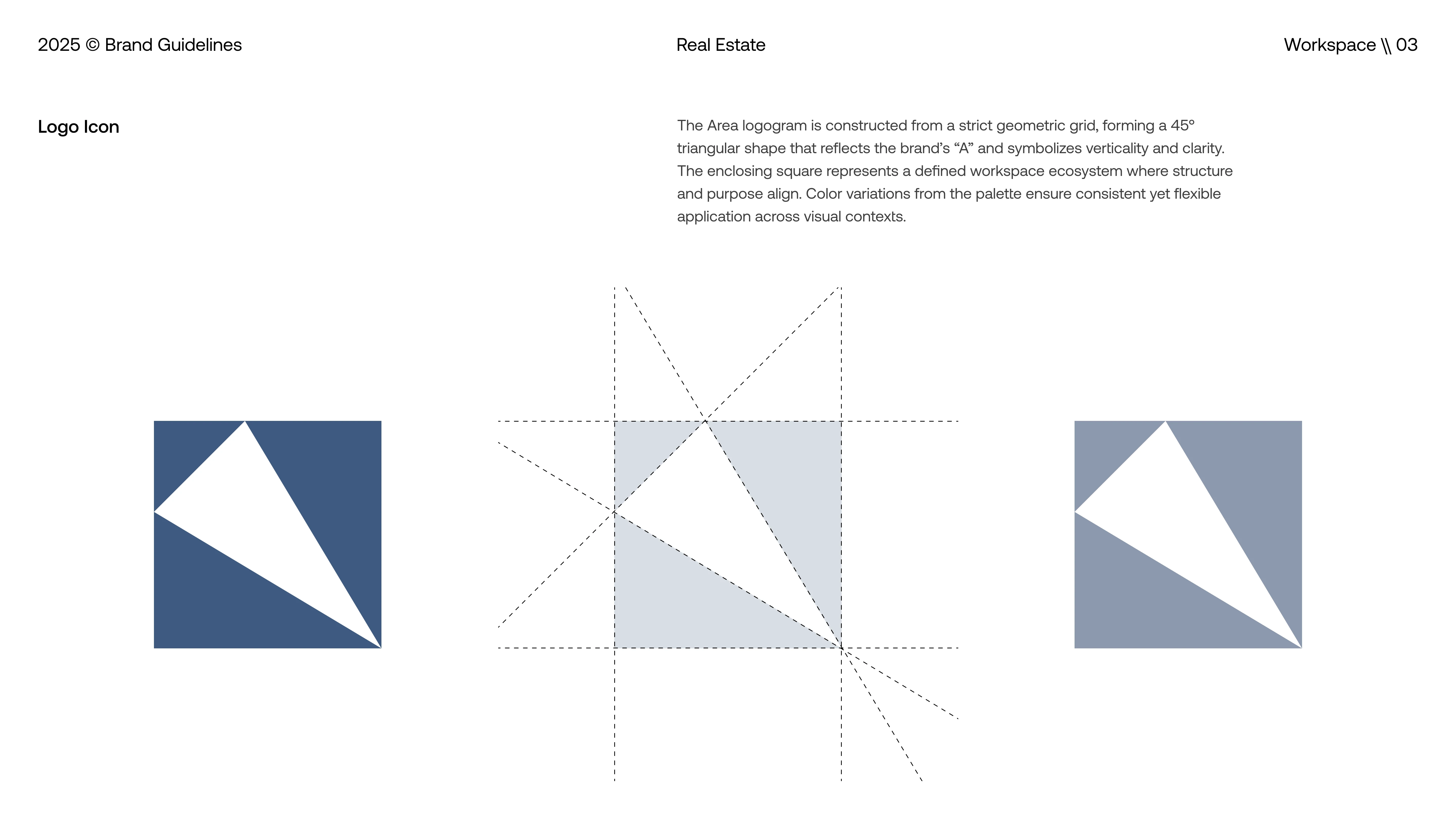
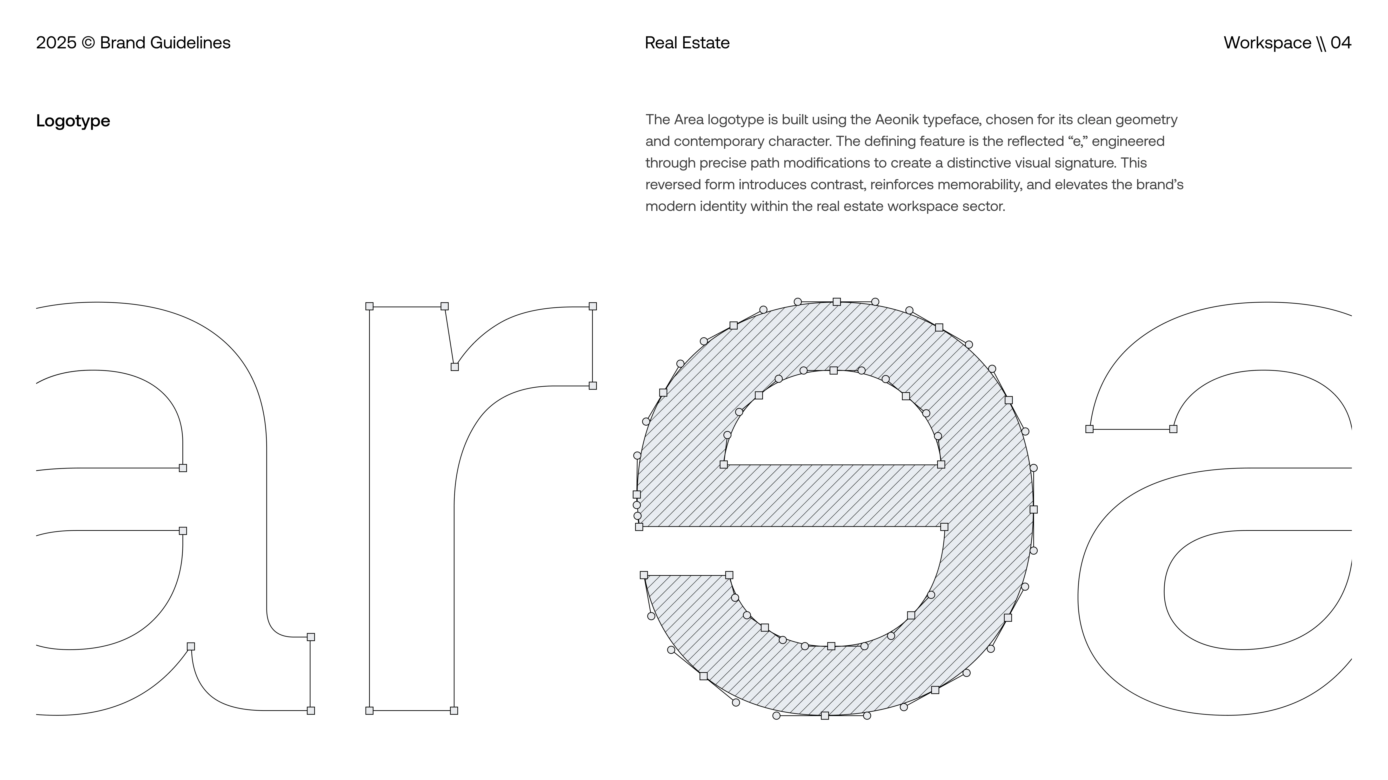
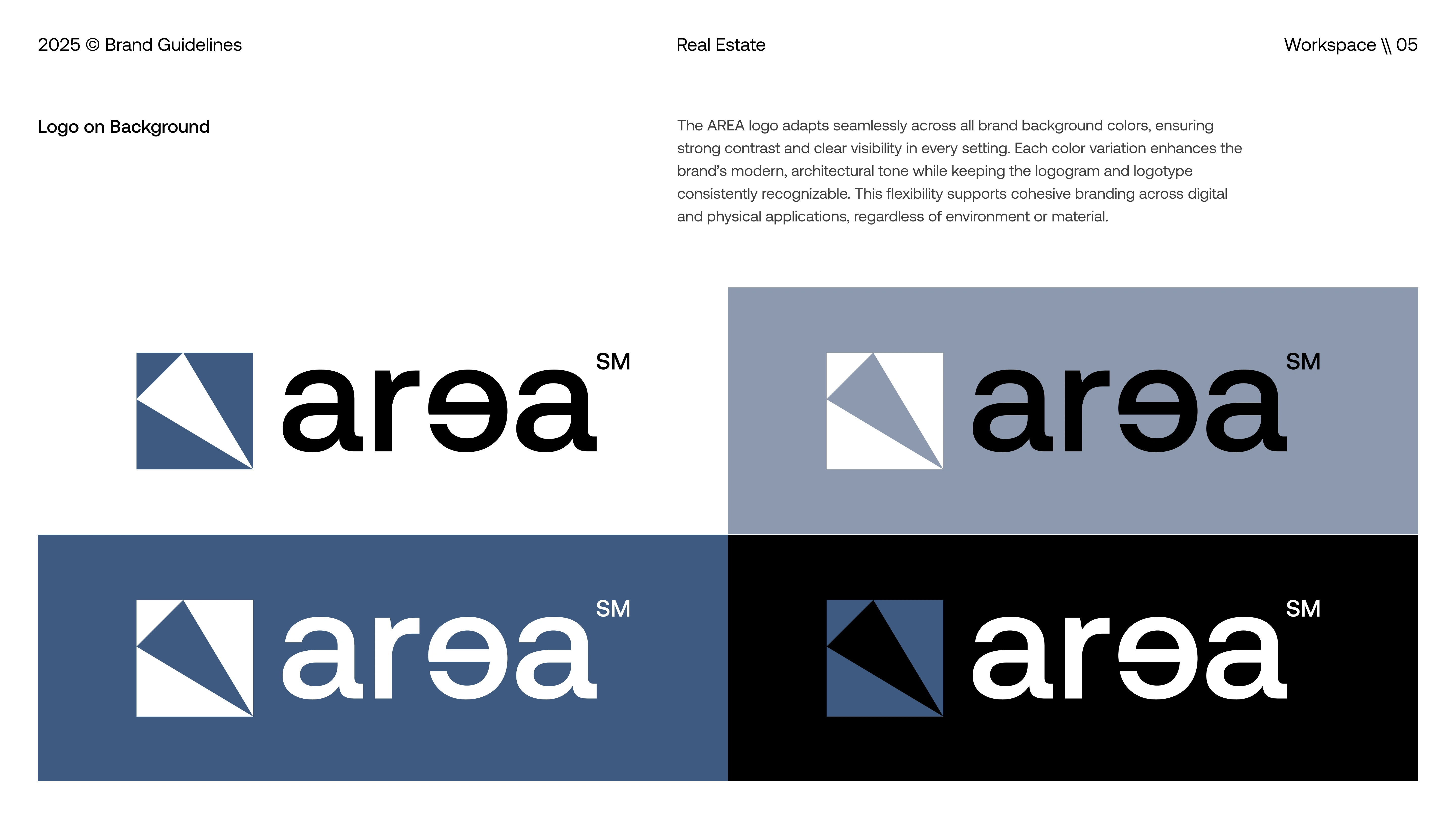
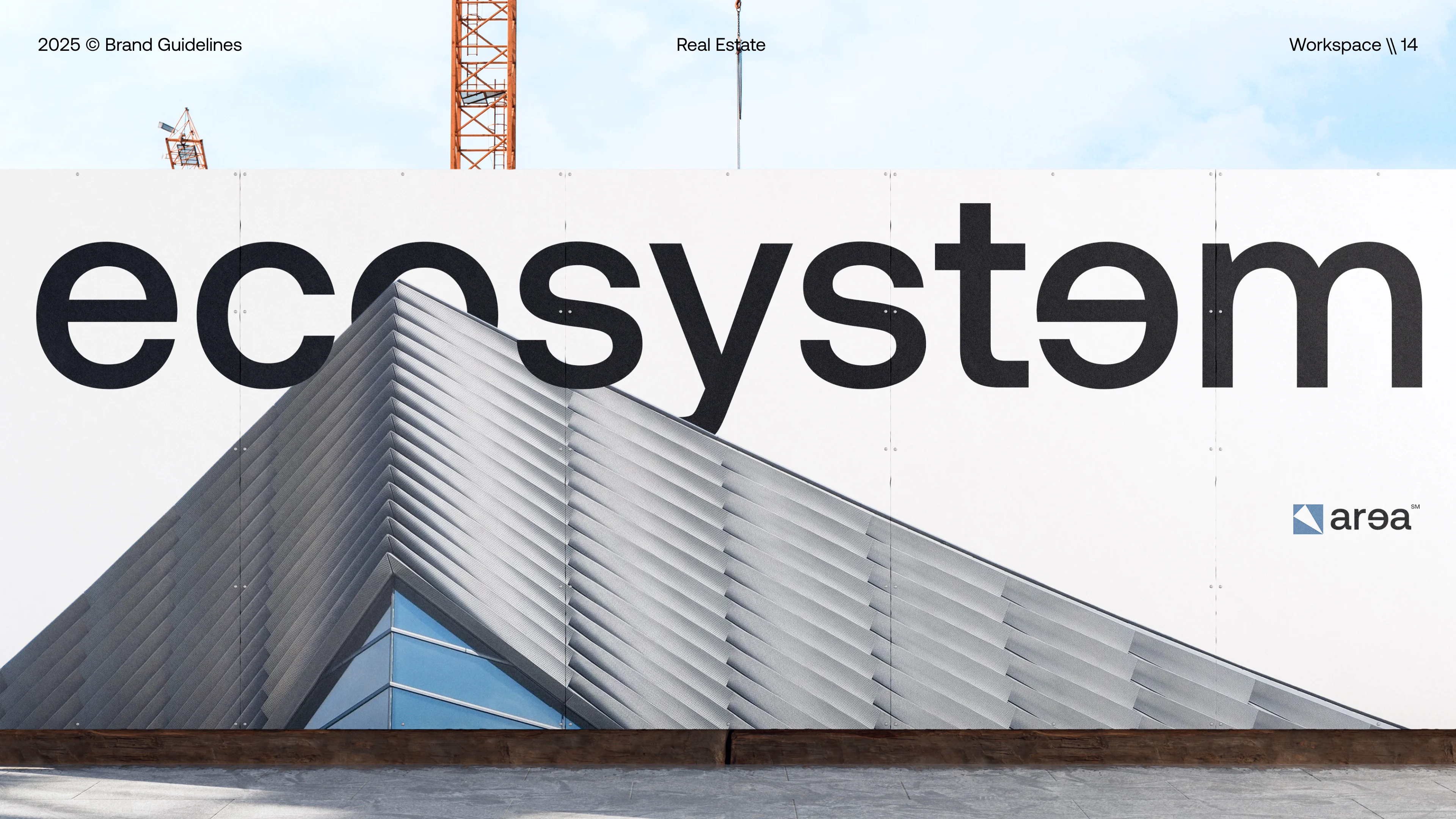
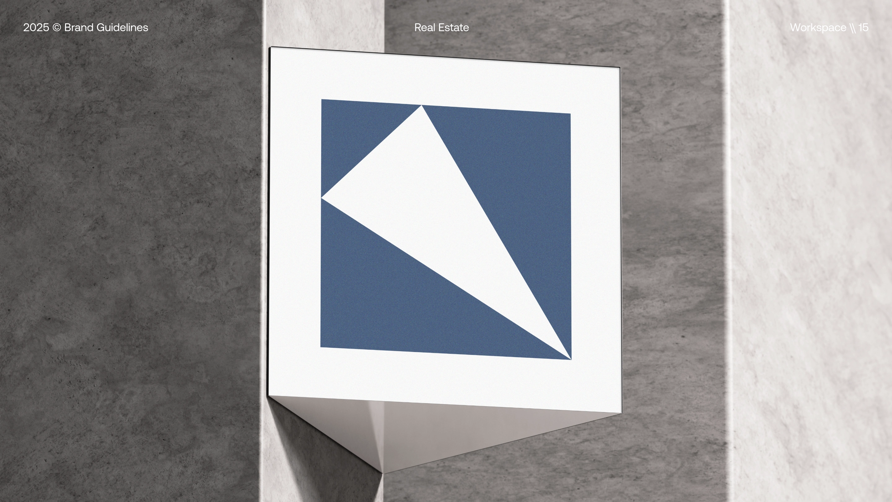
The design direction takes inspiration from structural geometry and modern architectural forms. Its angular logomark creates a distinct, precise symbol, while the customized logotype with the “ə” character adds a unique and contemporary touch. Aeonik serves as the primary typeface for its balanced geometry and consistent legibility. The color palette of Dusk Blue, Lavender Grey, True Black, and Pure White reinforces a calm, modern tone, supported by dynamic patterns and supergraphics that strengthen visual continuity across the brand.
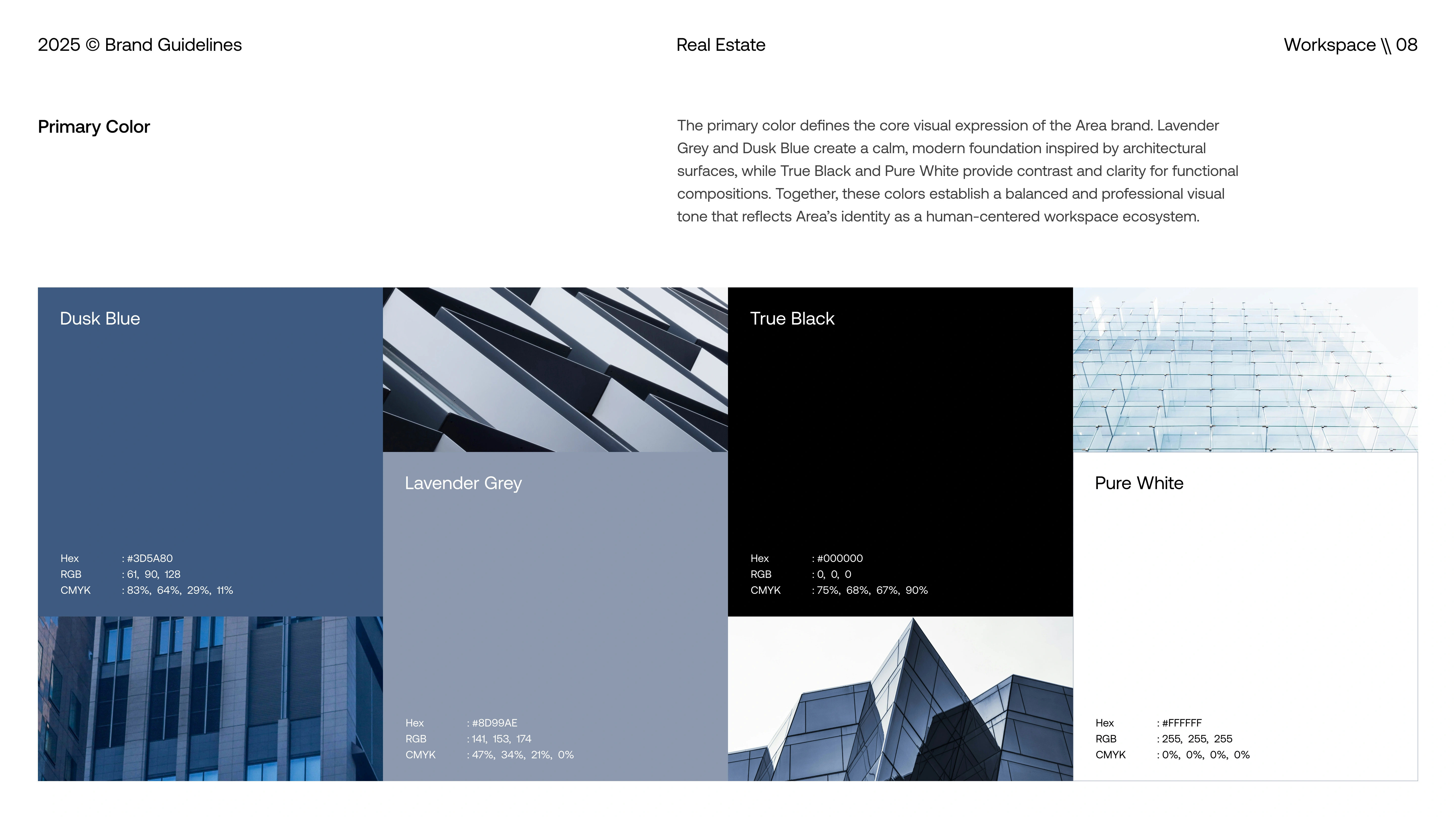
Primary Color
A minimalist color direction built on Dusk Blue, Lavender Grey, True Black, and Pure White. Designed to reflect architectural clarity, calm professionalism, and a clean, modern real estate identity.
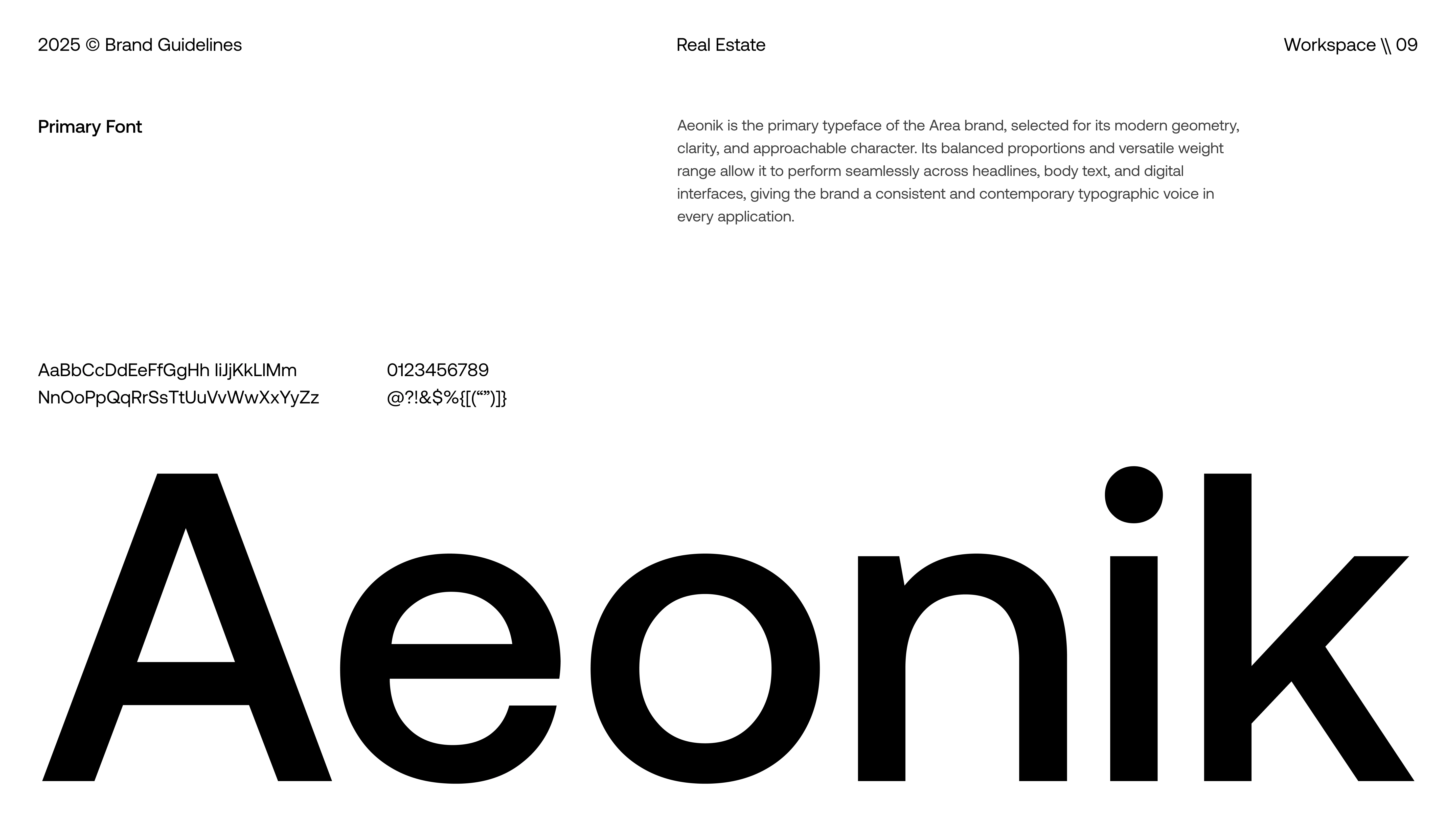
Primary Font
A modern geometric typeface selected for clarity, structure, and versatility. Aeonik brings a clean, contemporary voice to the Area brand across print, digital, and environmental applications.
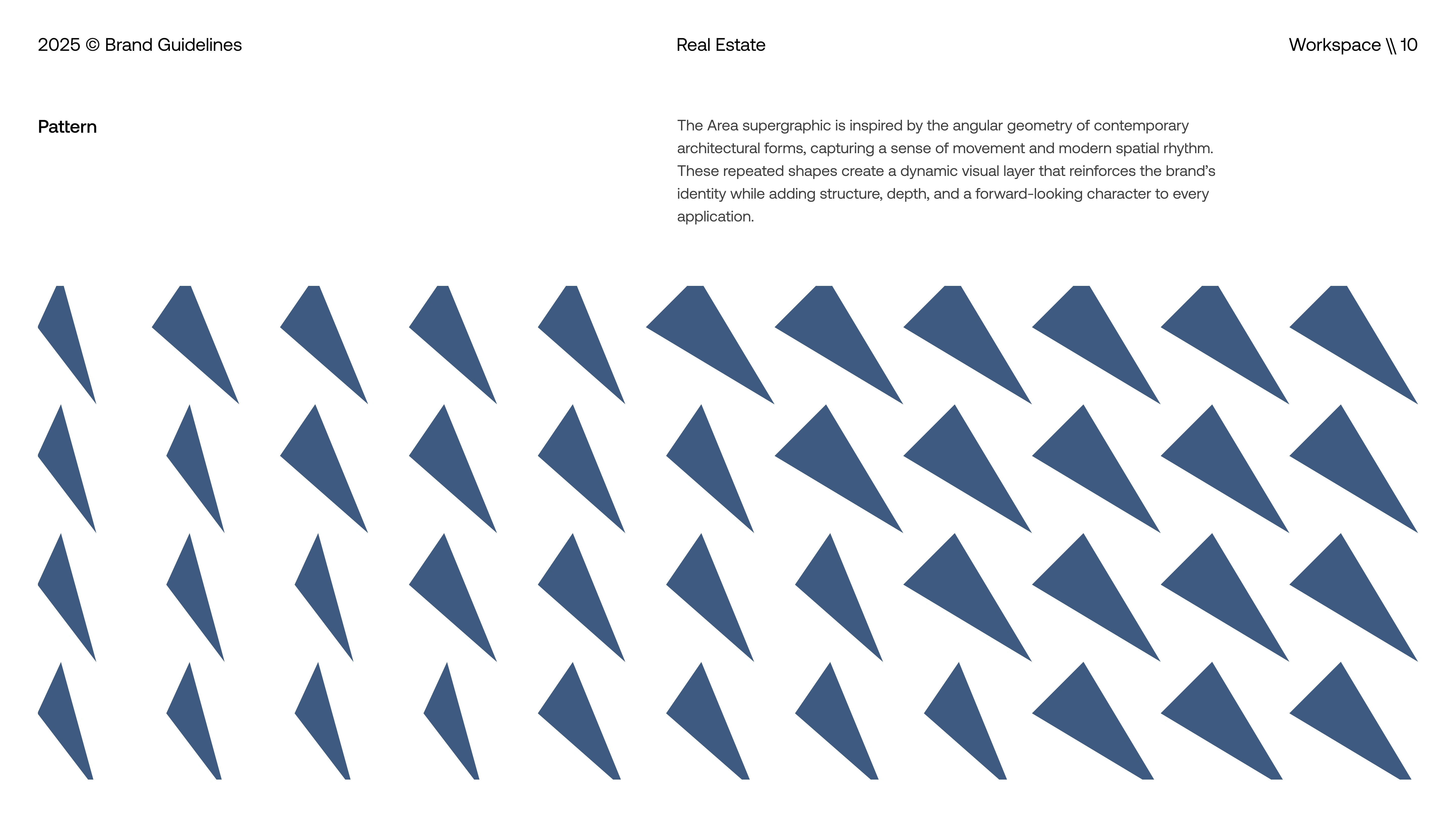
Brand Pattern
A geometric supergraphic inspired by modern architectural angles, designed to add movement, depth, and a dynamic visual rhythm to the Area identity.
The Solution & Impact
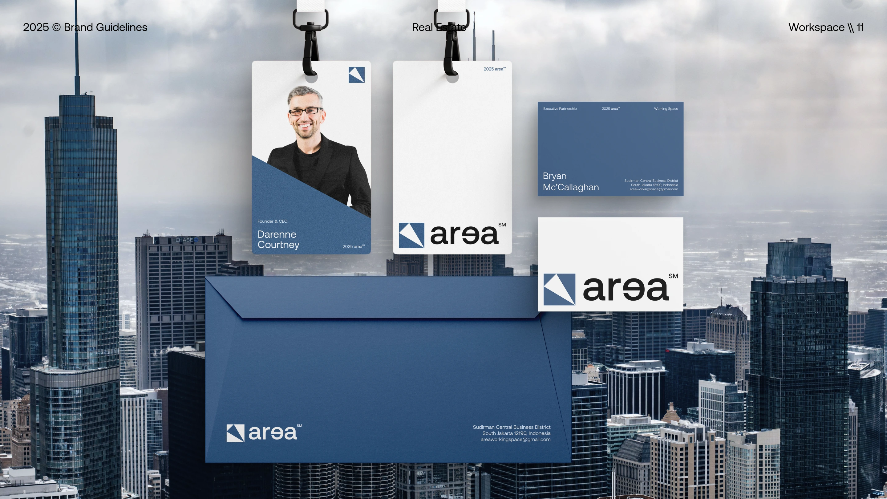
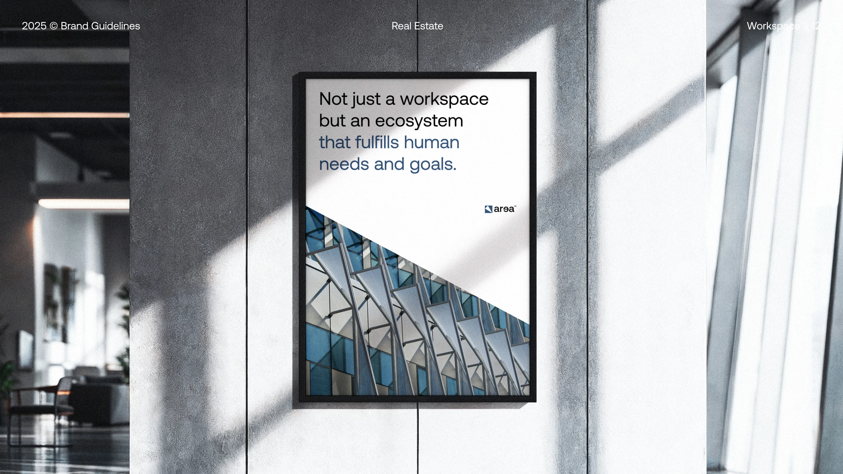
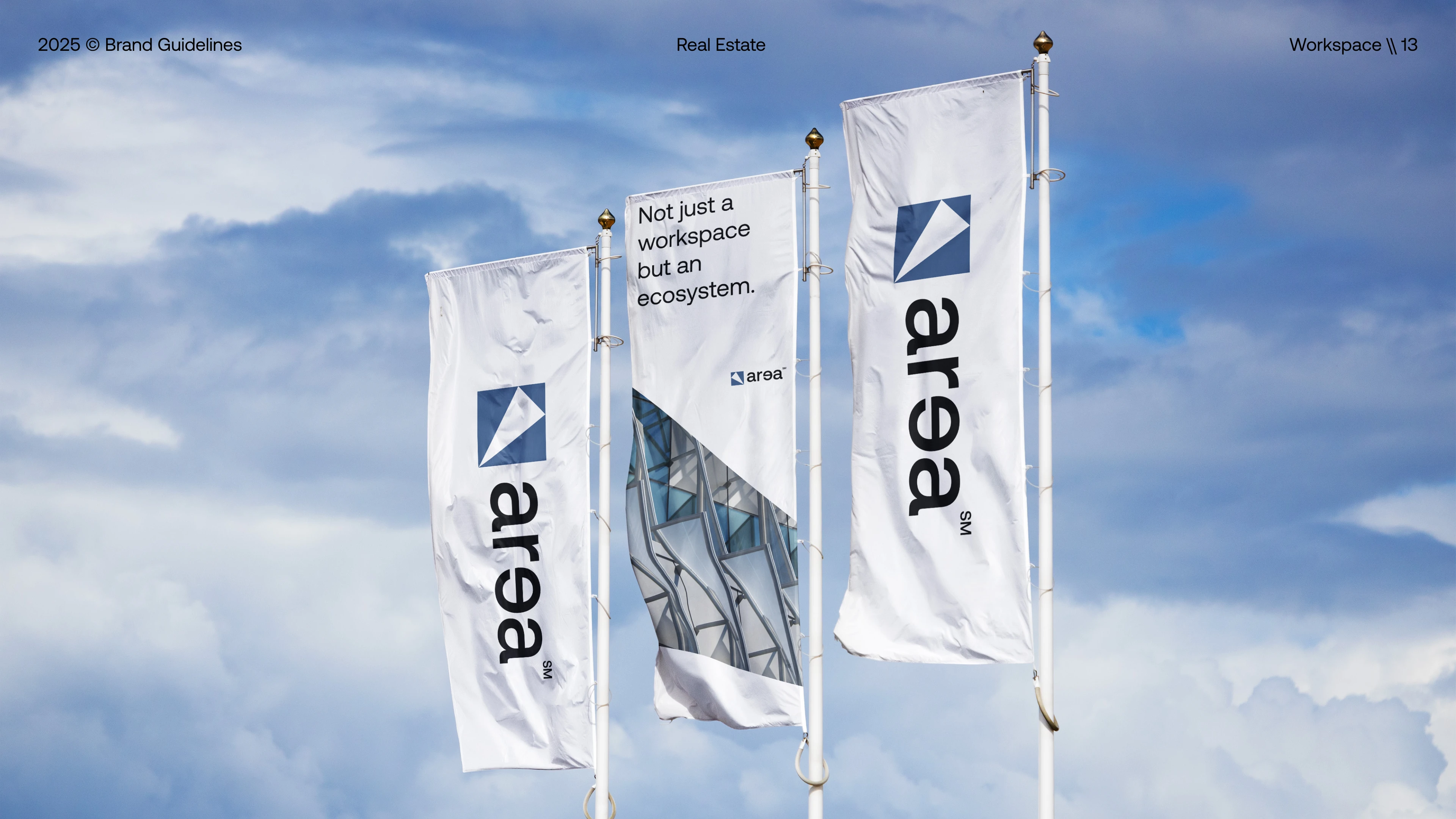
The resulting brand guidelines unify logotype construction, spacing rules, typography, color palettes, pattern systems, and real-world applications into a single cohesive framework. This identity strengthens Area’s position as a contemporary real estate brand, enabling clear communication, strong visual consistency, and a memorable presence across both digital and physical touchpoints. With a design language grounded in precision and modernity, Area establishes itself as a confident, refined, and forward-looking brand in the real estate landscape.
Like this project
Posted Nov 21, 2025
Area is a modern real estate brand built around clarity, structure, and a refined sense of space.