Customer Service Dashboard
Cansaas Agency
Overview
This exploration presents a Customer Service Dashboard designed to centralize conversations, support requests, and internal communication within a unified workspace. The product is focused on helping teams manage inboxes, monitor conversation status, and maintain visibility across ongoing interactions. It is built for support teams and operational roles that require structured oversight of daily communication flows. The experience emphasizes clarity and organization in a high-volume messaging environment.
The Challenge
Customer service platforms often become cluttered as conversations, notifications, and internal notes accumulate. Users may struggle to prioritize messages, track conversation status, or switch between inboxes without losing context. The challenge lies in balancing real-time communication with structured workflow management. Ensuring clarity while handling continuous inbound activity is a common friction point in support tools.
Design Approach
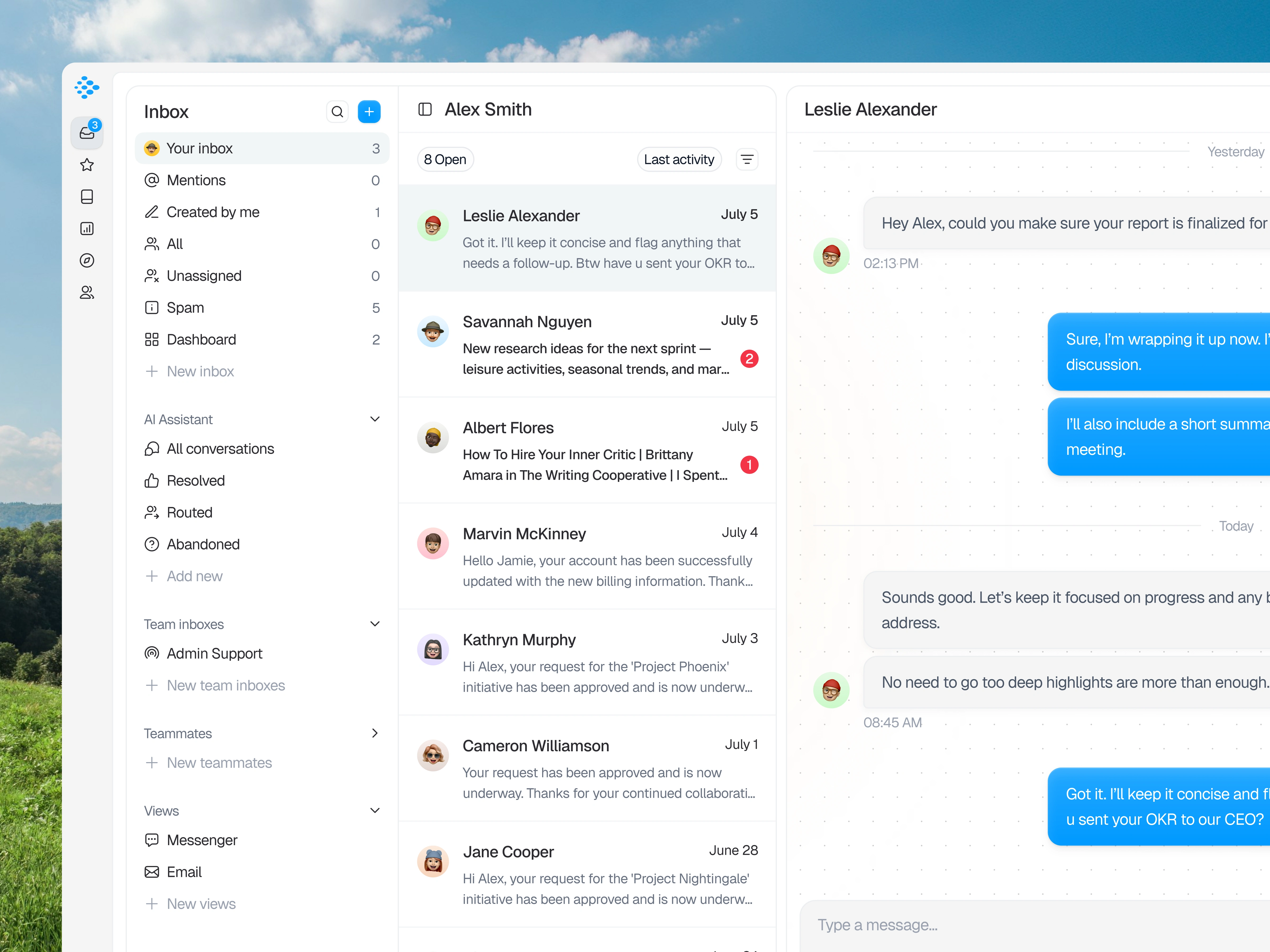
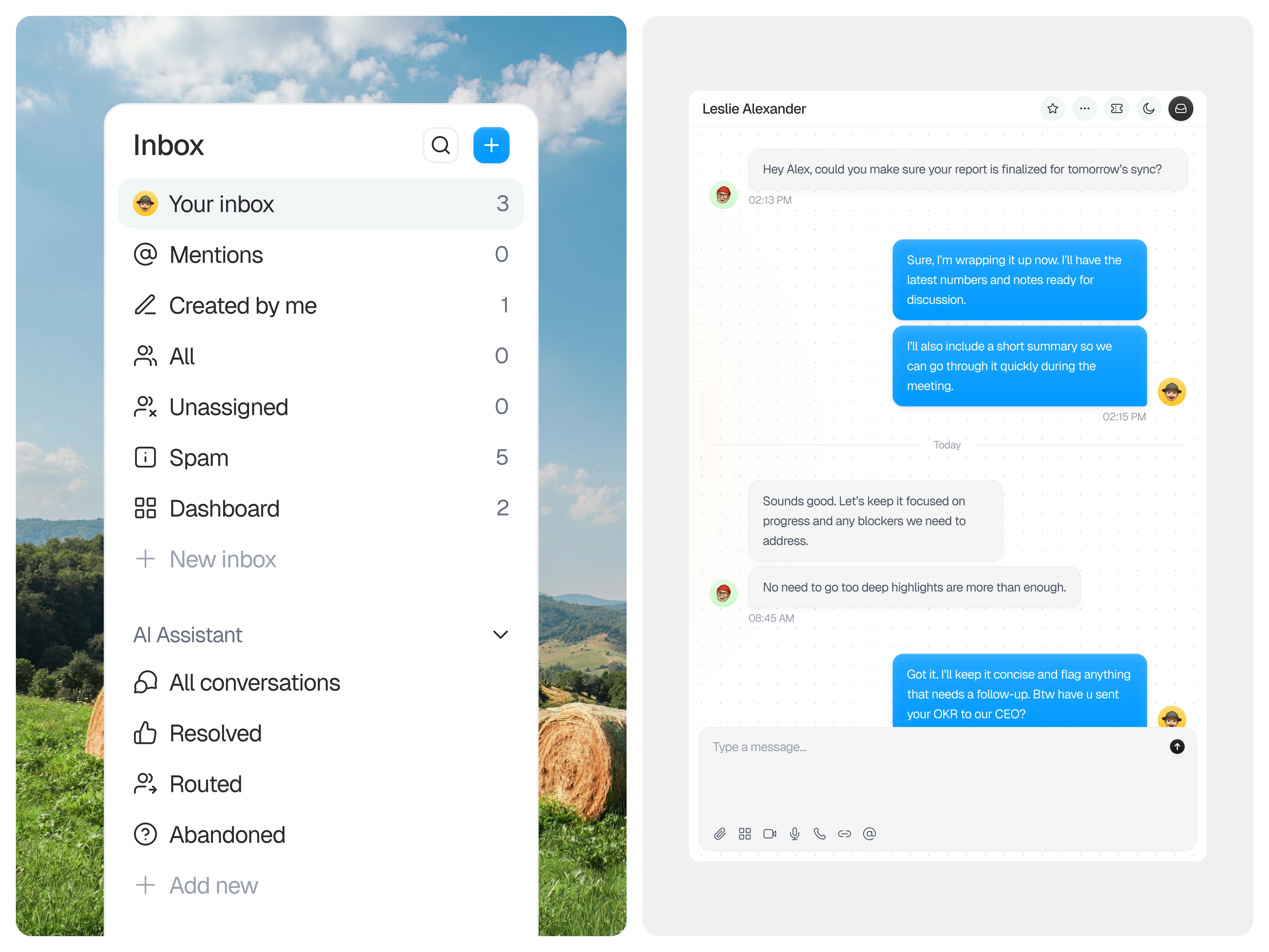
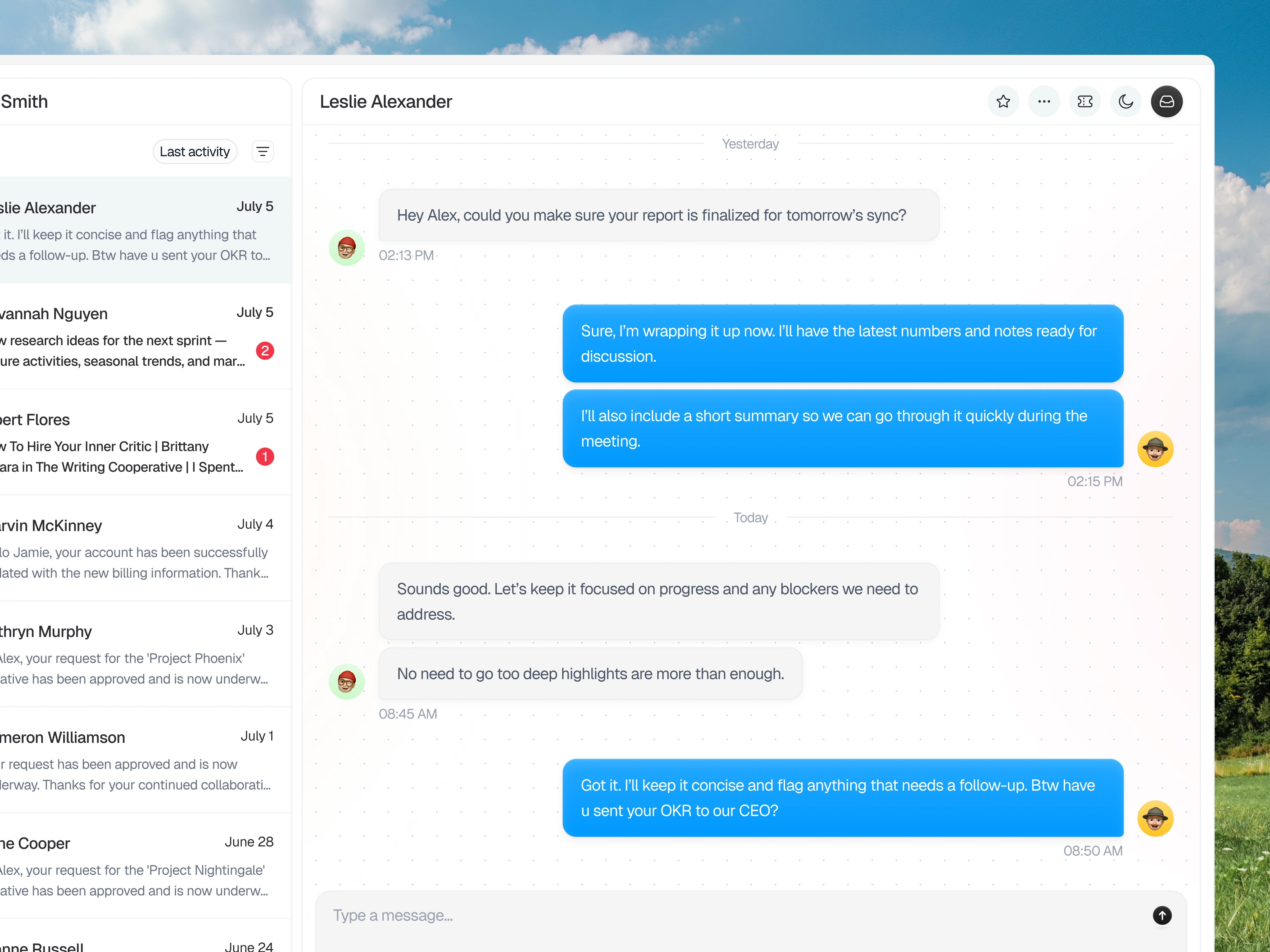
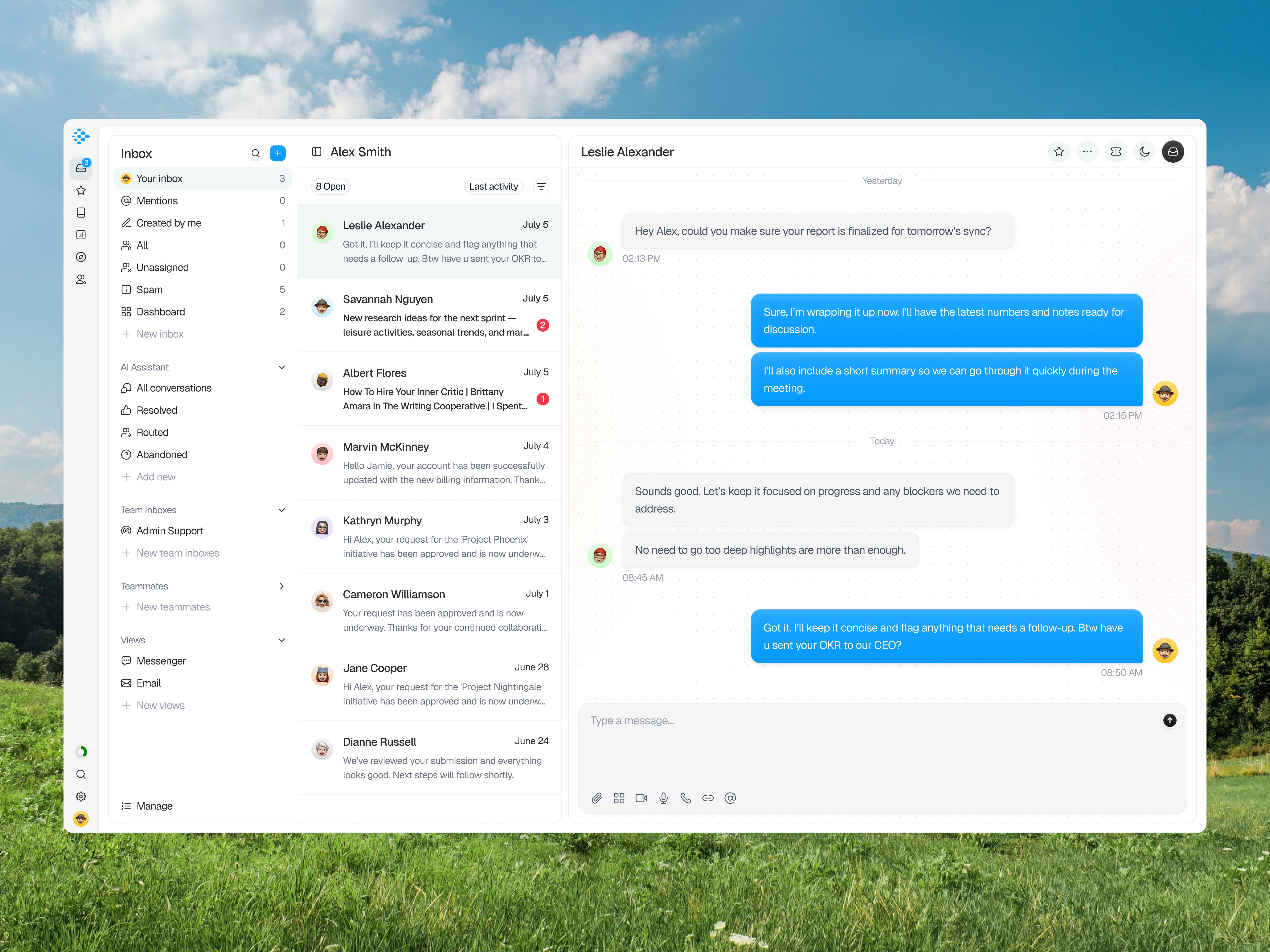
The layout is structured into distinct zones that separate navigation, conversation lists, and active message threads. Hierarchy is established by anchoring inbox categories on the left, surfacing conversation summaries in the center, and dedicating the main panel to focused dialogue. Information is grouped to support quick scanning before deeper engagement. The structure prioritizes contextual awareness so users can manage multiple conversations without disorientation.
Visibility of System Status
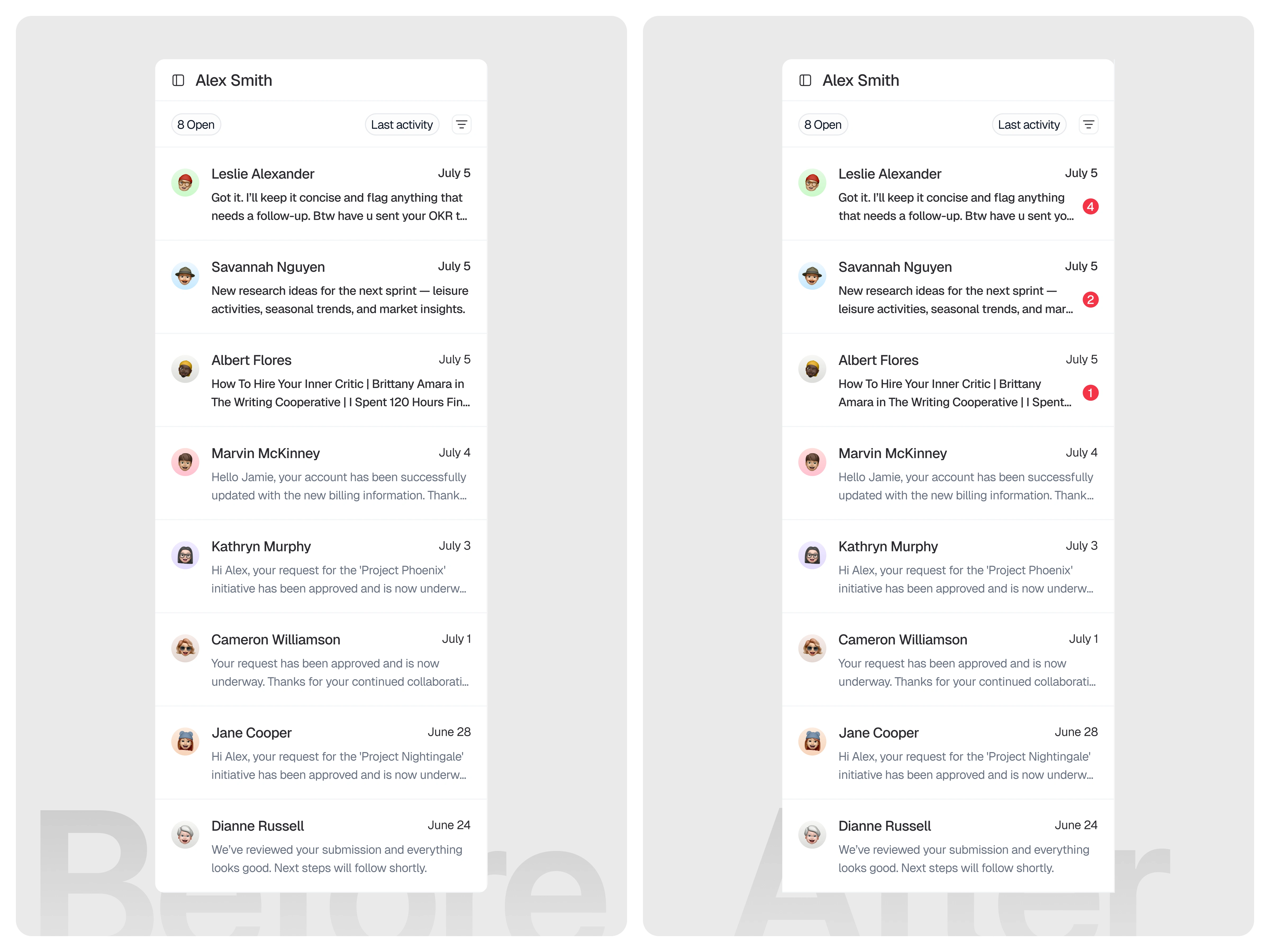
The system should always keep users informed about what requires their attention through clear and immediate visual indicators. In the initial version, unread conversations were only distinguished by slightly bolder text. While this technically created a difference between read and unread messages, the change was too subtle to provide strong visibility. Users could easily overlook unread chats, especially when scanning quickly, since the distinction relied solely on typography without any supporting visual signal. In the improved version, unread messages are now accompanied by a numeric badge that clearly indicates both the presence and quantity of unread messages. This provides an explicit and easily scannable status indicator, allowing users to instantly recognize which conversations need attention and how many messages are waiting. The badge reduces ambiguity, improves message prioritization, and communicates system status more effectively than relying on bold text alone. (src: Jakob Nielsen – 10 Usability Heuristics for User Interface Design)
Key Features Highlighted
The interface introduces categorized inbox views that allow teams to filter conversations by mentions, assignments, and status. A structured conversation list provides visibility into sender identity, message previews, and activity timestamps to support prioritization. The main chat panel presents threaded dialogue in a clean, readable format, while message input tools enable quick responses and follow-up actions. Supporting controls help teams monitor progress and maintain alignment within ongoing discussions.
The Solution and Impact
The resulting dashboard supports customer service teams in maintaining focus and control across dynamic communication flows. By organizing inboxes, conversation summaries, and message threads into clearly defined areas, the interface reduces cognitive strain during daily operations. Users can shift between overview and detailed conversations without losing context. The design encourages structured responsiveness while preserving clarity in fast-moving support environments.
Like this project
Posted Feb 13, 2026
Customer Service Dashboard exploration designed to centralize inbox management, conversation tracking, and structured support communication clarity
Likes
1
Views
11