Intuitive Music Streaming App Design
Cansaas Agency
Overview
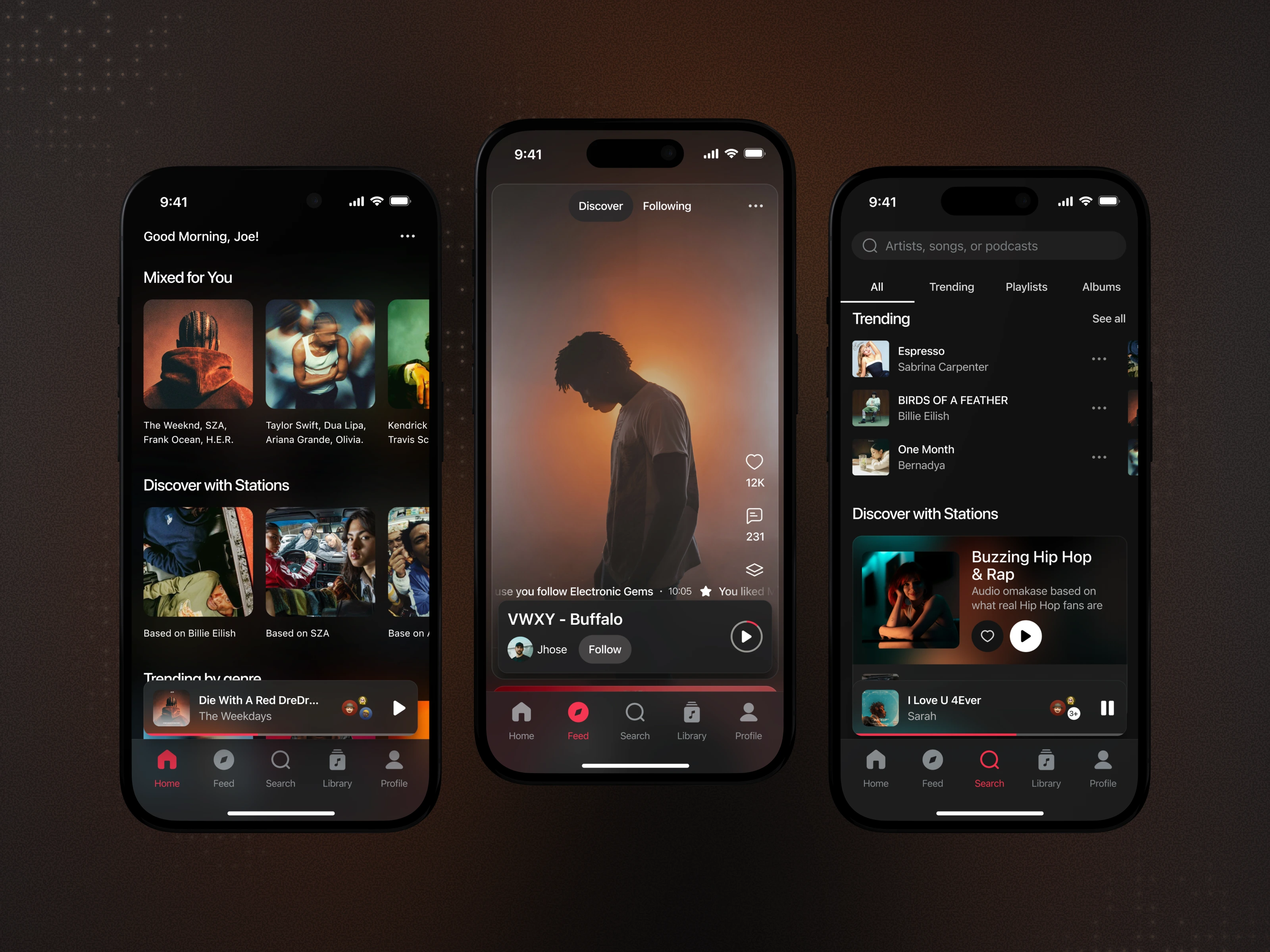
This exploration presents a music streaming mobile app designed to help users discover, organize, and enjoy music through an elegant and intuitive mobile experience. The goal was to create a navigation system that feels natural, reduces cognitive load, and lets the music take center stage through thoughtful visual hierarchy and interactions.
The Challenge
Many music streaming apps struggle with cluttered interfaces and confusing navigation patterns. Users often feel overwhelmed by too many features competing for attention, making simple tasks like finding trending music or accessing their library more complicated than necessary. The challenge was to simplify the navigation structure while maintaining quick access to essential features without sacrificing discoverability.
Design Approach
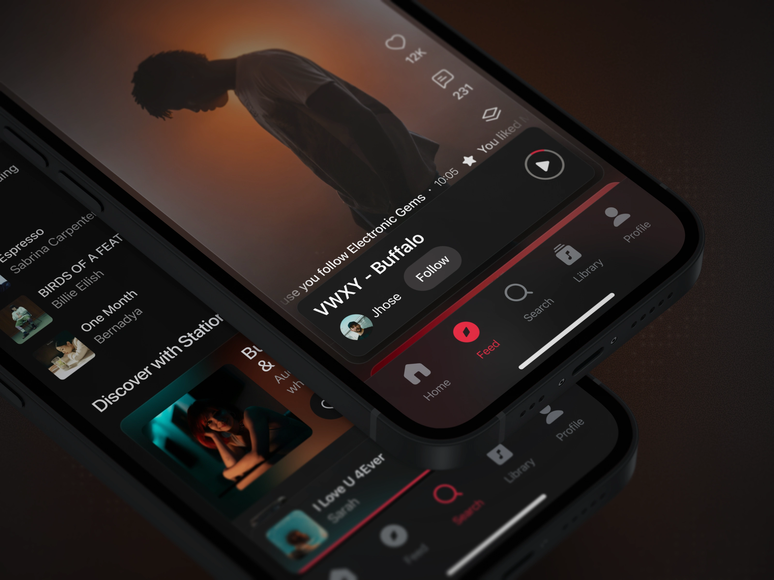
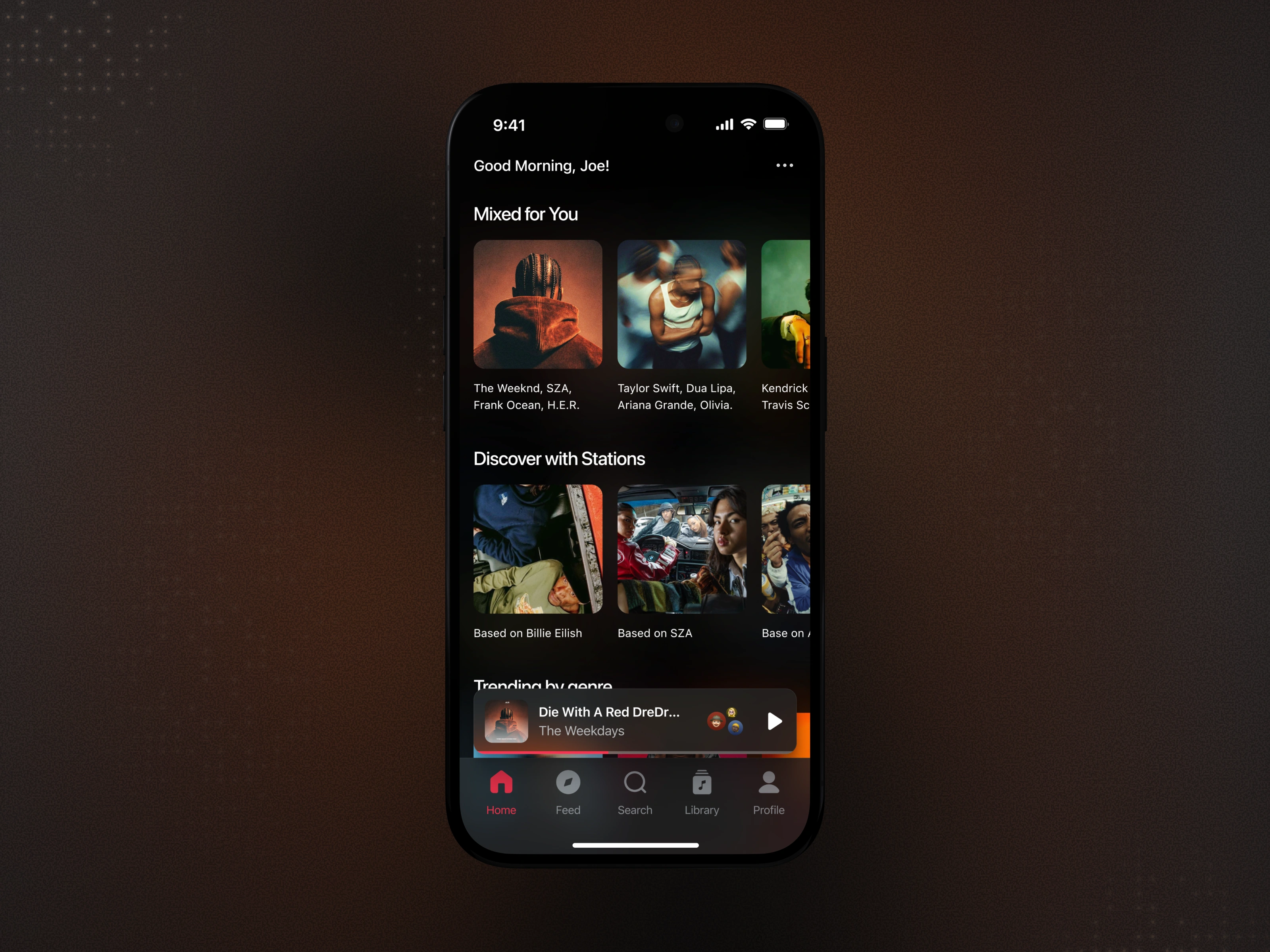
We designed the app with a mobile-first, content-forward mindset, focusing on clarity, visual elegance, and frictionless interactions. The dark theme reduces eye strain during extended listening sessions while allowing album artwork and content to pop. Navigation follows familiar patterns with clear visual cues, while personalized sections like "Mixed for You" and "Discover with Stations" are surfaced immediately on the home screen. Each screen maintains consistent hierarchy and spacing to create a cohesive, premium feel.
Key Features Highlighted
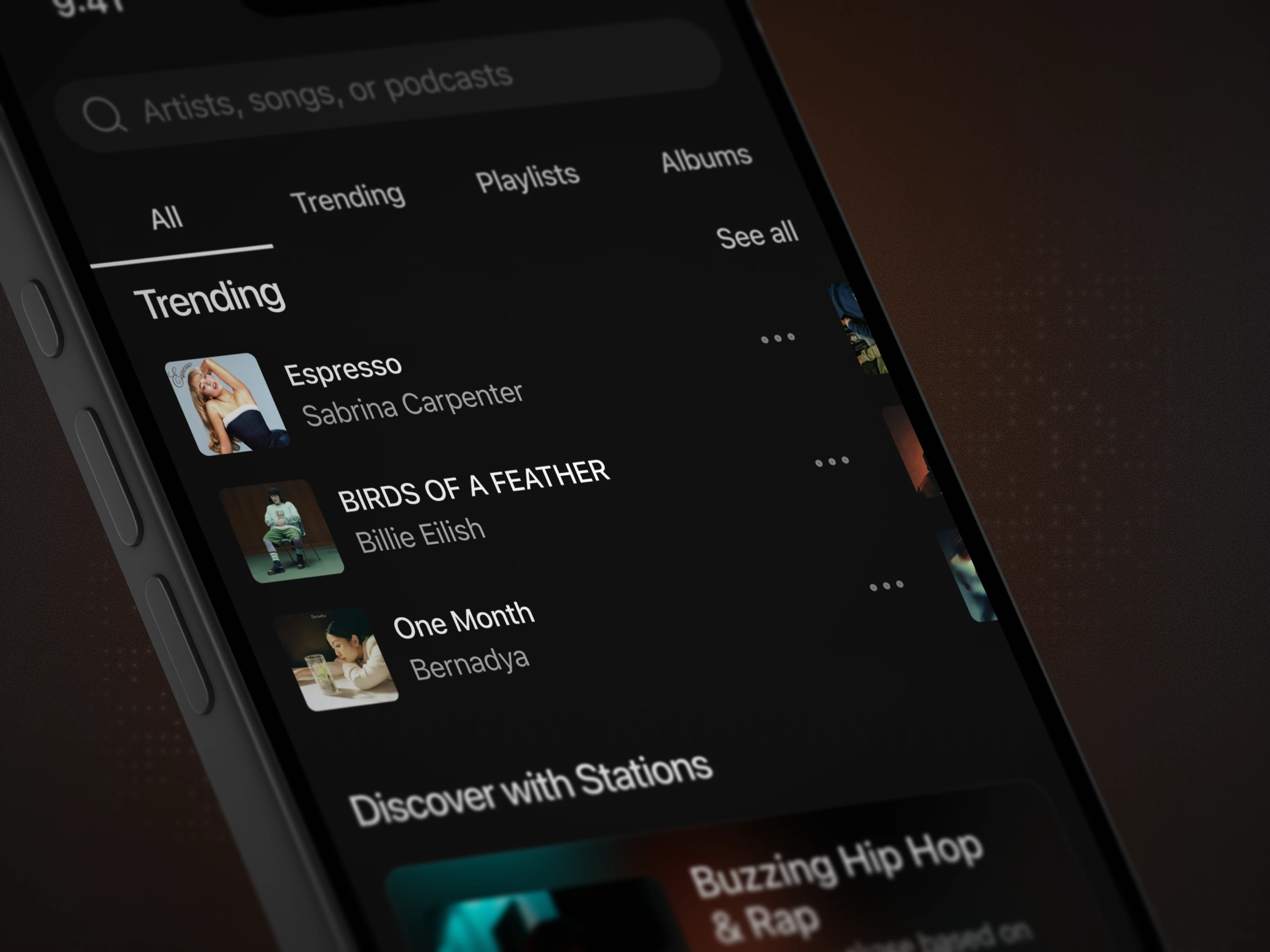
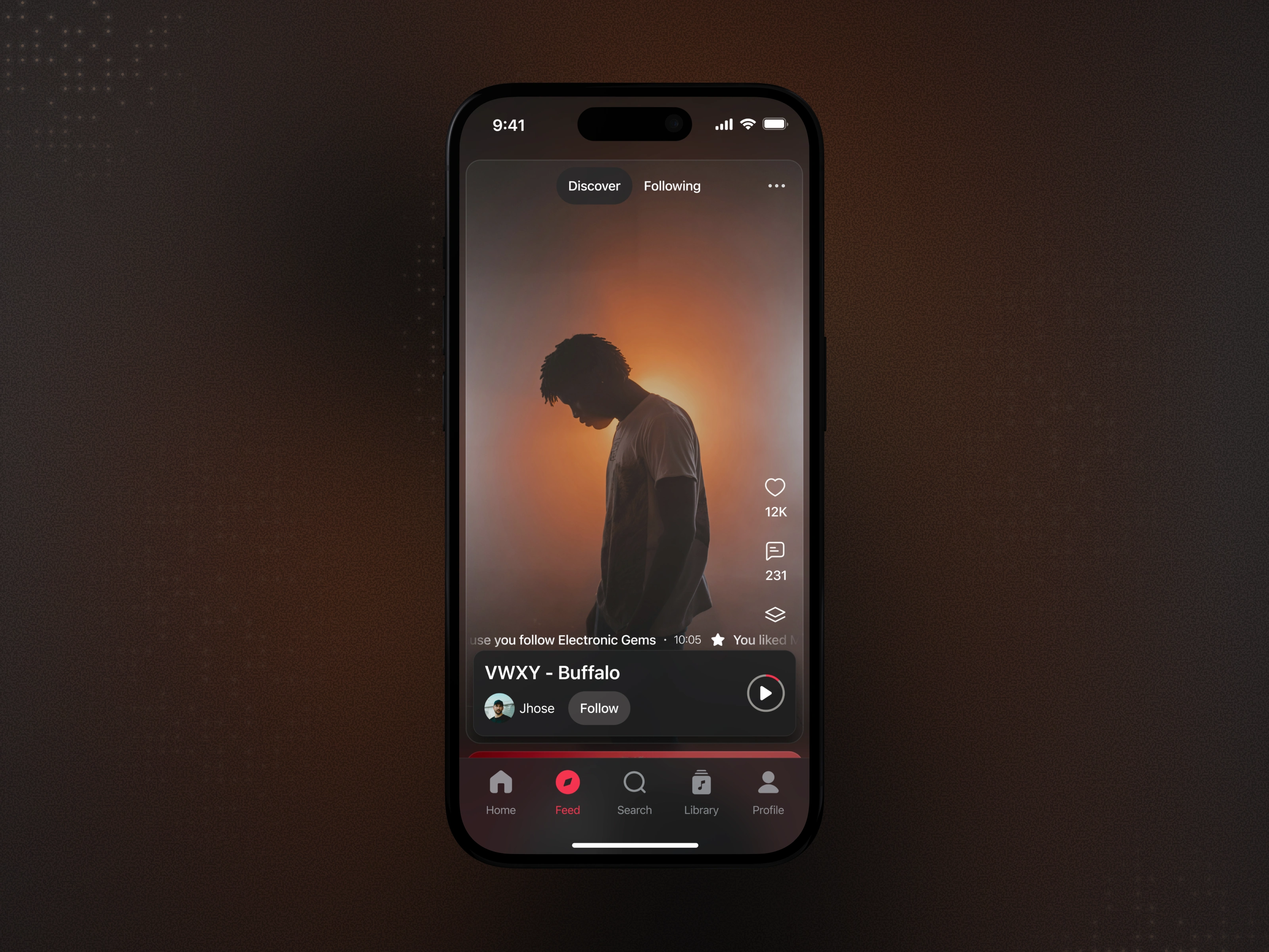
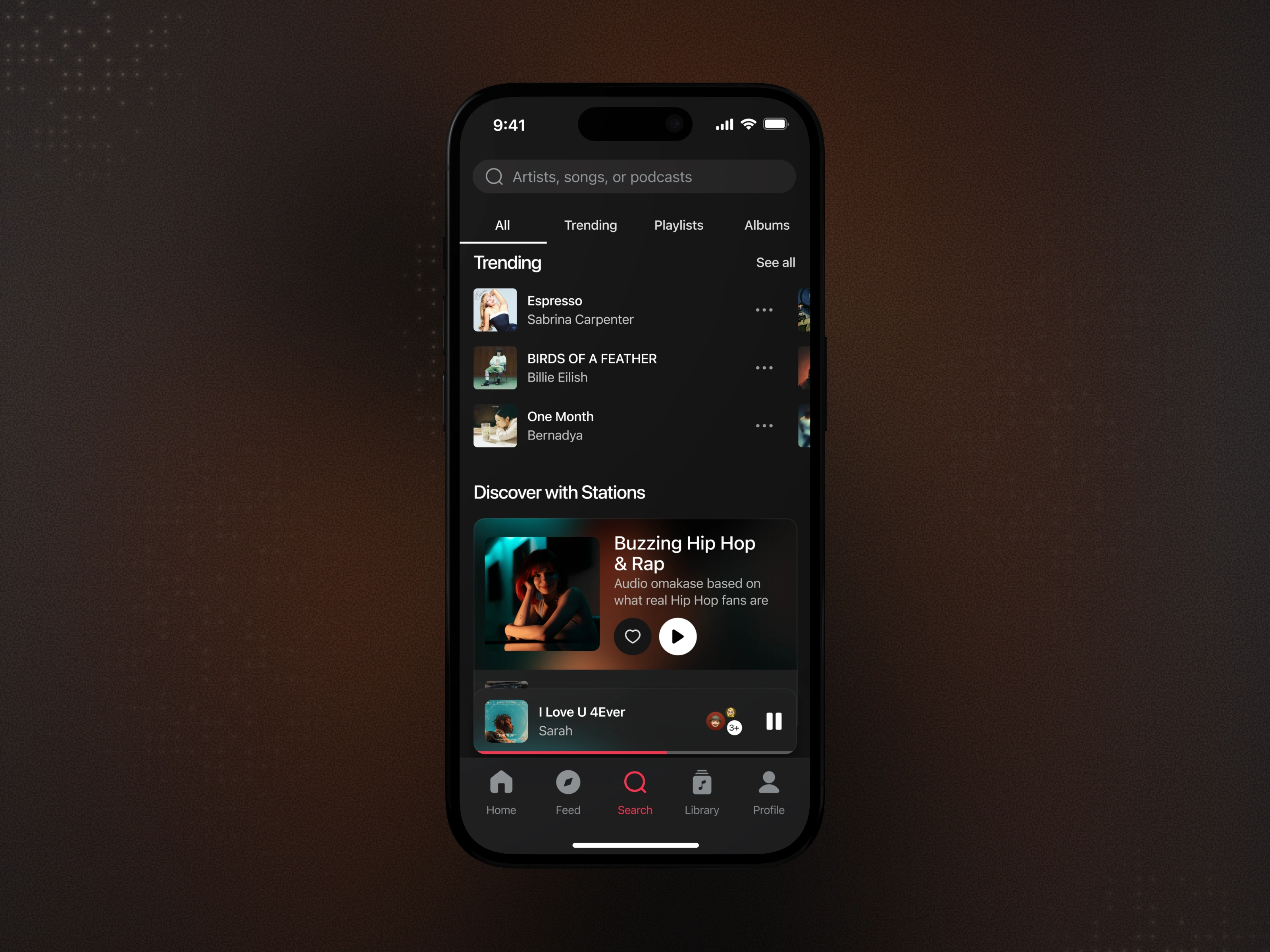
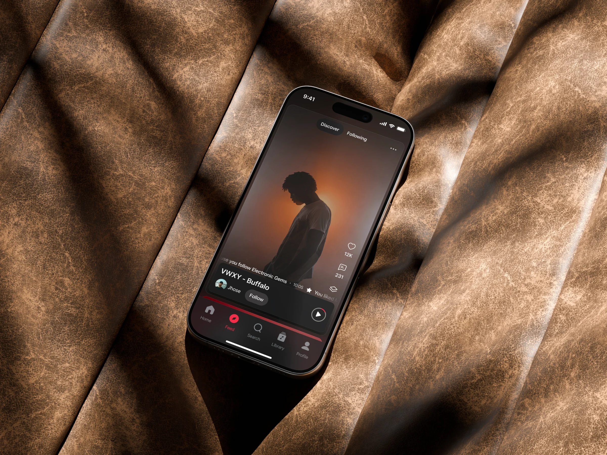
The app emphasizes personalized music recommendations, curated stations based on artist preferences, trending content discovery, and seamless search functionality. Visual progress indicators, clear categorization, and quick-access navigation ensure users can move between discovering new music and accessing their library without friction. The feed screen provides a social dimension, showing activity from followed artists and users.
User Flow & Interaction Design
The user flow is optimized for both passive listening and active discovery. Primary actions—playing music, searching, and accessing the library—are accessible from any screen via persistent bottom navigation. Secondary features like following artists or liking tracks are positioned contextually without interrupting the main experience. This ensures the app remains lightweight, intuitive, and encourages daily engagement without feeling overwhelming.
Visual Hierarchy & Consistency
Consistent Visual Language Reduces Learning Curve
Interfaces should maintain consistent patterns, spacing, and visual treatments to help users build mental models and navigate confidently.
In this design, the navigation bar remains fixed across all screens with clear iconography and active state indicators. Content cards follow consistent sizing and corner radius patterns, while typography hierarchy clearly distinguishes primary content (song/artist names) from secondary information (metadata, descriptions). Color is used purposefully—the signature pink accent guides users to interactive elements and active states, while white text ensures optimal readability against the dark background.
By maintaining these consistent patterns throughout the home, feed, and search screens, users can quickly understand the interface structure and focus on content rather than learning new interaction patterns on each screen. (src: Jakob Nielsen – 10 Usability Heuristics for User Interface Design)
The Solution and Impact
By presenting music content through a clean, visually cohesive interface with intuitive navigation, this streaming app encourages exploration and sustained engagement. Users can discover trending music effortlessly, access personalized recommendations instantly, and navigate between features confidently—creating a premium listening experience that feels both familiar and refined.
Like this project
Posted Feb 6, 2026
Designed a music streaming app focusing on streamlined navigation and user engagement.