Email Builder Dashboard
Cansaas Agency

Overview
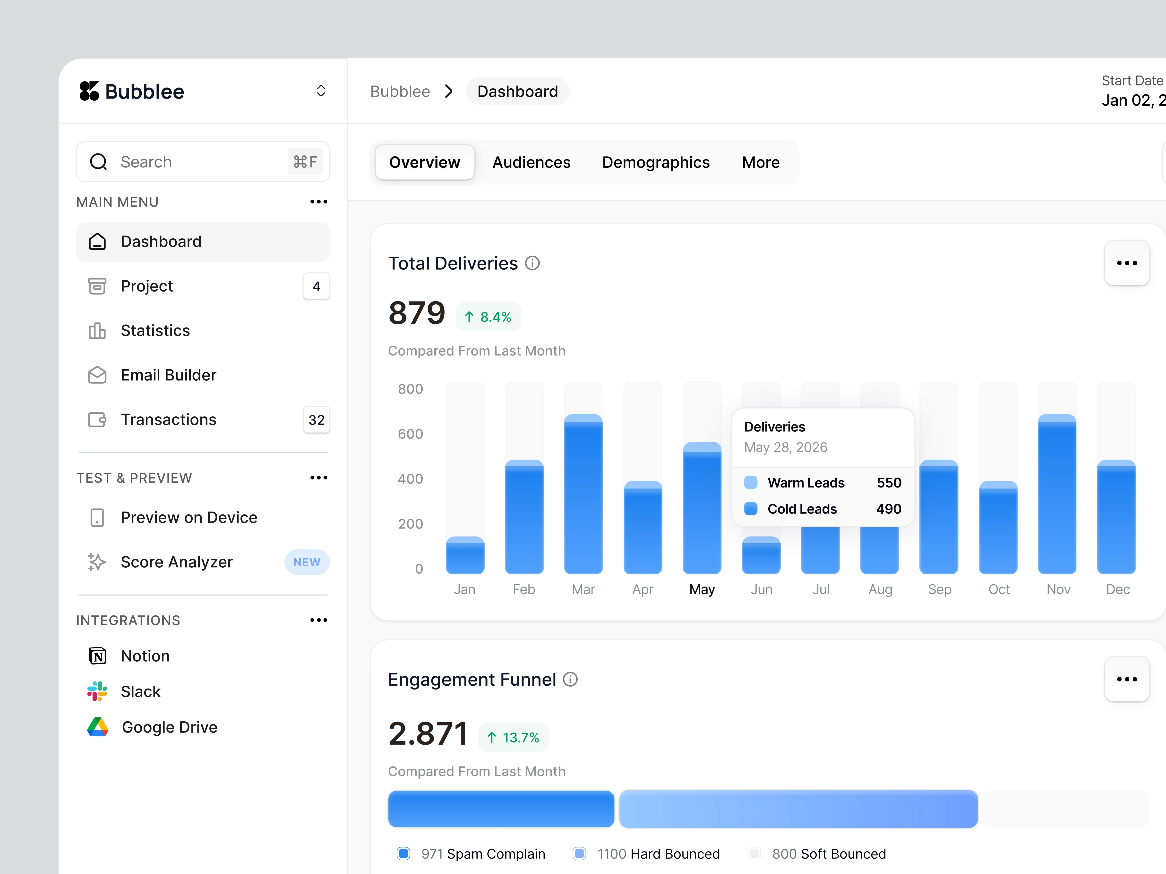
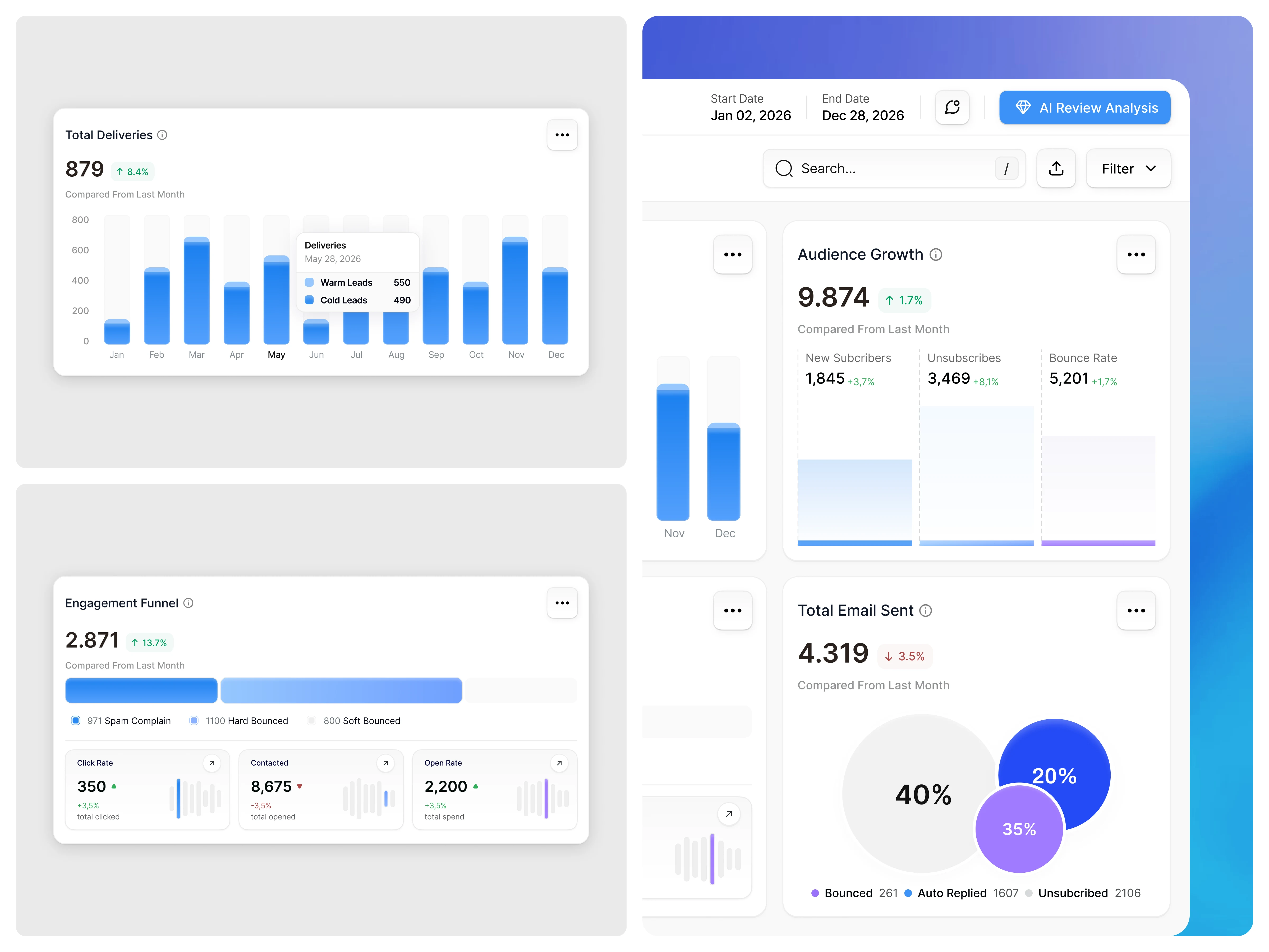
This Email Builder Dashboard UI/UX case study explores the design of a modern SaaS analytics interface built to help teams monitor email performance with clarity and confidence. The goal of this dashboard is to transform complex campaign data—such as deliveries, audience growth, engagement funnels, and response outcomes—into an interface that feels calm, readable, and actionable. By prioritizing visual hierarchy, spacing, and intuitive data visualization, this design supports faster insights and better decision-making for marketing teams and product stakeholders.
The Challenge
Email marketing dashboards often present performance data in fragmented views, forcing users to jump between reports to understand campaign health. The key challenge was designing a single Email Builder Dashboard that could surface critical metrics—such as deliveries, engagement quality, and audience behavior—without overwhelming users. The interface needed to support both quick daily monitoring and deeper performance evaluation while keeping data easy to interpret.
Design Approach
We approached the design by establishing a clear information hierarchy and modular layout system. Metrics are grouped into focused cards, allowing users to scan performance by category rather than decoding dense tables. Consistent spacing, soft visual elevation, and restrained color usage guide attention naturally across the dashboard. Interactive elements such as tooltips and segmented charts provide deeper context on demand, ensuring the interface remains clean while still offering detailed insights.
Key Features Highlighted
This Email Builder Dashboard emphasizes delivery performance tracking, audience growth monitoring, and engagement funnel visualization within a single unified view. Key features include segmented delivery insights (Warm vs Cold Leads), clear month-to-month performance comparisons, and interactive charts that reveal deeper context through subtle tooltips. Supporting metrics such as click rate, open rate, bounce behavior, and automated responses are presented in structured cards, enabling faster scanning and more informed campaign decisions.
The Solution and Impact
The final Email Builder Dashboard delivers a streamlined analytics experience where performance trends are immediately visible and easy to act on. By unifying delivery metrics, audience growth, and engagement funnels into one cohesive interface, teams can assess campaign effectiveness faster and with greater confidence. The result is a calm, data-driven dashboard that reduces cognitive effort, supports better decision-making, and scales effectively with growing email operations.
Like this project
Posted Feb 10, 2026
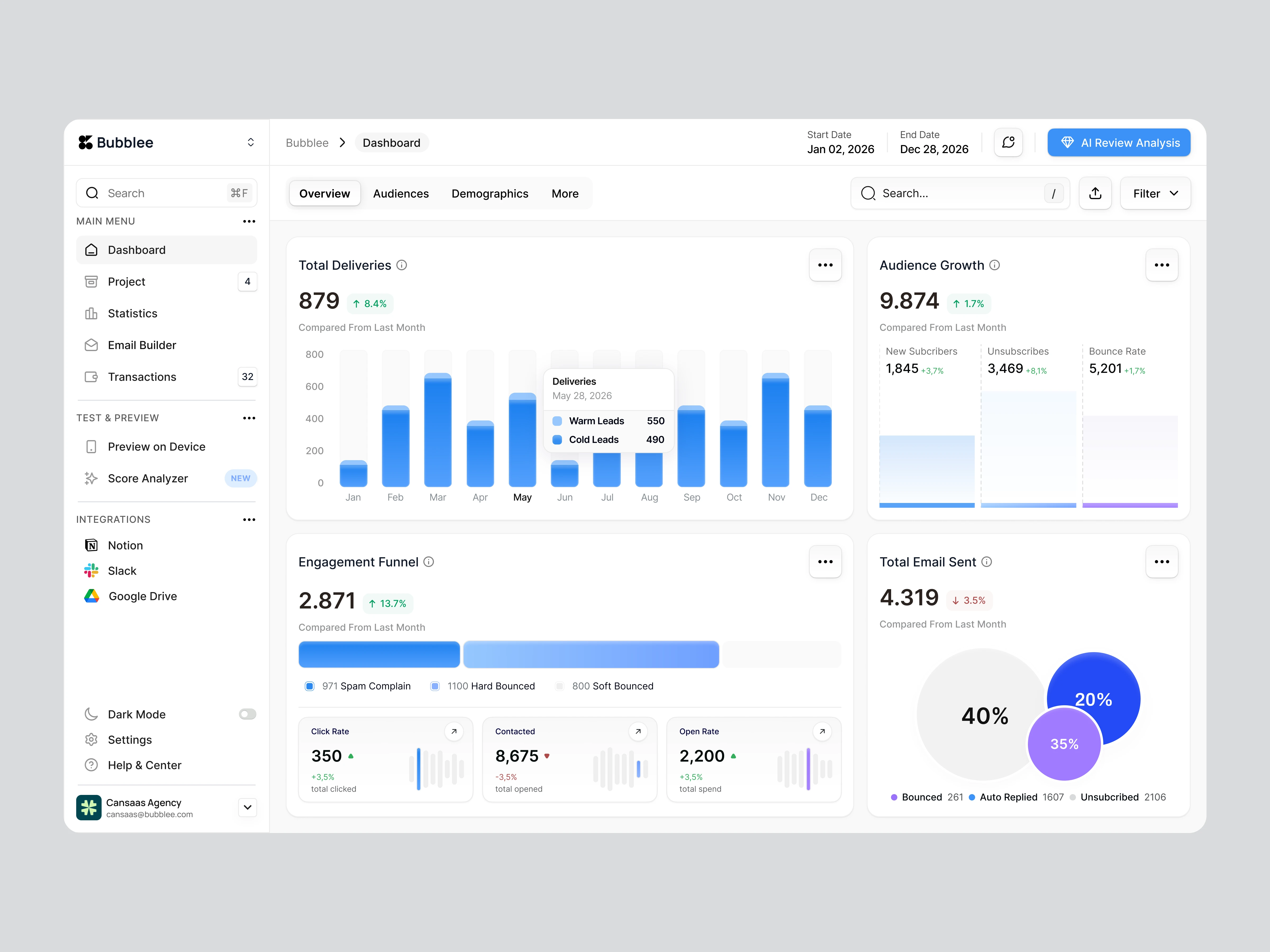
A clean Email Builder Dashboard with clear hierarchy and intuitive charts, helping teams read delivery, engagement, and audience insights faster.