Responsive Automation SaaS Landing Page
Cansaas Agency
Overview
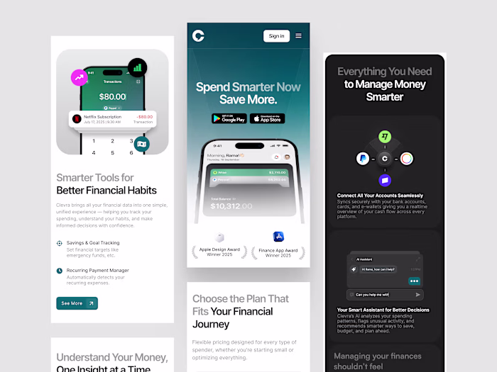
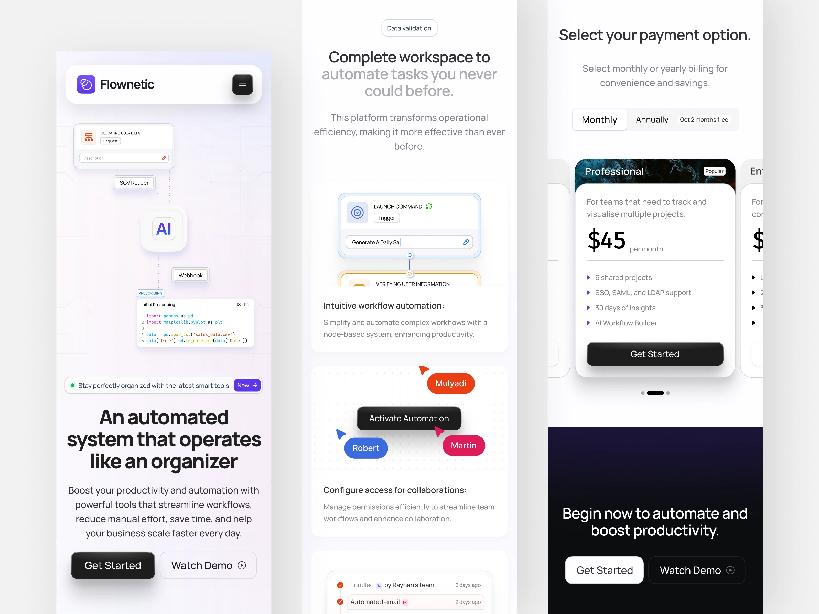
This exploration presents the mobile responsive version of an automation focused SaaS landing page. We adapted the original layout to deliver the same clarity and structure in a smaller, touch friendly format so users can explore tools, pricing, and workflows comfortably on any device.
The Challenge
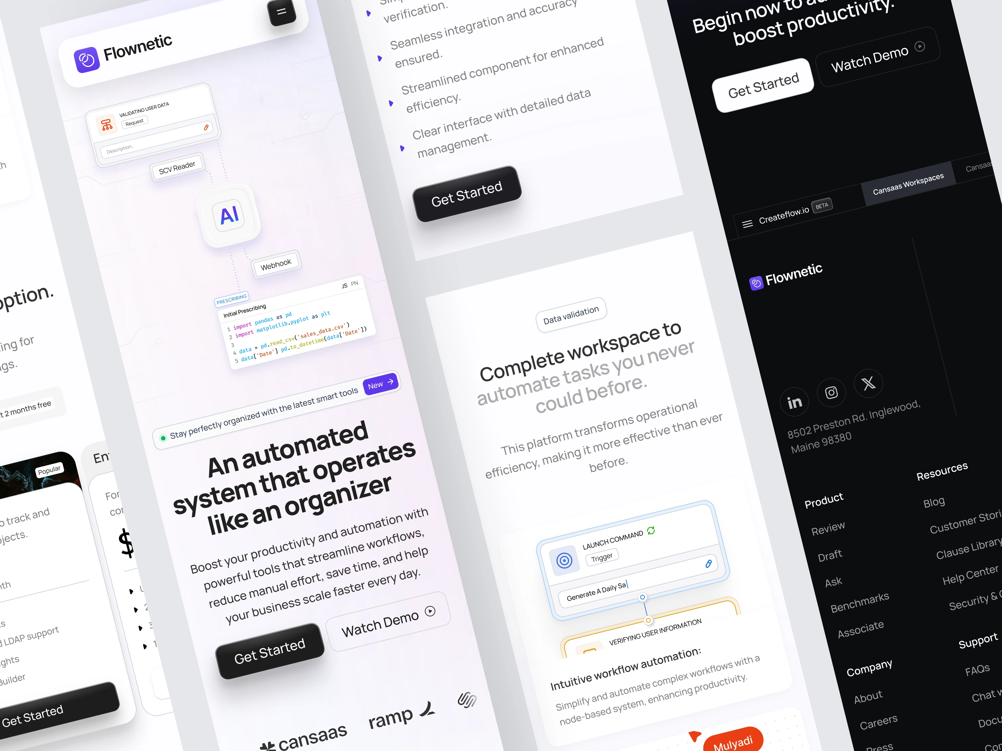
Translating a dense automation interface into a mobile layout can result in crowded components and hierarchy loss. Users struggle when spacing collapses or when interactive elements feel too tight. Our challenge was preserving readability and ensuring every section remains informative without overwhelming the screen.
The Solution and Impact
By developing a mobile responsive layout, the landing page now offers a consistent experience across devices. Users can explore automation features, learn about the product, and evaluate plans clearly even on smaller screens. The result is a seamless mobile experience that maintains the structure and usability of the desktop version.
Like this project
Posted Dec 3, 2025
We adapted the automation landing page into a mobile responsive layout that keeps workflows, insights, and pricing clear and easy to navigate on any device.
Likes
1
Views
6