Roemah - Real Estate Dashboard
Cansaas Agency
Overview
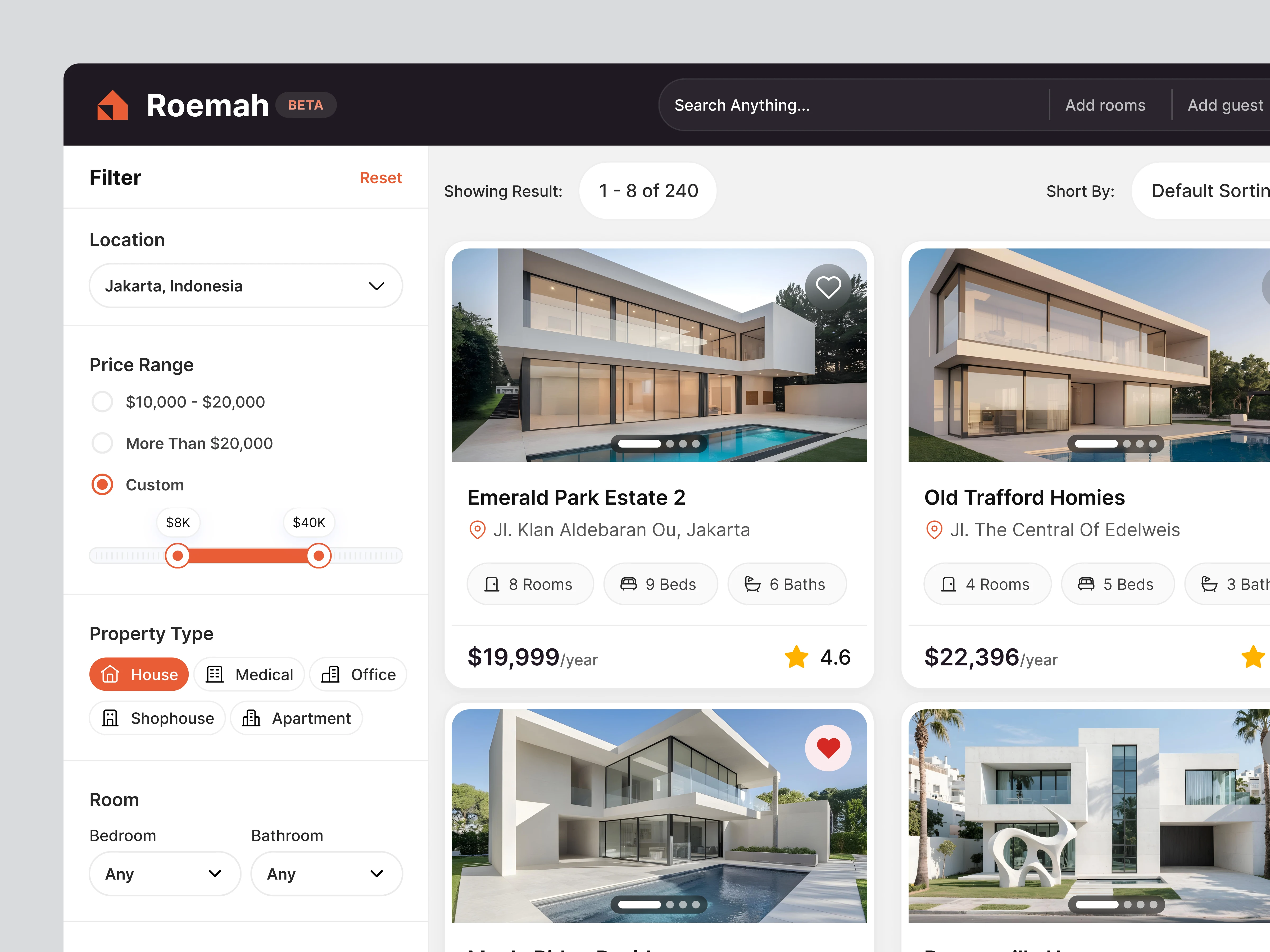
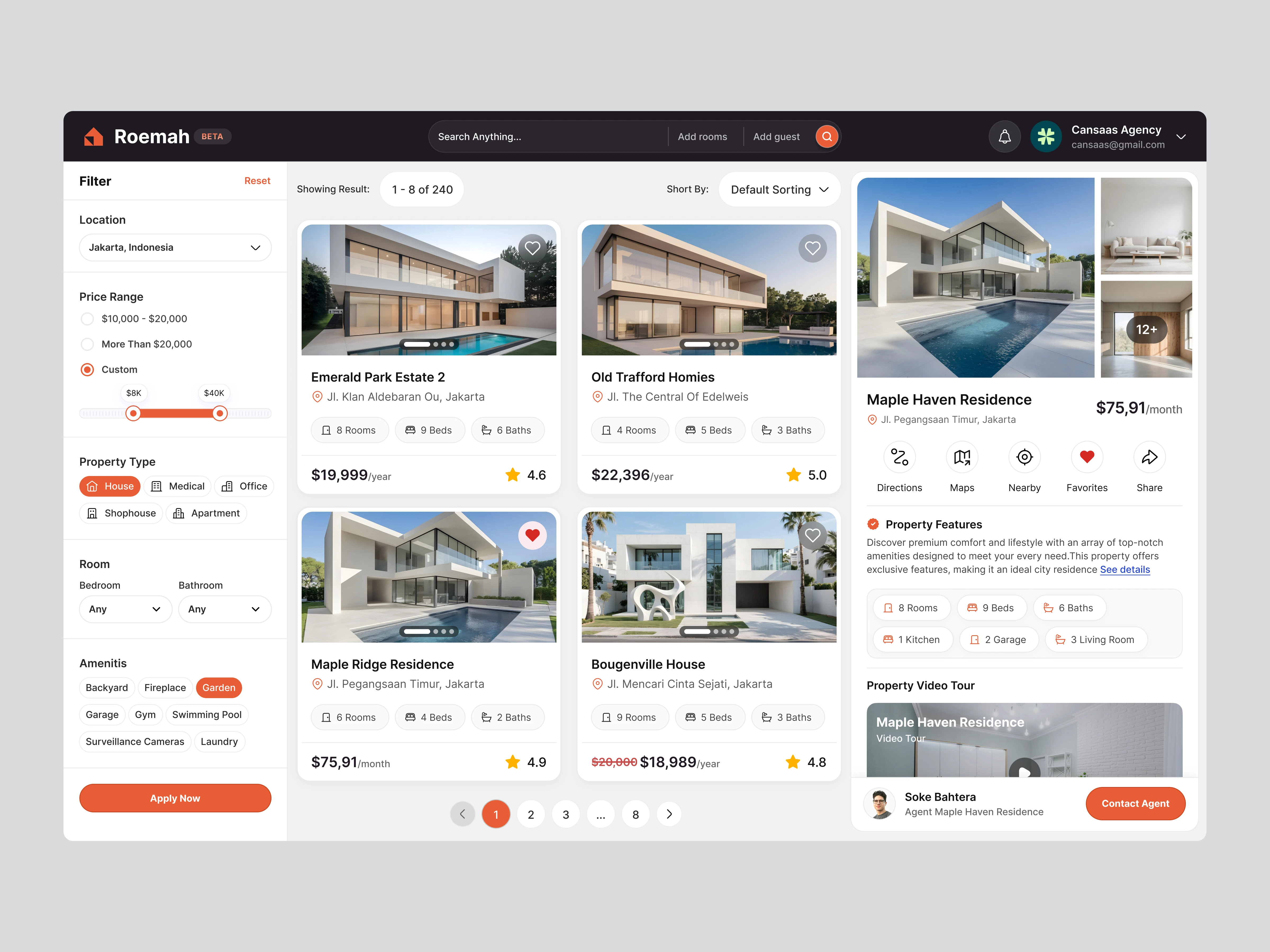
This exploration presents a structured way for users to browse and evaluate property listings through the Roemah platform. We designed the layout to help people filter homes, compare details, and review essential information inside one clear workspace. The goal was creating a friendly and intuitive experience for anyone searching for a place to live.
The Challenge
Real estate platforms often overwhelm users with dense information and inconsistent layouts. Many find it difficult to compare properties or understand key attributes because details are scattered. Our challenge was simplifying the browsing flow so users can search, evaluate, and make decisions with confidence.
The Solution and Impact
By refining hierarchy and improving interaction flows, the dashboard enhances how people browse real estate options. Users can filter results efficiently, review details instantly, and connect with agents directly. The result is a smoother and more intuitive experience that supports clearer decisions throughout the property search journey.
Like this project
Posted Dec 2, 2025
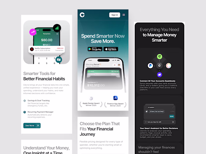
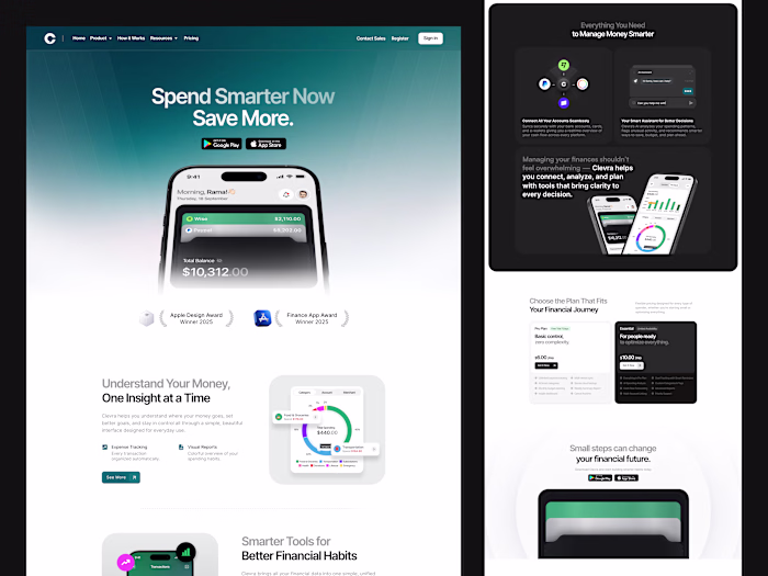
We adapted Clevra into a mobile responsive layout that keeps insights, reports, and financial tools clear, structured, and easy to read across smaller screens.
Likes
1
Views
11