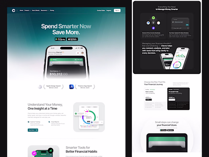
Clevra - Responsive Finance SaaS Landing Page
Cansaas Agency
Overview
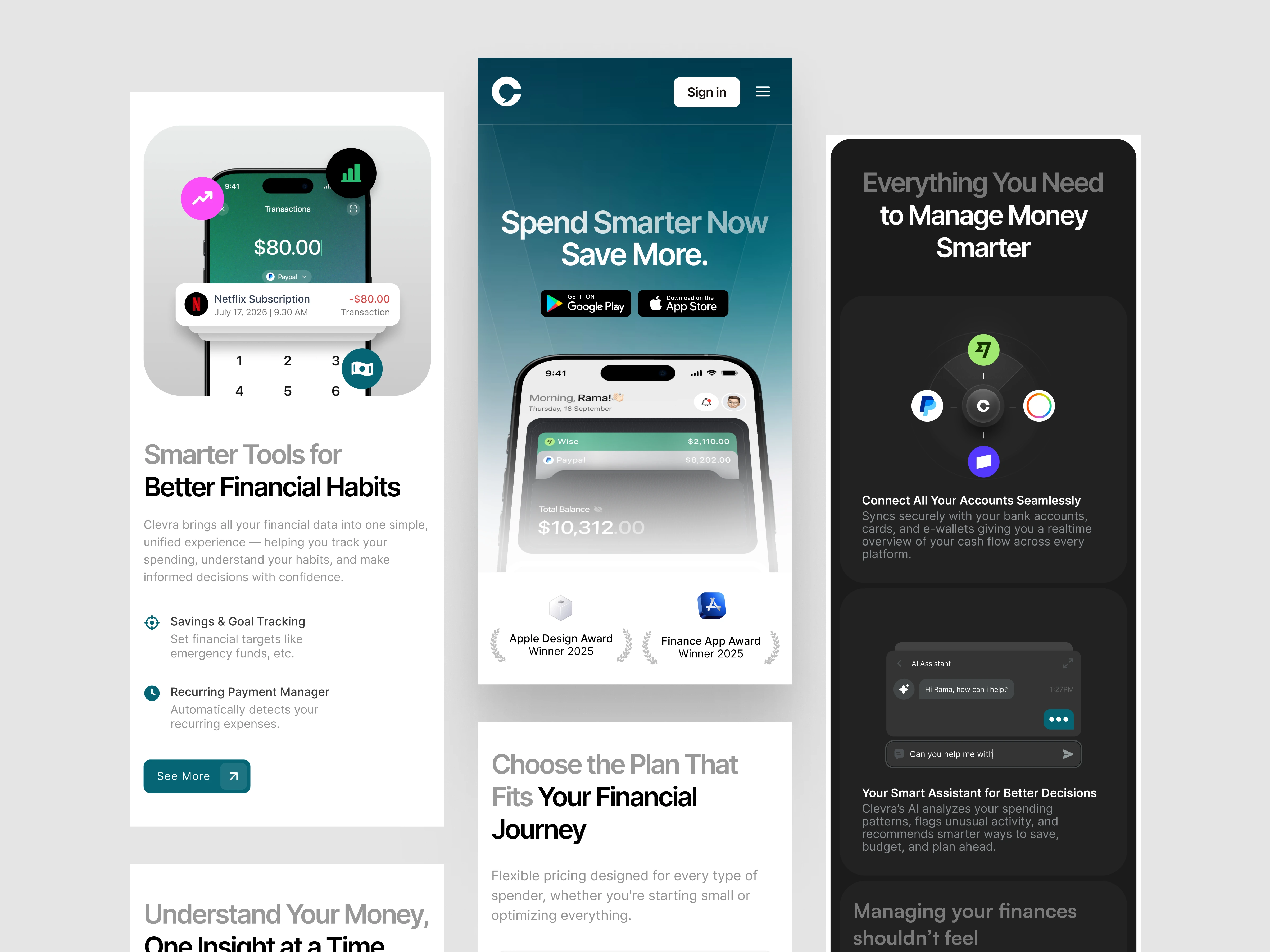
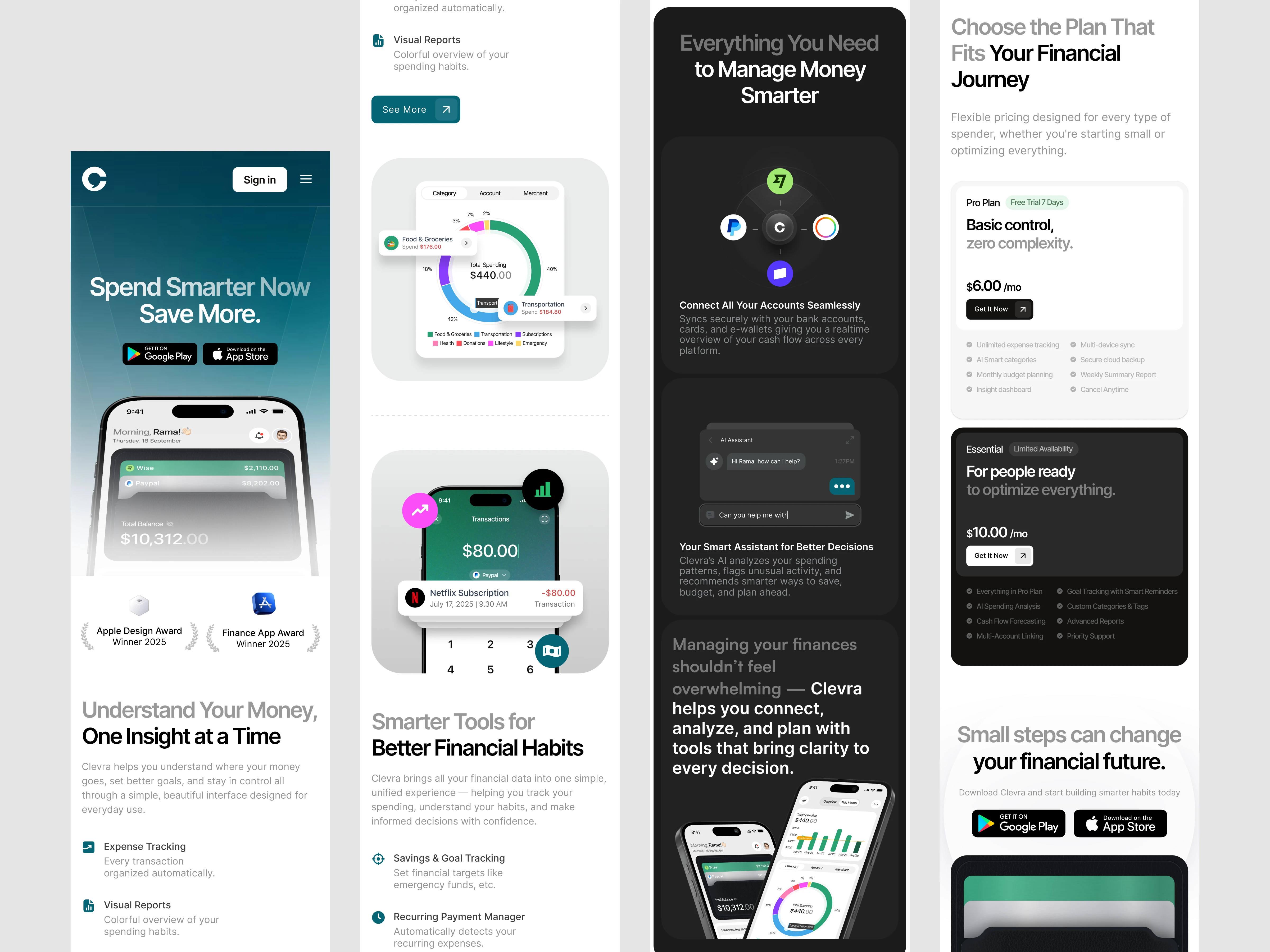
This exploration presents the mobile responsive version of Clevra’s financial platform. We designed this layout to deliver the same clarity, structure, and smart insights found in the desktop experience while adapting them into a seamless mobile interface. The focus was creating a design that feels intuitive and readable on smaller screens.
The Challenge
Reducing a full desktop layout into a compact mobile format often leads to crowded sections and hierarchy loss. Users struggle to read financial data when spacing and structure collapse. Our challenge was keeping the content light, organized, and easy to scan while preserving the value of the original landing page.
The Solution and Impact
By transforming Clevra into a mobile responsive layout, the landing page now supports smoother cross device experiences. Users can explore insights, compare plans, and understand their finances easily while on the go. The result is a consistent and thoughtful mobile version that maintains clarity across all screen sizes.
Like this project
Posted Dec 1, 2025
We adapted Clevra into a mobile responsive layout that keeps insights, reports, and financial tools clear, structured, and easy to read across smaller screens.
Likes
1
Views
11