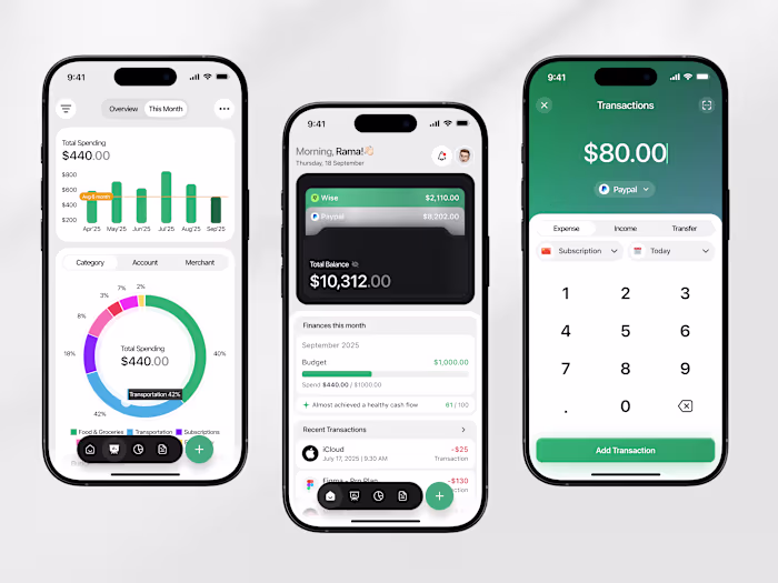
Orvix - Productivity Landing Page
Cansaas Agency
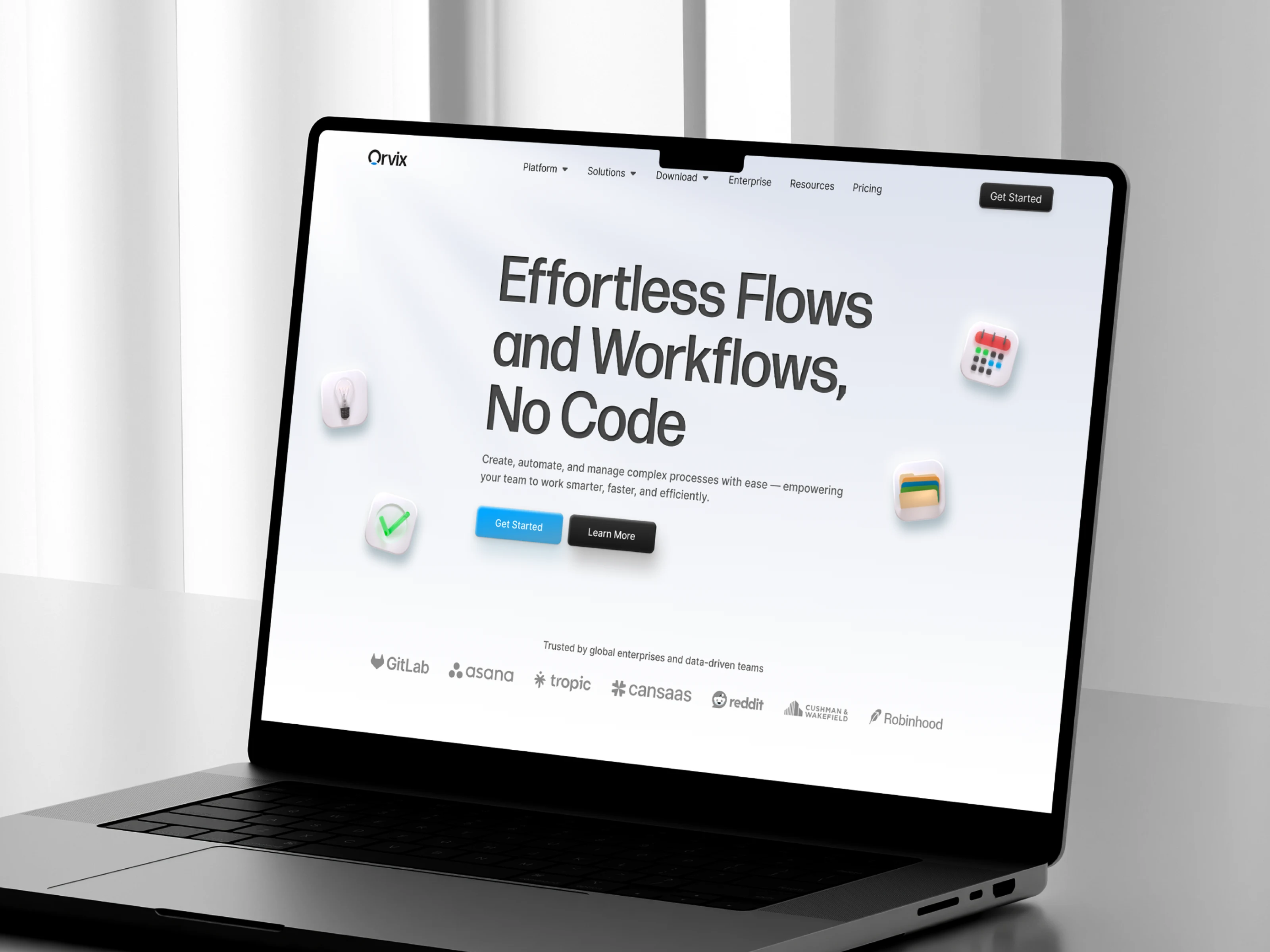
Overview
This Productivity Landing Page is designed as a high-conversion interface that streamlines complex workflows into a visually clean and user-friendly experience. The layout focuses on clarity, modern UI language, and trust-building elements through recognizable brand integrations and clean typography.
Designing for the decisive user. We cut through analysis paralysis by applying Hick's Law to our pricing page. Limiting the user to just two clear choices Standard vs. Pro transforms feature comparison from a confusing task into a quick, confident decision. Less clutter, more conversion.(lawsofux.com)
The Problem
Many productivity platforms overwhelm users with complex visuals and dense information. This design addresses that challenge by prioritizing seamless navigation, visual hierarchy, and clear messaging that instantly communicates value without cognitive overload.
Result
The final interface delivers a refined and scalable landing page design that positions the product as a smart, premium solution for productivity-driven teams. With optimized visual flow and high accessibility, the design increases engagement, trust, and conversion potential.
Like this project
Posted Oct 13, 2025
Our new landing page design, we created a clean, structured interface for a no-code platform that unifies all productivity tools in one seamless experience.
Likes
1
Views
11