Aura AI - Brand Guidelines
Cansaas Agency
Overview
Aura is a vibrant brand identity built to express energy, innovation, and modern simplicity. Designed as a visual system that blends motion, light, and clarity, Aura captures the intersection between futuristic aesthetics and functional design. The brandbook establishes a consistent visual framework defining logo behavior, color application, typography, and implementation across multiple touchpoints, from billboards to digital interfaces.
This project focuses on creating a cohesive yet flexible identity one that can adapt across mediums while maintaining a confident, intelligent tone.
The Problem
In a competitive landscape where technology and lifestyle brands often look alike, Aura needed a distinct and scalable identity that communicates progressiveness without losing accessibility. Many modern brands struggle to balance creativity and clarity either leaning too heavily on visual complexity or becoming too minimal to stand out.
The challenge was to design a system that embodies innovation and energy while staying legible, structured, and future-ready.
The Concept
The Aura identity was built around the idea of motion and light visual metaphors for progress, transformation, and flow. By merging neon gradients with minimal typography, the brand achieves a look that feels dynamic yet grounded, symbolizing constant movement in a fast-paced world.
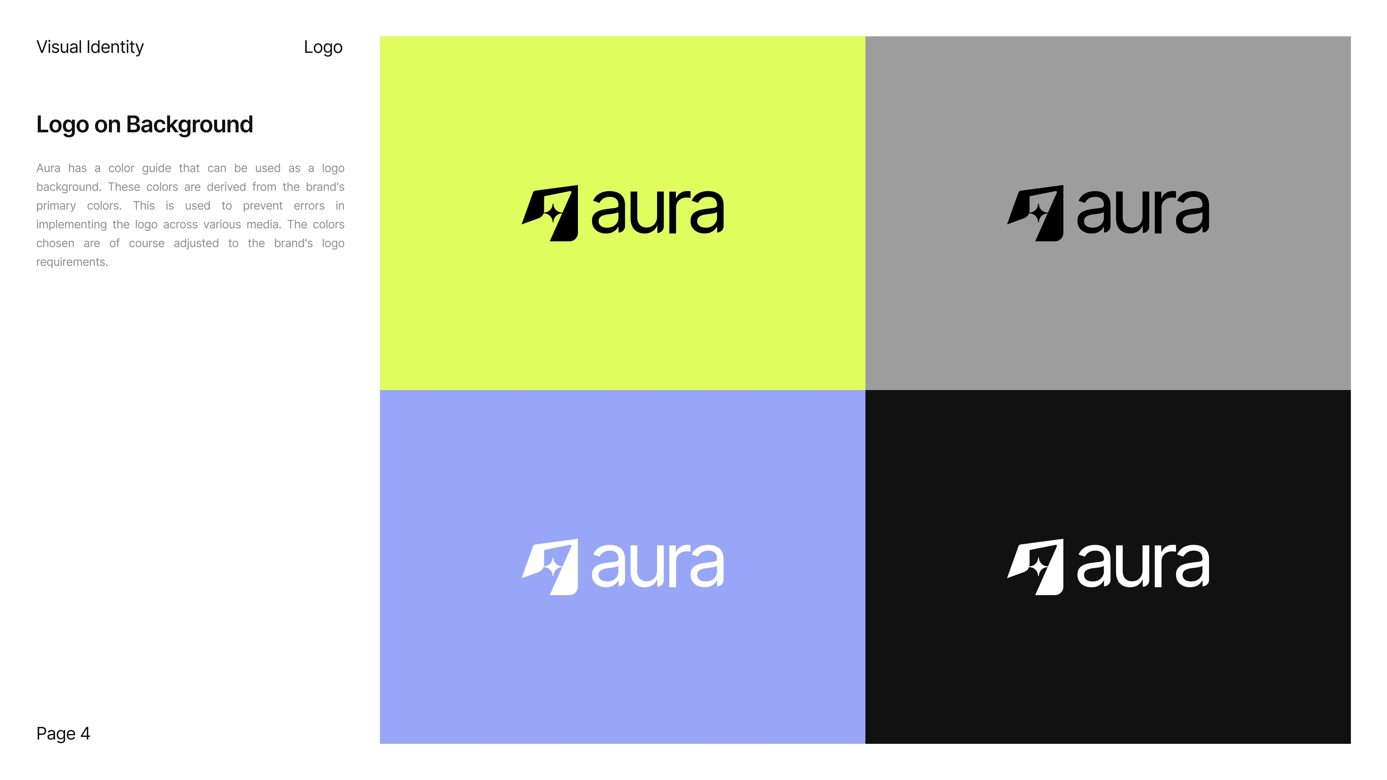
Typography plays a crucial role: Inter was chosen for its geometric precision and digital adaptability, aligning perfectly with the brand’s futuristic tone. Meanwhile, the use of generous white space reinforces clarity, allowing the vibrant hues to shine without overwhelming the viewer.
Visual Language
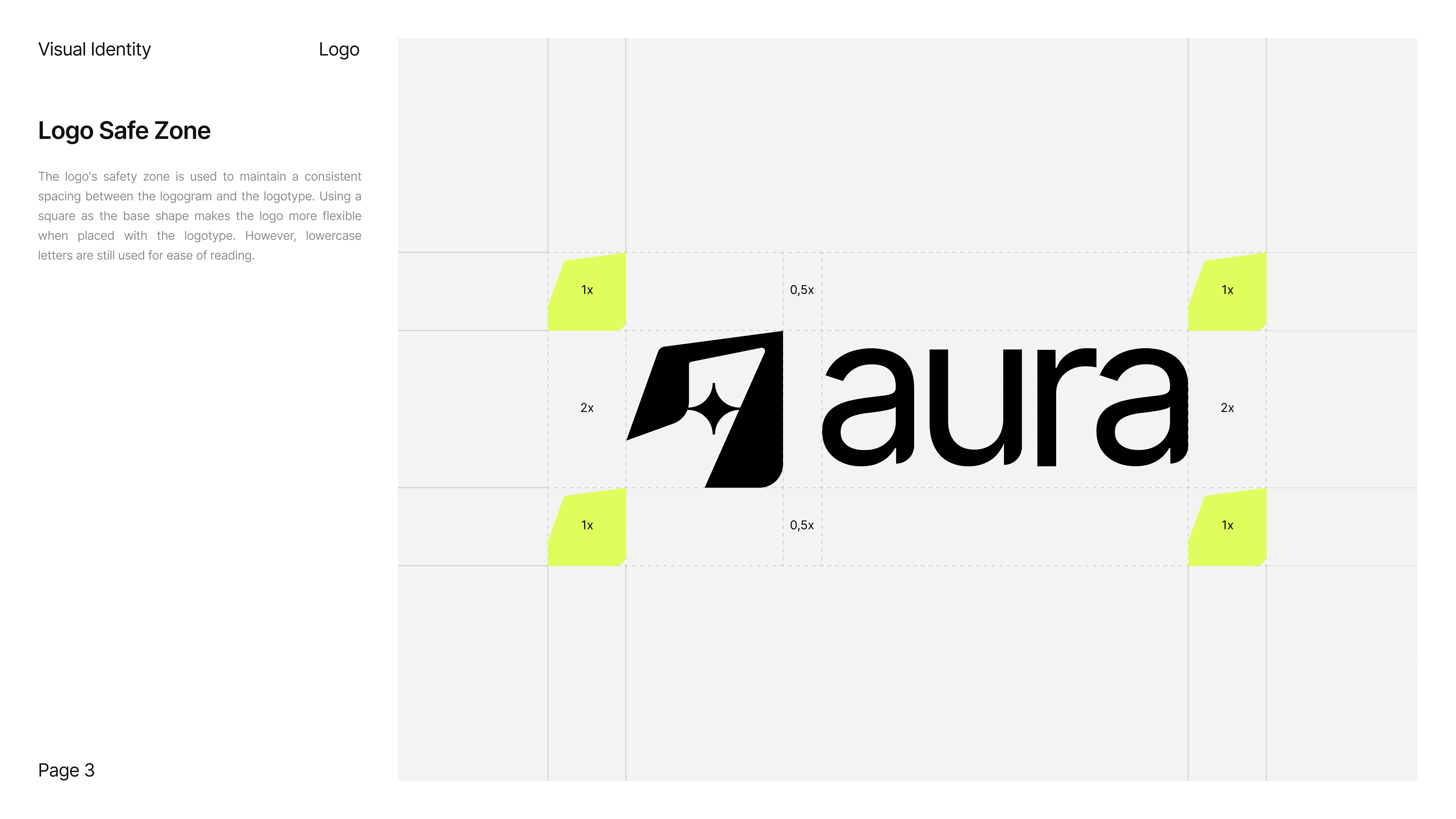
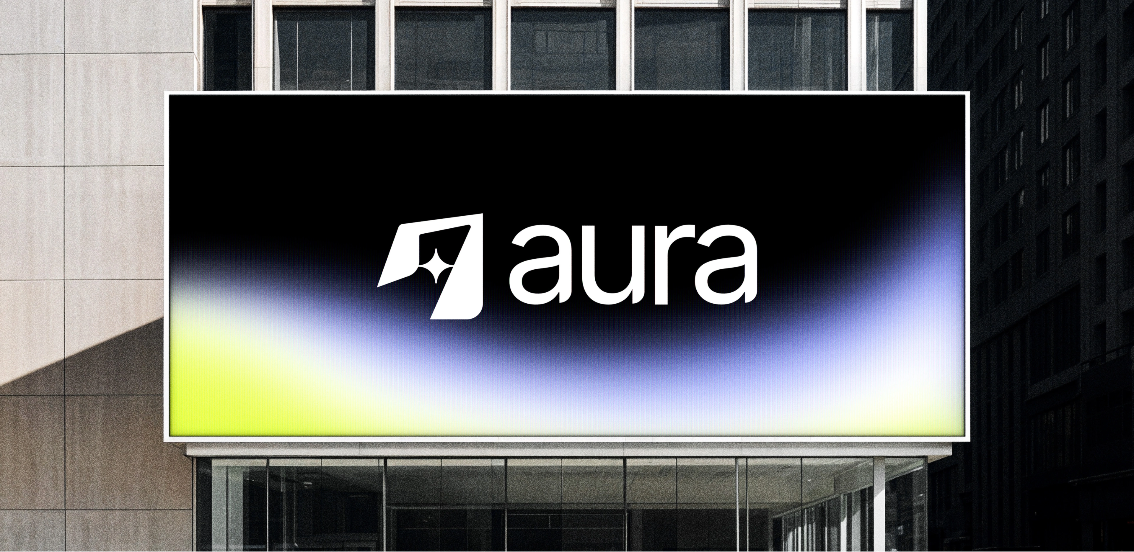
The color palette reflects Aura’s dual nature neon yellow for creativity, cool lilac for innovation, neutral grey for stability, and black for contrast and confidence. Together, these shades create visual balance and ensure high legibility in both light and dark contexts.
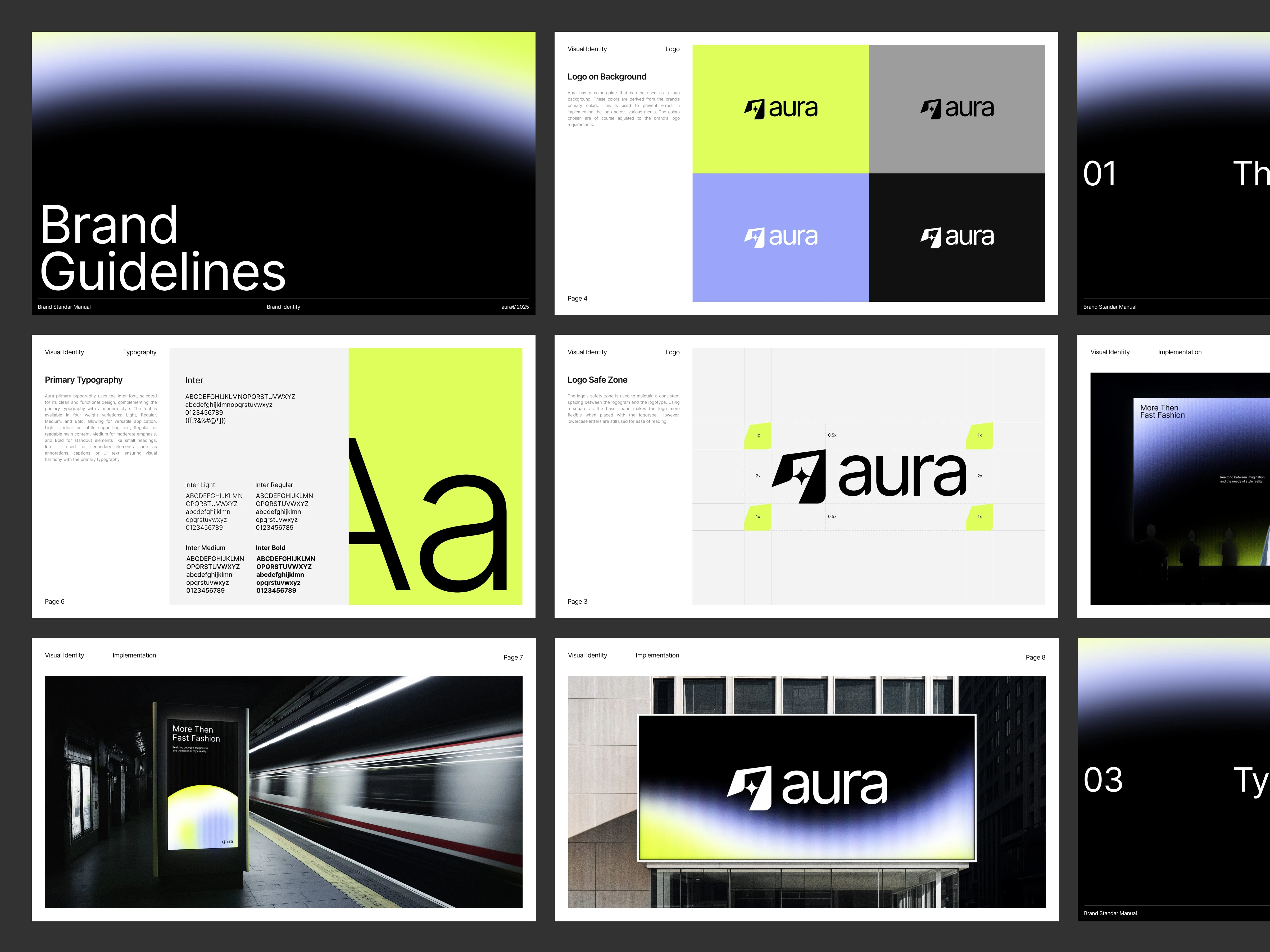
The logo system is built for flexibility with well-defined safe zones, proportional grids, and responsive scaling to maintain consistency across screen sizes and print applications. Whether displayed on a digital billboard or within a UI component, the logo retains its clarity and presence.
Implementation
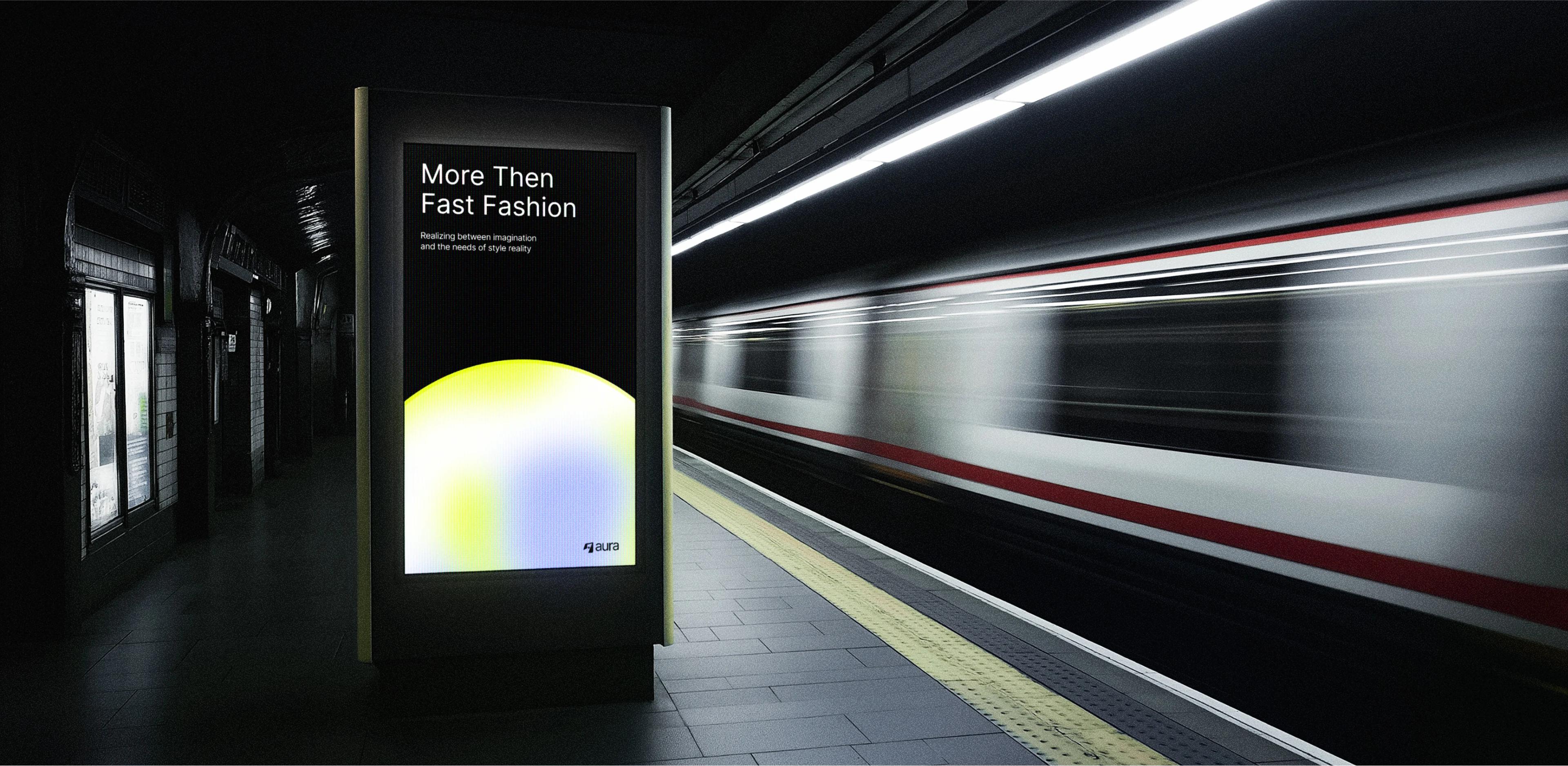
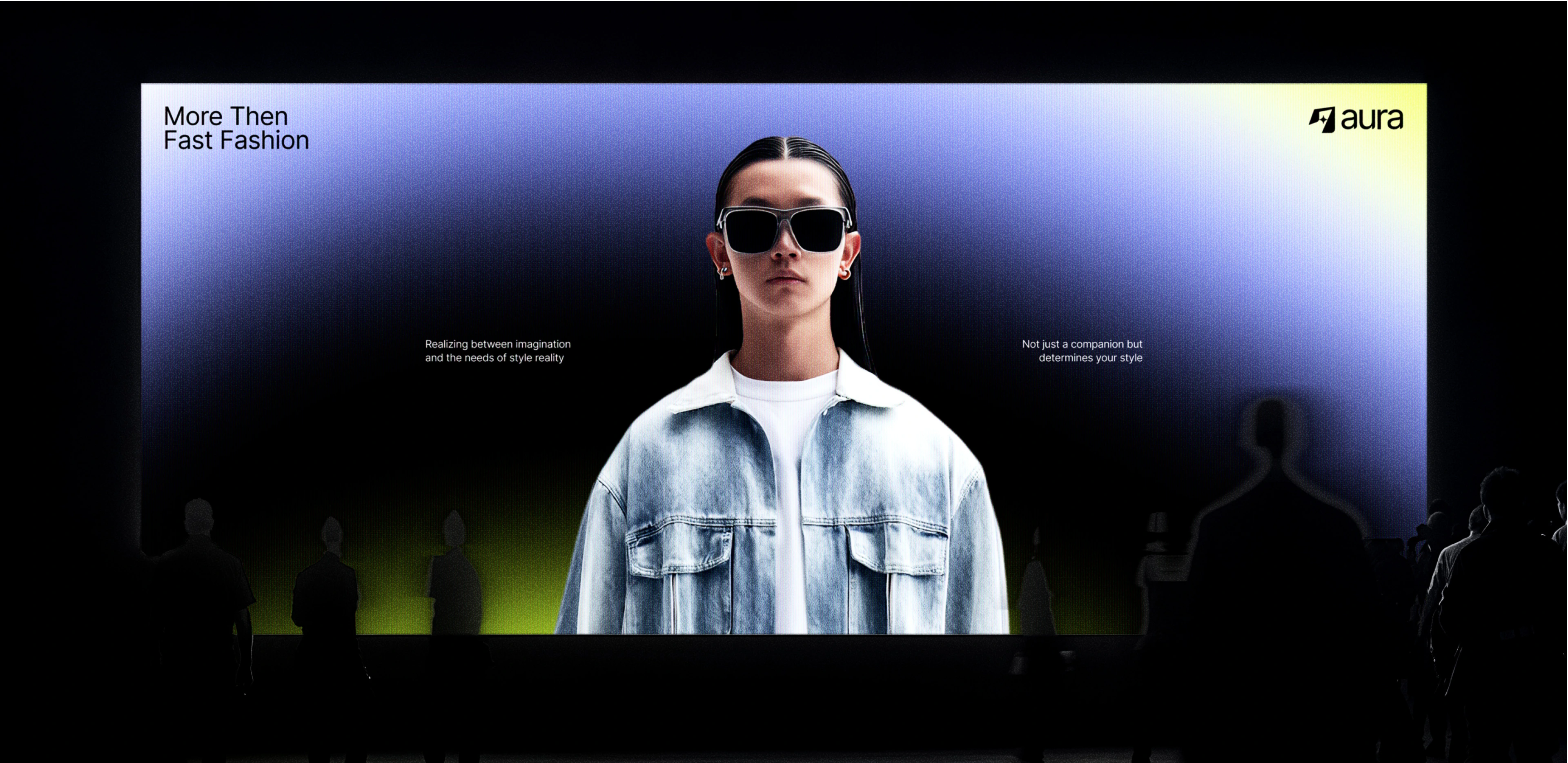
From subway advertisements to large-scale building banners, Aura’s brand elements are designed to scale seamlessly across physical and digital platforms. Each application maintains visual harmony by adhering to the core principles of the brandbook logo spacing, color proportion, and typographic consistency.
In digital environments, the identity extends naturally into UI systems, reflecting the same rhythm of contrast, balance, and motion. This creates a unified experience that feels distinctly “Aura” wherever users encounter it.
Conclusion
The Aura Brand Guidelines define more than just a look they embody a philosophy of adaptable innovation. By merging neon vibrancy with minimal geometry, Aura becomes a symbol of clarity in motion bold enough to stand out, refined enough to endure.
Every page of the brandbook reinforces Aura’s mission: to stay intelligent, confident, and adaptable in a fast-changing world. Through thoughtful design decisions, the identity system ensures Aura will continue to evolve consistently and unmistakably wherever its light reaches.
Like this project
Posted Oct 7, 2025
The Aura visual system captures a sense of motion and light blending neon gradients with minimal typography to create a bold yet balanced aesthetic.