Orion - Finance Landing Page
Cansaas Agency
Overview
Orion is a modern FP&A (Financial Planning & Analysis) platform designed to help businesses forecast financial outcomes, optimize budgets, and make data-driven decisions with confidence. The landing page embodies the brand’s mission: turning financial complexity into clarity through elegant visual storytelling and intuitive interaction design. Its clean aesthetic, balanced white space, and crisp typography create a sense of precision and trustworthiness values that are essential for a fintech product.
The Problem
Financial tools often suffer from information overload and cognitive friction. Users are presented with too much data, unclear hierarchies, or uninspiring layouts that make decision-making difficult. The previous iteration of Orion’s landing page lacked visual hierarchy and persuasive flow key features and pricing plans blended together without clear emphasis. The challenge was to craft a design that communicates credibility, control, and conversion intent helping users not just understand the product, but feel confident engaging with it.
The Solution
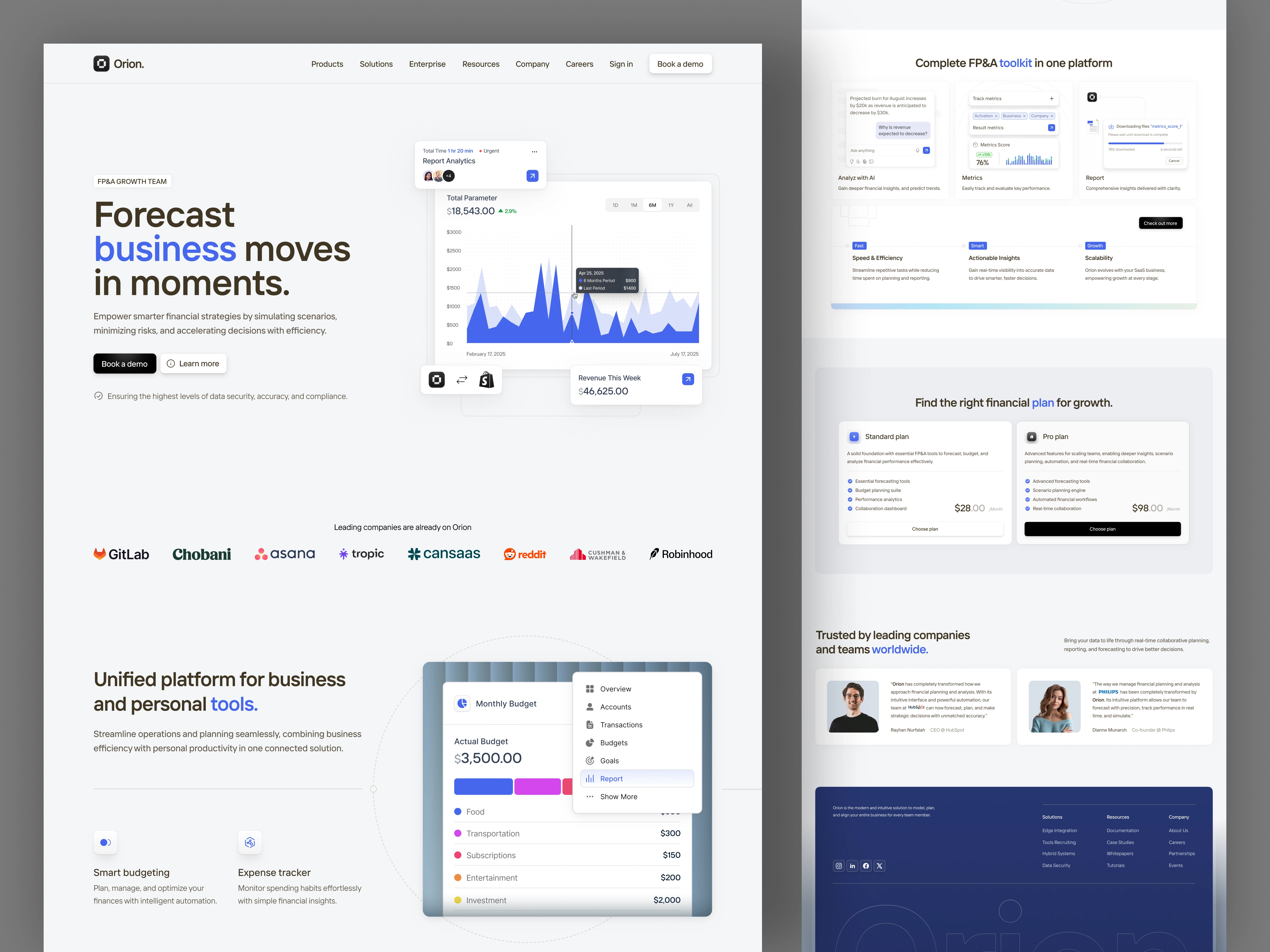
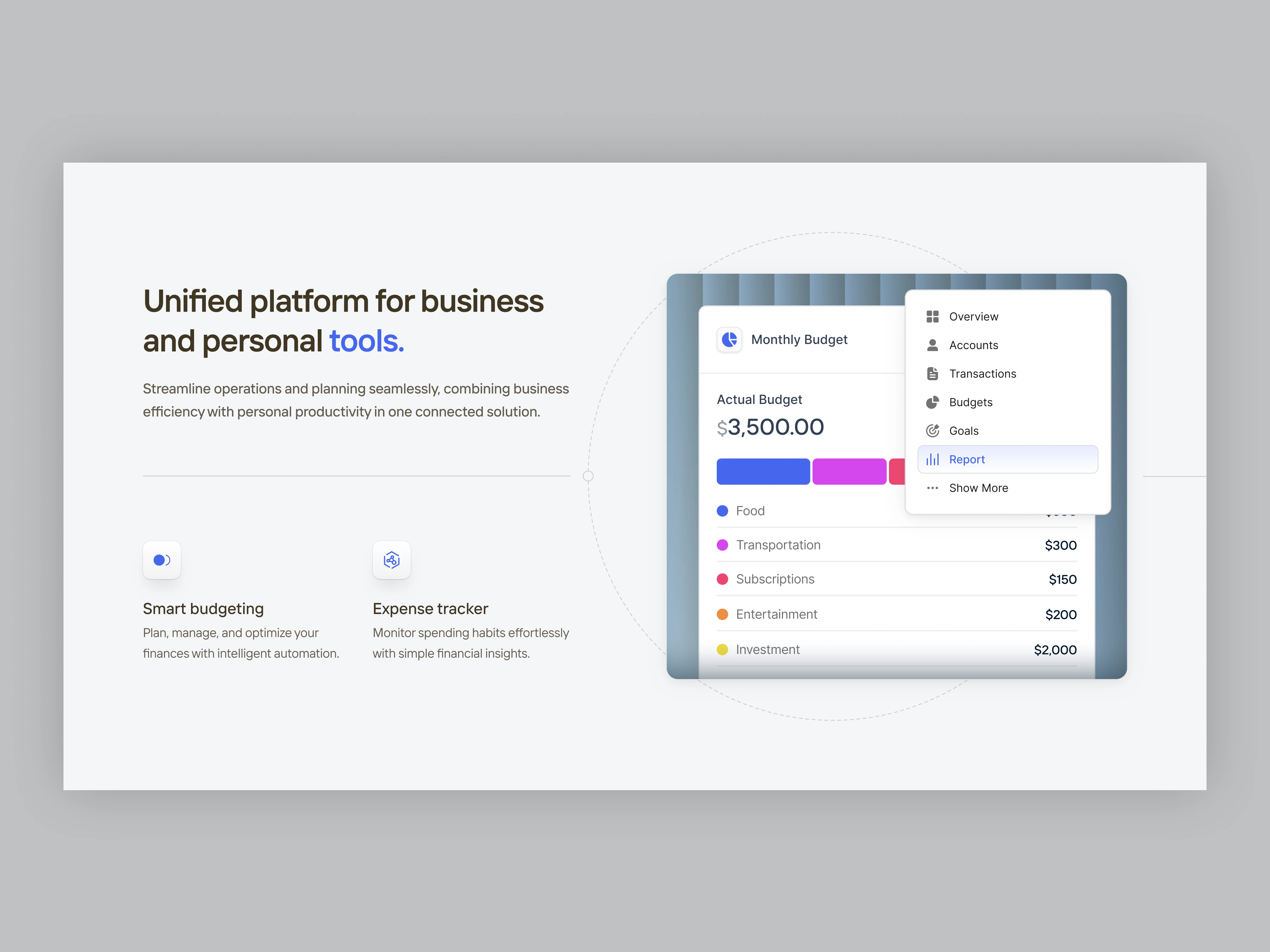
The redesign of Orion’s landing page focuses on structured storytelling and guided exploration. By using a modular layout, each section flows naturally into the next starting with a data-driven hero that captures attention, followed by trust indicators, detailed feature breakdowns, and transparent pricing. Subtle animations and microinteractions enhance engagement without overwhelming the user. The tone and color palette blend minimalism with professionalism, creating a seamless connection between financial reliability and digital sophistication.
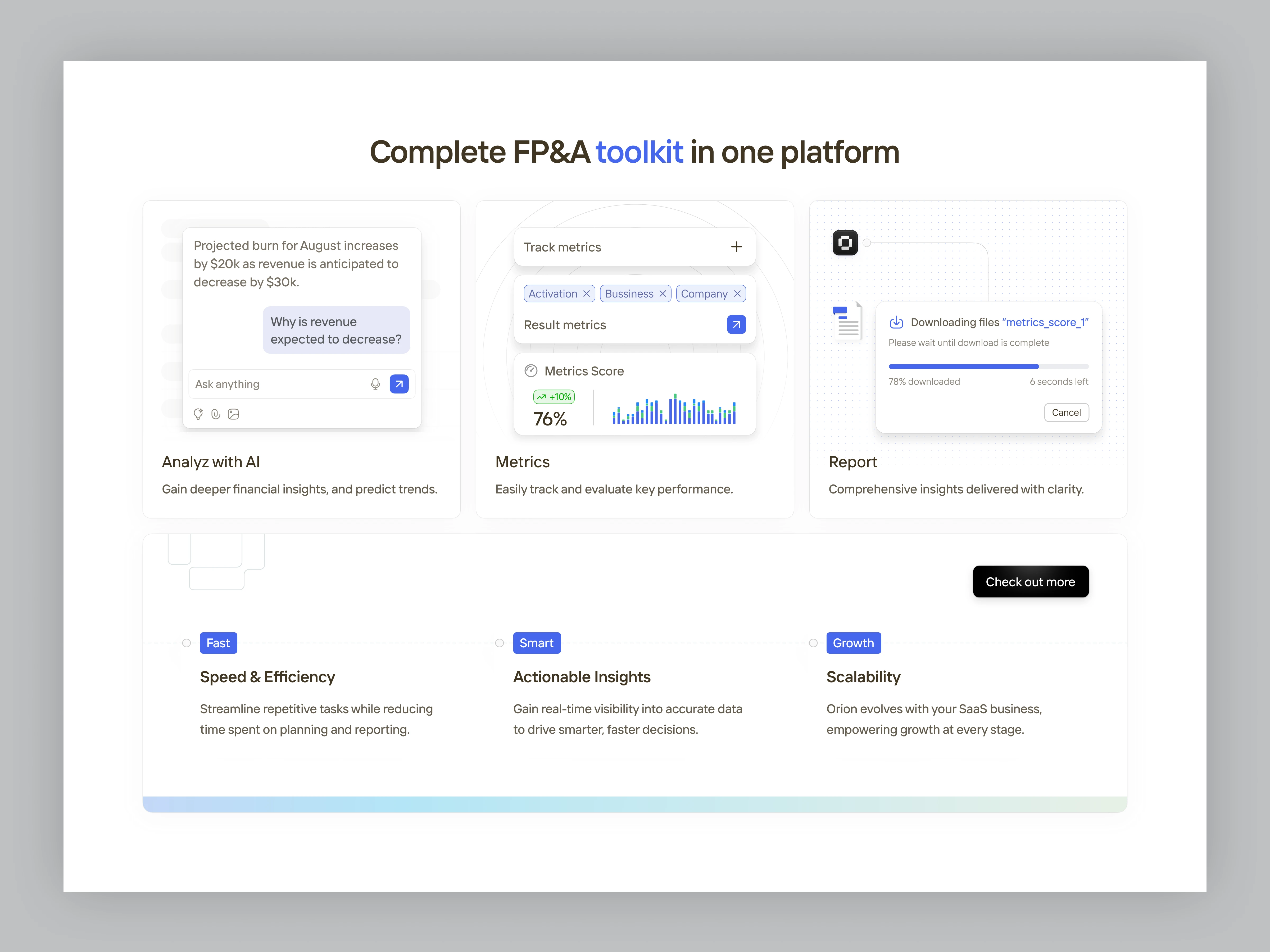
Effective Use of Highlighting (Decoy Effect / GoodUI)
Principle (GoodUI / Psychology of Persuasion): You visually emphasize the Pro Plan using a black button and a slightly darker card appearance, subtly guiding user attention toward the higher-value option. This technique, often referred to as the Decoy Effect, leverages contrast and emphasis to make one option feel like the natural or “recommended” choice. By visually framing the Pro Plan as more premium and dominant, users are nudged toward upgrading—a proven conversion design strategy observed in cognitive psychology and supported by GoodUI.org.
This not only enhances perceived value but also simplifies user decision-making. Rather than overwhelming users with too many similar choices, the contrast directs focus intuitively, increasing high-tier plan selections and overall conversion rate.
Conclusion
The Orion Finance Landing Page successfully transforms a complex financial solution into a clear, visually engaging experience. By combining conversion psychology, data visualization, and trust-building UI patterns, the design delivers both clarity and persuasion. The result is a landing page that feels professional, intuitive, and growth-oriented—empowering teams to make smarter financial moves in moments.
Like this project
Posted Oct 6, 2025
The design is clean, professional, and combines bold typography with blue highlights to convey a sense of credibility and technology.