Mobile Chat App
Cansaas Agency
Overview
This exploration presents a mobile chat app designed to create a cleaner, calmer, and more focused messaging experience. We aimed to improve how users navigate conversations, browse media, and manage personal settings through a more structured and visually consistent interface.
Visibility of System Status
Interfaces should keep users informed about what is going on through clear, timely feedback and indicators) (src: nngroup.com)
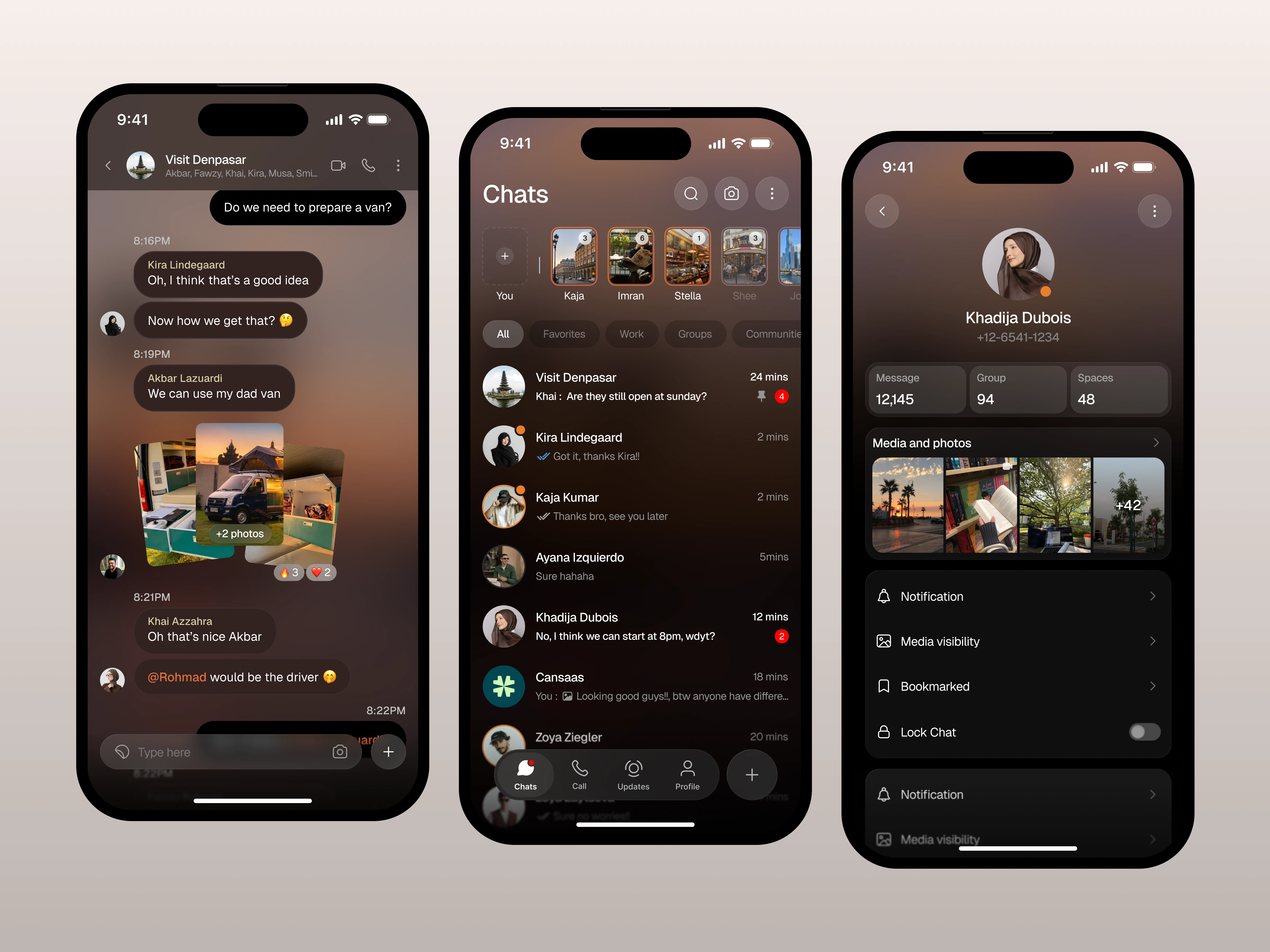
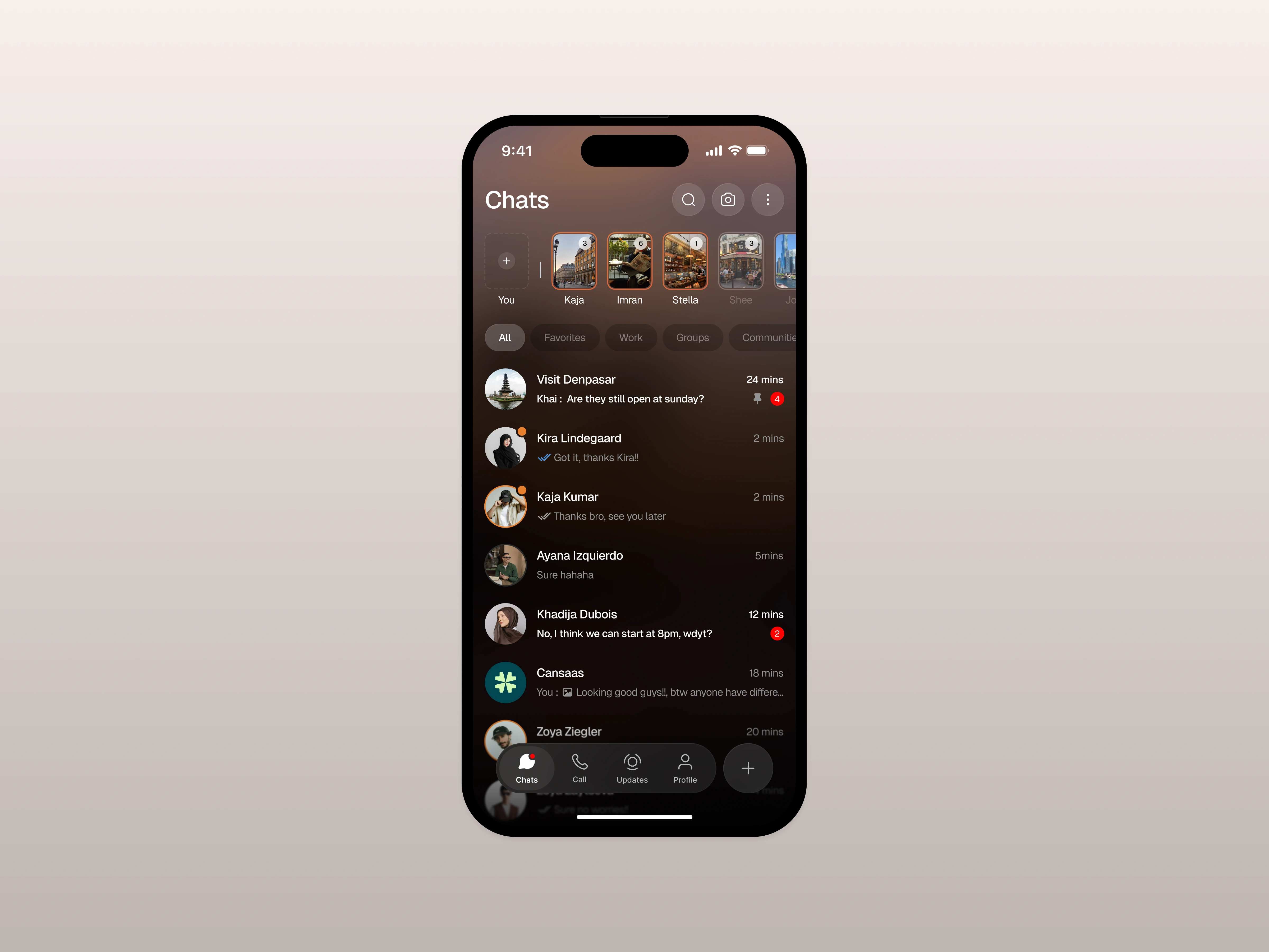
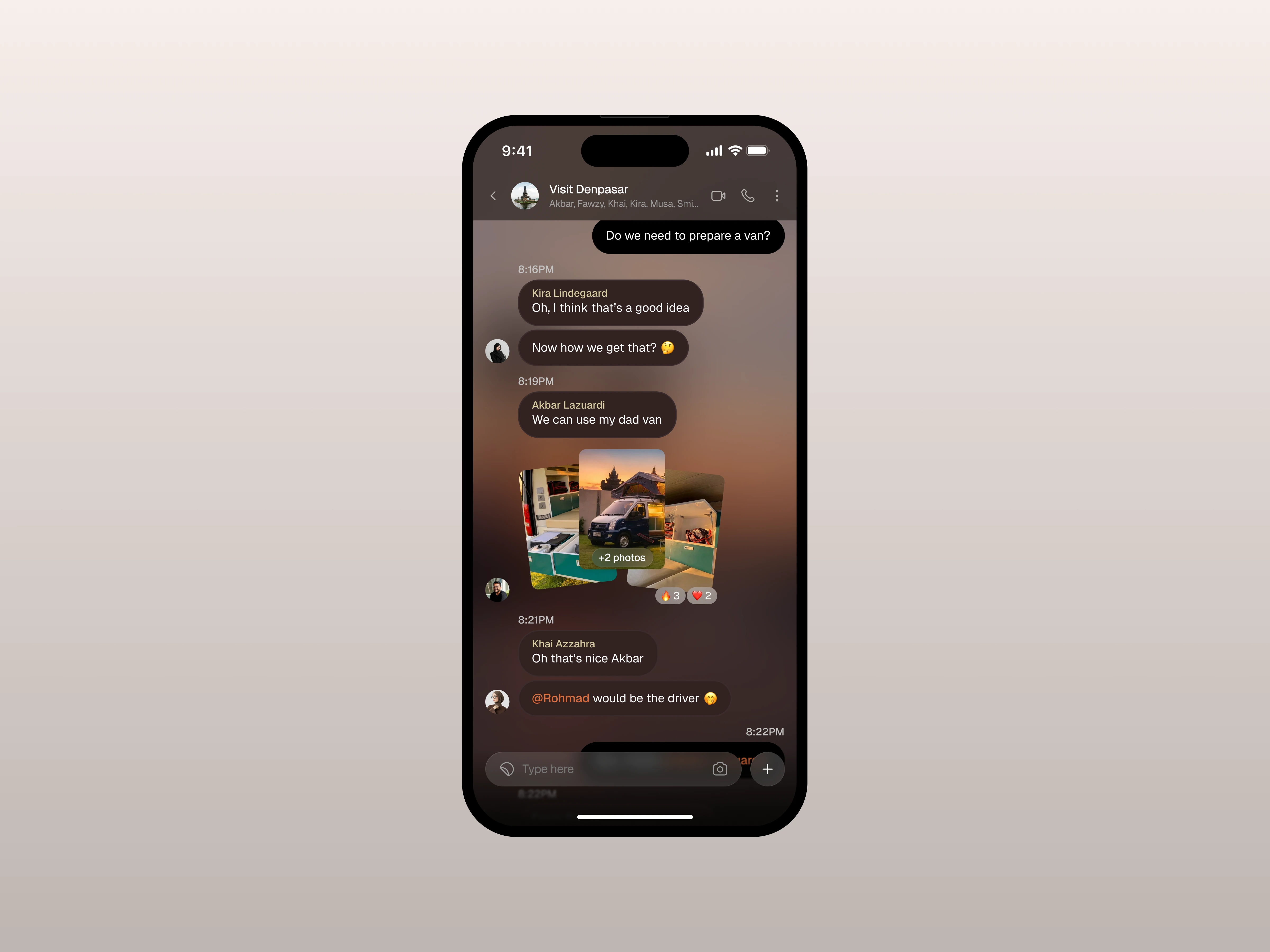
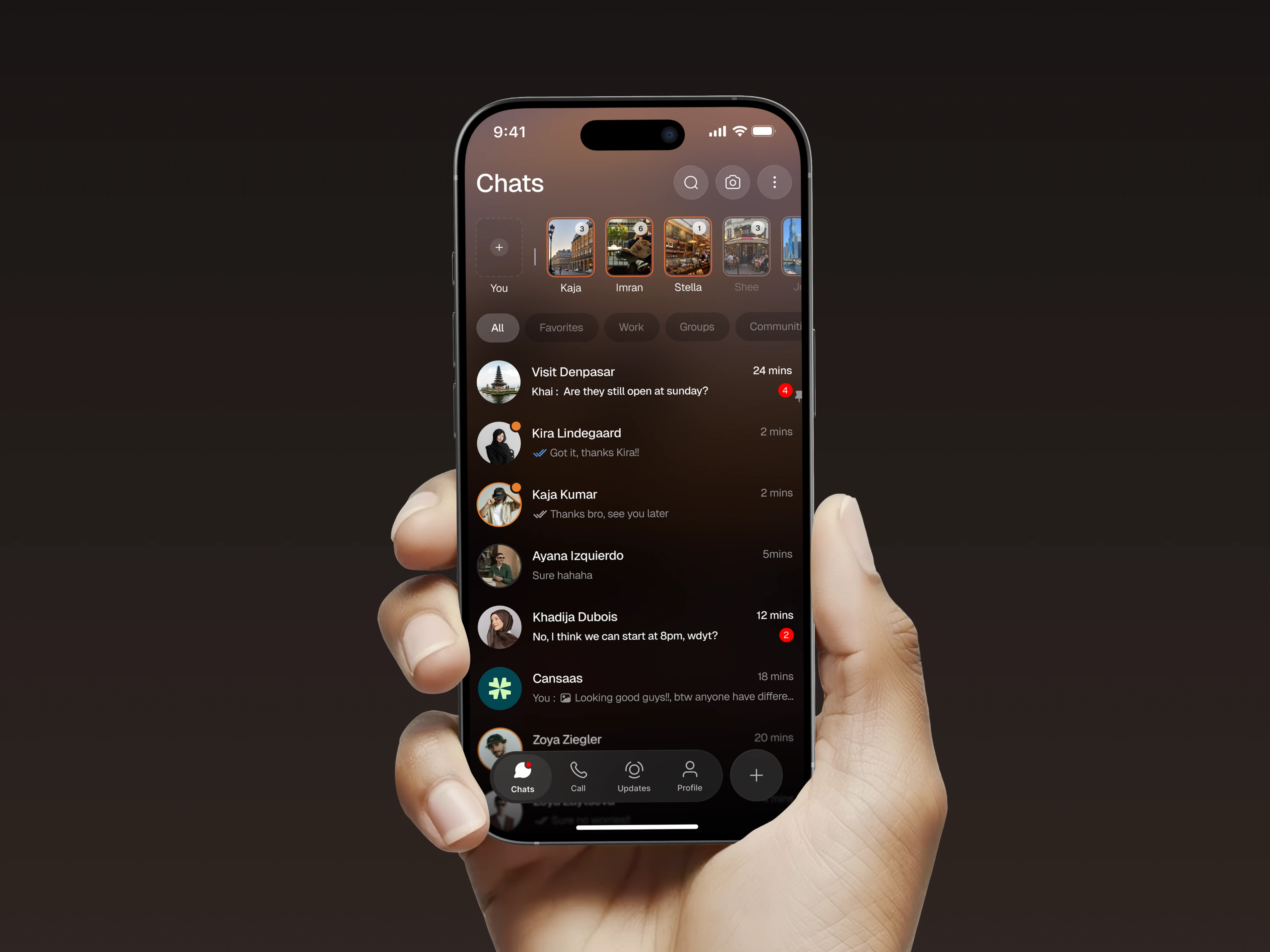
In the after design, badges, pins, and online indicators are cleaner and easier to distinguish, allowing users to quickly see which chats are unread, pinned, or active. This clearer status signaling helps users prioritize which conversations to open first and increases their sense of control over the inbox.
The Challenge
Messaging apps often feel cluttered due to dense threads, mixed media, and interactions that compete for attention. Users struggle when layouts lack hierarchy or when important information gets buried during long conversations. Our challenge was reducing visual noise while keeping essential interactions easy to access.
Design Approach
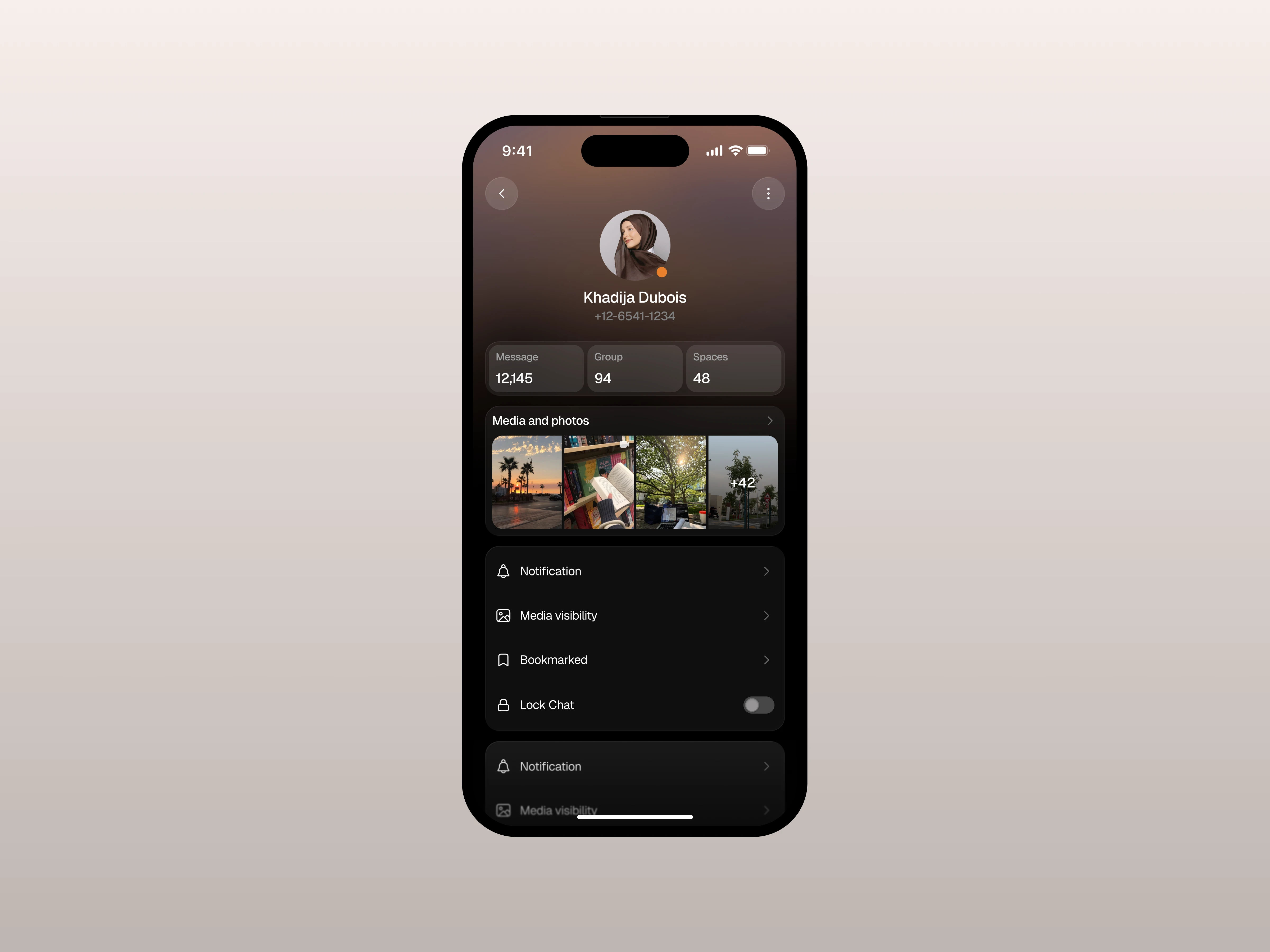
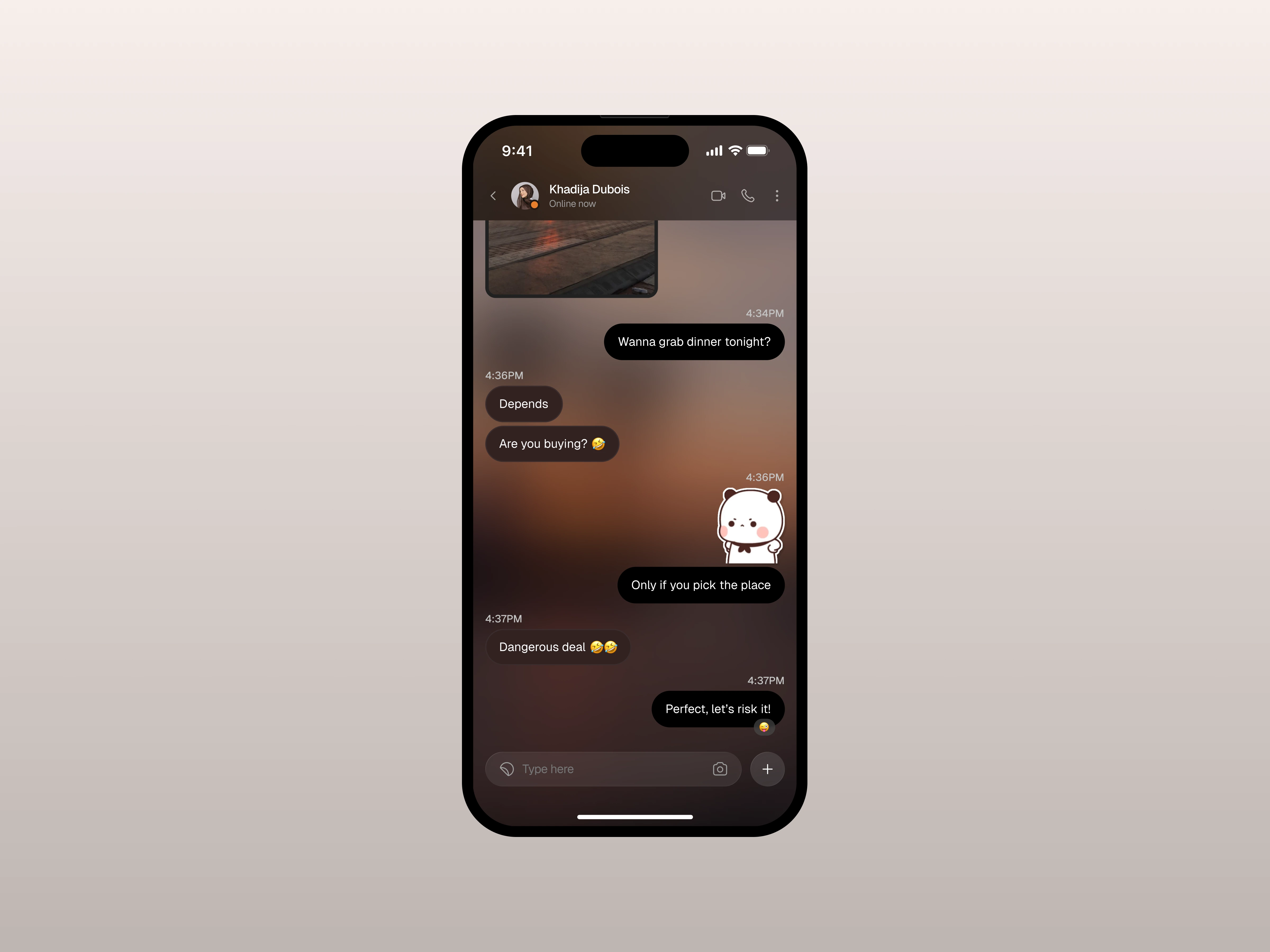
We used a warm, gradient based theme with soft depth to create an inviting environment for conversations. The chat screen prioritizes message clarity with rounded bubbles, subtle reactions, and clean media previews. The main chat list organizes threads with readable spacing, avatars, and quick indicators. The profile page consolidates media, settings, and controls into a simple scrollable view.
The Solution and Impact
By refining hierarchy and creating calmer visual rhythms, the app helps users stay engaged in conversations without feeling overwhelmed. The result is a messaging experience that feels more personal, more readable, and easier to navigate across daily interactions.
Like this project
Posted Dec 10, 2025
We designed a mobile chat app with clearer conversations, smoother media previews, and a calmer layout to make daily messaging more focused and enjoyable.
Likes
2
Views
14