Analytics Dashboard
Cansaas Agency
Overview
This exploration presents an analytics dashboard designed to help teams monitor real time activity, track engagement patterns, and review key performance indicators in a structured layout. We aimed to create a clear environment where data is easy to read and even easier to act on.
The Challenge
Analytics tools often overwhelm users with dense charts, unclear labeling, and fragmented navigation. When insights are hard to interpret, decision making slows down. Our challenge was organizing complex metrics so users can scan data quickly and understand performance at a glance.
Design Approach
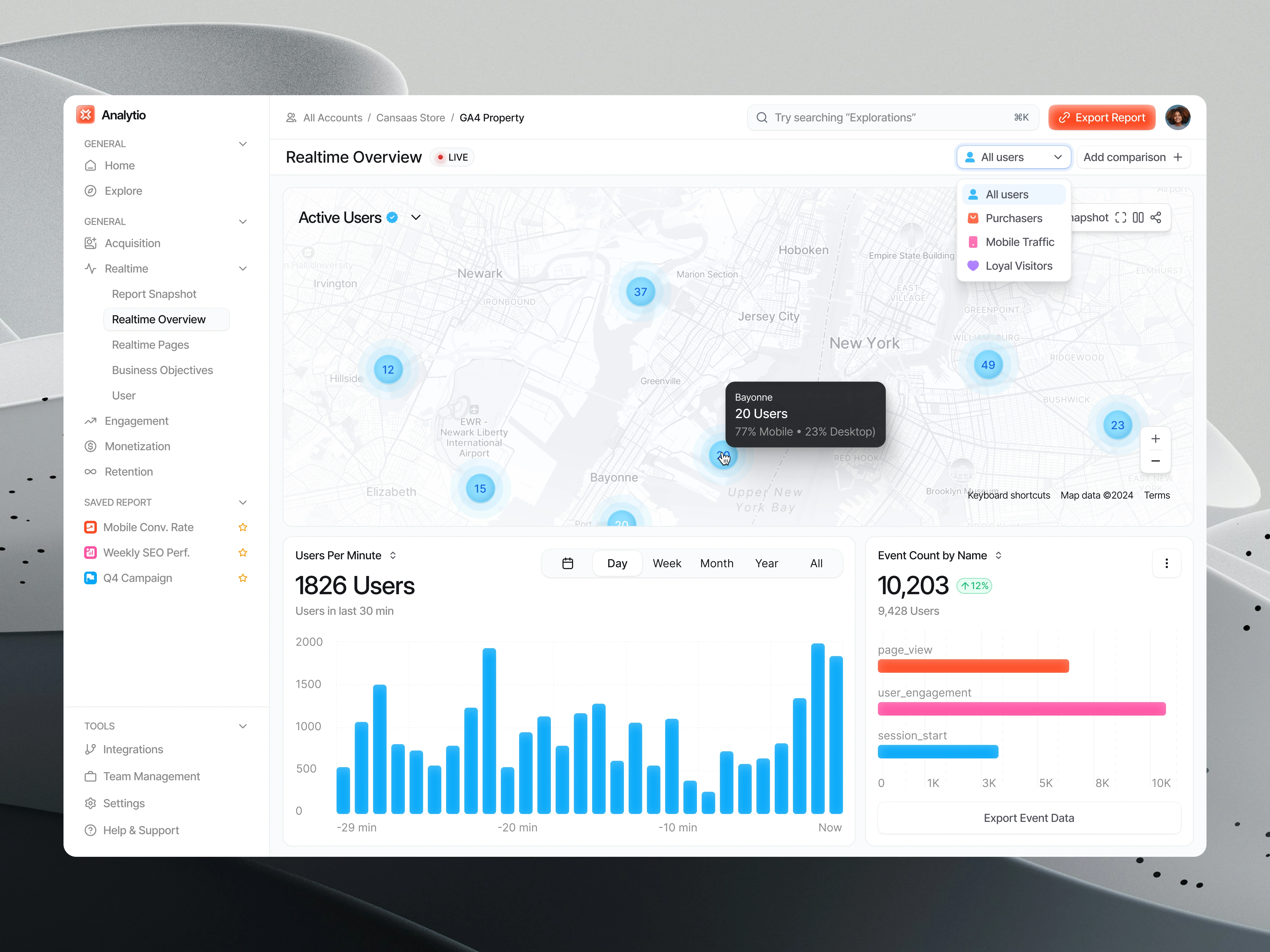
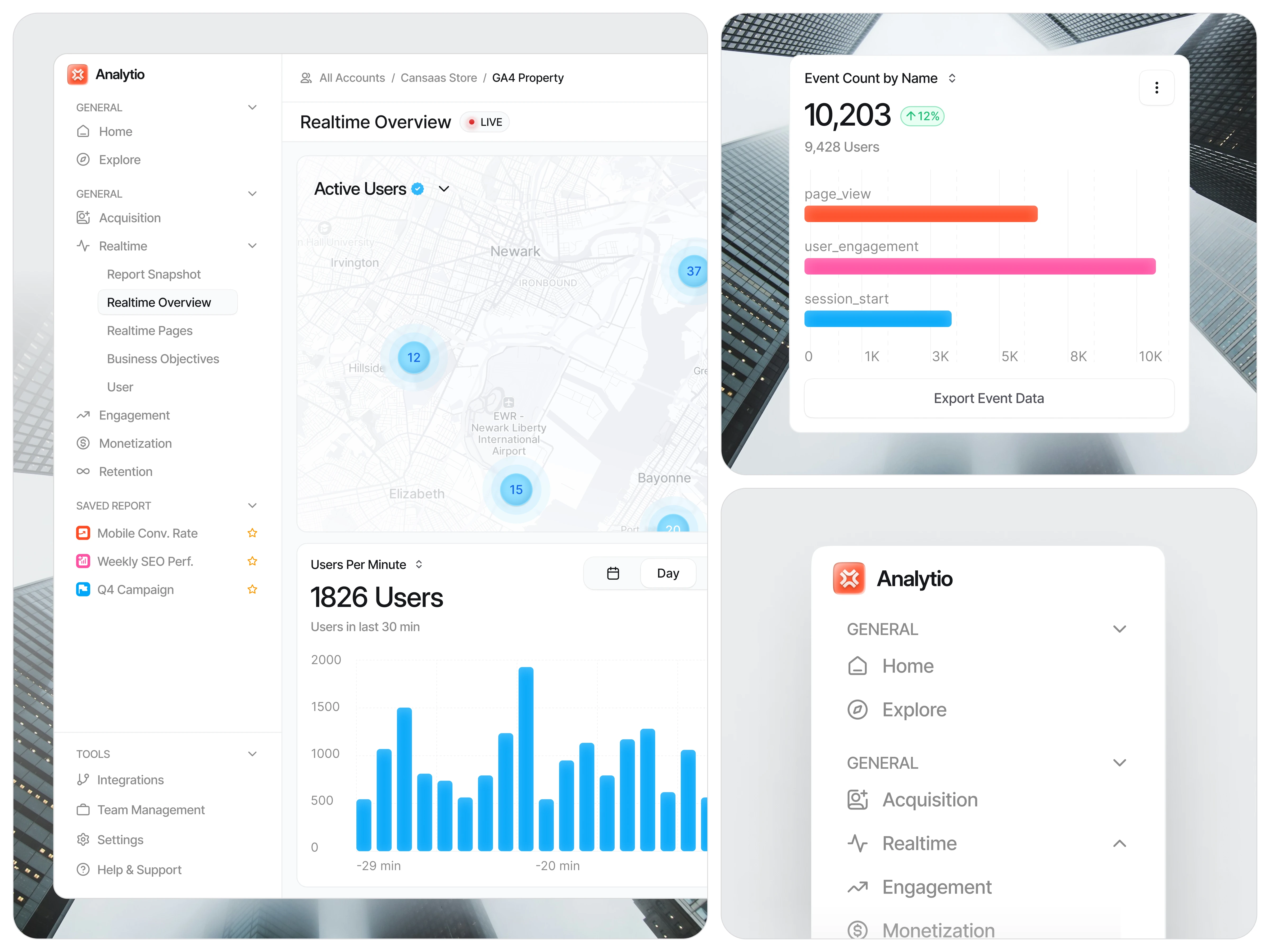
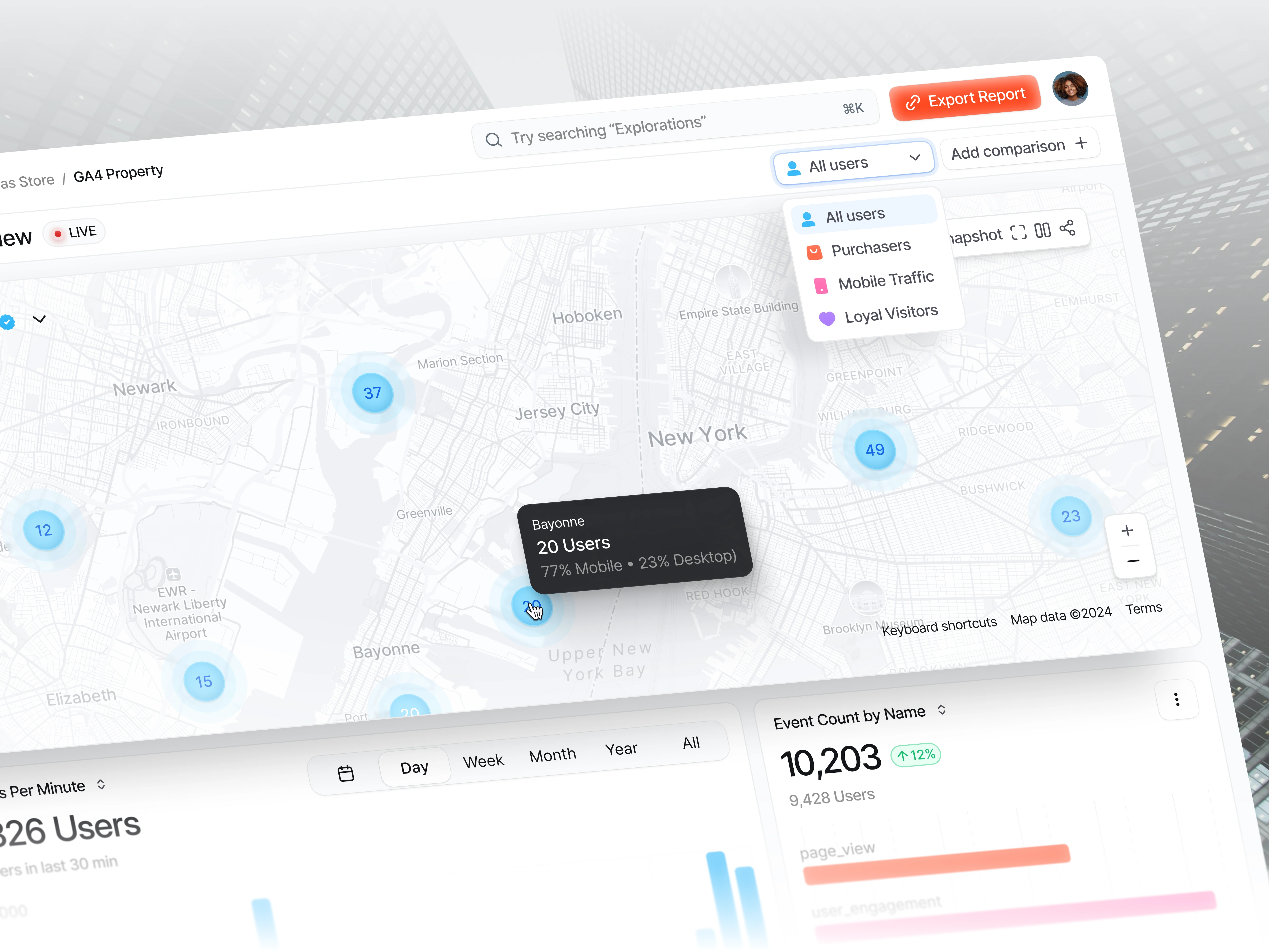
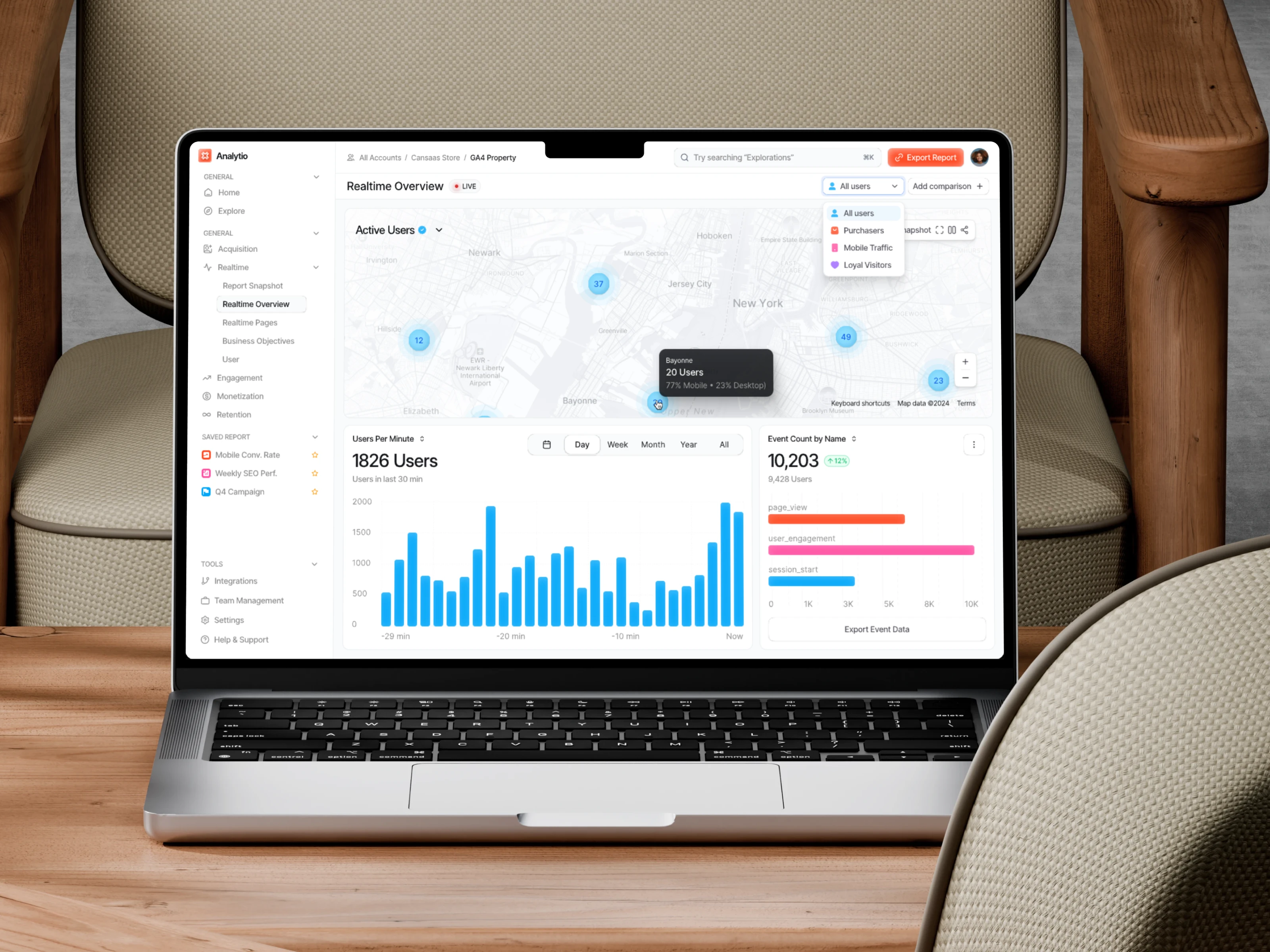
We structured the interface into clean modules including active user maps, real time usage charts, event counts, and filter controls. Consistent spacing, calm colors, and soft elevations support readability across data types. Interactive elements such as tooltips, category filters, and time controls help users explore insights without losing context.
Visibility of System Status
The system should always keep users informed about what is going on through clear and immediate feedback.
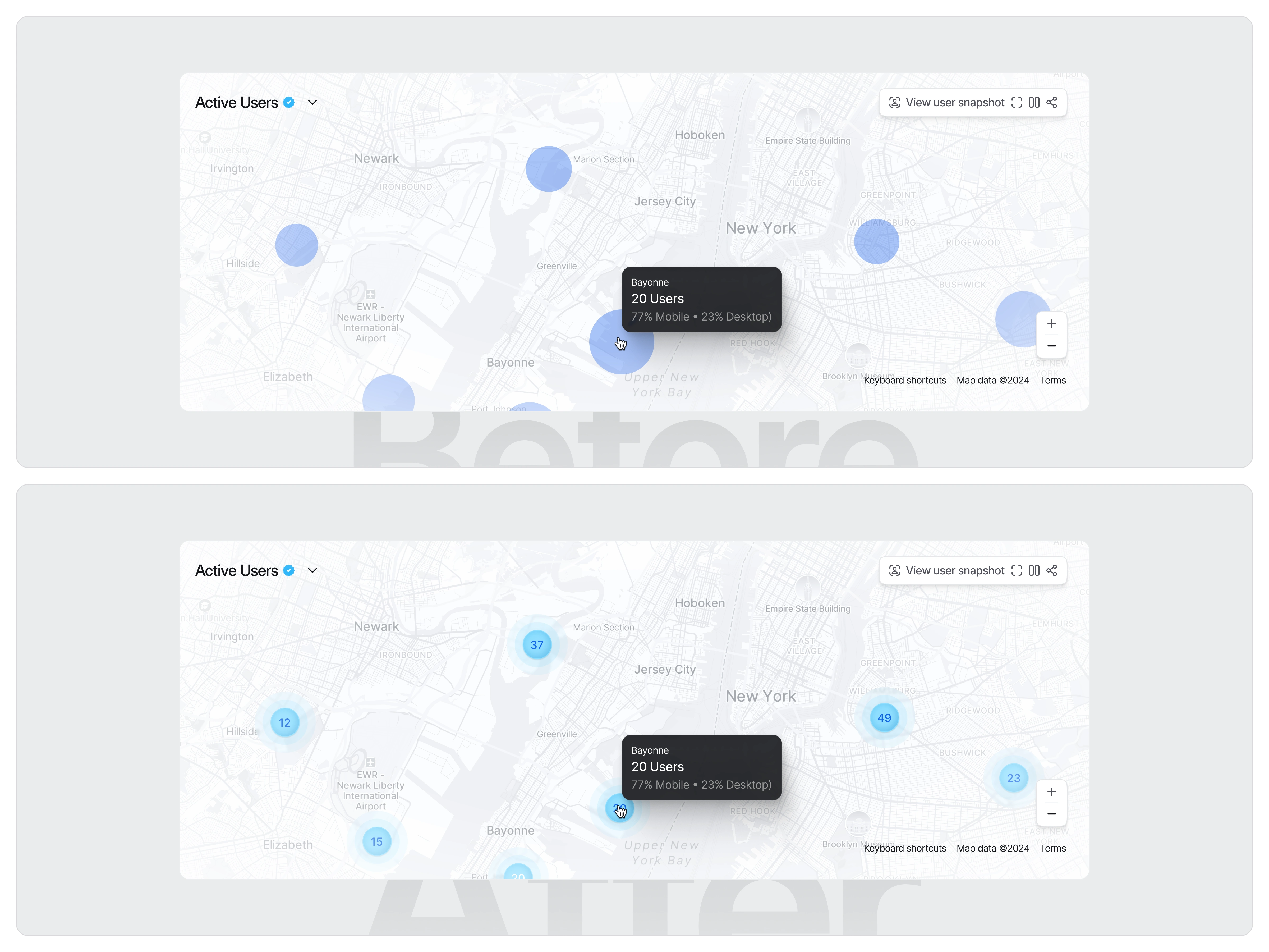
In the initial version, the active-user markers on the map appeared only as plain blue circles without any numerical data. Because the circles lacked context, users couldn’t immediately understand how many active users were represented by each point. This forced them to rely entirely on the tooltip to get essential information, slowing down decision-making and making the map feel less “live” despite being part of a real-time analytics page.
In the improved version, each marker now displays the exact number of active users directly inside the circle. This addition provides instant clarity, allowing users to understand distribution and intensity at a glance. The subtle ripple or “water-wave” animation reinforces the idea of real-time activity, visually communicating that the data is live and continuously updating. As a result, the interface becomes more informative, intuitive, and aligned with the expectations of a real-time overview dashboard. (src: Jakob Nielsen – 10 Usability Heuristics for User Interface Design)
The Solution and Impact
By simplifying hierarchy and aligning data into focused sections, the dashboard helps teams interpret insights faster. Users can identify spikes in activity, monitor audience behavior, and export event data with confidence. The result is a clean analytics experience that improves clarity and supports timely decisions.
Like this project
Posted Dec 12, 2025
We designed an analytics dashboard that organizes real time activity, user trends, and event insights into a clear layout so teams can interpret data quickly.
Likes
1
Views
5