Running Mobile App
Cansaas Agency
Overview
This exploration presents a running mobile app designed to help users track activities, visualize routes, and understand performance progress in a clear and motivating experience. The focus is on making running data feel accessible and rewarding.
The Challenge
Many fitness apps overwhelm users with dense metrics and confusing charts. Runners often struggle to understand their progress or stay motivated when insights feel too technical. The challenge was to present performance data in a way that feels simple, encouraging, and easy to read on mobile.
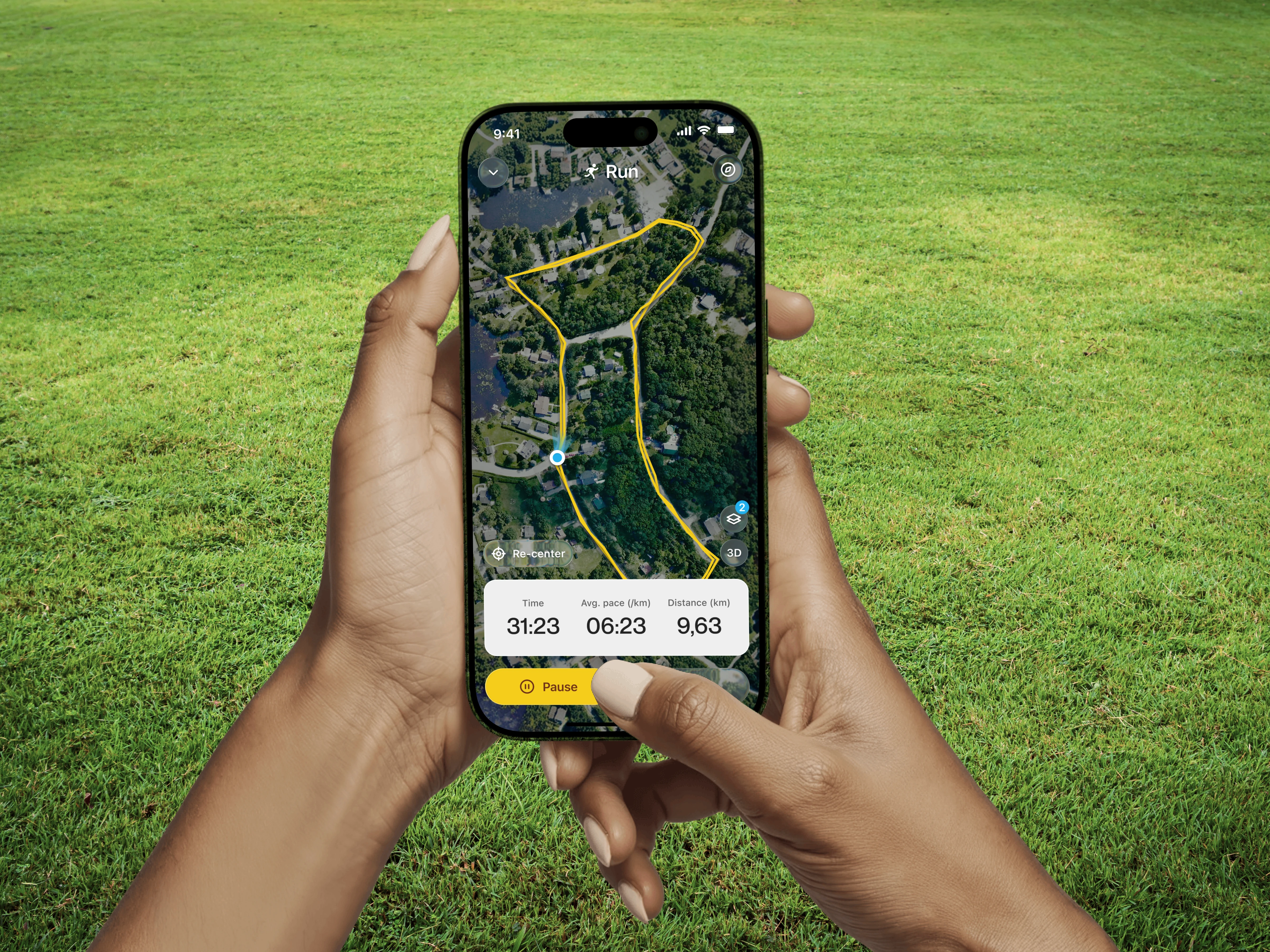
Design Approach
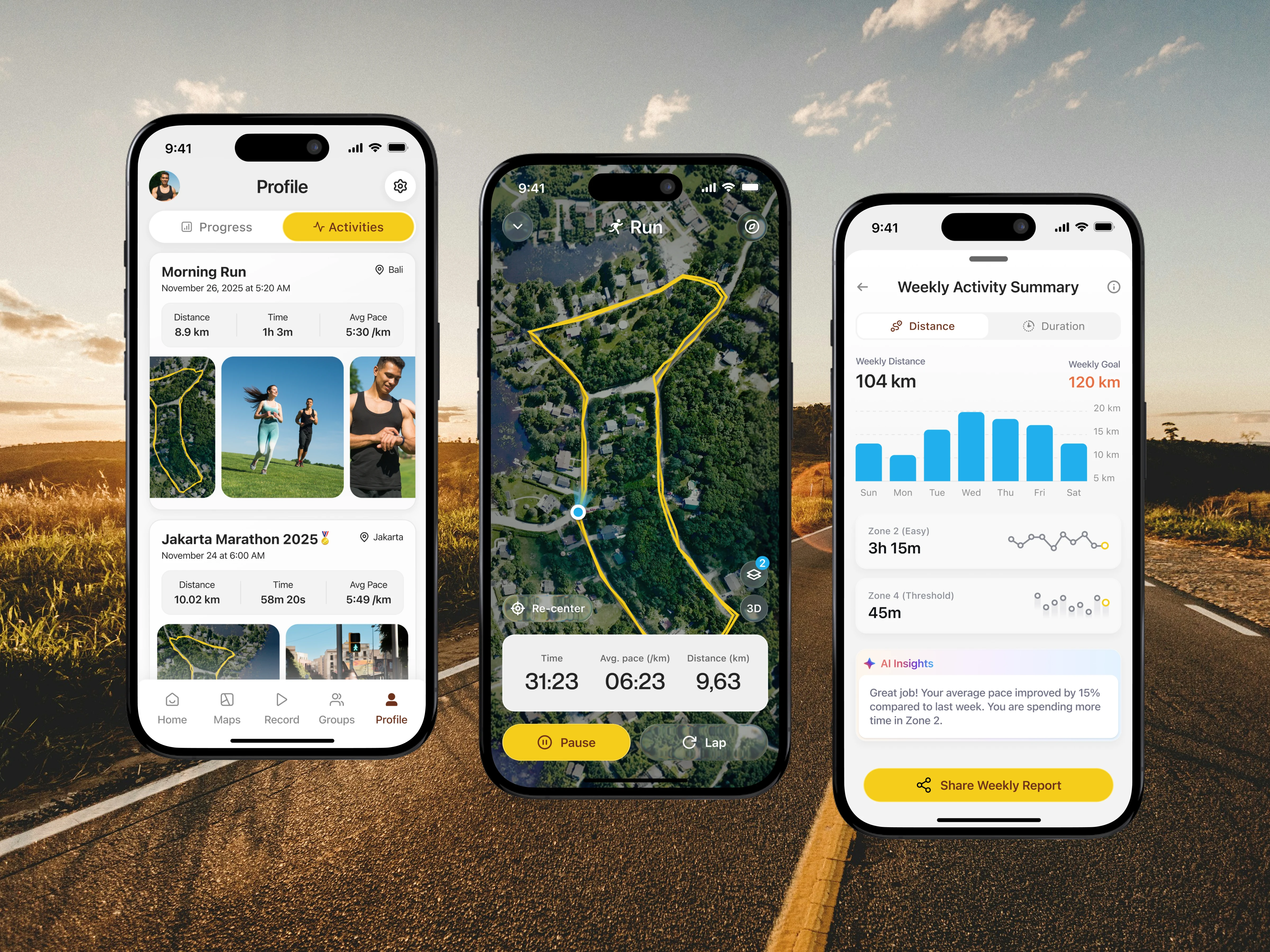
We designed the interface around three core moments: activity history, live run tracking, and performance insights. Clean cards, clear typography, and visual route mapping help users quickly understand distance, pace, and time without friction. The layout prioritizes clarity and smooth interaction.
Recognition Rather Than Recall
Minimize the user’s memory load by making information visible and easy to interpret. Users should not have to mentally process raw data to understand meaning or patterns.
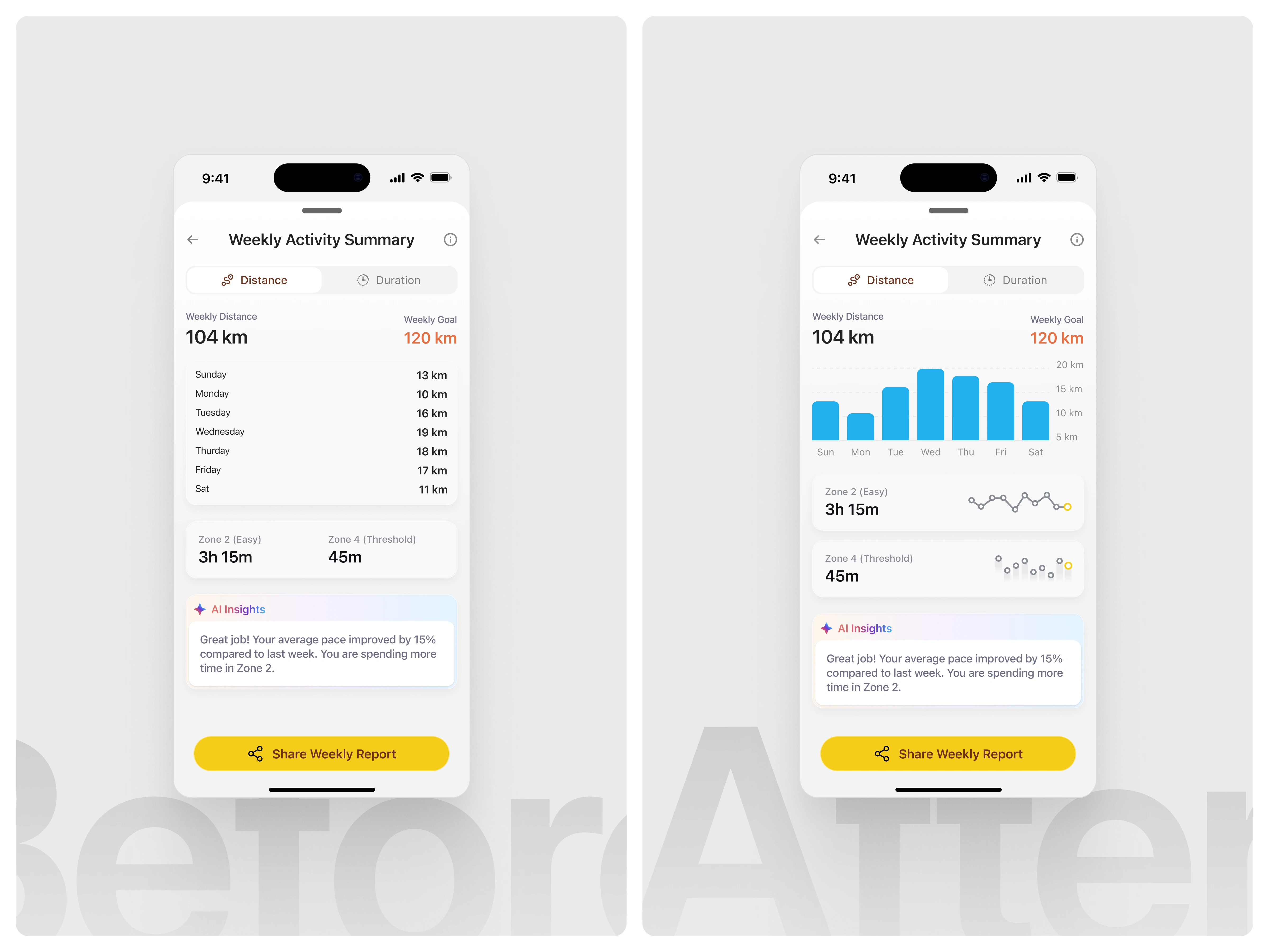
In the initial version, weekly activity data was presented primarily as a text-based list showing distances per day. While accurate, this format required users to read each line and mentally compare values to understand their weekly performance patterns. Insights such as which day had the highest activity or how balanced the week was were not immediately apparent and demanded additional cognitive effort.
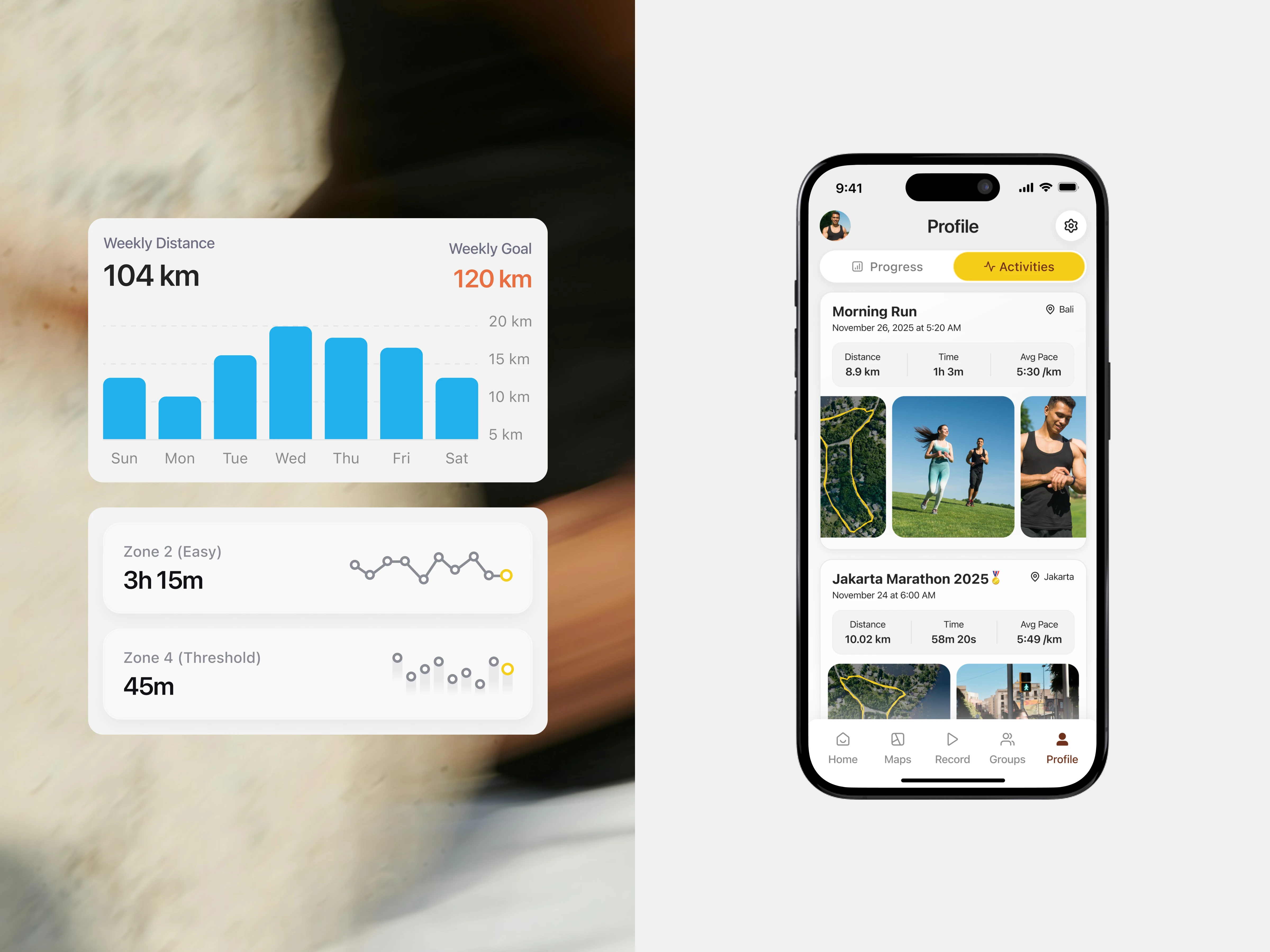
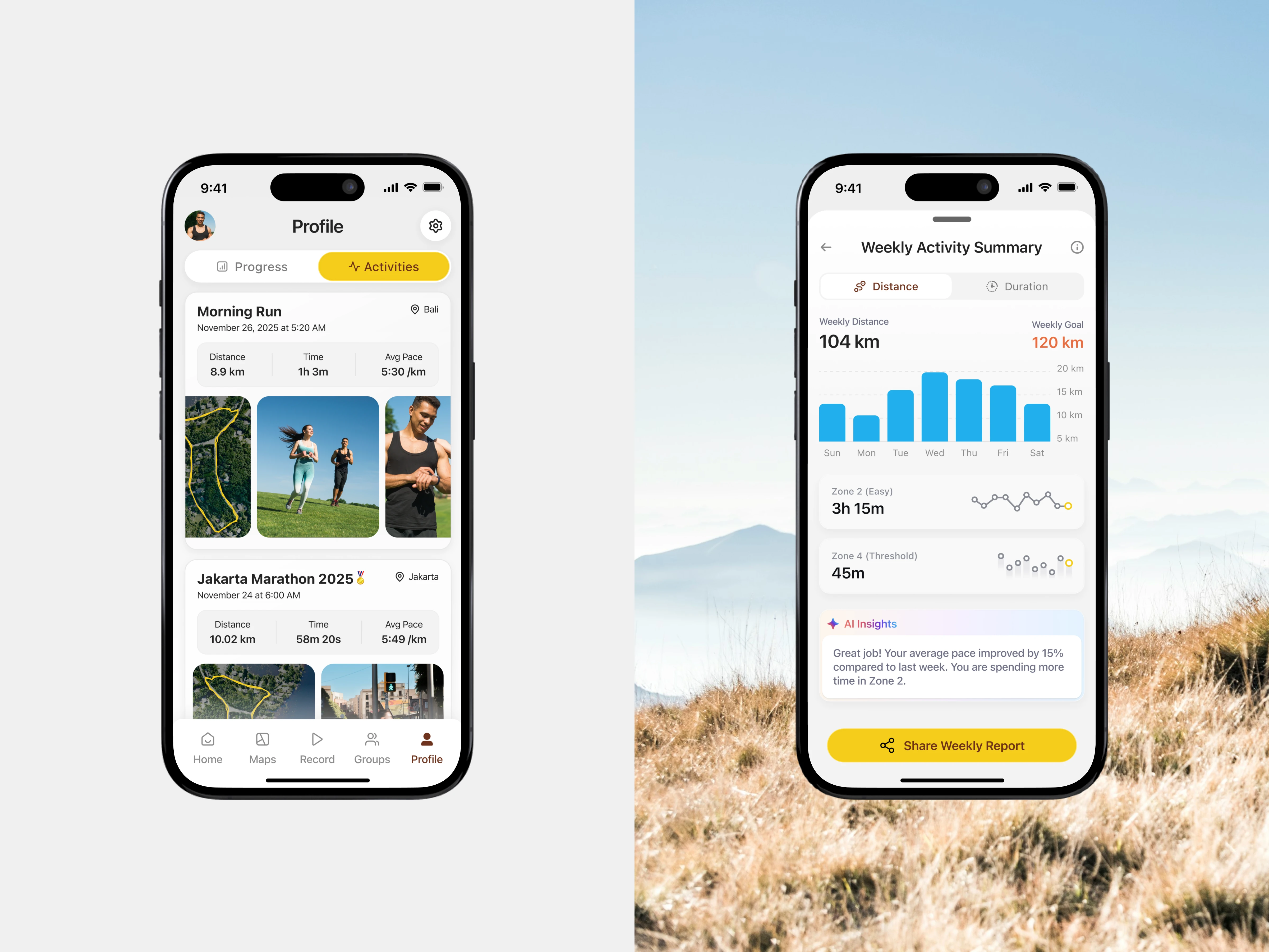
In the improved version, the daily distance data is visualized using a bar chart, allowing users to instantly recognize patterns, peaks, and gaps across the week. Visual hierarchy helps users quickly grasp performance distribution without reading each value individually. Supporting metrics, such as training zones, are also enhanced with lightweight visual indicators, reinforcing comprehension at a glance. These changes reduce cognitive load and make weekly insights easier to understand, faster to scan, and more engaging, especially in a performance-tracking context. (src: Jakob Nielsen – 10 Usability Heuristics for User Interface Design)
The Solution and Impact
By simplifying running data into clear visuals and friendly insights, the app creates a motivating and easy-to-use experience. Users can track runs confidently, understand progress faster, and stay engaged with their fitness goals over time.
Like this project
Posted Jan 13, 2026
Running mobile app exploration designed to visualize routes, track performance, and present activity insights clearly through a clean, user-friendly interface.