Orvix - Productivity Responsive Landing Page
Cansaas Agency
Overview
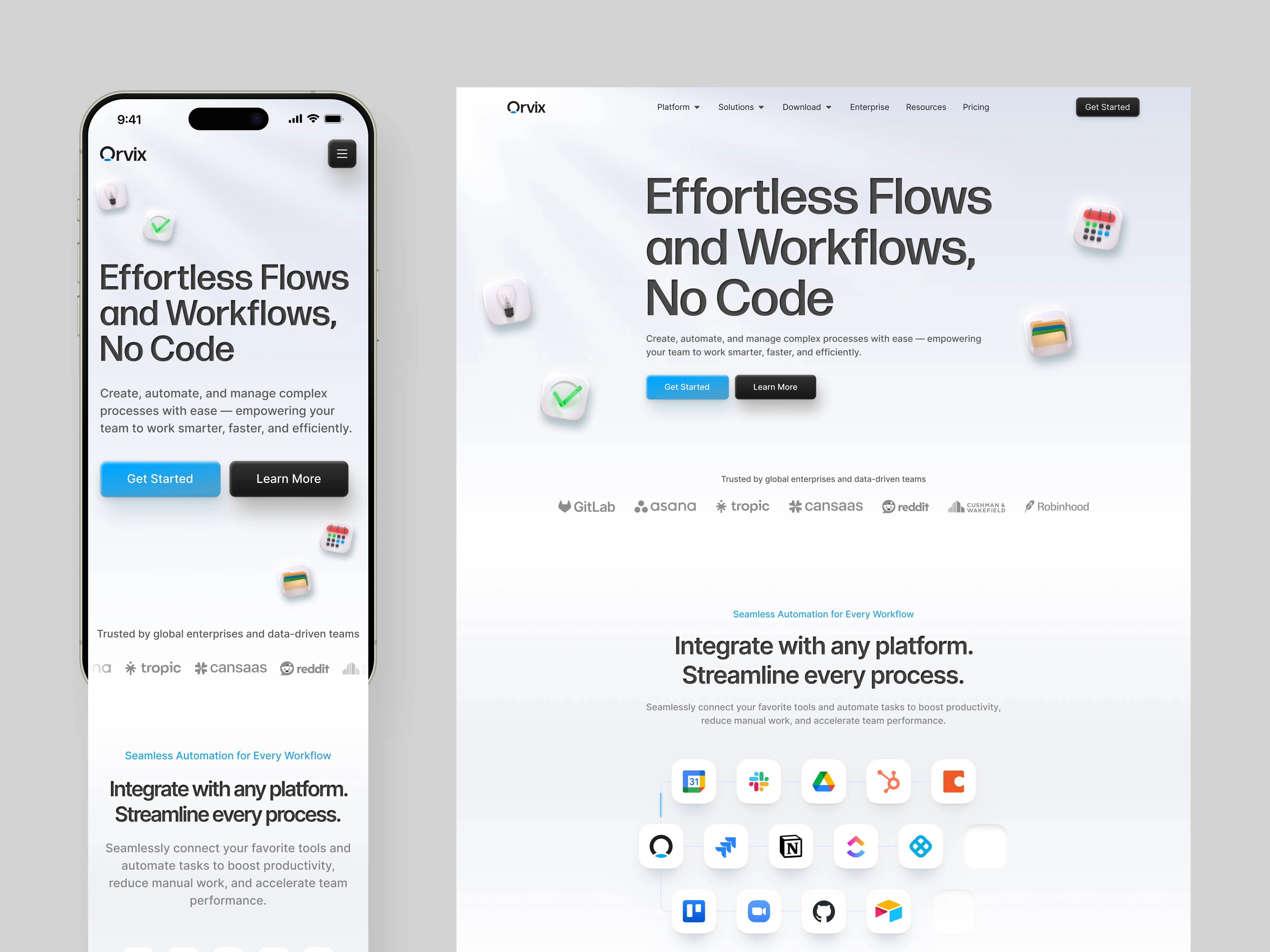
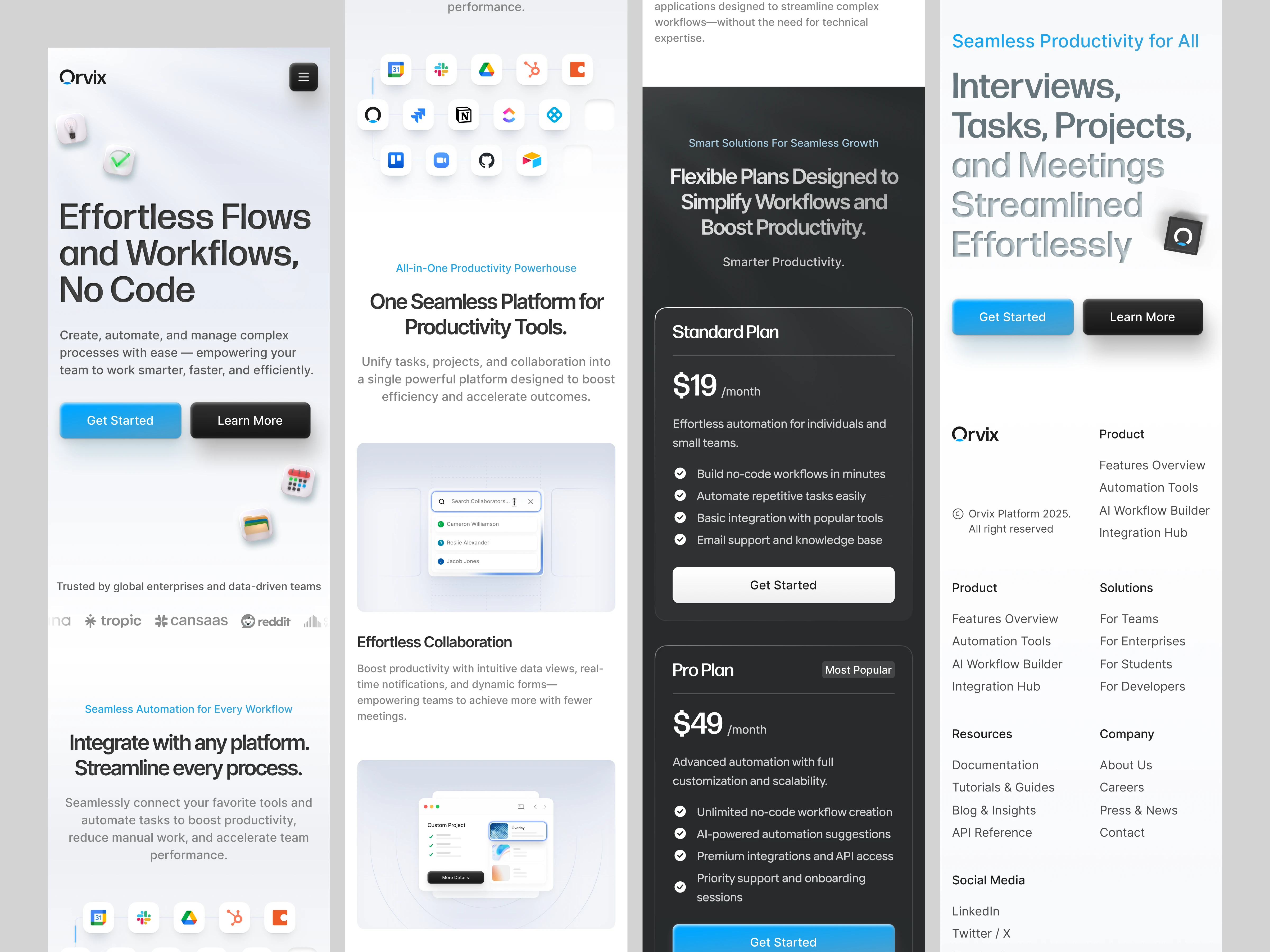
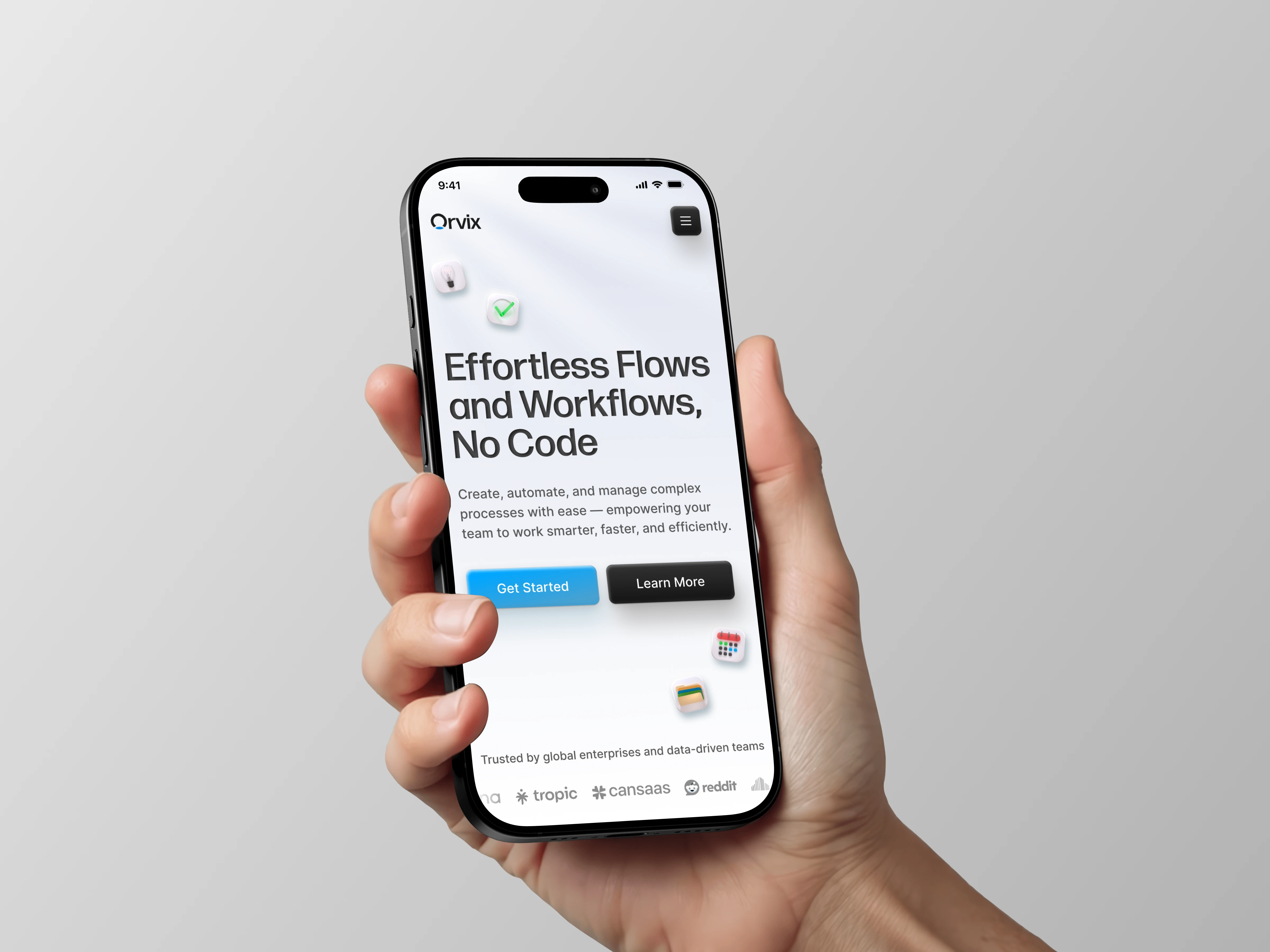
This Productivity Landing Page is crafted to deliver a clean, conversion-focused experience that adapts seamlessly across screen sizes. The layout emphasizes clarity, smooth visual hierarchy, and strong CTA placement, making it easy for users to understand the product’s value without friction.
The Problem
Many productivity tools suffer from cluttered interfaces and unclear messaging, causing users to drop off before reaching key actions. The goal here was to design a responsive page that simplifies communication while increasing sign-up intent through strategic visual cues.
Design Approach
The design leverages modular sections, spacious white space, and high-contrast CTAs to guide decision-making effectively. Each section is structured to answer a user’s immediate question What is it? Why should I care? What’s next? without overwhelming them with excessive text.
Core Experience
By introducing recognizable integration icons, familiar UI elements, and platform trust indicators, the page builds credibility early on. Responsive card layouts ensure that whether viewed on desktop or mobile, the content maintains hierarchy and visual impact.
Conversion Strategy
The consistent repetition of strategic CTAs like “Get Started” and “Learn More” ensures that users are never more than one scroll away from taking action. Subtle depth effects and micro-elevations help highlight primary interactions, improving click intent without feeling aggressive.
Outcome
The result is a landing page that communicates value clearly, reduces cognitive friction, and leads users effortlessly toward engagement. With scalable components and polished typography, it aligns well with SaaS-standard aesthetics while still maintaining a modern, premium feel.
Like this project
Posted Oct 17, 2025
This design highlights key features, integrations, and pricing in a structured layout to guide users smoothly from awareness to action
Likes
1
Views
13