Vault - CRM Dashboard
Cansaas Agency
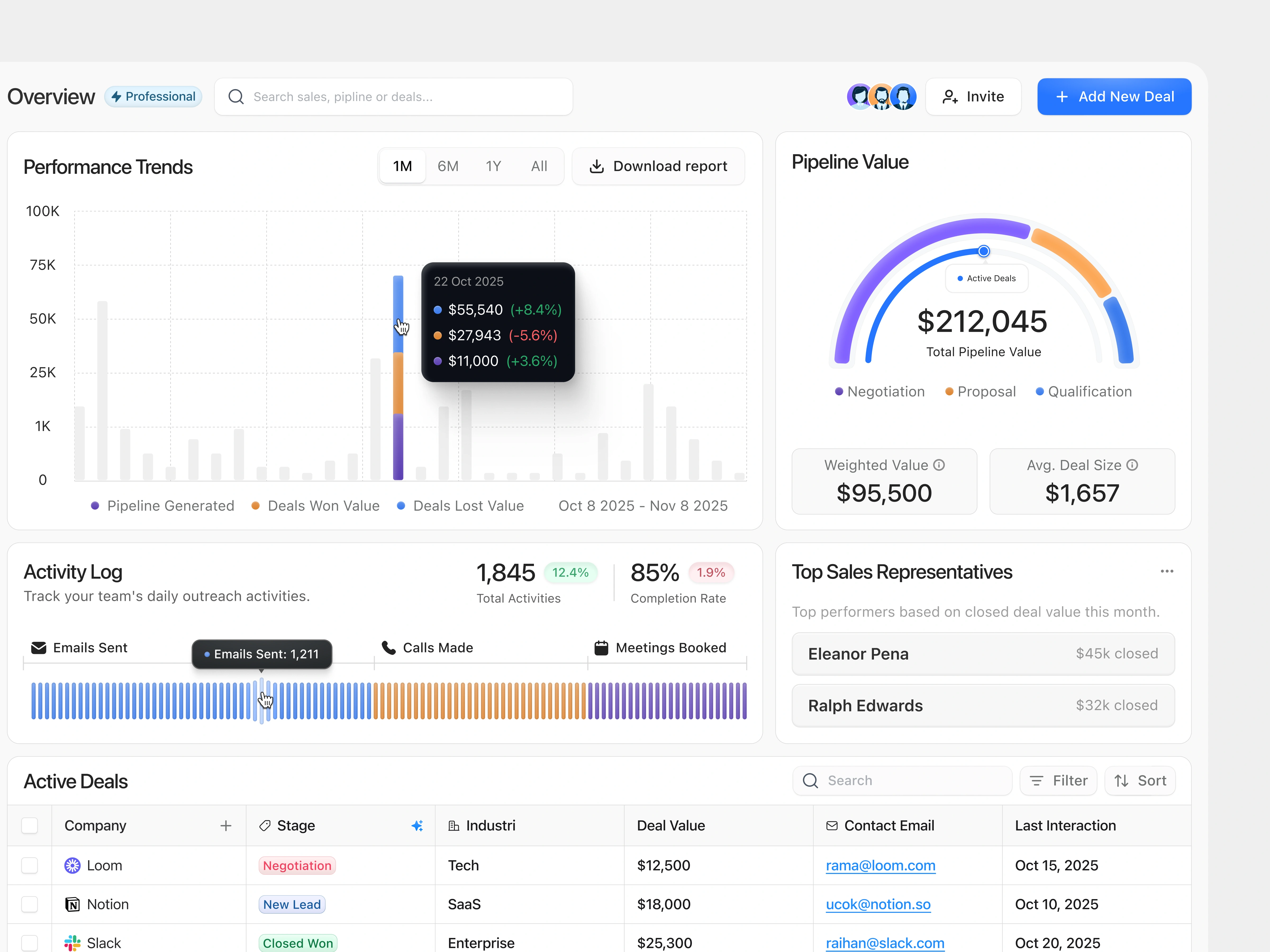
Overview
Vault CRM Dashboard is designed to give sales teams a clear, data-driven view of their entire workflow — from active deals to performance trends. The layout embraces a clean, professional aesthetic with balanced white space, intuitive color coding, and modular components that make business analytics more approachable and actionable.
The Problem
Traditional CRM dashboards often overwhelm users with scattered data and poor hierarchy. Sales reps struggle to track leads, activities, and pipeline progress efficiently, which leads to slower decisions and missed opportunities. Our challenge was to transform complex data into clarity — reducing friction while improving focus on performance.
Recognition Rather Than Recall
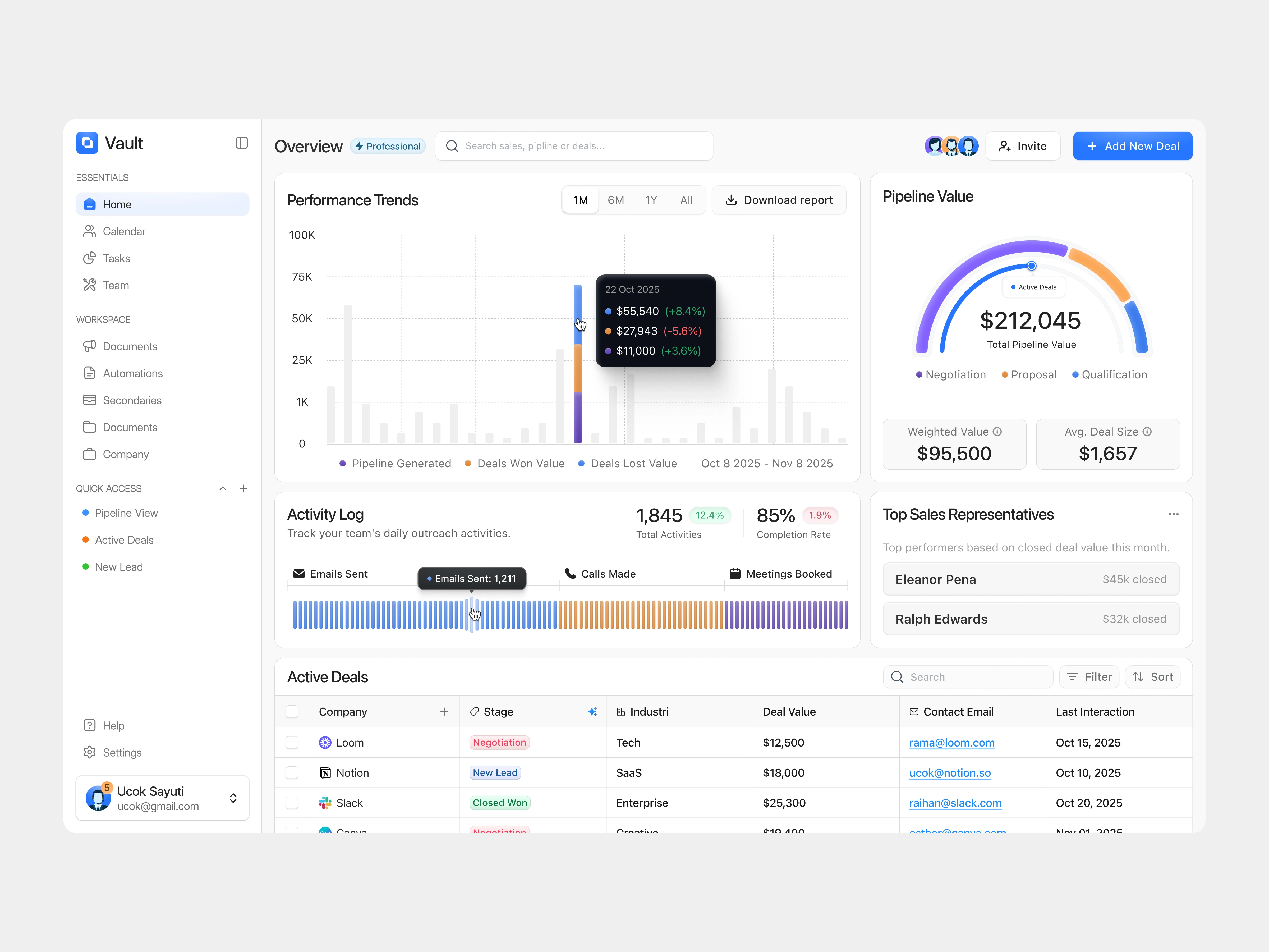
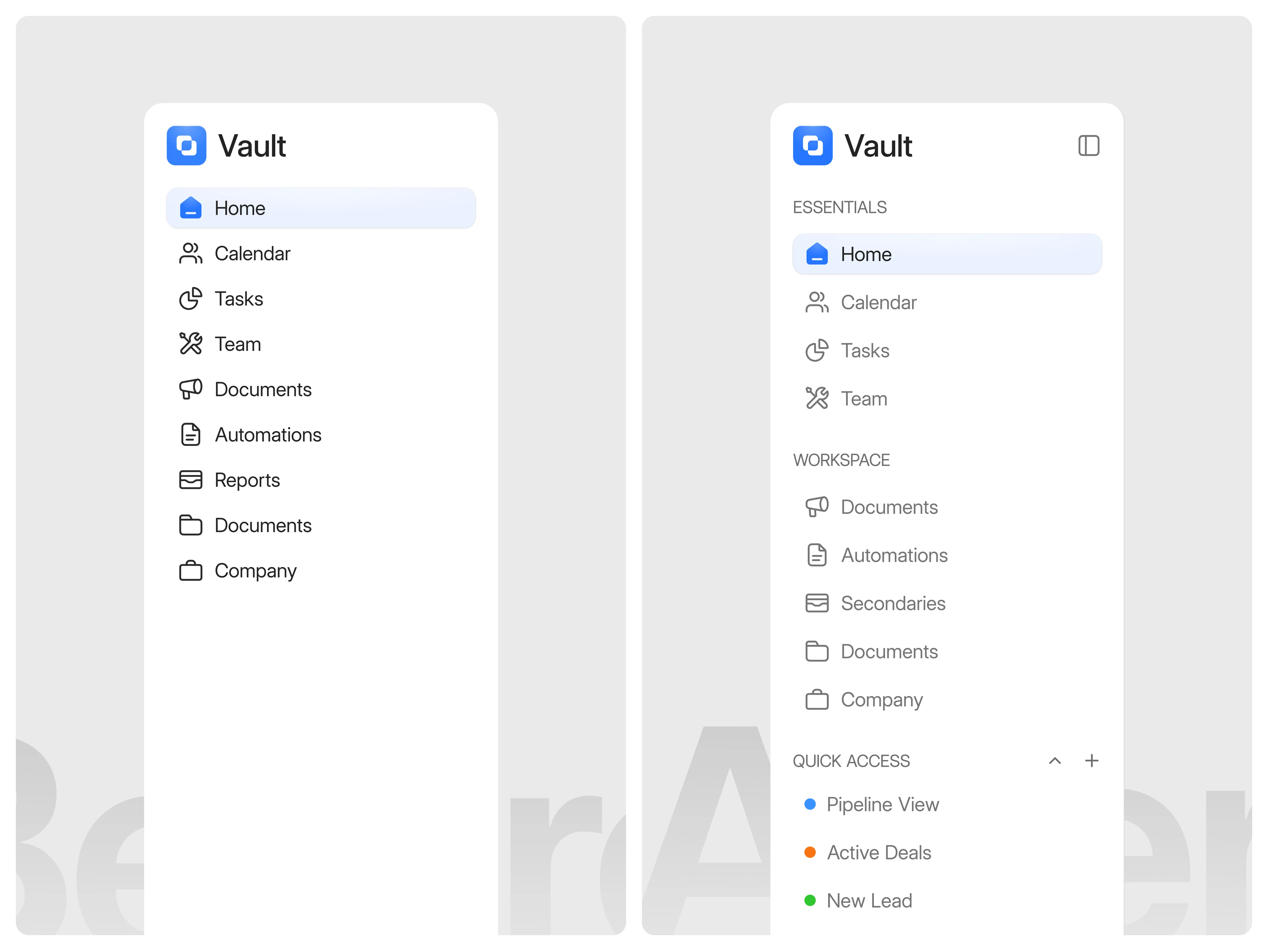
Minimize the user’s memory load by making elements, actions, and options visible. Users should not have to remember information from one part of the interface to another. In the initial version, all navigation items were listed in one long column without clear grouping or hierarchy. This made it harder for users to quickly locate key sections, since every item appeared visually equal whether it was a frequently used feature like “Home” or a secondary one like “Company.” As a result, users needed to scan the entire list each time to find what they were looking for. In the improved version, items are now organized under clear categories such as Essentials, Workspace, and Quick Access, helping users immediately understand where to find or place information. Visual grouping reduces cognitive load, while color-coded indicators in “Quick Access” offer instant recognition for different deal statuses. These refinements help users navigate more efficiently and intuitively, without needing to recall item positions from memory.
(src: Jakob Nielsen – 10 Usability Heuristics for User Interface Design)
Solution & Impact
We redesigned the interface to centralize key sales metrics into one cohesive view — combining performance insights, pipeline value, and team activities for faster decision-making. With a minimalist layout, clear color hierarchy, and smart visual feedback, the dashboard enhances user confidence and boosts productivity. The result is a modern CRM experience that turns data into action, helping teams close deals smarter and faster.
Like this project
Posted Nov 10, 2025
This CRM dashboard design centralizes your entire sales workflow, from deals and team activity to pipeline tracking, all in one intuitive view.
Likes
2
Views
12