Budget Tracking Mobile App
Cansaas Agency
Overview
The Budget Tracking Mobile App is designed to simplify personal finance management through a clean, modern, and data-driven dashboard experience. The interface focuses on clarity, usability, and real-time financial insights, allowing users to monitor income, expenses, and spending behavior in one seamless ecosystem. By combining intuitive navigation with structured analytics, the app transforms complex financial data into actionable visual information.
The Challenge
Managing personal finances often feels overwhelming due to scattered data, complex charts, and unclear categorization. Many budgeting apps overload users with numbers without prioritization or contextual insights. The challenge was to design a financial dashboard that communicates budget allocation, monthly income growth, and spending distribution clearly—without cognitive overload—while maintaining an elegant and premium mobile experience.
The Solution
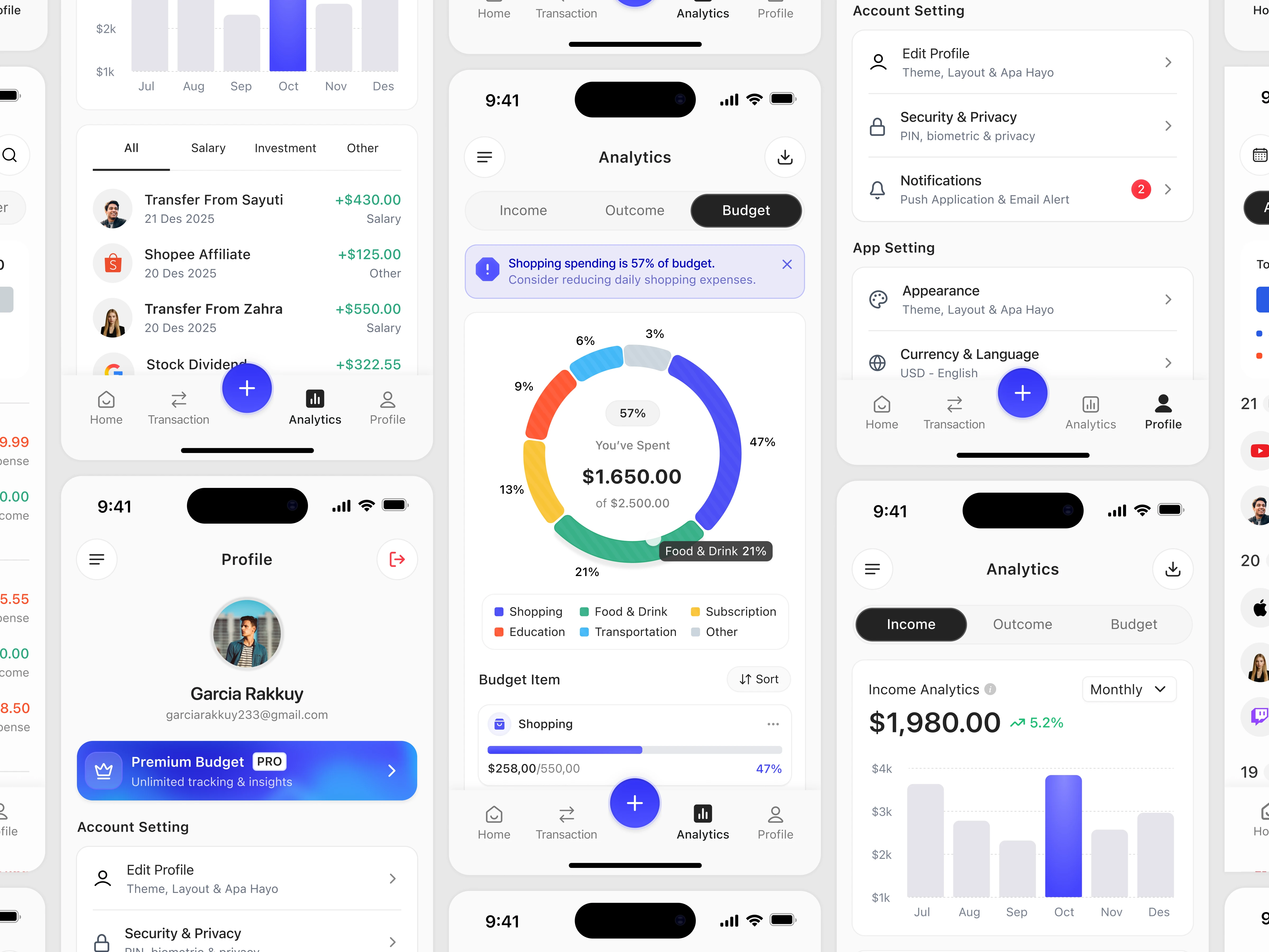
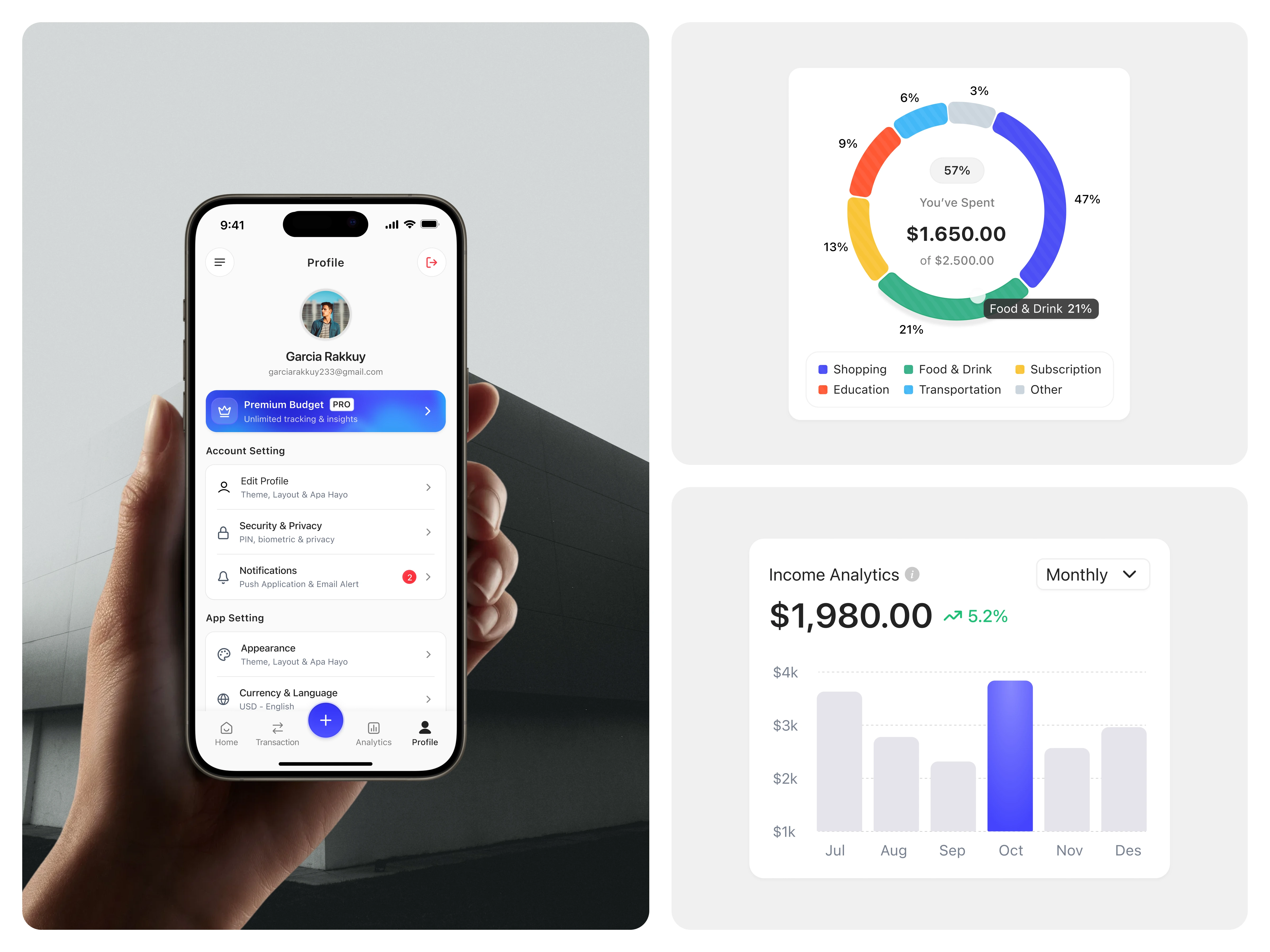
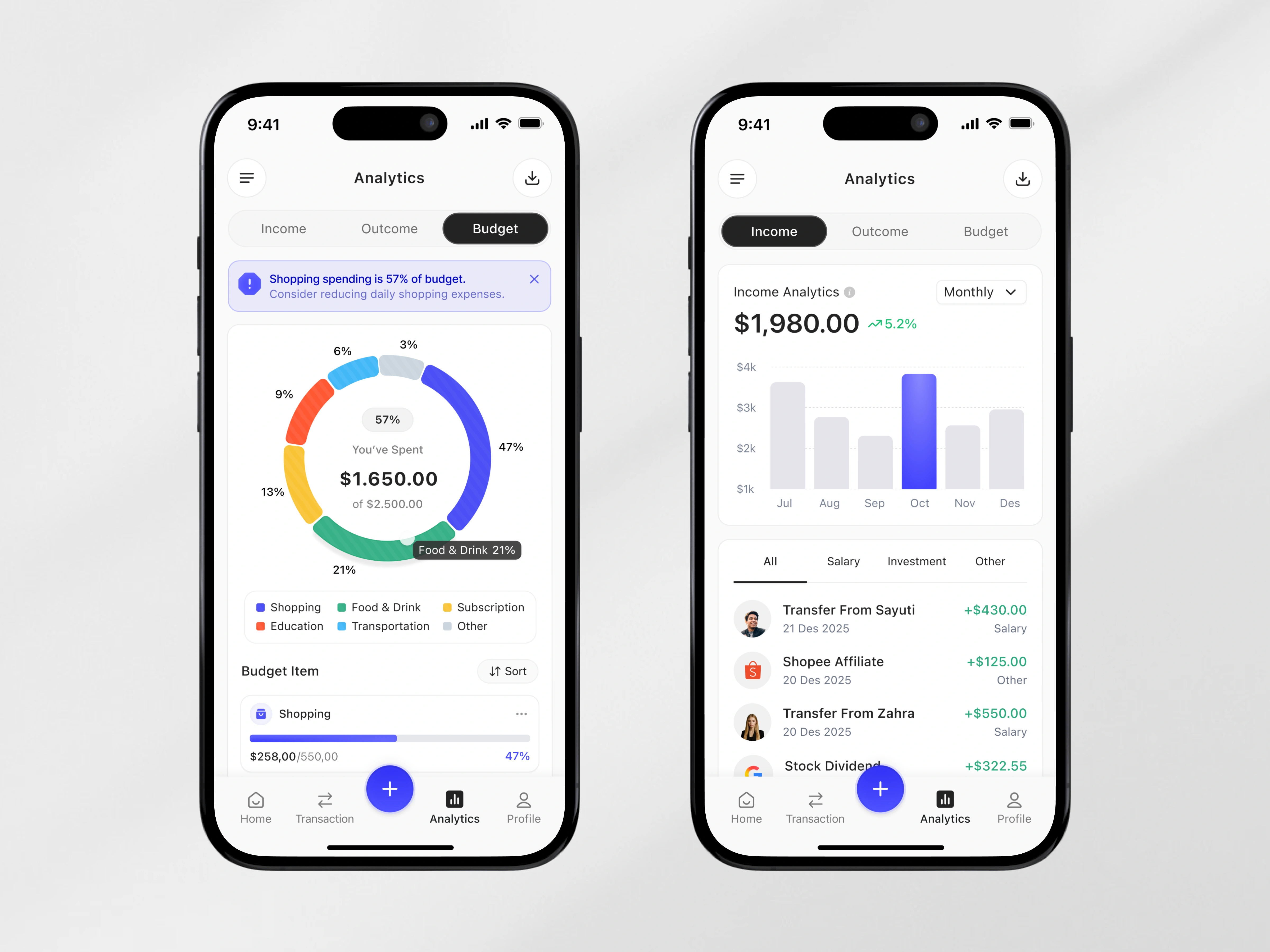
We approached the design with a visual hierarchy-first strategy. The dashboard integrates segmented analytics views (Income, Outcome, Budget) to guide users through financial states effortlessly. The Budget Breakdown Donut Analytics Card visually represents category distribution with color-coded segments, percentage indicators, and contextual labels, making spending patterns instantly scannable.
The Monthly Income Analytics Card complements this with a bar chart visualization, highlighting trends and performance growth using subtle color contrast and emphasis states. Smart microinteractions, alert banners, and contextual notifications (e.g., overspending warnings) enhance usability and reinforce financial awareness in real time.
UX Strategy
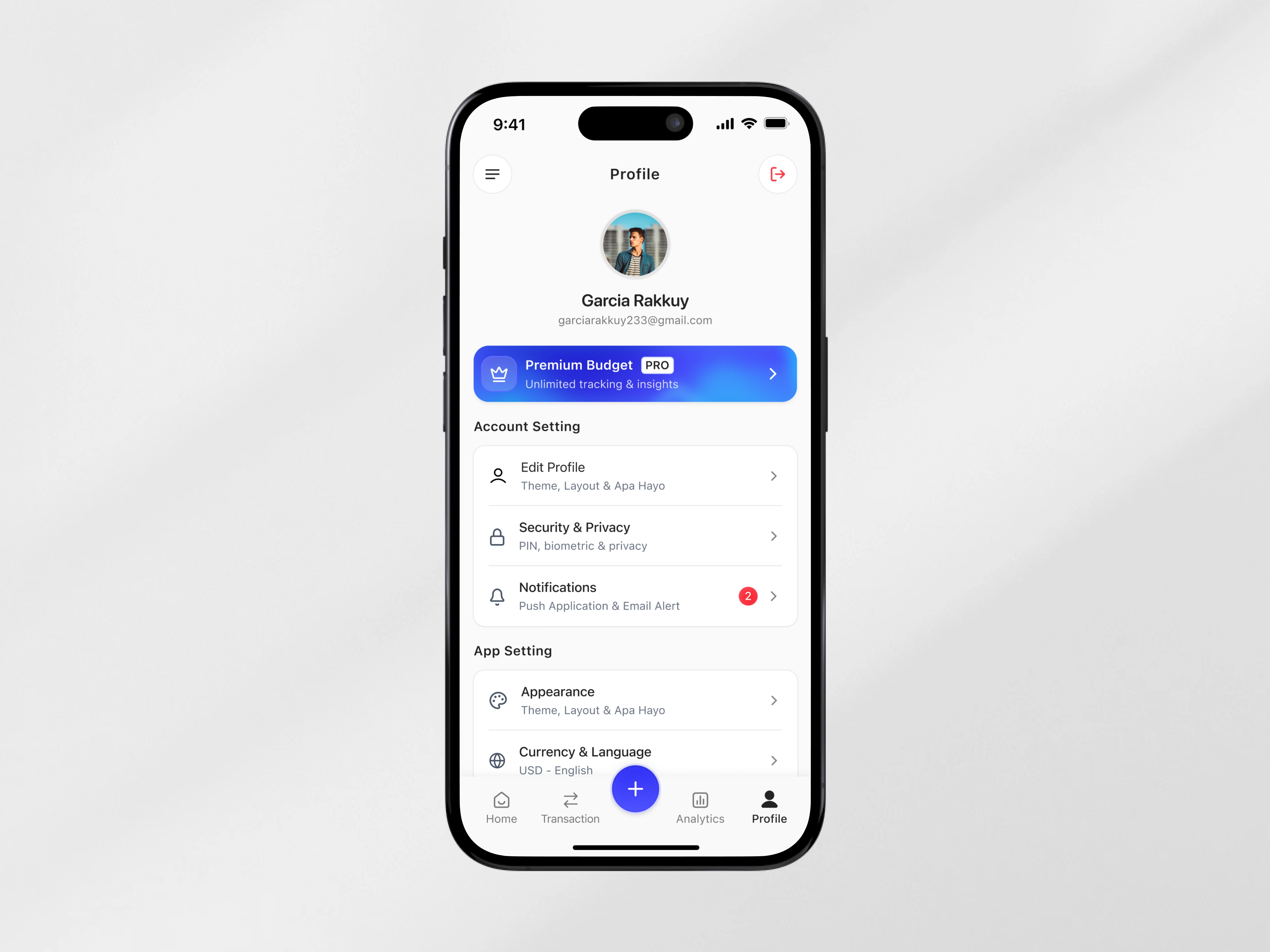
Navigation is structured around a bottom tab system for fast access to Home, Transactions, Analytics, and Profile. The floating action button centralizes primary actions, improving efficiency. Financial data is segmented logically, with clear typography scaling, balanced white space, and soft elevation cards to maintain readability.
The interface uses visual feedback, percentage indicators, and progressive disclosure to reduce decision fatigue. Every chart and data block is designed to answer a simple question: What should I do next?
Recognition Rather Than Call
Interfaces should minimize the user’s memory load by making information, relationships, and options visible and easily recognizable instead of requiring users to recall or interpret them.
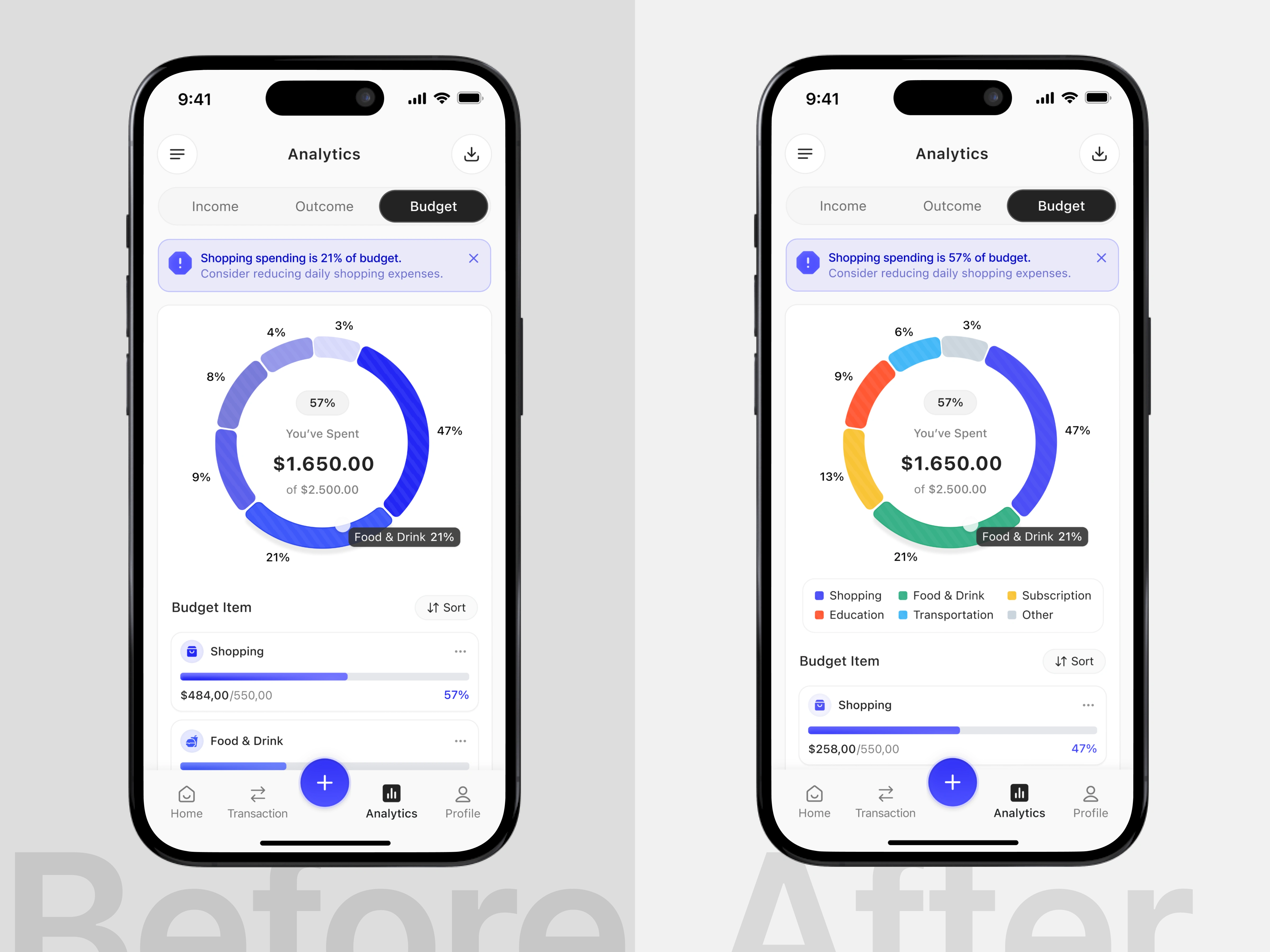
In the initial version, the budget chart relied heavily on similar color tones, making category segments difficult to distinguish. Without a clear legend or strong visual differentiation, users had to mentally recall or guess which segment represented each spending category. This increased cognitive effort and slowed down data interpretation, especially when comparing multiple categories at once.
In the improved version, each budget category is represented by a distinct and consistent color, supported by a visible legend beneath the chart. This allows users to immediately recognize category distribution and understand spending patterns at a glance without relying on memory. The clearer visual mapping reduces cognitive load, improves scanability, and enables faster, more confident decision-making when reviewing budget insights. (src: Jakob Nielsen – 10 Usability Heuristics for User Interface Design)
Like this project
Posted Feb 19, 2026
Modern budget tracking mobile app with intuitive dashboard, real-time income analytics, and clear visual spending breakdown insights.