Manify - CRM Dashboard
Cansaas Agency
Overview
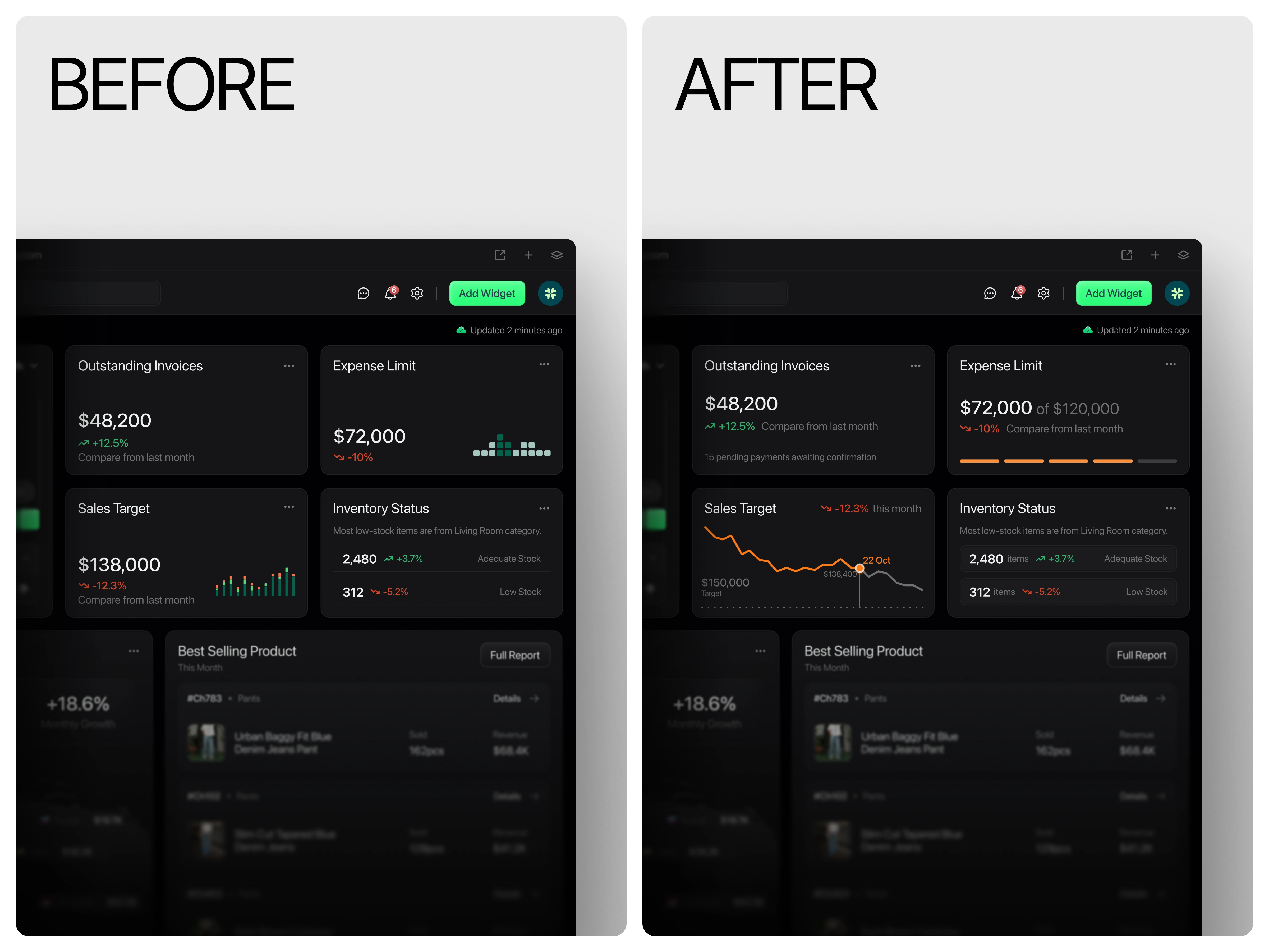
Manify CRM Dashboard is a next-generation financial and sales management platform tailored for enterprises and data-driven teams. The goal of this design is to centralize analytics, automate insight generation, and simplify performance tracking across multiple departments from cashflow and logistics to inventory and market distribution. With a dark UI aesthetic and well-structured data visualization, the dashboard enhances focus, readability, and executive decision-making.
The Problem
CRM and financial management tools often struggle with data overload presenting too many metrics without hierarchy or context. This results in decision fatigue and inefficient navigation. The challenge was to create a visually cohesive and intuitive dashboard that merges complex datasets into a clean, interactive interface allowing users to grasp key insights instantly while maintaining data depth for advanced analysis.
Match Between System and the Real World
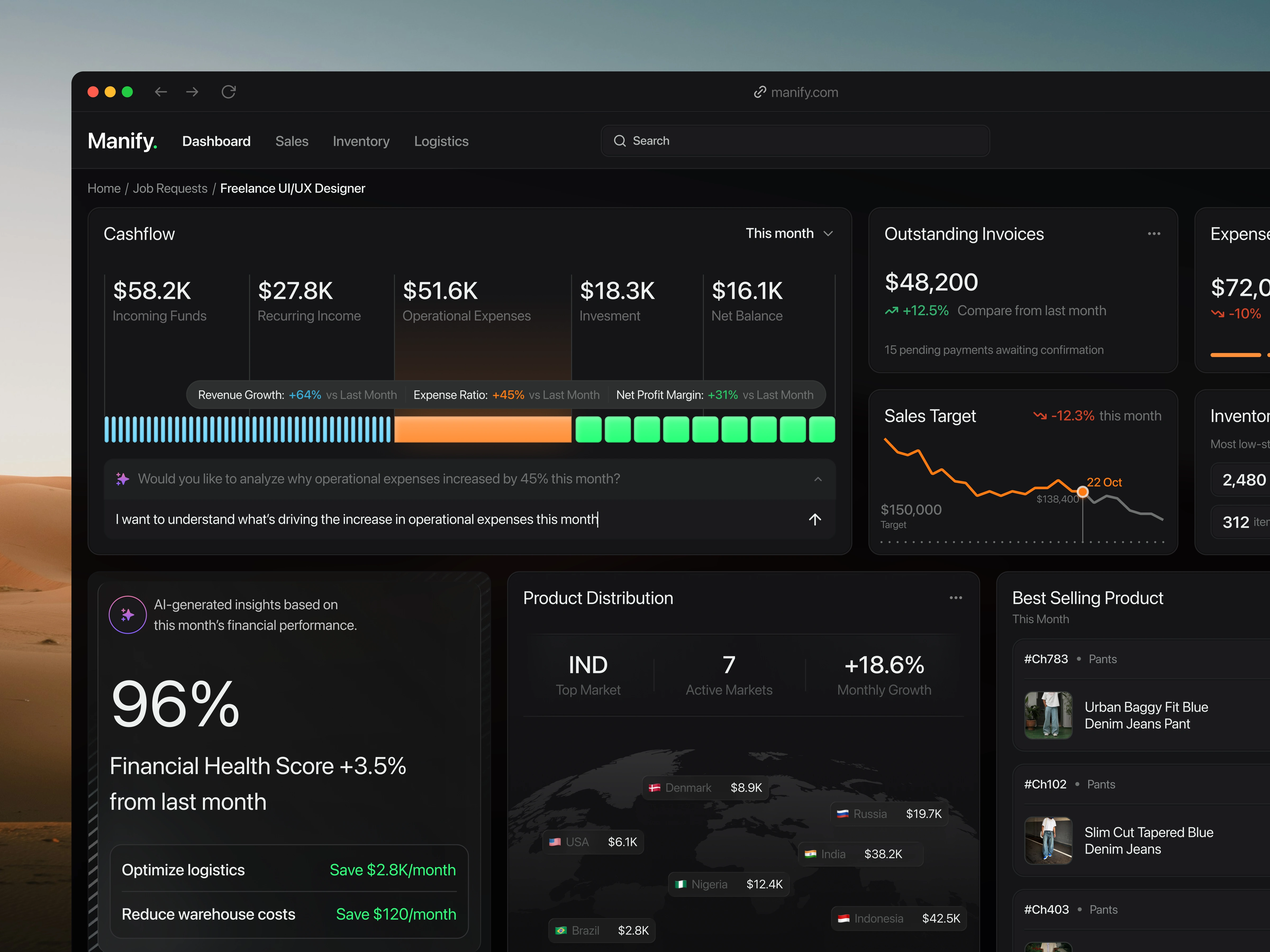
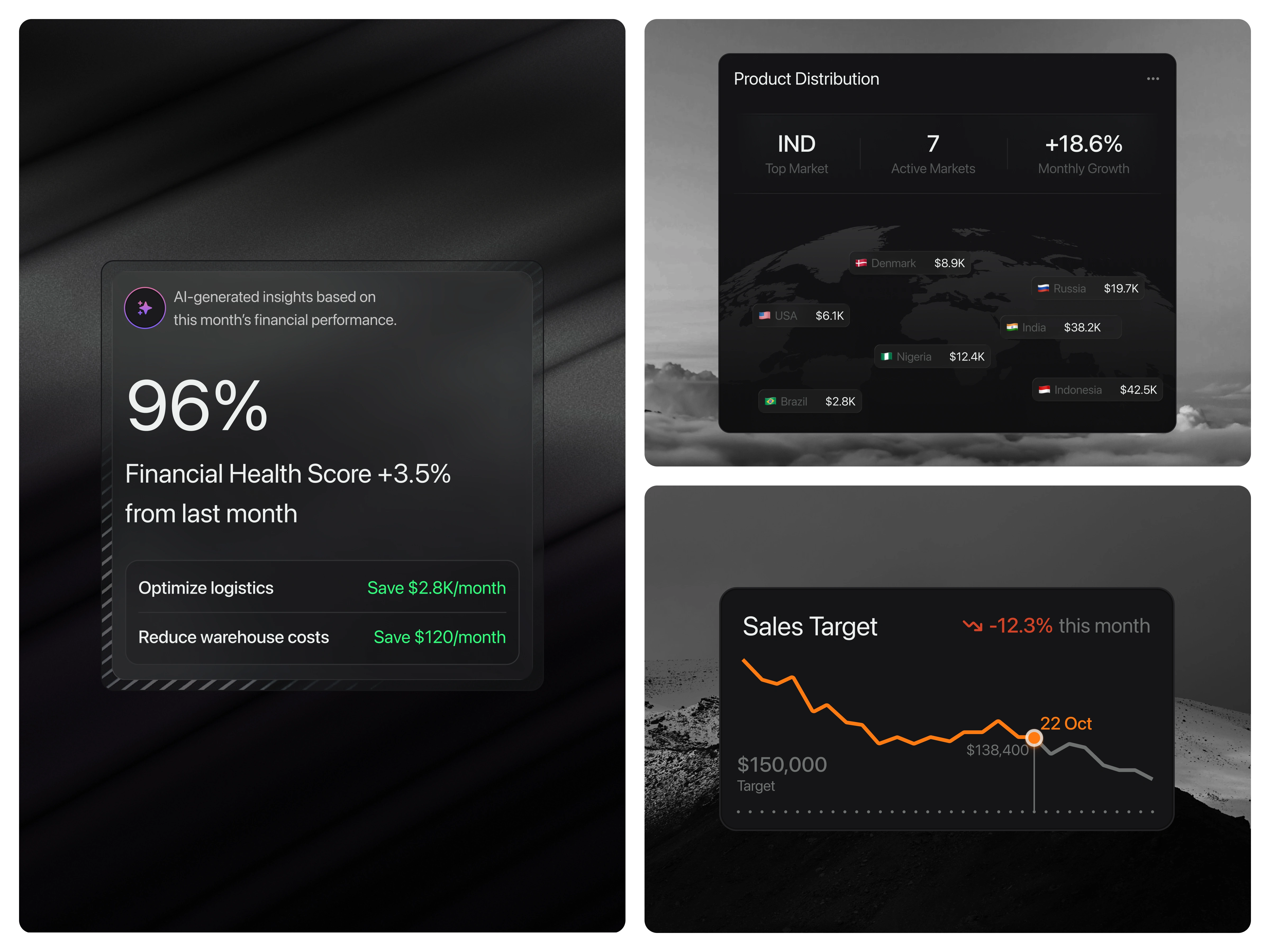
The system should speak the users’ language, with words, phrases, and concepts familiar to the user, rather than system-oriented terms. In the initial version, both Sales Target and Expense Limit were represented using simple bar charts with limited context. While they showed numerical values, users had to mentally calculate or imagine trends to understand performance over time.
This increased cognitive load and made it harder to make quick, informed decisions. In the improved version, the charts have been updated to display clearer progress and trend visualization a line chart for Sales Target that reflects performance fluctuations over time, and a progress indicator for Expense Limit showing how much of the total budget has been used. These visual changes make the data easier to interpret at a glance, aligning the interface more closely with how users naturally understand progress and trends in real life.(src: Jakob Nielsen – 10 Usability Heuristics for User Interface Design)
Outcome
Manify CRM Dashboard delivers an ecosystem that unites performance tracking, forecasting, and operational optimization within one sleek environment. It’s not just about data visualization it’s about empowering users with smart automation, informed analytics, and frictionless navigation.
This design redefines CRM dashboards as decision-making assistants, not just reporting tools.
Like this project
Posted Oct 23, 2025
Our new CRM Dashboard design delivers a clear, data-driven overview of financial performance, product sales, and logistics all in one cohesive interface.