Notes App Dashboard
Cansaas Agency
Overview
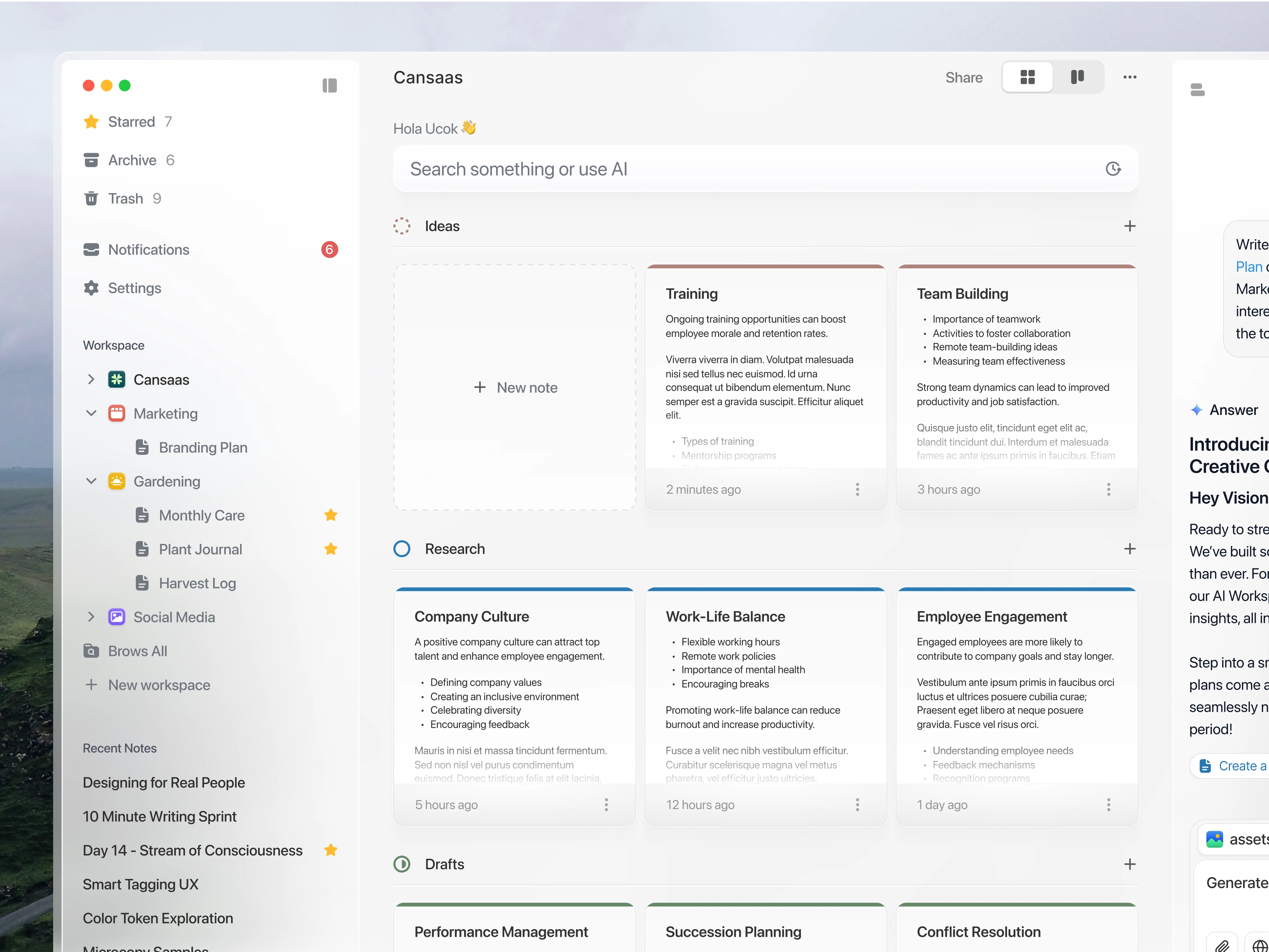
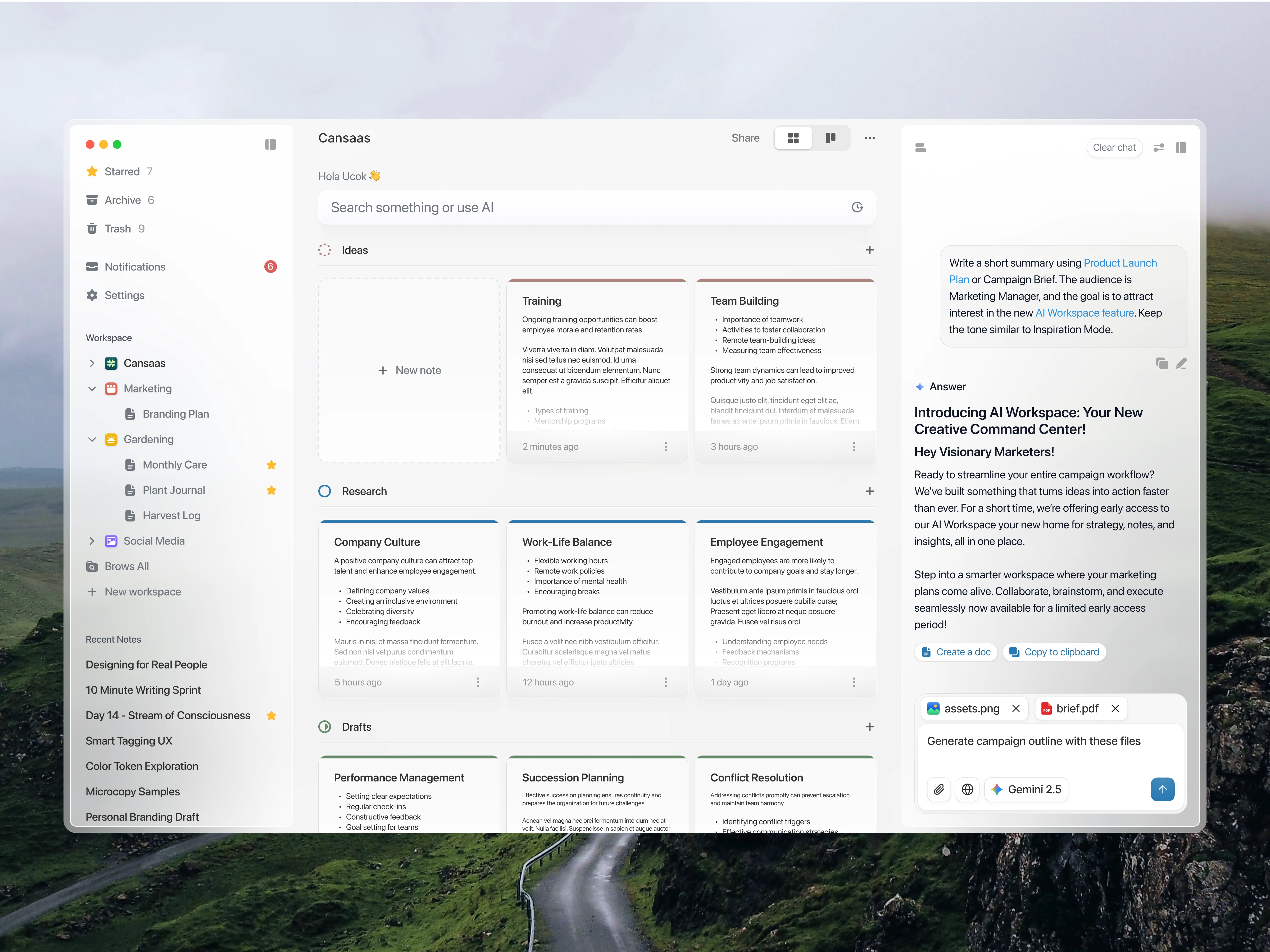
This UI/UX case study unveils the Cansaas Notes App Dashboard design, an intuitive and powerful command center built for modern knowledge workers and visionary marketers. Our objective was to move beyond traditional note-taking applications, creating a unified Productivity Workspace that seamlessly merges information organization, project hierarchy, and cutting-edge AI integration. This dashboard is designed as the central hub where raw ideas transition into actionable tasks, providing much-needed clarity in a complex digital landscape.
Visibility of System Status
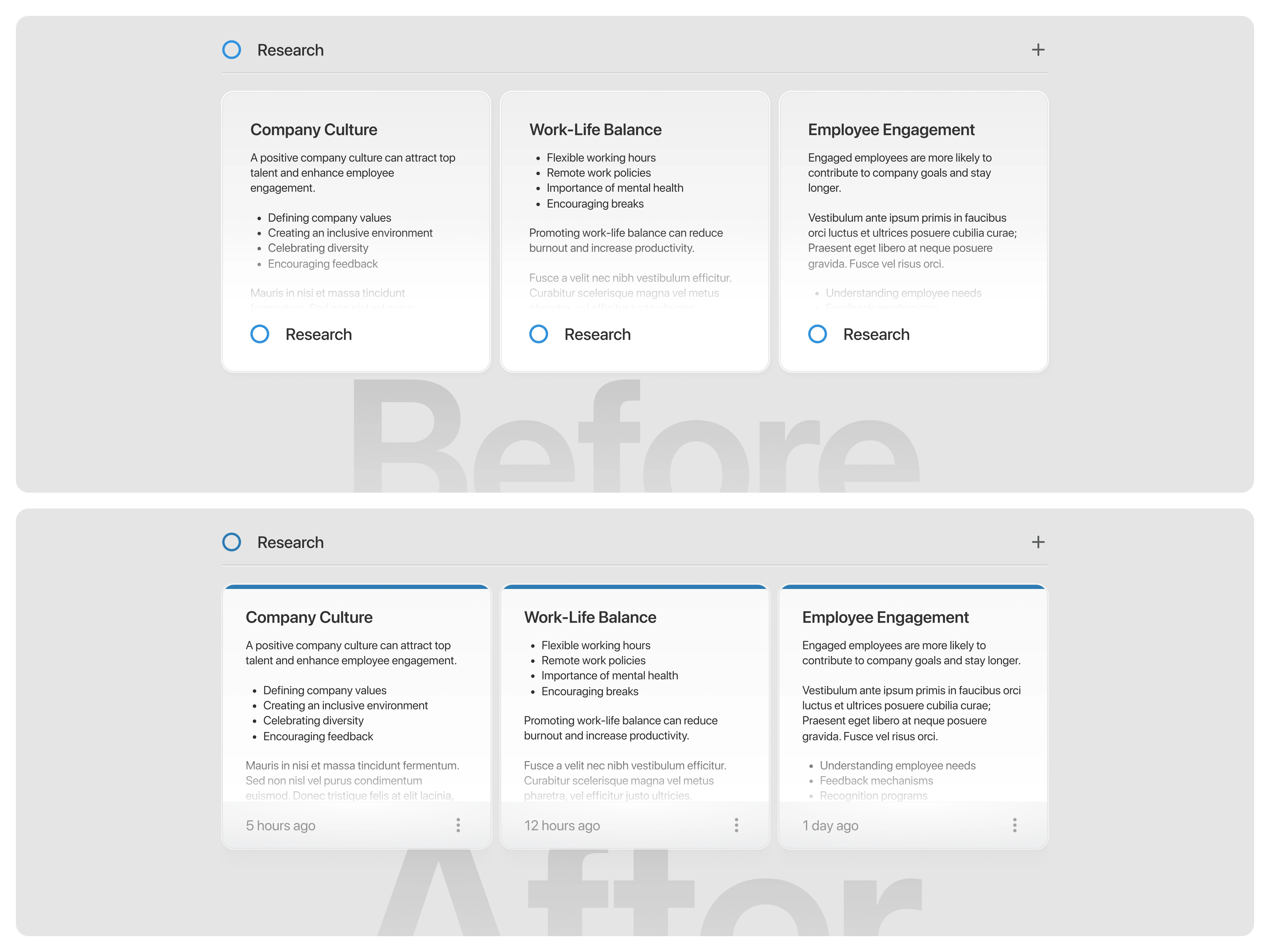
The system should always keep users informed about what is going on, through appropriate feedback within a reasonable time. In the initial version, each card displayed repetitive information the “Research” label appeared both at the top and the bottom of every card. This redundancy added unnecessary visual noise without providing new context. Additionally, users couldn’t see when each note was last modified, making it unclear which cards contained the most recent updates.
In the improved version, the redundant bottom “Research” label was removed, and a subtle “last updated” timestamp was added instead. This change keeps the interface cleaner while giving users valuable feedback about the recency of their notes. A three-dot icon was also introduced to represent quick actions, helping users access secondary functions without cluttering the main layout. Together, these refinements create a more focused, informative, and trustworthy experience. (src: Jakob Nielsen – 10 Usability Heuristics for User Interface Design)
The Challenge
The primary problem in existing Notes App Dashboards is often information fragmentation and cognitive overload. Users struggle to maintain a clear overview of their diverse projects from raw ideas and detailed research to active drafts. The design needed to solve this by transforming a scattered document repository into a coherent, highly scannable Information Architecture that respects the user's attention while offering deep-dive functionality for essential project management categories like Team Building and Succession Planning.
Result
The resulting Cansaas Notes App Dashboard is a testament to design-driven productivity. It successfully tackles the complexities of modern digital work, delivering a clean, highly organized, and intelligent workspace. This UI/UX Case Study demonstrates how thoughtful information architecture, combined with powerful AI capabilities, can significantly enhance workflow and project clarity for any professional seeking a superior digital note-taking experience.
Like this project
Posted Nov 4, 2025
This AI powered Note Dashboard is crafted to simplify how teams organize, brainstorm, and refine ideas.
Likes
1
Views
12