User-Friendly Link Analytics Dashboard Design

Cansaas Agency

Overview
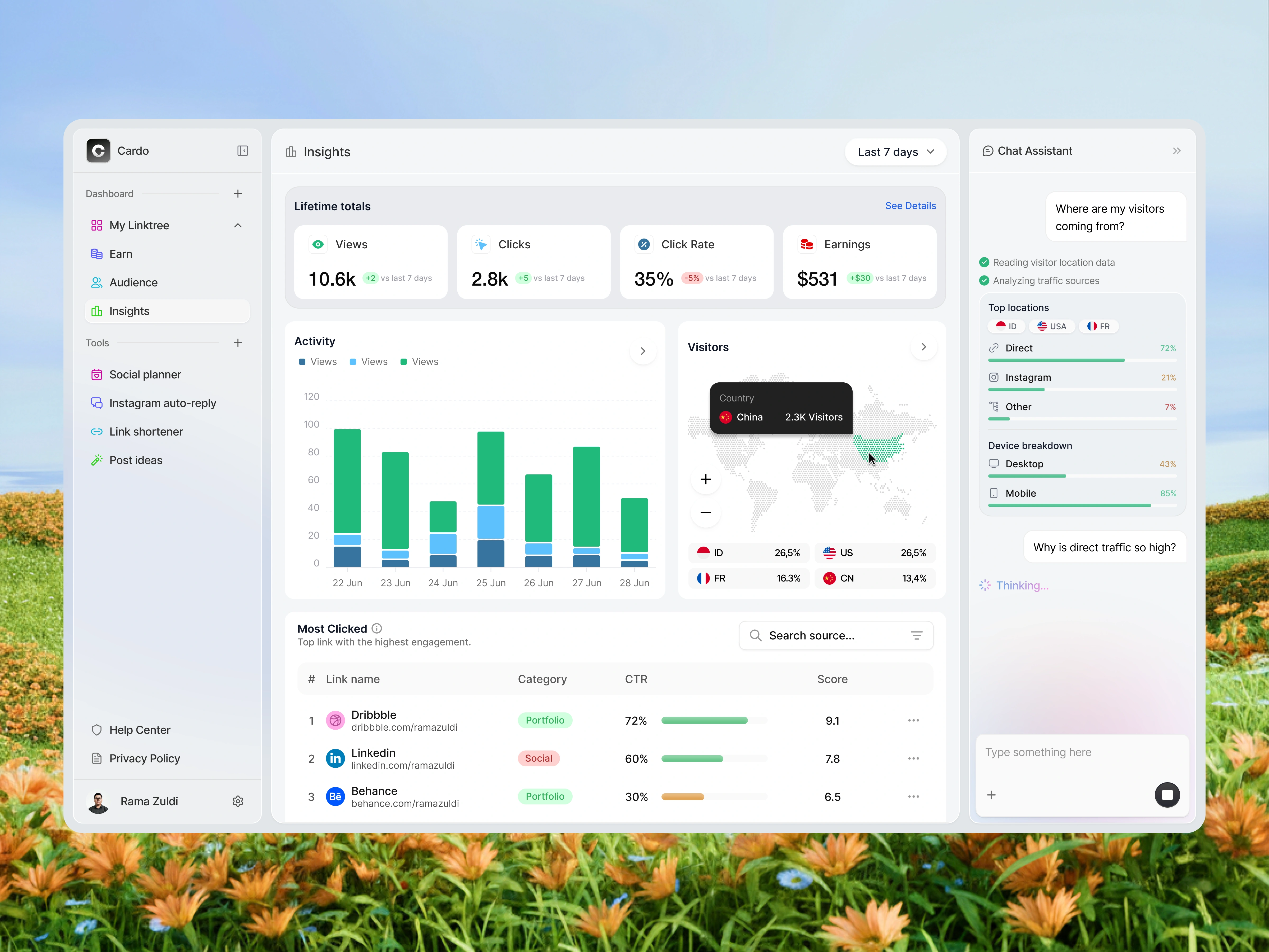
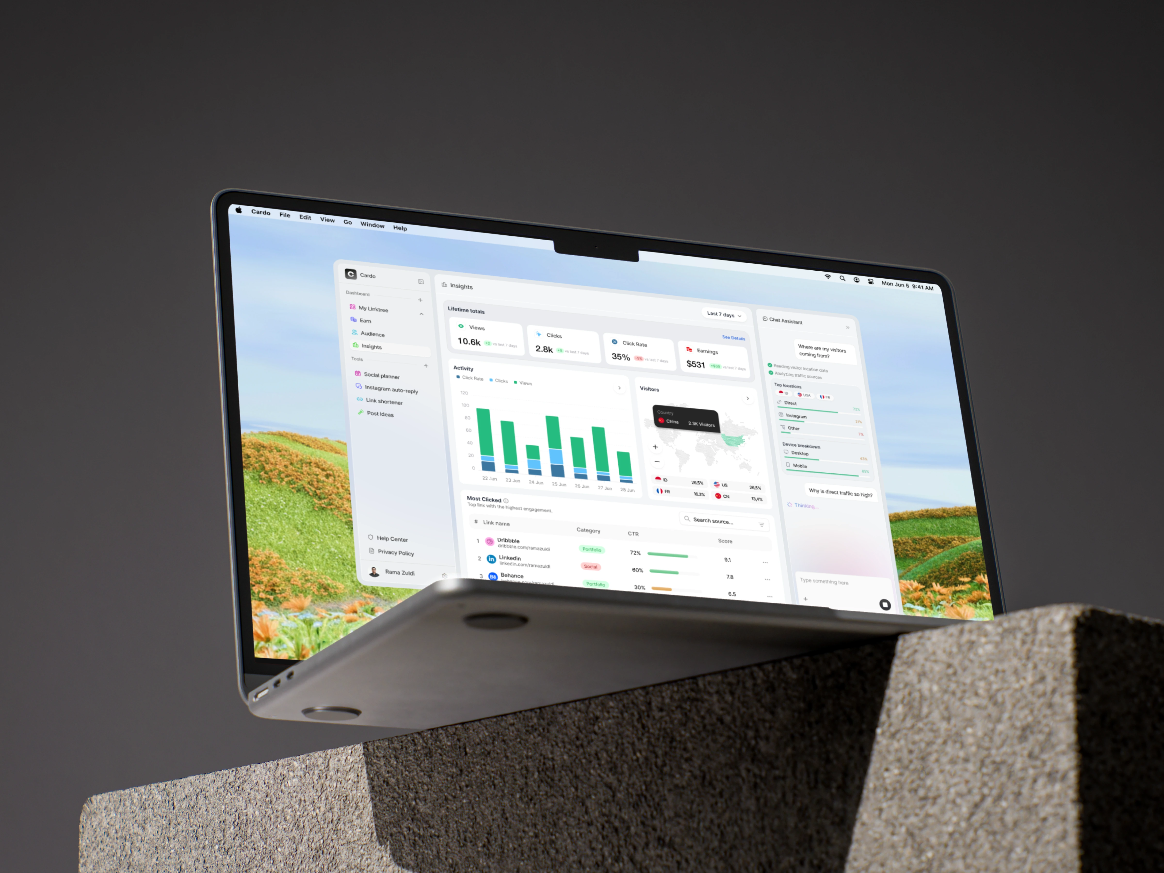
Modern creators, marketers, and businesses rely on multiple channels to drive traffic, making link analytics more important than ever. This concept reimagines a Link Analytics Dashboard that transforms complex engagement metrics into an intuitive workspace. Instead of simply displaying numbers, the dashboard helps users understand visitor behavior, monitor traffic sources, evaluate link performance, and uncover actionable insights through a clean interface enhanced with an integrated AI assistant.
The Challenge
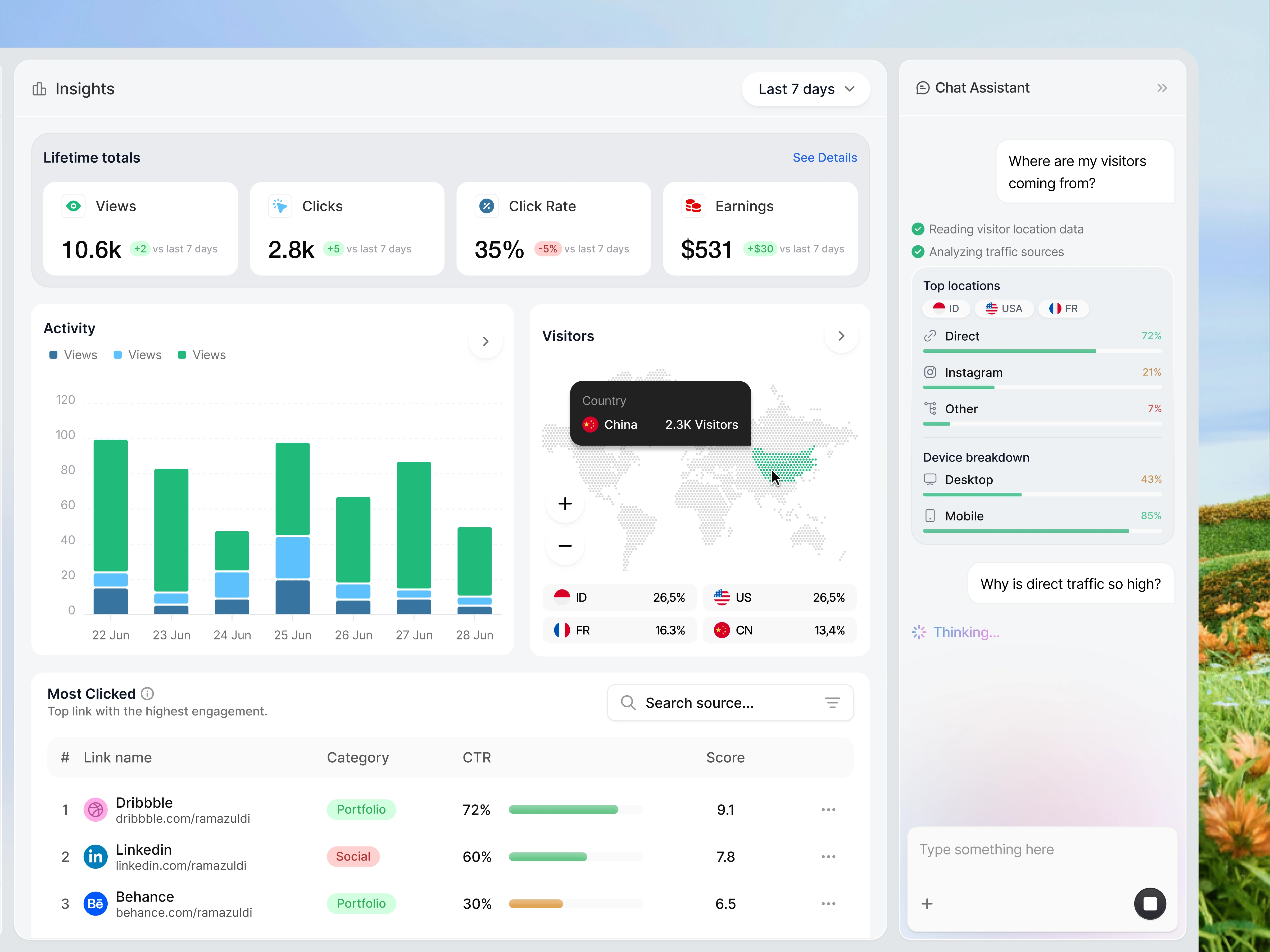
Most analytics platforms overwhelm users with fragmented reports, dense charts, and disconnected data. Critical metrics like clicks, CTR, visitor locations, traffic sources, and revenue are often spread across multiple pages, forcing users to spend more time searching for answers than acting on them.
The challenge was to simplify this experience while preserving analytical depth. Every interaction needed to help users reach meaningful insights faster without sacrificing functionality.
The Solutions
The dashboard was designed around clarity, hierarchy, and decision-making.
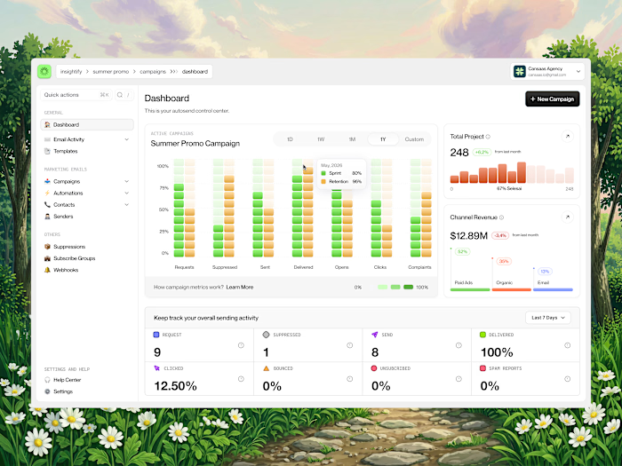
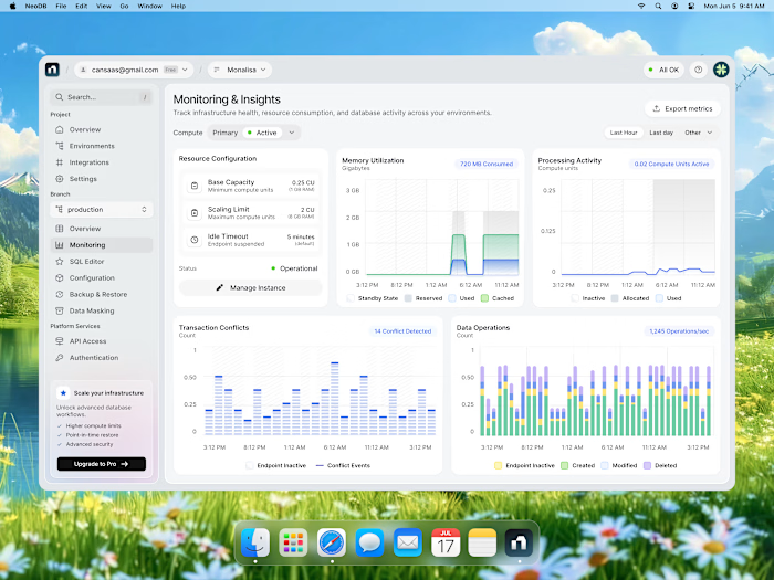
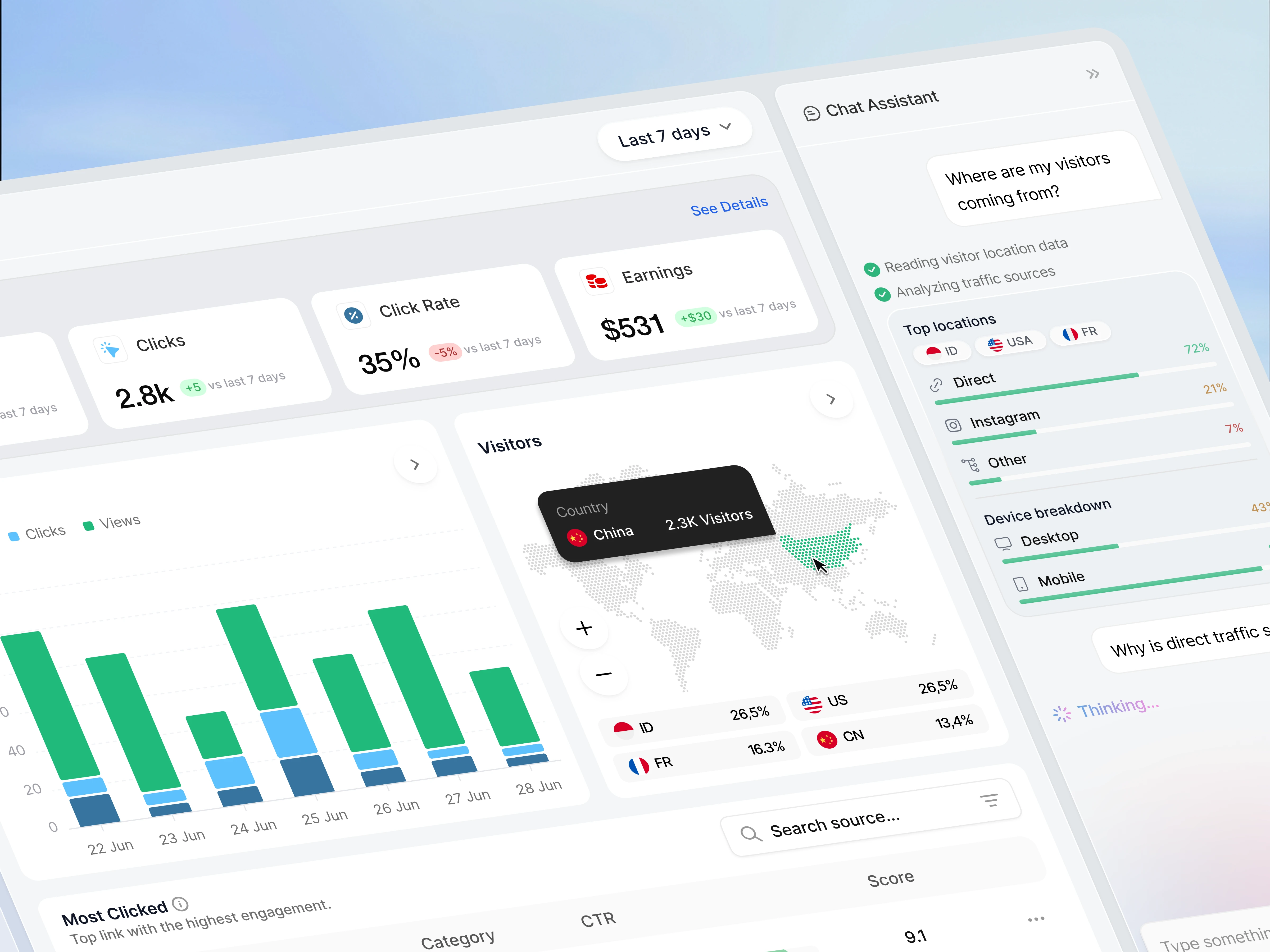
A modular card system organizes key performance indicators—including views, clicks, click-through rate, and earnings—into digestible summaries that can be scanned within seconds. Interactive data visualizations present engagement trends, while the visitor map reveals geographic distribution through an intuitive global overview.
To reduce the need for manual analysis, an AI-powered chat assistant provides contextual answers about traffic sources, audience behavior, and device usage, allowing users to explore analytics through natural conversation instead of navigating complex reports.
Design Approach
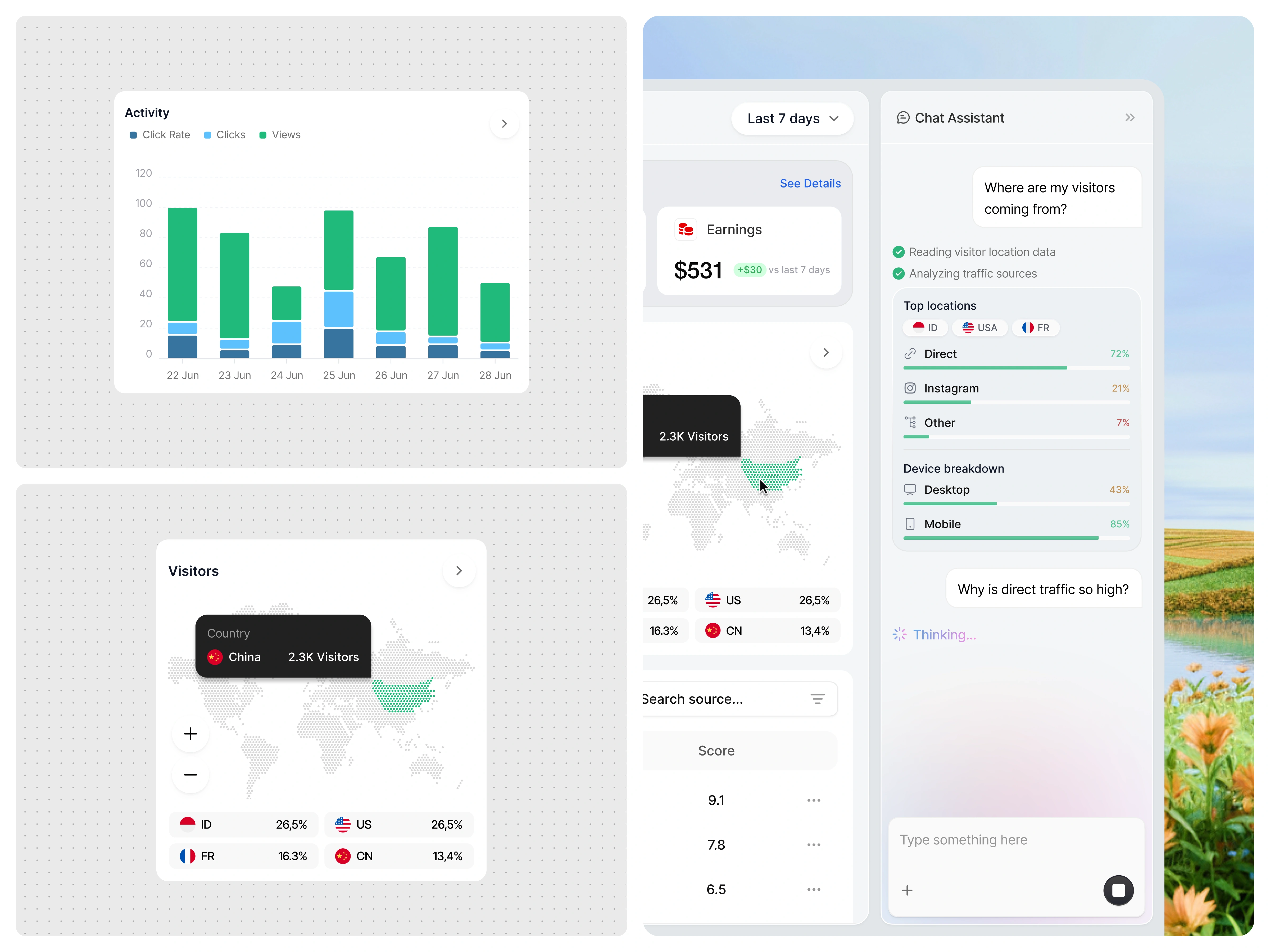
The interface follows a modern minimalist design language with generous whitespace, subtle shadows, and carefully balanced visual hierarchy. Soft neutral surfaces combined with green performance indicators create a calm environment that keeps attention on the data.
Charts, maps, and tables are intentionally simplified to improve readability, while consistent spacing and typography ensure users can quickly distinguish between primary insights and supporting information. Every component was designed to reduce cognitive load and make analytics feel approachable for both beginners and experienced marketers.
Design Highlights
This concept focuses on turning raw analytics into meaningful decisions. Rather than adding more widgets, the design prioritizes information hierarchy, contextual intelligence, and visual clarity. The integrated AI assistant acts as an extension of the dashboard, helping users discover patterns and answer questions without interrupting their workflow.
The result is a product experience that feels lightweight, intelligent, and actionable—allowing users to spend less time interpreting data and more time optimizing performance.
Like this project
Posted Jul 7, 2026
Designed a user-friendly Link Analytics Dashboard using AI features.
Likes
1
Views
19