SaaS Sales Performance Dashboard Design
Cansaas Agency
Overview
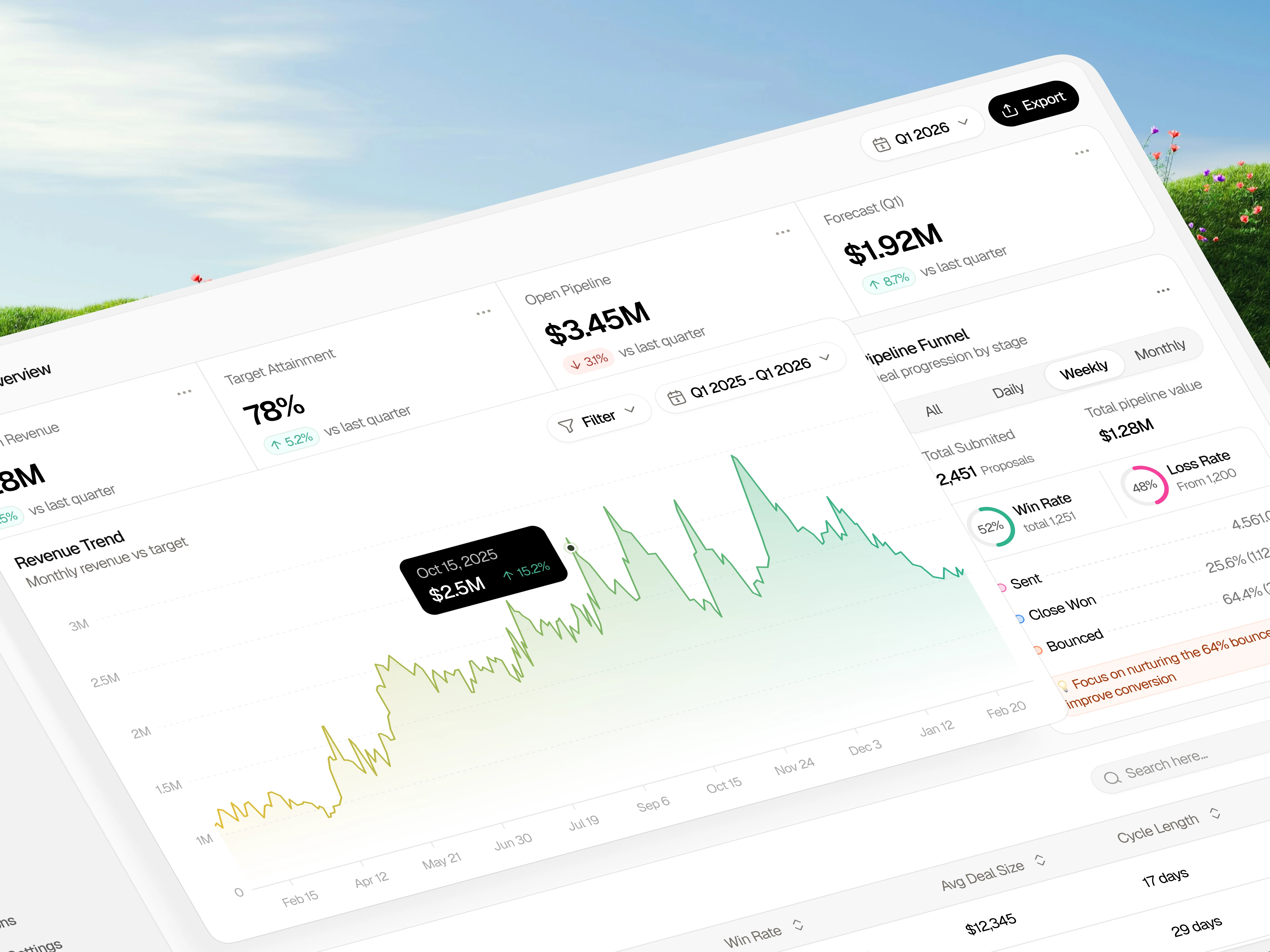
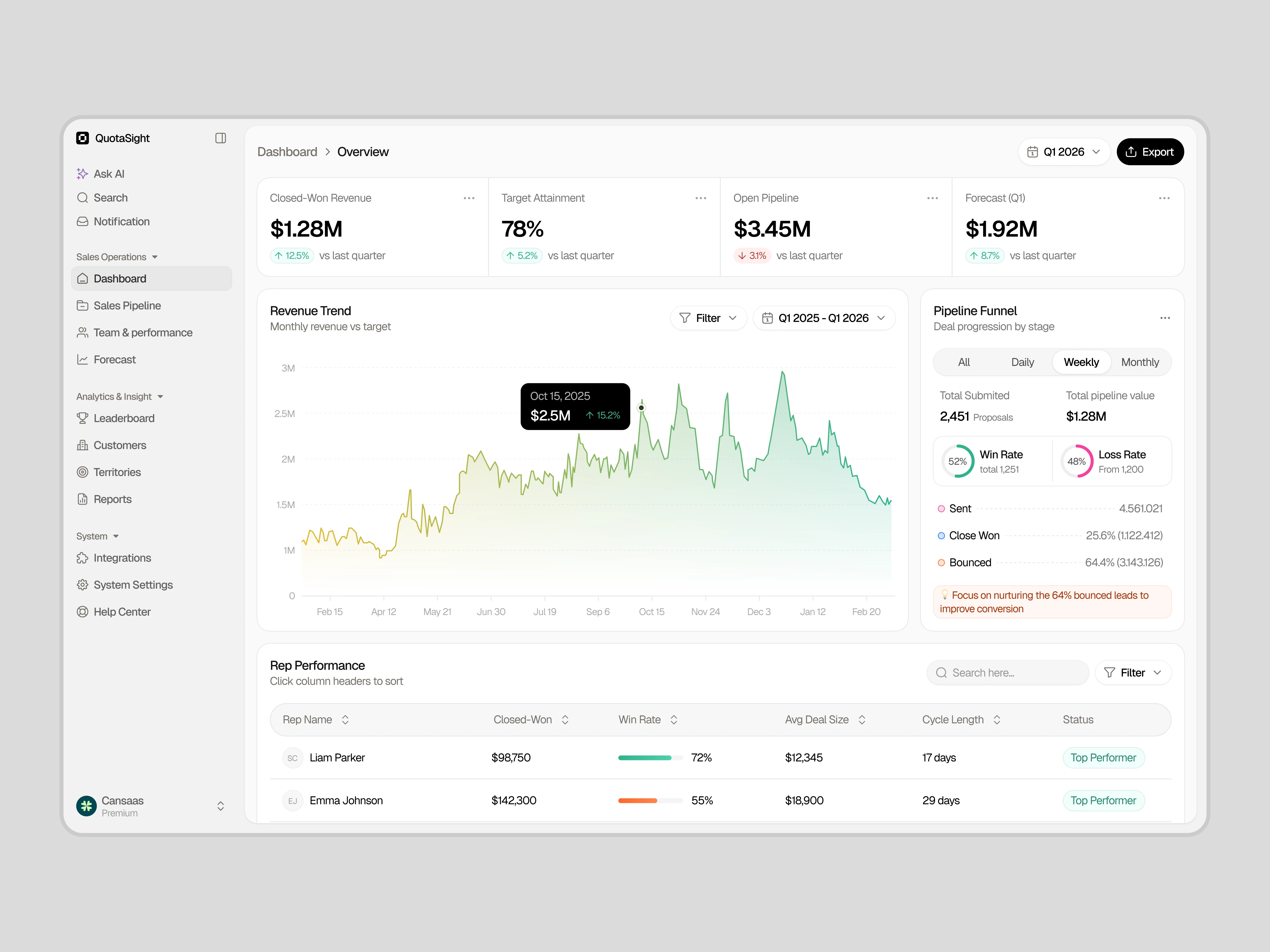
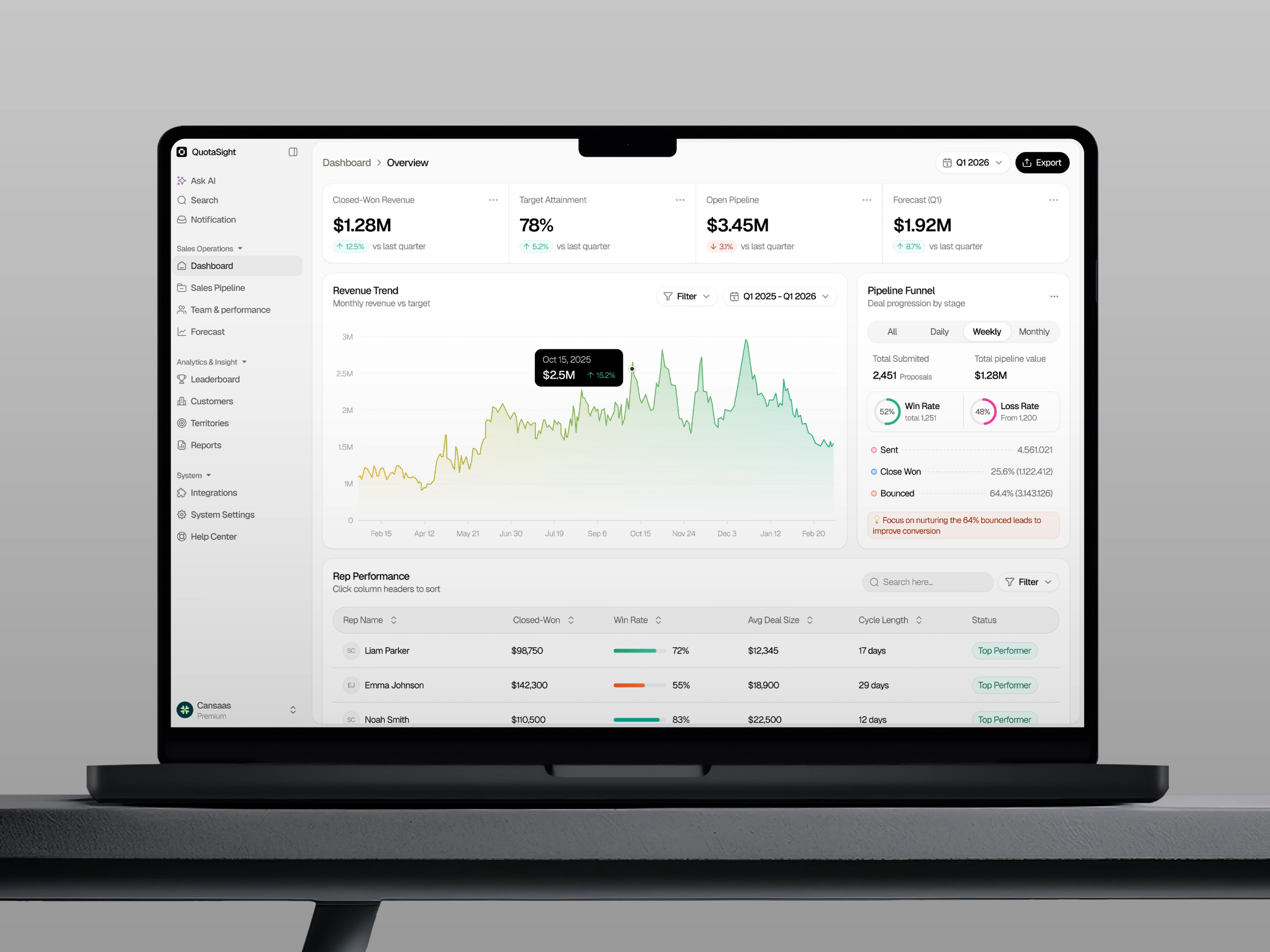
QuotaSight is a B2B SaaS Sales Performance Dashboard designed to help sales leaders quickly understand pipeline health, revenue performance, and team productivity. The interface brings together key sales metrics, including revenue trends, pipeline analytics, forecast performance, and rep performance, into a single, structured dashboard. By combining clear data visualization with a modern SaaS dashboard UI, the design enables sales teams to move from high-level insights to detailed performance analysis without switching between multiple tools.
The Challenge
As sales teams grow, the volume of data across CRM systems, reporting tools, and spreadsheets increases rapidly. While organizations often have access to large amounts of sales data, extracting actionable insights becomes difficult and time-consuming. Leadership teams need a way to quickly answer critical questions such as: Are we hitting our targets? Where are deals getting stuck? Which sales reps need support? The challenge was to transform fragmented sales data into a clear, leadership-friendly analytics dashboard that provides fast insights and reduces cognitive load.
Design Approach
The dashboard was structured around a four-layer information hierarchy to support fast decision-making. At the top level, KPI cards highlight the most critical business indicators such as closed-won revenue, target attainment, pipeline value, and forecast performance. These metrics provide an immediate snapshot of sales health.
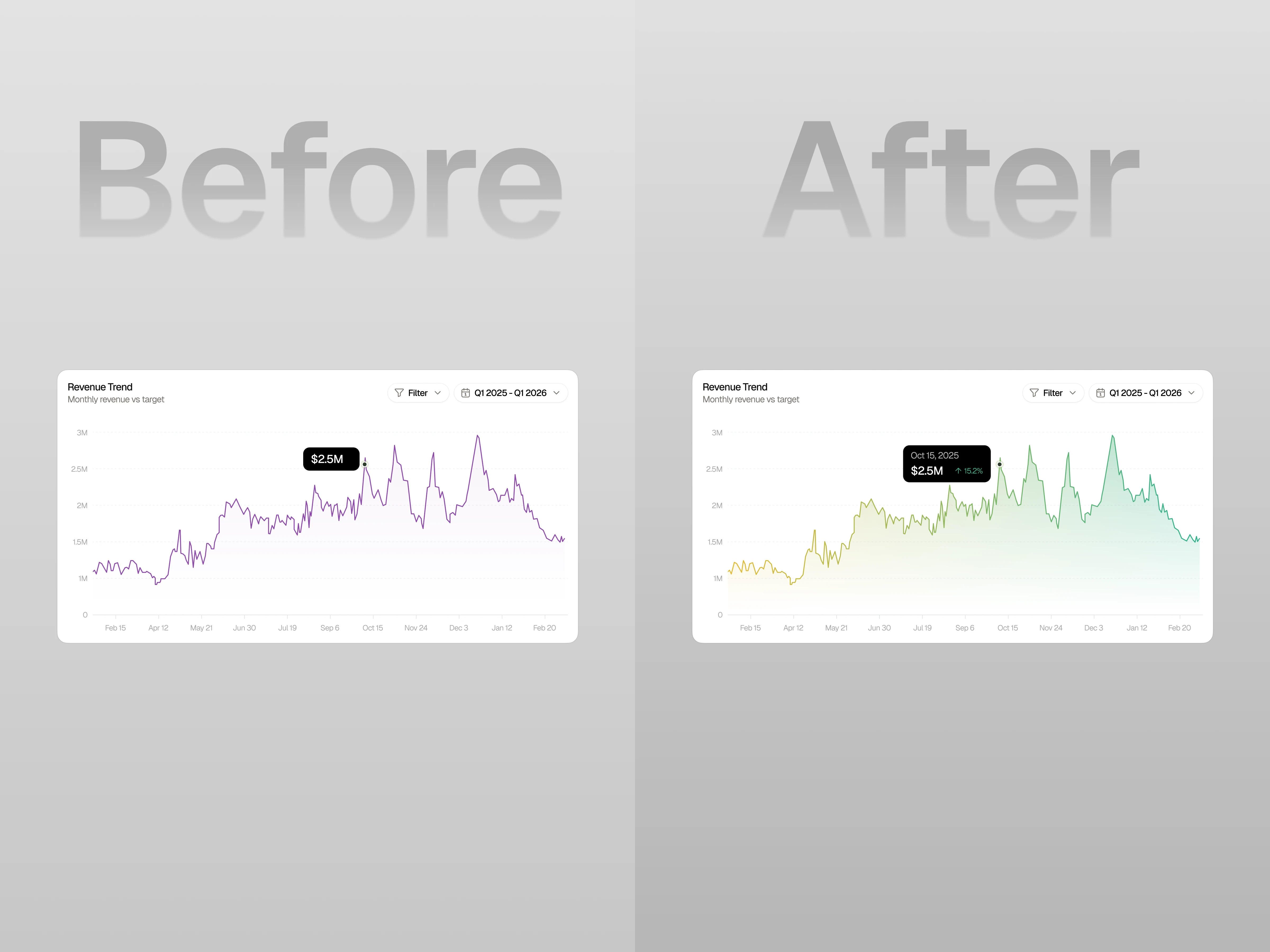
Below the KPI layer, a revenue trend chart visualizes performance over time, helping leaders quickly identify growth patterns, anomalies, and seasonal fluctuations. A pipeline funnel visualization complements this by showing how deals progress through stages and where conversion drops occur. Finally, a rep performance table provides detailed team insights, allowing managers to compare individual performance across win rate, deal size, and sales cycle length.
Data Visualization Strategy
The dashboard separates trend analysis and structural analysis through different visualization types. Line and area charts are used to communicate revenue movement over time, enabling quick pattern recognition. Funnel diagrams highlight deal progression across sales stages, while tables and comparative metrics help identify top performers and underperforming reps. This combination of analytics UI patterns and intuitive data visualization ensures that users can interpret complex data quickly and confidently.
Outcome
The result is a modern SaaS sales analytics dashboard that transforms complex CRM data into actionable insights. By combining structured hierarchy, clean interface design, and clear visualizations, the dashboard helps sales leaders quickly monitor revenue performance, identify pipeline bottlenecks, and evaluate team productivity. The design ultimately supports faster decision-making and a more transparent view of overall sales health.
Like this project
Posted Mar 6, 2026
Created a SaaS dashboard for sales data visualization and analysis.