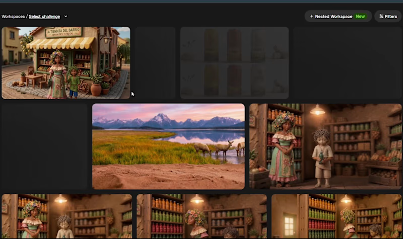
Logo Design Projects in Buenos Aires ProvinceLogo Design Projects in Buenos Aires ProvinceFor the challenge, we conceived a fictitious malt brand, a nutritious and sweet beverage with no added sugars. Cristian had the idea of creating a malt commercial, so we decided to embark on a design from scratch.
I believe human guidance is present in every single step of the process, right from the first prompt, starting with the need to showcase something we identify with. How to execute it is part of the sequence of decisions we made along the way.
We began with a generic prompt to see what would happen. We analyzed the initial label layout proposed by the model and guided it through modifications that led to a final result very far removed from those early versions. There was a clear need for less artwork on the label to keep the focus on what truly mattered, ensuring the label design wasn't strictly straight. We also guided the model to move the bottle away from the standard beer bottle design it initially proposed, softening straight lines to bring a sense of warmth and approachability to the design, and ensuring the cap was rendered as a screw-cap. There was also human guidance involved in the final shot of the video where we present the brand, explaining to the AI how to achieve the specific effect we imagined with the soil.
This is, therefore, our submission for the Envato challenge.
@Envato Mr. Tasty Redesign 🍔⚡
The goal of this project was to develop and strengthen the brand concepts that existed but were not being fully represented. Urban speed, rhythm, and quality were some of the key concepts we worked on.
In addition, we introduced a new concept: “Explosion.” This idea was used to convey the explosion of flavors in the food while giving the brand a distinctive identity that sets it apart from competitors. We achieved this through the combination of colors, supporting graphic elements, typography, packaging, stationery, signage, and, most importantly, the concepts behind the brand.
The logo represents rhythm, speed, premium quality, and originality, transforming the way customers perceive the brand and how it communicates with its audience.
You can find my contact information on my profile if you'd like to work together on your brand 😁
Thanks for watching!
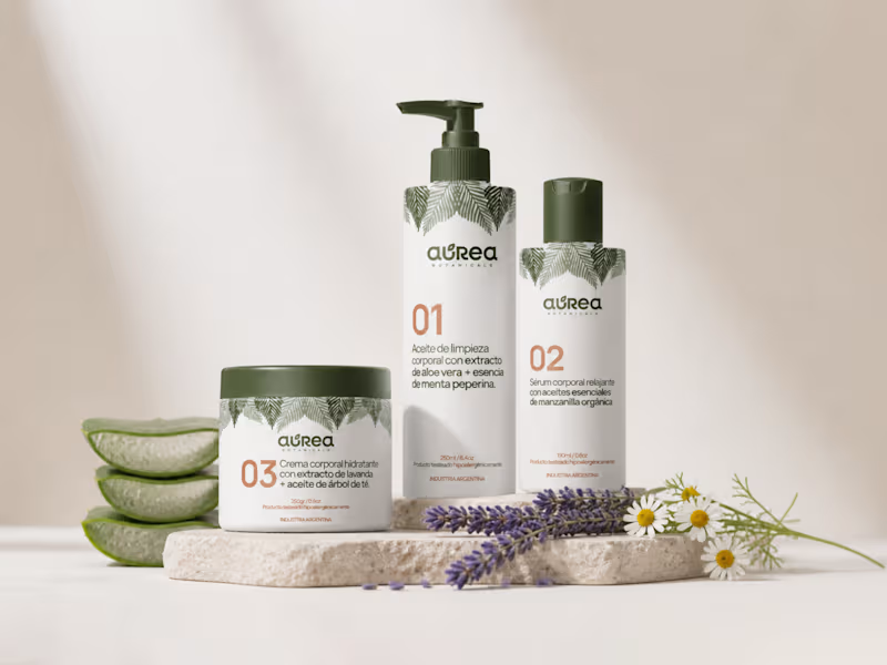
#MrTasty #BurgerRestaurant #GraphicDesign #Branding #Burger AUREA BOTANICALS es una marca argentina que se creó desde el deseo de conectar con el cuidado personal, partiendo de un lugar más consciente y sensorial.
El desafío fue desarrollar una marca que transmita naturalidad y calidad, sin perder la esencia naturista. Encontrar un lenguaje visual capaz de expresar lo botánico desde un enfoque más cuidado, donde lo estético y lo emocional acompañen la experiencia del producto.
Una estética con intención. La identidad se construye a partir de una paleta armónica, inspirada en lo natural, que busca generar calma y conexión.
Las decisiones tipográficas acompañan esta idea desde la elegancia, aportando claridad sin perder personalidad y simplificando la experiencia del usuario a la hora de elegir los productos adecuados para su piel. Cada elemento fue pensado para sostener un lenguaje visual coherente, donde lo orgánico no se vuelva caótico, sino intencional.
Más que producto, experiencia. El sistema visual se extiende al packaging y a los puntos de contacto, entendiendo que cada instancia forma parte del vínculo con la marca. La experiencia se construye desde lo sensorial: lo que se ve, lo que se percibe y lo que transmite.
AUREA BOTANICALS se posiciona como una marca delicada, consciente y coherente. Una identidad que equilibra lo natural con lo estético, generando una experiencia que se siente tan bien como se ve. Visual Identity & Brand Guidelines for Jewellery Brand
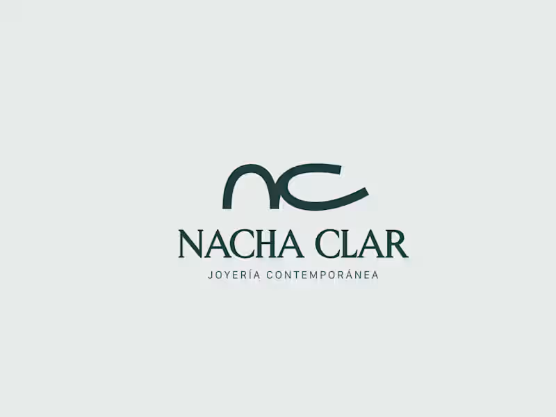
Case Study: Nacha Clar | Contemporary Jewelry Branding
Overview
Natacha Tellez is a visual artist and contemporary jeweler behind the brand Nacha Clar. Her work is defined by a clean, sophisticated aesthetic, blending diverse materials—such as bronze, acrylic, leather, and silver—with artisanal techniques like lost-wax casting. Operating from her atelier in Olivos and her flagship store in the coastal town of Mar de las Pampas, Natacha creates small-batch, handmade collections (12–20 pieces per line) that range from minimal and modern to organic and ethnic-inspired.
The Challenge
Since 2020, the brand has maintained a presence on Instagram, but it required a strategic evolution to match its high-end craftsmanship. The project focused on:
Designing a cohesive visual identity that effectively communicates the brand’s core values and artistic essence.
Launching a digital storefront and building a robust online positioning strategy to scale its reach.
Target Audience
The brand speaks to professional women (ages 40–60) with a refined, urban, and intentional sense of style. They seek distinctive design details to elevate their daily look—from the office to social gatherings—valuing the balance between premium craftsmanship and accessible luxury. They are cultured, active women who enjoy travel, art, and the Mediterranean lifestyle.
Strategic Solution
The strategy focused on elevating the brand’s perceived value through a sophisticated editorial lens. Key actions included:
Aesthetic Positioning: Developing a visual language that reflects the "High Design – High Quality – Fair Price" triangle.
Inclusive Narrative: Implementing a communication strategy that truly represents the target demographic, using photography featuring models within the 40–60 age range to foster authentic connection and aspiration.
Lifestyle Integration: Aligning the brand imagery with the client’s lifestyle—balancing coastal inspiration with urban elegance.
Key Expertise Applied
Brand Identity Design & Visual Storytelling.
Digital Positioning & E-commerce Strategy.
Creative Direction for Jewelry Photography.
B2B/B2C Communication for Luxury Goods.