pro
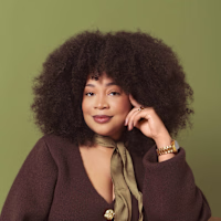
Chantal Jemmott
Strategic branding for premium wellness brands
- $5k+
- Earned
- 3x
- Hired
- 5.00
- Rating
- 605
- Followers
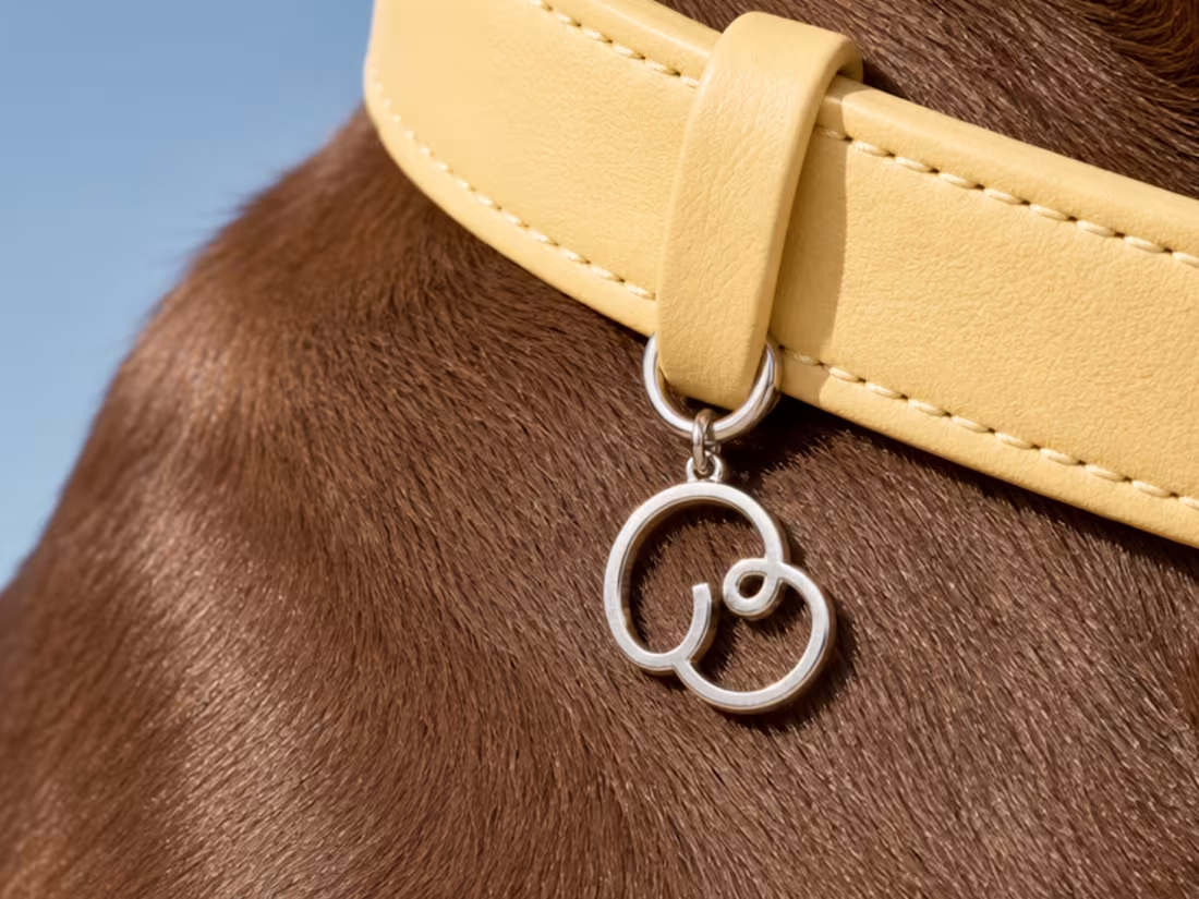
Bondri is live. 🐾
Full brand identity, packaging design, Amazon assets, and custom illustrations for this dog calming chews brand.
One of the main challenges: designing two packaging variants that felt like the same world but communicated different moments. Daytime calm and nighttime calm read very differently.
More coming soon.
89
148
8.6K
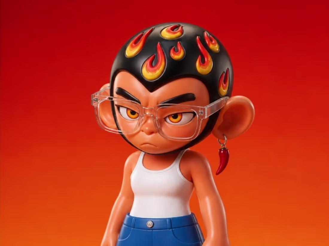
Fyah & The Yard Mascot Design
3
70
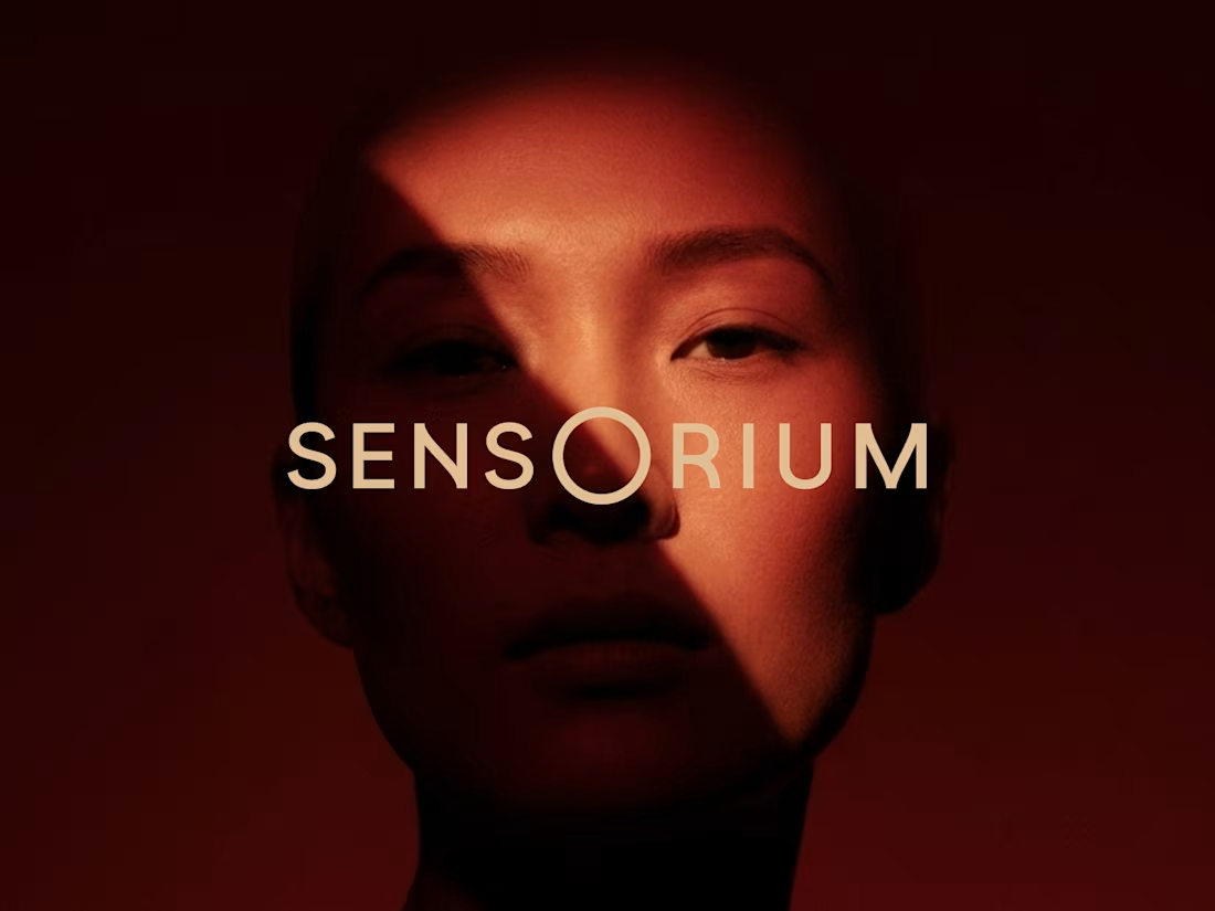
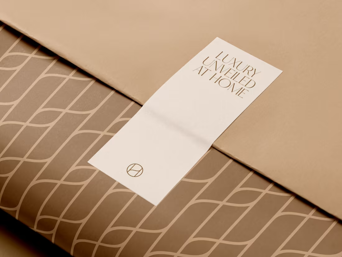
Sensorium is a luxury wellness brand rooted in Arabic heritage and modern science, created to inspire transformation through the senses. Through strategy and visual identity, the project reimagines wellness as an immersive experience where scent, touch, sound, texture, and ritual come together to foster deeper connection and personal growth.
Services: Brand Strategy, Brand Identity, Creative Direction, Wellness Branding.
3
816
Harmony is a premium at-home massage service in Saudi Arabia. I worked on the brand’s rebranding, social media strategy, and Instagram design to create a softer, more consistent, and elevated online presence.
The project focused on translating Harmony’s sense of calm, trust, care, and professional wellness into branded posts, stories, carousels, service highlights, client reviews, and bilingual English/Arabic content.
Services: Rebranding · Social Media Strategy · Instagram Design
12
893
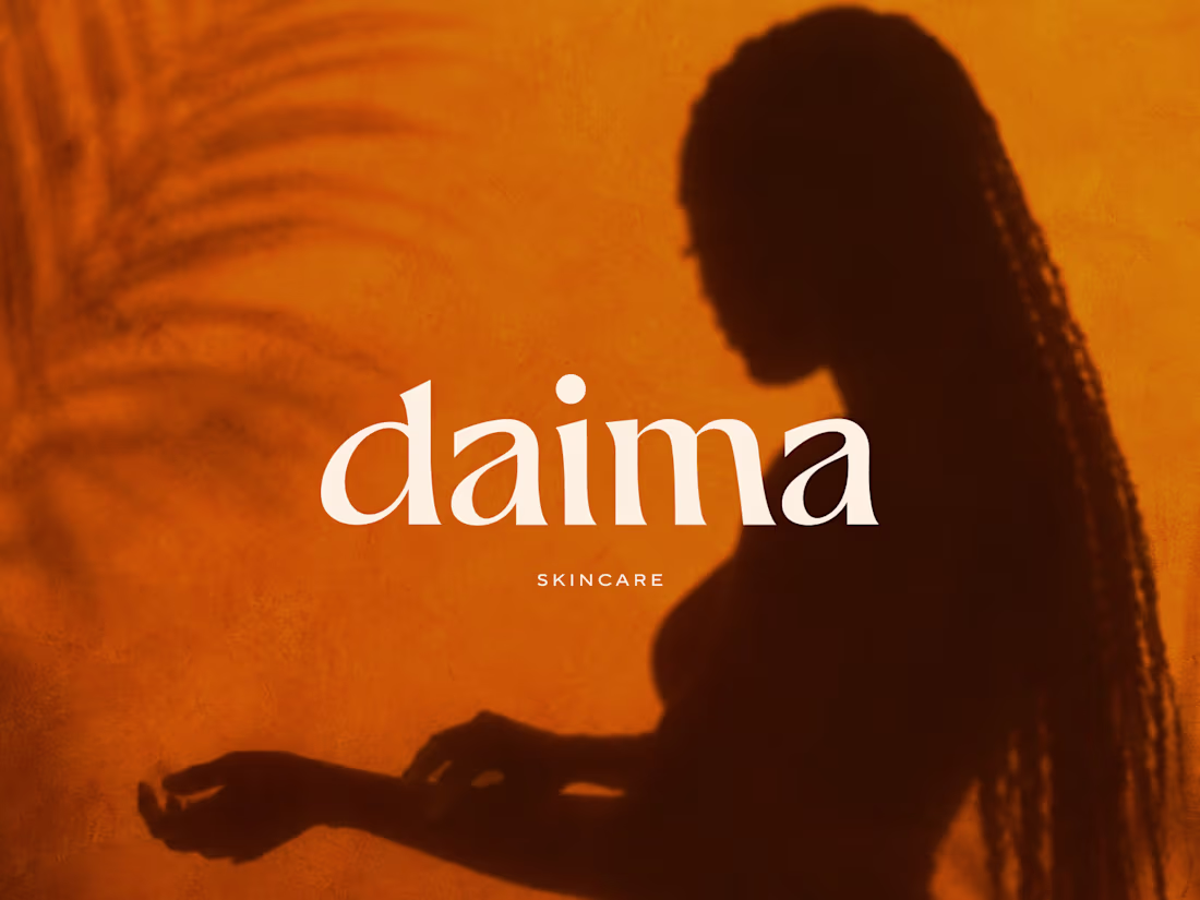
Daima is a conceptual body care brand inspired by lasting care and intentional rituals. The visual identity draws from the reflections of sunlight on water at sunset, using fluid patterns and vibrant colors to create a warm, elevated, and sensorial experience.
12
825
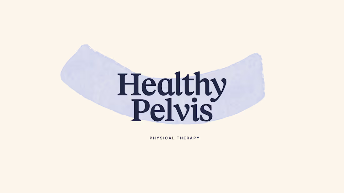
A rebrand and new website for a physical therapy clinic in California.
Built to feel clear, calm, and truly supportive.
1
9
712
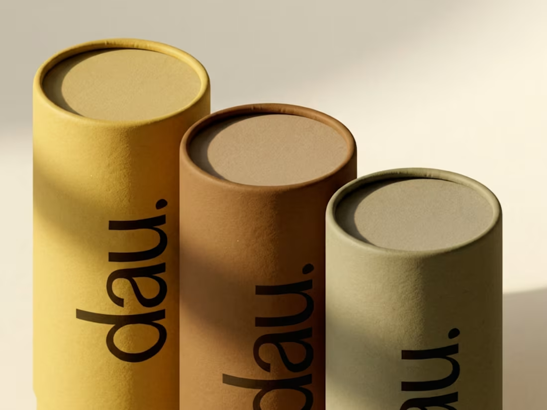
Dau | Brand Identity for Architecture & Interior Studio
5
48
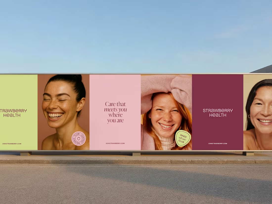
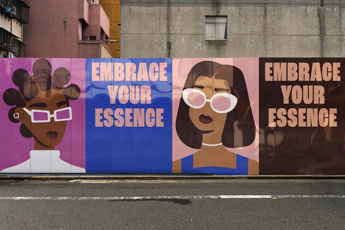
Brand Identity for Female Health Brand
9
86
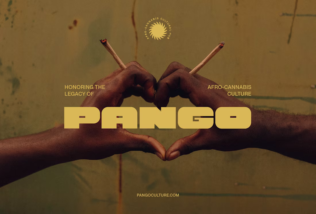
Brand Identity for Cannabis Media Hub
13
99
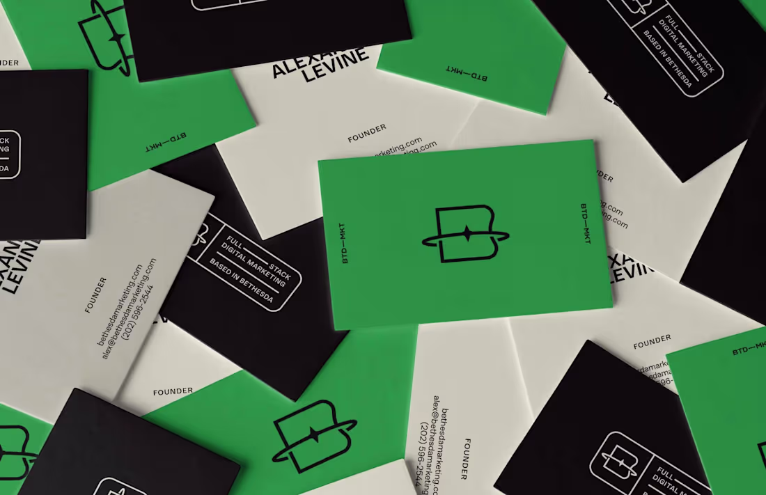
Branding for Digital Marketing Agency
37
183
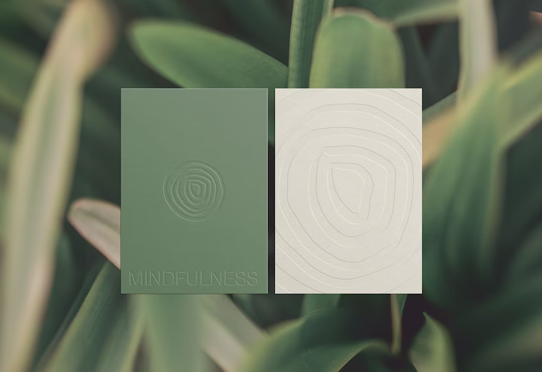
Wellness Retreat Branding
5
83
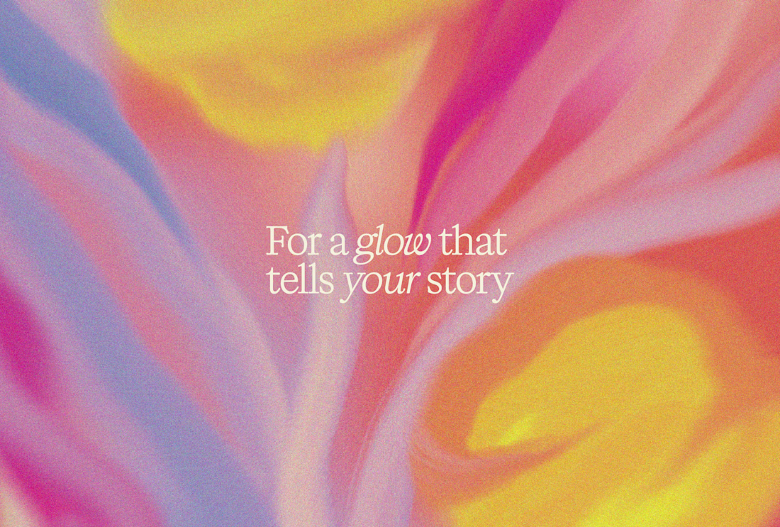
Skincare Branding
40
208
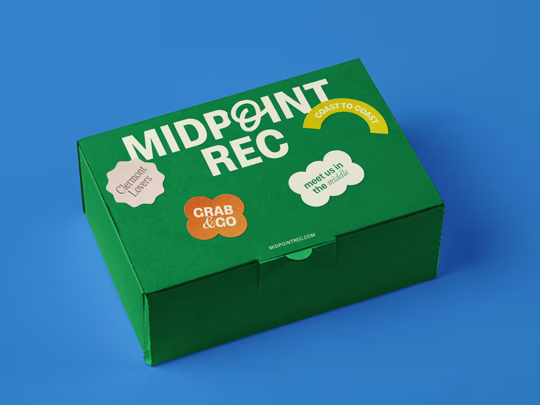
Outdoor Recreation Brand Identity
43
244
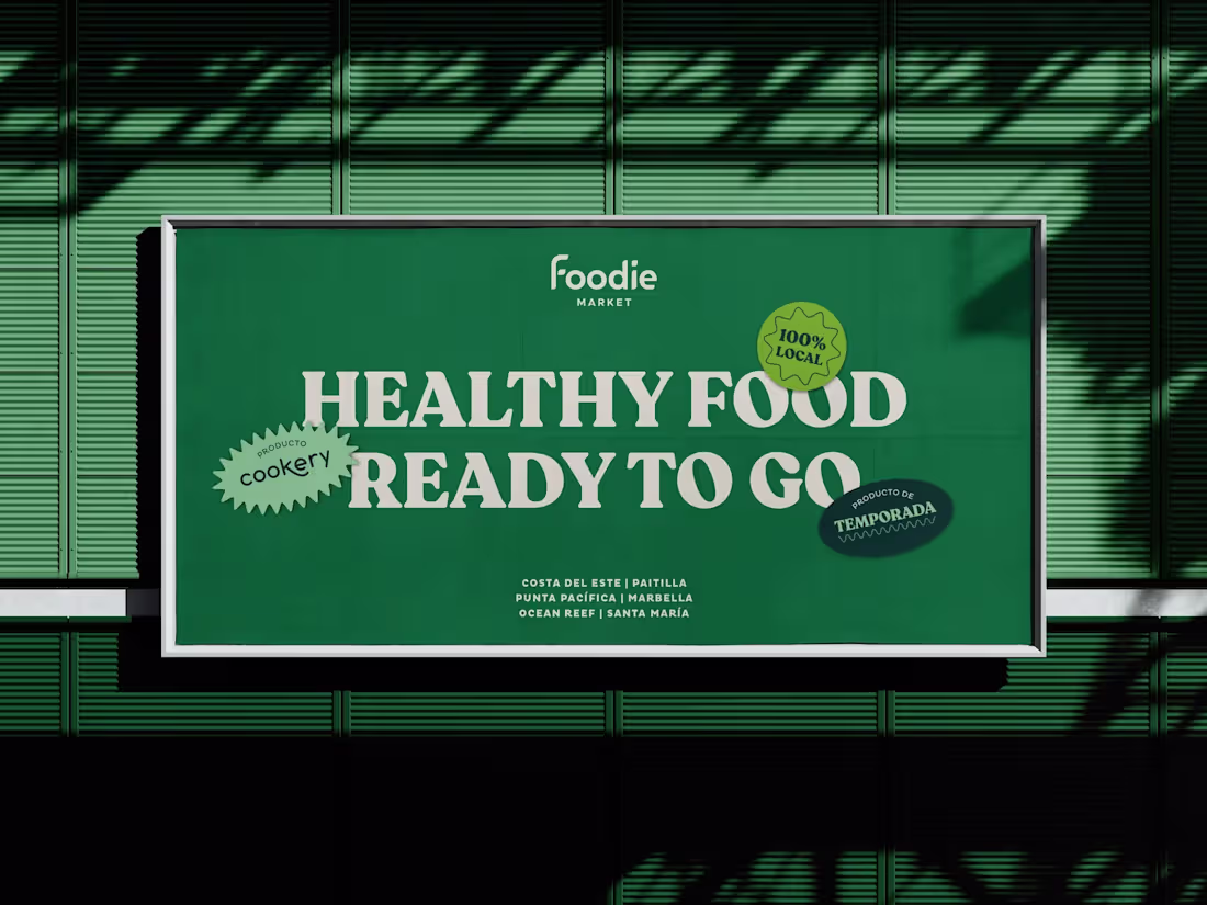
Specialty Produce Market Rebranding
6
70
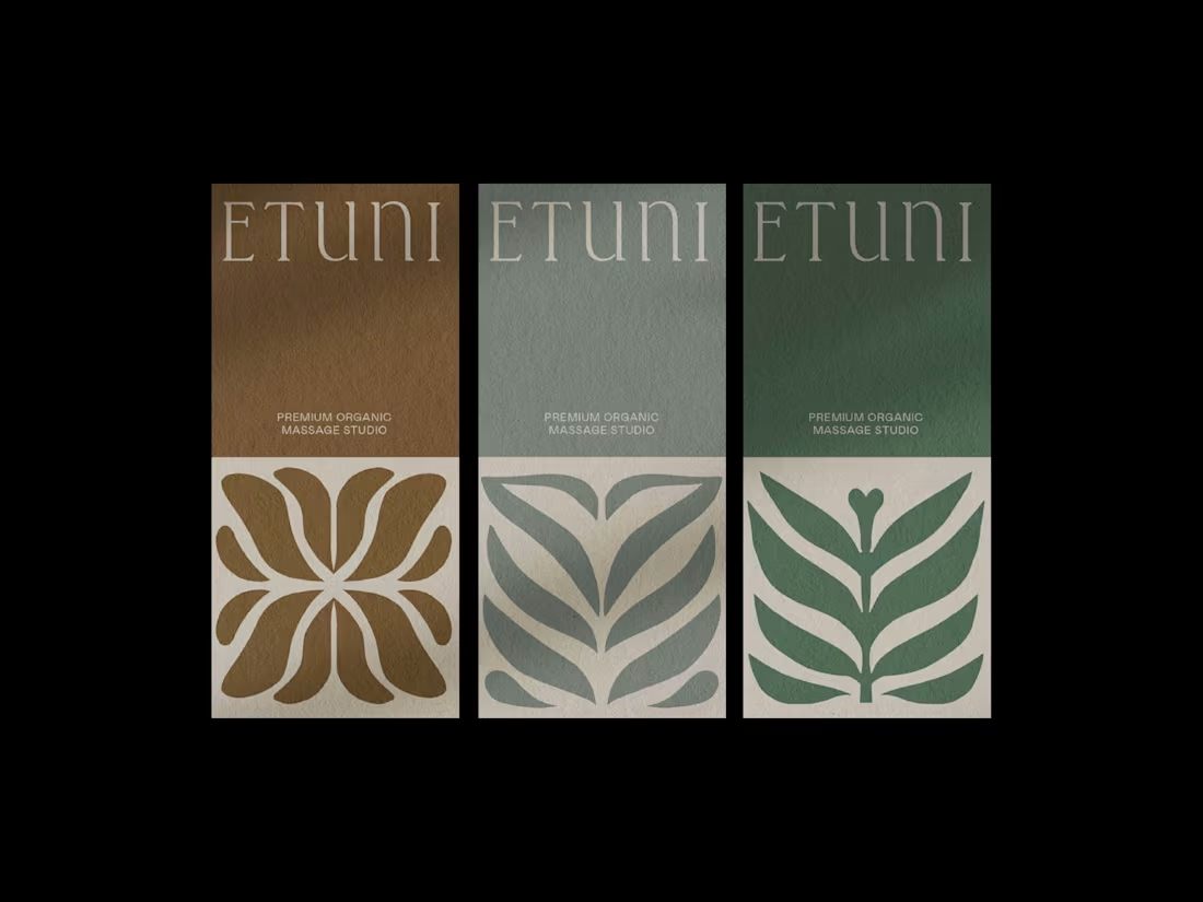
Rebranding for a Massage Studio
11
41
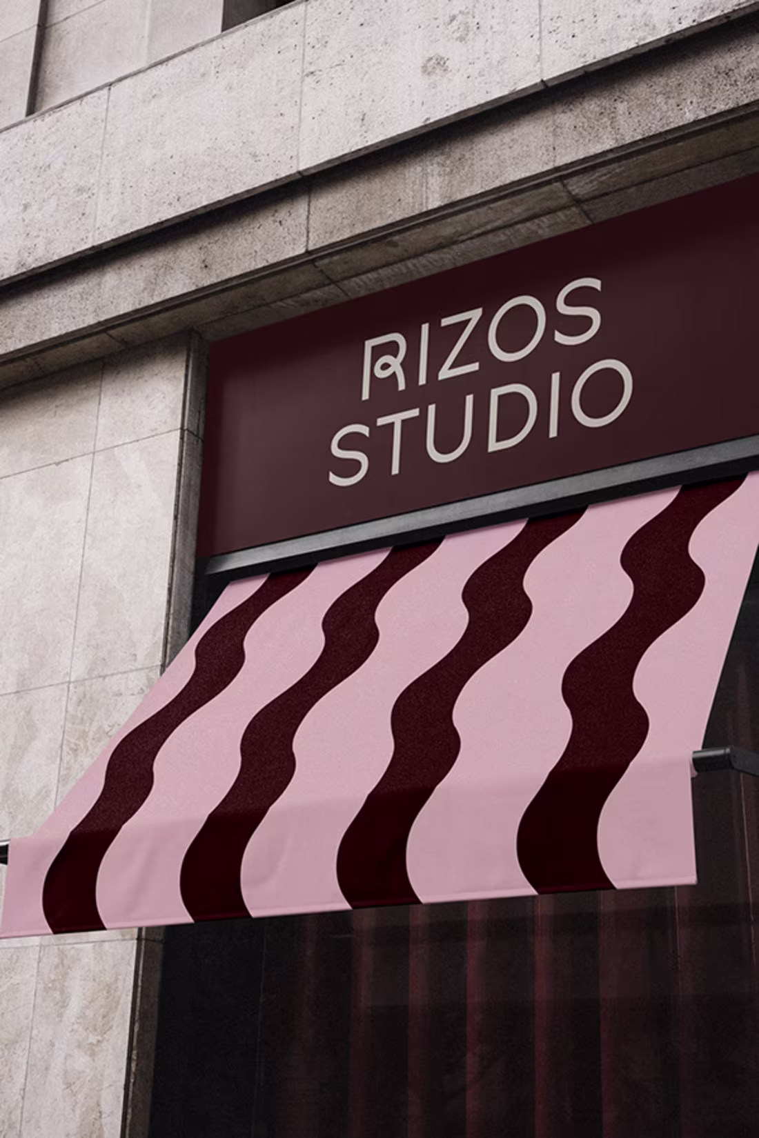
Rizos Studio | Comprehensive Branding for an Afro Hair Salon
6
62
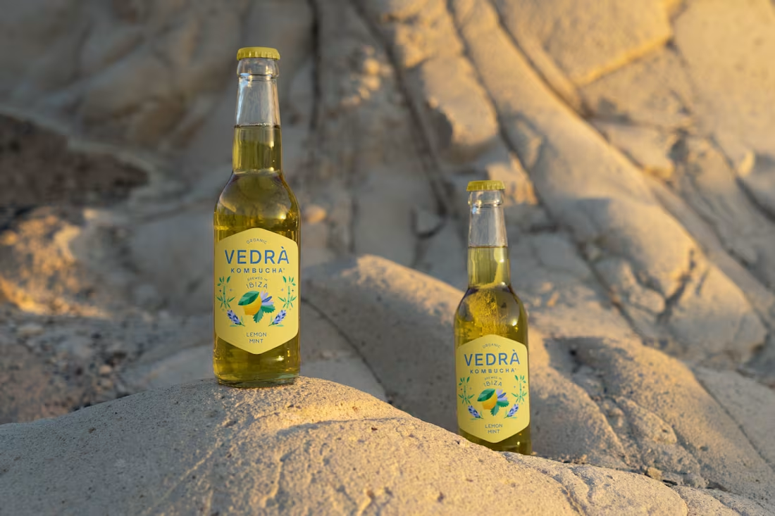
Kombucha Packaging Rebranding
6
54
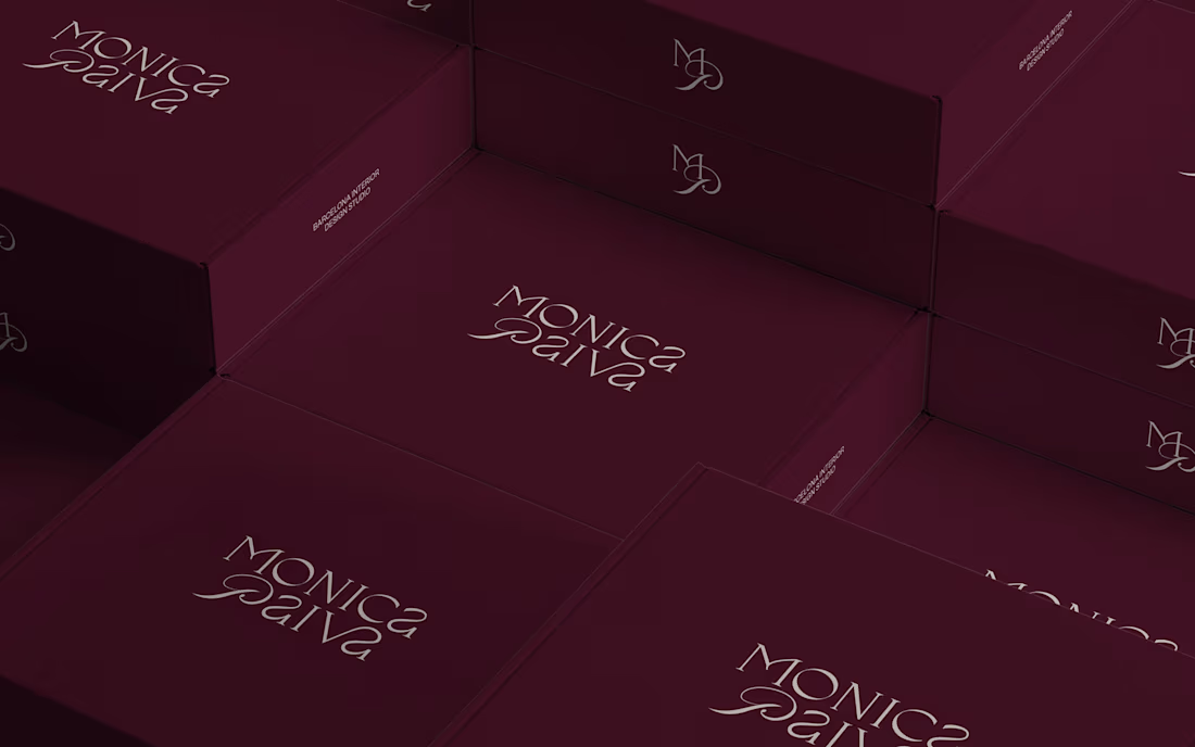
Personal Brand Identity for Interior Designer
6
44
Bold Attitude | Digital Illustration
2
50