The network for creativity
Join 1.25M professional creatives like you
Connect with clients, get discovered, and run your business 100% commission-free
Creatives on Contra have earned over $150M and we are just getting started
Back to feedPost
When does a hand-drawn logo make sense for a brand?
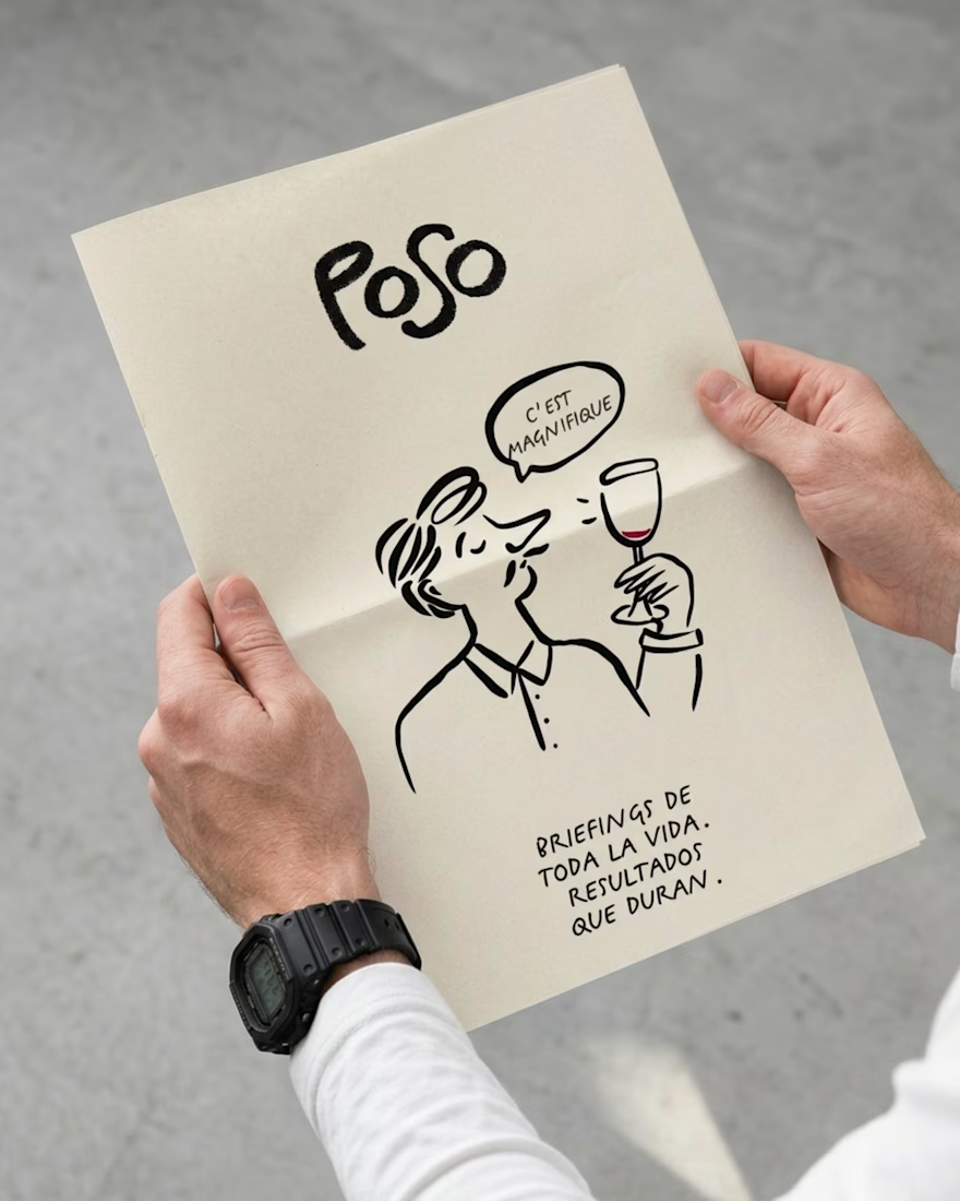
In this case, a Barcelona-based creative studio founded by a team with decades of combined experience approached me wanting a hand-drawn identity that would feel unexpected for a team like them, a way to signal creativity and distinction.
They came with a strong concept: the sediment at the bottom of a wine glass. What stays after everything else fades. A nod to what good work leaves behind after years of experience.
The entire identity is built on hand-drawn illustration, so the logo needed to do something different. With so much personality already living in the visuals, we went for a logotype with weight and presence, something that could anchor the brand and communicate their expertise.
The hand is still there. Just in a different form.
Do you think hand-drawn elements are being used more as a trend than as an intentional choice?




One of the logo routes we didn't choose. Balanced and friendly, but it was pulling the brand toward a different industry. Sometimes the right call is knowing which direction feels good but doesn't actually serve the brand.


Yes, but they work best when they’re used as an intentional design choice rather than simply because they’re popular.
Exactly! Intention is everything. Without it, it's just aesthetics.

That's a great way to put it!


I think hand-drawn works best when there’s a real reason behind it. Here, the concept makes it feel intentional rather than just a trend.
That's the only way it really works. When the concept justifies the choice, it stops being a trend decision.

Looks super cool! Love the craft behind every branded element, from type to illustration. I believe it makes the brand very strong and consistent
Thank you! The challenge was making every element feel like it belonged to the same world while keeping it from reading as childish or unprofessional.

Thank you so much Anita! That means a lot coming from you 💛 I really put effort into making the brand elements consistent. I’d love to work with you on something like this in the future!

Such a thoughtful approach. When hand-drawn elements are rooted in the brand story rather than used as a trend, they feel much more authentic and memorable. Love how the identity balances personality with expertise.
Really appreciate that. When rooted in the concept, they stop being decorative and start being part of the argument 🙏🏽

This is such a beautiful visual direction!
Thank you! 🙏🏽

Marvelous work!
Thank you so much! 🙏🏽
You're welcome!

Love it 🔥
Thank you! 🔥


Looks very cool!
Thanks!

I really like the decision to let the hand-drawn character live in the wider identity instead of forcing it into the logo.
Yes, it was trial and error trying to find that balance. Thank you!


This amazing design, keep it up more good works.
Thank you! 🙏🏽

Keeping a hand-drawn mark consistent across sizes is tricky, curious how you handled the smaller formats.
Yes, and for this case we had some flexibility, the client is very familiar with this type of practice. We also developed other brand elements that could carry the identity in those situations. It's really a mix of all the possibilities a creative brand has compared to a...

POSO as the sediment at the bottom of a glass is such a sharp concept to hang a hand-drawn identity on, and keeping the logotype weighted while the illustration carries the personality keeps it from feeling too soft. To answer your question, my guess is trend mostly, but studios...
Thank you for that read. The client came in with a strong, clear concept already, as a creative studio they knew what they wanted and reached out specifically to accomplish this style.
Makes sense, a studio that already works in that hand-drawn space would come to you already speaking the same visual language. Do less design-literate clients tend to ask for the safer, more generic route instead?
This was actually an exception. This project came through a recurring creative partner who usually has very clear expectations. With clients outside the creative industry, I tend to take more of a lead on the art direction and guide the concept from the start.
Nice
Thanks!

this is lovely, i love the handwritten & drawn elements you incorporated! it feels so in touch with an undeniable story past just a logo or storefront.
Thank you! That's exactly what a brand identity should do, carry a story that goes beyond the logo!


Amazing work👏🔥🔥
Thank you! 🙏🏽

Outstanding project, keep creating 👏
Thank you 😍🙏🏽

Love the design and illustrations. Looks so good and personalised
Really appreciate that! It was very much the intention here 🙏🏽

Fantastic work!
Thanks!

Thank you! So glad it feels that way!

Wow Amazing Project😍
Thanks!


Stunning
Thank you!

I agree hand drawn logos are trendy right now but a story like this makes it timeless. Did you try lighter script fonts before settling on this bold look?
Thank you! And yes I actually shared another version in the comments, you can see one of the directions we explored there.

Nice
Thanks!

Awesome!
Thanks!

Great work!
Thanks!

looks super wow
Thank you!

Love the illustrations
Thanks 😍


Super cool
Thank you!
The network for creativity
Join 1.25M professional creatives like you
Connect with clients, get discovered, and run your business 100% commission-free
Creatives on Contra have earned over $150M and we are just getting started








Related posts


The INKFLESH mark I designed starts with an empty profile avatar. A deliberately plain shape for an identity full of strange characters.
The characters needed room to change. The identity also had to work on a woven label or an app icon, where a detailed illustrated face has very little space to do its job.
I kept the silhouette and palette constant, then let the artwork change around them. The mark can hold an illustration, appear as a solid stamp, or sit on its own at a small size. Each version still has the same shape underneath.
That was the useful constraint: decide what someone should recognise when the most expressive part of the design disappears.
If your identity depends on a detailed illustration, try its smallest application before approving the whole world around it.
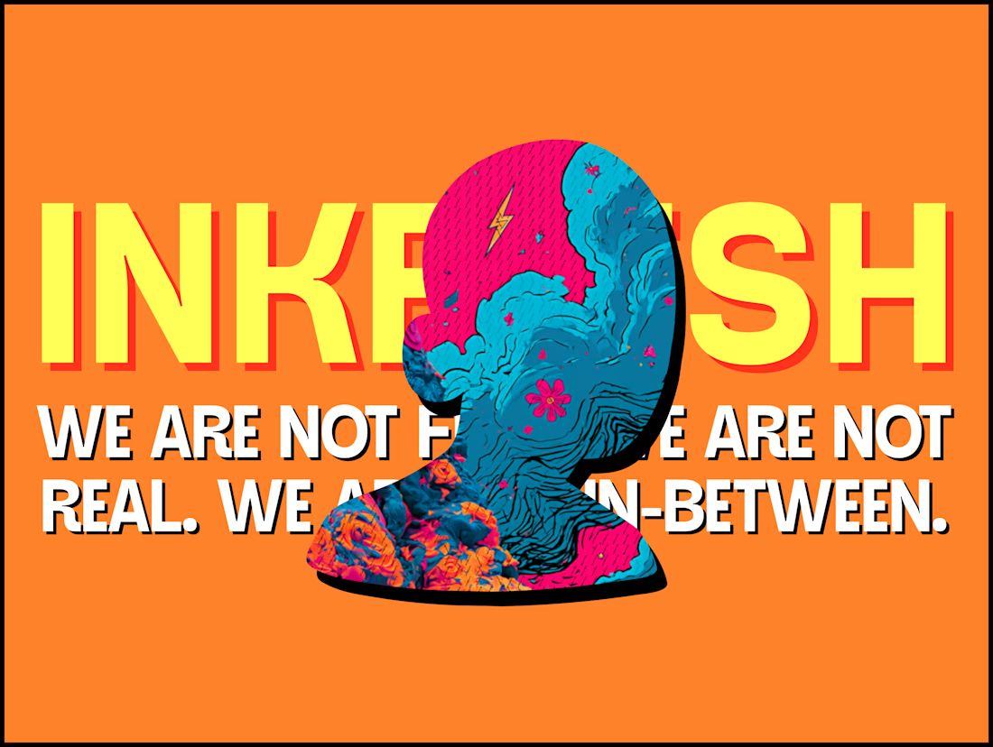

Super bold and creative! Love the vibrant colors. 🔥


Collage

Post
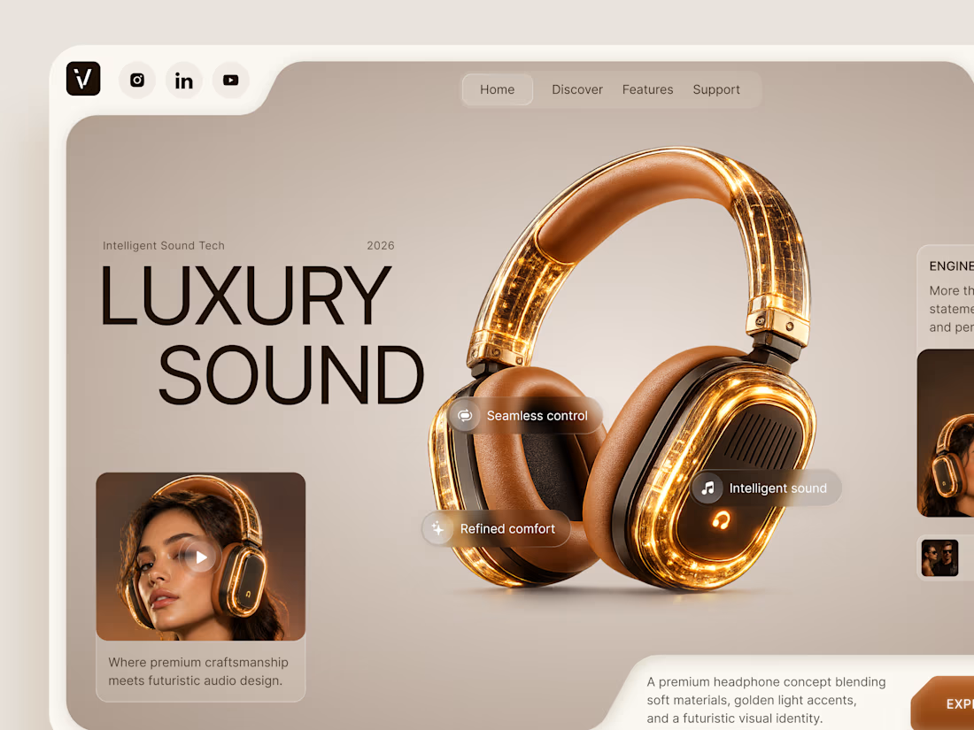
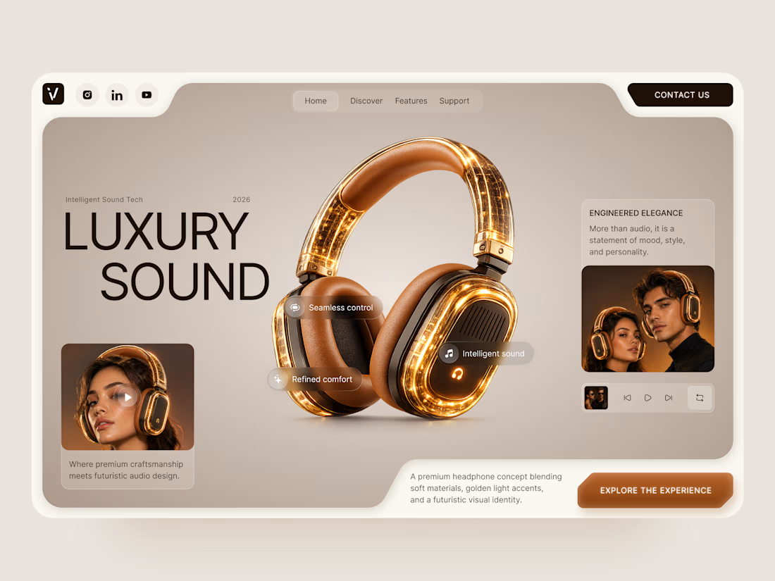
Luxury Sound — Premium Headphones Landing Page 🎧✨
A premium landing page concept for a luxury audio brand, built around a bold headphone design and a refined visual experience
The design combines warm neutral tones, glowing details, oversized product visuals, and minimal typography to create a futuristic yet elegant feel
Special attention was given to:
• Product-first composition
• Premium visual direction
• Feature highlights
• Lifestyle imagery
• Clear CTA placement
• Responsive mobile experience
The result is a clean, immersive product experience that makes the headphones feel like more than tech — they become part of the lifestyle 🔥


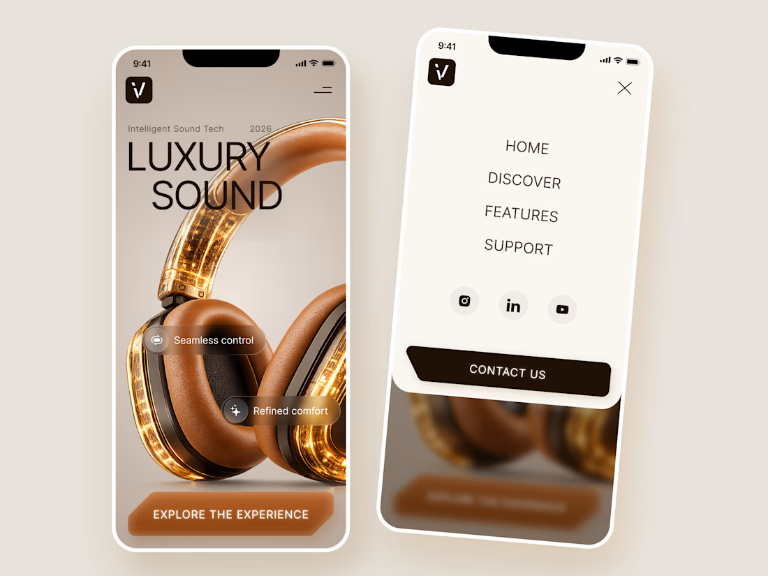

The amber glow on the headphones against that warm beige is lovely. How does the mobile menu handle the product image?