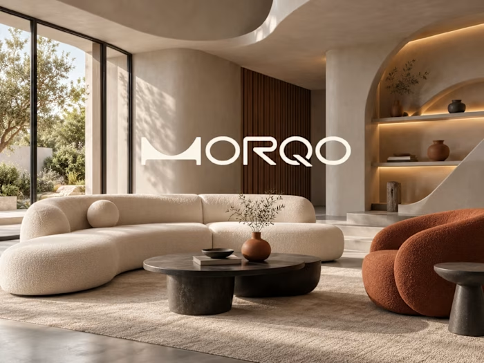
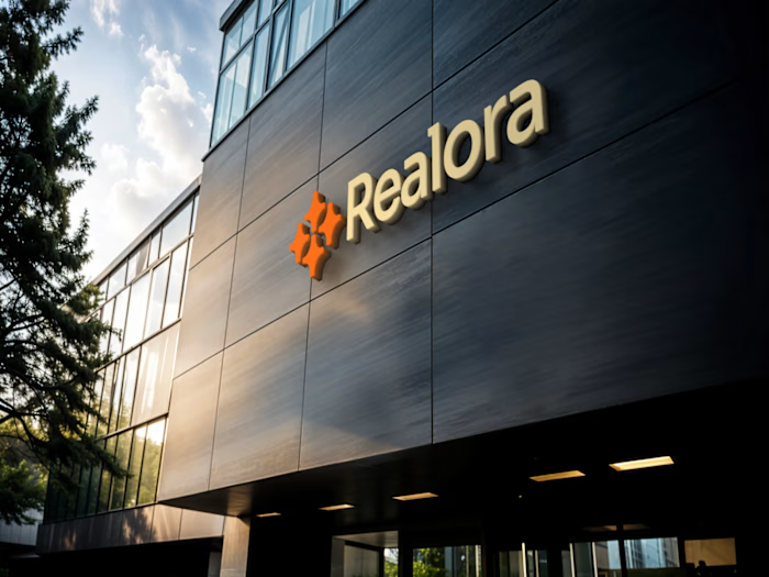
Real Estate Brand Identity & Brand Guidelines

STEPHEN ALEJI


Real estate brand identity and brand guidelines — Haven Ridge
#Brand identity #Brand guidelines #Logo design #Real estate
THE BRIEF
Haven Ridge Properties develops modern homes and investment properties for first-time buyers and investors. The brand needed to feel premium without feeling cold — trustworthy enough for a young family buying their first home, polished enough for an investor comparing portfolios.
THE APPROACH
I built the identity around two ideas: shelter and growth.
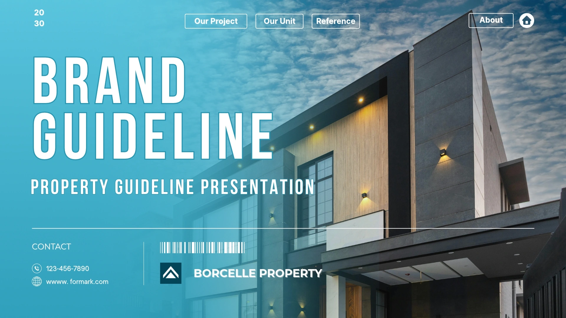
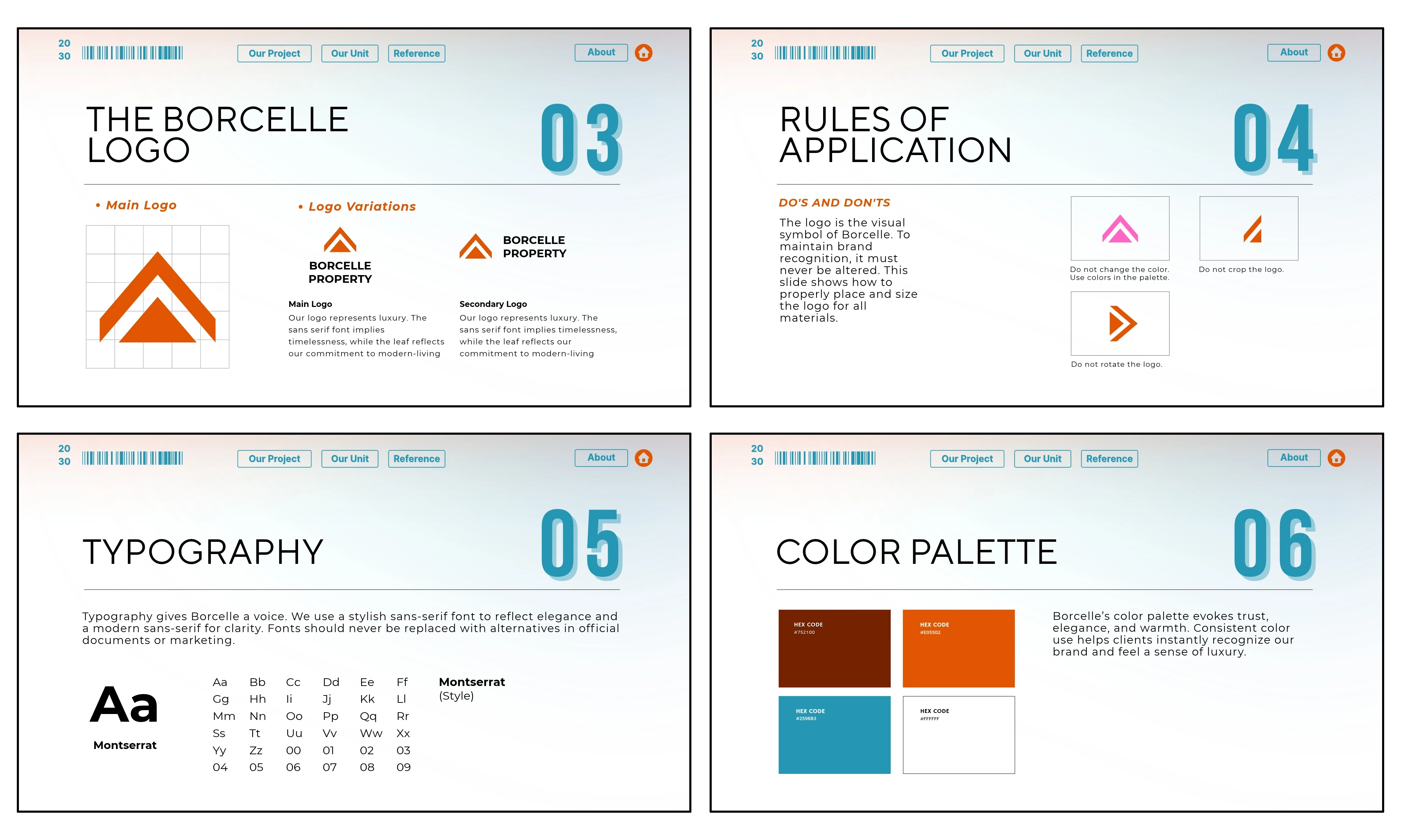
The mark combines a roofline with an upward arrow — home and long-term value in a single symbol. It's simple enough to work at any size, from a signboard to a favicon.
Burnt orange carries the logo with warmth and energy. Teal brings calm and trust, and deep brown grounds the palette for text and print.
Typography pairs a tall condensed display face for confident headlines with Montserrat for clean, readable body copy.
A SYSTEM, NOT JUST A LOGO
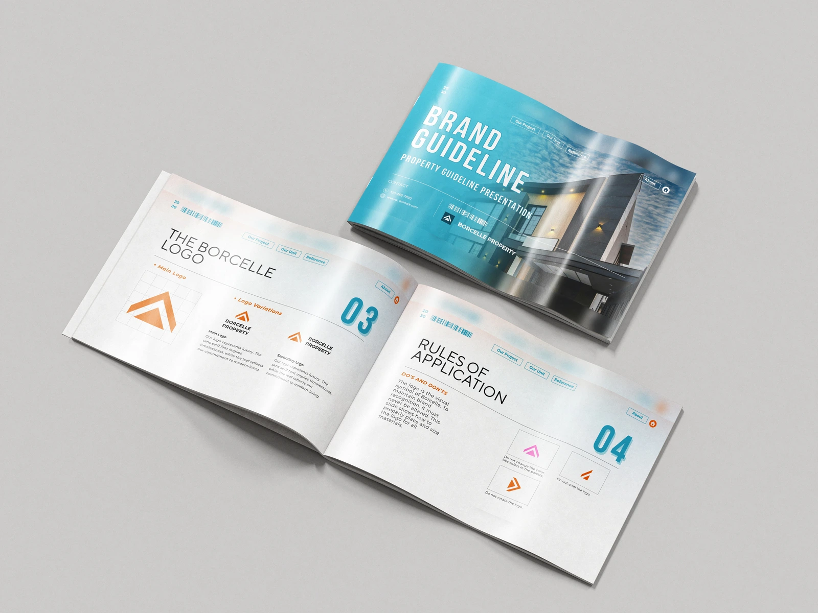
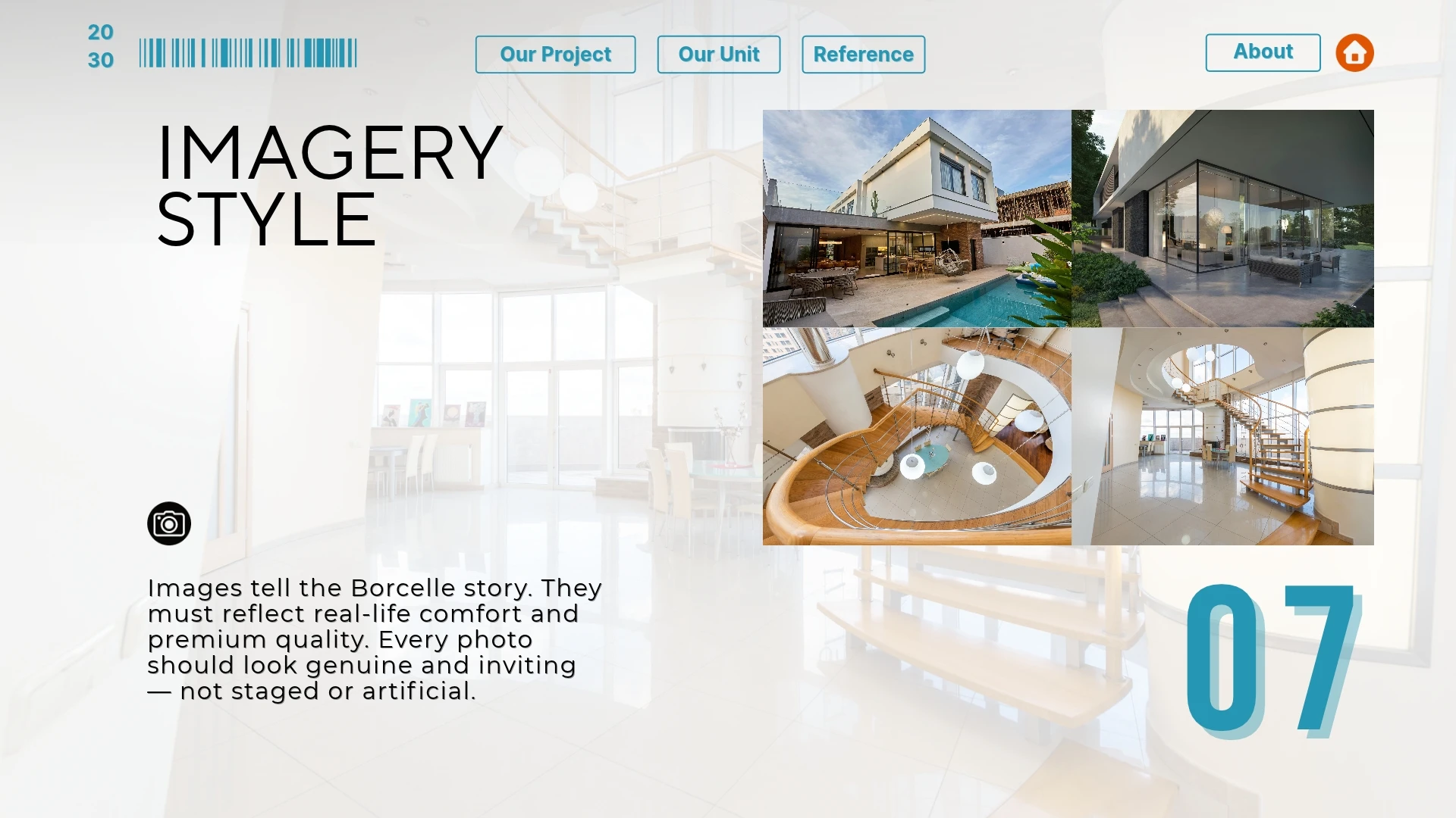
The guidelines define how the brand shows up everywhere: logo usage rules, a typography hierarchy, a colour palette with clear roles, and an imagery direction built on real, inviting photography — never staged or artificial.
WHAT I DELIVERED
• Primary and secondary logo lockups
• Logo usage rules (do's and don'ts)
• Typography system
• Colour palette with usage roles
• Imagery direction
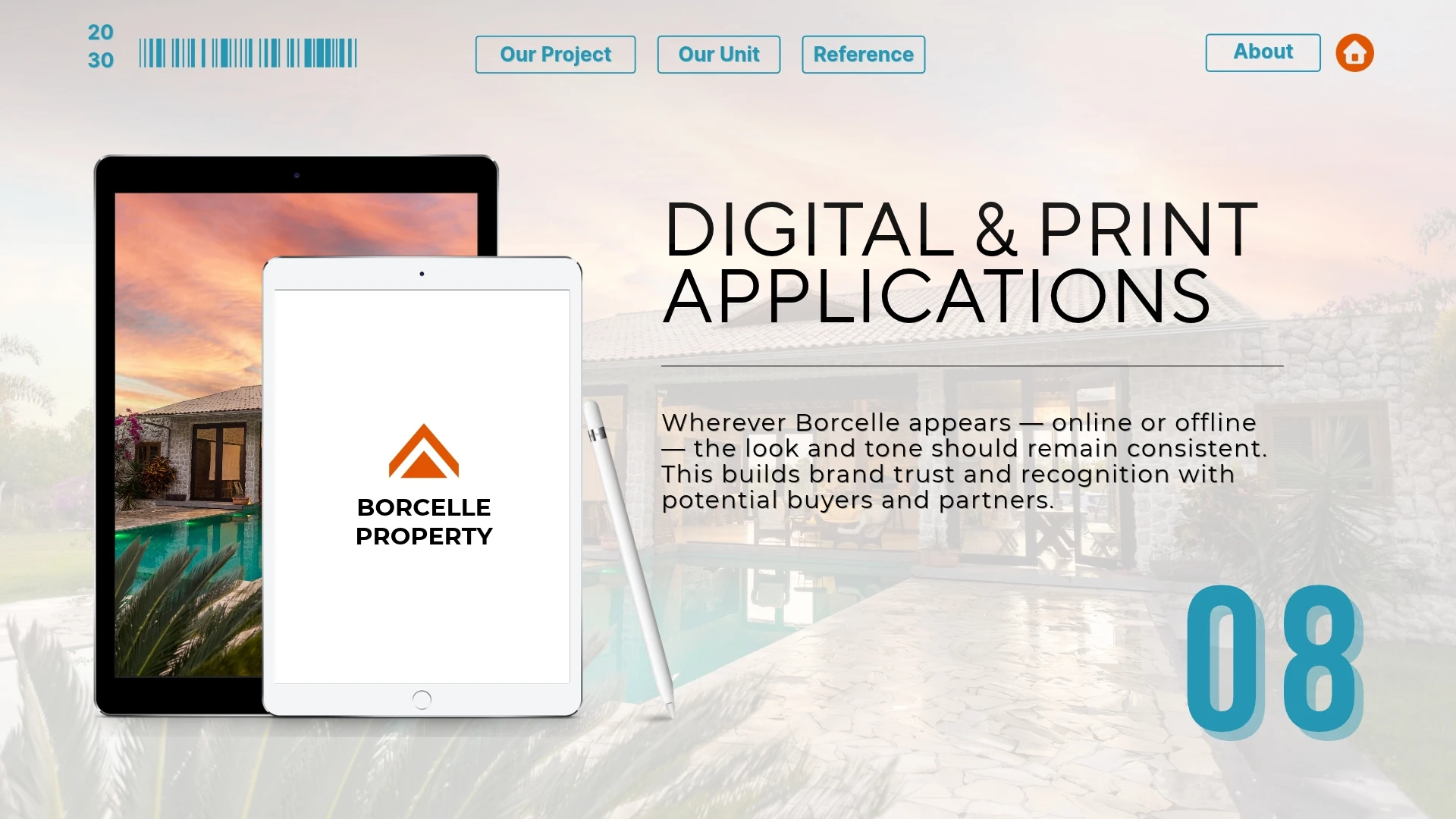
• Digital and print applications
• Complete brand guideline document
THE RESULT
A consistent, rule based identity the team can apply across signage, property listings, brochures, and digital channels without losing the premium feel.
Need a brand identity for your company? Let's talk.
Like this project
Posted Nov 6, 2026
Brand identity and guidelines for a real estate developer — logo, type, colour, and imagery built around shelter and growth to feel premium yet trustworthy.