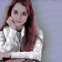
Nicolette .
aspiring renaissance woman. writer. but WAIT there's MORE–
New to Contra
Nicolette is ready for their next project!
THE TRUMAN SHOW: BUT IT'S '26.
did you get that?
in essence?
paul anthony kelly's your stand-in for jim carrey here, as you might've noted as the primary differentiator.
anyway, that kind of energy in the base graphic here is my goal, the sort of energy i'm looking to capture as i rework the advertisements for an original-character based creative writing group i've had running since around 4 - 5 years back! we have a new year to celebrate soon, so i figured we ought to shake things up as for our promotional graphics.
themes we look to dial in on include mass surveillance, impacts of online fandom culture on those who all the rumors center around, how long secrets can remain locked down, AI's trickling into just about all artistic avenues you can name, how industry professionals choose to cope, & what equal & opposite reactions can do to the credibility or status of both 'nobodies' that most only know if they love researching the art they consume & those known to the general public.
thoughts? feelings? what catches your eye first?
4
352
animated going away party invitation.
this one was a family favor, but i feel proud enough to post it here! a little invitation to wish luck to my brother the best before his next adventure. in love with partiful being able to work so easily with canva as a featured app, it makes the RSVP process so much smoother on the front of communication!
3
9
655
just a silly little motion graphic i threw together for an interest check we've got approaching to keep track of members still interested in partaking in the writing group i create work for. y2k mcbling met with a hint of grunge to offer edge to the nostalgic feel of the monochrome of it all was a big aim here.
something to catch the community's interest & keep a tech element in play.
the classic of 'u up?' felt it fit like a glove.
2
13
672
xanadu - event banner.
this is a .gif banner ad for a fictional island getaway, all names & brands in the copy below are self-created or used with permission from collaborators (ie. lyra leblanc isn't my own creation, but a friend's, & she's a sort of 'kim kardashian'-esque figure in my writing community's universe portrayed by actress shannon thornton).
the event was mapped out by a team of four, including myself, though this graphic is my own creation, using photoshop to edit free stock video footage for the .gif texture created in the background & free online sources for fonts, images, & the line/wire texturing in the background, which was warped to have a stable, subtle element set in front of the one in motion along with the text & camera framing.
i wanted, above all, to convey an almost magical tone through visuals to mirror the chosen name being 'xanadu'–– a nod to both the cult classic film & the definition as synonymous with a realm akin to many perceptions of heaven or nirvana–– while keeping a contemporary feel that felt real & conscious of our premise's use of modern technology as a pillar. it was important that the graphic stayed warm in terms of palette & color, especially when it came to making sure the central figure wasn't misrepresented through any sort of whitewashing. that led me to thinking more of sun & sand of beaches & the often colorful cocktails we find tailored to suit the season. the ocean got its nod through the movement in the background, so working up a palette that was vibrant & eye-catching as well as complementary to the model naturally started centered around the hot pink of her dress, then bled into inclusion of paler pinks, yellows, & light to medium oranges. in the midst of creation, a sunset's start came to mind, & i ran with the idea as inspiration, though i didn't want to recreate the image of a sunset, as locking into one setting felt too concrete for the flexible nature of the event i'd created with my team.
the two names near the lower right hand corner, sattari & caelestis, are both fictional sponsors in different fields, each highlighted in their styles through font but made simple to understand as sponsors with a '+'. the plus sign as an indicator of their involvement with the event as opposed to a larger, perhaps more standard, 'sponsored by...' in its place felt contemporary & 'technical', in adherence with the practicality of the wire details & to contrast with the billowing fuchsia of the garment behind it as well as the title's 'glowing' text effect & pathway being bent to lean back on the beachy feel.
7
773
specwork for advertising tattydevine's earrings in an instagram post.
GIVEN BRIEF:
Create an Instagram post to promote the Moon Jellyfish Earrings for TattyDevine (https://www.tattydevine.com/products/moon-jellyfish-earrings-1?variant=55124411122039). This post should include: an actual Instagram post with copy + an accompanying caption. Make sure to adhere to Tatty Devine’s tone of voice and entice people to check out the earrings on the website. Don’t be salesly in your post- the point is to catch the reader’s attention. To get them to go on the website and find out more. You do not need to sell them on every single benefit in your post - that happens later. So just create something that grabs their attention and makes them go 'WOW- fun!'
STATED TONE OF VOICE:
Simple, yet descriptive. Friendly, welcoming. They have super BOLD designs (just look on their site) but the copy isn’t as CRAZY as what they create. It describes what the product is, in great ornate detail.
___
first, i headed to analyze the brand's presence on instagram: to find a foundation, i needed a grasp on how their captions were structured, if the grid showed a schedule of any sort (like featuring a specific product each friday, for example, any little quirks of the sort!), & if there was an established color palette they worked with often to make sure i could adhere there if need be. the latter wasn't a factor, as the brand embraces a fun-filled variety in the style of each post, but the tone of their captions was just as bold as the products they offer! many of those i saw kept it short, sweet, & occasionally calling back to nostalgia for those of all ages. with this in mind, captions i'd pitch for the post include the following:
- Always swim with a buddy. With our moon jelly earrings, you might even find it true that two are brighter, bolder, & better than one.
- Bold, vibrant accessories are OUR summer staple. Stand out sunning shoreside in our Moon Jelly Earrings.
- Color your summer with our moon jellies to make your forever memories!
- Plated in silver or gold, statement pieces never get old: make a splash with our dangling, dazzling moon jellies!
- Embody the ocean's world of color: our moon jelly earrings guarantee heart-eyes towards your sense of style (& a compliment or three)!
- Nothing helps you take on summer heat like accessories that give your look something bright & unique. Bonus: with silver or gold plating, the sun's guaranteed to grant an extra glimmer!
- Invite summer adventure with hooking these beauties in: a bright pair of dangling moon jellies that turns 'where'd you get those?' into brand new friends.
the copy included in the graphic itself (a .gif file i'd convert to an .mp4 for the client's post, its lack of audio allowing for an on-theme song to attach to the post as instagram offers–– my first suggestions would be 'beyond the sea' by bobby darin, 'under the sea' as performed by titus burgess or the song's instrumental, & 'soak up the sun' by sheryl crow) incorporates a fairly simple rhyme structure for higher potential of viewers being lured in by its catchiness, almost like a lyric they can attribute a rhythm & even an imagined voice of sorts to. the earrings are given this 'voice' through their own dialogue in order to make consumers feel automatically close to the brand, considered by those who craft the earrings: an understanding that the aim is to offer a unique product to enhance their outfits, of course, but also draw second glances from others & make them stand out as embracing nature's quirks. everyone loves a compliment, & there's a playful air about the transition from the jellyfishes' more formal drumroll of an introduction to their popup appearance & pre-established connection to those reading the proposal to 'team up' for a memorable summer–– one that would undoubtedly make for more new connections made even through compliments & questions about the statement pieces &/or their sources.
5
709
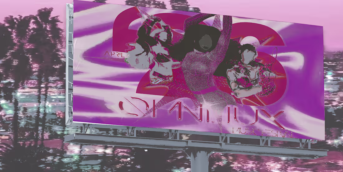
this is a sort of spec-work kind of ad for a fictional music festival, omnilux, created through photoshop cc, a free mockup from pixelbuddha, & images of represented models / other sources cited as free to use on pinterest.
the name was chosen by a team of three, myself & two other friends i've met through creative writing–– inspired by popular real-life events, like coachella, lollapalooza, bonnaroo, etc., we specifically were looking to create a one-word name that would feel both unique enough to be memorable while also leaning back to our community's take on technology through the sleek, chic sort of feel behind the title itself. 'omni-' as a prefix implies that the experience is all-encompassing, that either a performer or a music lover casually present is in for a great time for the festival's run, & '-lux' tacked onto the end nicely in a way that felt authentic to simple real-world strategies in promoting experiences through the idea of luxury, glamour, splendor, & invoke even abstract images of the material elements that media has taught many to associate with fame.
5
689
these are gifs designed to advertise a fiction-based writing community i've run since march of 2021! this is our latest style for ads, which i also am responsible for running consistently through tumblr & discord.
the goal of our advertising is to lure likeminded writers in by showing off the idiosyncrasies in the characters written on our site, since our community-building drive is highlighted in showing off everyone's creations in ways that represent them adequately.
our premise revolves around AI/tech/surveillance's impact on the entertainment industry & all even adjacent to it, a sort of safehaven for creative writers frustrated by the state of any art or simply by society to have an outlet that allowed for creativity & collaborative, inclusive worldbuilding a world that's 99% in line with real life in all it's beautiful & beastly happenings, like the pandemic & the WGA strikes in recent years. realism & research are key in our eyes in order to write true-to-life struggles with respect & a solid, at least semi-thorough understanding of how different parts of 'entertainment' as a coverall function.
using pngs from pinterest & adobe photoshop cc, i create a gif graphic for all characters with the public figures selected to 'portray' them. four points that were most important to me are as follows: (1) one's interior life not being negated or neutralized by labels of renown, infamy, or celebrity; (2) technology & its constant advancements; (3) the 'shackles' that social media has on any individual when it comes to establishing their own sort of brand; (4) unique character elements shown in smaller details (like a text formatting bar for a screenwriter & more instagram-based features for an influencer/MUA).
7
682