Petalry Brand Identity Development - Kittl exploration

Lisa Demchenko


Petalry: a women's supplement brand built on small, kind habits
Brand identity, packaging and brand system · Self-initiated concept, 2026
Overview
Petalry is a daily supplement brand for women aged 25–45 who treat wellbeing as a practice, not a project. The range covers hormone balance, calm and sleep, and everyday energy, with plant-based capsules and powders in pouches, cartons and amber jars.
Scope: naming, logo system, colour and typography, packaging, brand guidelines, social templates and motion
Toolkit: Figma, Claude, Kittl
The challenge
Women's supplements tend to look one of two ways. There's the clinical approach (white labels, lab language, numbers everywhere) and the soft approach (sugary pastels, script fonts, promises of transformation). The first feels cold and the second feels like it isn't taking you seriously.
Petalry needed to sit between the two: warm but adult, calm but confident. It also needed to feel like a brand you'd keep on your kitchen counter, not hide in a cupboard.
The idea: care adds up
Supplements only work if you take them, and most wellness brands motivate people with pressure: streaks, before-and-afters, 30-day transformations. Petalry takes the opposite position. Small, kind things done regularly add up to something whole, and missing a day doesn't undo anything.
Everything else follows from that line.
The name
Petal combined with -ry, the ending of words like artistry and jewellery. It suggests a craft and a collection built up over time, where each petal is one small act of care.
The mark: six petals, one still growing
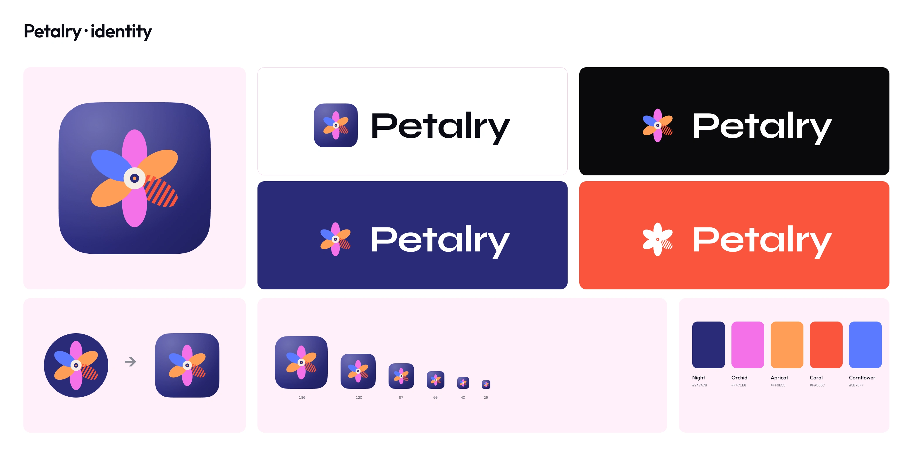
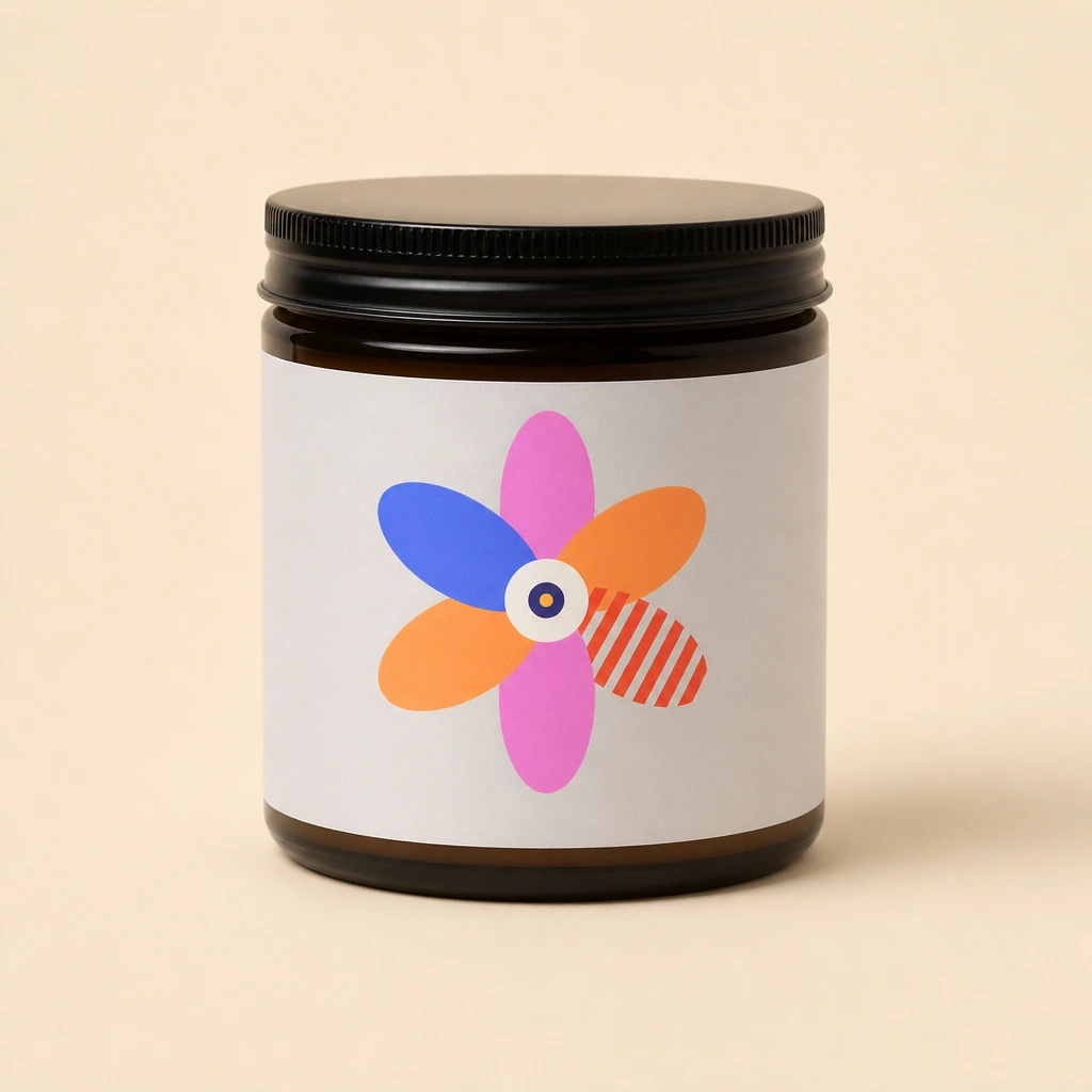
The logo is a six-petal flower in the brand colours around a cream centre. Five petals are solid, and the sixth is striped: it's still filling in. That petal is the habit you're working on today, and it's the heart of the identity. It stays in every version of the mark, including one-colour and single-ink ones.
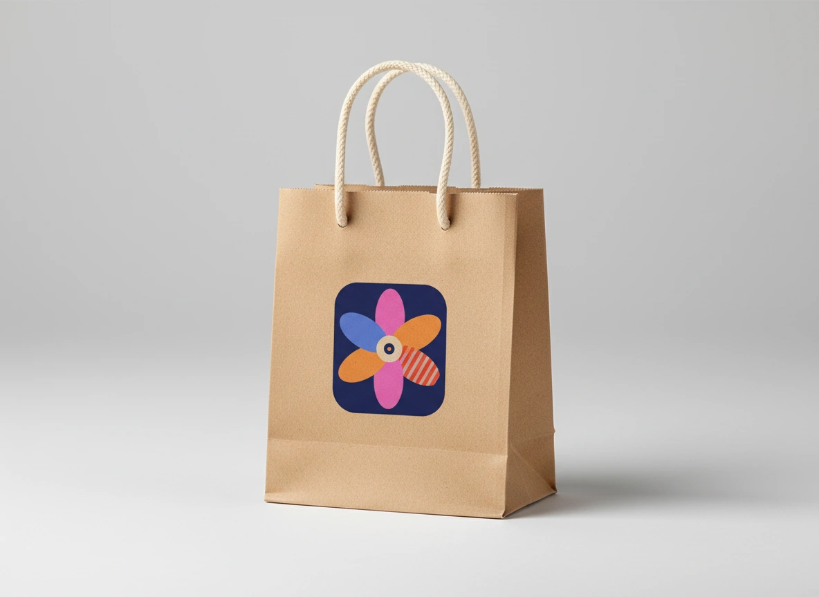
On packaging and in-app, the flower sits in a rounded Night squircle. This gives the brand a compact, instantly recognisable badge that works just as well on a pouch as on a phone screen.
Brand identity exploration - Petalry
Colour: the petals get the colour
The palette is five colours: Night (
#2A2A78), Orchid (#F471E8), Apricot (#FF9E55), Coral (#FA553C) and Cornflower (#5B7BFF), with Cream as the neutral.The key rule of the system is that backgrounds are only ever Night, Cream or White. The bright colours belong to the flower and to small accents, never to large fields. That keeps the brand calm, so the mark always stands out and no petal ever disappears into its background.
Typography
Syne Bold carries the wordmark and headlines. It's wide, geometric and confident, with a slight oddness that stops it feeling corporate. General Sans handles everything else, from ingredient lists to legal copy. It's clean and neutral and lets the headlines do the talking. Headlines are set in sentence case with tight tracking, and there's no third typeface.
Packaging
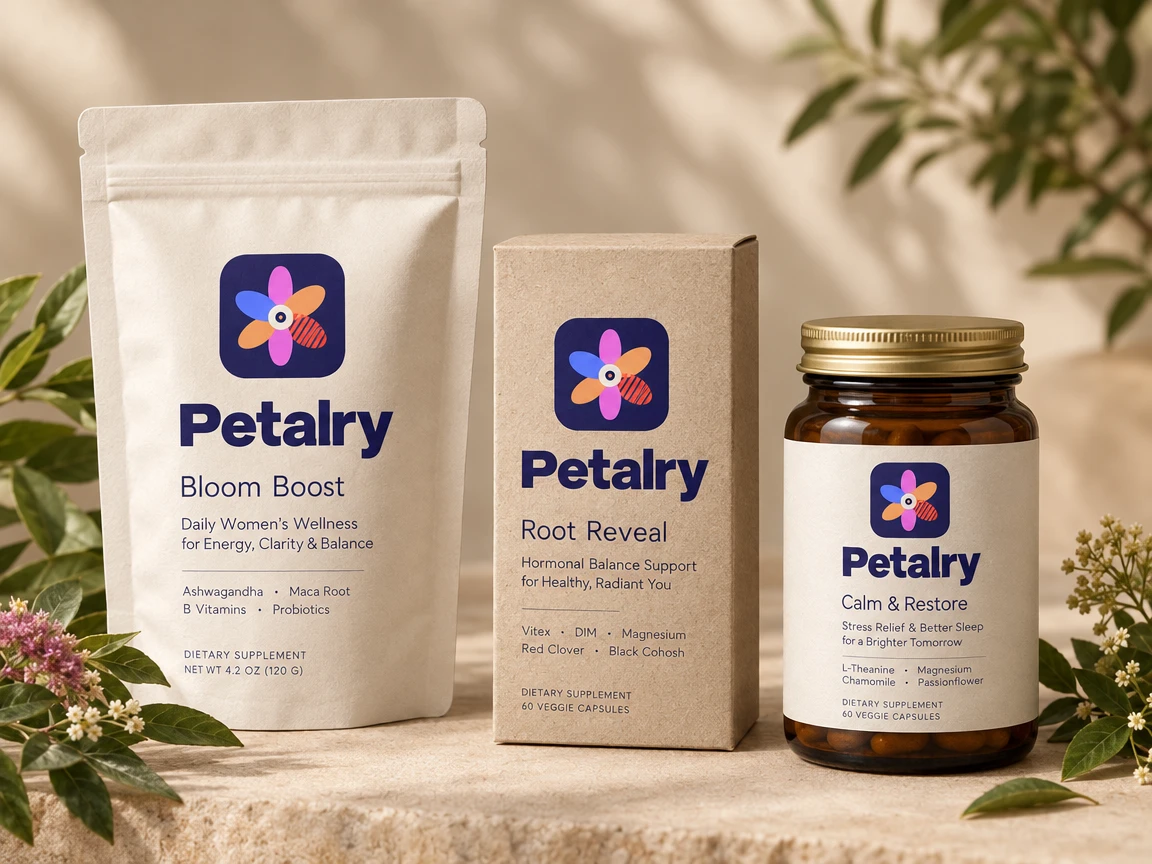
The range uses one clear hierarchy across every format:
the mark in its squircle
the wordmark
the product name
a one-line benefit
key ingredients
the regulatory information, quietly at the bottom
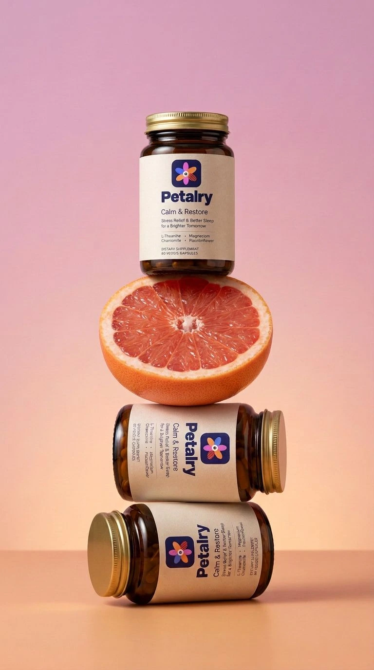
Materials stay honest and tactile: a matte cream pouch, a kraft carton and amber glass with a gold lid. The launch range has three products:
Bloom Boost: daily women's wellness for energy, clarity and balance
Root Reveal: hormonal balance support
Calm & Restore: stress relief and better sleep
Because every product shares the same layout, the shelf reads as one family. The product name and benefit do the differentiating, not a different colour for each product.
Voice
Petalry talks like a kind friend who happens to know a lot about wellbeing.
We say: Miss a day. Nothing wilts. · Small rituals. Steady bloom. · Care that grows with you.
We don't say: Don't break your streak! · Transform your body in 30 days. · Optimise your hormones.
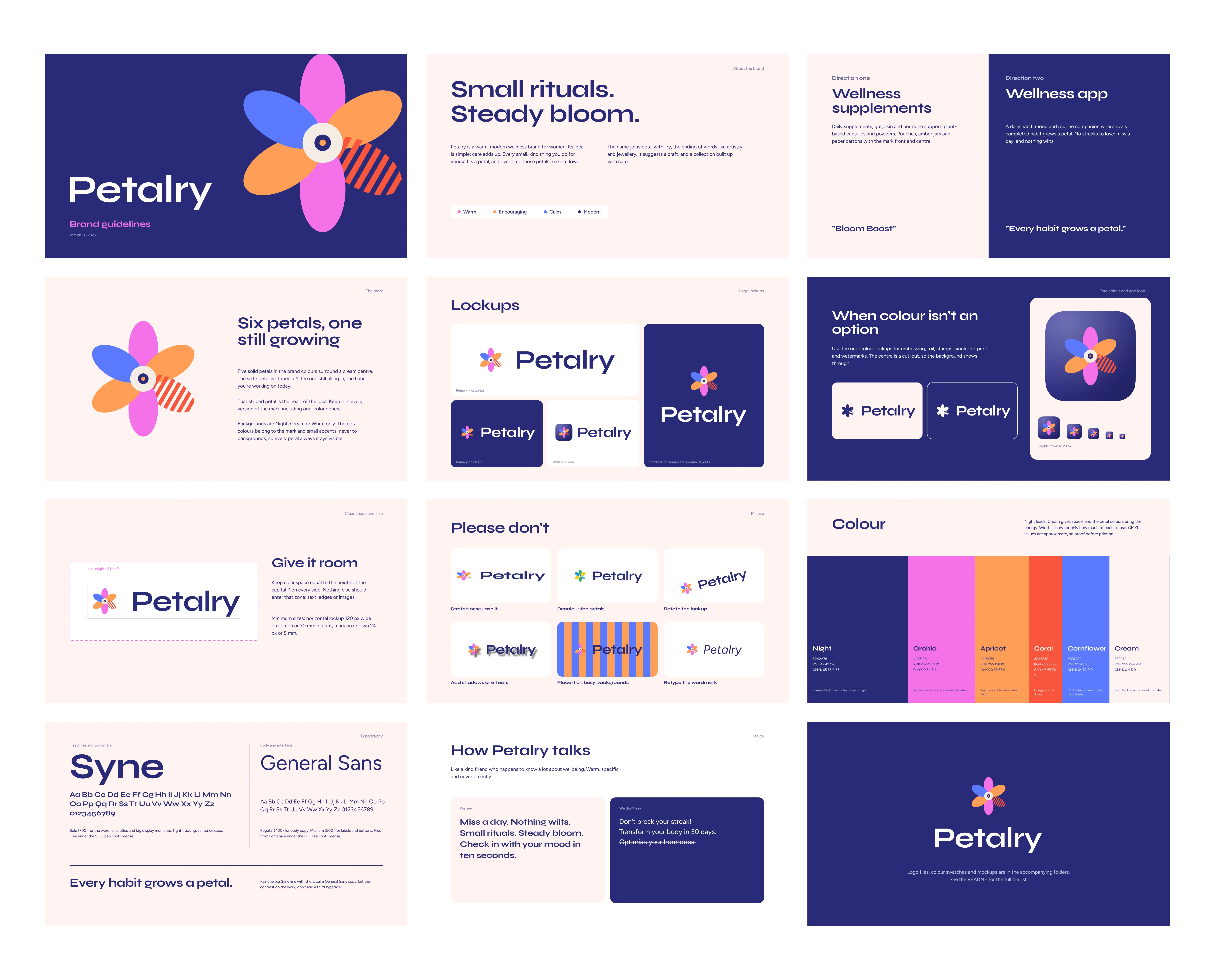
Brand guidelines - Petalry
The system
The identity is delivered as a working system, not a set of static files:
Figma file: logo components with variants, colour variables, text styles, social templates and the full guidelines deck, all linked, so changing a colour or lockup updates everything
Canva templates: Instagram posts and stories for the team to use day to day
Motion: a brand film built from the mark itself, where the petals arrive one at a time, each paired with a small habit, until the flower is complete
Reflection
The most useful decision came late: taking the bright colours off the backgrounds. Early explorations used Orchid and Apricot as full-bleed fields, and they looked cheerful but tiring, with petals vanishing into same-coloured backgrounds. Keeping the colour inside the flower made the whole brand calmer and more premium, and made the mark work harder.
Petalry is a self-initiated brand concept. The full identity is available to one owner.
To lay it out as a case study page, put the product-line mockup at the top. The macro label shot pairs well with "The mark," the palette frame with "Colour," the jar with "Packaging," and the bento shuffle from the film with "The system." I can also turn this into a Claude Doc or a publishable page.
Like this project
Posted Sep 28, 2026
Petalry is a brand concept for daily women's supplements, designed to sit between clinical and overly sweet. Figma, Claude and Kittle exploration.