SaaS UI Kit — a design library built with ChatGPT + MagicPath

Lisa Demchenko


Overview
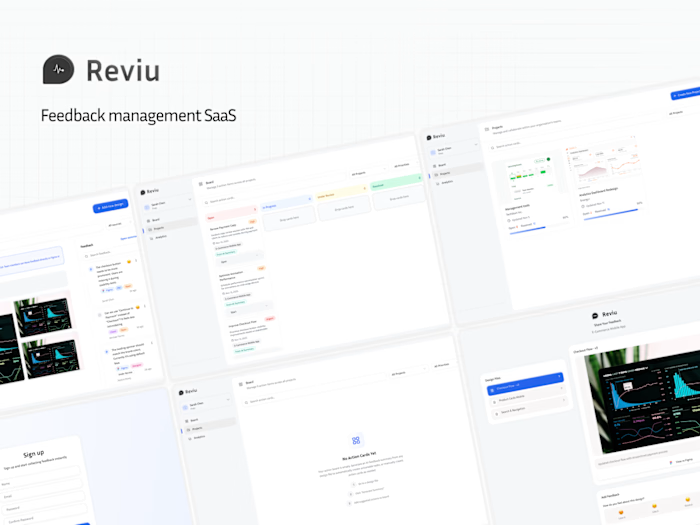
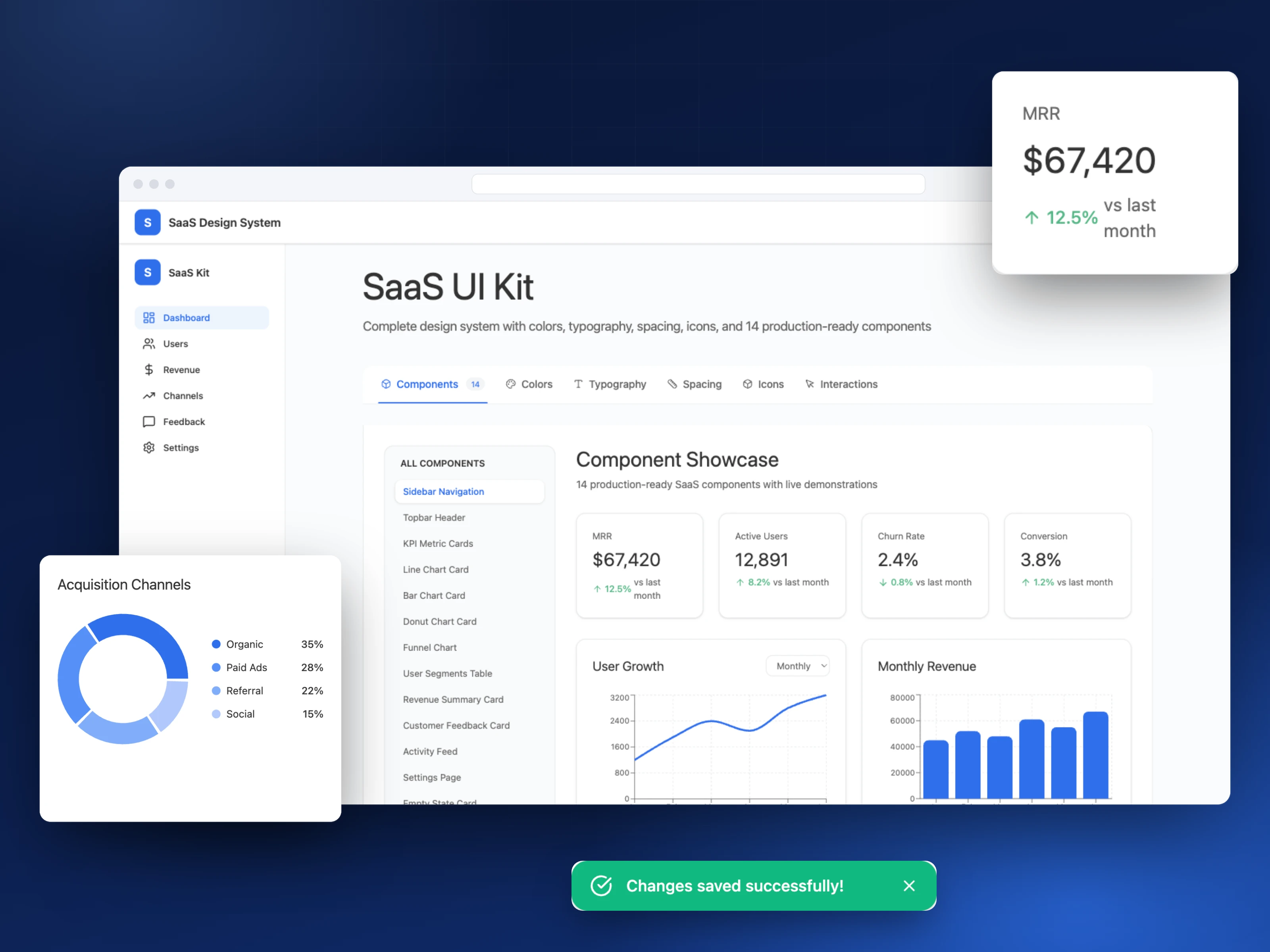
A complete SaaS design library — colour tokens, a typography scale, a spacing system and 14 production-ready components — specified with ChatGPT, built in MagicPath, then refined by hand. Self-initiated for the MagicPath design challenge, and a test of a bigger question: what happens to design system work when AI does the groundwork with us?
The challenge
Design libraries are expensive to start. Colour tokens, grids, spacing rules, naming — days of setup decisions before a single component exists. A full system, planned, defined, built and tested properly, has taken me four to six months.
I wanted to know how much of that groundwork AI could carry without losing the structure of the system, or my ownership of the decisions. MagicPath's design challenge was the excuse to test it end to end, on a SaaS UI kit.
Approach
1. Structure before style. Most libraries start with a moodboard. This one started with scope: I had ChatGPT list the essential components for a SaaS product — buttons, inputs, cards, nav, tables, charts — and built the backbone first, defining the style along the way.
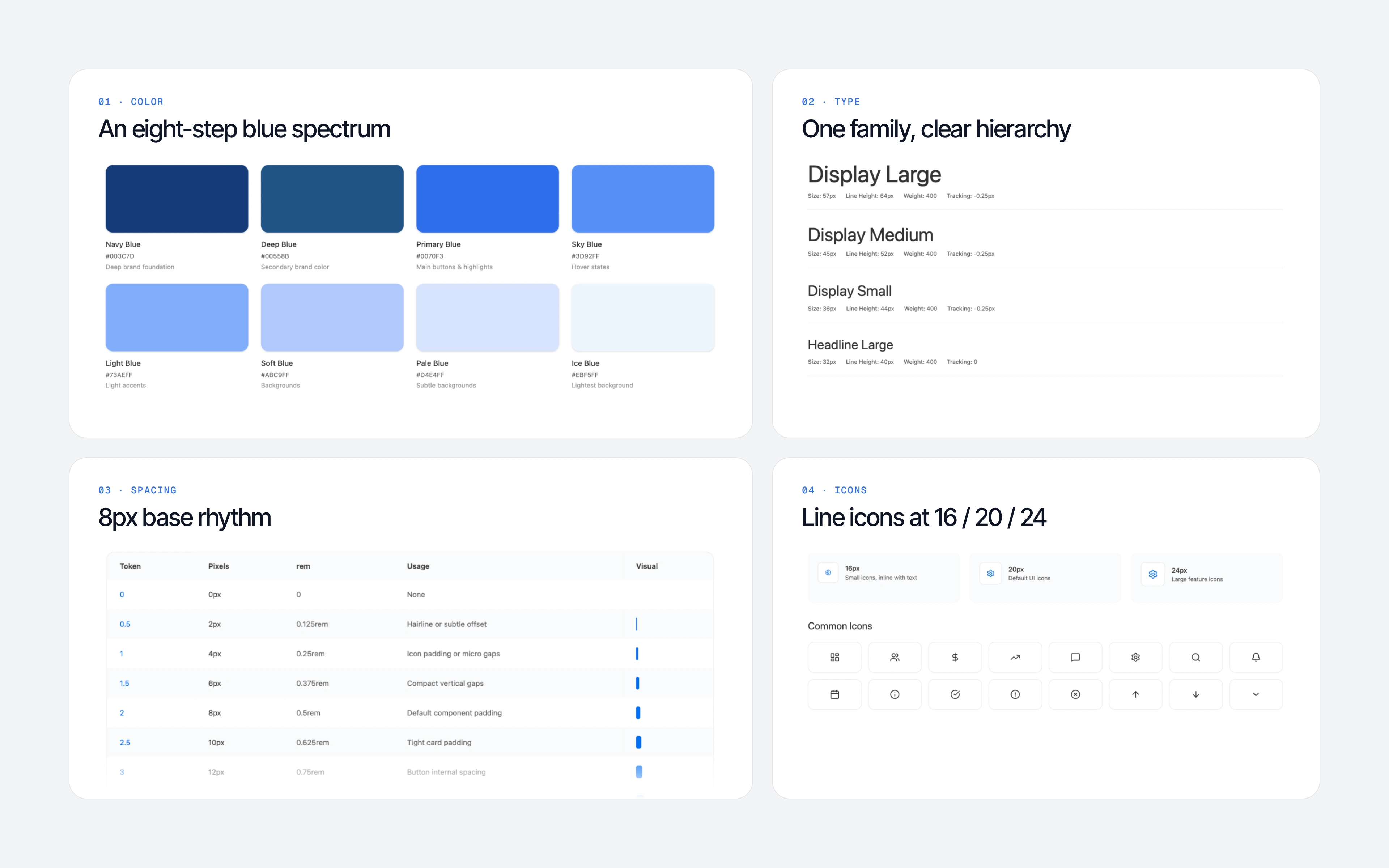
2. A defined visual language. Then the system rules: Outfit / Inter, a display scale (57/64, 45/52, 36/44), an 8px base spacing scale with 4px vertical rhythm, 24–40px section separation, 16–24px horizontal padding on mobile. Modern, minimal, neutral enough to sit under SaaS or consumer work.
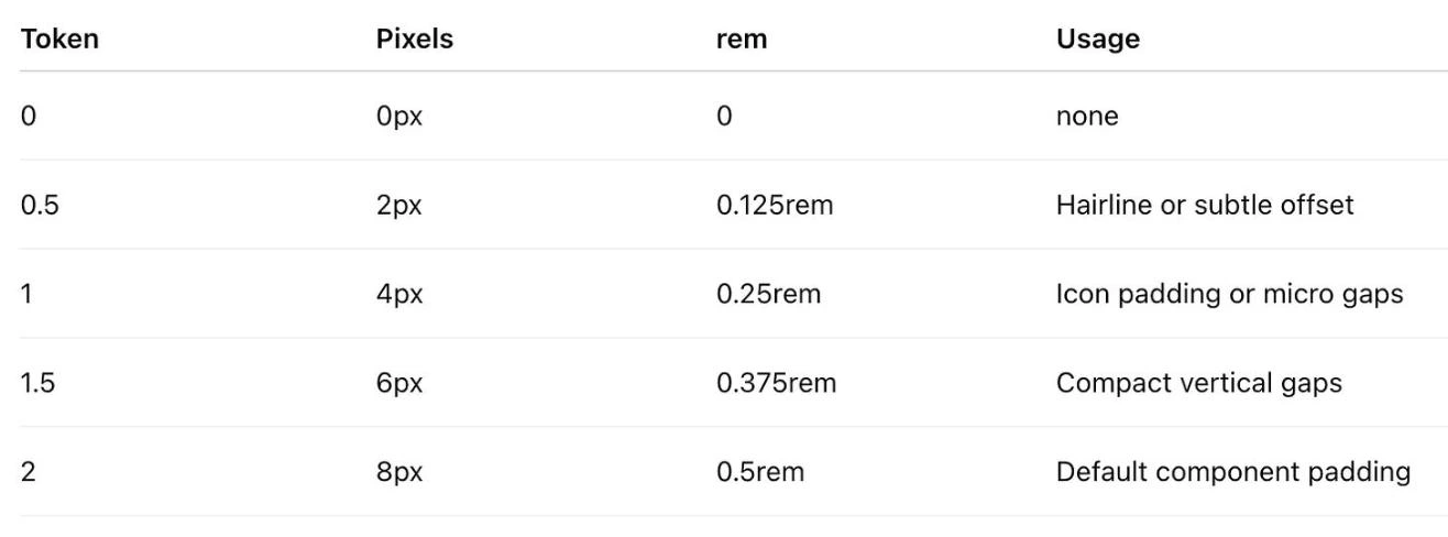
The spacing scale ChatGPT defined — tokens, pixel values and usage rules, before a single component existed.
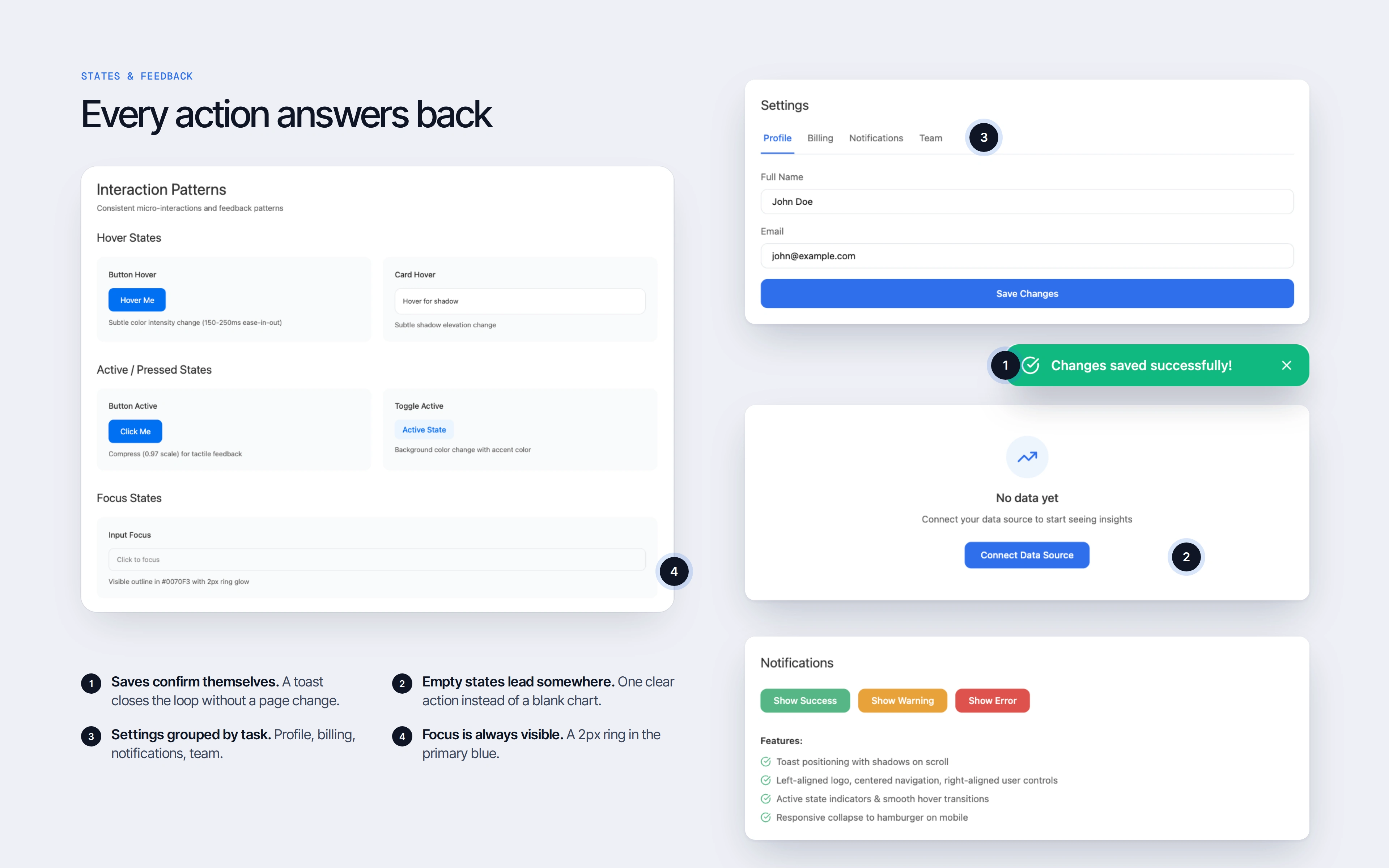
3. A spec for every component. Then depth: a detailed prompt for every component covering hierarchy, spacing, behaviour, colour, typography and motion. The button spec alone defined four variants, an 8px radius, 12/20px padding, elevation on hover, 40% disabled opacity and 150ms ease-in-out transitions. By the end of this step I had a design language — visual and structural — before opening a single design tool.
4. Two builds in MagicPath, compared. There were two ways to do it, so I tested both.
→ All prompts at once produced an interactive library page in minutes: colour tokens, typography scale, grid and spacing system, and live components that read as one coherent system — documentation and presentation in the same artefact.
→ Component by component was slower, but far easier to tweak, and those components recombine into new components and screens.
Same system, two levels of control — worth knowing which one to reach for.
Foundations
5. The designer pass. AI got it to a solid starting point; judgment finished it. I raised text contrast for accessibility, adjusted type weights for clearer hierarchy, and cut component variants to keep the kit lean. MagicPath drifted from the prompt in places — most often in the all-at-once build — so the last pass was mine.
Outcome
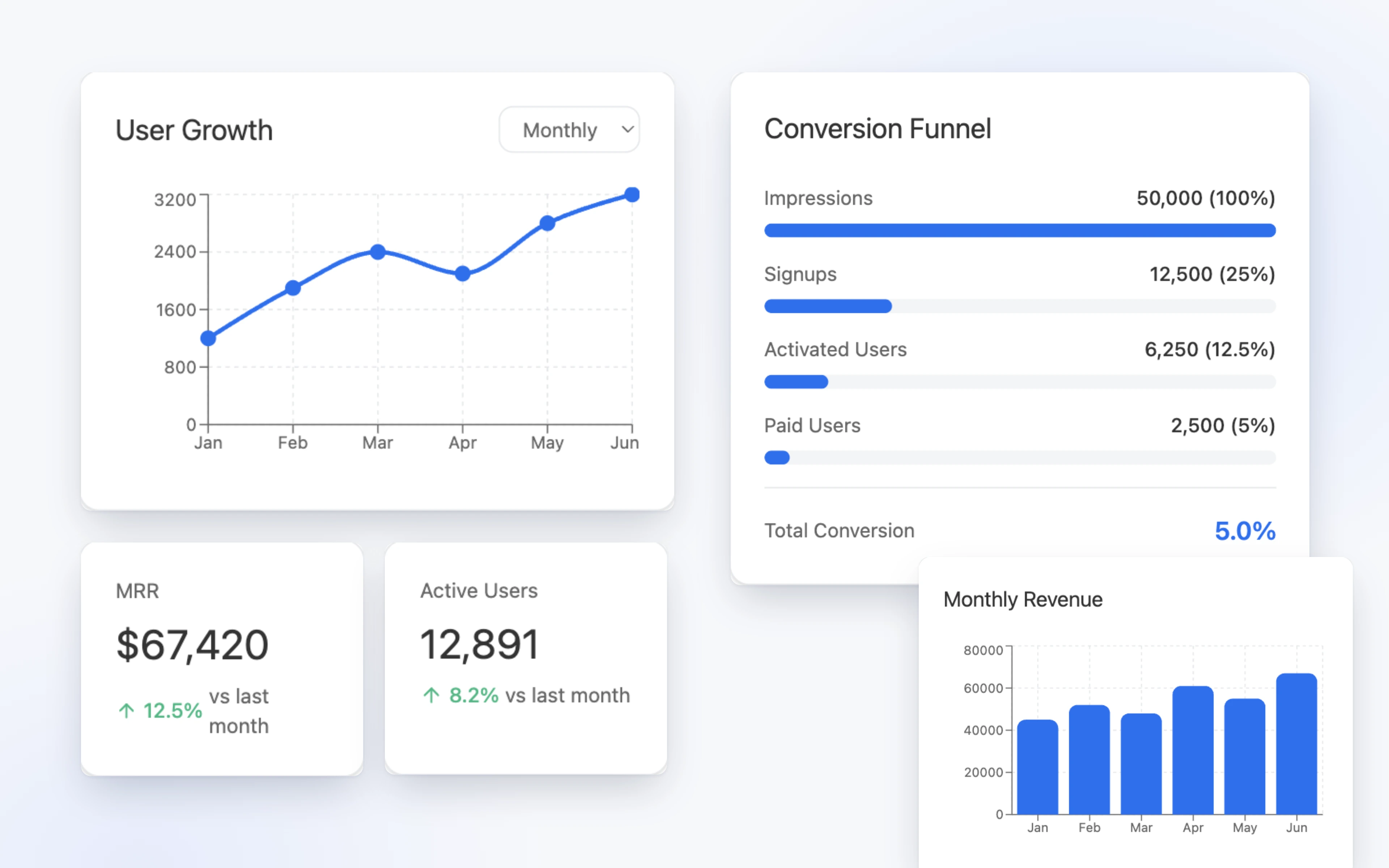
An interactive SaaS UI kit: colour tokens, type scale, spacing and grid, and 14 production-ready components with live demos.
A second, component-level build that extends cleanly into new components and screens.
A reusable prompt library and component checklist, published for other designers.
Foundation work compressed from months to a single session — with consistency improved, not traded away.
What it showed
The surprise wasn't the speed, it was the coherence: spacing, rhythm and hierarchy held together across the whole system.
AI still doesn't understand the relationships between components — that judgment stays with the designer. But it is good at patterns, at consistency, and at the setup work that usually eats the first weeks of a project. Heavy lifting by the machine; taste, hierarchy and accessibility calls by me.
That split is how I run design system work now — and it's why a seed-stage team can have a real library in place long before they'd expect one.
Links
Like this project
Posted Sep 17, 2026
A SaaS design library — tokens, type scale, spacing and 14 production-ready components — specified with ChatGPT, built in MagicPath, refined by hand.