Designing Reviu: Feedback Management SaaS

Lisa Demchenko

Overview
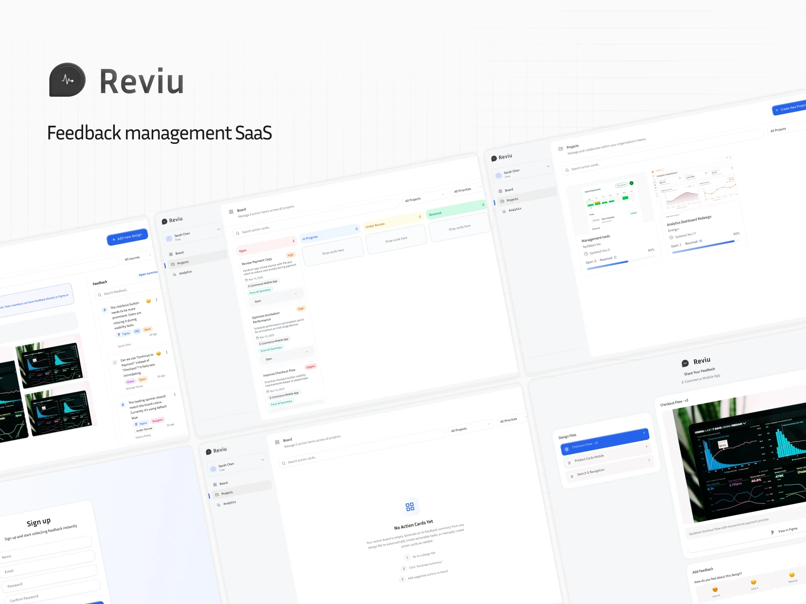
Reviu is a SaaS tool designed to help freelancers, in-house designers, and design teams centralize and make sense of scattered feedback across Figma, Slack, email, and client communication channels.
The goal: turn feedback chaos into clarity through thoughtful UX, clean interfaces, and AI-powered insight generation.
The Problem
Designers receive feedback from everywhere:
Slack DMs
Figma comments
Voice notes or Looms
Clients sending screenshots or videos
Developers adding notes in Jira
The result?
Fragmented, duplicated, and hard-to-track feedback that slows down iterations and increases misalignment.
Key pain points surfaced during early conversations and research:
No central place to gather feedback
Hard to understand the “why” behind feedback
Manual grouping/clustering takes too long
Designers feel overwhelmed during design reviews
No clear view of what’s done vs. pending
Figma comments alone don’t support full project context
Research
Methods Used
To understand the space and validate assumptions, I conducted:
12 user interviews (freelancers, in-house designers, agency founders)
1 survey (40+ responses)
Competitor analysis (Ruttl, Pastel, Figma comments, Filestage, Notion)
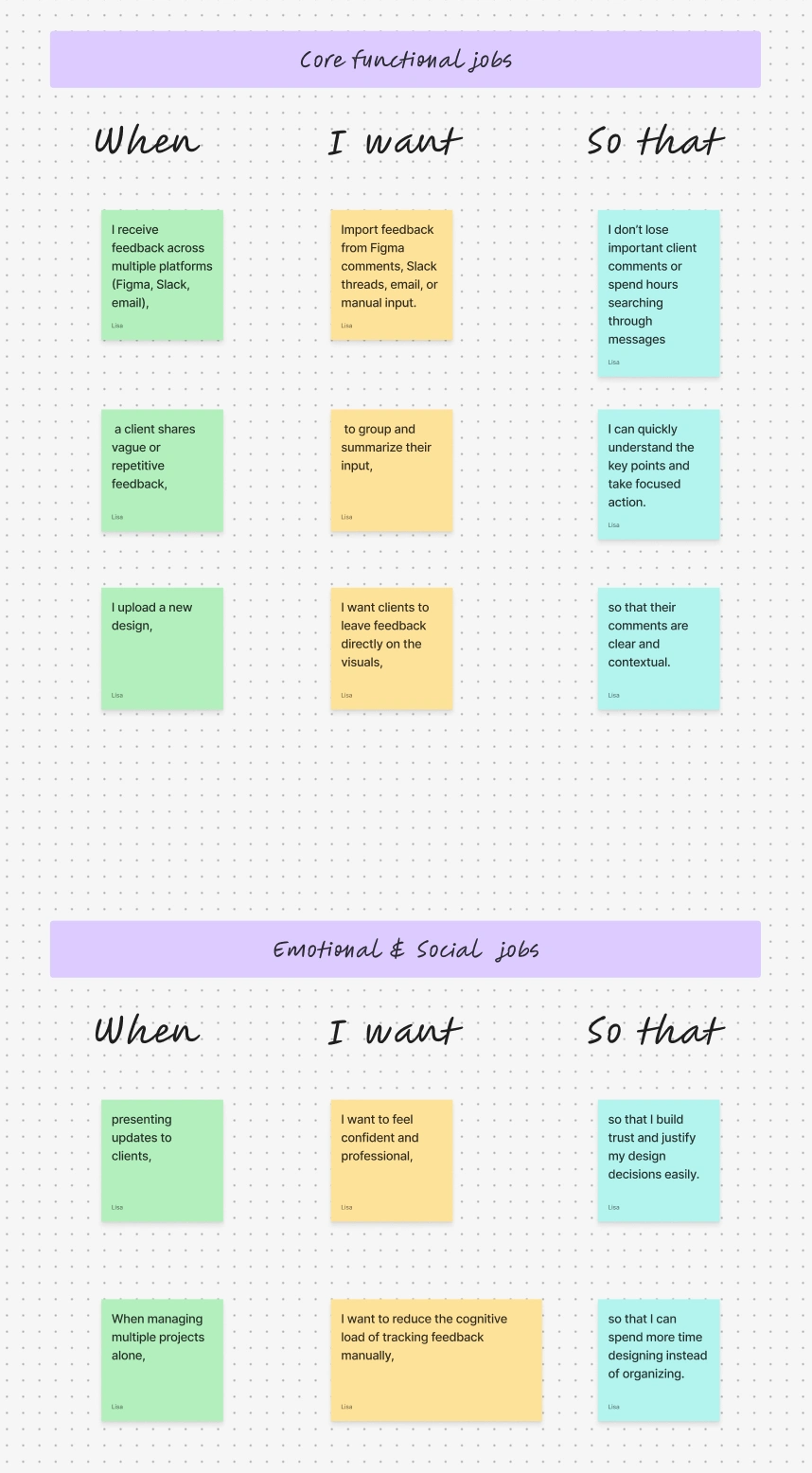
JTBD analysis
Persona development
From 12 user interviews to MVP: I designed Reviu, a SaaS that pulls scattered design feedback from Figma, Slack and email into one AI-organized workspace.
Key Insights
🔹 1. Feedback lives in too many places
Designers said they spend 30–60 minutes per round just collecting feedback across channels.
🔹 2. Designers need feedback with context
A comment in Slack is meaningless without a design reference.
🔹 3. Tracking status is frustrating
Most designers manually track feedback status in Notion or leave Figma comments unresolved.
🔹 4. Clients give vague, unclear feedback
Designers often need to summarize or reinterpret what clients said.
🔹 5. Teams want visibility
PMs and devs need a high-level view, not just comment threads.
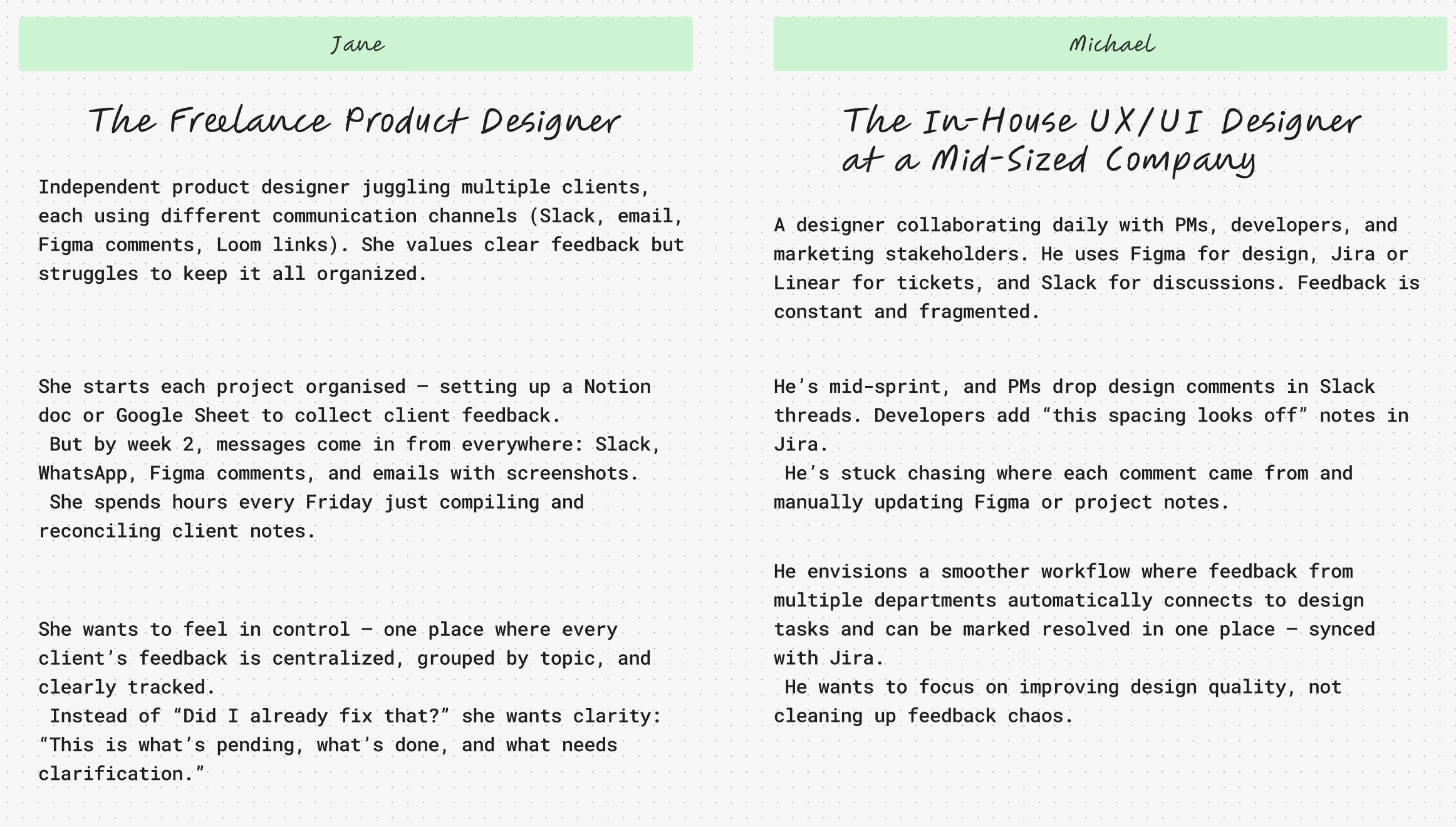
Personas
Based on research, I defined 2 primary personas:
Strategy
Product Vision
A calm, intelligent workspace where designers can collect, organize, and act on feedback effortlessly.
Design Principles
Clarity over complexity
Visual hierarchy always visible
Minimal mental load
AI as an assistant, not a replacement
Consistent, elegant, linear-style UX
MVP Scope
Based on value → effort prioritization, the MVP included:
Core Features
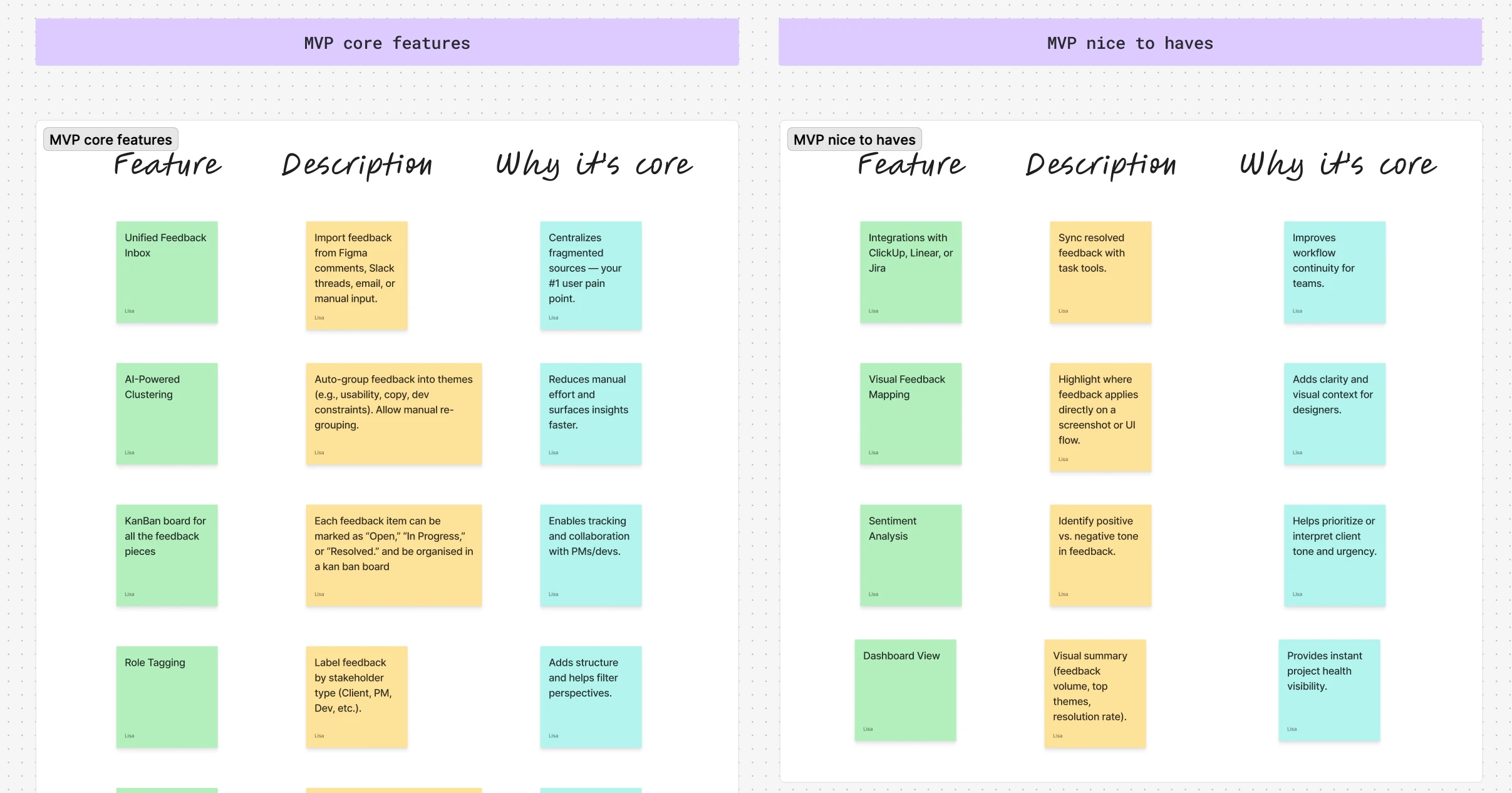
Why this scope:
It directly addresses the top frustrations without requiring heavy integrations for v1.
Information Architecture
A clear IA was sketched to align with the MVP flows:
Authentication
Kanban board, including inbox
Projects
Project Space
Uploads
Feedback
AI Summary
Clusters
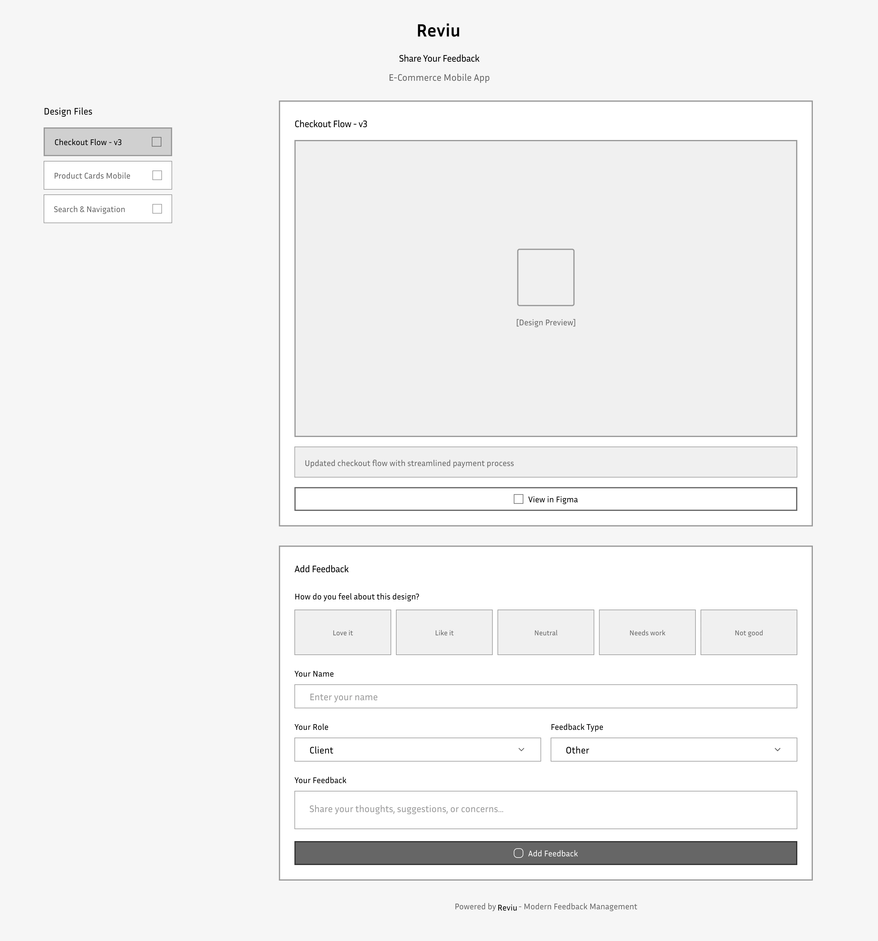
Shareable Pages (public)
Analytics
Settings
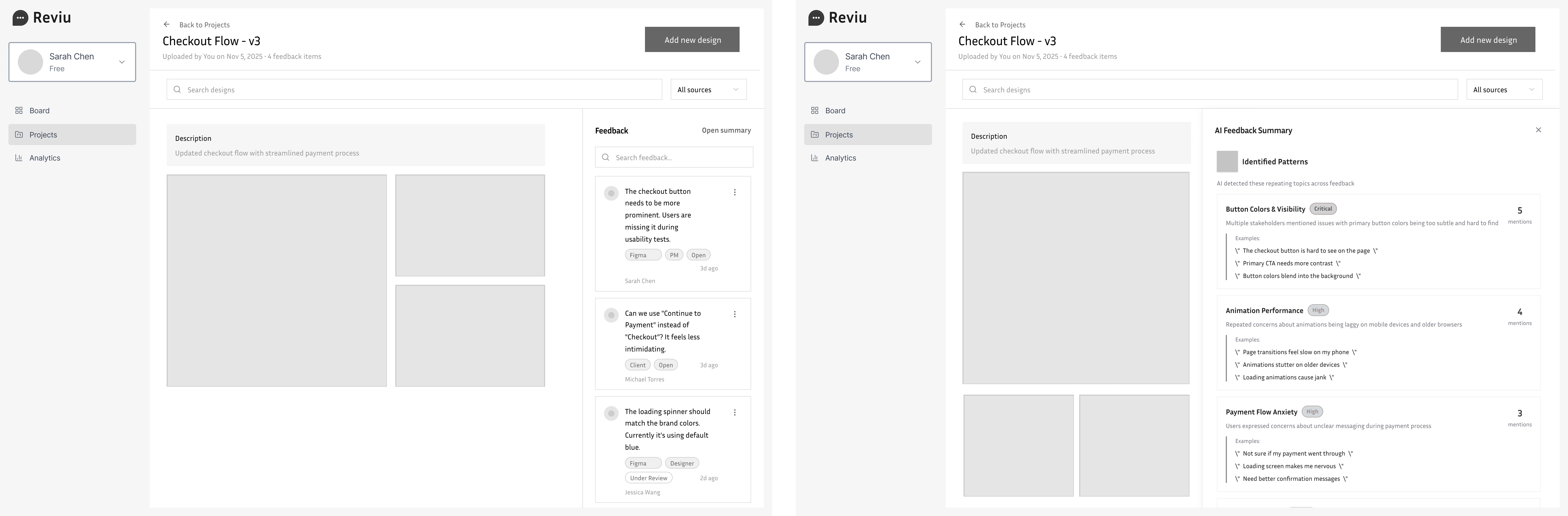
Wireframing Process
I created low-fidelity wireframes focusing on:
Clear navigation
Minimal clutter
Highly scannable feedback lists
Key Wireframe Decisions
A right-side contextual panel for design previews
Feedback list left, design preview right → best for flow
Cards for project overview
Slide-out for AI insights
Dashboard empty state that encourages onboarding
UI Design
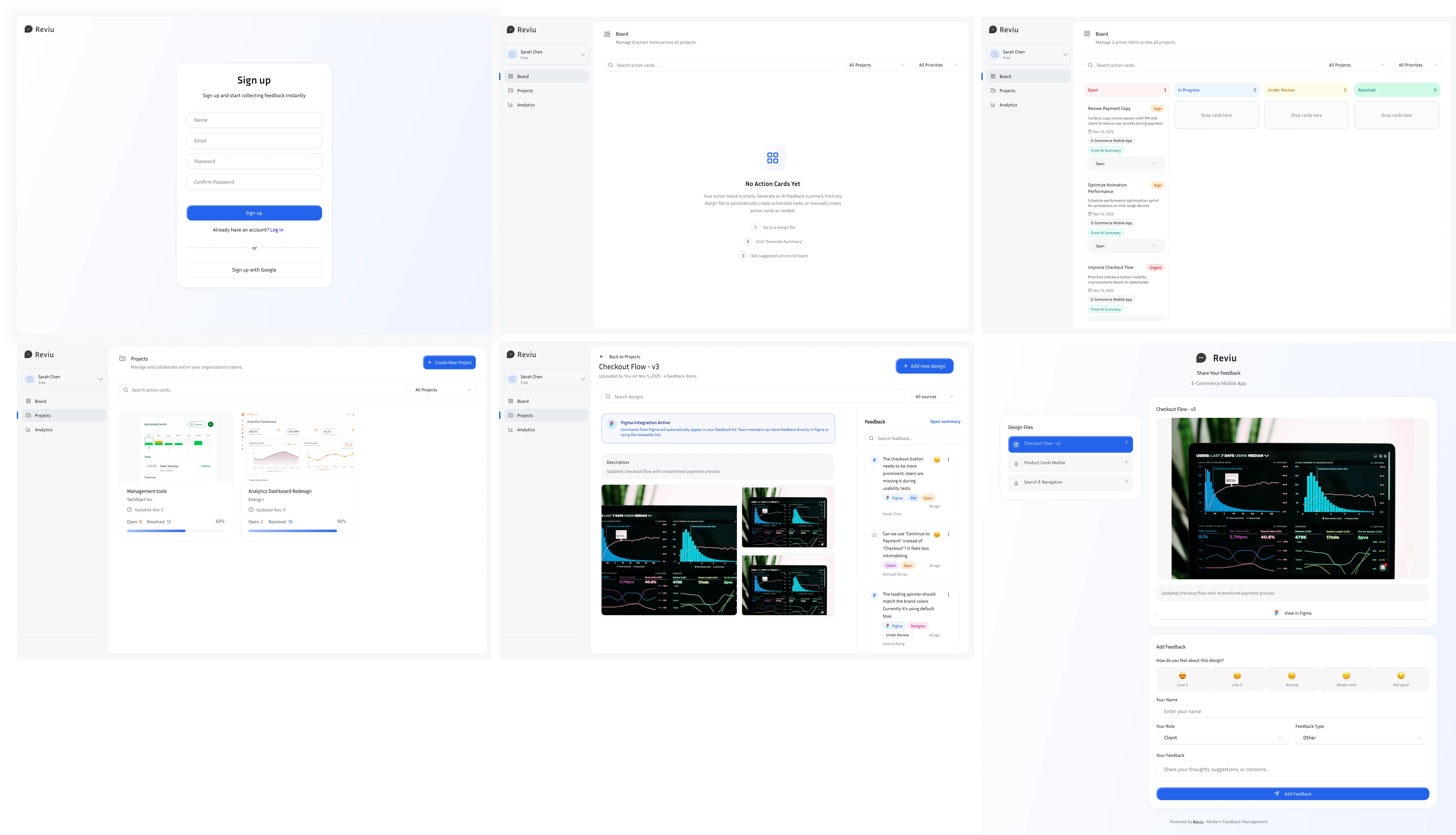
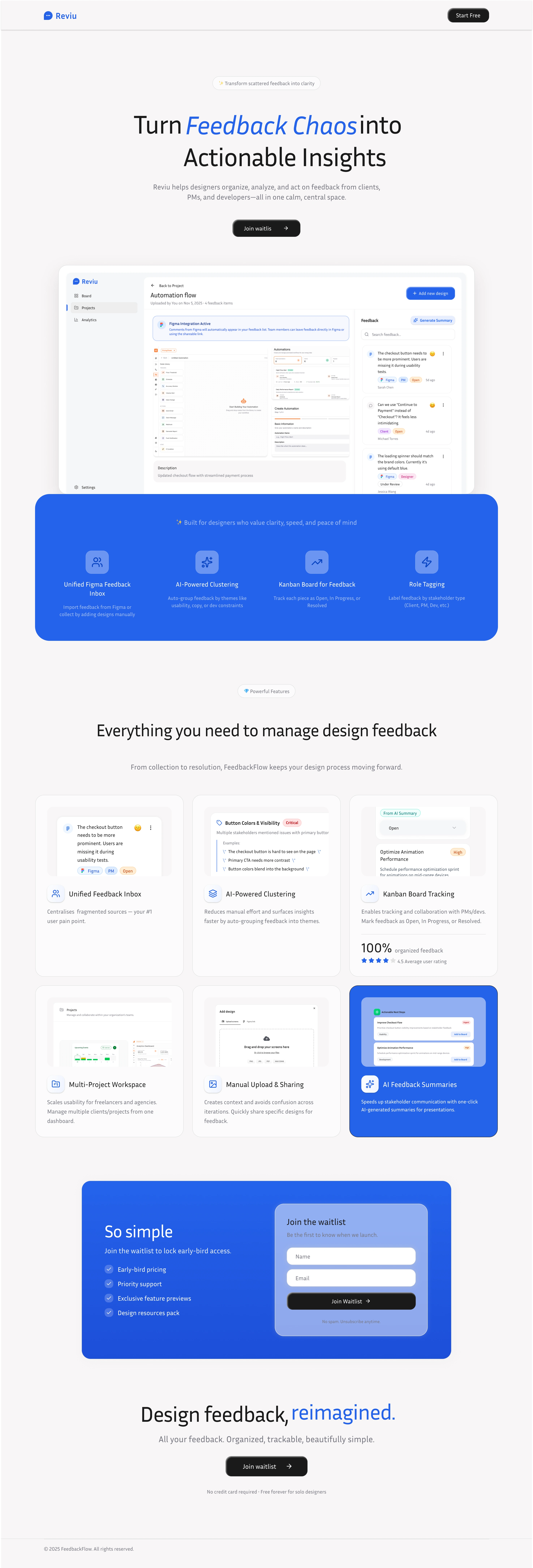
Website
Like this project
Posted Nov 26, 2025
From 12 user interviews to MVP: I designed Reviu, a SaaS that pulls scattered design feedback from Figma, Slack and email into one AI-organized workspace.
Likes
0
Views
84