Spektra Visual Identity Development

Daniel G Bright
Verified


Spektra — Building a brand from one source to a full spectrum.
An identity that makes the idea of distribution visible.
A strong source can take many forms. An idea can become a conversation, a piece of content, a campaign or a reason to pay attention. What matters is what stays intact as it moves.
That relationship became the foundation for Spektra’s identity.
The brand’s positioning, “Distribution, engineered,” held an interesting creative tension. “Distribution” suggests movement, reach and adaptation. “Engineered” suggests intention, structure and repeatability. The identity needed to express both.
Too restrained, and it would lose the energy of the idea. Too expressive, and it would lose the sense that something deliberate was happening underneath.
My task was to bring those qualities together in a visual system the brand could keep building on.
Overview
Finding the idea that could carry the identity
The phrase “One source. Many useful signals.” gave the project its clearest direction.
It described a relationship that could become visible: a single input, adapted into different expressions, each still connected to its origin.
Refraction offered a way to explore that relationship. Light can separate into a spectrum, revealing different parts of the same source. For Spektra, that became a principle for constructing the identity.
The logo
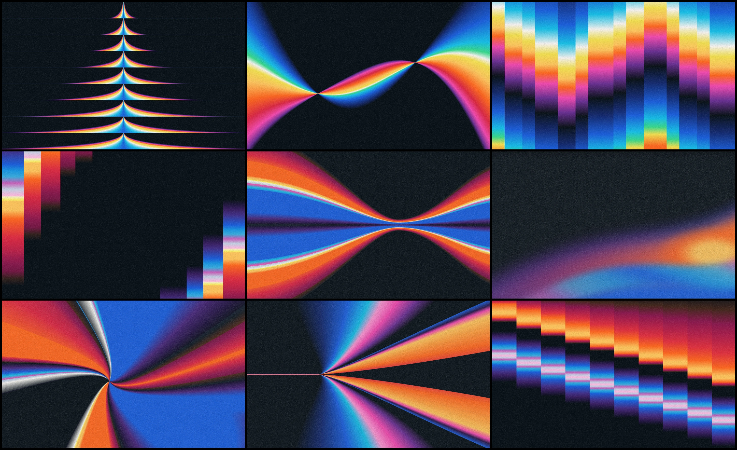
I explored rays that expand from a shared point, contours that repeat around a common center, and color fields that appear to stretch, compress and change direction. These graphics could suggest movement within a still image.
The ambition was for the brand to feel alive. That meant paying attention to where the eye enters a composition, how it travels through the graphic, and where the energy gathers.
Gradients
The most useful explorations had an underlying order. You could feel the movement, but you could also understand how it had been made.
Choosing a spectrum with room to grow
Color became one of the defining decisions.
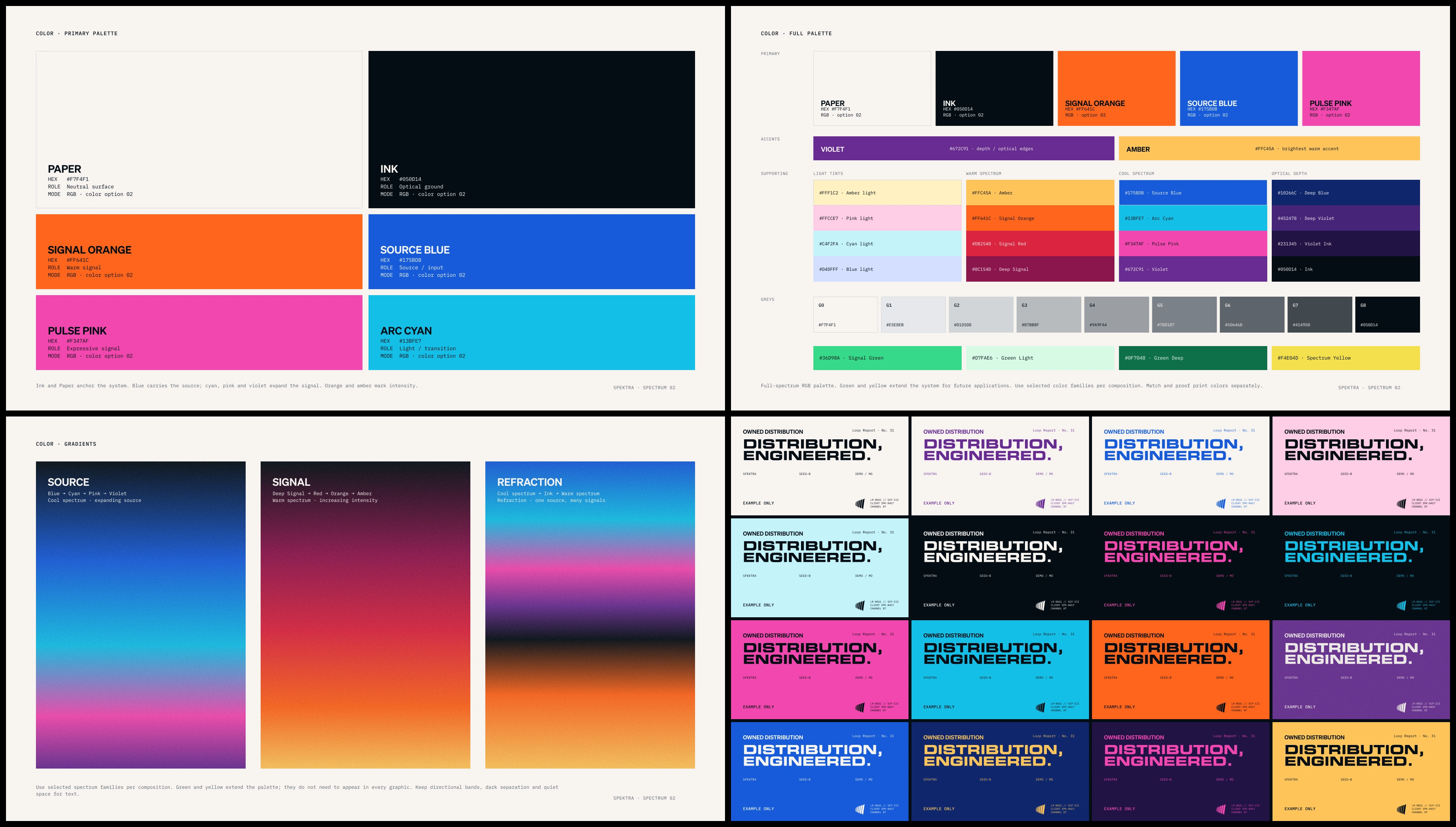
The early work explored a focused orange-and-blue palette alongside a broader, full-spectrum direction. The tighter palette had a clear contrast. The spectrum offered more range and a closer connection to the central concept.
The founder preferred the second direction, then raised a practical question: if the team needed a green later, would there already be a defined color that belonged with everything else?
That question helped sharpen the system.
Colors
A palette has to support decisions beyond the examples shown in a presentation. It needs to make the next application easier, including one nobody has designed yet.
I expanded the color system with defined hues, supporting shades and combinations that could work across different backgrounds. Ink and warm paper established a consistent foundation. Blue, cyan, pink, violet, orange, yellow and green gave the brand room to shift its expression.
Some compositions could be direct and almost monochromatic. Others could use the full intensity of the spectrum. The layout, typography and construction of the graphics would keep them connected.
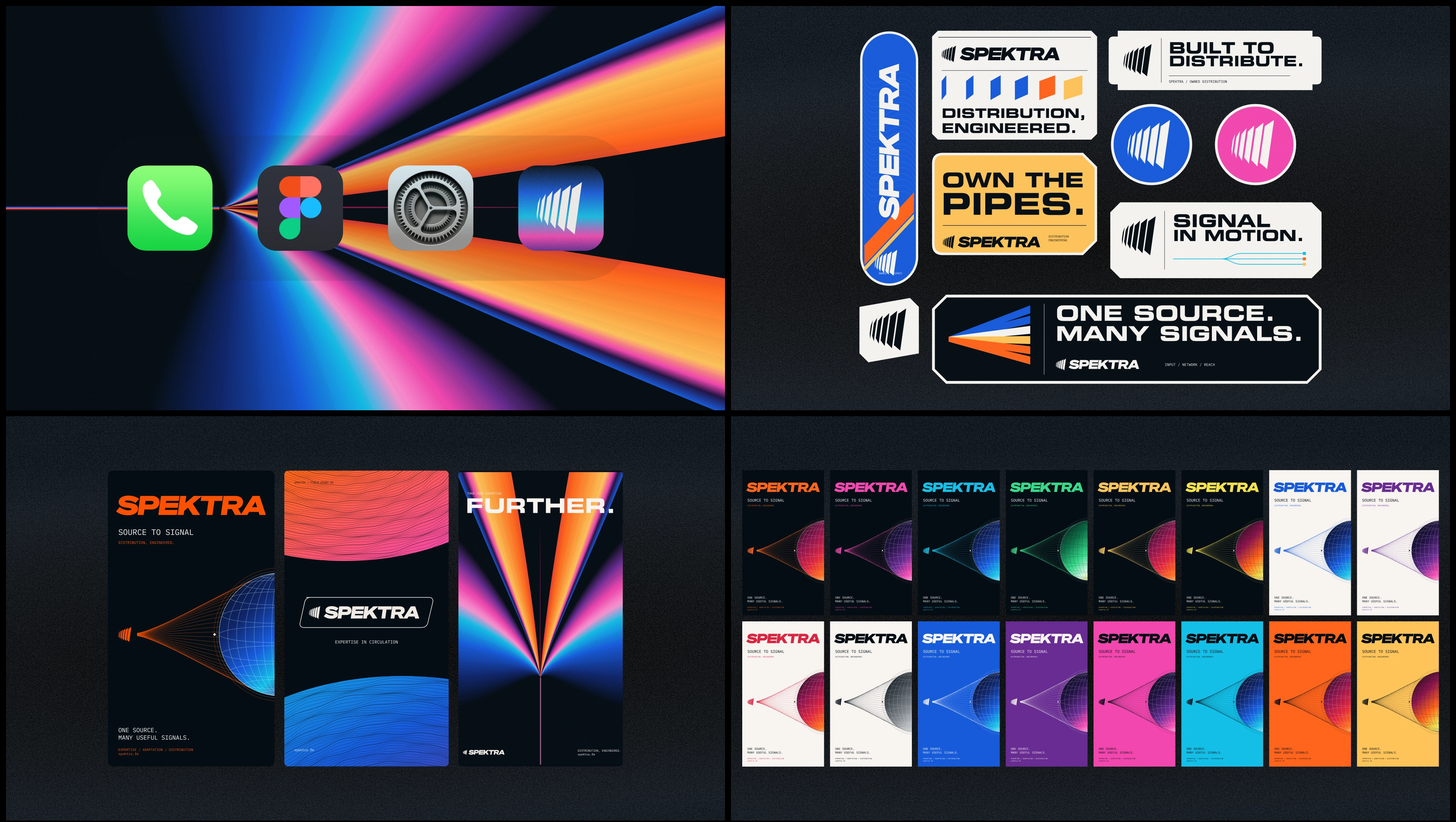
The gradients followed the same discipline. Their direction and shape mattered as much as their colors. Bands could converge, contours could repeat, and rays could expand from a source. That gave the color a role within the composition.
Refining the mark through use
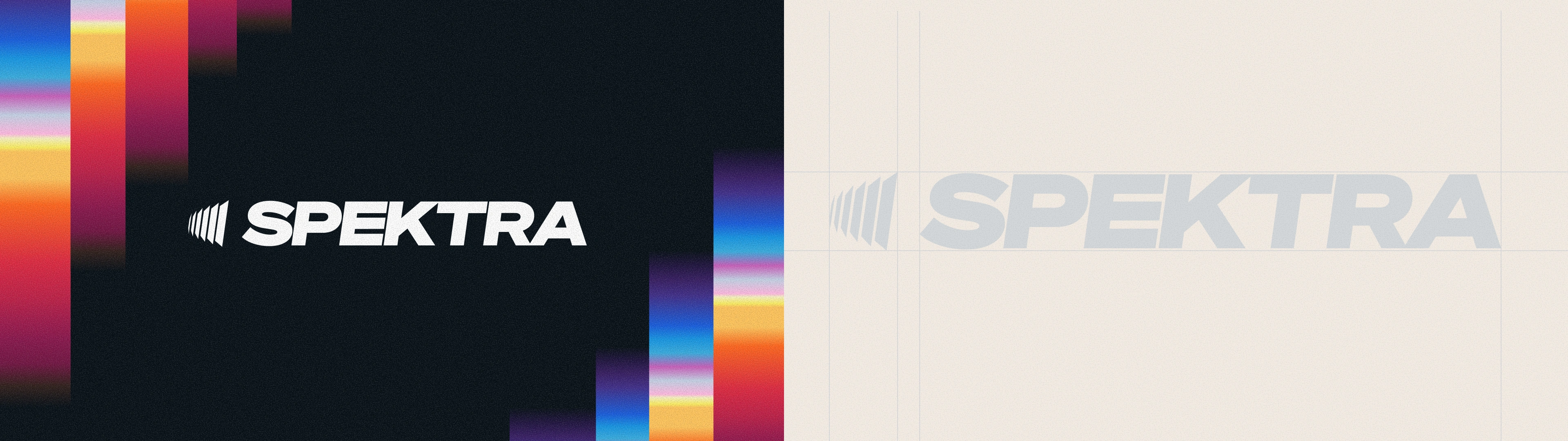
As the wider identity developed, the relationship between the symbol and wordmark needed closer attention.
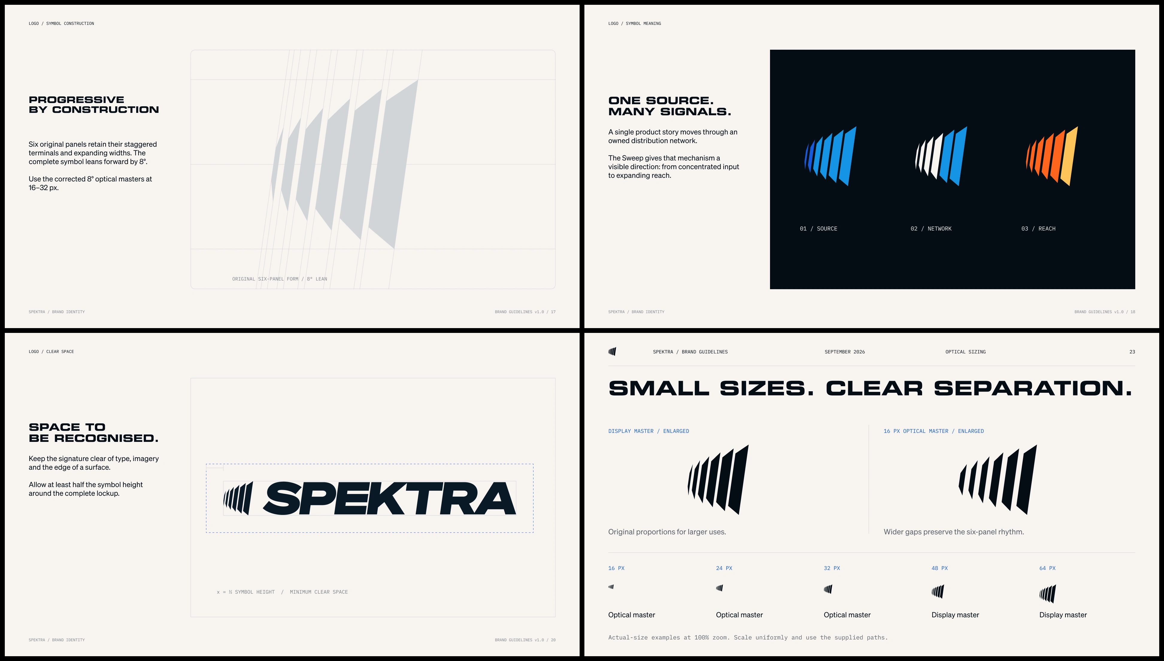
The founder noticed that the mark felt more rounded than some of the surrounding graphics. He also questioned whether its angle should follow the wordmark more closely. At small sizes, the narrow spaces between the blades were beginning to close visually.
Mark through the assets
These were useful observations because they came from looking at the identity in context.
I explored a more angular version and compared it with the original construction. The original remained the stronger foundation, with a forward lean that brought it into closer alignment with the wordmark.
From there, the work became more precise: adjusting the symbol’s apparent height, balancing its weight against the lettering, and reviewing the spaces between the blades at smaller sizes.
The Mark
A logo can look convincing when it fills a screen and behave very differently in a profile image or website header. Those smaller applications helped guide the refinements.
The aim was to preserve the character of the mark while making the complete lockup feel more resolved.
Giving the expression a structure
With an expansive color system and energetic graphics, typography needed to provide stability.
Eurostile LT ExtendedTwo Bold gave the headlines a broad, architectural presence. Its proportions could hold their own against the more expressive artwork. Monospaced supporting details introduced a technical register, while a clear hierarchy kept longer information readable.
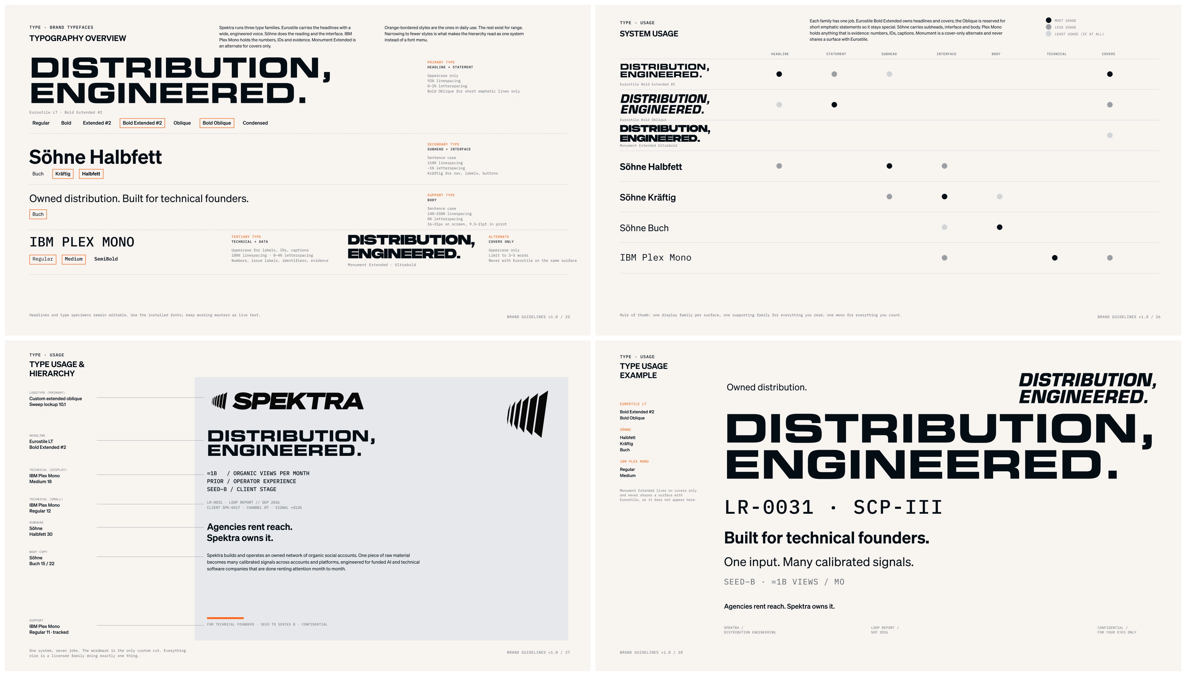
Typography
The contrast became an important part of the identity: substantial headlines, precise small details and graphics with a strong sense of direction.
That structure also made restraint possible. Every surface did not need a large gradient or a complex motif. A strong typographic composition in two colors could feel just as recognizably Spektra.
Building graphics from rules
The vector language developed around a practical principle: each motif should have a construction rule that someone else could understand.
Shared centers. Repeated contours. A single input opening into multiple channels. Controlled changes in spacing, scale and rotation.
Graphics
Those rules made the graphics repeatable without making every composition identical.
A contour could become a supporting detail, expand across a poster or be cropped into a narrow format. The relationship between its parts would still hold. New motifs could emerge from the same logic.
This gave the identity a way to grow beyond its first set of assets. Future work could begin with an established principle and adapt it to the surface at hand.
Taking the identity beyond the presentation
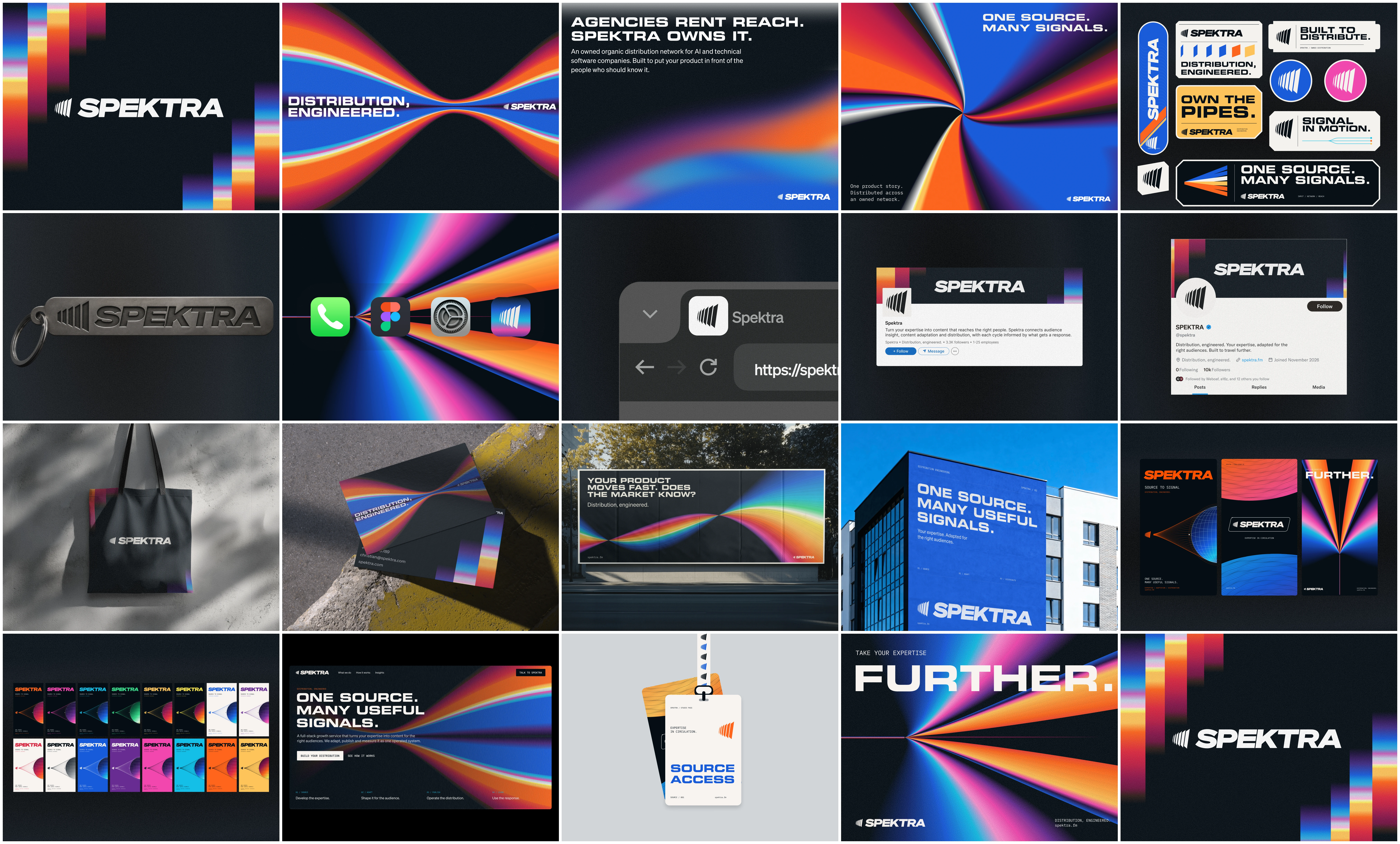
The Identity
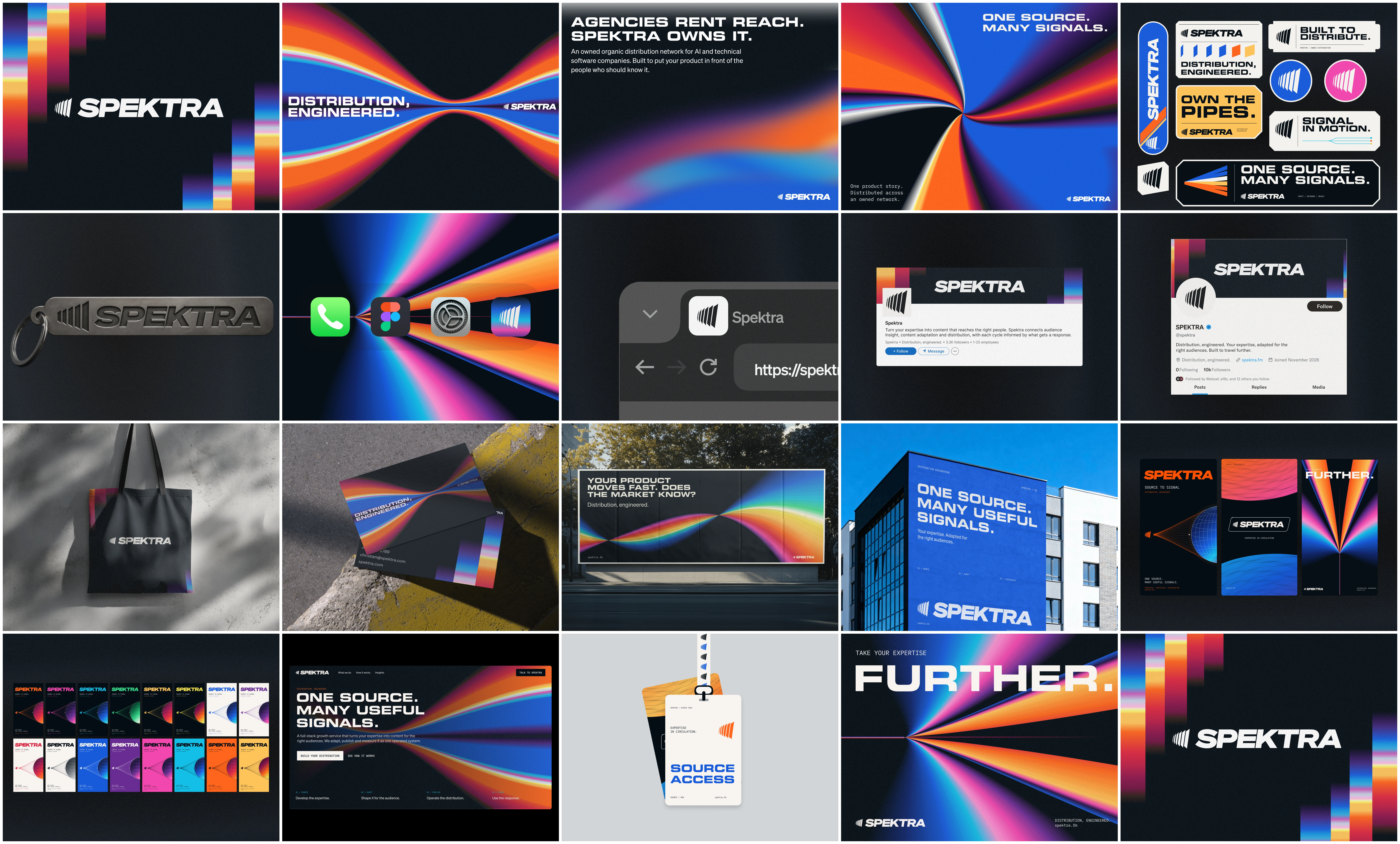
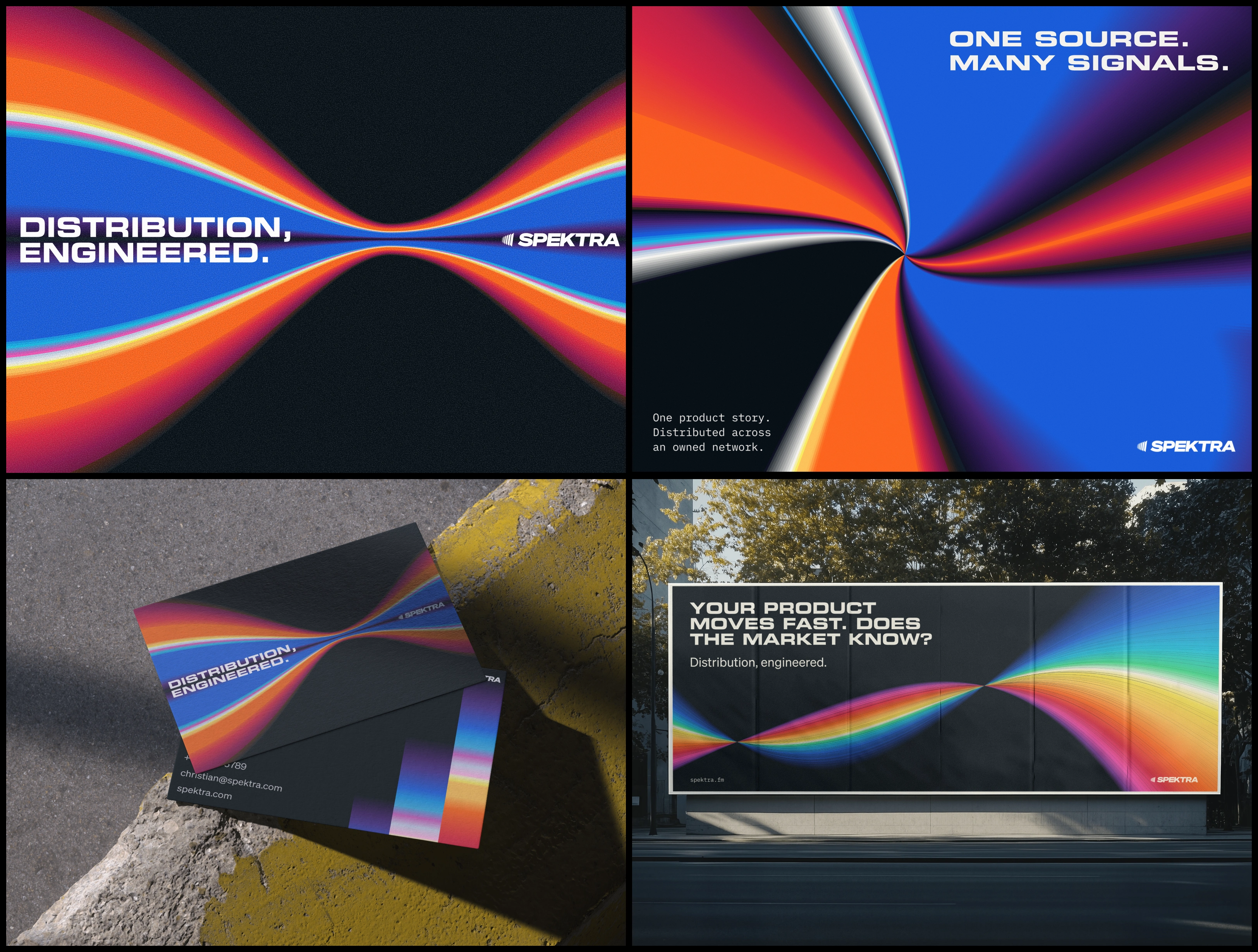
Application concepts tested how the elements worked together across social layouts, posters, a website hero and physical brand items.
Each surface exposed a different requirement. A poster needed an immediate focal point. A social layout needed a recognizable hierarchy within a smaller frame. A website hero needed enough space for a message and a clear next step.
These applications helped establish when the graphics should lead, when typography should carry the composition, and how much color a particular surface needed.
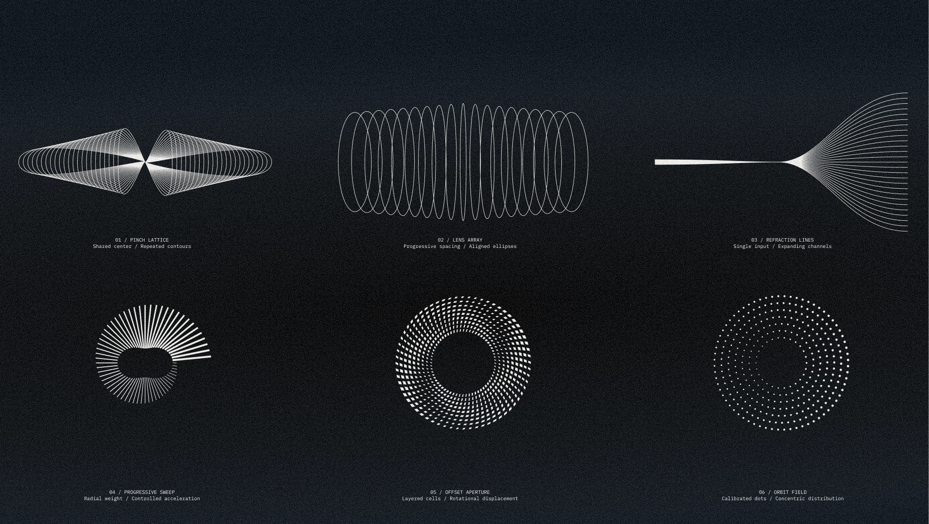
Vector Elements
The guidelines then brought those decisions together. They documented the logo system, color combinations, typography, graphic construction and layout principles, with further guidance for dividers, format adaptation and motion behavior.
Organized assets completed the handoff, giving the team both the materials and the direction to continue using the identity.
Spektra’s finished visual system connects its most expressive moments to a consistent underlying structure. The spectrum creates variety. The construction rules preserve continuity.
That is the idea running through the project: one source can produce many different expressions, and each can still belong unmistakably to the same brand.
One source. Many useful signals.
Creative direction and design: Daniel G. Bright / Bright Studios
Scope: Visual identity, logo refinement, color system, typography, vector graphics, application concepts, brand guidelines and asset handoff.
Book a discovery call: bybrightstudios.com/intro
Like this project
Posted Sep 22, 2026
Developed Spektra's visual identity with a flexible color system, refined logo, and comprehensive brand guidelines.
Likes
20
Views
365
Timeline
Aug 17, 2026 - Sep 21, 2026
Clients
Spektra