Sync – Changing who a car rental brand gets compared with

Daniel G Bright
$7.5K+ earned


The car you booked should be the car that arrives
Sync’s founder, Nikos Drandakis, booked a white Peugeot. A black Skoda showed up.
The rental industry has two words for that experience: “or similar.”
Sync was built around a different promise. Renters choose the exact car, a local provider delivers it to their door, and there is no deposit hold on their card.
As professional rental companies began listing fleets alongside private owners, the brand had to work for a broader audience. Mainstream renters needed confidence in an unfamiliar service. Fleet owners needed to see a business they would be comfortable putting their name beside.
Bright Studios’ role was to give Sync a position and an identity that could support both.
The first impression was working against the offer
In discovery, Nikos described Sync’s social presence as closer to a classifieds listing than a company someone would trust with their car keys. Posts lacked consistency, and the site’s link-preview title introduced Sync as a marketplace.
That language explained how the business operated. It left the rental experience in the background.
Our strategic diagnosis was that Sync’s presentation invited the wrong comparison. It asked people to evaluate an unfamiliar way of renting before giving them a clear reason to choose it.
Meanwhile, the reasons were specific: the car you selected, delivery to your door and no deposit hold.
The brand needed to make those differences the starting point.
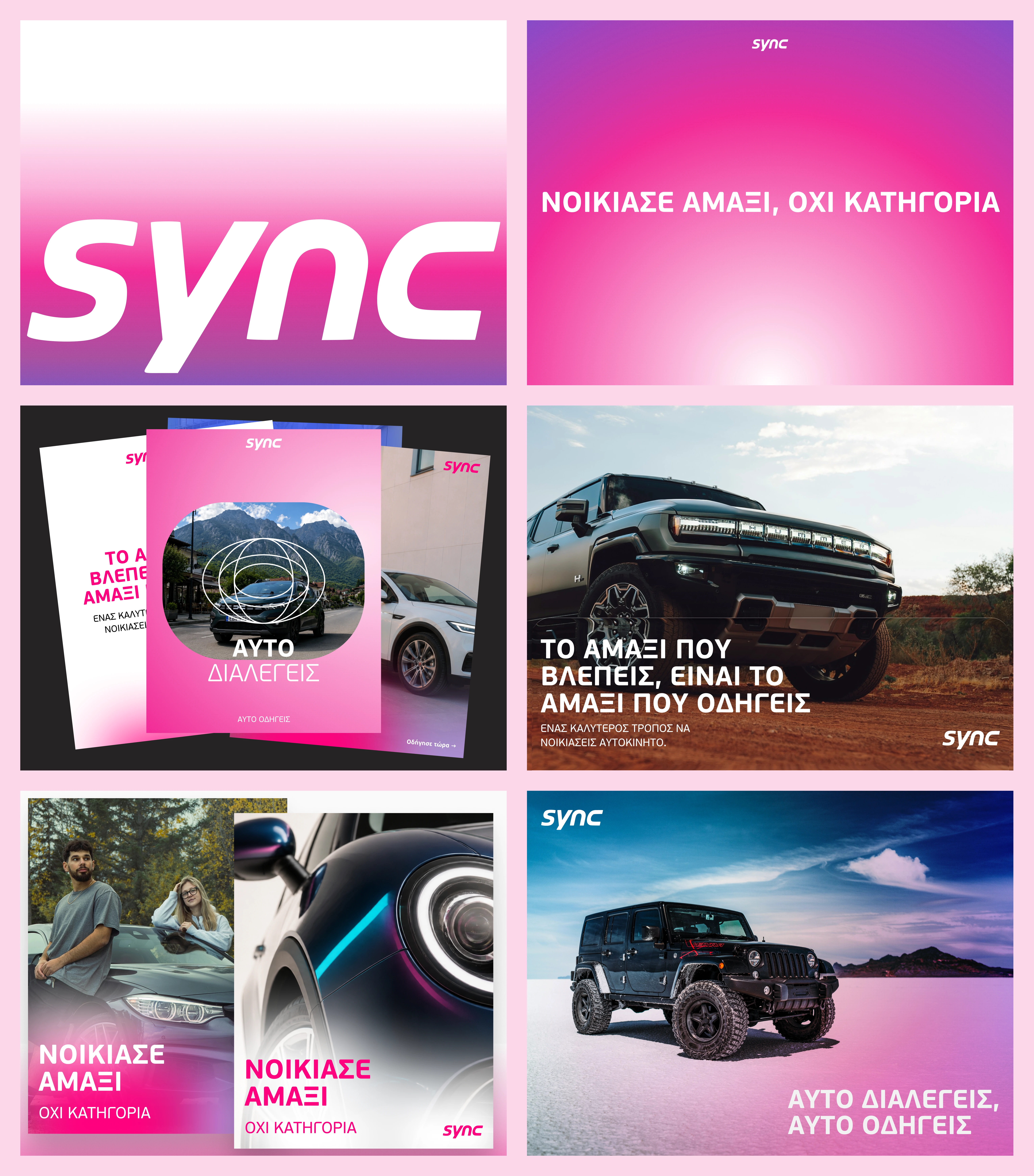
Design Elements
Put Sync in the car rental conversation
We positioned Sync as car rental in Greece, with a better answer to familiar frustrations.
That gave the work a clear competitive frame: Avis, Hertz and Sixt. Their level of polish became the benchmark for the identity. Sync’s own service became the source of its message.
We moved “peer-to-peer,” “car sharing” and “marketplace” out of the lead messaging. The provider model could be explained where people needed to understand it, while the first impression focused on what they were booking and what they could expect.
The creative direction followed: look established, speak personally.
Build the message around what disappears
Customer reviews gave the messaging a useful pattern: «χωρίς», meaning “without.” People described the experience through the friction it removed, from deposits to bureaucracy.
Sync’s marketer, Alexis, put that idea into the line:
«Χωρίς γκισέ, χωρίς χαρτούρα».
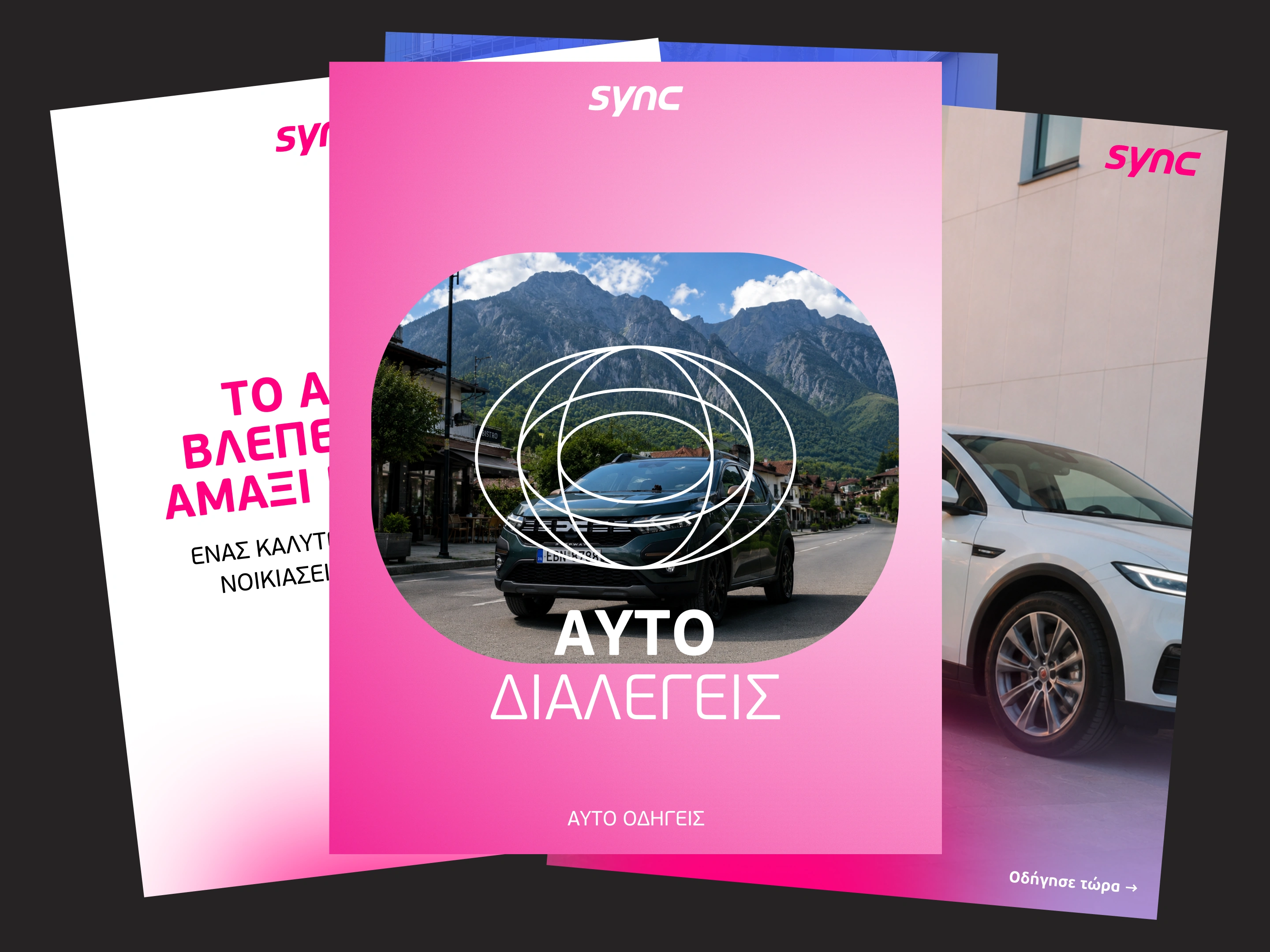
No counter, no paperwork
It gave the brand something concrete to say. Instead of asking renters to believe a broad promise about convenience, it named two familiar inconveniences they could leave behind.
The founding story gave the same idea a human starting point. The white Peugeot and black Skoda became a way to explain why choosing the exact car matters.
Make the identity recognisable before the logo is read.
We retained the pink already present in Sync’s app and gave it a more disciplined role. Calm neutral backgrounds carry the information; pink draws attention to the moments that matter.
A rounded window, derived from a car’s side mirror, gives the system a recurring shape. It frames photography in larger compositions and carries through to smaller formats and the app icon. Clear rules govern its use so it remains recognisable across layouts.
Inside that window, the photography stays natural: real cars, providers and Greek surroundings. We avoided brand-coloured filters and duotones, letting the identity frame the image without changing its character.
Typography had to work in Greek first. We selected Beau Sans for prominent Greek headlines as well as Latin text, using one family across the system. That kept the voice consistent and reduced the decisions needed to produce each asset.
Together, these choices gave Sync a more consistent presentation while keeping the people and places behind the service visible.
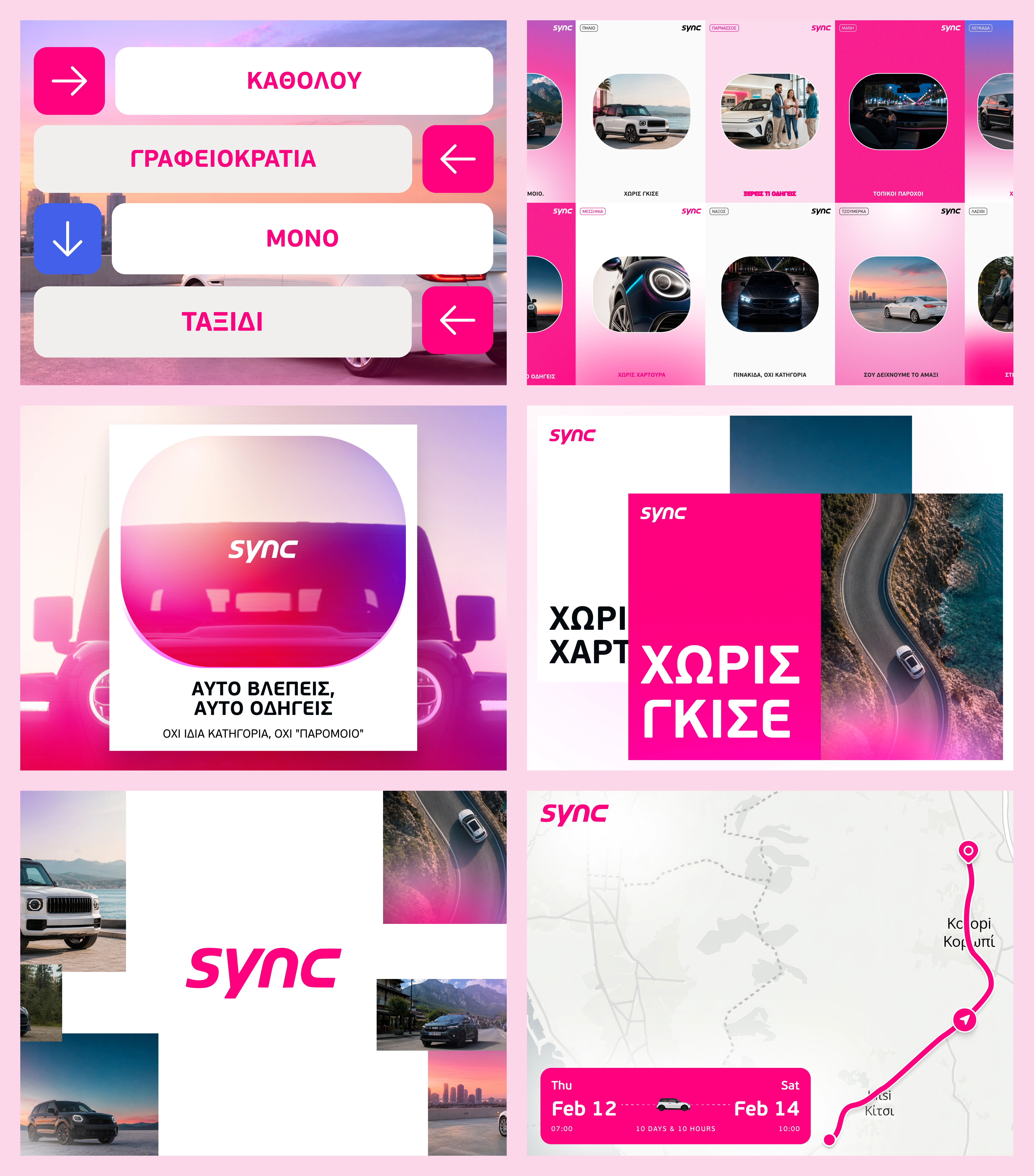
Design Elements 2
Design for the person making the next post
Alexis produces Sync’s social content without an internal design department. The system had to be practical in his hands.
We defined a limited set of layout and styling choices: consistent corner radii, one icon family and clear colour proportions. The template scope covered three static formats and two carousels, with rules for image placement and copy hierarchy.
The editorial test was equally specific: name a real part of the experience, make something a fleet owner would be comfortable sharing, and avoid claims any rental company could make unchanged.
The aim was to make everyday production more consistent without requiring a new design decision for every post.
A clearer position, expressed as a working system
The strategy and identity work established a connected set of decisions: car rental as the lead category, specific service differences as the message, and a visual language designed to hold together across social content.
The recommendations also reached the website’s written layer. The link-preview title was an early priority because it needed to introduce the same position as the identity: car rental in Greece, without the counter.
Commercial results will need to be measured as the work rolls out. The contribution at this stage is a clearer basis for how Sync presents itself and how its team produces that presentation consistently.
Sync’s strongest introduction starts with a familiar rental frustration and a specific reason it should no longer happen.
Like this project
What the client had to say
Great work across the board and a very responsive great designer with excellent communication skills.


Nikos Drandakis, Sync Technologies AE
Sep 2, 2026, Client
Posted Sep 14, 2026
Brand strategy and identity for a Greek rental platform ready to compete for mainstream trust.
Likes
12
Views
291
Earned
$7.5K+
Timeline
Jul 27, 2026 - Sep 2, 2026
Clients
Sync Technologies AE