Tithe — iOS App UI/UX for a Screen-Time Members Club

Daniel G Bright
$10K+ earned


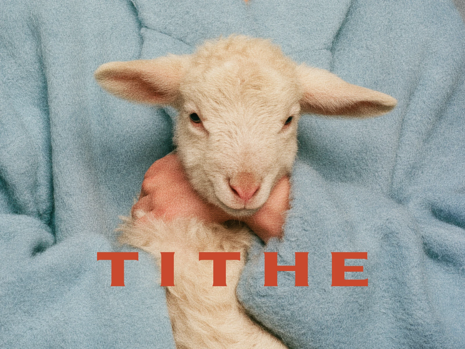
Tithe is the focus app where every exit has value. Block the apps that eat your attention. Break focus, and something real happens: money moves from checking to savings, a donation fires to a cause you chose, or your apps stay locked until your body earns them back.
Screen-time apps sell guilt. Tithe prices attention. That difference had to survive contact with 35 screens.
Onboarding
Timer
The situation
The founder built the product herself and arrived with a brand most startups never get: a deck with genuine conviction. Soho House energy, 90s editorial photography, powder blue and espresso, a hand-scribbled lamb as the mark. What did not exist was the layer between brand and build: the screens themselves.
The stakes were unusually concrete. This is an app that asks users to connect their bank through Plaid and authorize real transfers when their willpower breaks. A product like that cannot look like a weekend build. Every screen that read as default iOS was an argument against linking an account. Trust was not a nice-to-have of the design. It was the spec.
Profile
The decision: design the exit like it matters
Every focus app celebrates completion and hides the quit button in apologetic gray. Tithe's entire thesis is that breaking focus is not shameful. It is the moment the product exists for. The money has to go somewhere worthy, and the interface has to make that feel true.
So the redirect sequence became the most deliberately designed moment in the app:
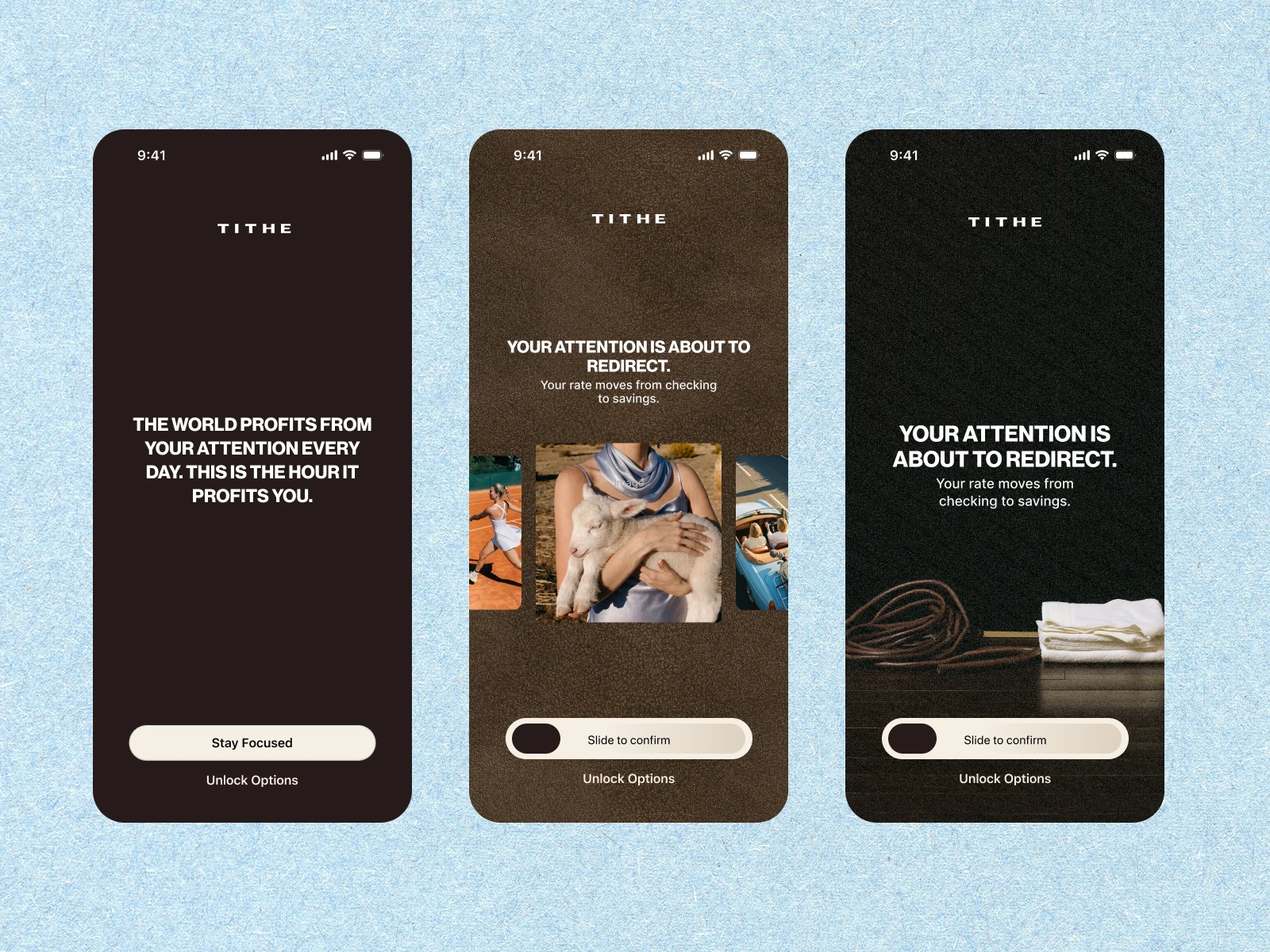
The shield meets every attempt to open a blocked app with a rotating editorial line: "The world profits from your attention every day. This is the hour it profits you." One quote per session, never per tap, so the words keep their weight.
The confirmation names exactly what is about to happen, then asks for a slide-to-confirm: a deliberate physical gesture, weighted like a signature, because this is also the moment of financial informed consent.
The consequence screen resolves into one oversized fact: "It moved."
The asymmetry is the design system in miniature. Starting a session is one tap, zero friction. Leaving one is deliberate, physical, informed. Easy to begin, ceremonial to break.
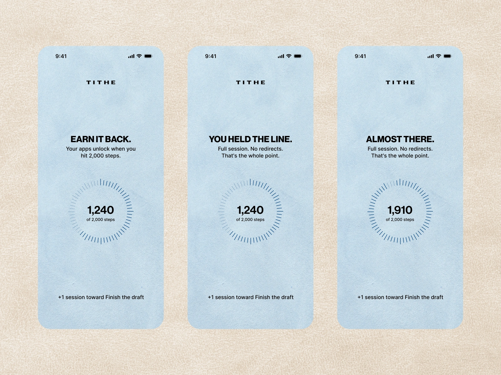
And the win state got equal billing. When a session completes untouched, the screen says: "You held the line. Full session. No redirects. That's the whole point." No confetti, no badge, no streak flame. A sentence that talks to the user like an adult. In a category built on dopamine mechanics, restraint is the differentiator.
A grammar of light and dark
The app changes register when consequences fire. Daily surfaces (dashboard, schedule, clarity) are light, editorial, lifestyle-led. The moment money is about to move, everything shifts to deep espresso: the shield, the redirect confirmation, the hard paywall all share the same dark ground. The user is never told this rule. They learn it by feel: when the room goes dark, something real is happening.
Setup
Setup
The system, screen by screen
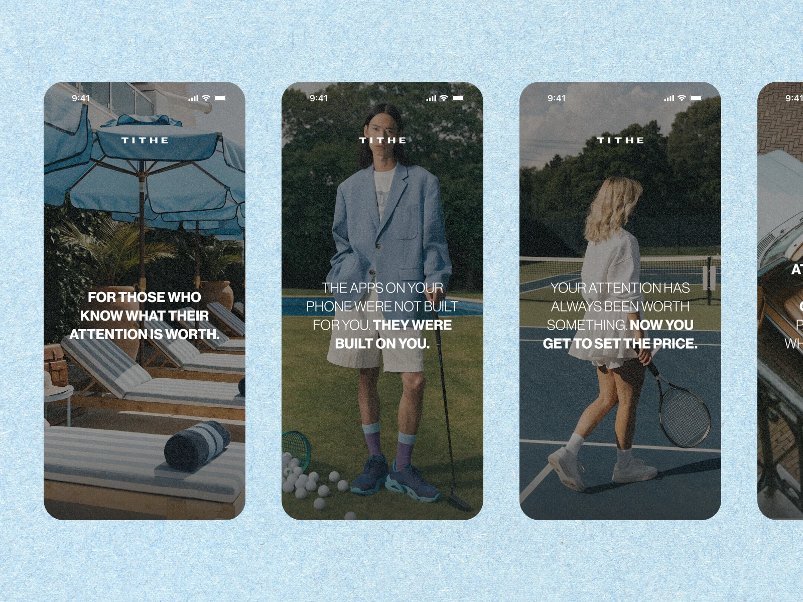
Onboarding opens with a five-screen induction. No forms, no CTAs, no progress bar. Full-bleed editorial photography, typography as interface, one declarative thought per screen: "The apps on your phone were not built for you. They were built on you." The user who taps through all five has self-selected. Configuration only begins after the worldview lands, and accounts and permissions are deferred to first session so nothing interrupts the story before the product has proven anything.
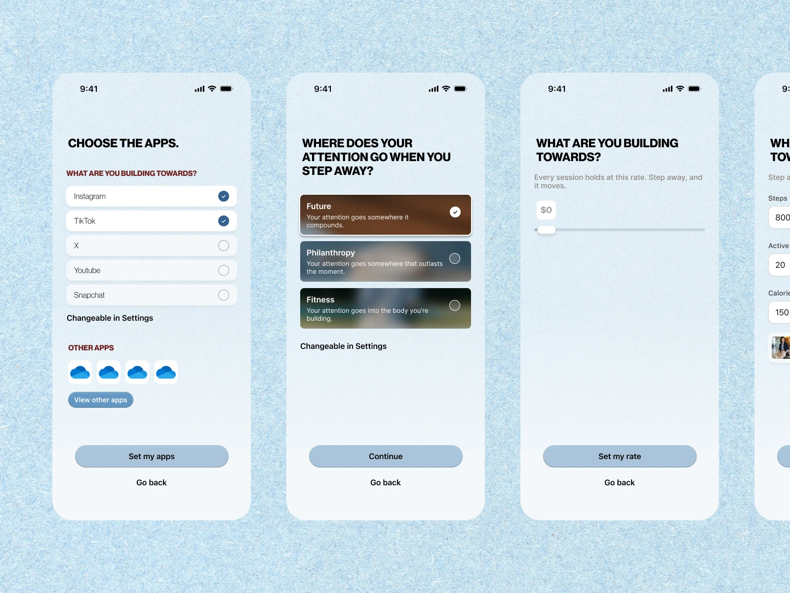
The fork. One screen presents three equal paths: Future, Philanthropy, Fitness. No pre-selection, because the choice has downstream consequences (Plaid, Every.org, HealthKit) and making it actively is part of the commitment. Each sublabel is a statement the user makes about themselves, not a feature description.
Paywall
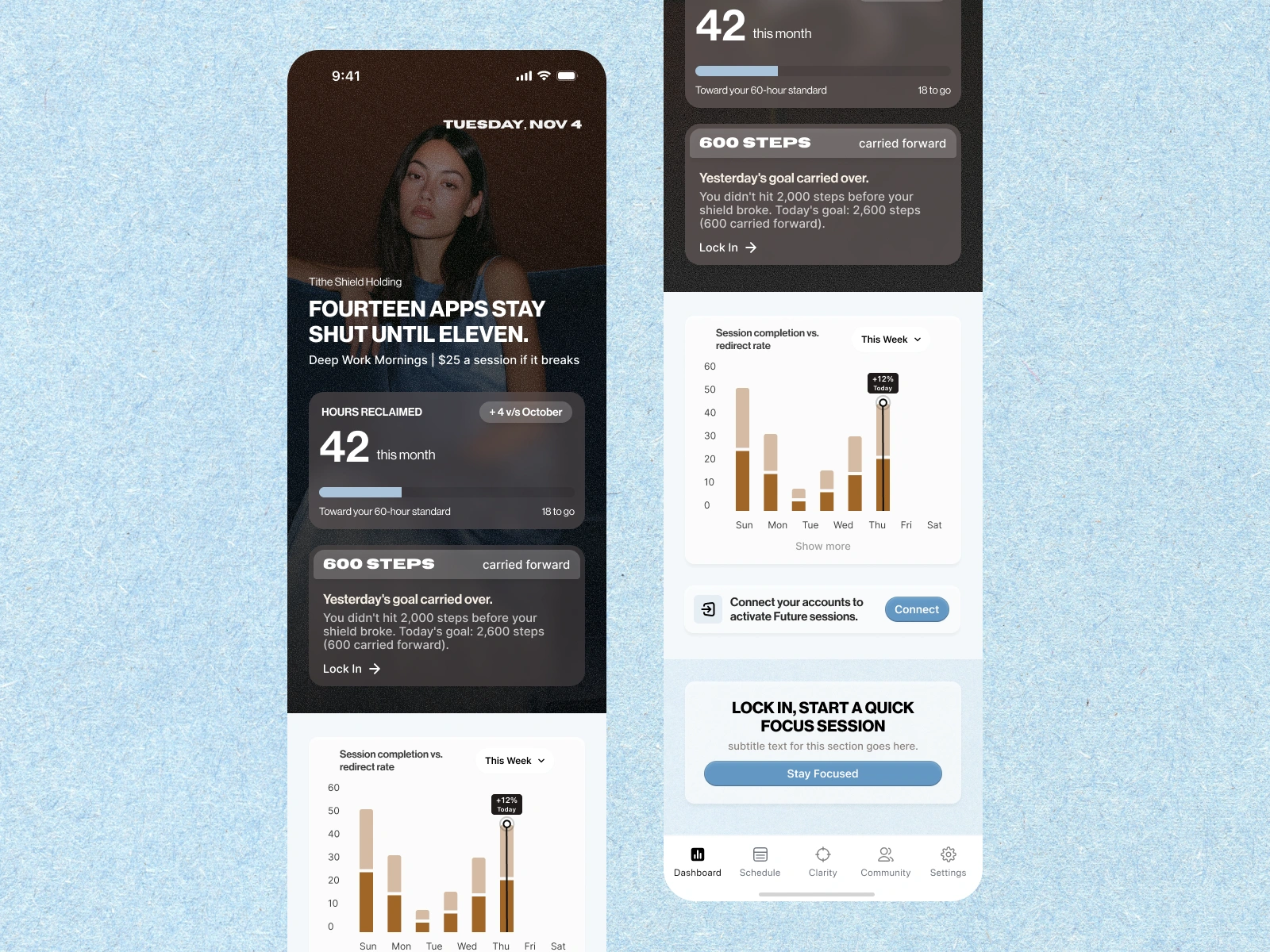
The dashboard leads with the stake, then the reward. A two-thirds full-bleed hero carries the session state in plain language: "Fourteen apps stay shut until eleven. $25 a session if it breaks." Below it, the number that matters: cumulative hours reclaimed, tracked against the user's own standard, with session start one tap away. The reward surface is a number that quietly grew while you lived your life.
Clarity is the self-knowledge layer. An attention audit built on blunt questions, goals that attribute real sessions to what you are actually building, and behavioral patterns that observe without coaching. The app notices. It does not advise.
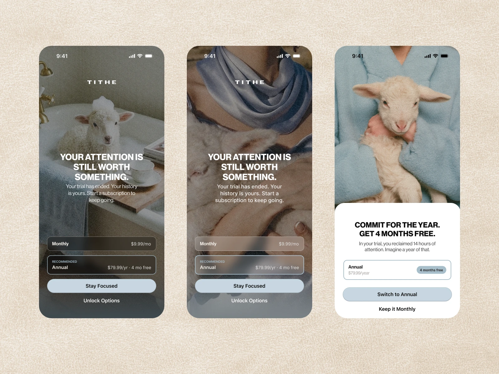
The paywall does not apologize. Trial ends, and the screen says: "Your attention is still worth something." Both plans, history preserved, no confirmshaming. Pricing as self-selection: the product is for people willing to attach stakes to their attention.
Designed inside real constraints
Apple's ShieldConfigurationDataSource allows almost no customization: no animations, no layouts, no blur. The shield had to carry the brand through an icon, a quote label, and two buttons, so every one of those elements works harder. The fitness path polls HealthKit live and unlocks automatically at threshold, which made its progress ring the most technically demanding screen in the file. Financial copy never implies instant settlement, because ACH does not settle instantly, and the confirmation reserves the legally required authorization language as a system-level template every path inherits.
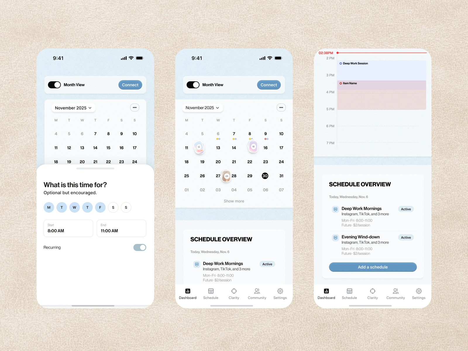
Calendar
The imagery
One photographic register across the app: 90s editorial, direct flash, film grain. Warmth comes from material (suede, cashmere, burl wood) and never from light temperature. No golden hour, no laptops, no journals, no stock, and no phones visible anywhere in an app about phones. The lamb, the brand's oldest etymology, is shot studio-register: held, not performing.
Outcome
Kickoff to handoff-ready Figma in six weeks, through three structured review rounds. The spine of the work (exit-as-hero, the light/dark grammar, no gamification) survived every round without needing to be defended, because it was argued from the product's own thesis rather than taste. Tithe is now in development against the file: every state mapped, every screen specced, with a visual system the founder can extend without us.
When your product's differentiator is a philosophy, the interface is where that philosophy either becomes real or becomes copy. Tithe's exits had value. We designed the exit like it mattered.
Like this project
What the client had to say
Daniel was a pleasure to work with! He was incredibly collaborative throughout the process, and was always receptive to feedback and new ideas. He brought a thoughtful approach and helped us make meaningful improvements to our project.


Ireland McGill, Tithe
Aug 7, 2026, Client
Posted Aug 14, 2026
The focus app where every exit has value: 35 screens, three consequence paths, and a design system that treats attention like currency.
Likes
26
Views
586
Earned
$10K+
Timeline
Jul 1, 2026 - Aug 7, 2026
Clients
Tithe