INKFLESH — the logo is the empty avatar

Daniel G Bright


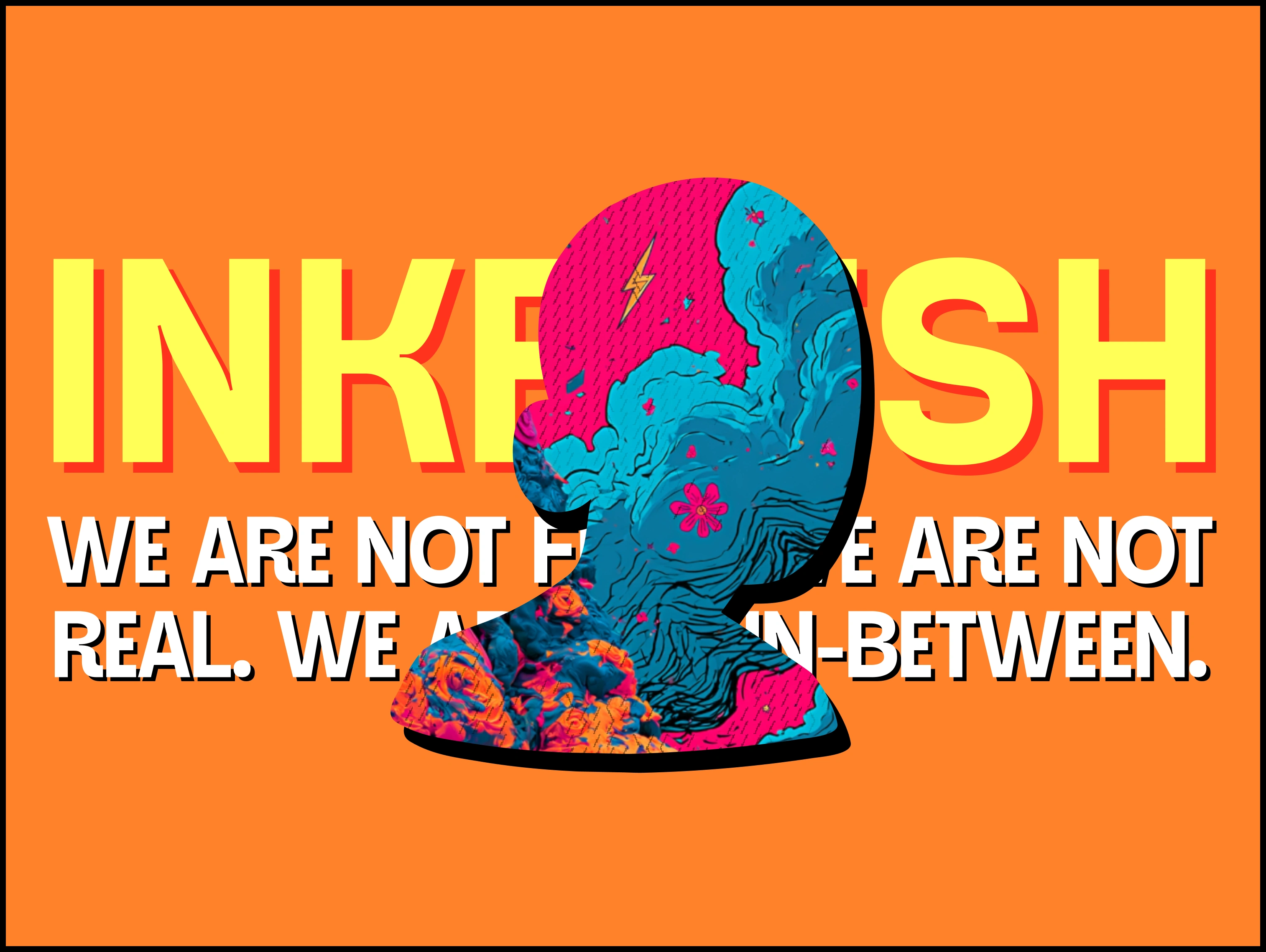
INKFLESH is an energy drink built on characters. Puppet-bodied figures in knitted coats, sat on couches in front of dead TVs, screaming into hot pink weather.
Walk the energy aisle and it's chrome, claw marks, lightning bolts and shouting. Everyone is selling the same aggression at the same volume, which means the whole category cancels itself out in a cooler. A character world is a way out of that, but it comes with its own problem.
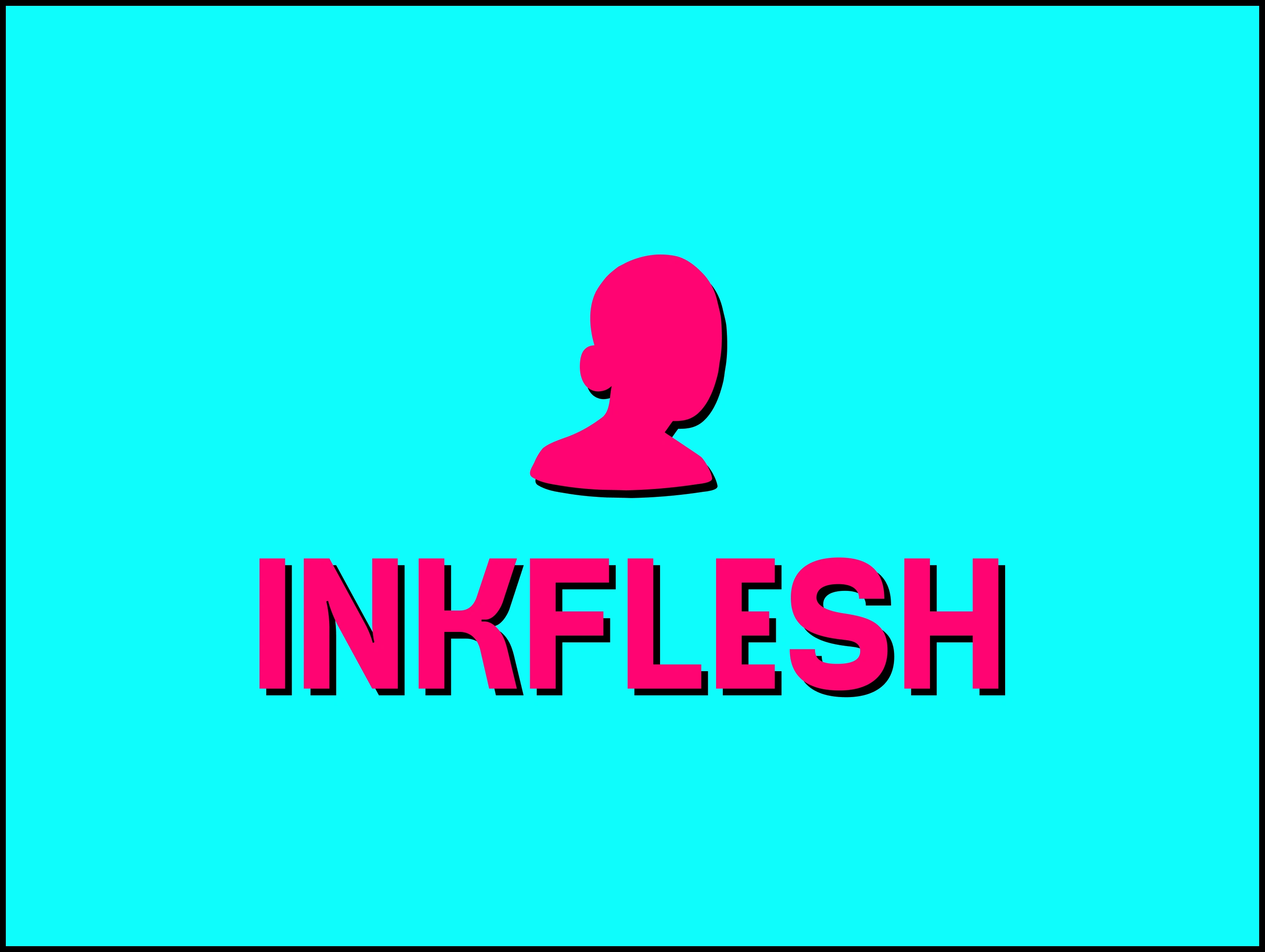
Logo
Character brands break in a predictable place. The character carries everything, so the moment you need to show up somewhere it doesn't fit, the brand disappears. A one inch woven label. A favicon. An app icon. Every one of those kills a detailed illustrated face. And with a drink you have a second problem stacked on top: flavours. Every new SKU wants its own character, and if the character is the brand, then every flavour is a different brand.
So the question was never what the characters look like. It was what holds the range together when the characters keep changing.
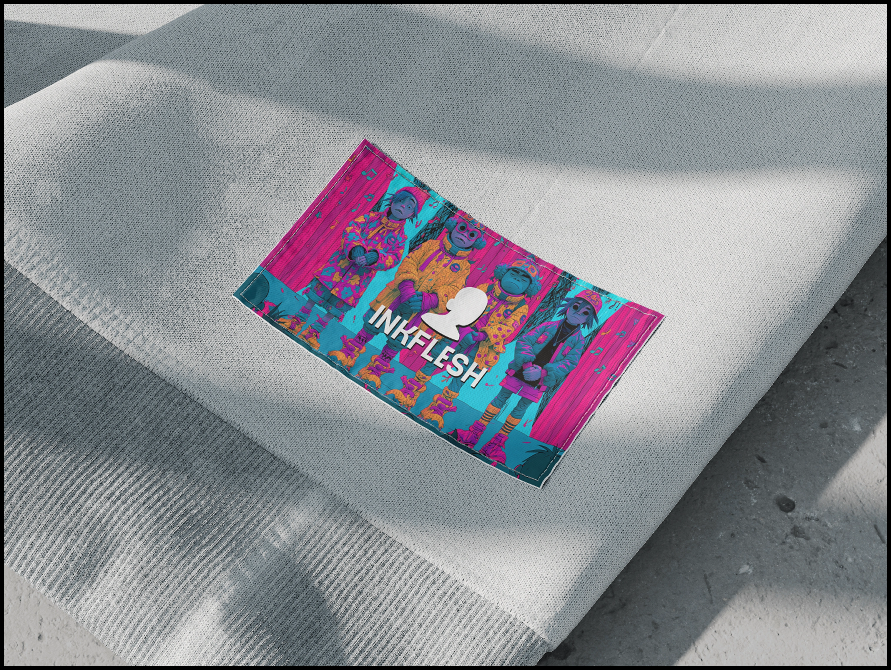
Shirt Print
What I landed on was the default avatar. The grey placeholder bust you get when you haven't uploaded a profile picture.
It's the most looked at and least owned shape on the internet, and for a world built on things that aren't human and aren't real, an identity that hasn't been filled in yet says the whole thing without a line of copy. It also survived the size test, which is what killed the alternatives. That silhouette reads at any scale, knocked out, filled with artwork, or flat in one colour, and it doesn't fight the illustration behind it.
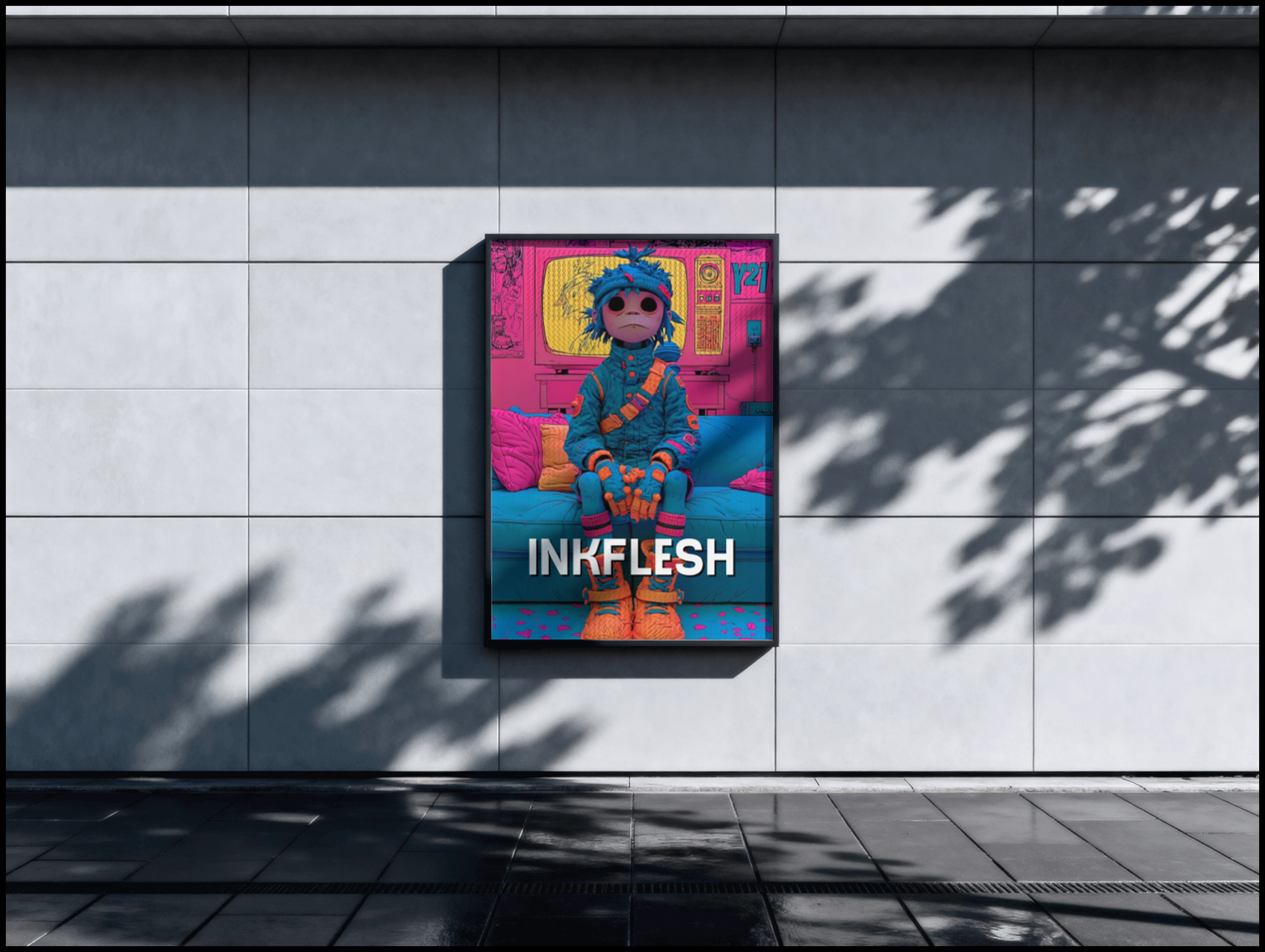
Banner Design
From there the system holds on colour rather than character. Hot pink, cyan, orange, black keyline, fixed. Any new figure, any new flavour, any illustrator brought in later can enter the world and still read as INKFLESH across a shop floor. The characters are content. The palette and the mark are the constant.
That gives the range room to be collectible instead of chaotic. Change the character per flavour, keep the silhouette and the colour, and the cans read as a set on a shelf rather than six unrelated designs fighting each other.
The mark ended up with three jobs. Filled with artwork it's a window into the world, which is how the posters work. Flat and solid it's a stamp for the can and secondary packaging. Cyan on black it's an app icon that can sit next to Safari and hold its own.
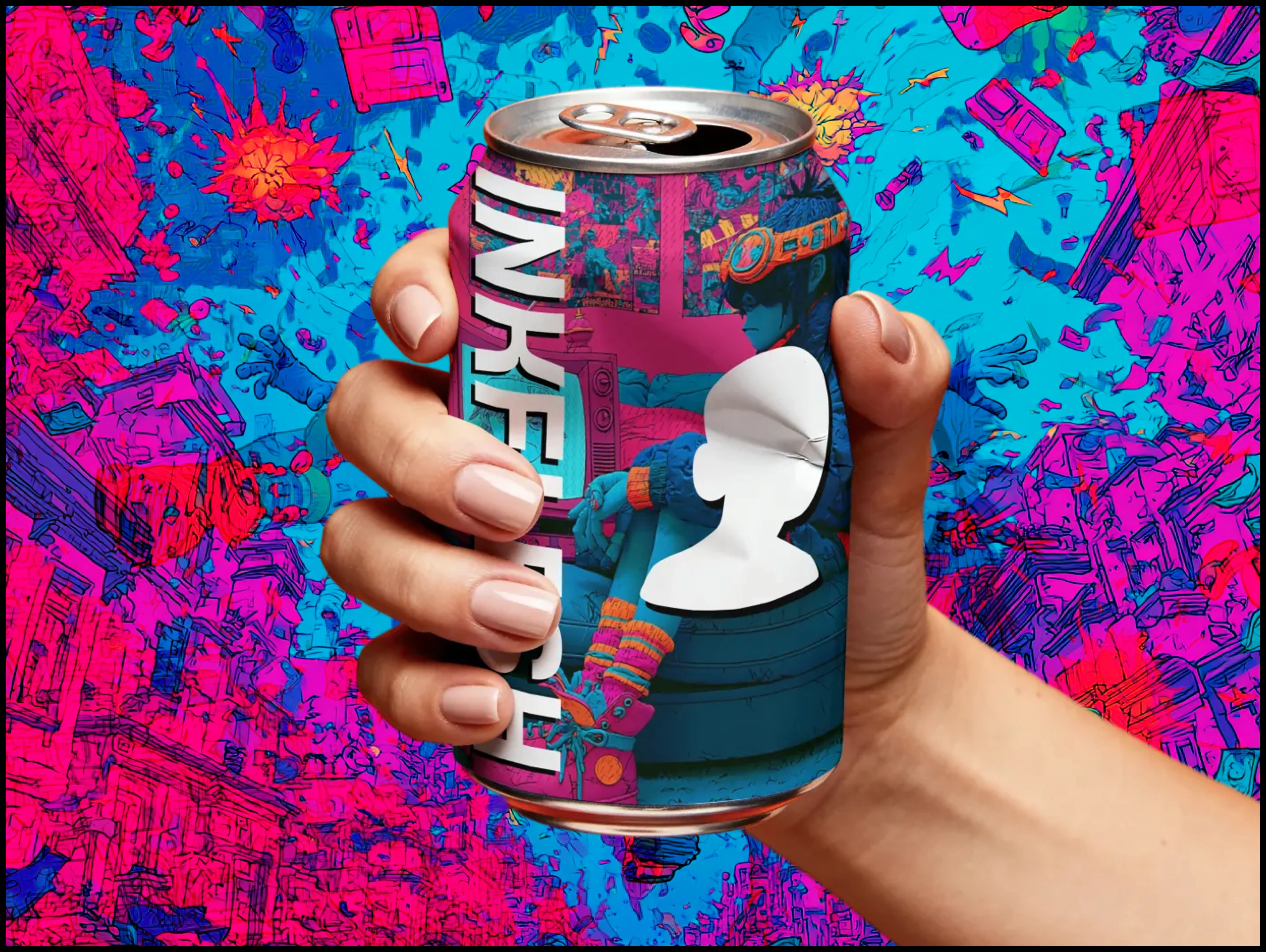
Can Design
The wordmark gets treated as a crop rather than a lockup. It runs off the curve of the can, gets blocked by the head on the poster, drops letters entirely. That only works if the mark completes the word in your head, and testing whether it did was most of the work.
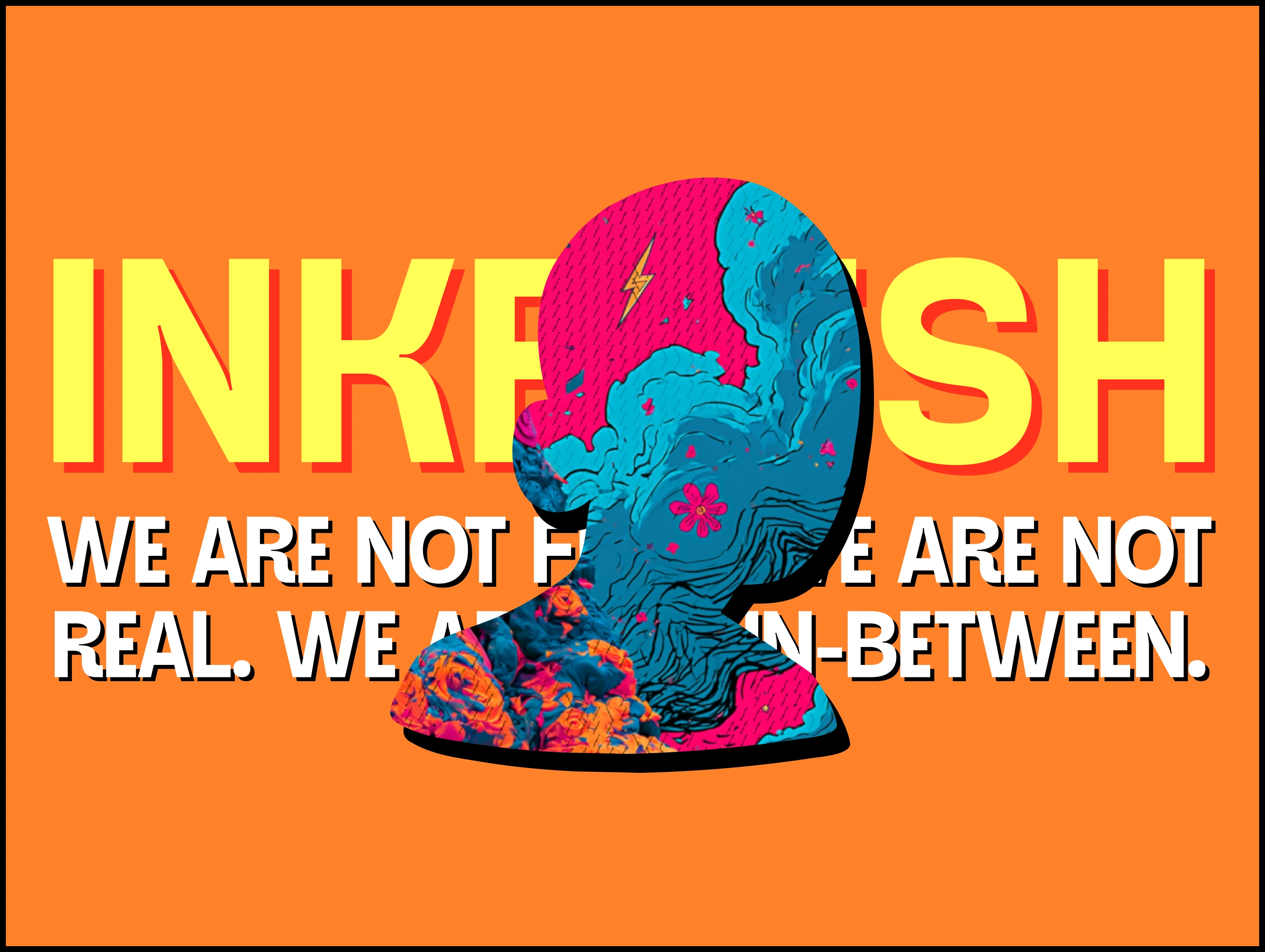
Brand Statement
Then I put it on the surfaces most likely to expose it. The can first, because curved print is unforgiving and half the artwork is hidden in a hand. A framed poster in daylight, because the palette had to survive outside a screen. A woven label, because thread has no gradients. An app icon, because 16 pixels is the real test. Same shape, same palette, no special cases on any of them.
A character brand that depends on the character is a mascot. One that still works when you take the character away is a range.
Like this project
Posted Jul 27, 2026
Brand identity for a character-led energy drink. The default profile silhouette as the mark, a fixed neon palette holding the range together.