BEM — An identity sampled from the paperwork it replaces

Daniel G Bright
Verified


April: hired to make templates
This started as a template request. Bem, the production layer for unstructured data, was days from a content push across blog, LinkedIn, newsletters, and ads, and the design brief was blunt: build reusable Figma templates so anyone on the team can drop in copy and ship without waiting on design.
The foundations existed. Branding&Co had shipped identity v1.0: dark-first canvas, Brand Blue and Accent Blue, coral and pink used sparingly. Deanna Dong had locked the messaging framework, including the line the whole company hangs on: AI is inherently probabilistic, but business-critical workflows have deterministic outcomes. My job was to make all of it producible.
The templates exposed the gaps
A brand guide answers taste questions. Templates ask production questions. Four LinkedIn card variants, OG cards, carousels, and ads for three platforms forced decisions the guide didn't cover: accent colors for new content categories, code snippet styling, metric cards built to carry lines like "1.2M invoices per month, one API." And one buried line in the brief quietly redirected the whole system: "would love a light-theme alternate," because LinkedIn reads light. That request became the cream canvas that now defines the brand's daylight surfaces.
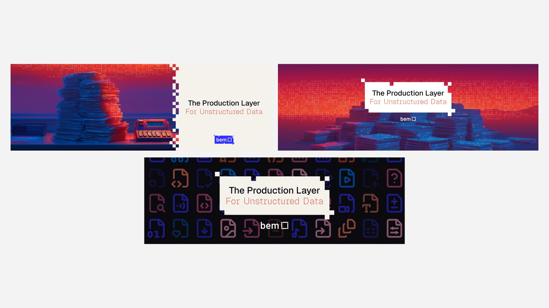
LinkedIn cover directions, light and dark
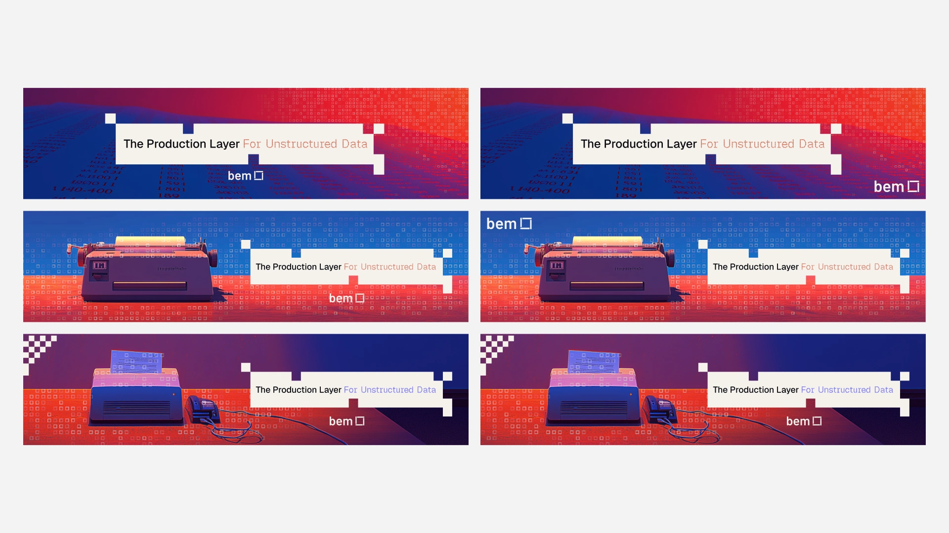
Banner system with the pixel-stepped card lockup across placements
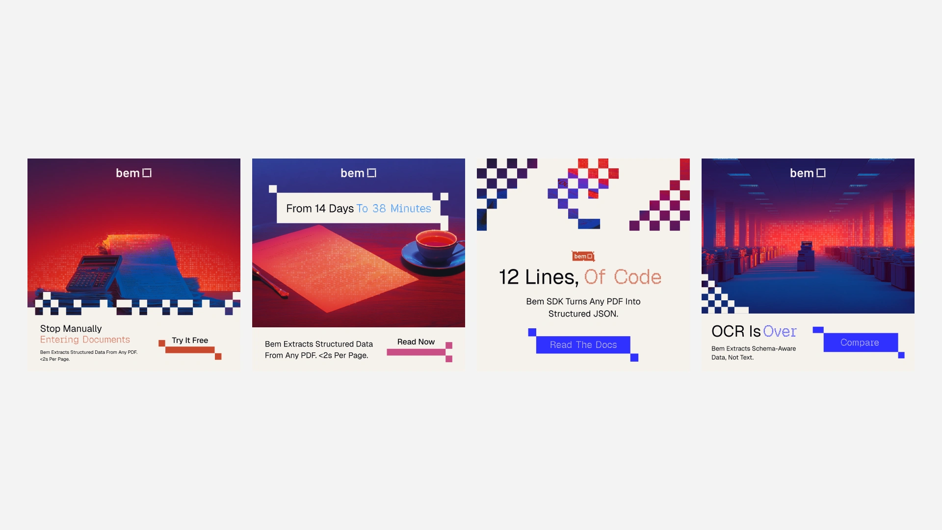
Ad templates: pain-point, proof, docs, and comparison variants
The bigger gap was imagery. A content engine needs dozens of images that hold together as one batch. So I built Document Mode: vintage back-office paperwork, 1970s insurance claims, beige filing archives, whole mountains of crumpled forms, shot like editorial documentary photography, Severance retrofuturism at Gursky scale, generated in Midjourney through a locked prompt library. Source images stay neutral. The red/blue duotone and the pixel sample-shed dissolve get applied in Figma, so every image inherits the same treatment. Underneath it all sits the organizing idea: the product is a sampling operation, continuous human mess in, discrete structured units out. Discretization became the rule for everything decorative. If a pixel cluster can't be explained by that idea, it doesn't ship.
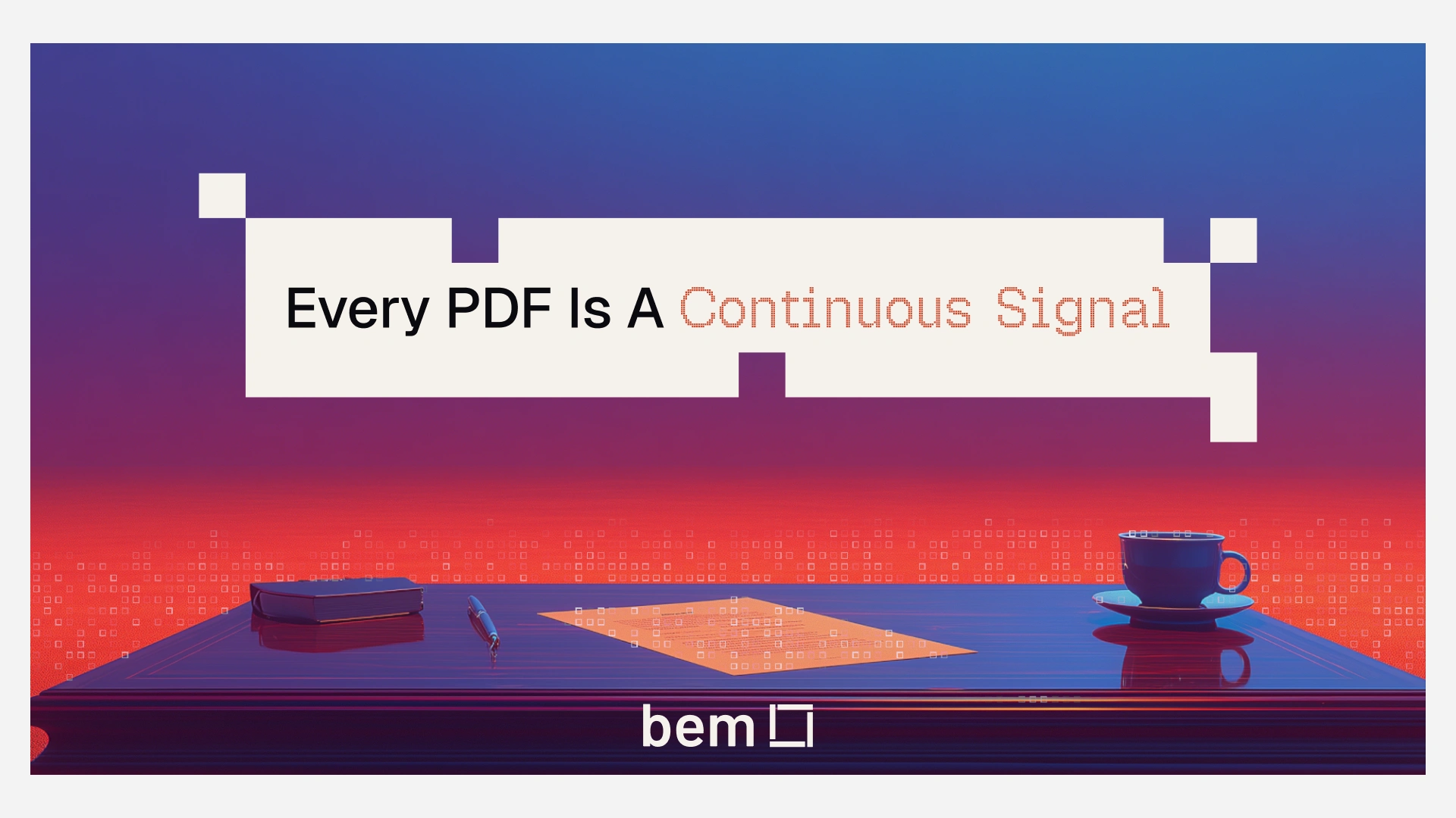
Every PDF Is A Continuous Signal — the thesis poster
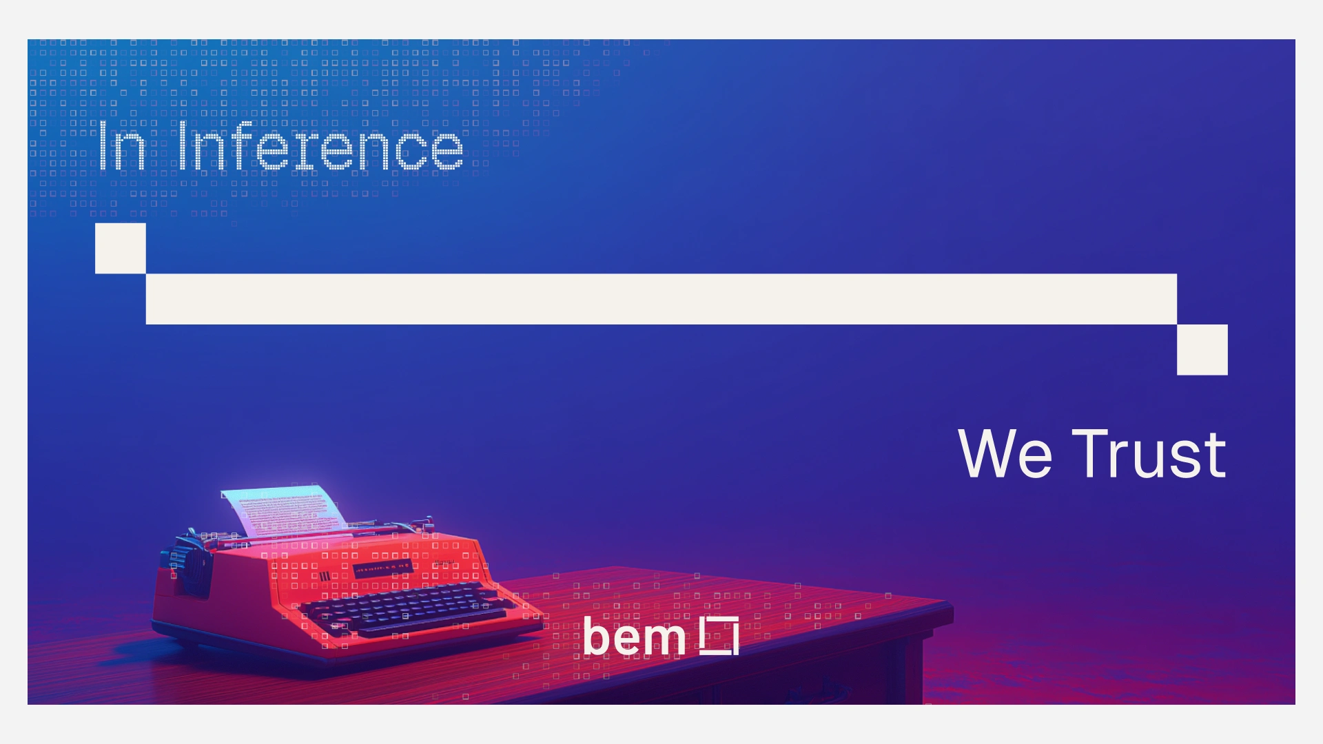
In Inference We Trust — campaign key visual
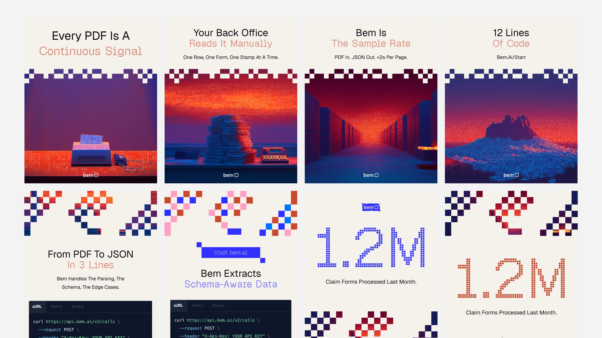
The social system in rotation: posters, code cards, pixel numerals
The same kit covers events, launches, and customer proof, with placeholder fields the team fills without touching layout:
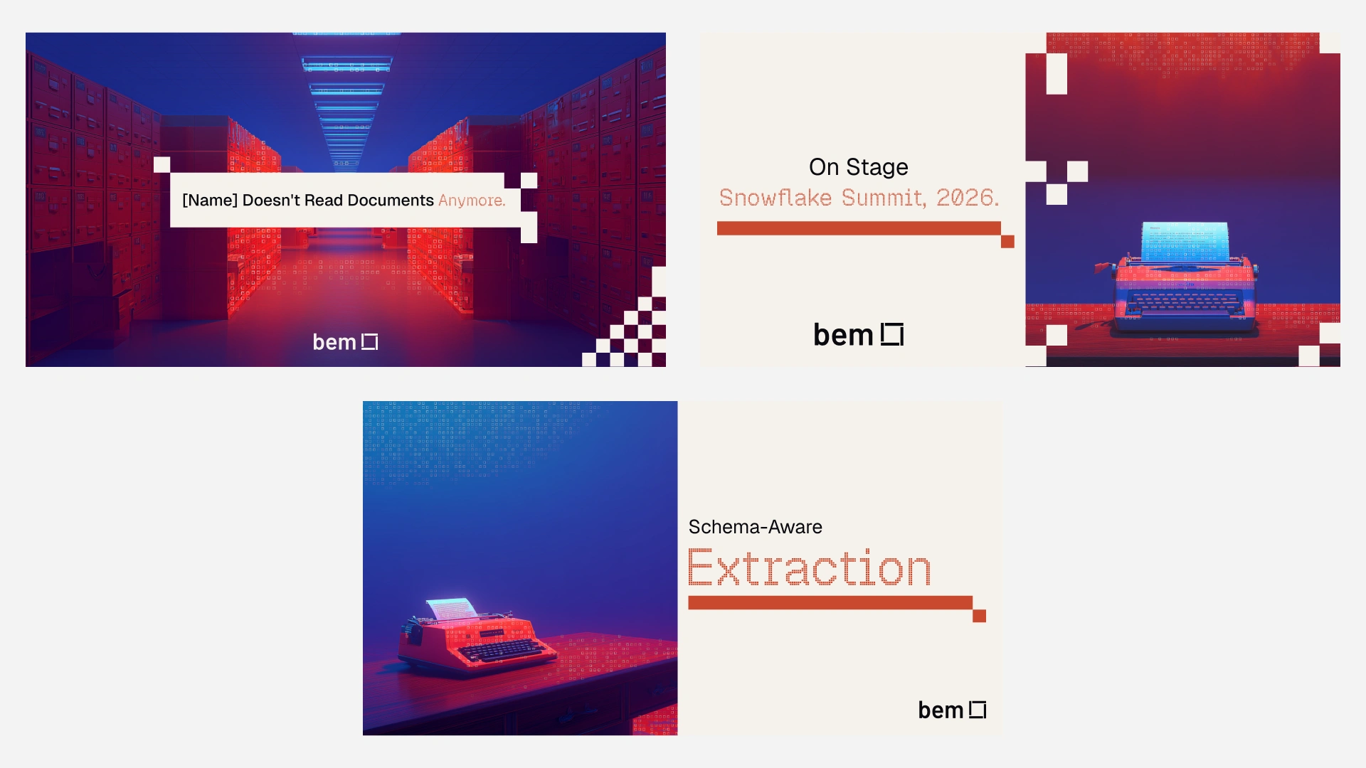
Event, launch, and campaign templates
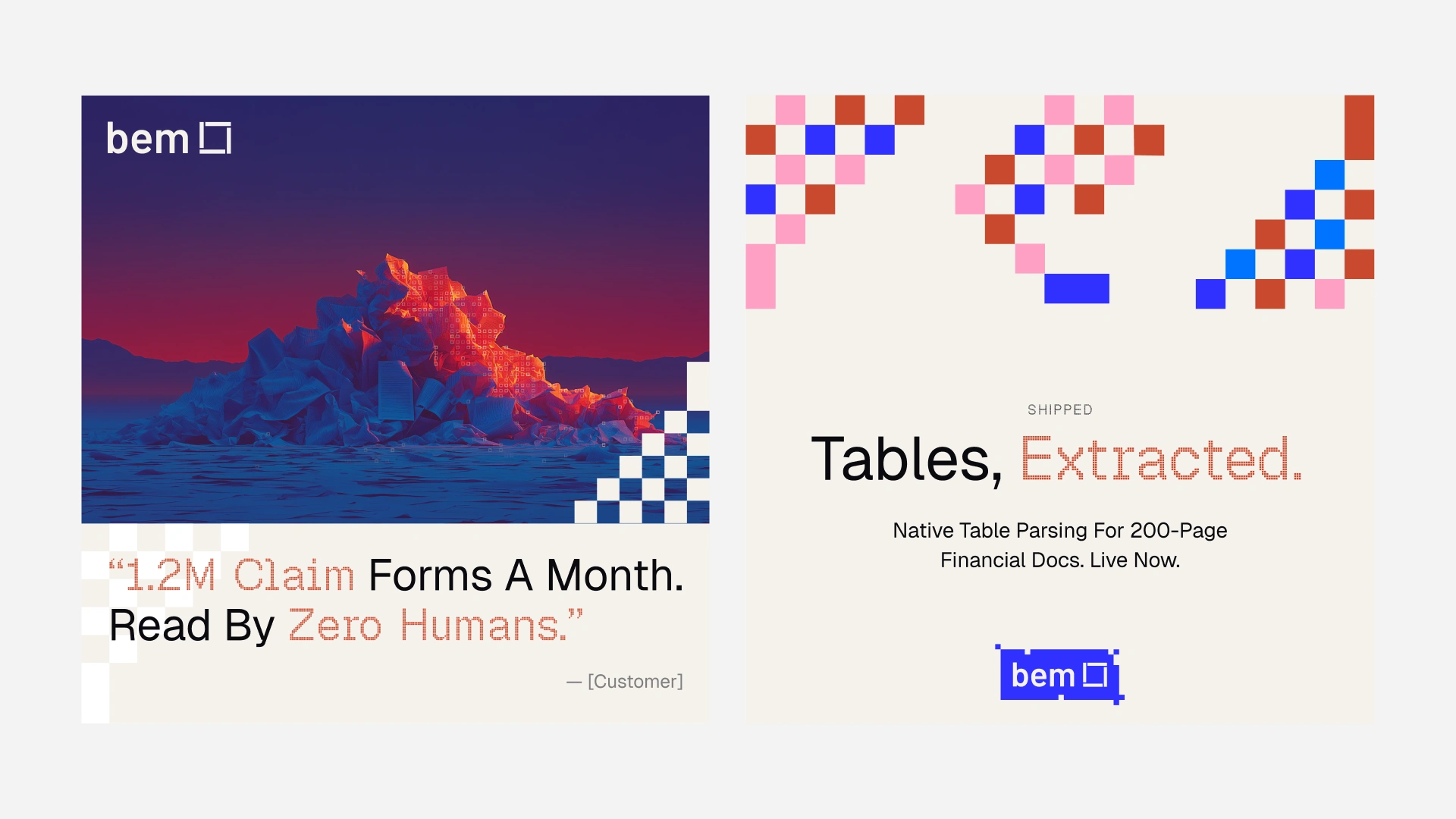
Customer quote and product launch cards
May: writing the system down
Once assets multiplied, I wrote brand guidelines v1.0, roughly 50 slides, with a things-to-avoid page that does the real governance work. Don't fill the canvas edge to edge. Don't center by default. Don't round corners into consumer UI. Don't add decoration the discretization idea can't explain. Color got assigned jobs instead of moods. Type settled into three registers: Geist for prose, Geist Mono for the technical layer, a pixel display face for headlines. And bem is always lowercase.
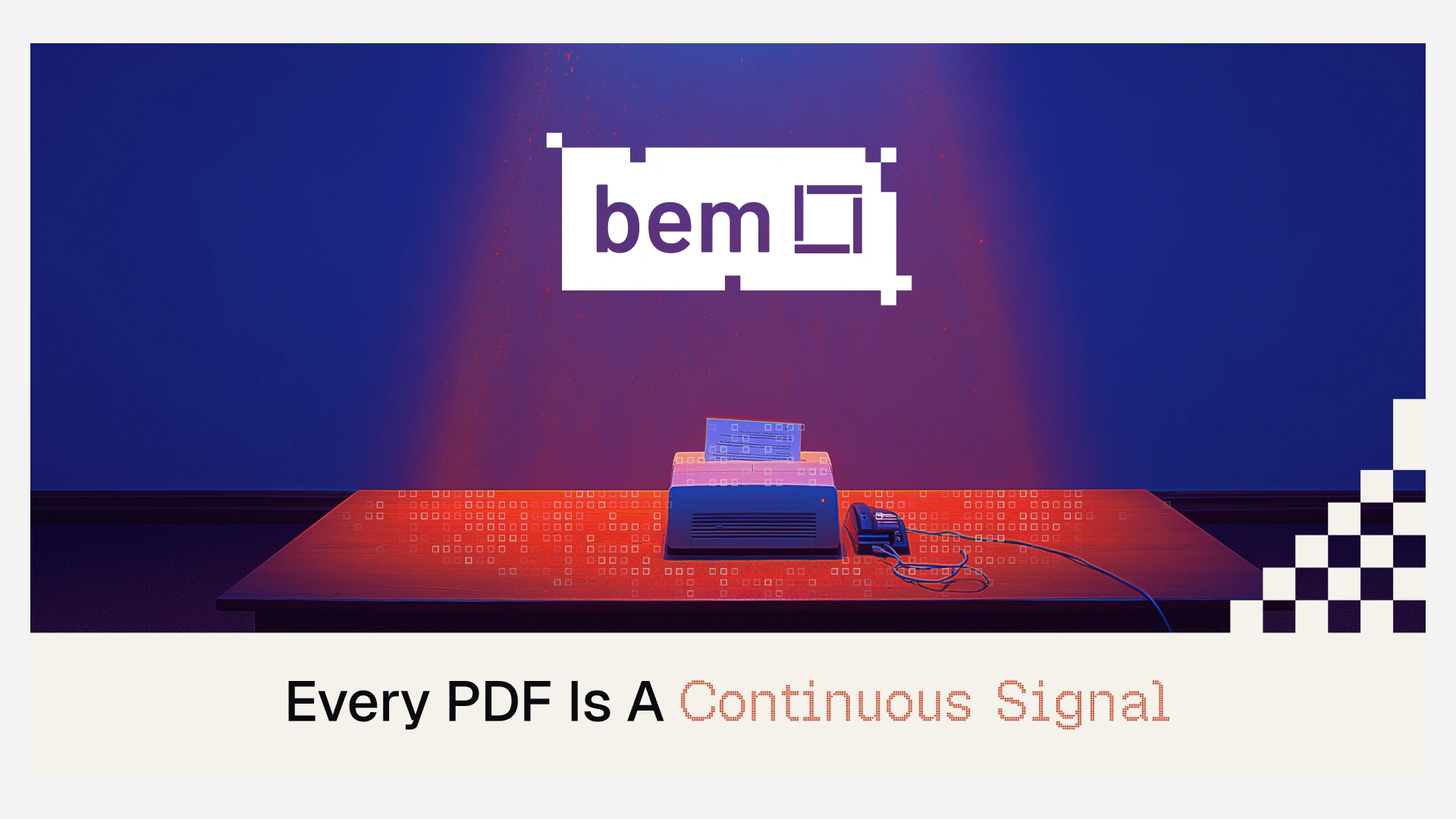
Logo held to the light: pixel-glitched lockup over Document Mode imagery
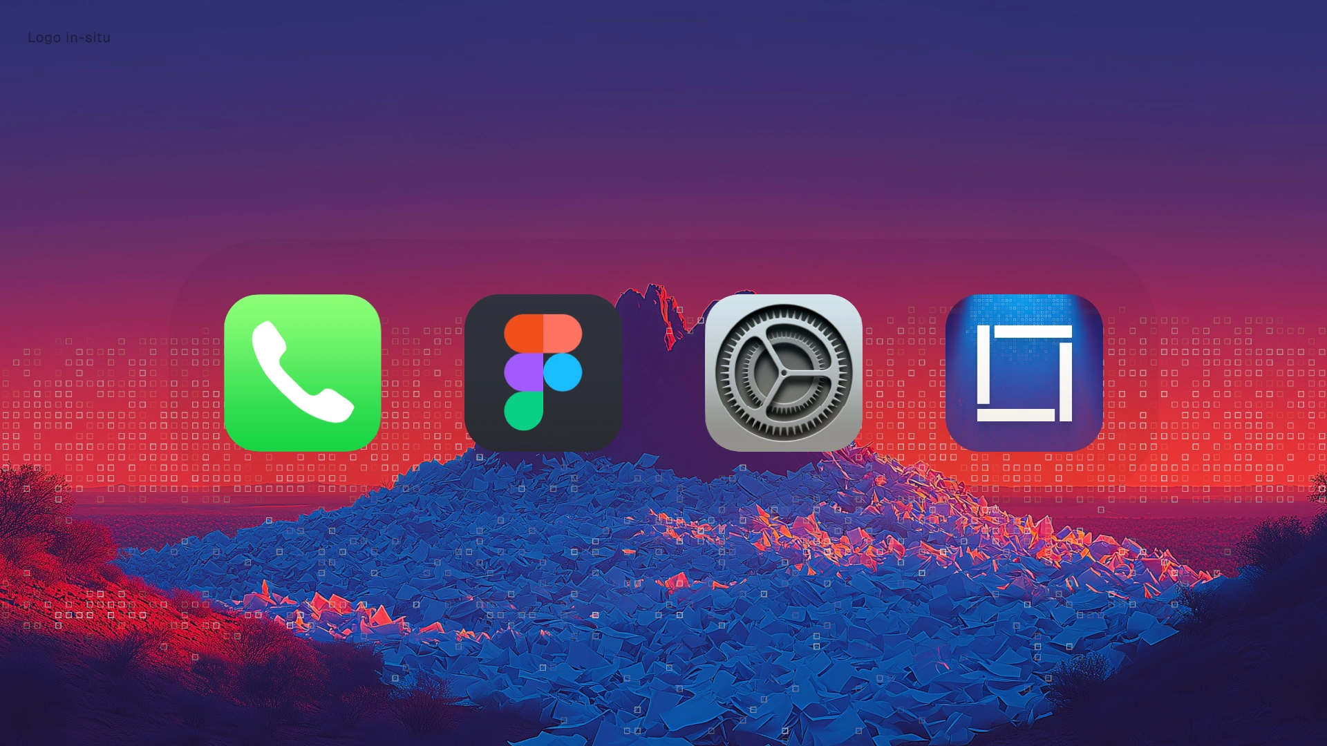
Logo in-situ, holding up at app-icon scale
There was an unusual second reader for those guidelines: a machine. Antonio, Bem's CEO, runs an automated marketing agent that assembles weekly campaign graphics. It had been regenerating copy over exported PNGs and butchering the type in the process. So we set the endgame together: pixel-perfect HTML templates the agent can fill, so the system holds even when no designer is in the room. A brand guide a machine can follow is just governance taken seriously.
June: the real problem surfaces
Mid-June, Antonio brought the business problem. Site analytics showed qualified enterprise buyers visiting and leaving without converting. His read, which I think is exactly right: detail-oriented technical buyers interpret design inconsistency as organizational immaturity. Each surface was individually fine and collectively wrong, because the company was growing and fundraising faster than implementation could keep up. He asked me to stop thinking deliverable-by-deliverable and tell him what the brand was missing.
Two days later I delivered a full audit of bem.ai. The finding: the site looked like every AI company at exactly the moment the product's argument was the opposite of the category. The market was selling "agentic." Bem sells deterministic guardrails: typed schemas, confidence scores, audit trails, replayable outputs. And that differentiator was buried mid-page. I proposed a new homepage structure with the determinism argument second, the six functions presented as one system, proof up close, and a single fork for the two buyers.
July and August: the rebuild
Six hero concepts later, one direction locked: cream canvas, pixel display type, Document Mode imagery under a live ASCII shader that dithers image highlights into characters, charset locked to {}[]<>=:,"0123456789 so the dither literally reads as JSON.
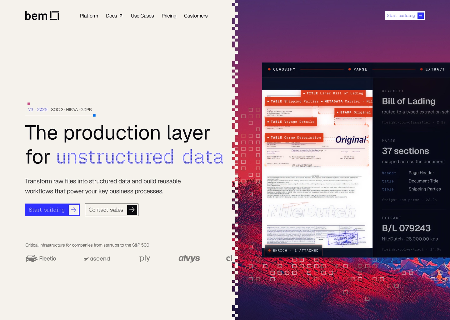
The locked hero direction
Then the full homepage on the new structure: a determinism section with a live metrics card showing precision, recall, F1, and a review threshold. A six-function pipeline worked on a real 47-page claims packet. A buyer fork color-coded blue and coral. Customer proof set in a stepped cream banner over brand imagery.
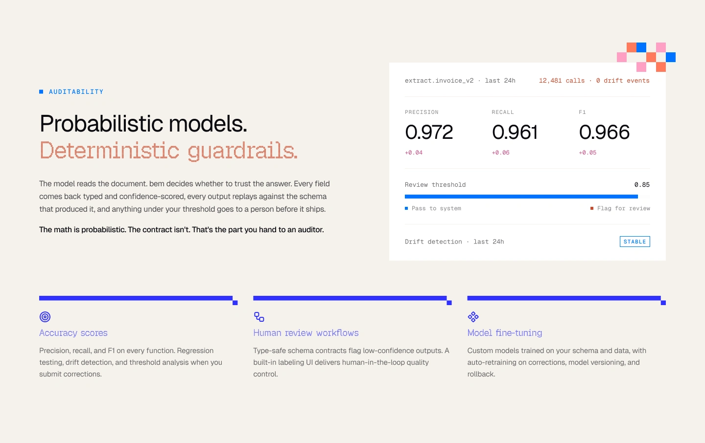
Determinism section with live metrics card
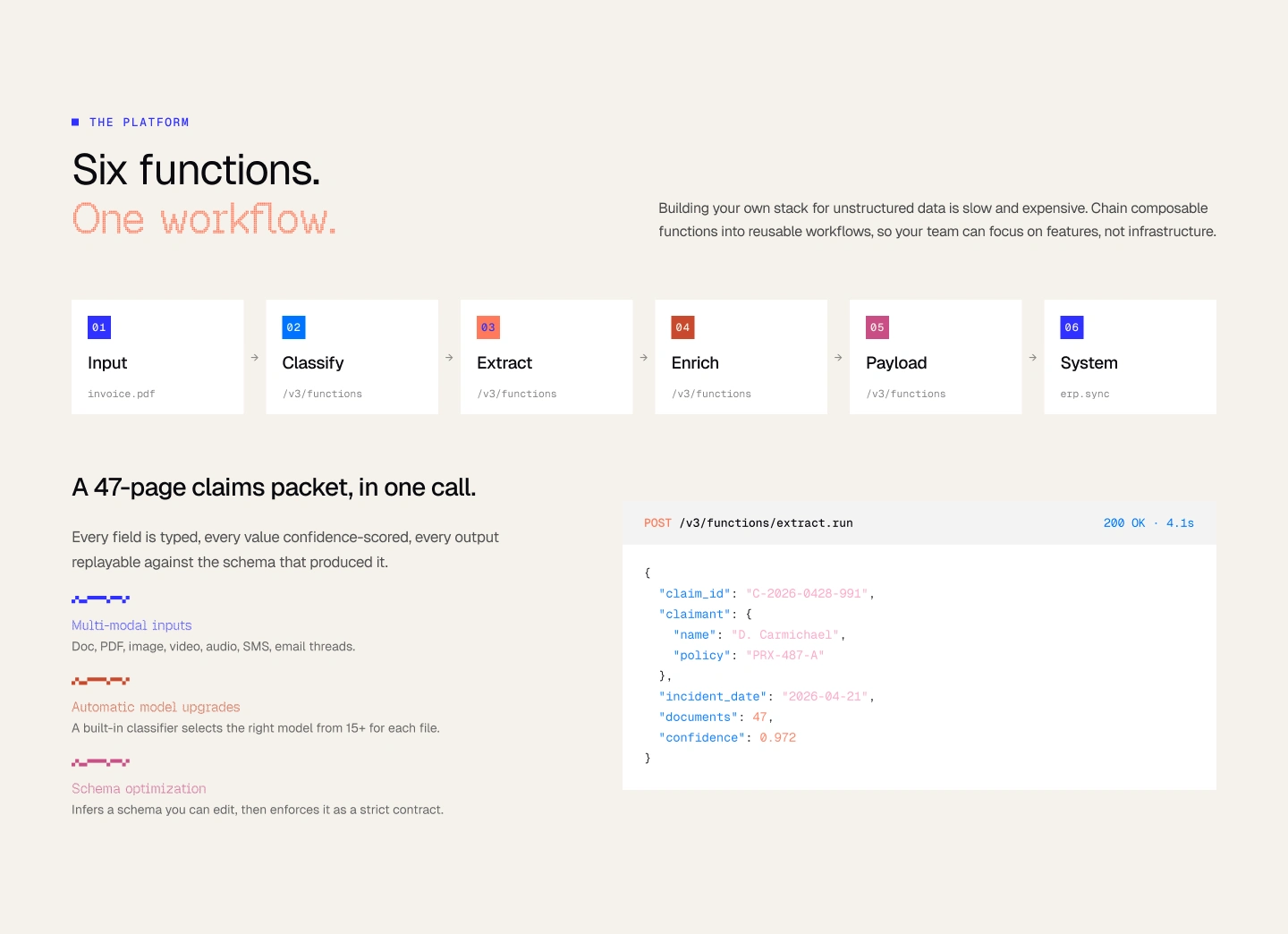
Six-function pipeline and syntax-colored extraction example
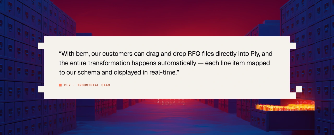
Customer proof in a stepped cream banner over Document Mode imagery
Where it stands
The content team ships without waiting on design, which was the original ask. The system runs across social, decks, one-pagers, merch (the "In Inference We Trust" hats survived contact with the whole team), and the rebuilt homepage. The next measure is the one that started the June conversation: whether enterprise drop-off improves once the new funnel ships.
The takeaway
Nobody buys a brand system because they want a brand system. Bem hired templates, and what fixed the templates was governance. When your buyer is technical and detail-oriented, consistency is evidence. Inconsistency is testimony against you.
Like this project
Posted Aug 14, 2026
Hired to build content templates. Ended up owning the brand system: Document Mode imagery, a governance layer, and a homepage rebuilt around the argument.
Likes
1
Views
97
Timeline
Apr 20, 2026 - Aug 17, 2026
Clients
bem