Built with Framer
Peak3 Website CMS Architecture
Daniel G Bright
$18K+ earned
The Setup
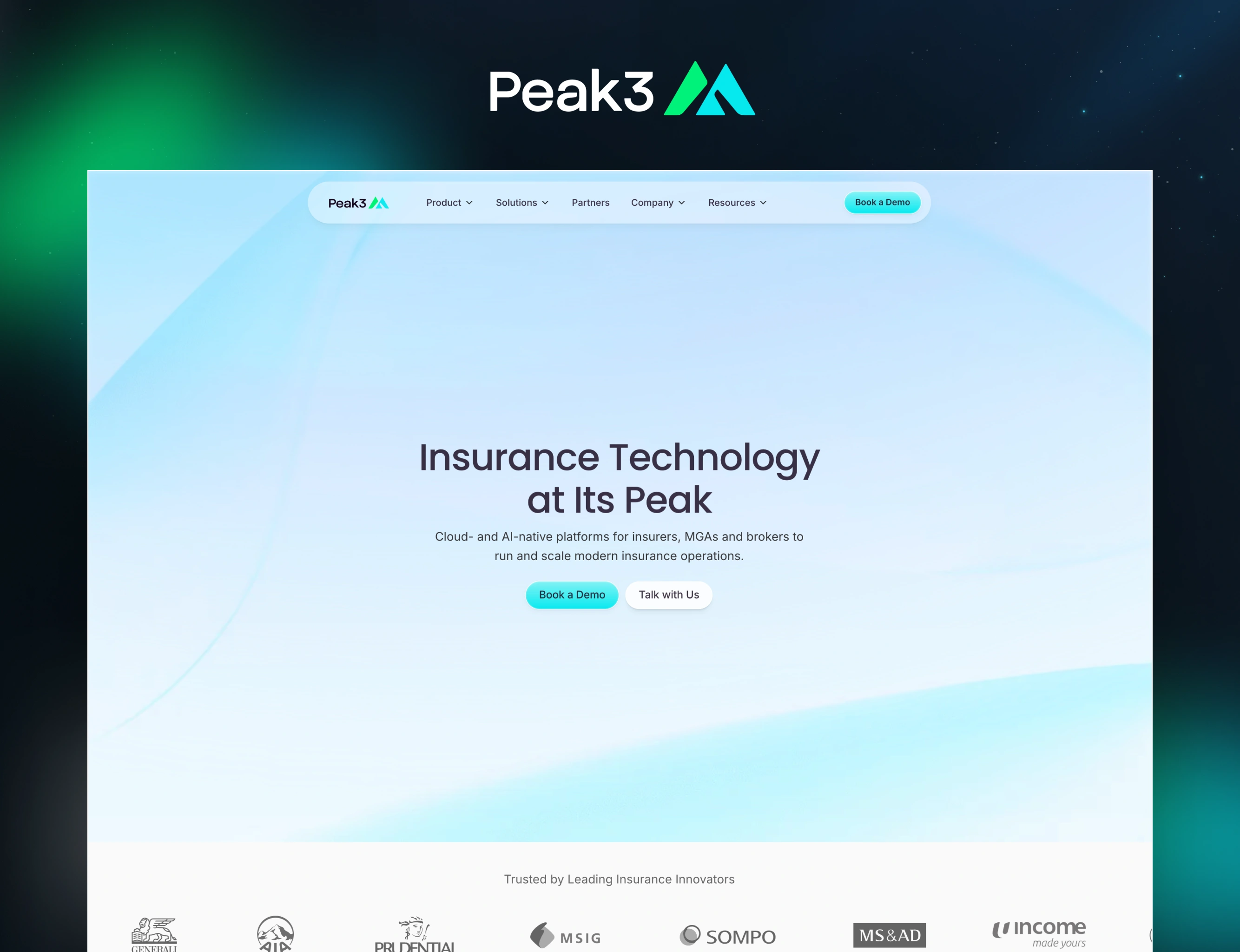
Peak3 powers over 2 billion insurance policies across 20+ countries for carriers like AIA, Generali, Prudential, and Zurich. Three enterprise products. Offices in Singapore and Dublin. 50+ partners. They'd just rebranded from ZA Tech, but the website still looked like the company they used to be.
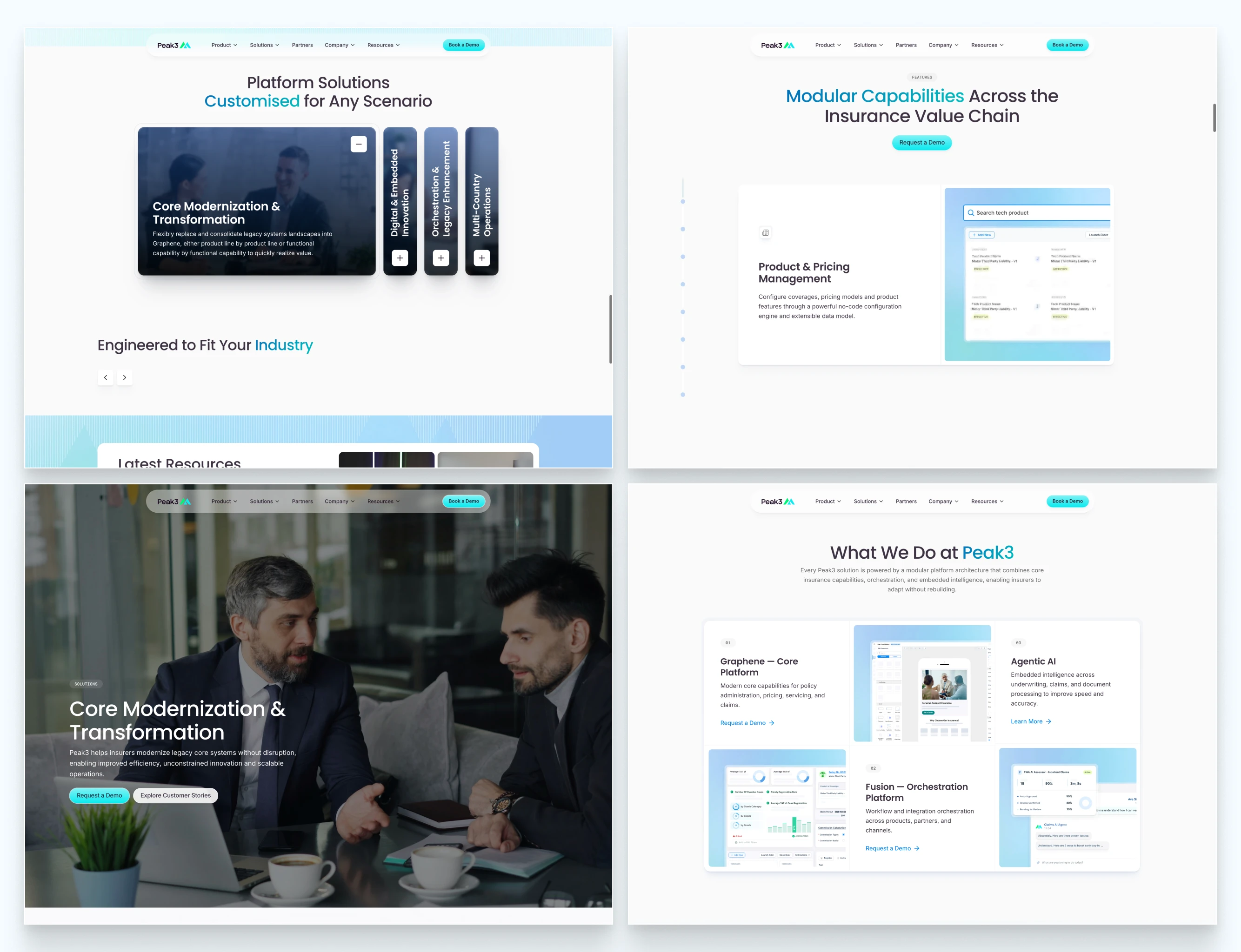
Bento's
The Tension
The product was credible. The surface wasn't.
Peak3 was selling trust infrastructure to billion-dollar insurance companies — buyers who Google you before the first call. What they found was a site that couldn't explain three distinct products clearly, buried proof points that should have been leading the conversation, and required a designer to change a single line of copy. Content lived in Docs and email attachments. The website was a brochure pretending to represent an enterprise platform.
Main Sections overview
The Decision
The obvious move was a visual redesign — refresh the look, ship it, move on. I went a different direction.
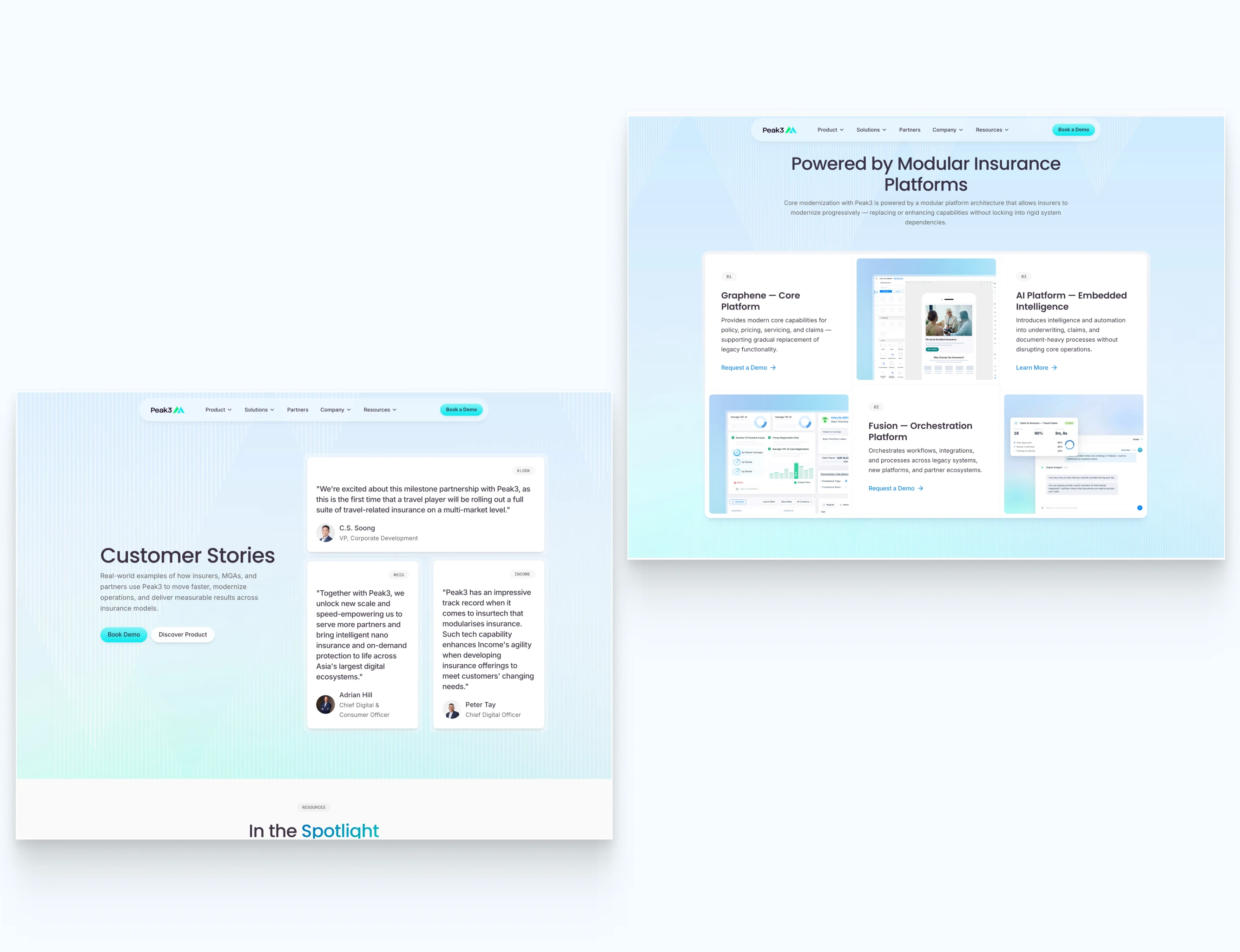
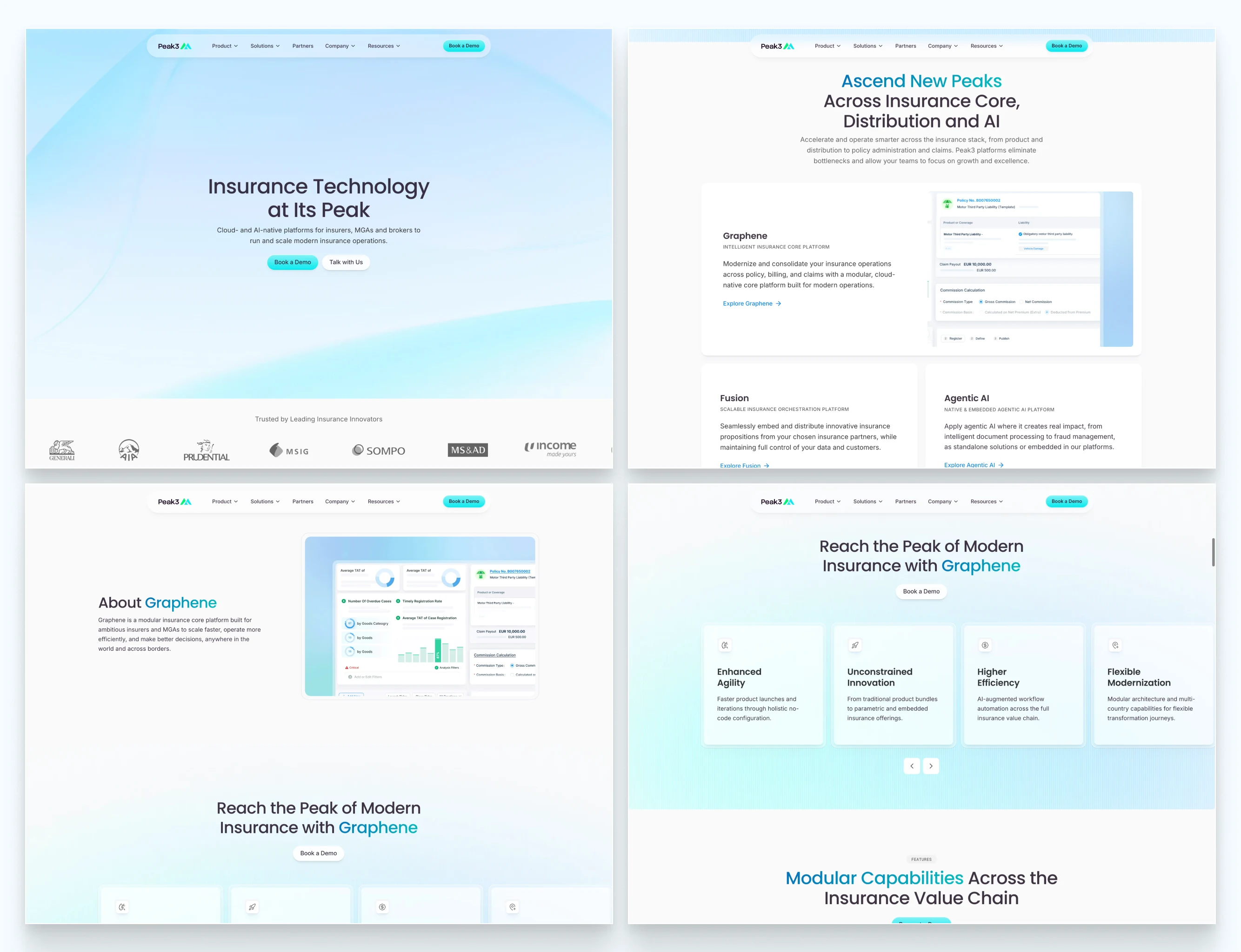
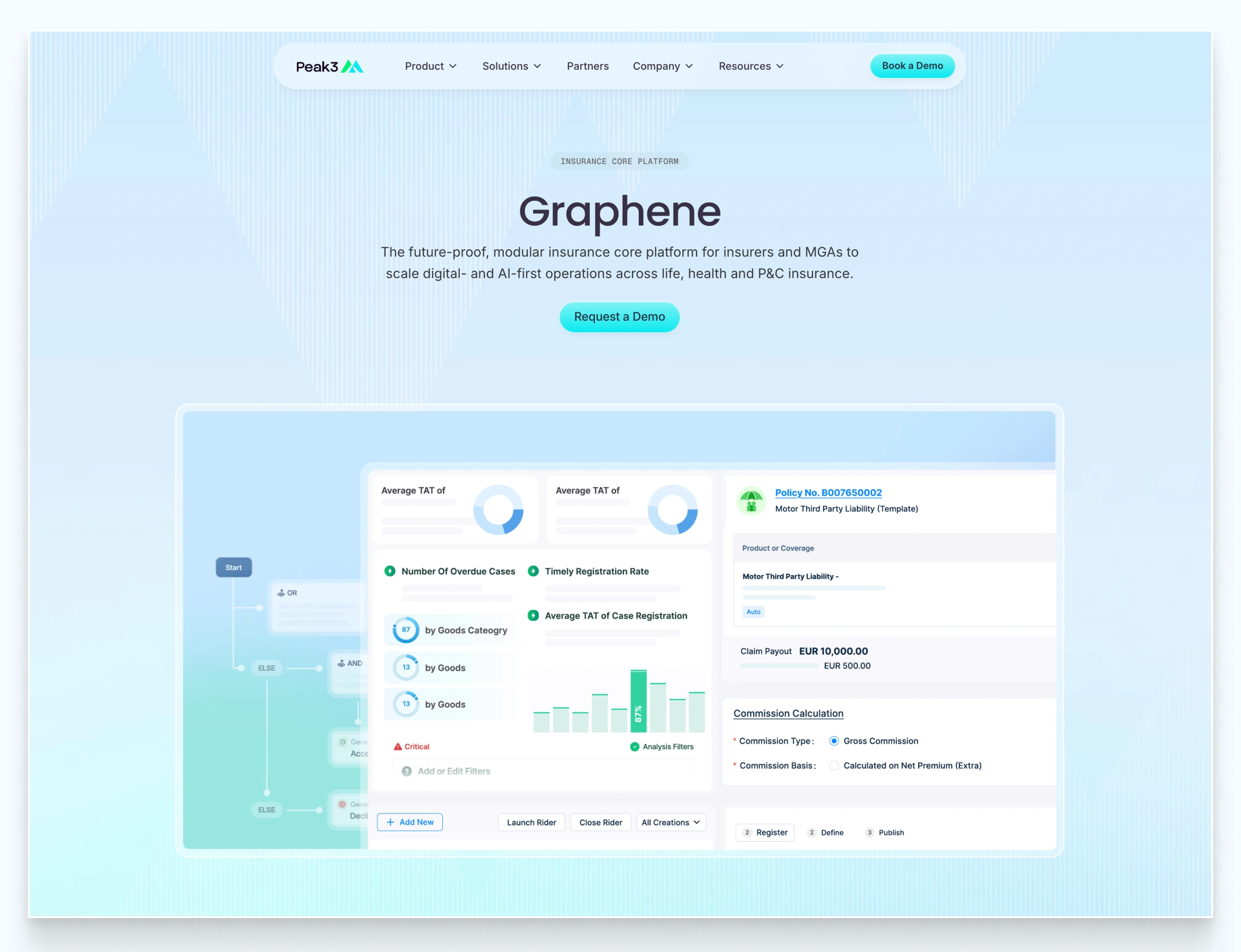
I architected the entire site as a content operating system: 17 unique page templates, 39 live URLs, 6 CMS collections, 3 product lines, full HubSpot integration — all built so a distributed team across two continents could publish, update, and scale content without ever touching the design layer.
Every card row, resource listing, product feature page, and partner grid is CMS-powered. Blog posts, case studies, whitepapers, news, events, careers — all structured, all publishable by the team independently. One universal gated-content form that scales across every whitepaper without creating new workflows. JSON-LD schemas baked into every page type for search visibility from launch.
This is the biggest Framer build I've done — not because of visual complexity, but because of system complexity. 17 templates is a small marketing site's total page count. Here, it was just the foundation.
The site had to work on day 300 the same way it worked on day 1, without me in the picture. That was the brief I wrote for myself.
Product hero section overview
The Impact
Within the first week of handover, Peak3's team was publishing independently — case studies, blog posts, product updates — across both offices, without design support.
Before this project, every content update was a bottleneck that required agency involvement. After it, a company operating in 20+ countries with three complex product lines had a site that could actually keep up with the business. Three products that enterprise buyers couldn't understand from the old site now have dedicated, structured pages built for people who do technical diligence before a call.
Content sections.
The hardest part wasn't the design. It was resisting the temptation to make it simpler than it needed to be. A site this large, with this many content types and contributors, doesn't survive on aesthetics. It survives on architecture.
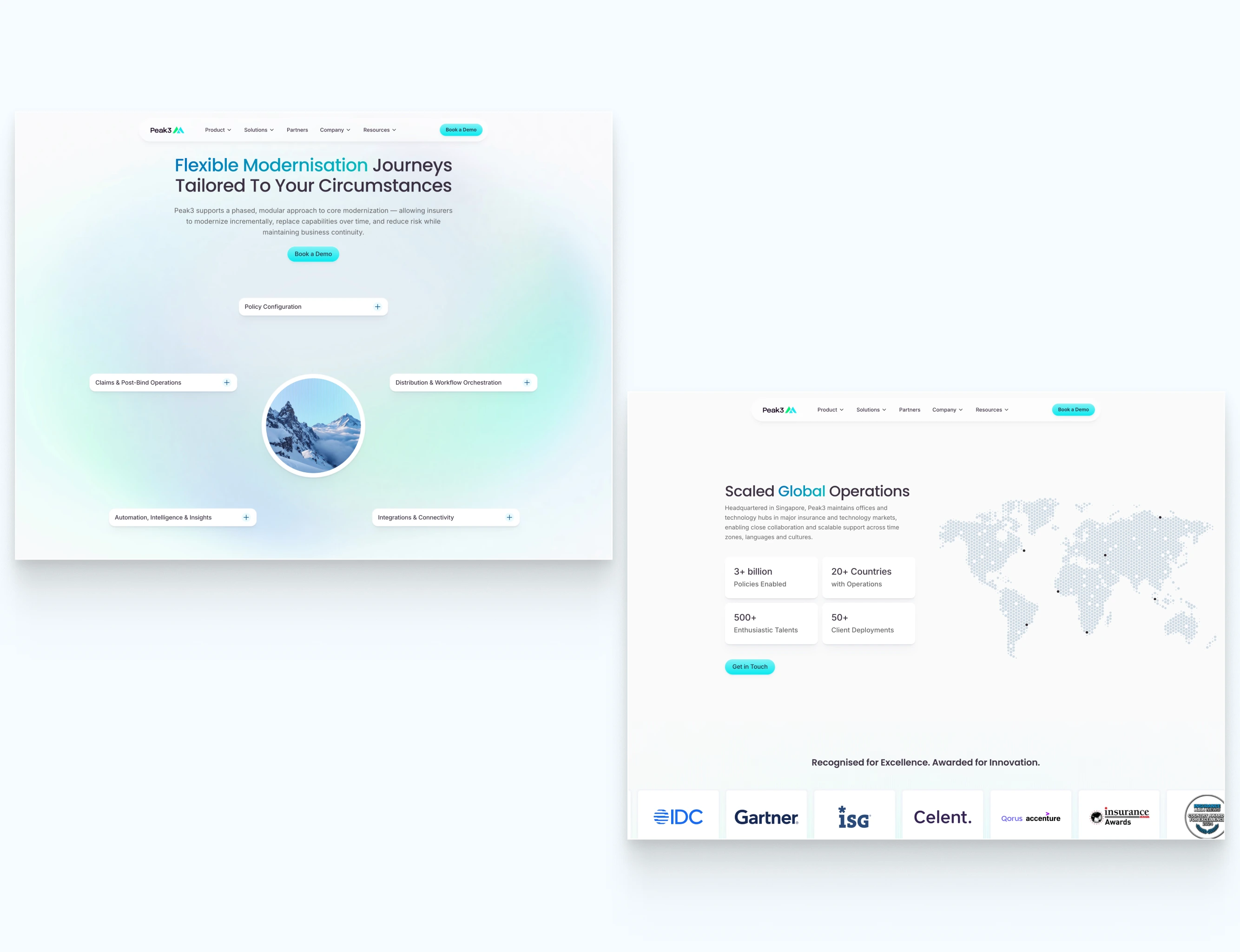
Spacious and creative sections.
The Takeaway
Most redesigns depreciate the moment you hand them over. The ones that compound are the ones a growing team can actually operate.
Build for the team that runs it — not just the audience that visits it.
Like this project
Posted May 11, 2026
Architected a scalable CMS for Peak3's insurance-focused website.
Likes
20
Views
460
Earned
$18K+
Timeline
Jan 30, 2026 - Apr 22, 2026
Clients
Peak3

