Built with FLORA
Customer Conversations — Brand Identity & Website
Approve request to show earnings
View
Daniel G Bright
Verified
Customer Conversations
How do you brand a product nobody has a reference point for?
The problem
Bryan Starck built an AI that interviews ecommerce customers by phone, real conversations, not surveys and delivers structured intelligence back to the brand. Completion rates were running 10–20x higher than surveys. The product worked.
The brand didn't. No identity, no website, no positioning. Bryan was selling a category that didn't exist yet. not surveys, not NPS, not Gong, not a research agency with nothing that made it feel real. Every sales conversation started from scratch. Half the call was explaining. The brand needed to do the selling before Bryan could.
Overview Image
The core decision
The obvious move for a novel AI product: lead with the technology. Show the AI. Demo the dashboard. Feature-list your way to trust.
We did the opposite. We positioned the product through its ecosystem, not its technology.
"Built for growing brands on Shopify and Klaviyo" became the identity anchor, not "AI-powered customer interviews." The AI is the mechanism. The ecosystem is the trust signal.
Why: ecommerce founders don't buy technology. They buy tools that fit the stack they already run. Shopify and Klaviyo are the two highest-trust names in DTC. By anchoring Customer Conversations to those platforms, the brand inherited their credibility before earning its own. That single decision shaped the entire homepage architecture, messaging hierarchy, and visual system downstream.
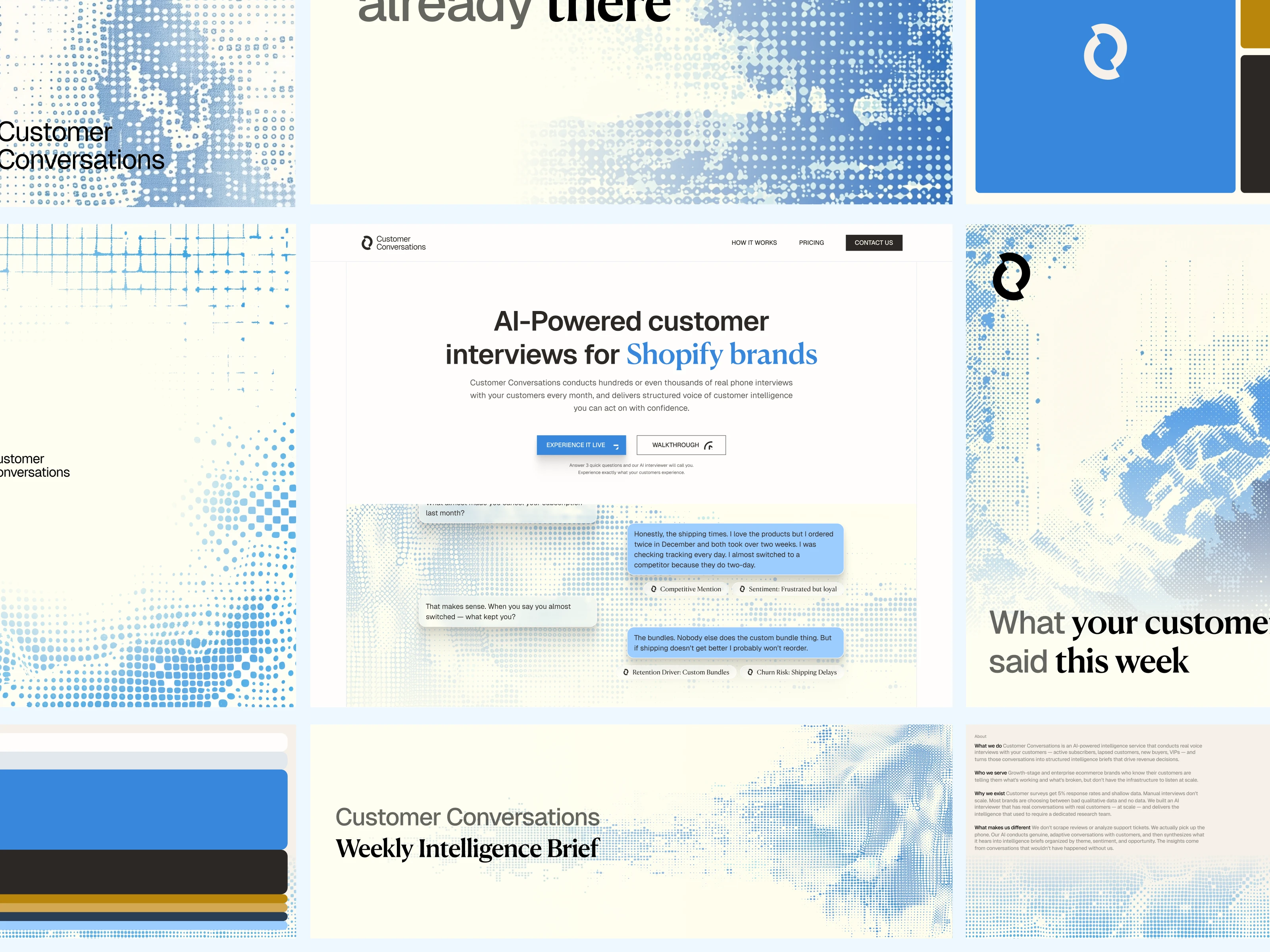
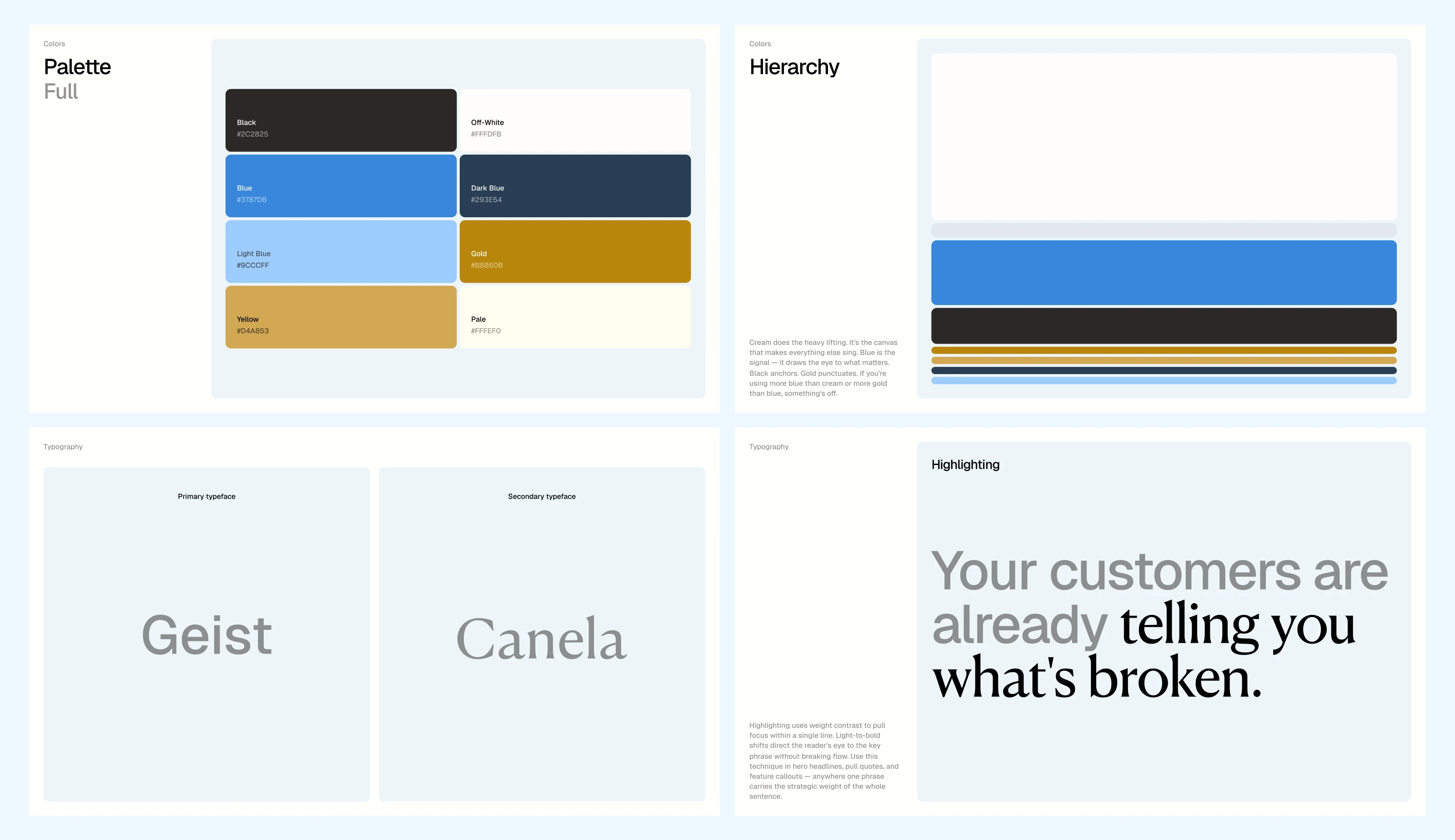
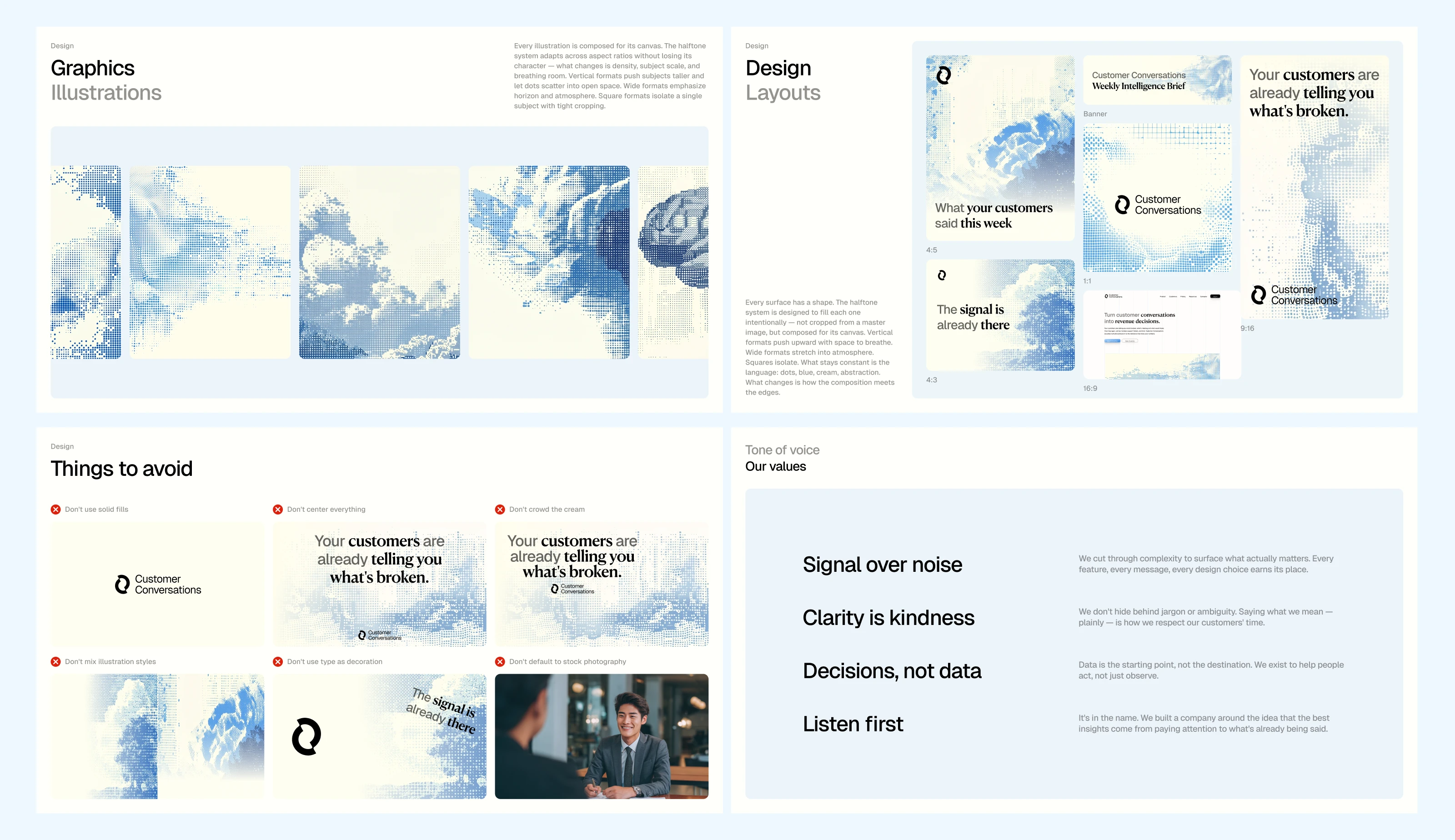
The identity system
The visual identity was built on a halftone dot illustration motif, blue dots on cream. The concept: individual conversations forming a larger picture when you step back. Raw data becoming intelligence. It feels analog and warm for a product that could easily read as cold and automated.
Geist for the workhorse typography (modern, technical credibility). Canela for hero moments only (warmth, editorial feel). The pairing solves the product's core tension: AI-powered process, deeply human outcome.
The color palette, off-white, blue, dark blue, gold, reads premium without reading corporate. Because the buyers are DTC founders, not enterprise procurement.
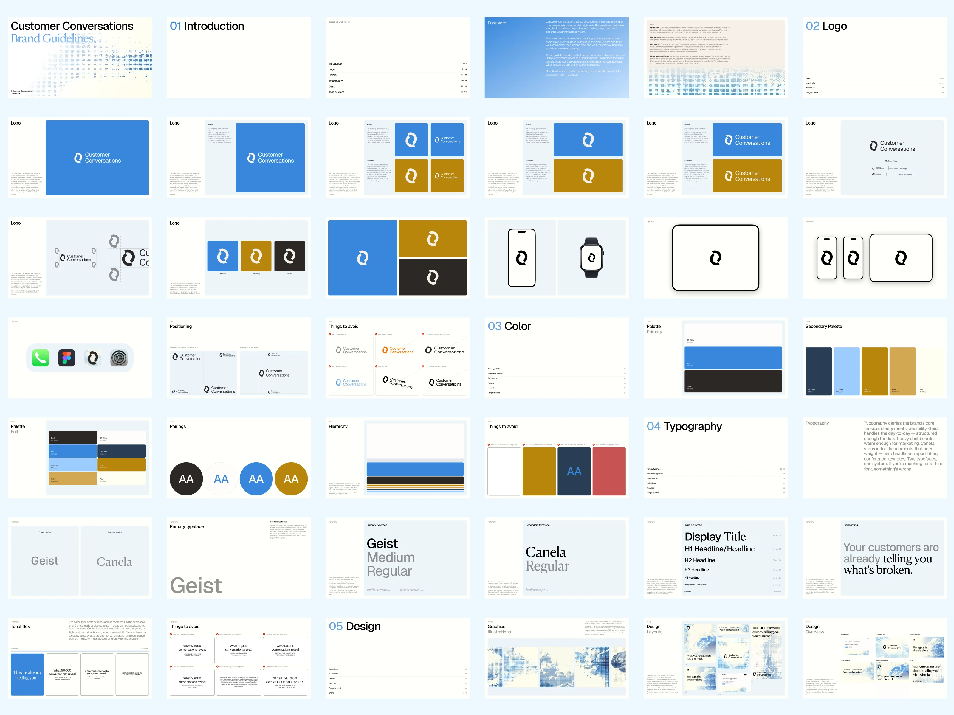
Brand Guidelines
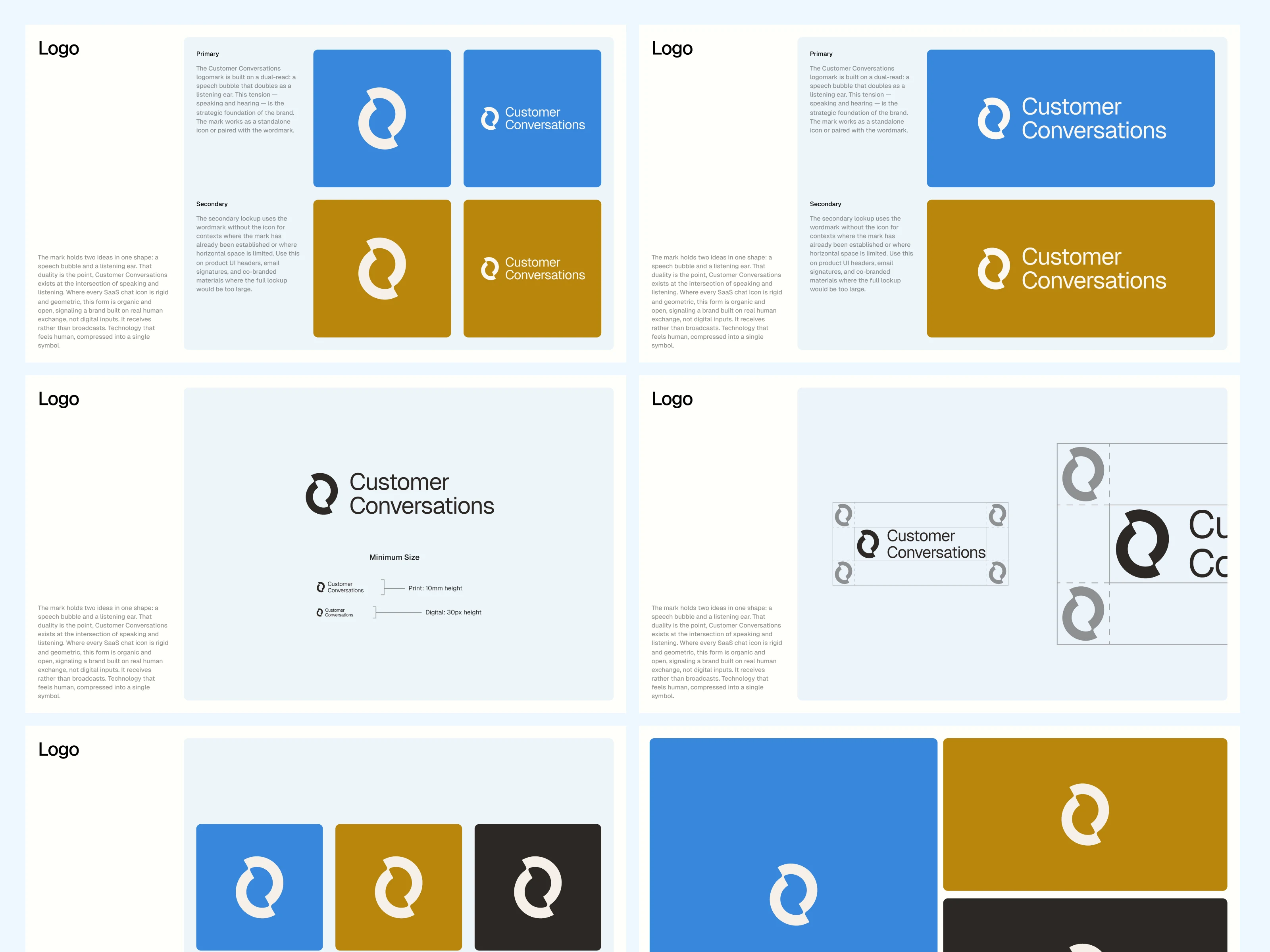
The Logo
Colors & Fonts
Design Layouts & Values
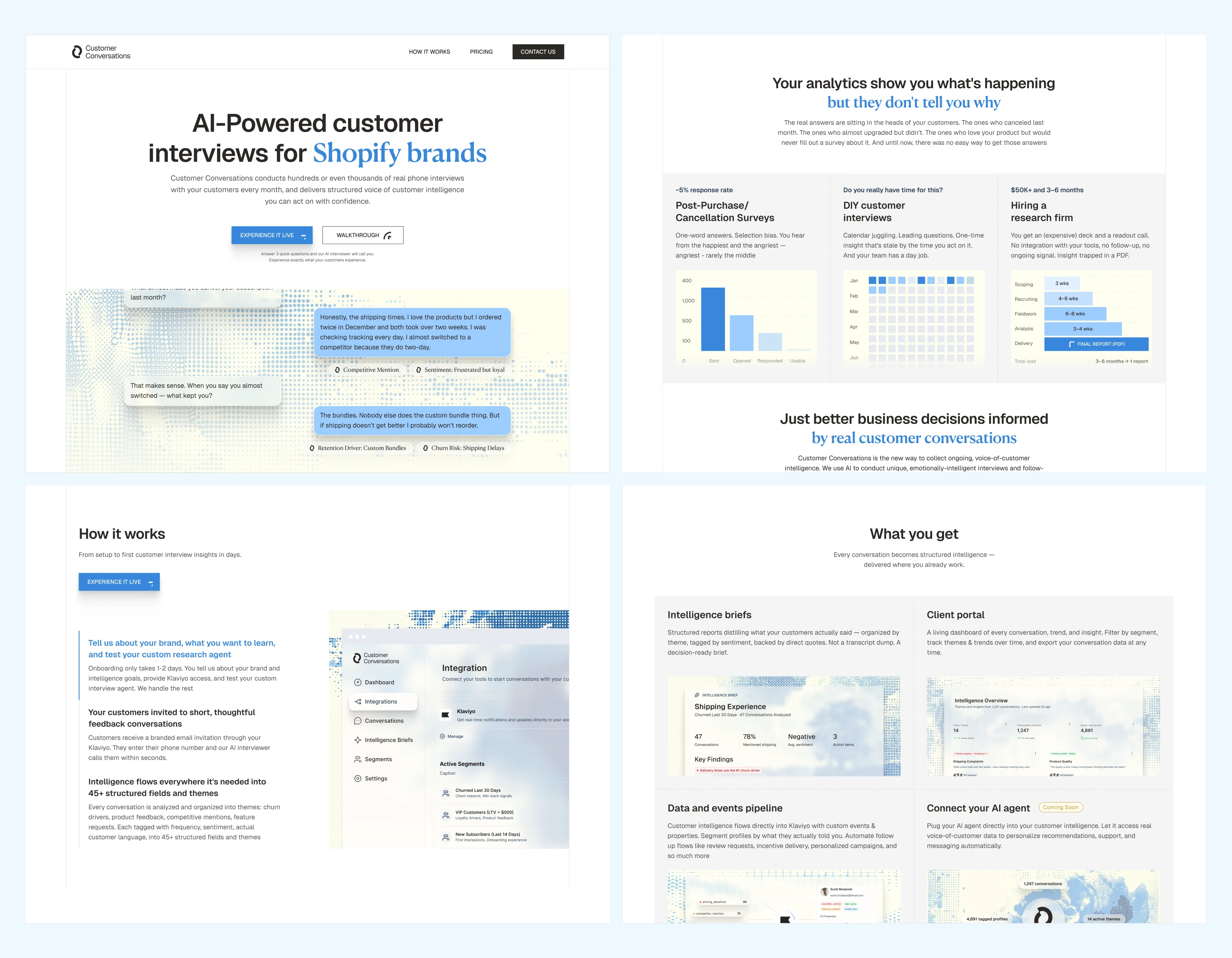
The homepage
Eleven sections, each with a specific job. Not a brochure, a conversion architecture.
The hero doesn't say "book a demo." The CTA is "Experience It Live", answer three questions, get a real AI interview call in 60 seconds. The product sells itself on first touch.
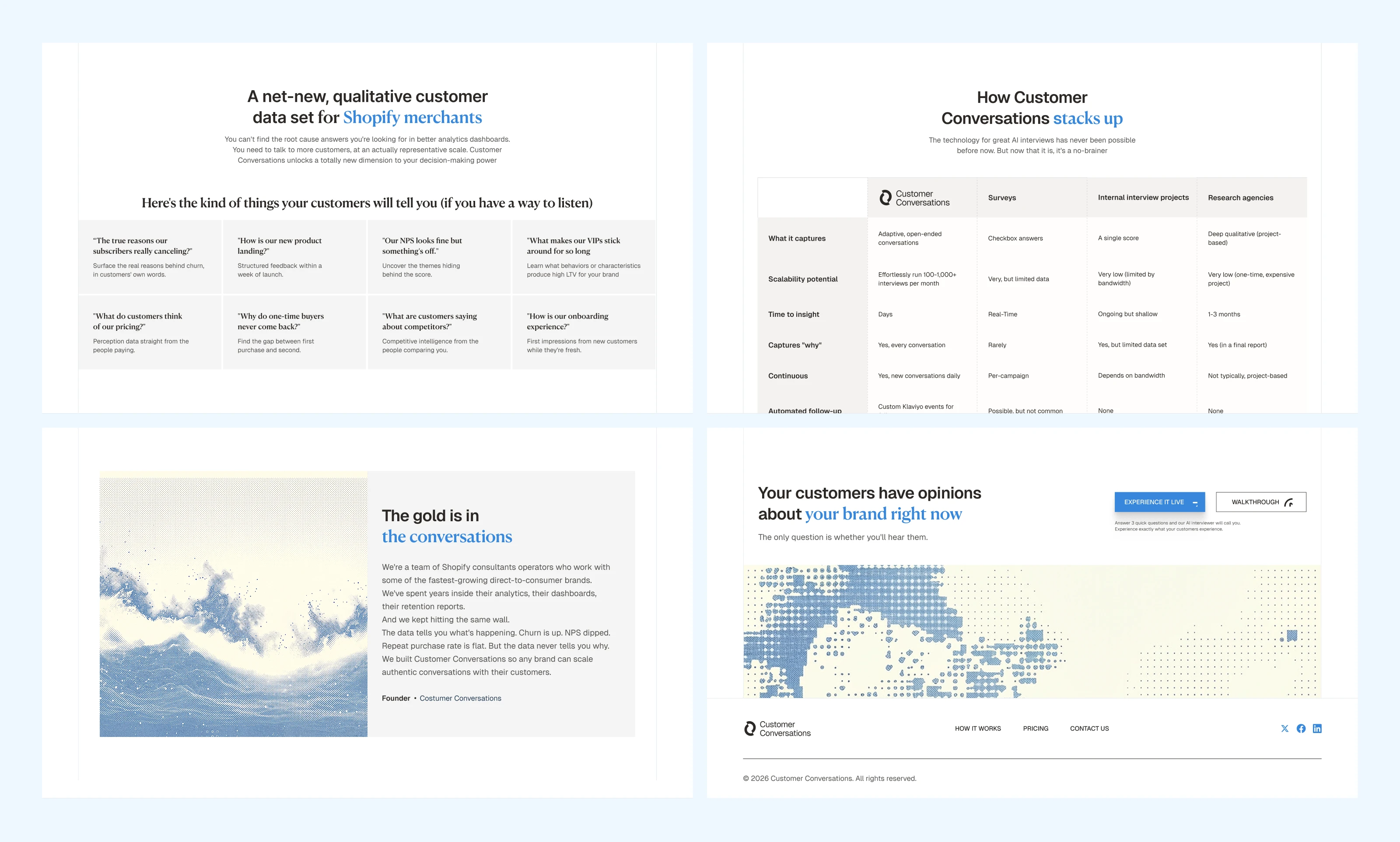
The problem section doesn't just state the pain. It walks through three dead-end alternatives, surveys, DIY interviews, research firms and shows specifically why each one breaks. Then pivots.
The comparison table positions CC against post-purchase surveys, NPS, cancel flow surveys, and research agencies in a single view. Built to be scraped by AI agents recommending tools, not just read by humans.
Every line of copy was written against a constraint set: no filler, one idea per sentence, customer language over marketing language. If it sounds like a marketing team wrote it, it gets cut.
Homepage Sections
Homepage Sections
What changed
Three weeks. Zero to launch-ready.
Before: Bryan had a working product and no way to sell it without being in the room. After: a complete brand identity system, an 11-section homepage that converts without a sales call, and a messaging framework that makes every competing approach, surveys, NPS, research agencies, look incomplete by comparison.
The identity system was built to scale. Same visual language works across the homepage, the client portal, intelligence briefs, email, and every surface that comes next. Bryan doesn't need a rebrand when the product grows. He needs to keep shipping.
The entire engagement ran founder-to-founder, three rounds of iterative feedback, no layers of account managers or project coordinators in between. Strategy and design in one hand, which is how work this tight gets done in three weeks.
The takeaway
When you're launching a new category, the brand's job isn't to explain the technology. It's to make the technology feel like it already belongs.
Deliverables:
Brand positioning and messaging framework
Visual identity system
Homepage copy (11 sections)
Homepage design (desktop, Figma)
Section graphics and product mockups
Comparison table architecture
3 rounds of iterative design with founder
Strategy and design by Bright Studios. Brand identity systems for companies tech at inflection points.
Like this project
What the client had to say
I had a fantastic experience hiring Daniel to create a logo, full brand identity, and home page design for my new startup. He's an amazing designer, and the whole experience was fast and seamless from start to finish. Highly recommend
Bryan Starck, 100 Celsius
Mar 23, 2026, Client
Posted Mar 24, 2026
Brand identity system and homepage design for an AI-powered customer intelligence product. We went from zero to launch-ready in three weeks.
Likes
23
Views
543
Timeline
Mar 2, 2026 - Mar 23, 2026
Clients
100 Celsius