Built with Framer
Timelaps — Designing a Living Brand Intelligence Platform
Approve request to show earnings
View
Daniel G Bright
Verified
Timelaps
Designing a Living Brand Intelligence Platform
Overview
Timelaps is a next-generation brand tracking platform built to replace slow, expensive research and static PowerPoint decks with something marketers actually want to use.
The goal was ambitious: create a brand and product system that feels alive, clear, and design-led, while maintaining the rigor and credibility of serious brand science.
Bright Studios partnered with the Timelaps founding team to define the strategy, name the product, design the brand identity, and translate that identity into a functional dashboard UI and launch splash page.
This wasn’t just about making something look good.
It was about changing how brand tracking feels.
Overview
Brand Guidelines
The Challenge
Brand tracking lives in an awkward space.
On one side: traditional research agencies.
Slow. Expensive. Static. Locked in decks no one revisits.
On the other: modern SaaS tools.
Accessible, but often shallow, visually bland, or overly technical.
Timelaps wanted to occupy the space in between.
Research-grade intelligence, delivered with the clarity and craft of a modern creative tool.
The challenge was threefold:
• Define a clear strategic wedge in a crowded category
• Build a brand that feels premium and human, not enterprise or gimmicky
• Translate that brand into a usable product interface, not just marketing visuals
Strategy & Positioning
We started with strategy before visuals.
The core insight was simple but powerful:
The real competitors weren’t other SaaS tools.
They were slow agencies and flying blind.
That became the foundation of the positioning.
Timelaps is not a research report.
It’s a living system.
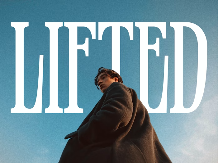
Brand Idea
Insight in Motion
Brand data isn’t static.
Perception shifts. Momentum builds. Patterns emerge over time.
Timelaps compresses that movement into something marketers can see, understand, and act on.
Naming the Product
Naming was treated as strategy, not decoration.
We explored dozens of options across clarity, motion, signal, and narrative territories before landing on Timelaps.
The name works on multiple levels:
• References time-lapse photography: revealing patterns invisible in snapshots
• Emphasizes motion, progress, and continuity
• Feels neutral enough to scale, but distinctive enough to own
• Easy to say, remember, and build language around
Timelaps doesn’t explain itself immediately.
It reveals itself through use, which was exactly the point.
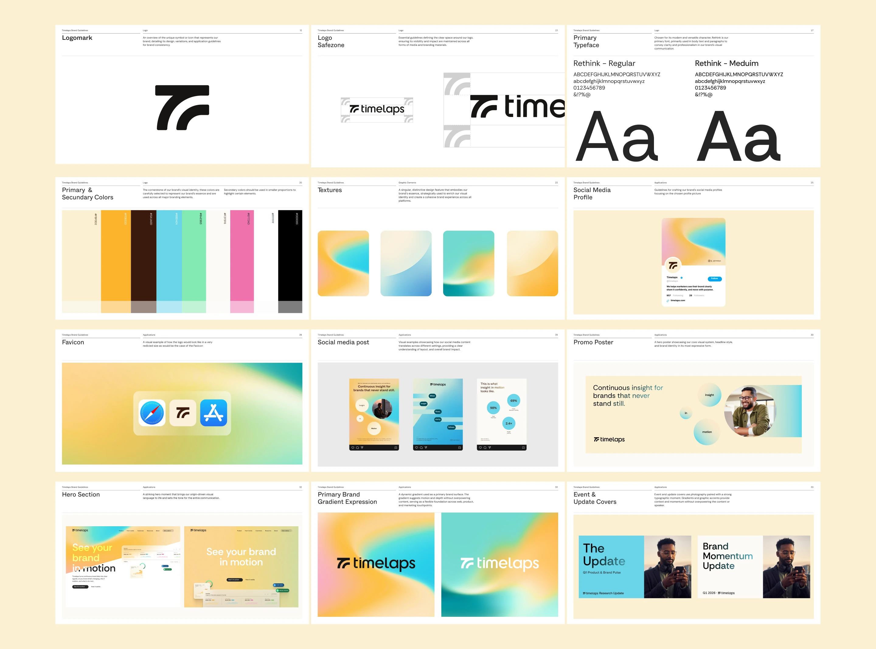
Brand Identity
The identity needed to balance opposites:
• Confident but calm
• Modern but trustworthy
• Expressive without being loud
• Technical without feeling cold
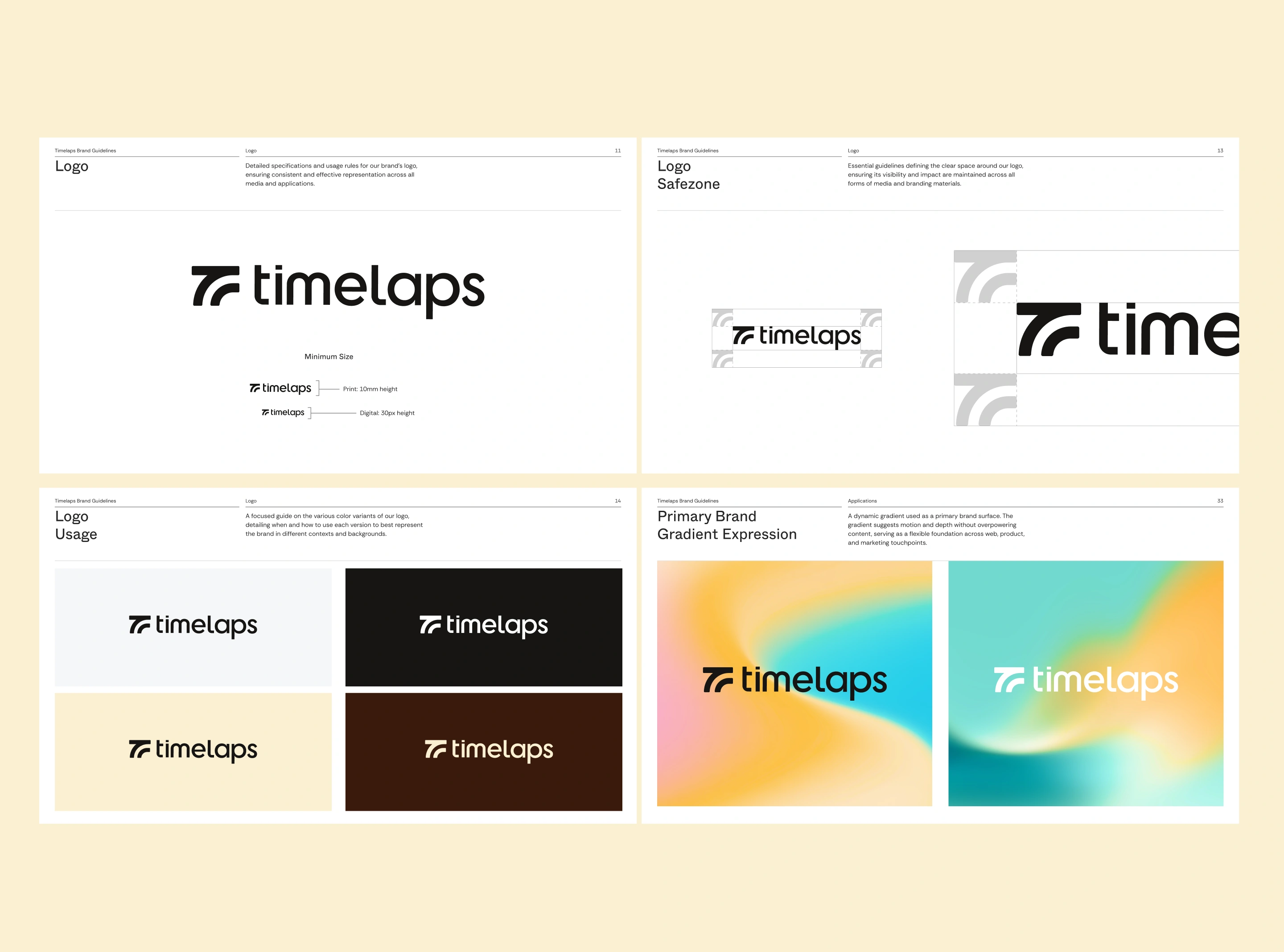
Logo & Icon
The logotype is restrained and deliberate.
The icon introduces forward motion through a subtle arc and directional cut, referencing momentum without leaning into sci-fi or gaming tropes.
This icon became the backbone of the visual system.
Color & Texture
Rather than relying on bright primaries, the palette uses warm neutrals anchored by a distinctive yellow accent.
Gradients are used as texture, not decoration.
They communicate motion, depth, and emergence, mirroring the way insight comes into focus over time.
Typography
Typography was chosen for clarity first.
Readable at small sizes.
Confident at large ones.
Never stylized at the expense of comprehension.
This was especially important given the product’s data-heavy nature.
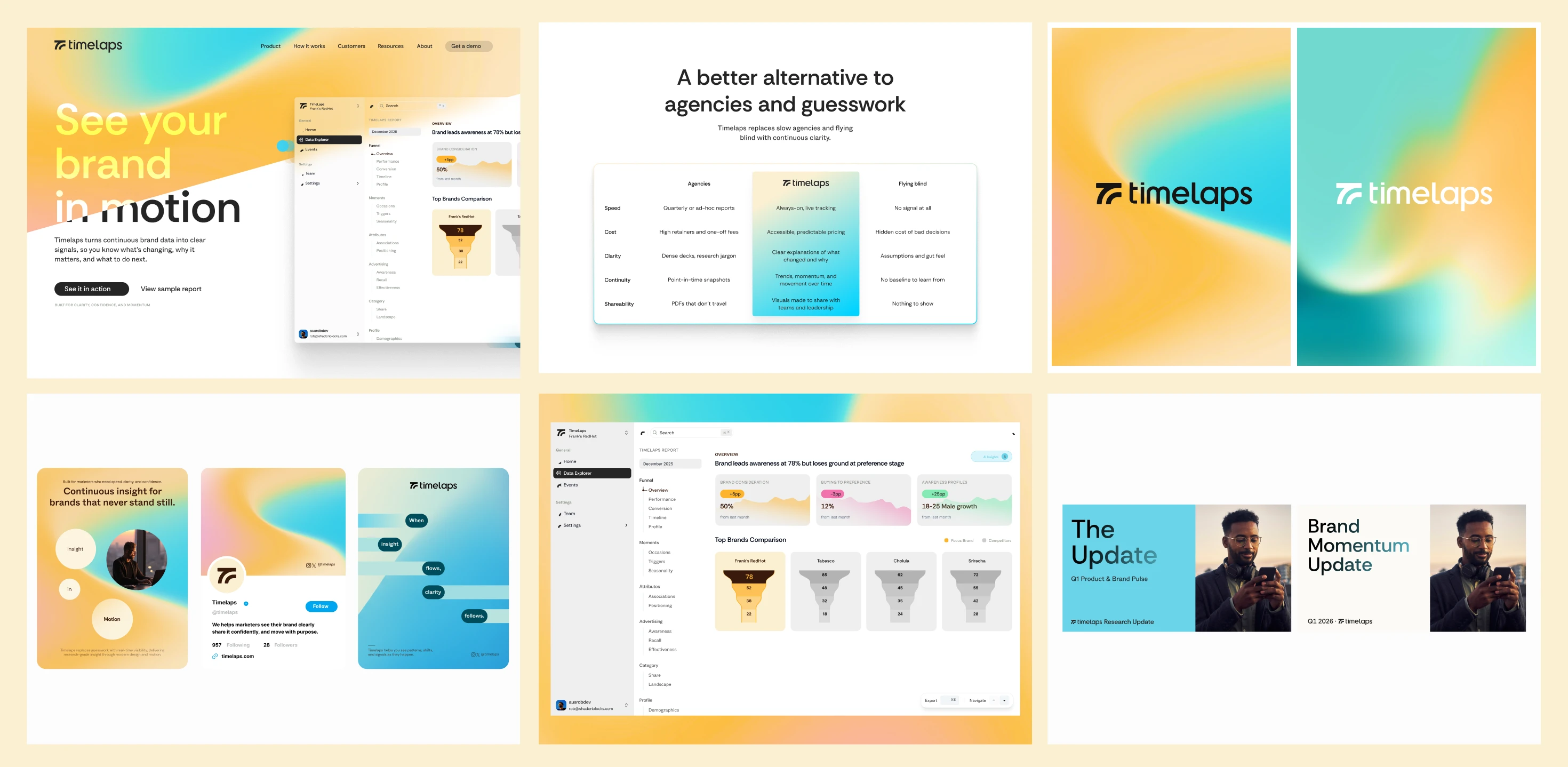
Product UI Direction
The brand was designed to live inside the product, not sit on top of it.
The dashboard UI prioritizes:
• Readability over visual noise
• Clear hierarchy for data storytelling
• Calm surfaces that let insights stand out
• Motion used to explain, not distract
Loading states, transitions, and micro-interactions were considered part of the brand experience, not afterthoughts.
The result is a dashboard that feels composed and intentional, even while handling complex data.
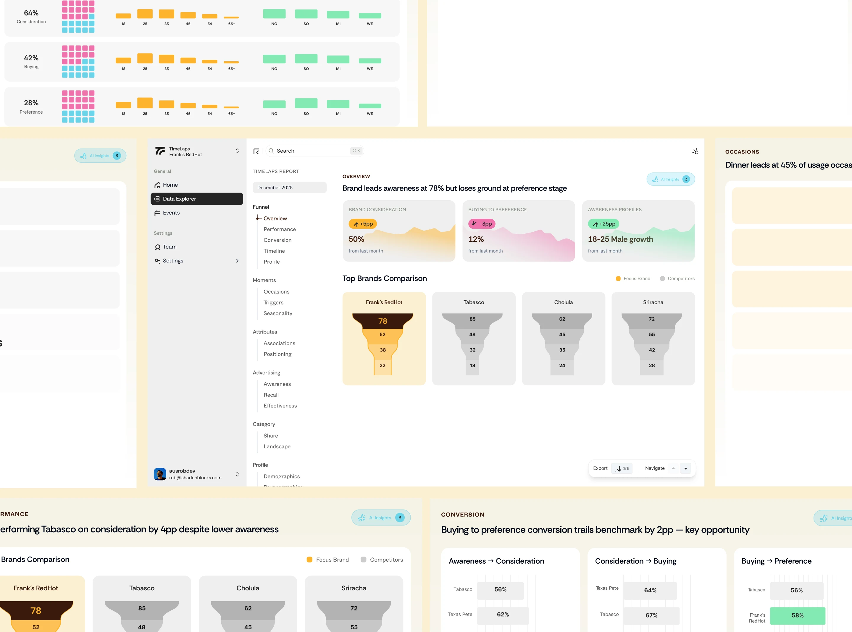
Dashboard UI
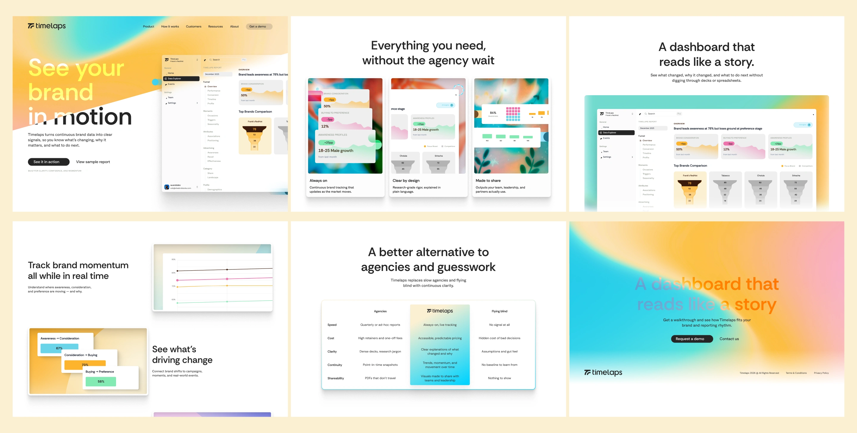
Splash Page Design
Rather than a full marketing site, Timelaps launched with a focused splash page.
The goal was simple:
• Explain the value quickly
• Establish credibility
• Invite the right conversation
The page is structured as a short narrative:
• Clear hero with primary call to action
• Benefits of brand tracking before comparisons
• Feature-led product glimpses
• A concise comparison against agencies
• Clean footer with supporting links and social presence
Nothing ornamental. Everything purposeful.
Deliverables
Bright Studios delivered:
• Brand strategy and positioning
• Product naming and narrative framework
• Full visual identity system
• Brand guidelines for external use
• Dashboard UI foundation
• Splash page design
• Asset pack including logos, icons, OG images, and templates
• Handoff documentation and walkthroughs
Overview Video
Outcome
Timelaps now has:
• A clear category position
• A distinctive, ownable brand
• A product interface that reflects its philosophy
• A system designed to scale with the company
Most importantly, it feels like a product built for marketers, not presented at them.
Closing Thought
Timelaps didn’t need louder branding.
It needed clarity, confidence, and momentum.
That’s what this project delivered.
Like this project
What the client had to say
Daniel was great - fast, responsive and we ended up with a great brand foundation. Would highly recommend and look forward to working with him again in future!
Hank Pretorius
Jan 28, 2026, Client
Posted Jan 29, 2026
Strategy, naming, brand identity, and product UI for Timelaps, a design-led brand tracking platform built to replace static research with insight in motion.
Likes
17
Views
621
Timeline
Nov 12, 2025 - Jan 27, 2026
Clients
Timelaps