Built with FLORA
LIFTED Brand Identity Development
Daniel G Bright
The Setup
LIFTED is a collective movement experience brand — part fitness, part art, part communal ritual. The challenge was building an identity for a concept that resists easy categorization. It's not a gym. It's not a dance class. It's not a wellness brand. It's something that only makes sense when you're in the room, which makes the brand's job brutally hard: convince people to show up for something they can't fully understand from the outside.
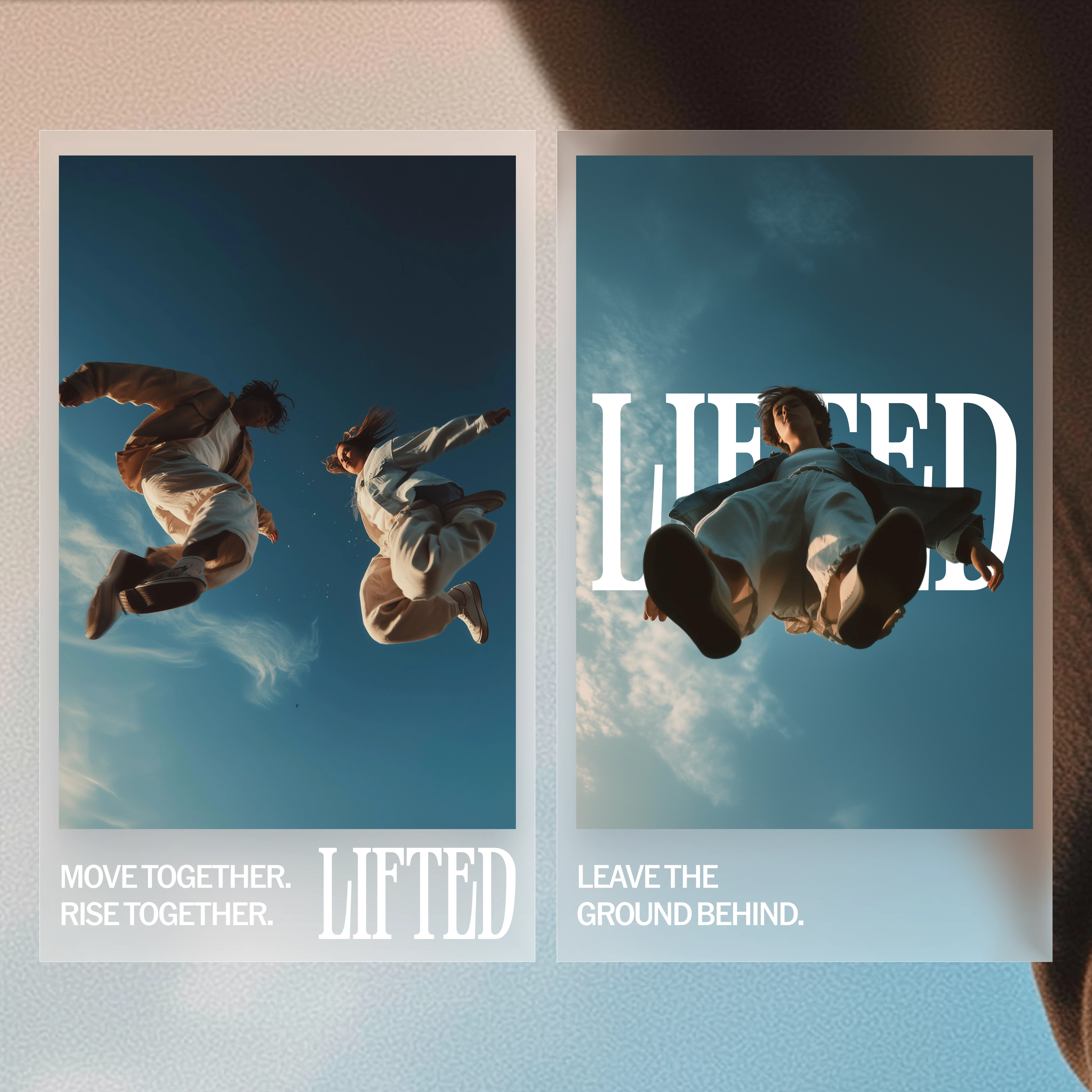
Social Media Posts
The Tension
Movement and fitness brands default to one of two visual languages: aggressive performance aesthetics (Nike, CrossFit — dark, gritty, aspirational through intimidation) or soft wellness aesthetics (pastel palettes, serif fonts, "honor your body" copy). LIFTED fits neither. The experience is physically intense but emotionally communal. It's about collective elevation, not individual performance.
The credibility gap: the brand needed to feel both powerful and inviting — serious enough to signal that the experience is real, warm enough that it doesn't alienate people who've never been.
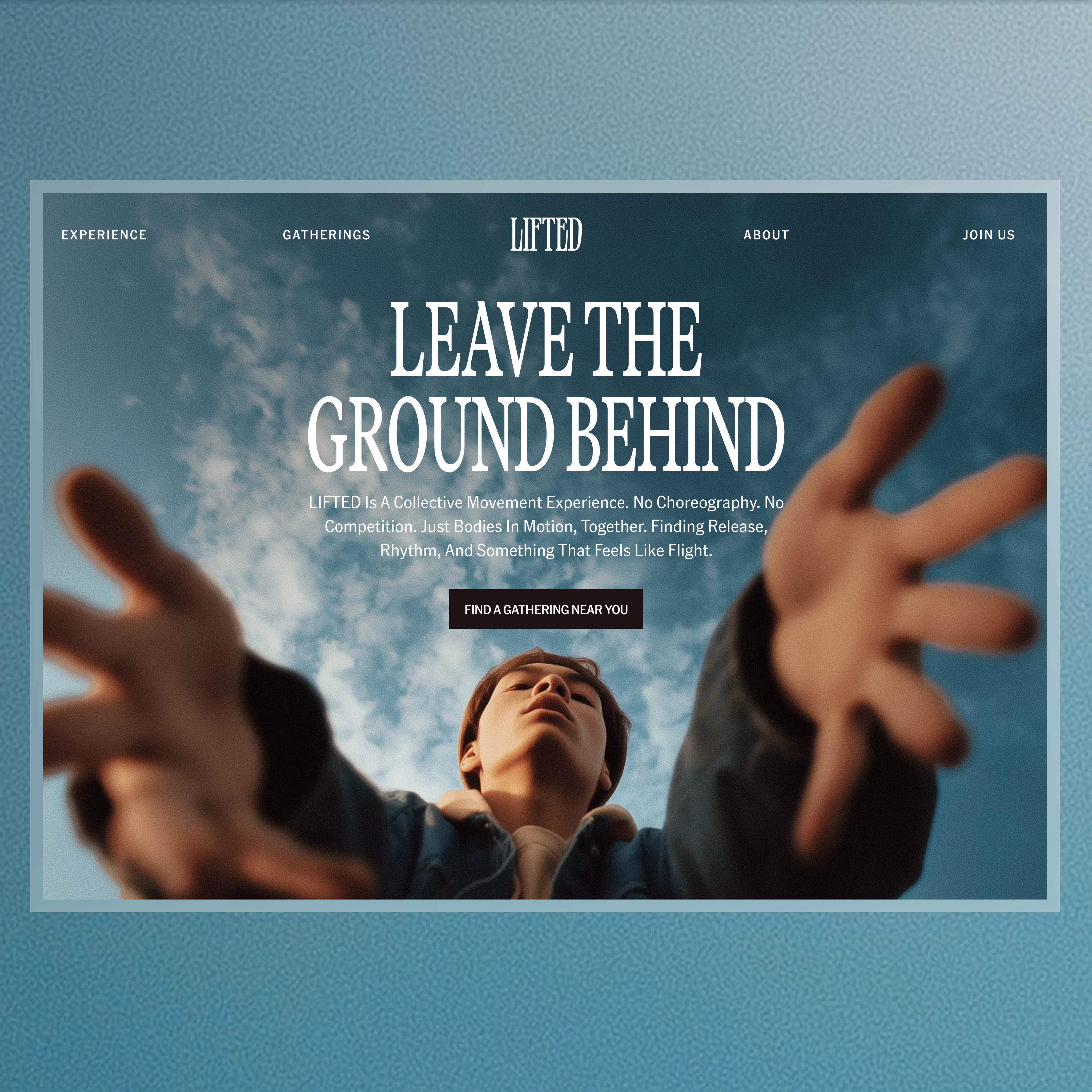
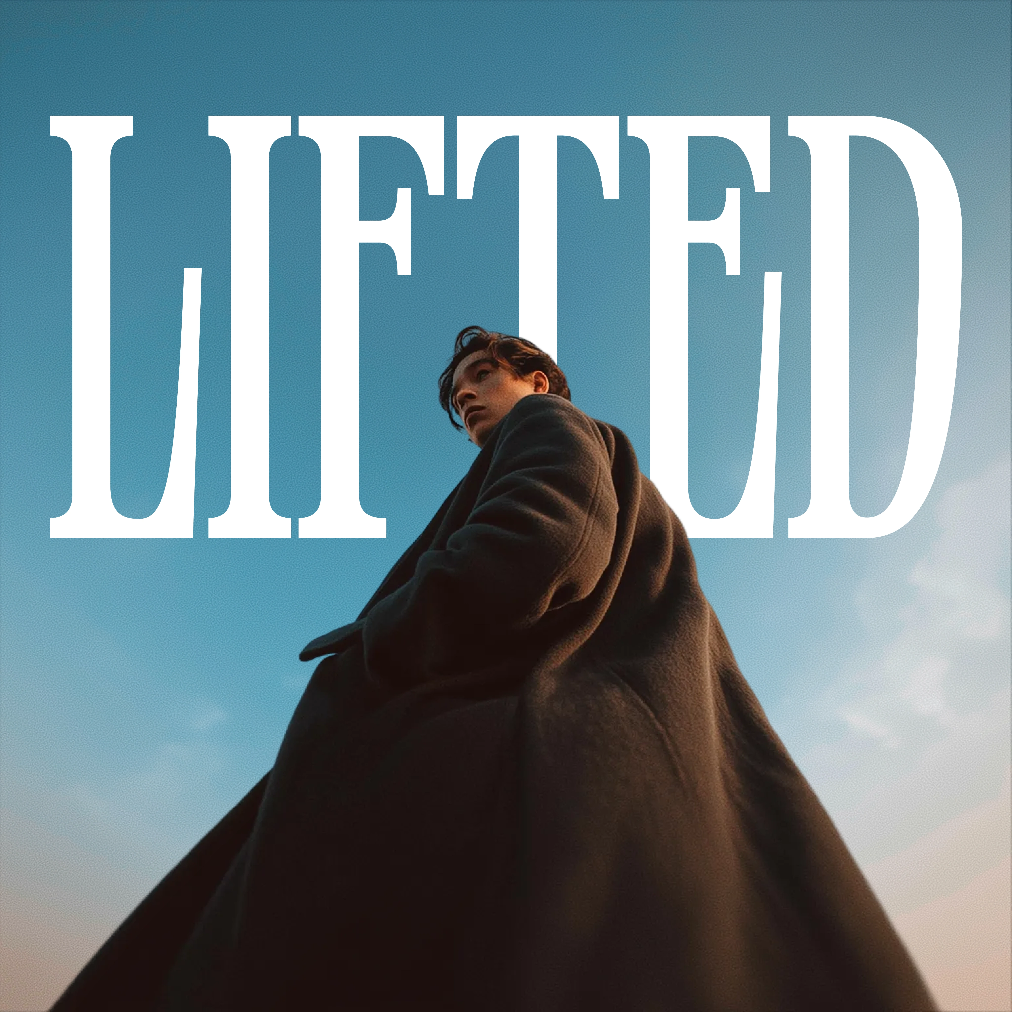
Hero Image
The Decision
The core strategic choice was to build the brand around the concept of vertical ascent — both literal (the movement goes up) and metaphorical (the emotional arc of the experience). Every visual and verbal element points upward.
This meant rejecting horizontal, grounded design language (which reads as "stable" and "calm") in favor of tall proportions, vertical type, upward-reaching imagery, and copy that pulls you off the ground: "Move together. Rise together." and "Leave the ground behind."
The non-obvious part: movement brands almost always show movement (action shots, motion blur, dynamic poses). LIFTED shows the moment before and after — the stillness of anticipation and the stillness of transcendence. The hero image is a figure in a coat, standing tall. Not moving. Just elevated.
Logo
The System
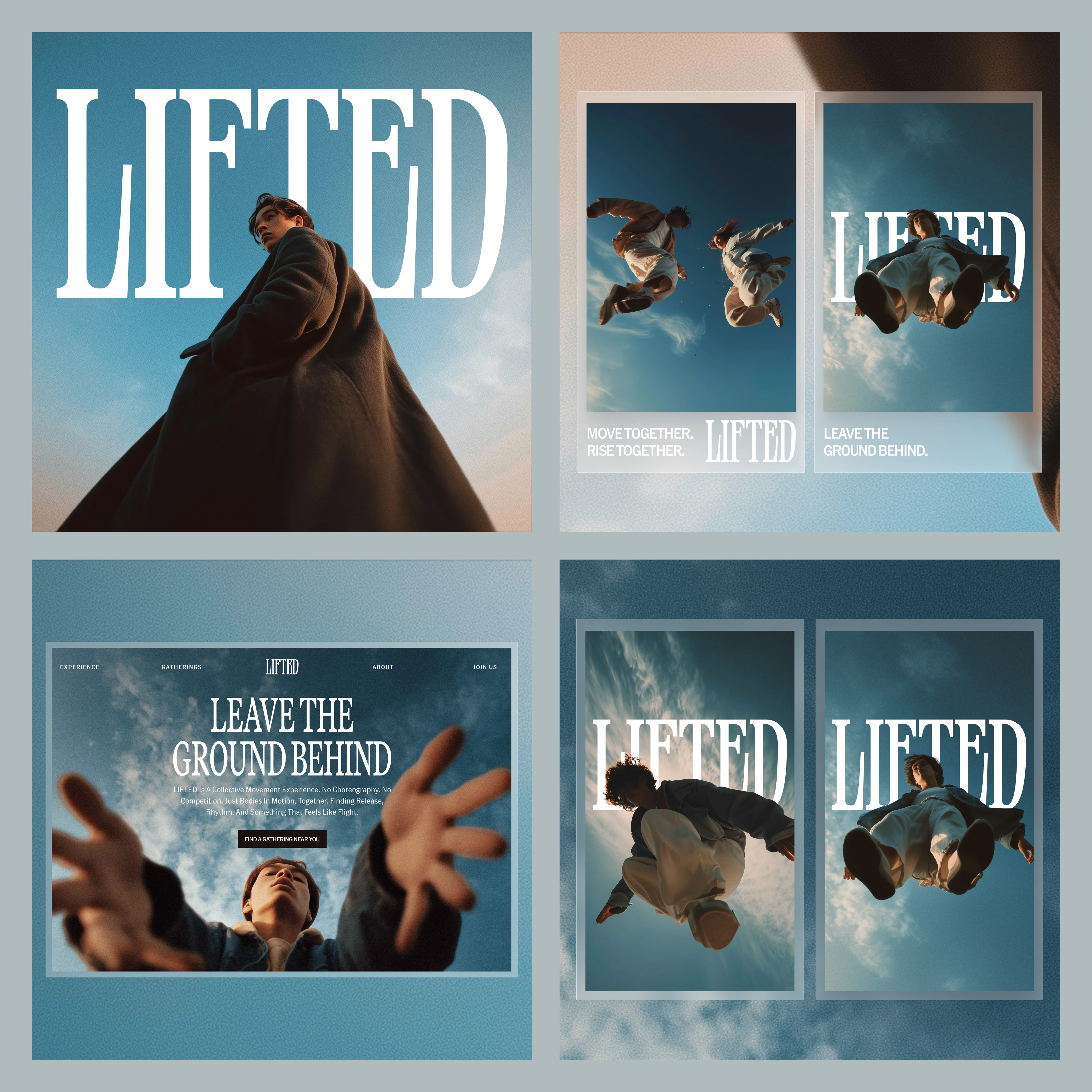
Typography: Large-scale serif type, set vertically and at dramatic scale. "LIFTED" isn't just a name — it's a visual gesture. The letters climb the layout.
Photography: Figures reaching upward, hands extended toward light, tall silhouettes. The photography captures aspiration without action — you feel the pull, not the sweat.
Messaging framework: Three tiers — "Move together. Rise together." (community), "Leave the ground behind." (transformation), and "Experience / Gatherings / About / Join Us" (the nav structure, which quietly frames the offering as events, not classes).
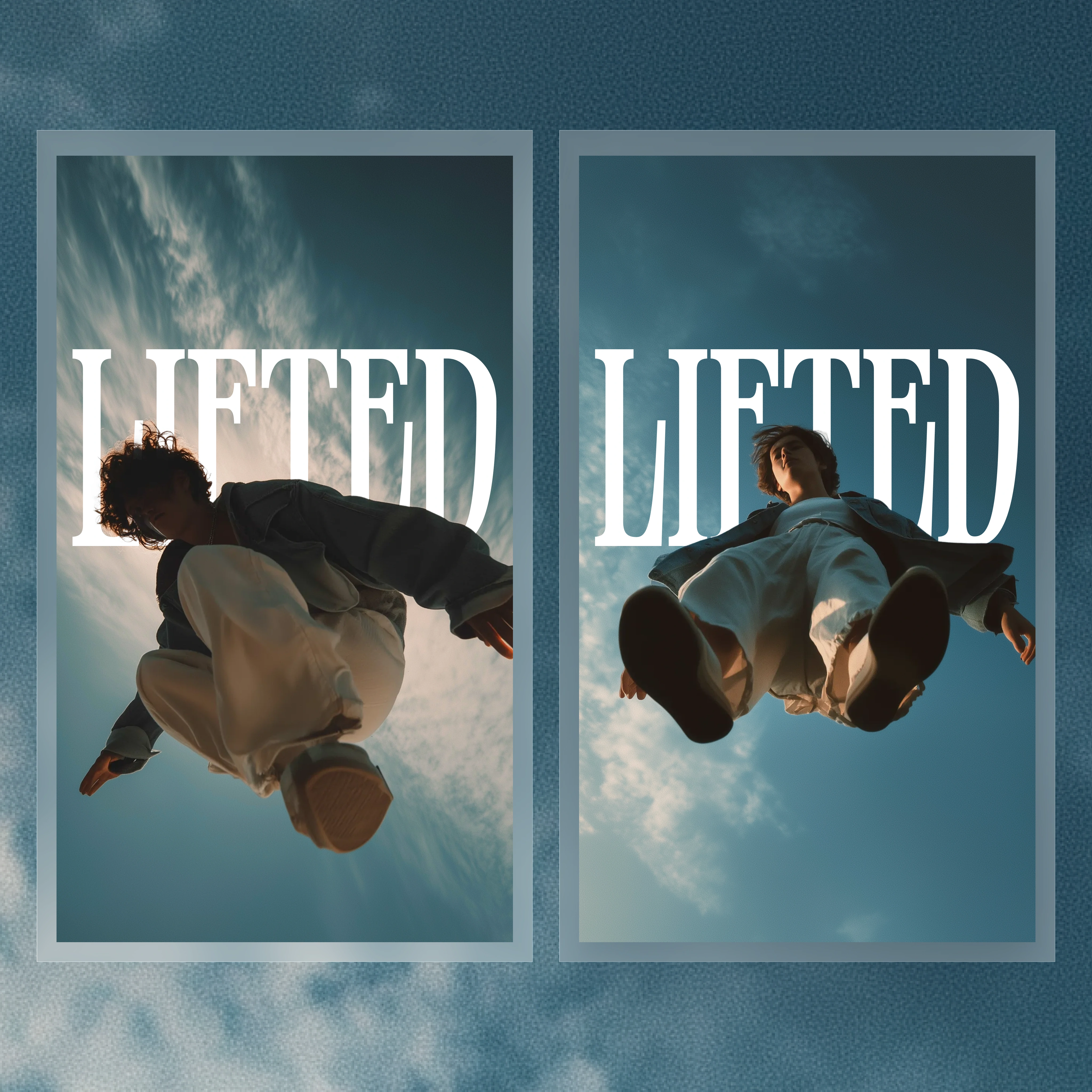
Social system: Vertical story cards with single-line statements. Bold type on atmospheric backgrounds. Each card delivers one emotional beat — they work in sequence or isolation.
Poster system: Full-bleed vertical layouts that function as environmental brand touchpoints. Designed to feel like they belong on a gallery wall, not a gym window.
Website: The hero features upward-reaching hands and uses the nav categories to reframe expectations. "Gatherings" instead of "classes." "Experience" instead of "about us."
Overview
The Takeaway
When the experience defies category, the brand's job isn't to explain — it's to evoke. LIFTED doesn't tell you what happens in the room. It makes you feel like you're already rising toward it.
Like this project
Posted Feb 28, 2026
Identity system for LIFTED built on one idea: every surface should feel like you just stepped up a level.
Likes
9
Views
329
Timeline
Jan 11, 2026 - Jan 19, 2026