Built with FLORA
Gummy Bear – Premium Brand Identity
Daniel G Bright
The Setup
Gummy Bear is a premium candy brand entering a category dominated by nostalgia-driven mass-market brands and novelty competitors. The challenge: how do you make a gummy candy feel like a considered product — not a gas station impulse buy — without losing the playfulness that makes the category work?
The Tension
The premium candy space has a positioning problem. Brands either lean into childish aesthetics (bright primary colors, cartoon mascots, loud packaging) or overcorrect into minimalist "wellness" territory that strips the joy out of candy. Neither approach works for a brand that wants to sit on a specialty shelf and still make you smile.
The gap: there was no visual language for "premium and playful" in confectionery. Every existing reference point pushed the brand toward one extreme or the other.
Logo
The Decision
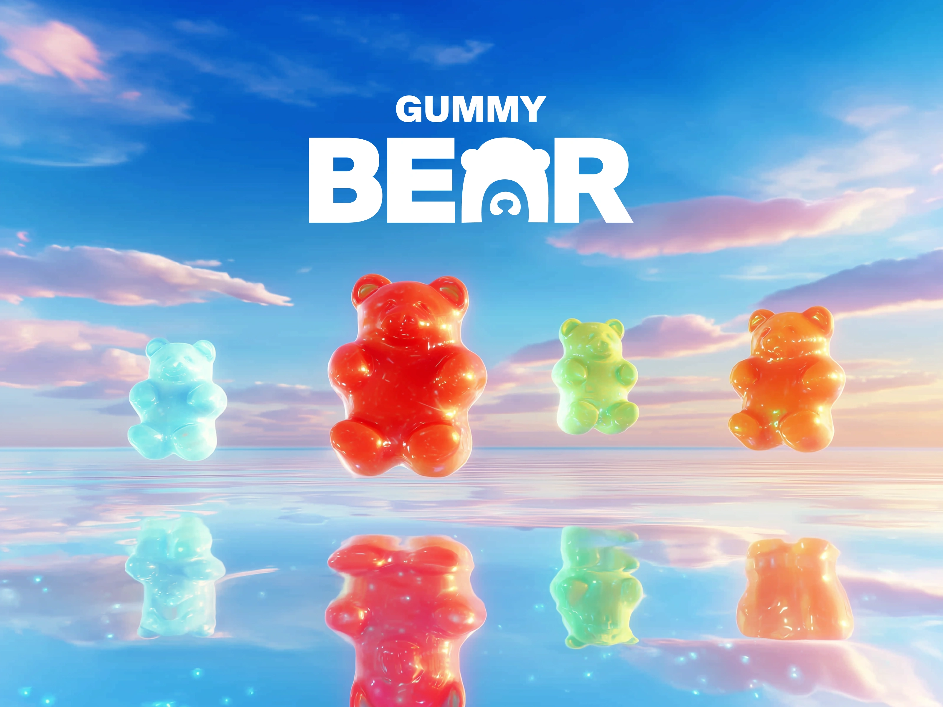
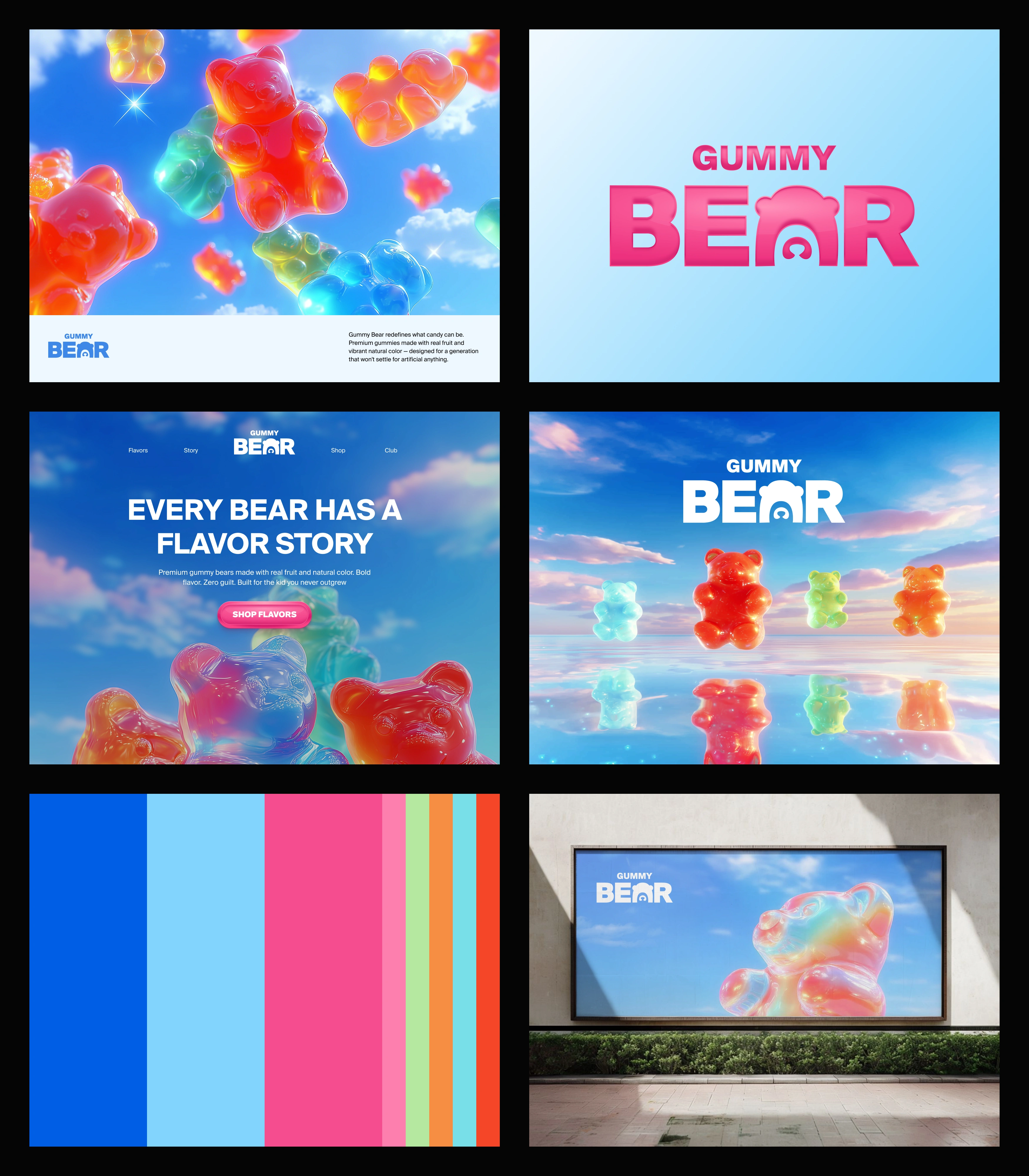
The core strategic choice was to treat the gummy bears themselves as the brand's visual identity — not a mascot, not an illustration, but the actual product rendered with the fidelity and lighting of a luxury goods campaign. Think fragrance ad, not candy aisle.
This was non-obvious because the instinct in candy branding is to abstract or cartoon-ify the product. Instead, the identity system puts hyper-realistic, glossy 3D gummy bears front and center — on reflective surfaces, with studio lighting, in jewel-tone color palettes. The product becomes the hero without needing a single illustration.
The tagline "Every Bear Has A Flavor Story" reinforces this: these aren't just flavors, they're characters. But the visual system keeps it elevated rather than cute.
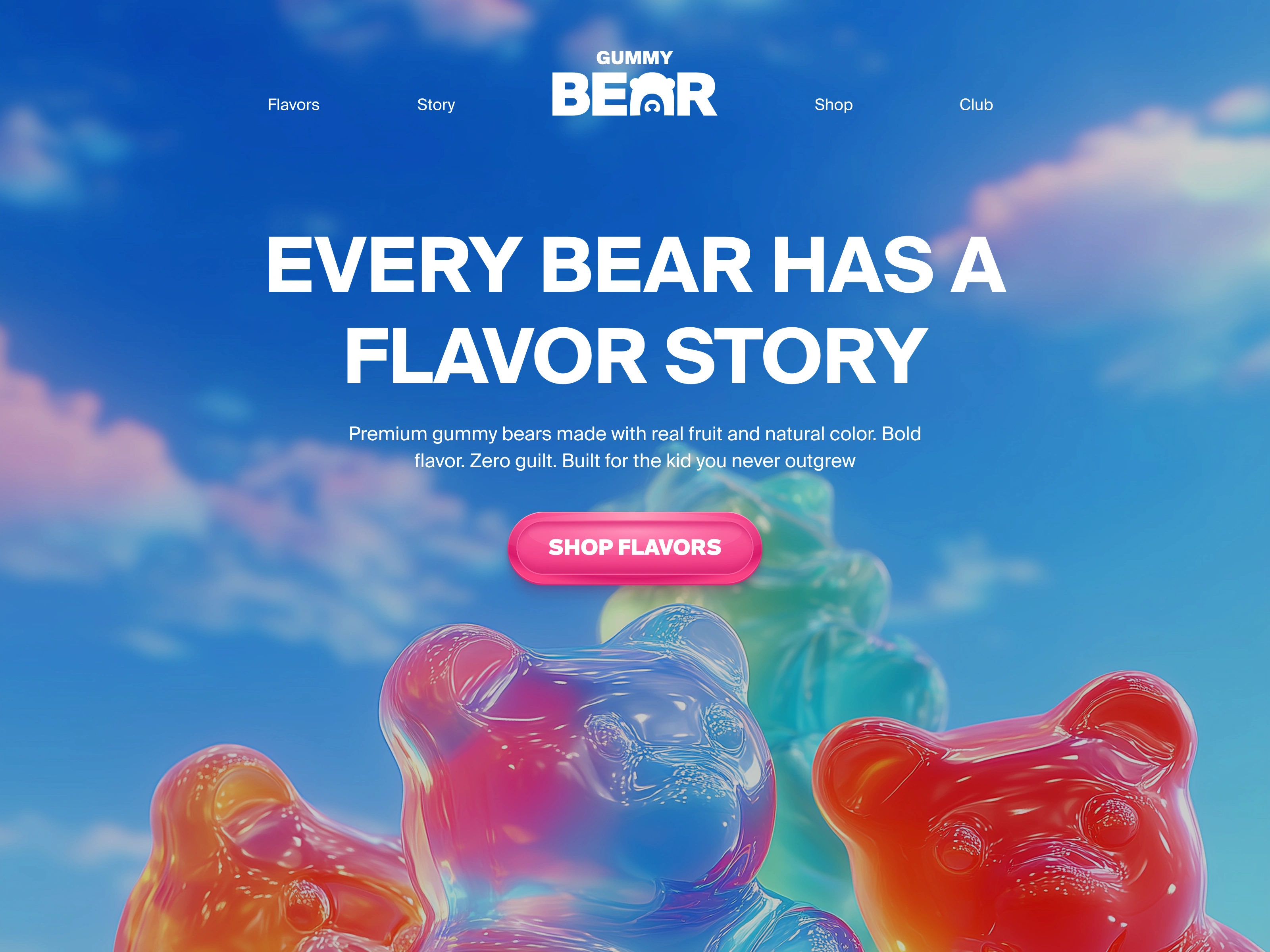
Hero Section
The System
The identity system spans:
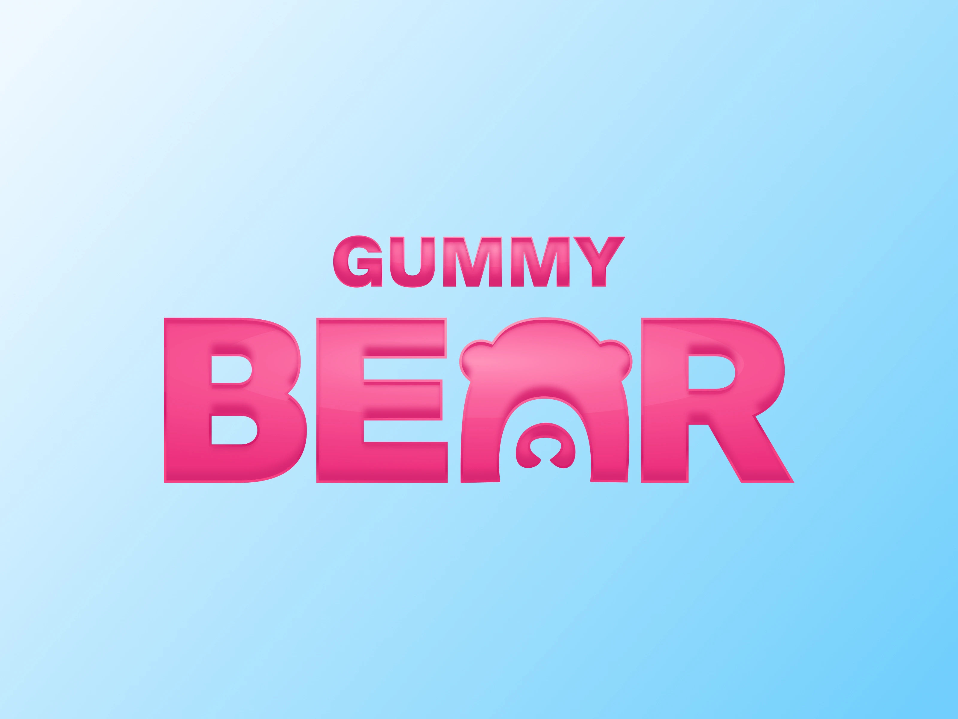
Logo: A glossy, dimensional 3D wordmark that mirrors the product's texture — translucent, reflective, tactile. It doesn't just name the brand, it feels like the brand.
Color palette: Eight colors mapped directly to the product line — hot pink, coral, lime, teal, blue, red — each functioning as both a flavor identifier and a design system element. The palette is maximalist on purpose: it signals variety and energy while the photography keeps it grounded.
Photography direction: Product-as-hero on reflective water surfaces and gradient backgrounds. The gummy bears are shot like objects of desire, not snack food.
Website: "Every Bear Has A Flavor Story" as the hero, with individual flavor exploration that treats each product variant as its own experience.
Environmental: Billboard mockups that prove the system scales — the product photography is strong enough to carry a 48-sheet with just a few bears and the wordmark.
Overview
The Takeaway
When you make the product the identity — not just an illustration of it — you don't need a mascot, a character, or a clever concept. You need better lighting and a higher standard for what candy branding is allowed to look like.
Like this project
Posted Feb 28, 2026
Brand identity for a premium candy brand. The strategic decision: treat the product itself as the visual identity.
Likes
11
Views
269
Timeline
Feb 8, 2026 - Feb 16, 2026