Built with Spline
MindGap – Identity for a Nootropic That Doesn't Try So Hard
Daniel G Bright
The Category Problem
Nootropic branding has two modes: clinical or chaos.
On one side, the biohacker aesthetic, stark whites, neural network graphics, language borrowed from software documentation. Optimize. Stack. Enhance. It speaks to people who want to feel like they're upgrading firmware.
On the other, wellness brands wrapped in so much softness they forget to be credible. Adaptogens and good vibes. Nothing that says this actually works.
Neither speaks to the people who think for a living, creatives, strategists, writers, founders. People who need clarity but don't want to feel like they're medicating their way through the workday.
Logo
The Insight
The best cognitive work doesn't come from pushing harder. It comes from removing friction.
Nootropics aren't about becoming superhuman. They're about closing the distance between foggy and focused, that gap where good thinking lives.
The opportunity: own the space between Silicon Valley stack culture and wellness fluff. Calm capability. Soft aesthetic, serious function.
The Name
MindGap — the cognitive space between scattered and sharp.
The gap isn't the problem. It's the transition state. The moment before clarity arrives. The brand doesn't promise to eliminate the gap — it helps you navigate it.
Simple. Memorable. Distinct from the "Neuro-" and "-ine" naming conventions cluttering the category.
Creative Assets
The Position
The nootropic for people who think for a living.
Not about grinding harder. About thinking clearer.
Target: Creative professionals, knowledge workers, founders — people whose output depends on cognitive quality, not just cognitive quantity.
Tension: Serious function without the clinical edge. Credible without being cold.
Territory: Calm capability.
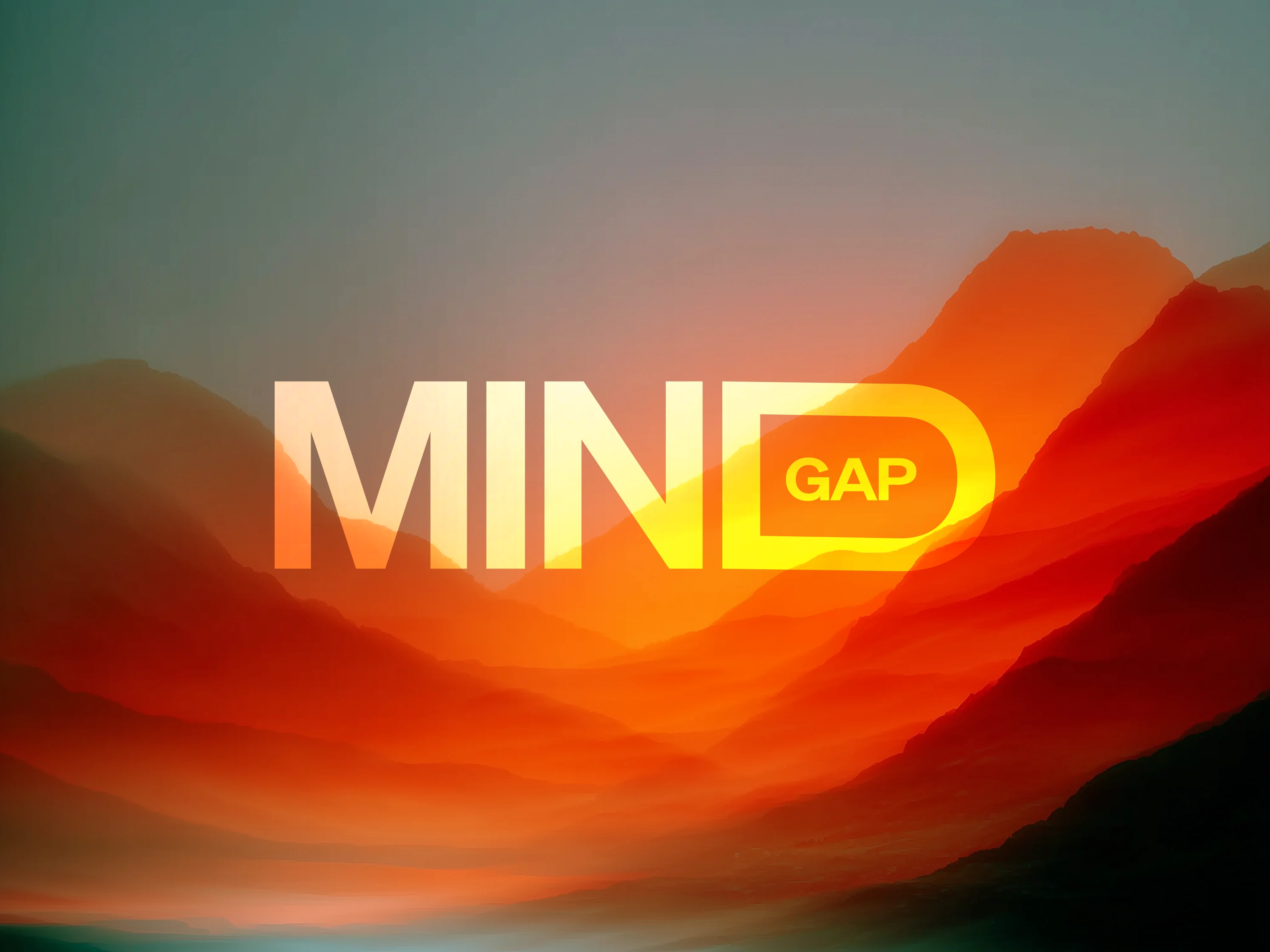
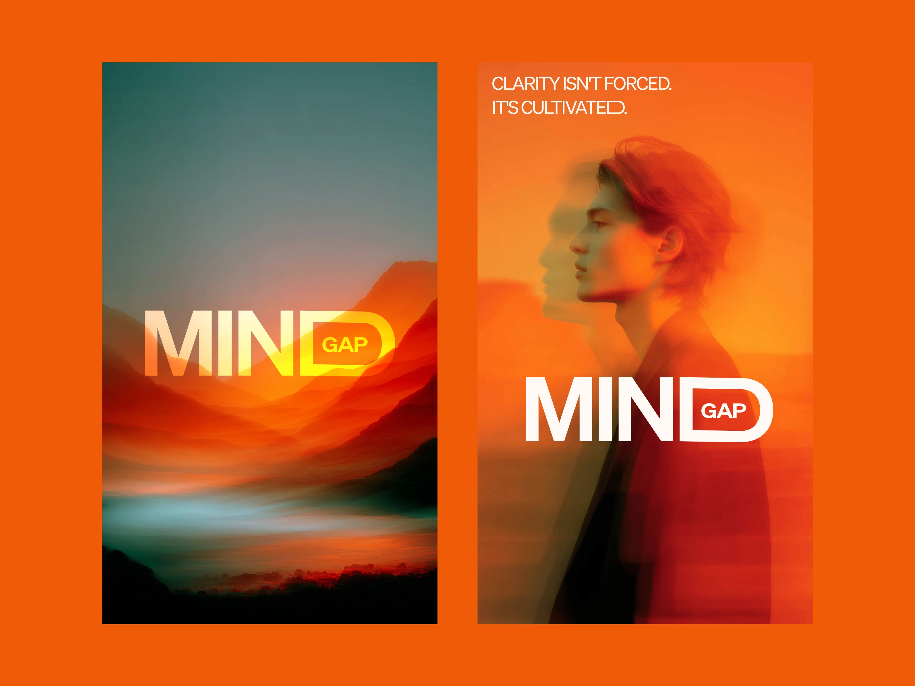
Visual Direction: Emerging Clarity
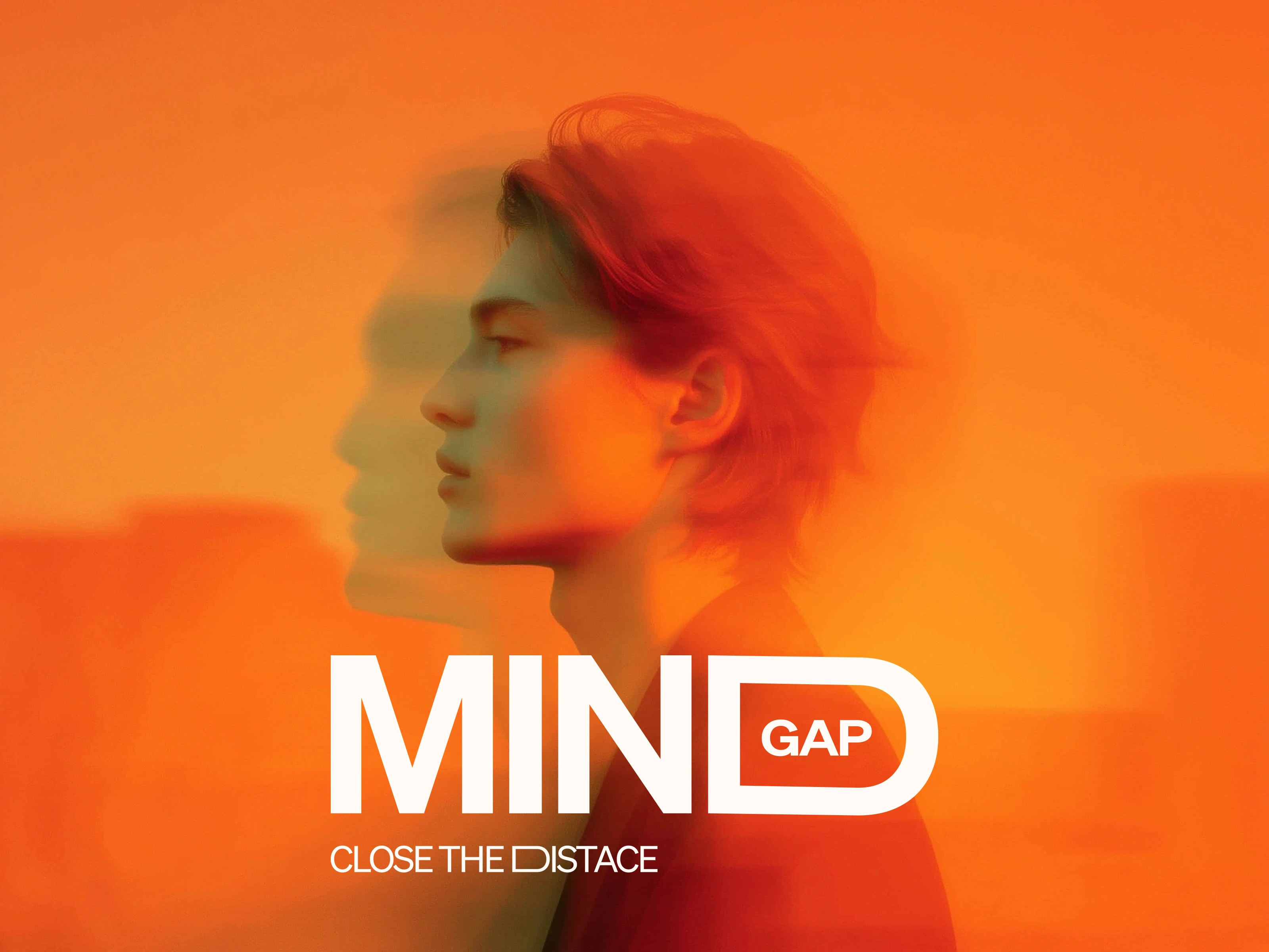
We developed a signature visual language built on transition states — the moment before clarity fully arrives.
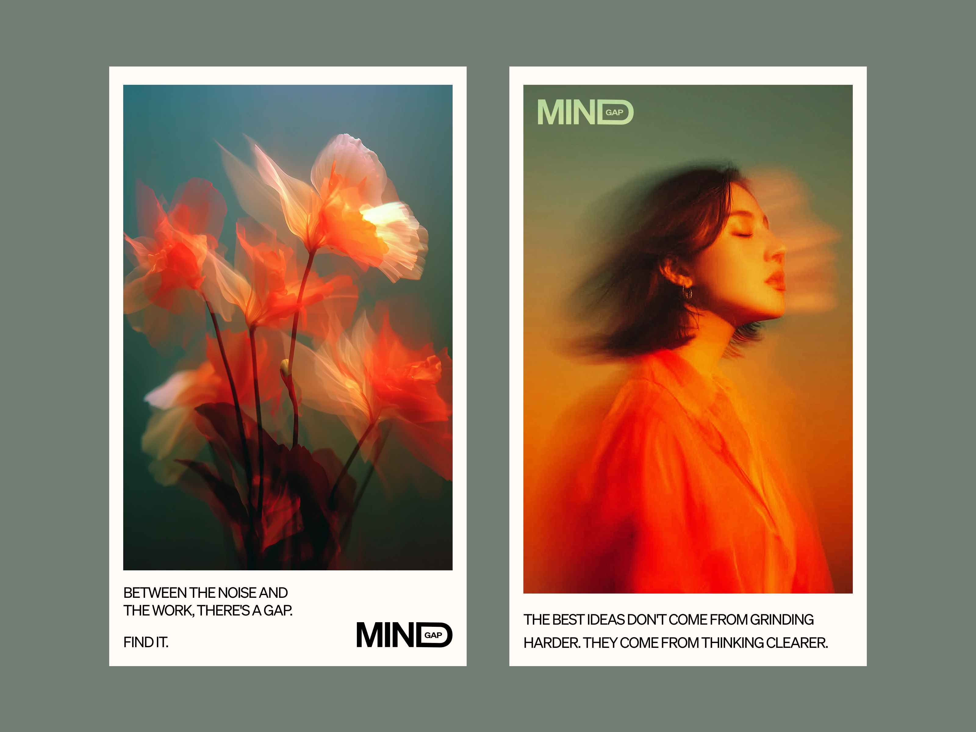
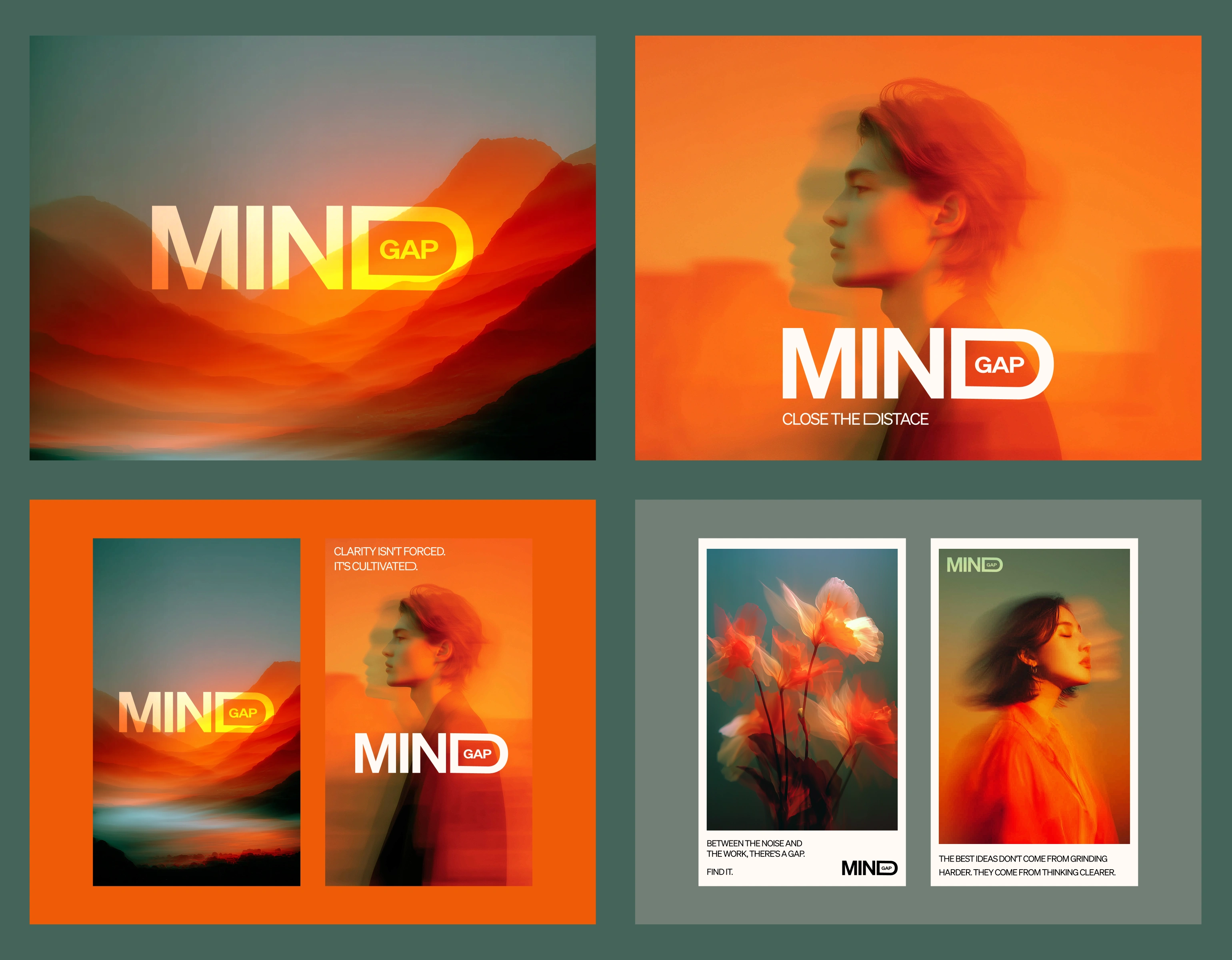
Photography style:
Long-exposure with intentional motion blur
Subjects caught mid-movement, mid-thought
Warm-to-cool color tension (amber to slate, copper to teal)
The effect: Images that feel like memory. Like a thought crystallizing. The product's benefit made visible without resorting to brain imagery or laboratory sterility.
Why it works:
The aesthetic is ownable, scalable, and directly tied to the product truth. It's not decoration — it's the strategy made visual.
Social Media Assets
Messaging Framework
Tagline:
MindGap — Close the distance.
Headlines:
"The best ideas don't come from grinding harder. They come from thinking clearer."
"Clarity isn't forced. It's cultivated."
"Between the noise and the work, there's a gap. Find it."
Voice principles:
Confident, not aggressive
Warm, not soft
Smart, not clever
Permission-giving, not demanding
Animated Spline Asset
What This Project Demonstrates
Category diagnosis — Identifying the aesthetic and positioning white space in a crowded market
Positioning that creates contrast — "Calm capability" stands apart from both clinical optimization and wellness vagueness
Visual concept rooted in strategy — "Emerging Clarity" isn't a mood board; it's the product benefit made visible
Naming with built-in meaning — MindGap works literally and conceptually
Messaging that earns attention — Copy that sounds like the brand thinks, not like it's selling
Overview
The Takeaway
Most nootropic brands talk at their audience about performance. MindGap talks with them about the experience of thinking well.
That's the difference between a product and a brand.
Like this project
Posted Feb 4, 2026
Most nootropic brands talk at their audience about performance. MindGap talks with them about the experience of thinking well.
Likes
14
Views
530
Timeline
Jan 4, 2026 - Jan 17, 2026