Built with Kittl
Crown AI Rebranding for Enterprise Credibility
Daniel G Bright
The Setup
Crown is a Series A AI platform company making the move from developer-led adoption to enterprise sales. The product was mature real customers, real revenue, real differentiation in a market drowning in vaporware. But the brand looked like every other AI startup: gradient backgrounds, geometric sans-serifs, and language that could have been copy-pasted from any pitch deck in the category.
Enterprise buyers weren't seeing a platform they could bet on. They were seeing another AI company that looked like it had something to prove.
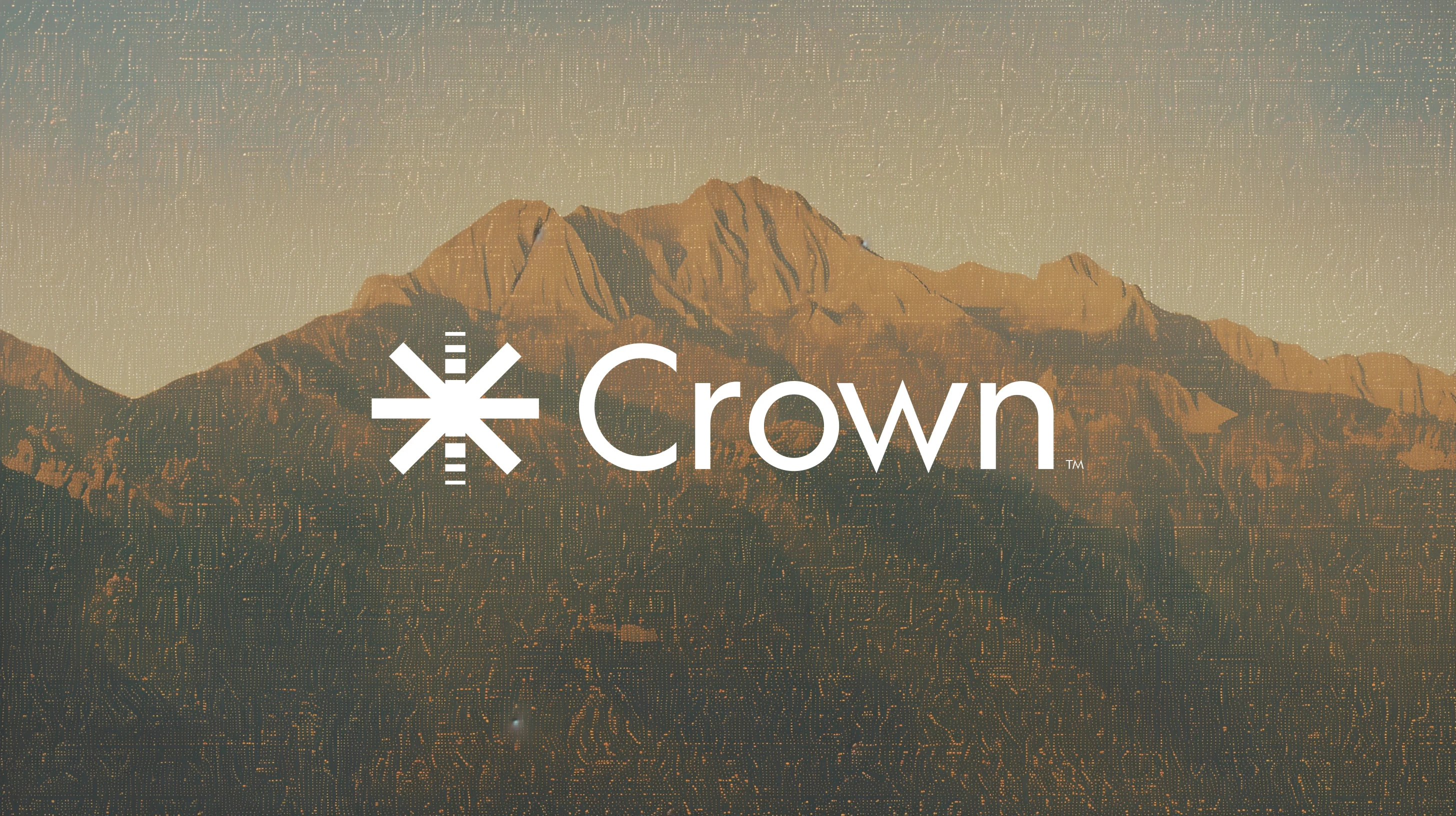
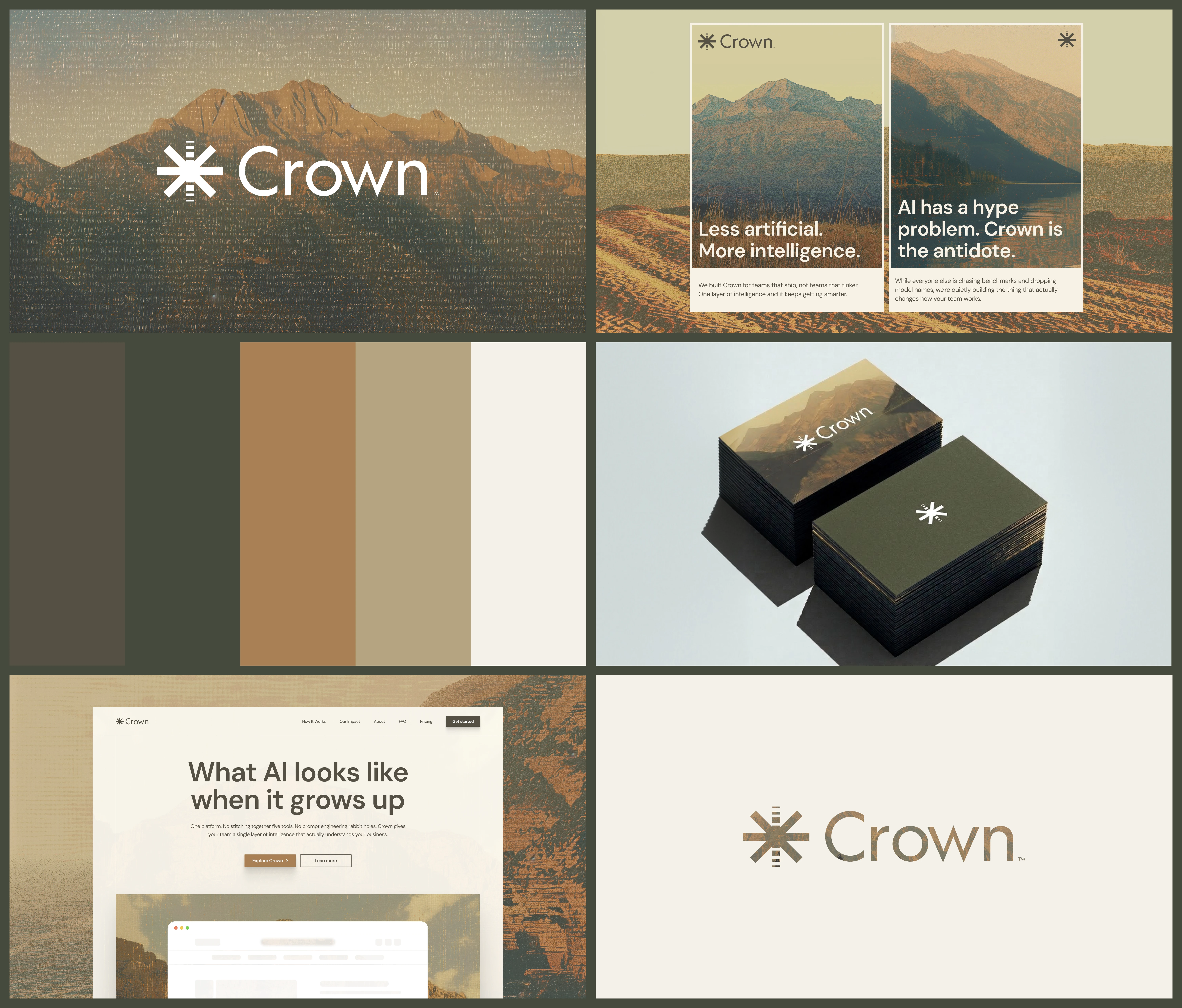
Main Logo
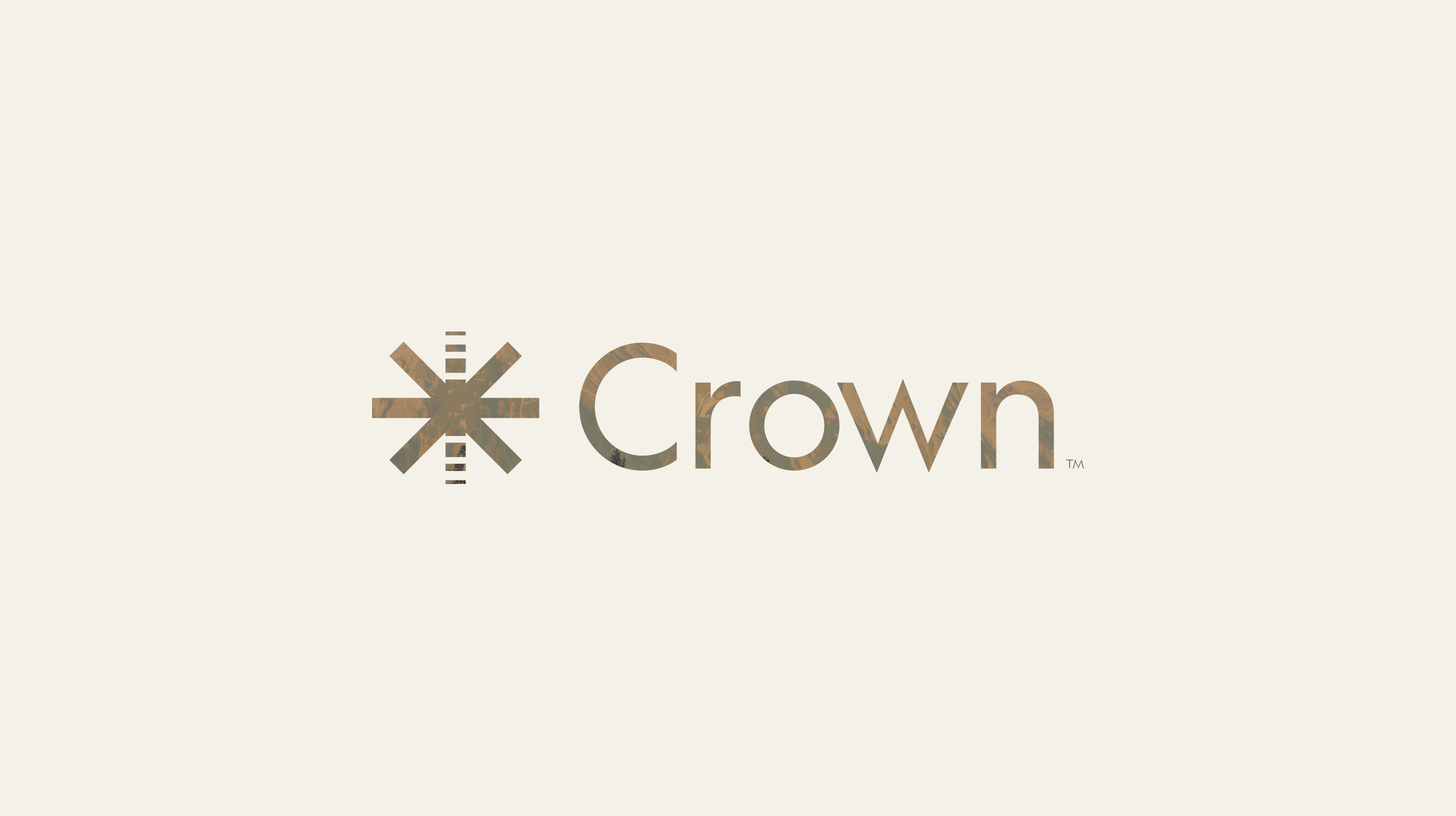
Alt Logo
The Tension
The AI market in 2024-25 has a credibility problem. Every company claims to be "the future of AI." Every visual identity runs the same playbook with dark mode, neon accents, futuristic type. The result: everything looks the same, and nothing feels trustworthy.
Crown's challenge wasn't building awareness. It was building belief. The product had outgrown the brand — the gap between what Crown actually was (a mature, shipping platform with enterprise traction) and what its surfaces communicated (another hype-cycle startup) was costing them deals. Enterprise buyers pattern-match on surfaces, and Crown's surfaces said "early stage" when the product said "ready."
Banner Design
The Decision
The core strategic call: position Crown as the antidote to AI hype, not by arguing against it, but by looking and sounding like the opposite of it.
This meant rejecting every convention the AI category had established. No dark mode. No neon. No "powered by" language. No futuristic aesthetic. Instead, the entire identity was built on a single principle: substance over spectacle.
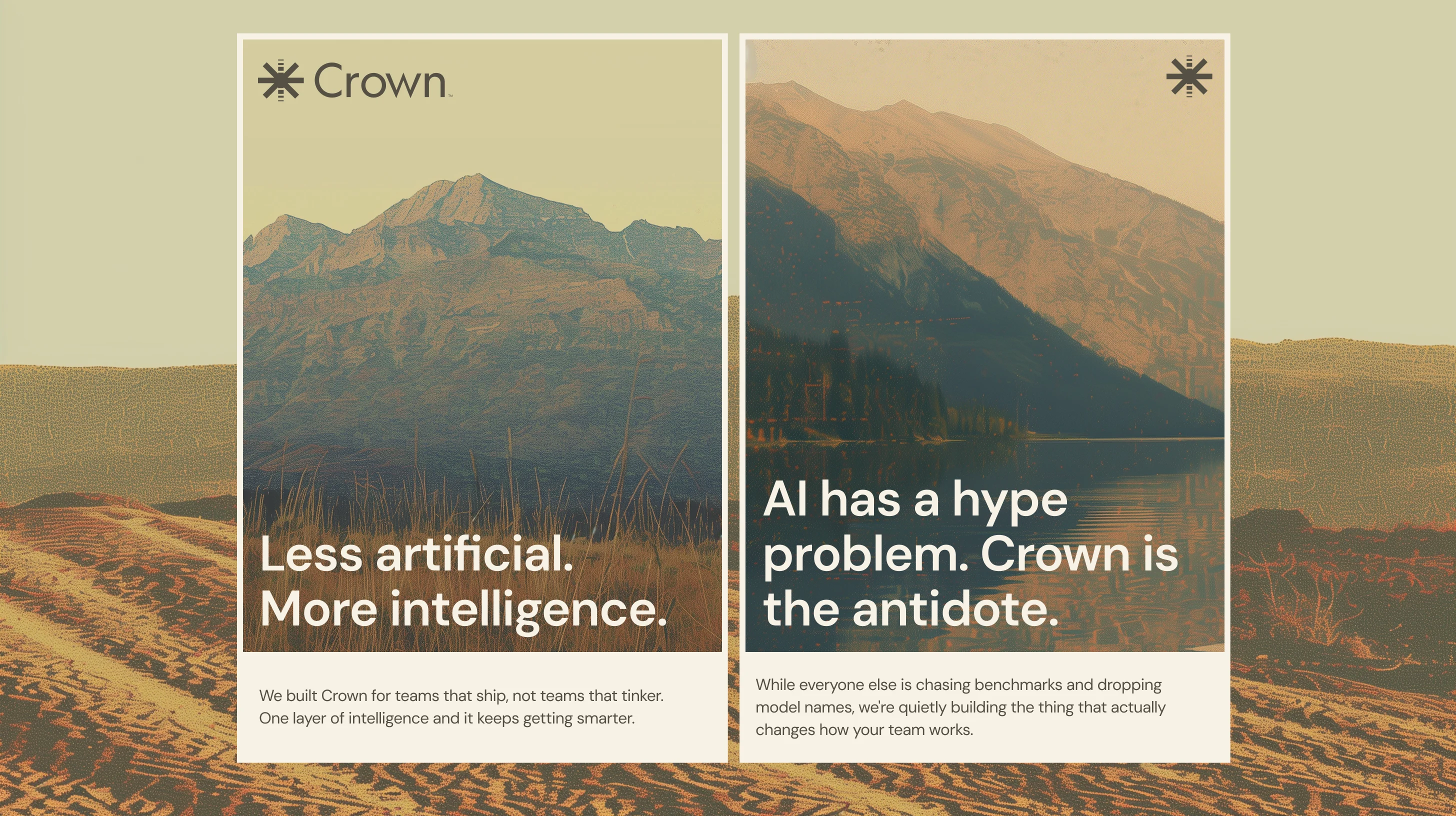
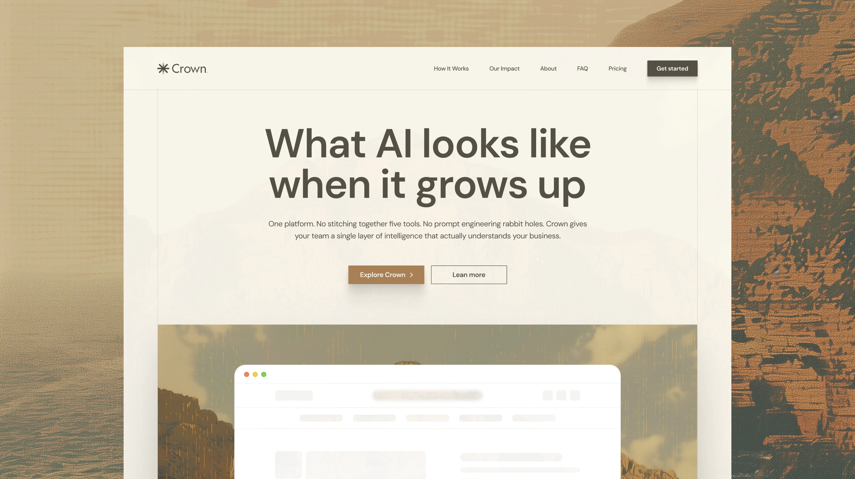
The positioning line "Less artificial. More intelligence." didn't describe a feature. It named the problem with the entire category and positioned Crown as the answer. Every message that followed reinforced the same frame: "AI has a hype problem. Crown is the antidote." "What AI looks like when it grows up."
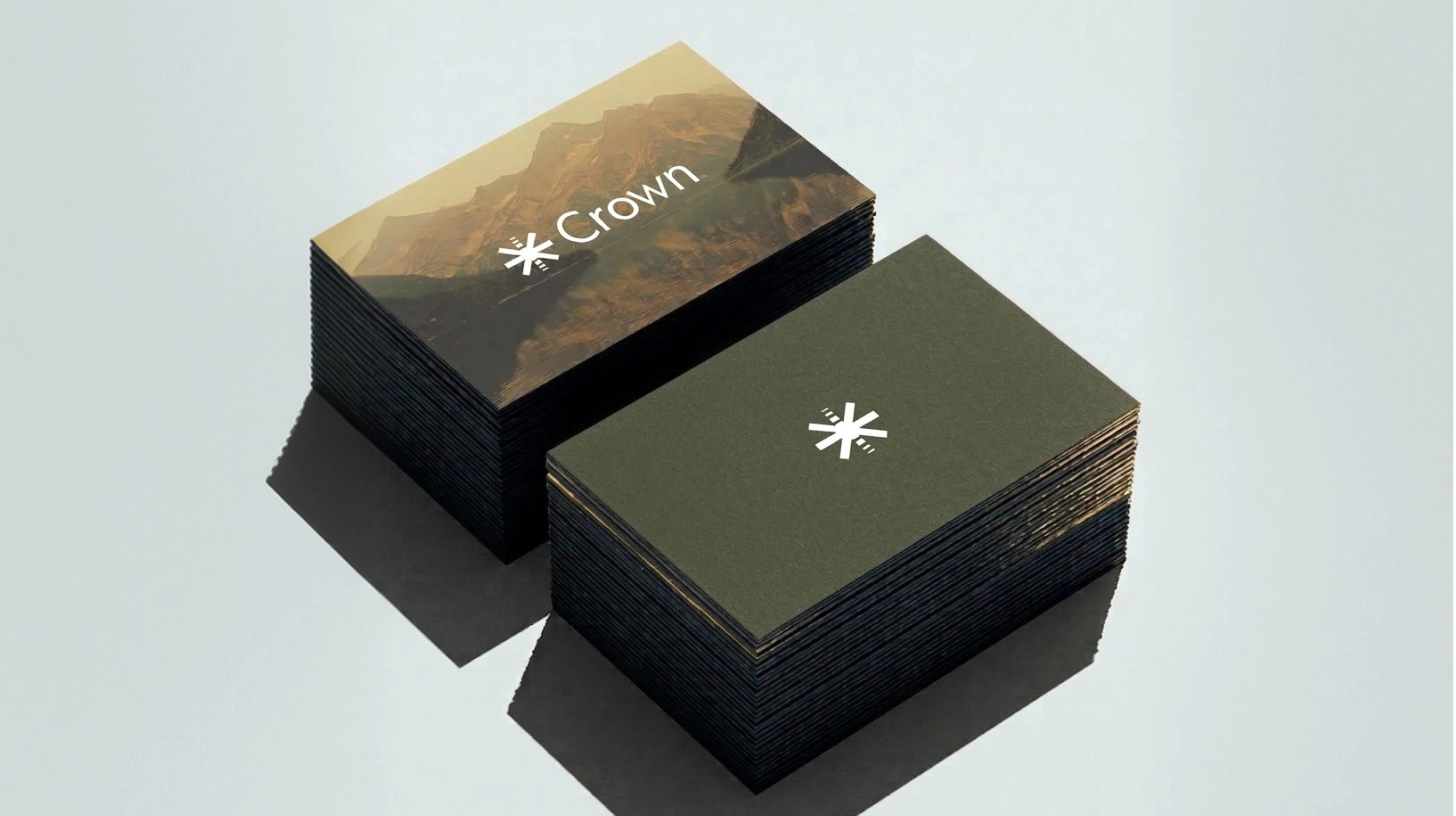
Business Cards
The System
The visual identity was derived entirely from the anti-hype positioning — not assembled from aesthetic preferences.
Color: An earthy palette — deep olive green, warm camel, sandy beige, cream — that rejects the cold, clinical blue-and-purple spectrum of AI branding. The palette signals maturity, groundedness, and permanence. In a sea of neon gradients, it's impossible to scroll past without noticing.
Hero Design
Typography: A serif wordmark — a deliberate rejection of the geometric sans-serifs that dominate tech. Serif type carries authority, heritage, and confidence. It says "we've been here" even when the company hasn't. It's the typographic equivalent of wearing a suit to an industry that shows up in hoodies.
Photography: Mountain landscapes instead of abstract data visualizations or AI-generated imagery. Nature photography does something counterintuitive for a technology brand — it makes the brand feel real, grounded, and permanent. It communicates scale without saying "scale."
Messaging architecture: Every piece of copy filters through the anti-hype lens. "We built Crown for teams that ship, not teams that tinker." "One platform. No stitching together five tools." The copy doesn't explain what Crown does — it explains what Crown isn't. Positioning by negation.
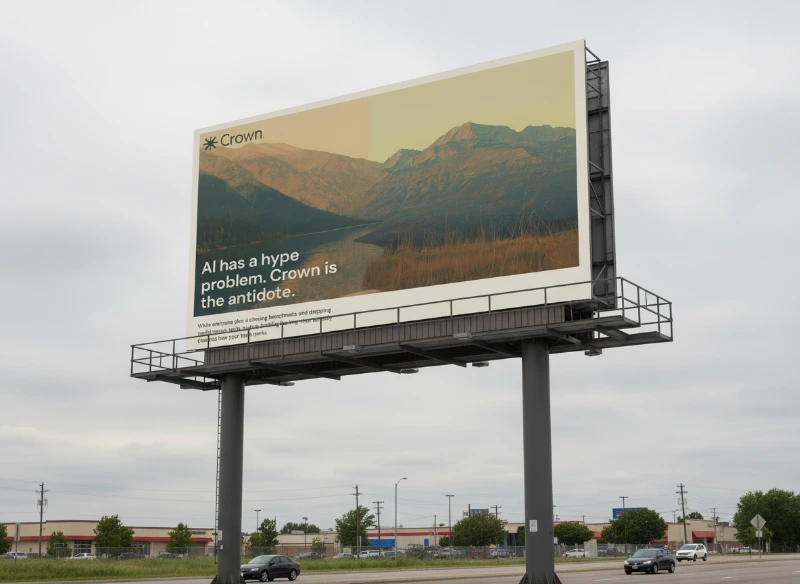
Billboard
The Impact
The identity system gives Crown something no amount of feature marketing could: instant differentiation. In a category where every company looks the same, Crown looks like it belongs to a different conversation entirely. The earthy palette and serif typography create a visual territory that competitors can't occupy without looking derivative.
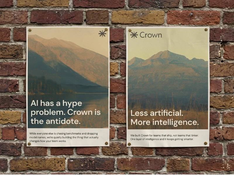
Poster
More importantly, the brand solves the enterprise credibility problem. The surfaces now match the product's maturity. When an enterprise buyer lands on Crown's site, the pattern-match says "established, trustworthy, serious" — not "another AI startup."
Overview
The Takeaway
The strongest positioning doesn't describe what you do it names what's wrong with everyone else. Crown's identity works because it doesn't compete on the same terms as the rest of the AI market. It opts out of the entire aesthetic vocabulary of the category and creates its own. The anti-hype position isn't a contrarian play — it's the only honest position for a company that actually has substance behind the surface.
Like this project
Posted Mar 10, 2026
Crown AI had the product to win enterprise deals and a brand that made them look like a side project. Repositioned category, rebuilt identity, closed the gap.
Likes
13
Views
386
Clients
Crown