Built with Jitter
ORGN — An identity engineered to survive the interface
Daniel G Bright
Verified
TL;DR
ORGN asked for a precise, black-and-white identity that behaves inside a dense product UI. Early geometry looked clever at presentation size and messy at 24 px. We reduced the symbol to its strongest idea: a circle with a precise triangular cut, harmonized it with the chosen wordmark (Option 1), and validated everything directly in the app (“Stealth-app”). The result is a mark that reads instantly, doesn’t fight the interface, and is hard to misuse.
Overbiew
Context
ORGN’s logo never lives alone. It sits in nav bars, avatars, and tight components that don’t care how pretty something was in a deck. The ask from day one was disciplined: black & white only, precise and tech-leaning, and usable at 16–32 px. No color heroics. No gradient crutches. If it can’t pass in-product, it doesn’t ship.
The brief behind the brief
“Precise and techy” usually means two competing desires: a logo that feels engineered and a logo that disappears until needed. That tension defined the work. Our job at Bright Studios was to make something quietly strong — confident enough to anchor a system, humble enough to disappear behind the product.
Exploration (and the first mistake)
We began with two routes:
1. A custom wordmark built from the Option 1 typography the team favored — solid, grounded, and stable.
2. A negative-space monomark using hex/cube language, kept strictly flat.
On slides, the geometric studies looked smart. Next to live UI, some of that “smart” read as “busy.” The founder and engineering team said it out loud: “too complicated.” They were right. When you need 10 seconds to explain a logo and the product gives you 200 milliseconds, the product wins.
What we learned fast
• Intricacy dies at small sizes.
• Outline-within-outline collapses first.
• Depth that depends on shading isn’t ownable in B&W.
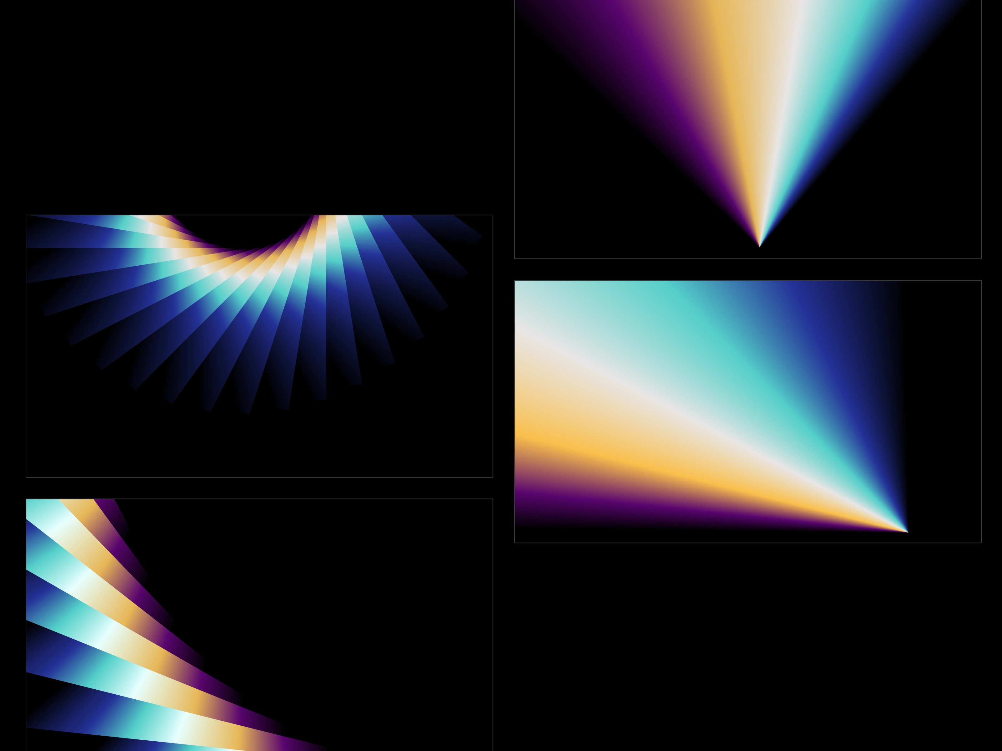
Grediants
The pivot
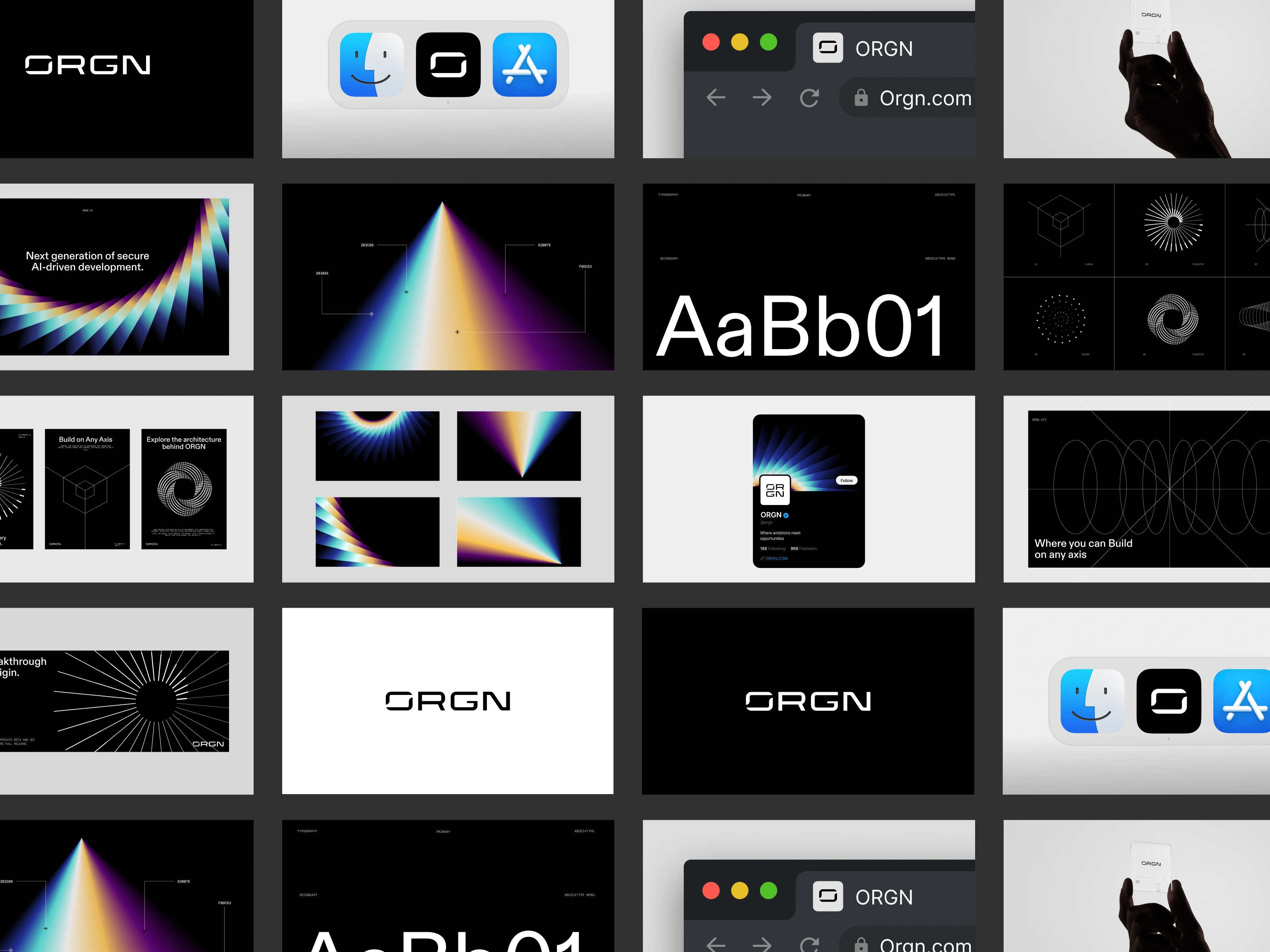
We stripped the symbol to the only idea that survived every test: the innermost circle with a precise triangular cut. No fake isometric. No shading. Just a clear, ownable gesture that still reads as engineered.
Then we did the unglamorous work:
• Stroke harmony: matched the monomark’s weight to the wordmark so neither looked like a guest at the other’s house.
• Proportion tuning: scaled the symbol slightly up so the triangle didn’t collapse at favicon size.
• Spacing discipline: set minimum internal gaps that survive export, compression, and system anti-aliasing.
Design where it lives
Everything was proofed inside the Stealth-app: light/dark nav, avatars, empty states, settings.
We tested:
• Favicon (16 px) and app icon (24–32 px)
• Top/side nav alongside dense components
• Avatar use, where a mark must be legible inside a circle at snack-size scale
When a shape reads first time, in the worst case, with zero color, you know you’re close.
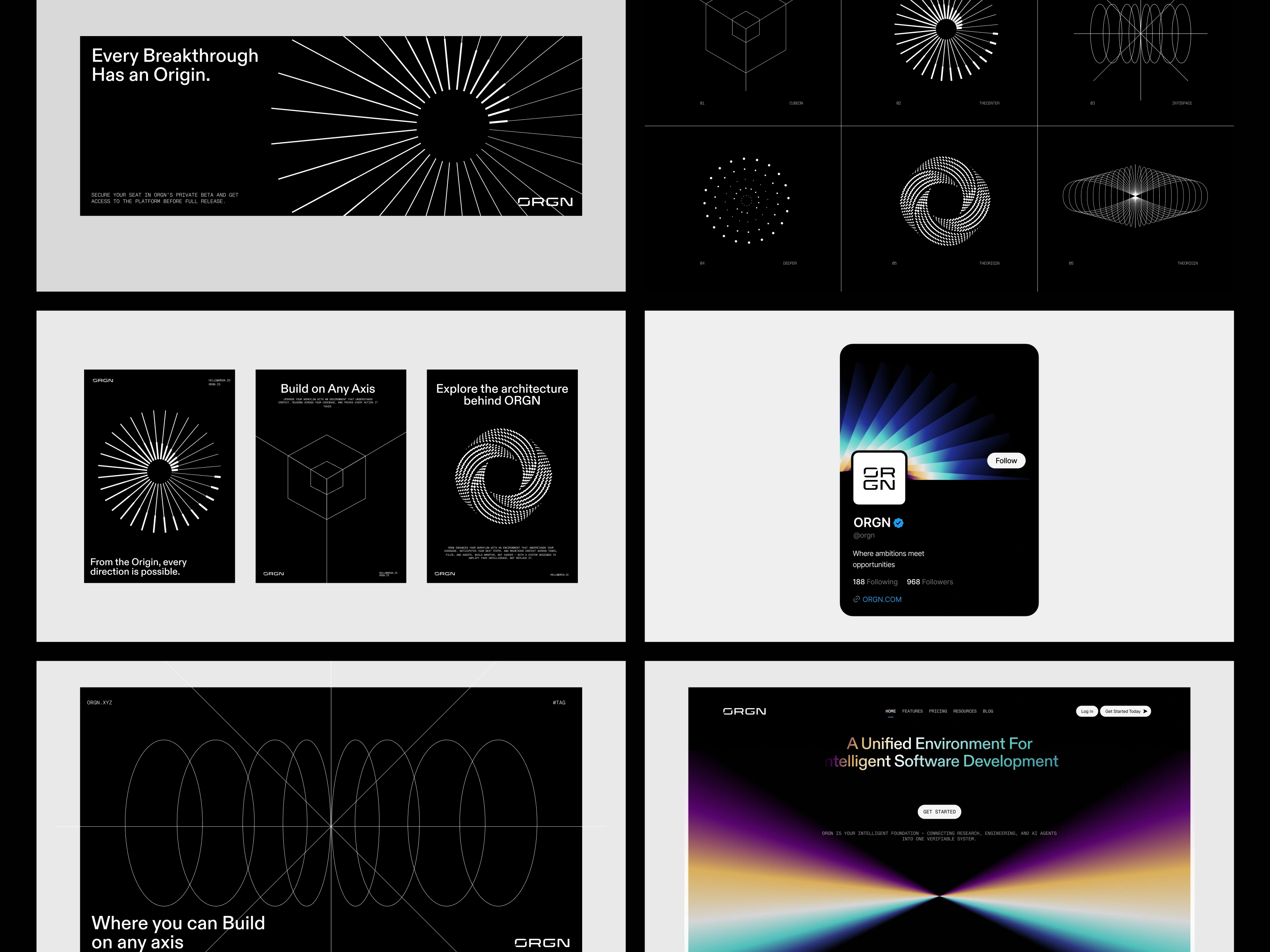
Where it lives
The system we shipped
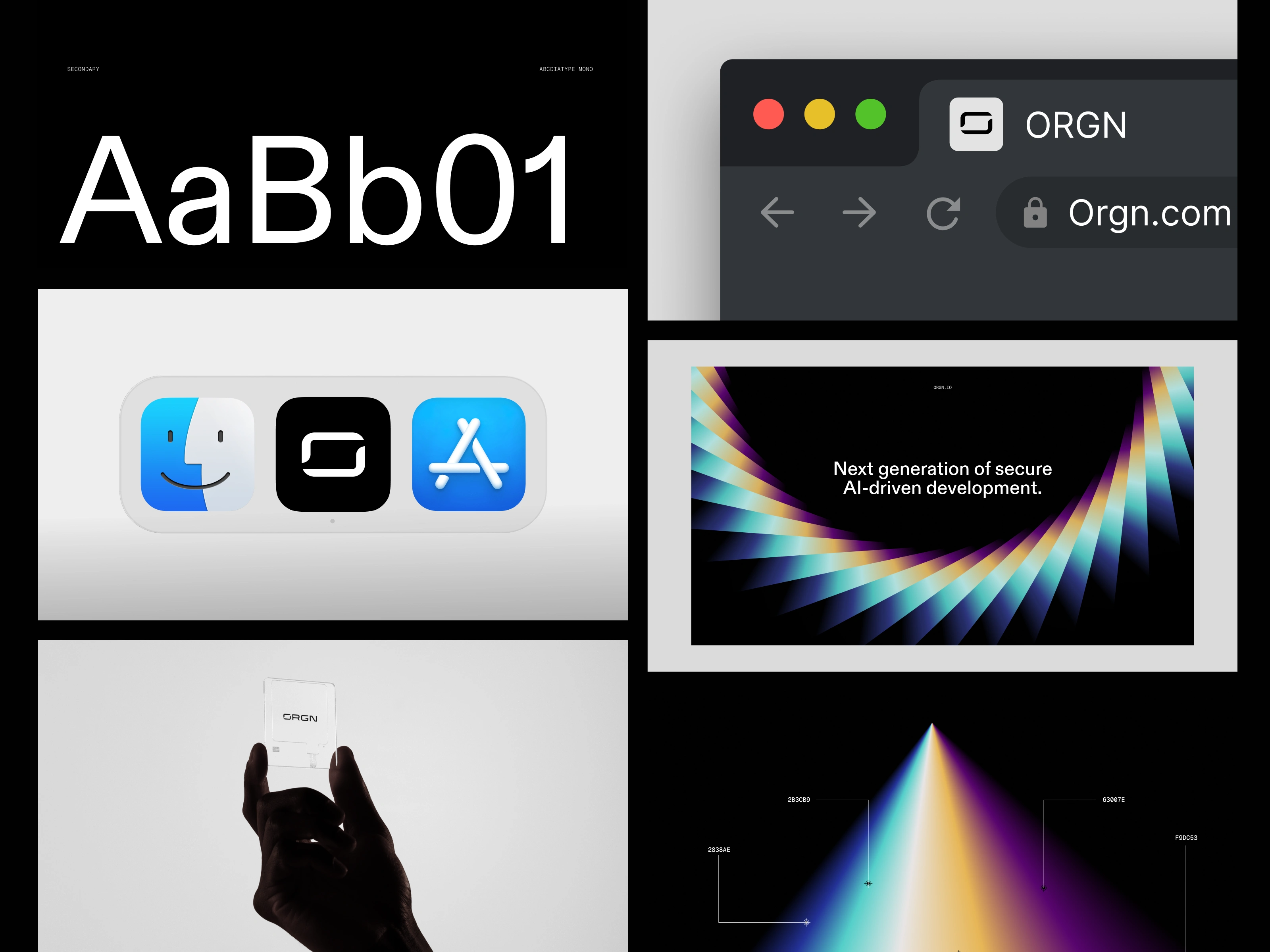
Primary assets
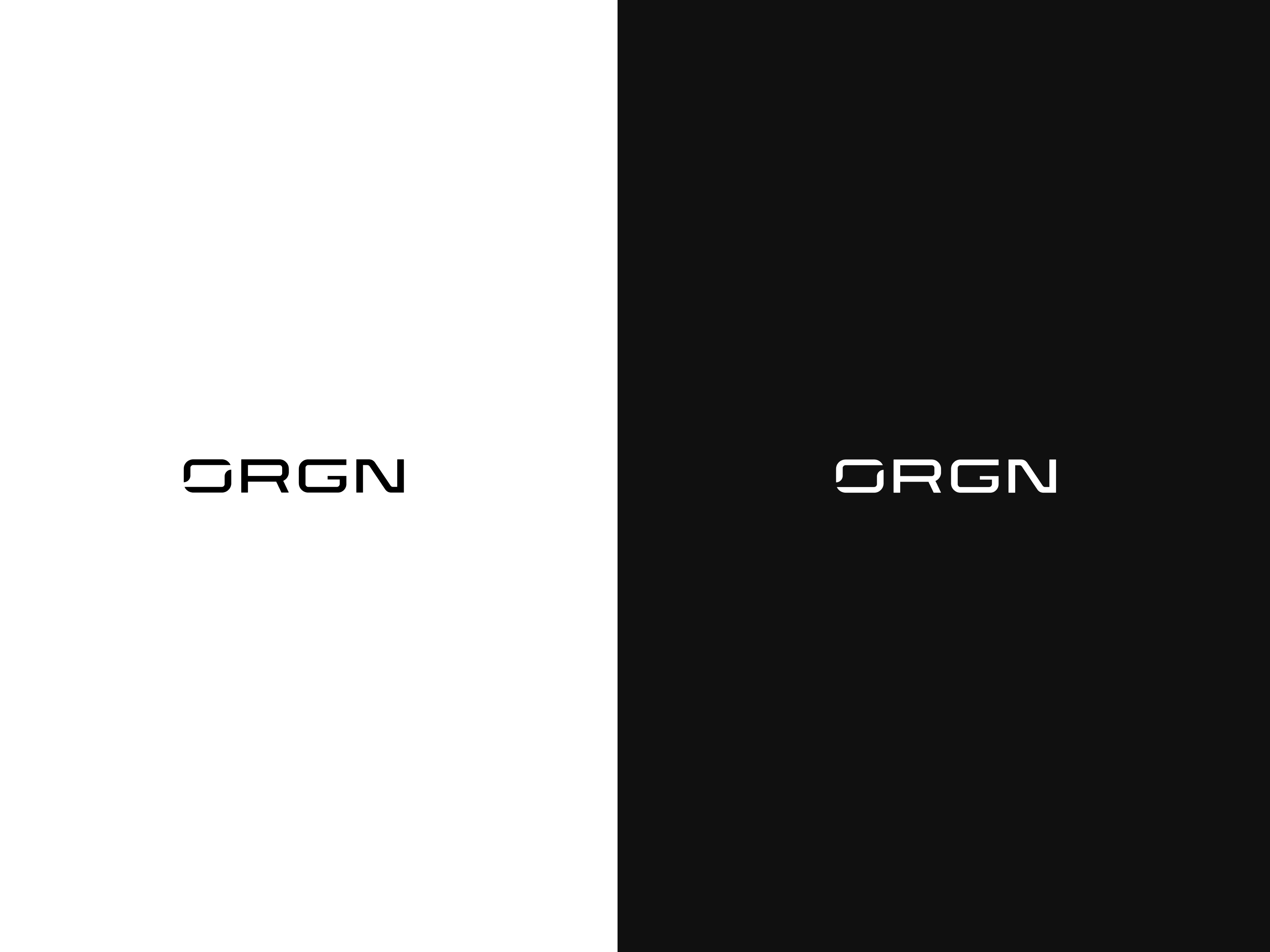
• Monomark: circle + triangular cut, flat B&W
• Wordmark: custom, grounded in the Option 1 direction the team preferred Lockups
• Horizontal and stacked, tuned to keep optical weight stable across sizes
Usage rules
• Clear space, minimum sizes, and “do/don’t” focused on the real failure modes we saw in testing (hairline details, nested outlines, faux depth)
Product placements
• Favicon, app icon, top-nav, side-nav, avatar, empty states — all validated inside the app files the team uses daily
Guidelines
• A compact kit that answers the only questions people actually ask: how small can it go, how close can things sit to it, what breaks it, and how do we avoid those breaks
Before → After
Before A clever, multi-facet geometric idea that looked great in a presentation frame, then lost clarity near 24 px and fought for attention inside UI.
After A flat, disciplined mark with one strong gesture. Recognizable in a blink, balanced with the wordmark, and indifferent to context. It doesn’t need color to survive.
After
Process notes
• Precision is a constraint, not a style. If math doesn’t improve legibility, it’s ornament.
• Founders and engineers are a useful truth serum. “Too complicated” usually describes the environment, not a taste preference.
• Testing beats taste. The interface is judge, jury, and executioner.
Outcome
The team approved the final system and moved directly into guidelines delivery. Implementation has been straightforward because the rules match reality. As Marina put it, the experience was “super professional, delivering on time… no complaints.” That’s the goal: leave a team with something they can trust and use immediately.
“Super professional, delivering on time… no complaints.”
— Marina, ORGN
Outcome
What we’re proud of
• Choosing restraint over cleverness
• Making the symbol and wordmark feel like they were born together
• Writing guidelines that reduce support pings instead of generating them
Deliverables
• Monomark and wordmark (SVG, PDF, PNG)
• Lockups (horizontal, stacked)
• Favicon/app-icon exports
• Brand guidelines (construction, spacing, min sizes, do/don’t, UI placements)
Like this project
Posted Nov 30, 2025
A product-first identity: a simple circle-and-cut symbol, a solid wordmark, and a usage system tuned for dense UI.
Likes
26
Views
713
Timeline
Oct 22, 2025 - Nov 27, 2025
Clients
o.xyz