Built with Framer
Augment MBA – Premium Landing Page
Daniel G Bright
Verified
Augment sells an alternative to the traditional MBA. Their instructors include the founders of Wikipedia, YouTube, Shazam, and Eventbrite. Annual memberships run $399/year; lifetime access is $1,470.
They had a landing page that listed everything — twelve sections of courses, perks, testimonials, and pricing. It informed. It didn't convert. For a product competing against the idea of a $100K MBA, the page's job isn't to describe what you get. It's to make you believe it's worth it.
The problem:
Augment had a world-class roster and a real product. But their page made them look like another course marketplace. Multiple fonts fighting each other, a lime green accent that read "tech startup," twelve sections at identical visual weight. Nothing stopped you.
Two rounds in, the founder kept saying one thing: "Premium. I want it to feel premium." But he couldn't define it. That's not a brief — it's a symptom. The real issue: the page treated every section as equally important, so nothing felt important.

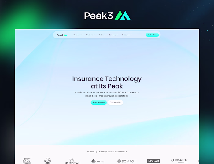
Hero Section
What we did:
We made it premium by taking things away.
Killed the lime green. Replaced it with a single warm gold, used only on CTAs. Dropped the serif font entirely — one typeface, hierarchy through weight and size alone. Merged two redundant sections. Twelve became ten.
The structural change mattered most. The original page scrolled like a list. We rebuilt it with alternating rhythm: full-bleed immersive sections, then tight informational ones. The page breathes. You stop where it matters.
Where it got messy:
The path wasn't clean. First gold gradient looked like a crypto page — pulled it back to gold on buttons only. Filter pills on the instructor section looked great in Figma but would be static in production, so we killed them. Restructured pricing three times before landing on discount-on-Annual-only with no badges. The "What is Augment" cards went through four rounds of simplification.
Every wrong turn made the final version sharper.
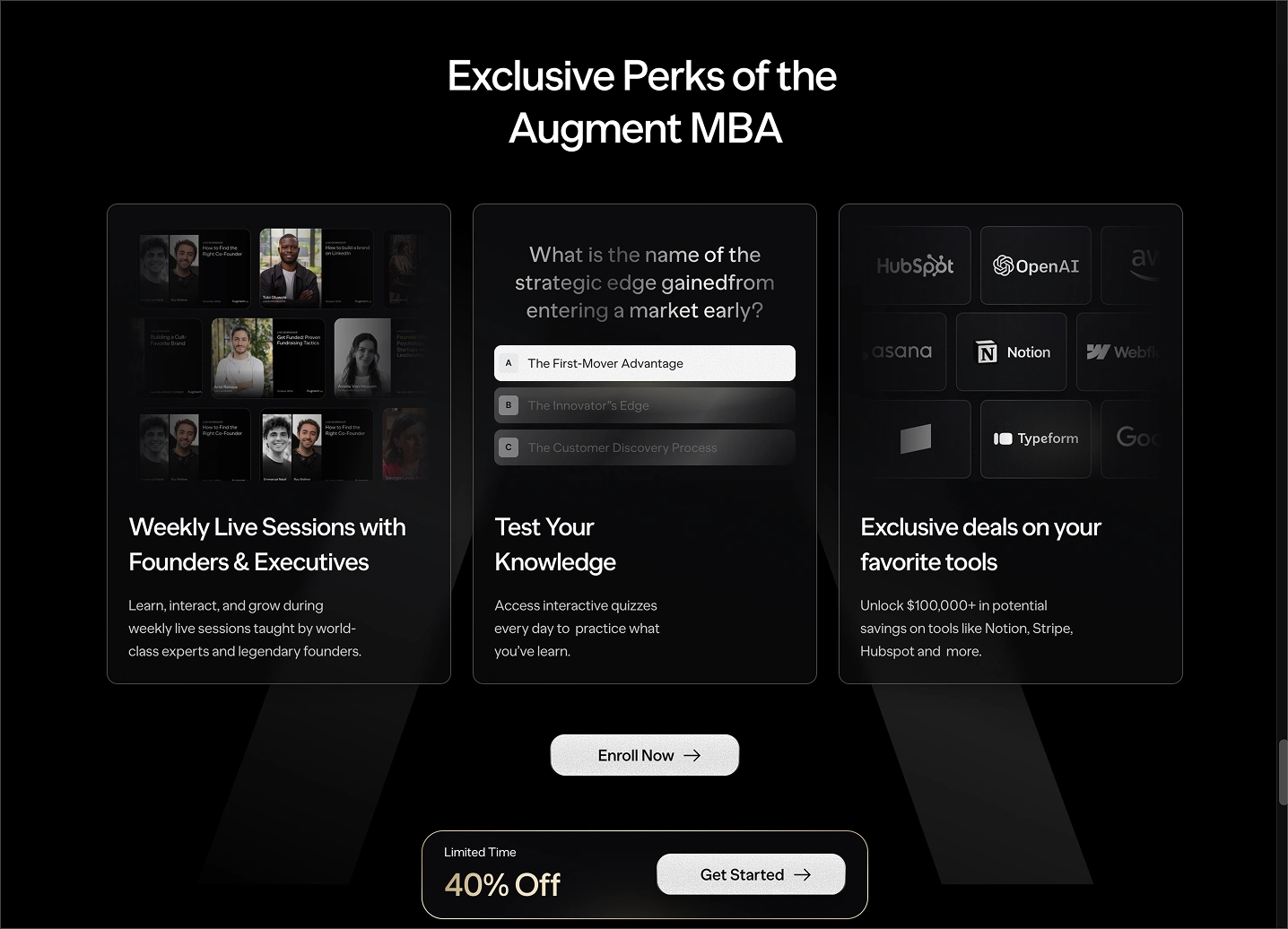
Perks
How it works as a system:
Hero stops the scroll. Instructor carousel makes the roster tangible. MBA comparison reframes the price. Curriculum accordion proves the content is real. Pricing converts. FAQ handles objections. Sticky CTA keeps a conversion path visible at every scroll depth.
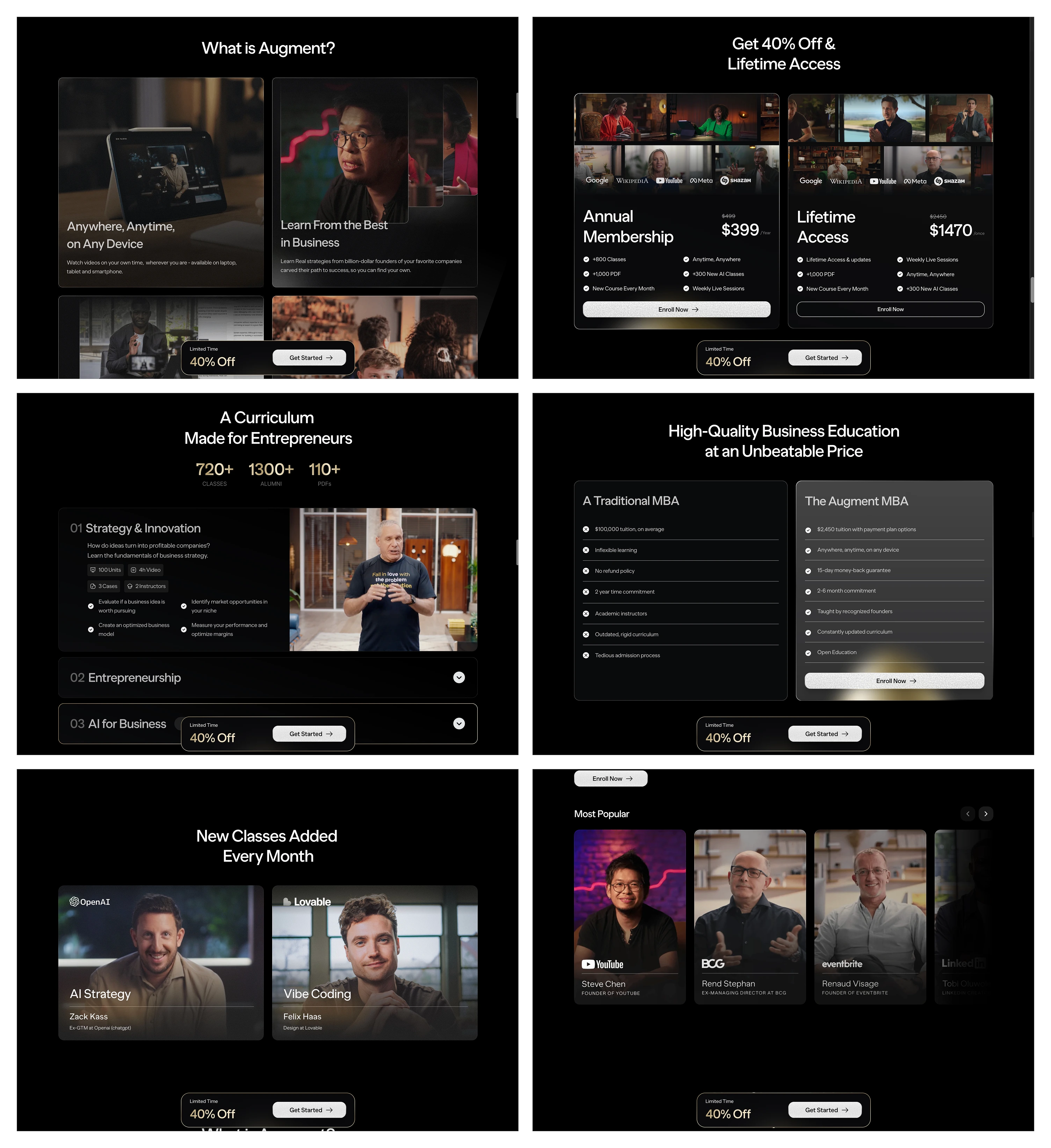
Overview
Result:
First design to approved Framer build in three weeks, three rounds of iteration. The clearest proof it worked: the client's feedback evolved from abstract ("make it feel premium") to precise ("add arrows to the mobile carousel"). When a client stops talking about feelings and starts talking about components, you've solved the design problem.
The gap between "course marketplace" and "prestigious education platform" isn't more polish. It's more restraint.
Like this project
Posted Apr 8, 2026
Framer landing page for Augment, the online MBA that's making traditional programs defend their existence. Built to convert skeptics in one scroll.
Likes
22
Views
943
Timeline
Mar 23, 2026 - Apr 8, 2026
Clients
Augment